










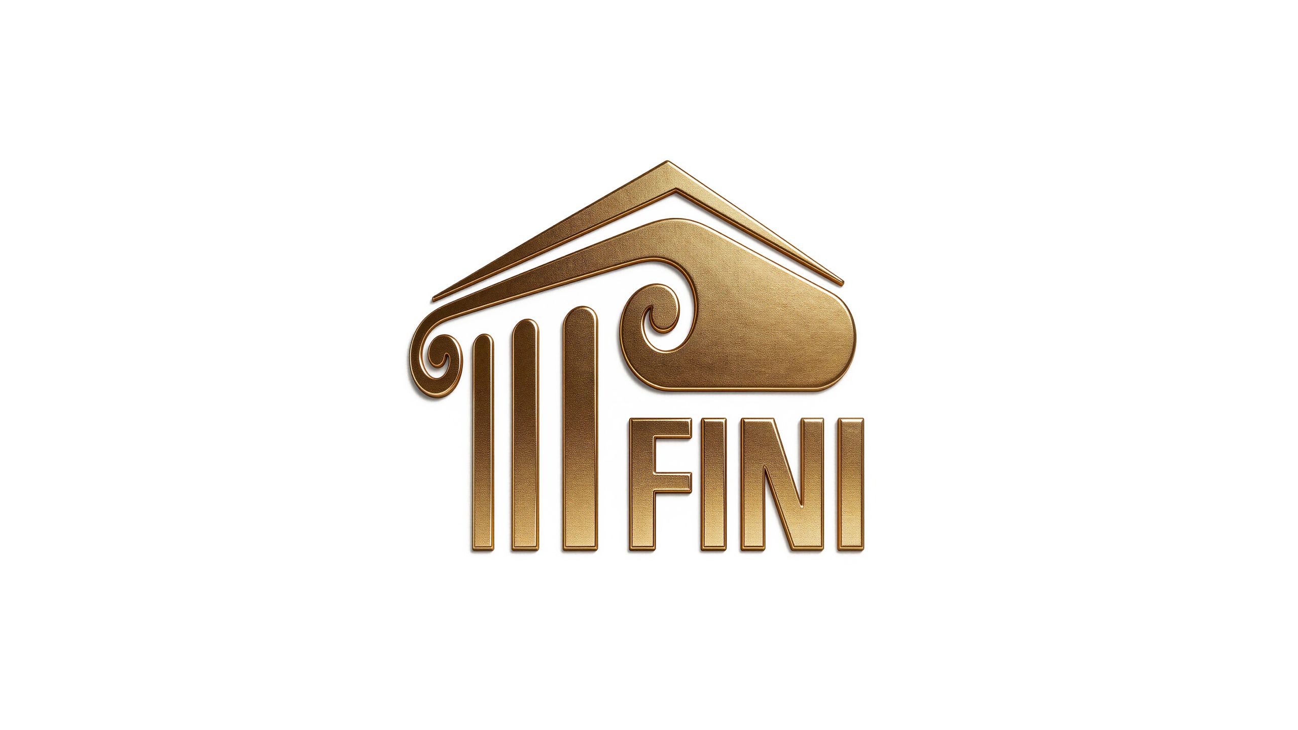
FINI is a comprehensive enterprise group with an international vision. With its stable business philosophy and profound industry accumulation, it has built a business landscape covering diversified business fields. The brand adheres to the development philosophy of "lasting business with lasting foundation and continuous accumulation" and is committed to winning market trust with classic quality and globalization.
The design goal of the brand logo is to demonstrate the strategic height and cultural heritage of Fini Group as a comprehensive enterprise group through classical architectural aesthetics, historical richness and international visual language, and to convey the brand image of "solid foundation and magnificent magnanimity".
Design concept and graphic language
The logo takes "Classical Temple" as the core concept, and uses the triangular pediment and Ionian columns of European classical architecture as the main graphics to construct a solemn and elegant temple outline. Three vertical columns support the triangular roof, symbolizing the solid foundation of the brand and the stability of the structure; a graceful scroll curve (Volute) extends from the right side of the column head. This classic decorative element originated from the Ionian column in ancient Greece, giving the logo the elegance and cultural depth of European classical architecture. The scroll curve naturally transitions into a rounded arc volume, wrapping the "FINI" word mark, forming an organic fusion of graphics and text, which means "the foundation of history carries the future of the brand." The overall design integrates the solemn order of classical architecture with the concise expression of modern brands, reflecting the dual attributes of Fini Group's cultural heritage and business structure.
The triangular pediment structure symbolizes the supreme authority of the palace and the strategic top-level design of the brand, conveying stability and direction with a simple and powerful geometric triangle; the three columns represent the core pillars of corporate development. The columns are equidistantly arranged and the lines are straight and vertical, reflecting the sense of order and discipline of brand management; the Ionian scroll curve is the most recognizable among the logos The recognizable visual symbol, the spiral shape is elegant and introverted, injecting a soft rhythm into the rigid architectural structure, symbolizing the brand's management wisdom of combining rigidity and softness; the rounded arc-shaped volume on the right wraps the scroll and the word mark into one, like the arch space of a palace, which is not only a continuation of the architectural language, but also provides a stable visual attribution for the brand name. The overall composition uses the rigorous proportions and decorative aesthetics of classical architecture to build a "brand palace" to convey the historical depth and grandeur of the Fini Group.
Font composition and color system
The word mark "FINI" adopts a classic serif capital font, with straight strokes, square structure, and broad and steady fonts, echoing the vertical lines of the columns, conveying the brand's authoritative temperament and international image. The vertical lines of the letter "I" are thick and equidistant from the columns, forming a visual rhythm integrating graphics and text, making the word mark seem to grow naturally from the architectural structure. The overall style of the font is solemn but not complicated, maintaining the clear recognition of the modern brand amidst the classical charm.
The main color, palace gold #8B7D4A, is the only color used in the logo, representing historical accumulation, noble quality and classic inheritance. The calmness and restraint of gold fit the stone texture of classical architecture, while conveying the brand meaning of wealth, trust and longevity; the auxiliary warm gold #A89860 is used for logo applications on light backgrounds, maintaining the golden tone while enhancing visual temperature and affinity; dark gold #6B5F38 Used for dark processing on dark backgrounds or three-dimensional applications to enhance the layering and engraving texture of the logo; pure white #FFFFFF is used as the standard background color to ensure the clarity of the logo and the pure presentation of the majesty. The overall color system is run through with a single golden color, reflecting the brand positioning of "classical palace, eternal foundation", different from the multi-color modern corporate style, and conveying the brand proposition of Fini Group of "establishing itself with classics and reaching for the future with quality".
Application extension and brand significance
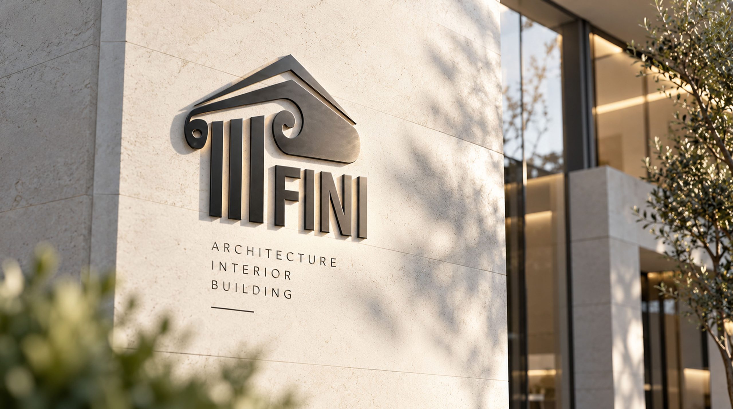
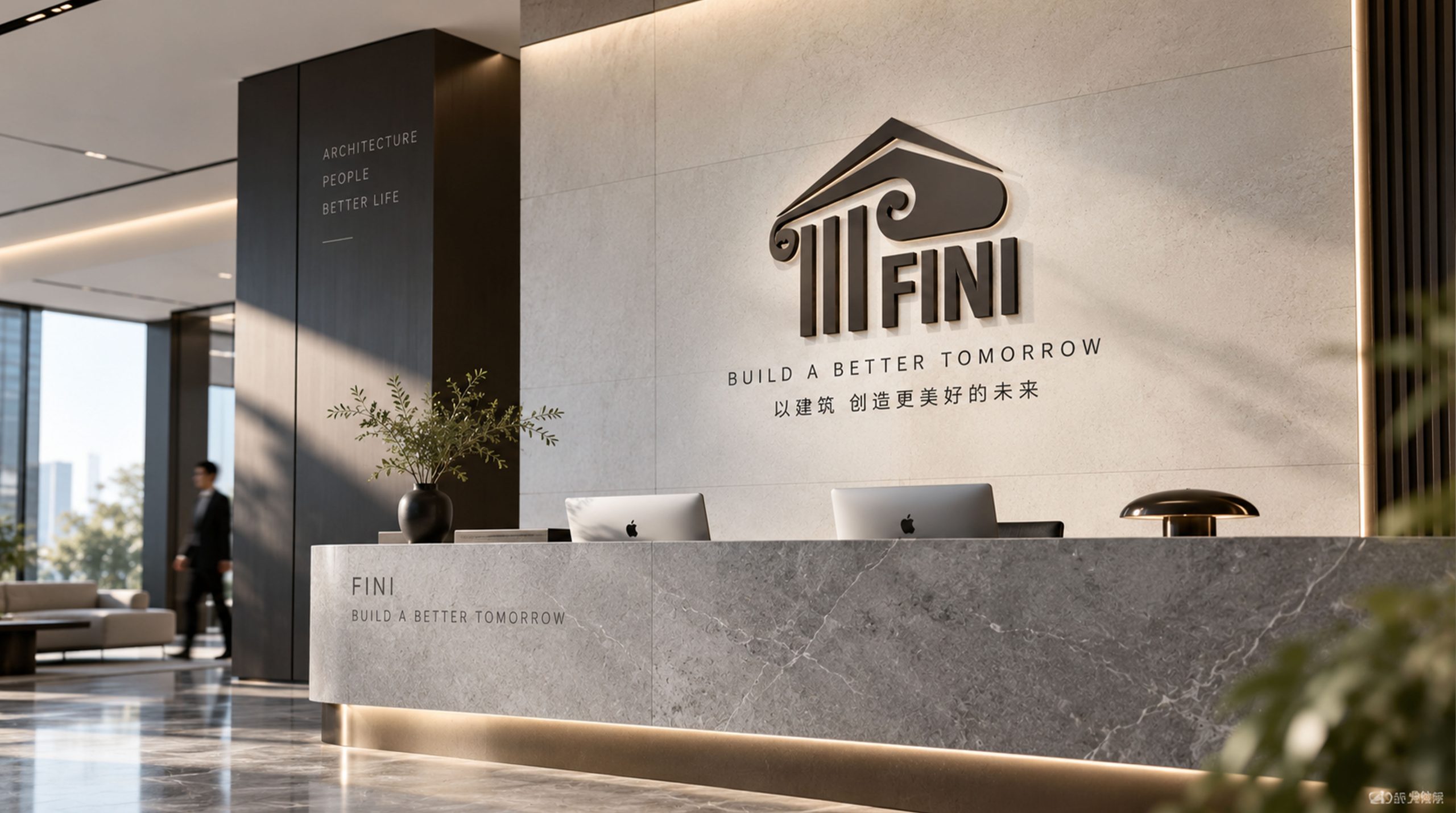
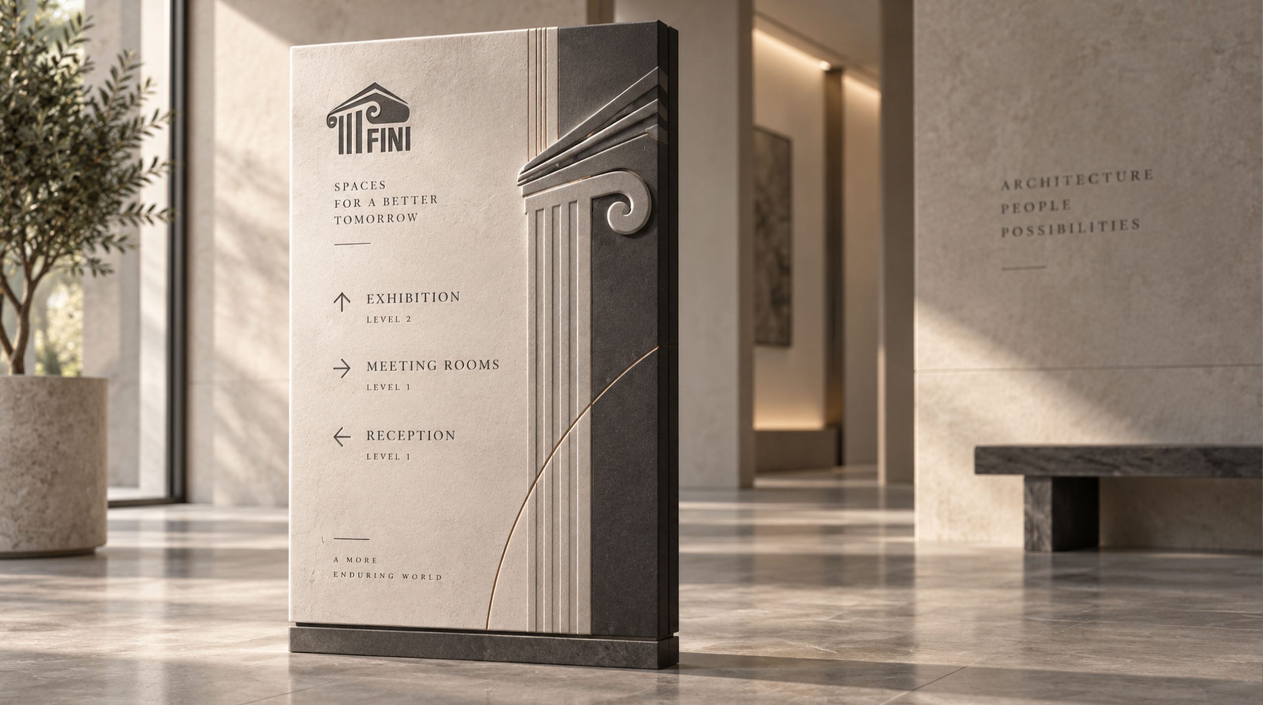
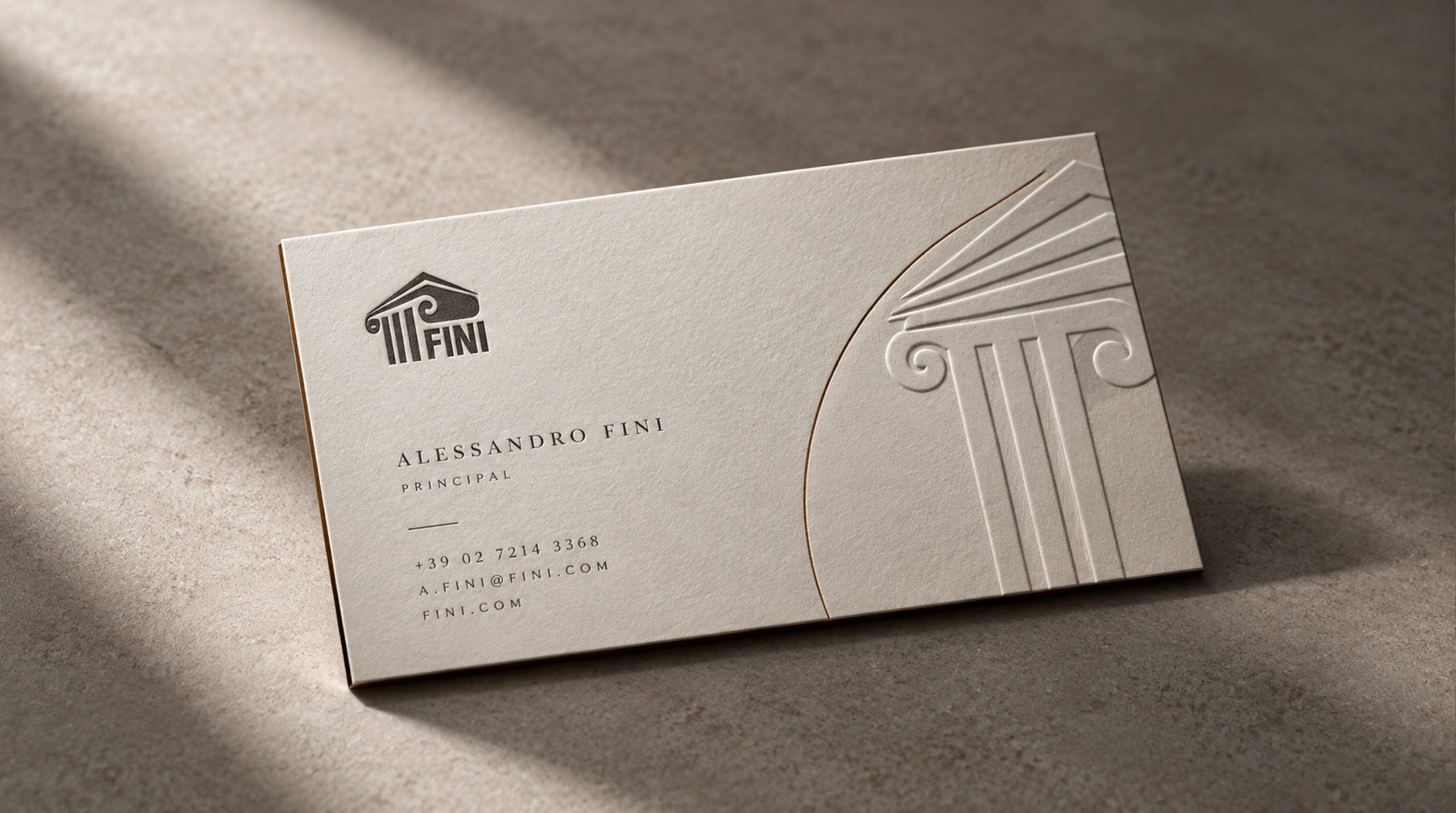
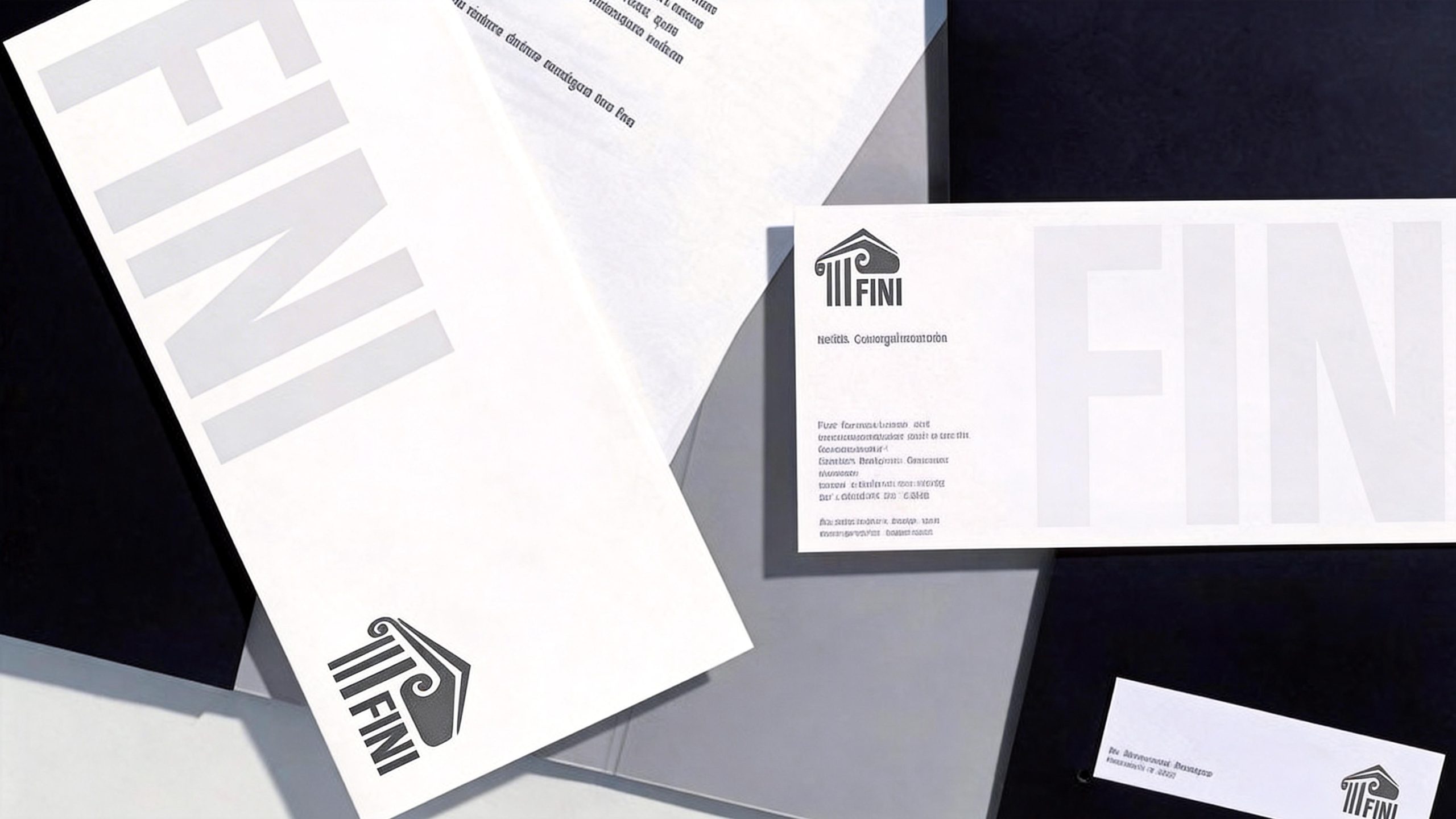
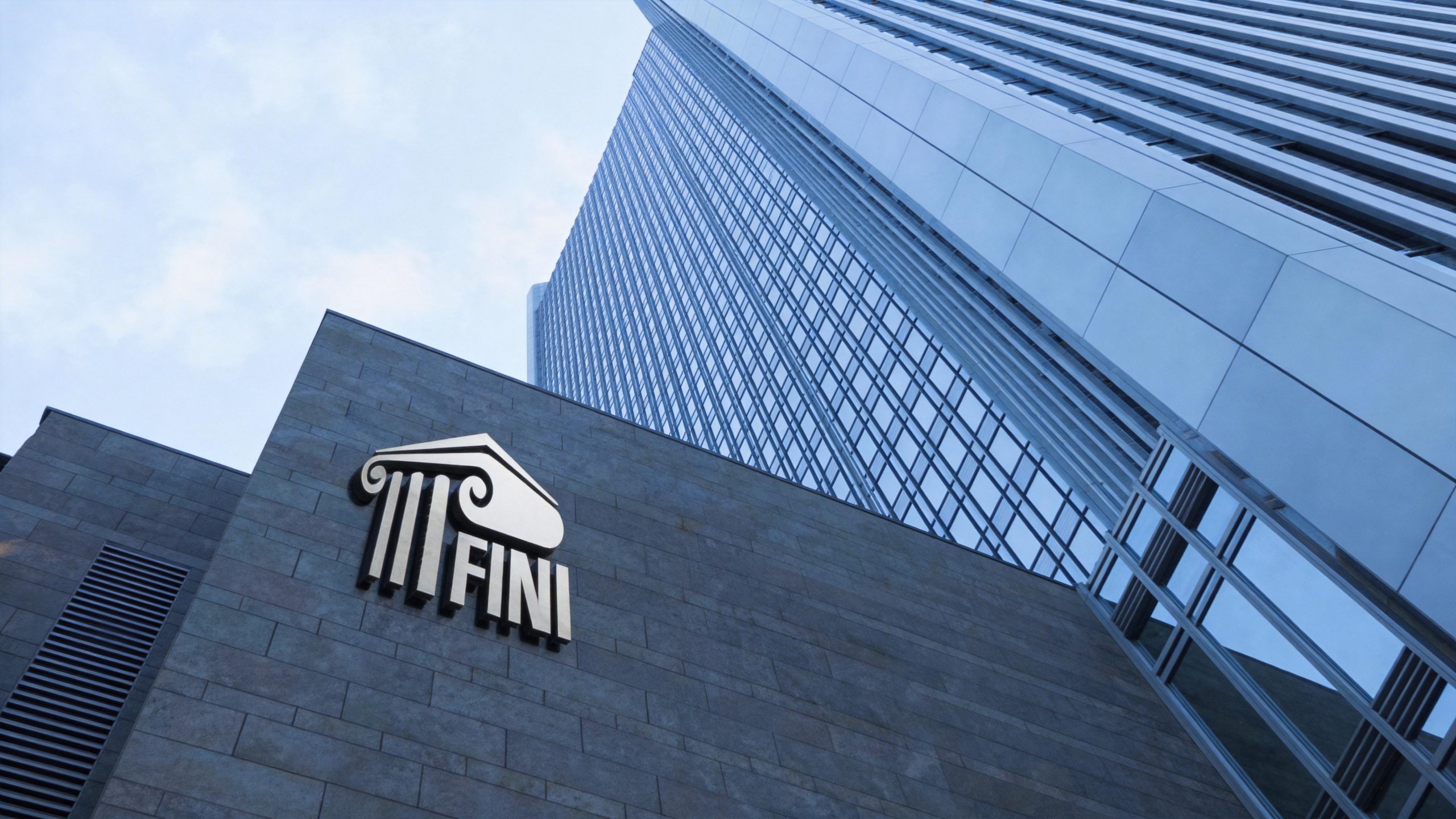
The logo has strong system scalability and can be widely used on the facade of the group headquarters building, front desk image wall, executive business cards and business letters; corporate annual reports, investor relations materials, brand brochures and strategic report covers; industry summits, business forums, government cooperation projects and international exhibition images; brand endorsement systems, joint logos and authorization certification logos for subsidiaries and business segments; high-end business gifts, souvenirs and brand customization materials. In the dynamic vision, the columns can stand in sequence from bottom to top, and the scroll curves stretch and rotate accordingly. Finally, the triangular mountain flower settles, symbolizing the steady construction process of the brand from foundation to palace. The palace graphics and scroll curves can be extended into visual mother elements for decorative patterns, certificate borders, dividing lines and brand pattern systems.
The logo contains three core images of the Fini Group brand: Solid Foundation - the three pillars represent the core pillars and solid foundation of corporate development; Classical Wisdom - the Ionian scroll symbolizes long-standing business wisdom and cultural inheritance; Grand Vision - the palace mountain flower conveys the brand's strategic height and grand vision of everlasting business. The overall design conveys the brand vision of Phini Group of "stable foundation, grand structure, and everlasting foundation".
Improper Usage (Brand Guidelines)
Do not change the number, spacing or height ratio of columns; do not modify the spiral direction, radian or connection relationship between the scroll curve and the word mark; do not change the hue, brightness or saturation of the main gold color of the palace; do not add gradients, shadows, strokes or light effects to the logo; do not rotate, mirror or separately extract local elements such as scrolls and columns for use; keep the white space around the logo not less than 25% of the height of the graphic; the minimum display width must not be less than 30mm.
design results
After the release of the logo, Phini Group's brand recognition and trustworthiness in the commercial field have been significantly improved. "Classical Palace + Ionian Scroll" has become the core visual identity symbol of its brand system. With its profound cultural heritage and magnificent architectural aesthetics, it has been widely used in industry summits, business cooperation and brand communication, demonstrating the brand vision of "everlasting business and grand structure".