










Seven Star Department Store is a comprehensive commercial entity positioned as a "collection" business, integrating retail stores and entertainment experiences, and is committed to creating a diverse, rich and dynamic one-stop shopping and leisure destination for consumers.
The brand is named after "Seven Stars", which means that it brings together seven dimensions of star experience, so that every visitor can find his or her own "star" here. This time, Qingmei Future was commissioned to lead the brand identity and overall VI design.
The goal of the brand logo design is to demonstrate the brand height of Seven Stars Department Store as a collective commercial entity through the visual language of elegant style, fashionable temperament and commercial vitality, convey the brand positioning of "star shopping, diverse experiences", while taking into account the commercial attributes of the store and the vitality of entertainment.
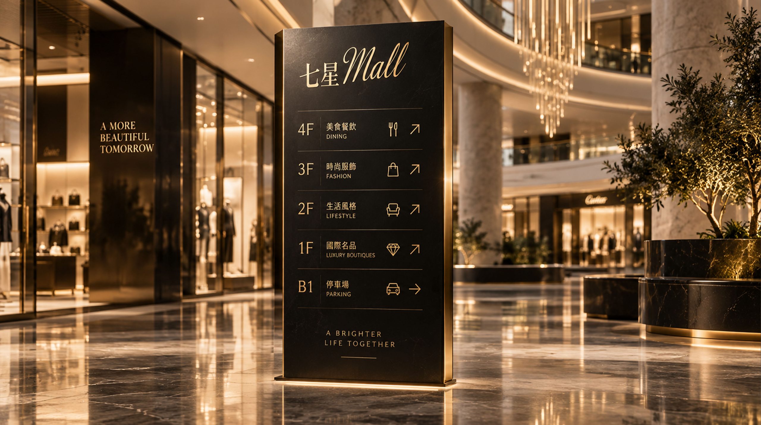
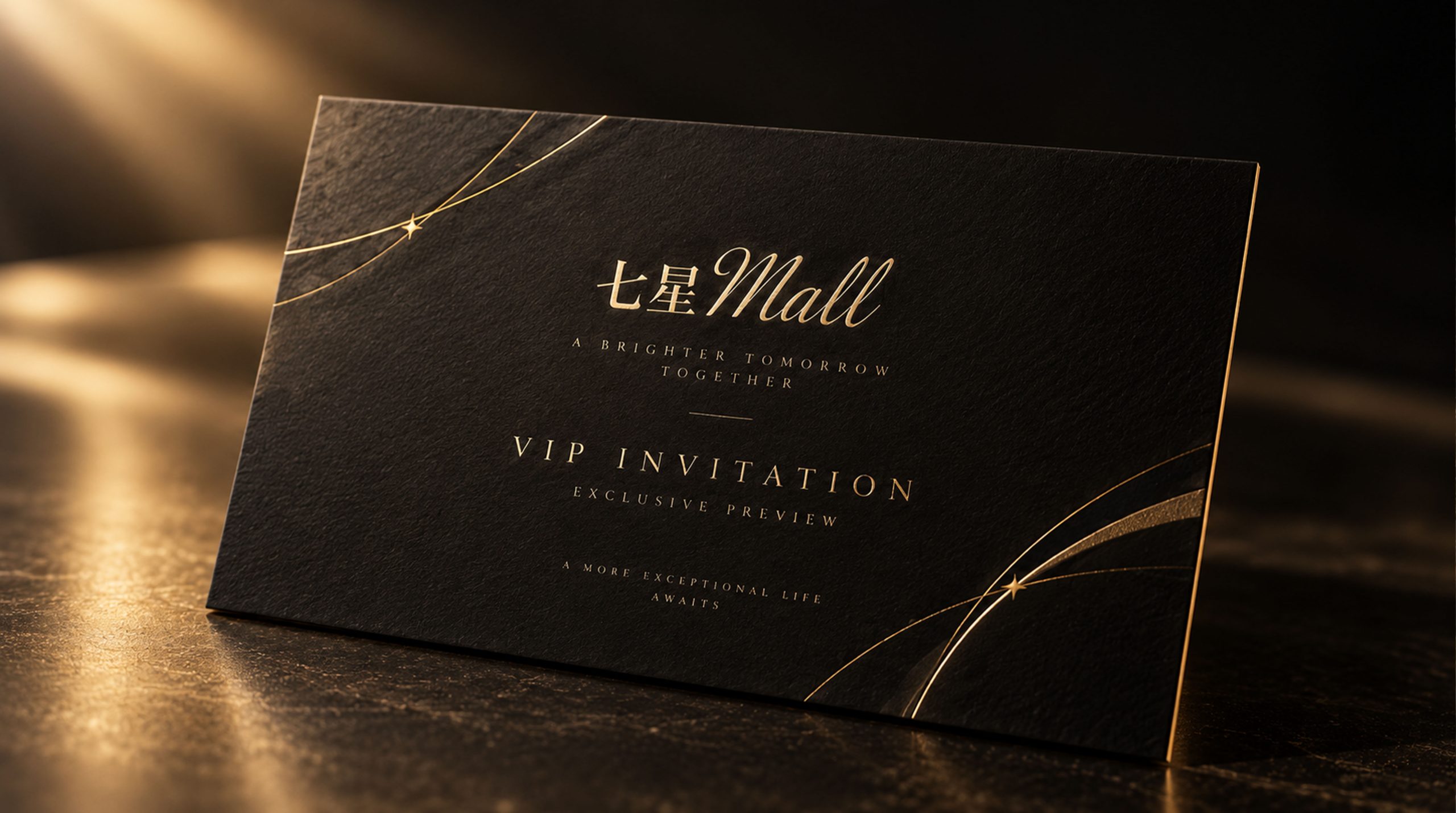
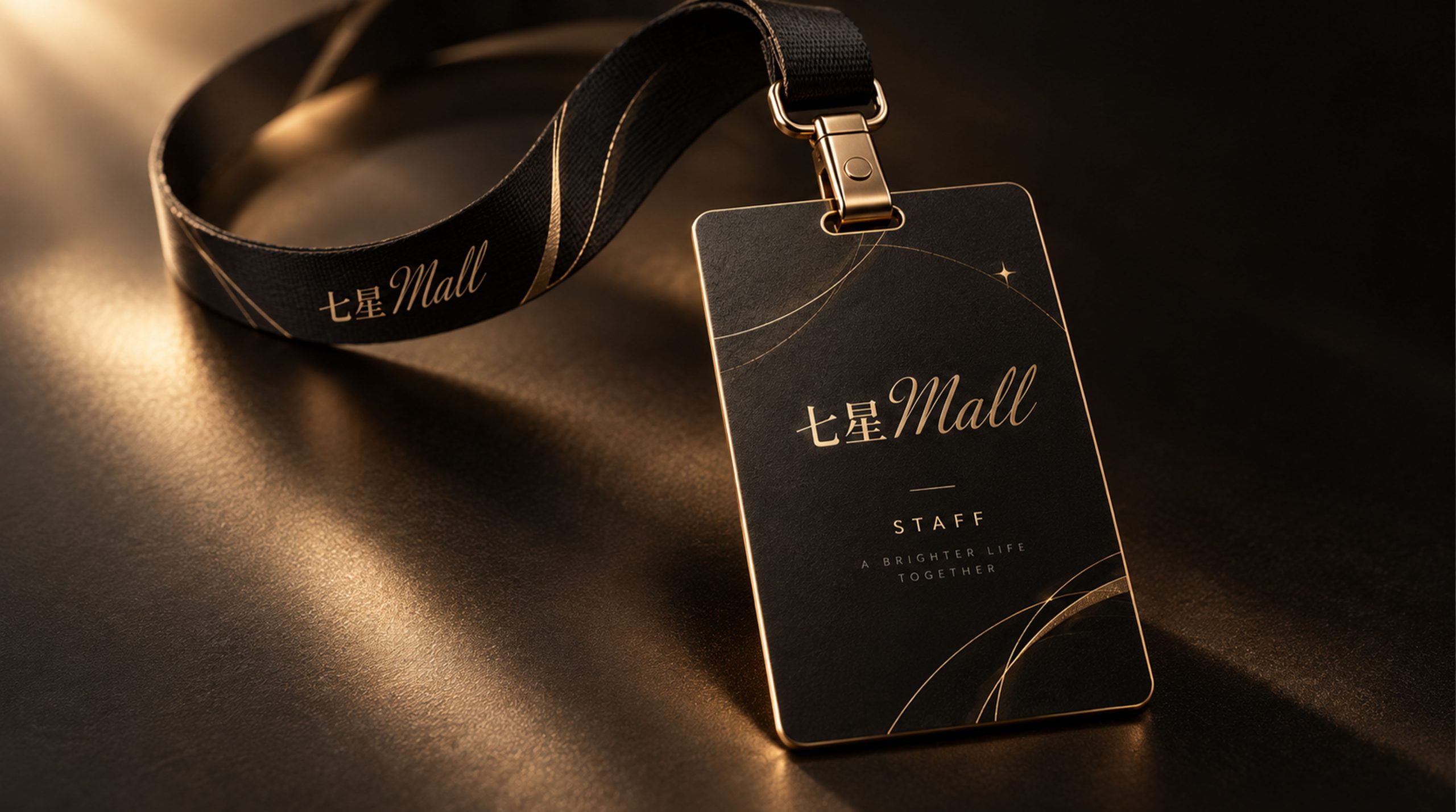
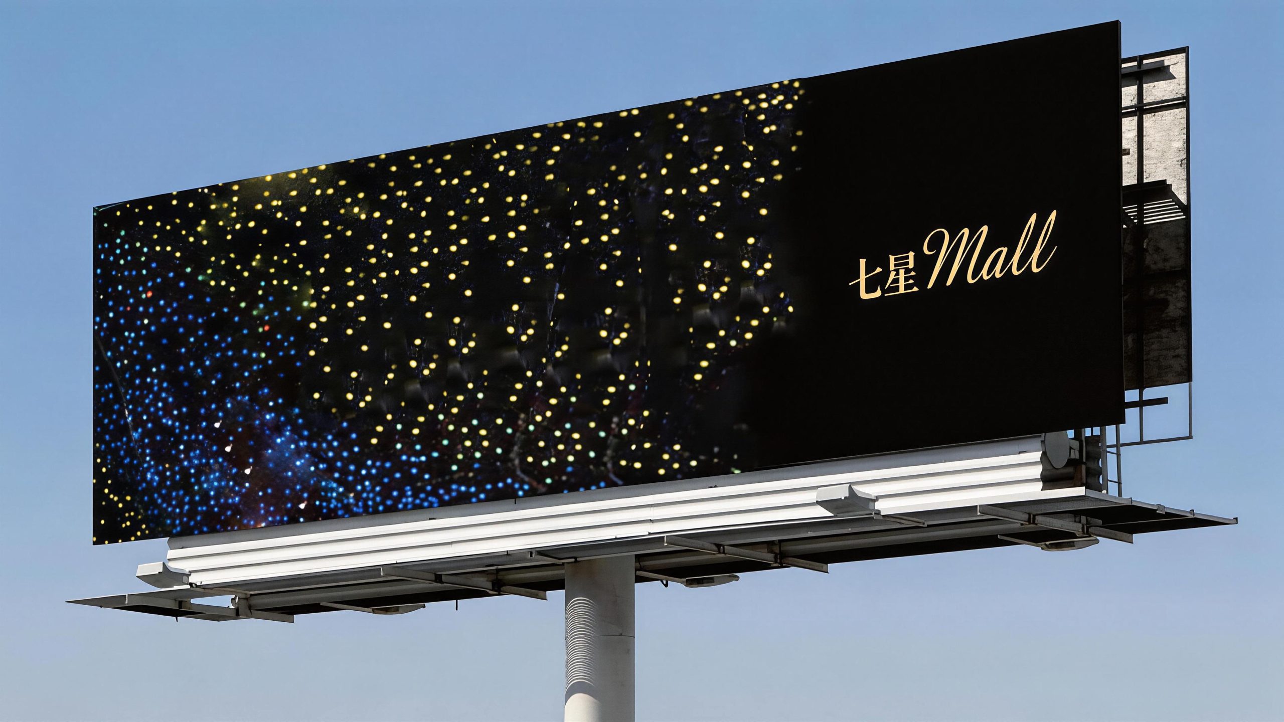
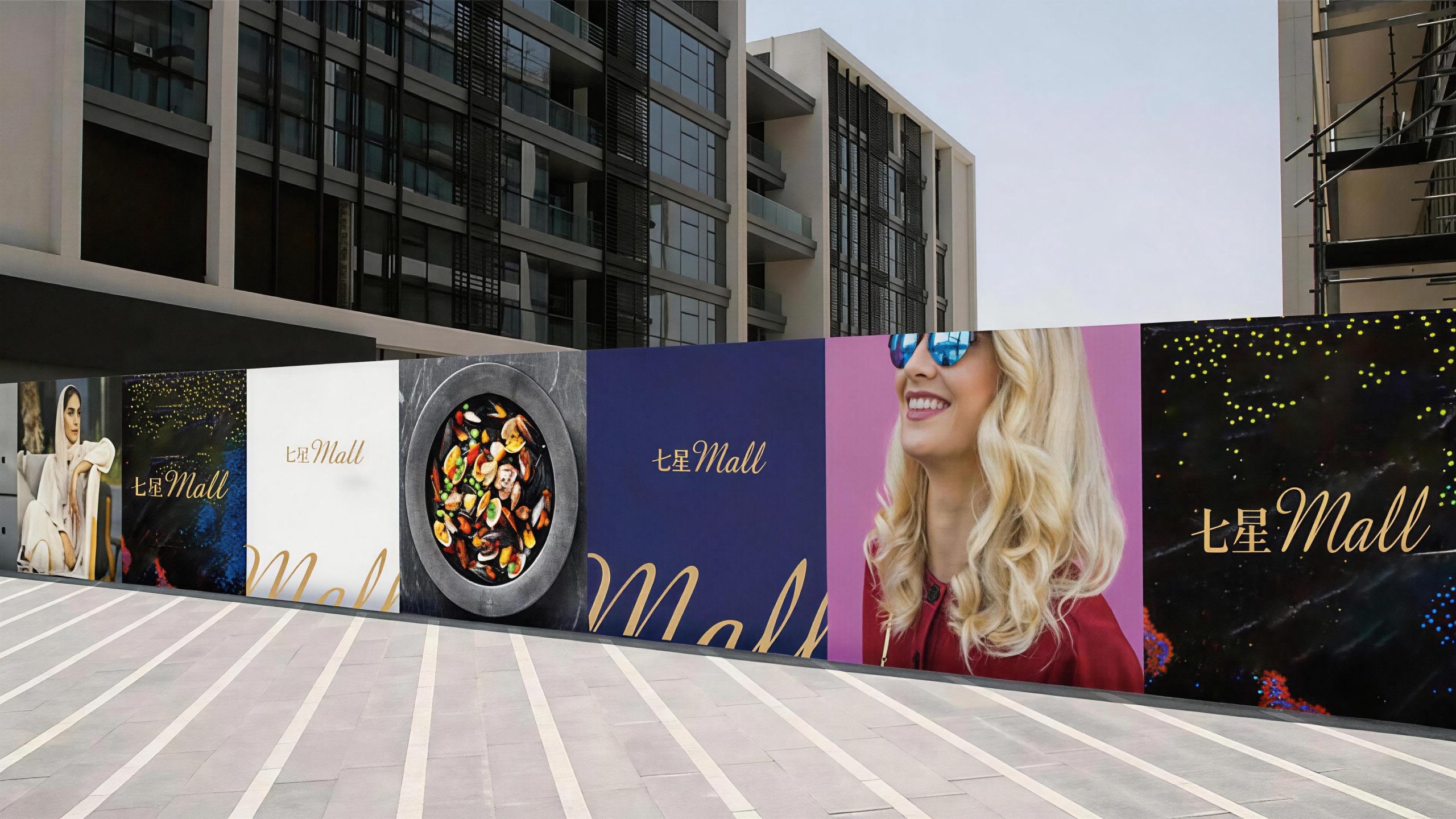
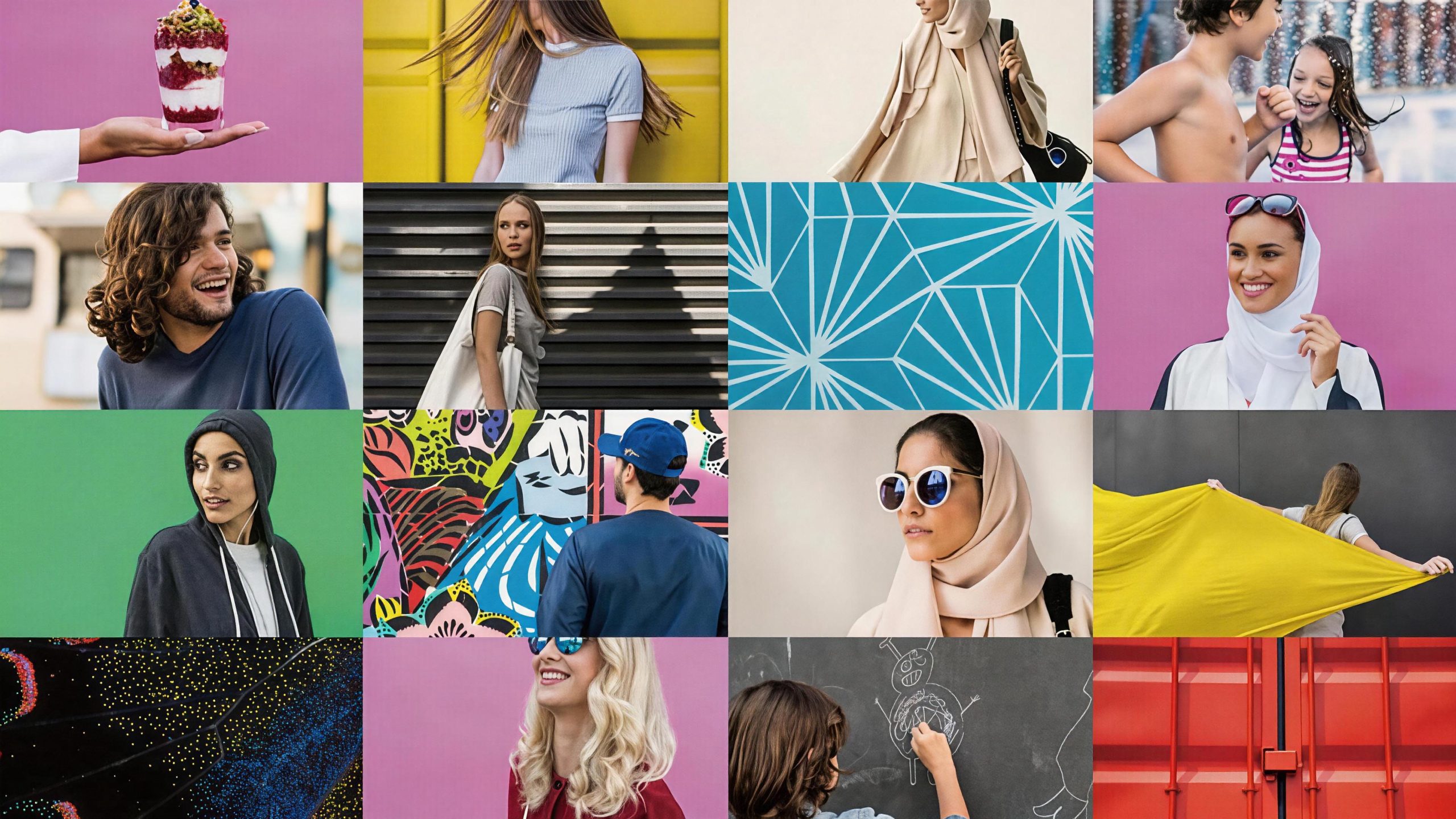
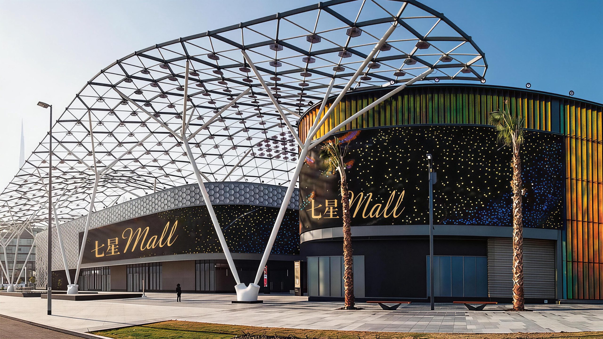
Design concepts and language graphics
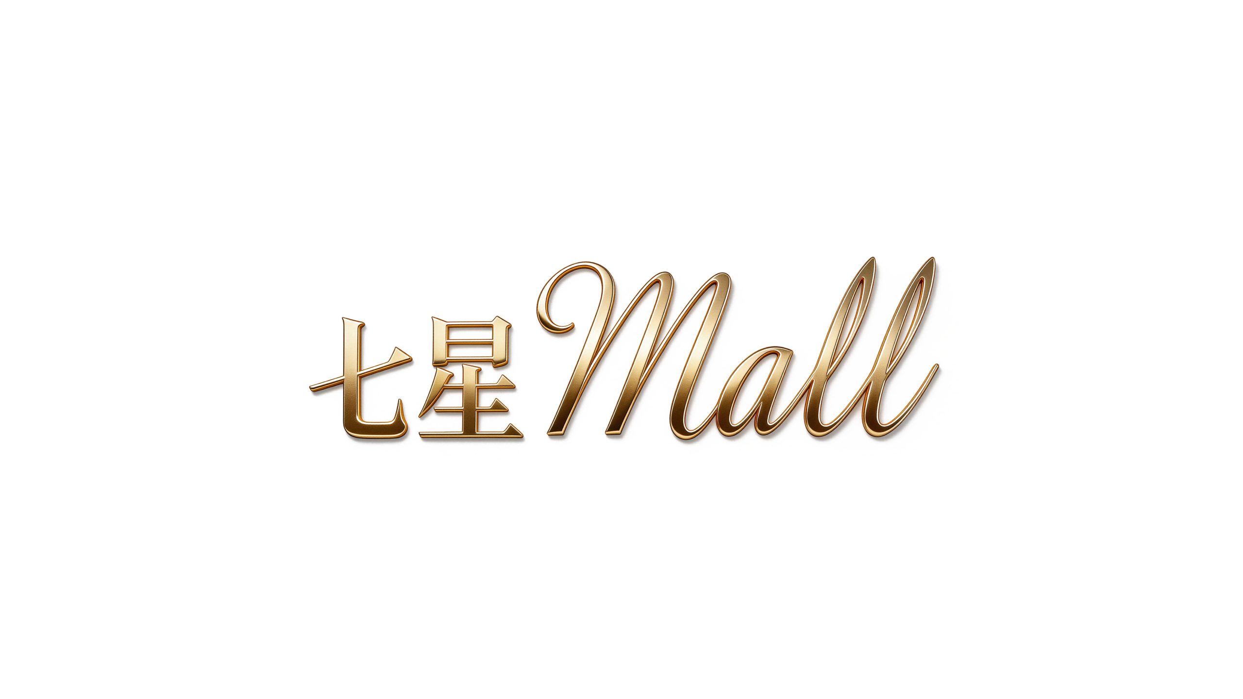
The logo uses "Chinese-English Logotype" as the core concept, organically integrating the Chinese "Seven Stars" and the English "Mall" to form a complete and unified brand logo. The Chinese "Seven Stars" is placed on the left, and the English "Mall" follows on the right. The two are naturally connected on the same baseline, forming an integrated Chinese and English brand name presentation. This design strategy not only retains the Chinese cultural recognition of the "Seven Stars" brand name, but also clarifies the attributes of the commercial format with the internationally accepted word "Mall", allowing the brand name to complete the dual message transmission of "brand + format" in one visual contact, implying the integrated positioning of "Chinese brand, international business". The overall design uses the word mark as the only visual core and eliminates redundant graphic decoration, reflecting Seven Star Mall's brand confidence in the high-end business and fashion consumption fields.
The Chinese "Seven Stars" is presented in a customized modern Song style, with slender horizontal strokes and straight vertical strokes. The strokes are retracted and relaxed, and the structure is dignified yet graceful, conveying the brand's cultural foundation and elegant temperament; the English "Mall" uses an elegant cursive writing style (Scr ipt), the strokes are coherent, smooth, undulating and stretched. The capital "M" opens with a broad and full arc, and "a", "l" and "l" continue smoothly in sequence. The whole is completed in one go like a flowing cloud, giving the logo a sense of fashion, elegance and international business atmosphere. The straightness of the Chinese Song font and the smoothness of the English squiggle form a visual contrast between hardness and softness, achieving multiple balances of "tradition and modernity, East and West, stability and agility" in the same logo. The overall composition uses the minimalist form of a pure word mark to build the visual core of the brand, conveying the high-end positioning and fashionable style of Seven Star Mall.
Font composition and color system
The details of the Chinese "Qixing" font design have been carefully considered - the horizontal strokes of "Qi" are stretched, the vertical hooks are clean and neat, the upper, "sun" and lower "sheng" of "star" are well-proportioned structure, and the handover of strokes is precise. The overall appearance presents a unique texture between the traditional Song font and modern serif font, which has both cultural thickness and commercial fashion. The cursive font of "Mall" in English adopts a writing style that is both elegant and easy to read. The thickness of the strokes changes naturally and smoothly, and the arcs of the continuous strokes are round and soft. It avoids overly fancy decoration and ensures clear recognition on both large-scale door headers and small-scale business cards. There are no separation symbols or lines between Chinese and English, and they are integrated with natural word spacing transitions, reflecting the integrity and inseparability of the brand name.
The main color, Star Gold #B8932F, is the only color used in the logo, representing high-end quality, star experience and the brilliance of business. The warmth and nobility of gold are in line with the high-end positioning of department stores, and echo the glorious image of "star" in the "Seven Stars" brand name; gold is neither a cold technological color nor a gorgeous fast-eliminating color, conveying the "elegant but not ostentatious" brand temperament with just the right temperature and restraint. Auxiliary dark gold #8C6D1F is used for the application variation of the logo on a dark background, maintaining the golden tone while enhancing contrast and recognition; auxiliary light gold #D4B060 is used for process adaptation of the logo on special materials (such as metal plaques, hot stamping printing). Pure white #FFFFFF and dark gray #333333 are used as the standard background color and auxiliary text color to ensure the clarity and systematicness of the logo in various application environments. The overall color system is run through with a single golden color, reflecting the brand positioning of "star quality, one color is gold".
Application extension and brand significance
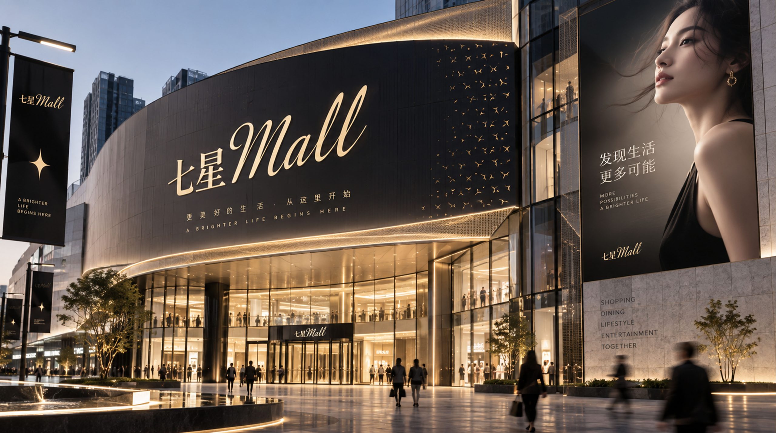
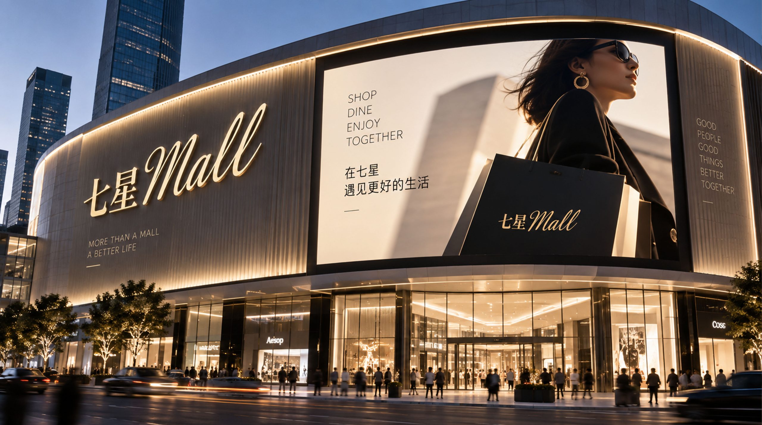
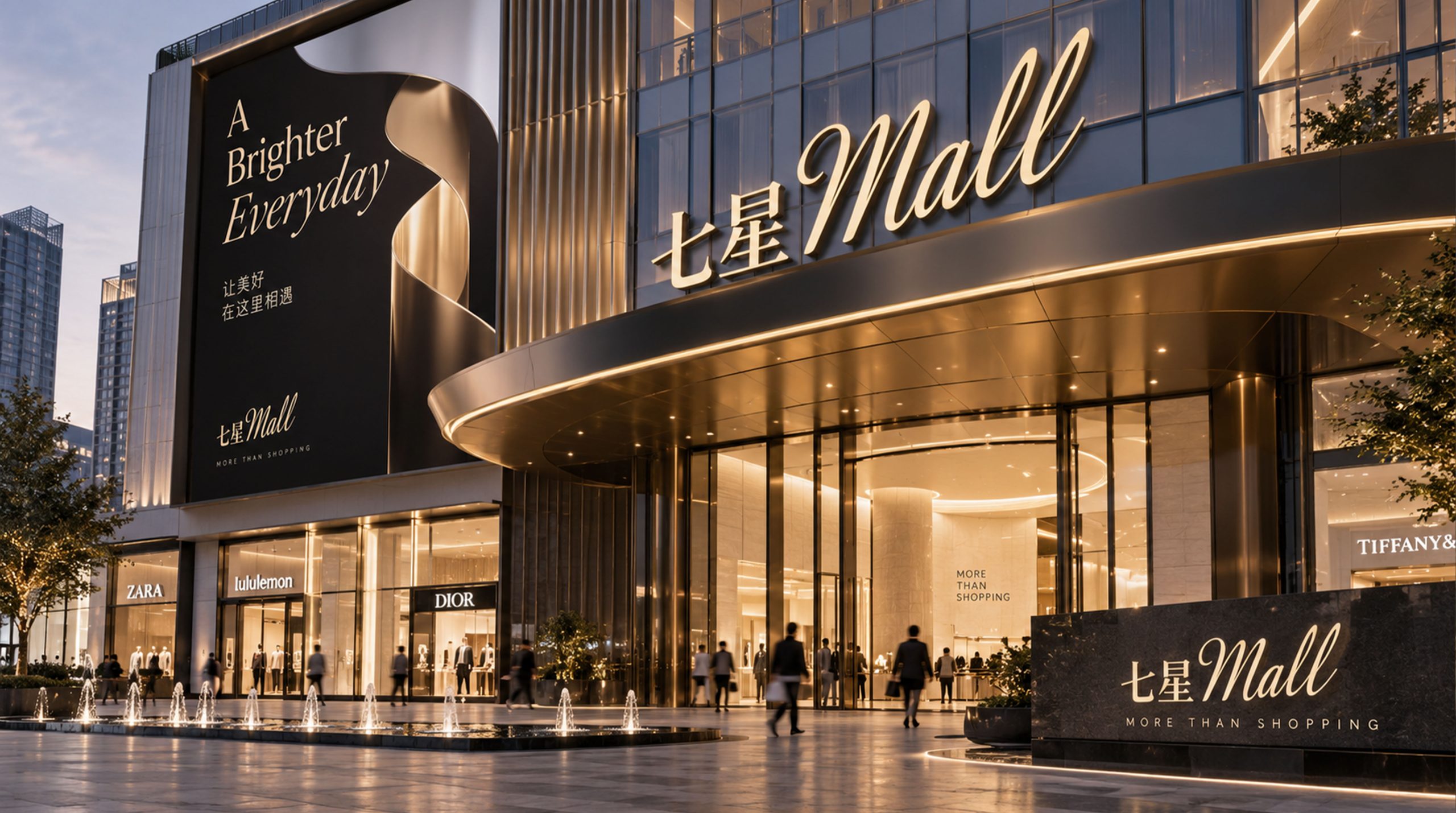
The logo has strong system scalability and can be widely used in giant door headers on shopping mall facades, atrium image installations, floor guides and store guidance systems; shopping bags, membership cards, gift cards and brand packaging materials; official websites, shopping applets, social media images and digital marketing materials; opening celebrations, festival theme activities, brand co-branding and cross-sector cooperation images; business investment brochures, investor relations materials and industry exhibition images. In the dynamic vision, seven stars can shine on stage one after another, and finally gather around the "Seven Stars Mall" word mark, symbolizing that the seven dimensions of experience gather and shine here. The golden wordmark can be combined with the flow of light and shadow to present a star-like bright texture on the digital screen.
The logo contains the three core images of the Seven Star Mall brand: Star Quality - the golden wordmark and the name "Seven Stars" convey a star-rated shopping experience that exceeds expectations; All-in-One - the seven stars of different shapes symbolize the gathering of diverse business formats in stores and entertainment; Elegant Style - the fusion of Chinese and English wordmarks and floral writing convey the fashionable temperament and international aesthetics of high-end business. The overall design conveys Qixing Mall's brand vision of "seven stars gathered together, one stop shining brightly".
Improper Usage (Protection Specification)
Do not split the Chinese "Seven Stars" and the English "Mall" into independent elements and use them separately; do not modify the stroke arc, continuous stroke pattern or glyph ratio of the cursive "Mall"; do not change the hue, brightness or saturation of the main color of Star Gold; do not replace the fixed font with other fonts Make the word mark; do not add strokes, shadows, gradient light effects or texture overlays to the logo; do not change the shape or exclusive color of any star in the seven-star icon system; keep the white space around the logo not less than 25% of the height of the word mark; the minimum display width shall not be less than 35mm.
design results
After the release of the logo and overall VI, Seven Star Mall's brand recognition and style have been significantly improved in the fields of commercial retail and consumer experience. The "Chinese and English fusion golden word mark + Seven Stars icon system" has become the core identification symbol of the Seven Stars Department Store brand system with its elegant, fashionable and systematic visual language. It is widely used in shopping mall environments, market communications and commercial investment promotion, showing the brand vision of "Seven Stars Gathering, Gathering Wonders".