










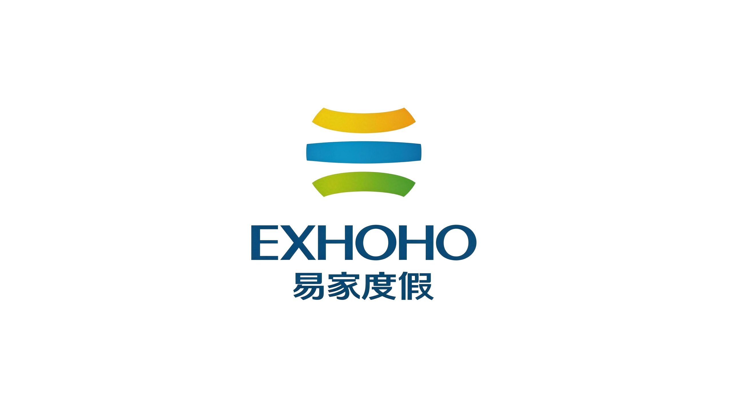
EXHOHO is a brand enterprise focusing on vacation properties and leisure travel services. It is committed to providing relaxed, happy and high-quality vacation life experience to families around the world.
The brand adheres to the core concept of "Happy Home", and uses high-quality vacation property resources and considerate service systems to enable every sojourner to find a sense of belonging and "fake" pleasure around the world.
The design goal of the brand logo is to demonstrate the industry positioning of Yijia Vacation as a vacation property brand through the visual language of natural vitality, trust and global perspective, and to convey the brand concept of "Happy Yijia" and the strategic layout for the global market.
Design concept and graphic language
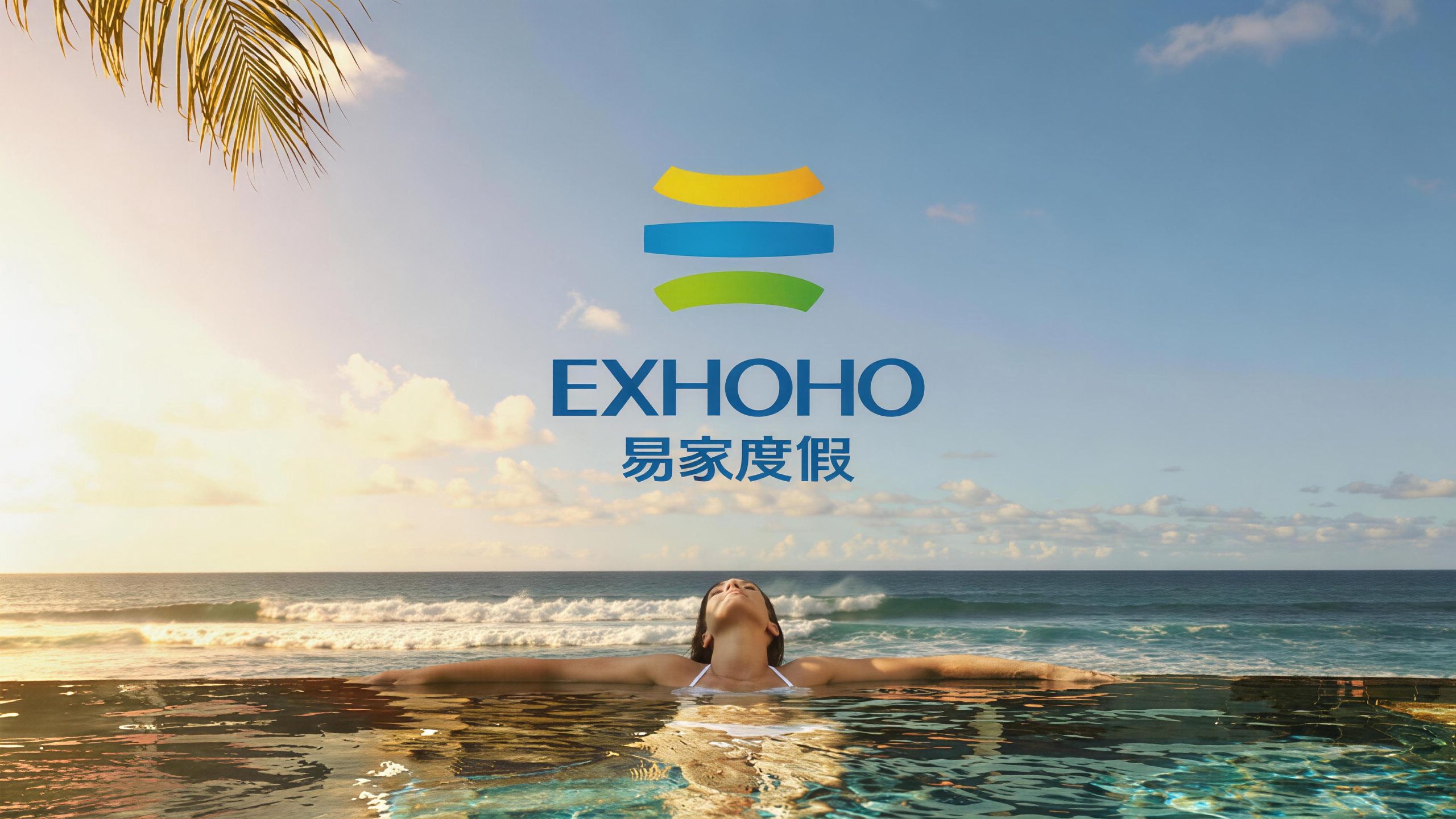
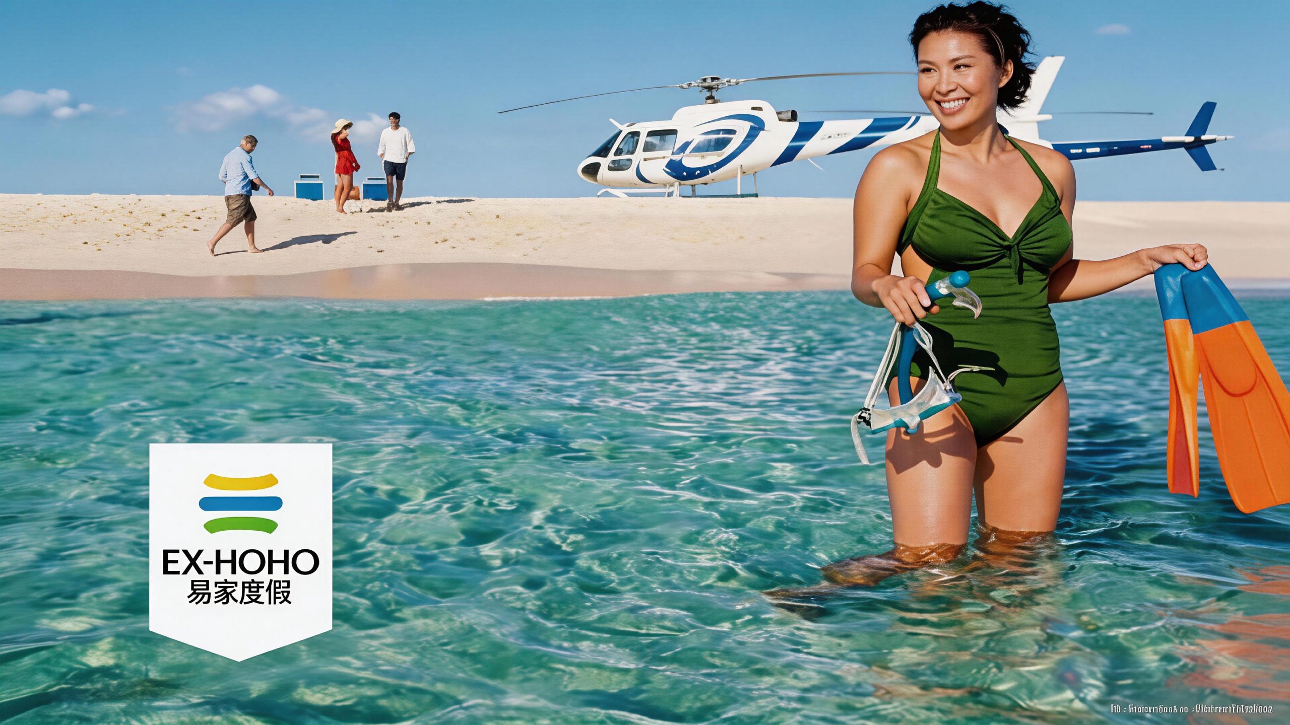
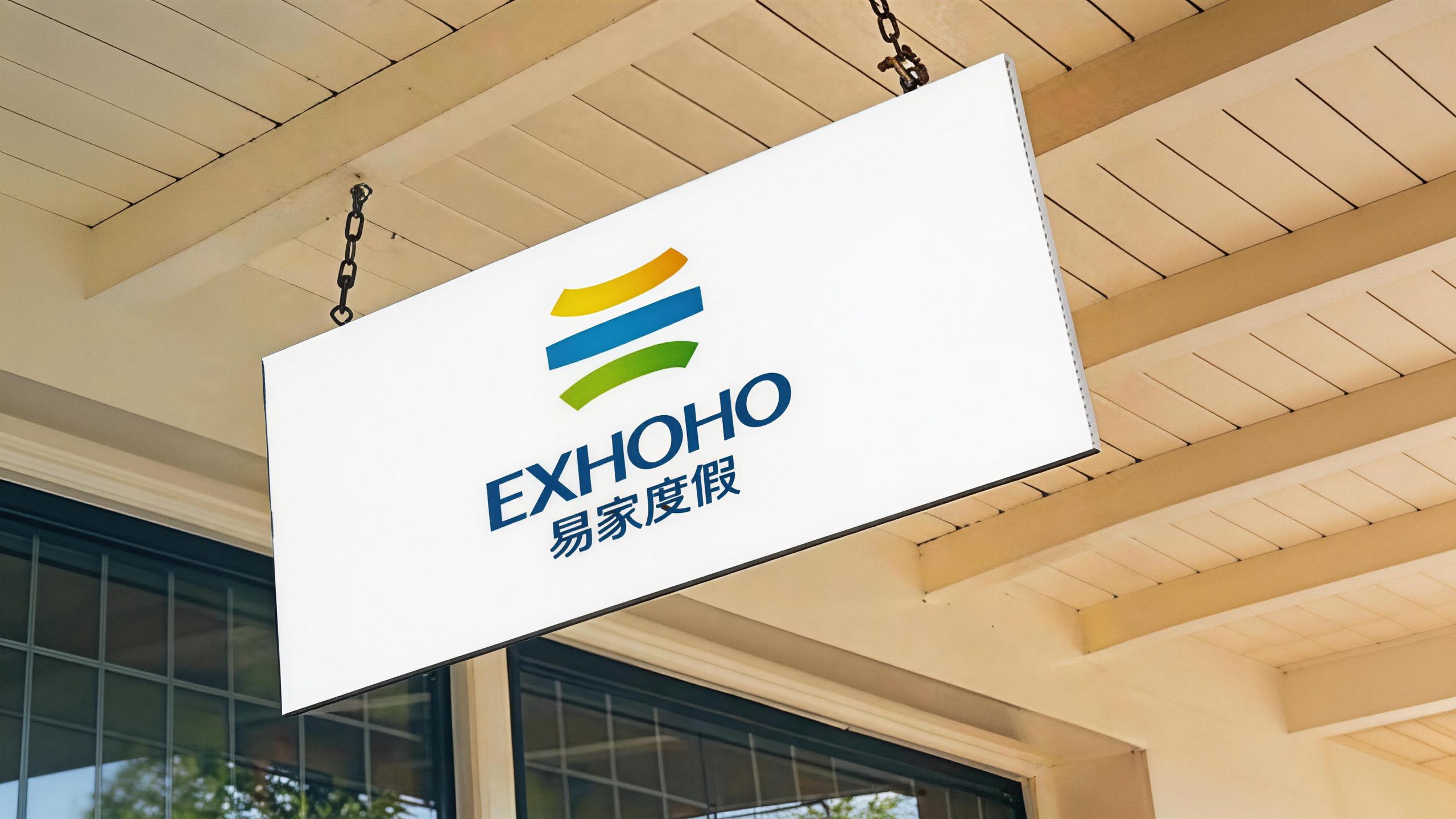
The logo takes "Nature Globe" as the core concept and uses three thick and full arc-shaped stripes as the main graphic. They are arranged up and down, and the arcs echo each other, forming an abstract spherical outline. The colors of the three stripes are directly taken from nature - yellow symbolizes the sun, blue symbolizes the ocean, and green symbolizes the grass. The three natural elements most associated with vacations are brought together into one, reflecting the joy and joy of vacationing at Yijia, thus reflecting the brand concept of "Happy Yijia". The earth graphic composed of three stripes also reflects the globalization strategy of Yijia Vacation - vacation resources are spread all over the world, and the service network spans the world. The overall design integrates the beautiful emotions of natural vacation with the professional trust of the property brand, reflecting the dual attributes of Yijia Vacation between leisure experience and asset management.
The golden arc above is like a ray of warm sunshine, and the arc is slightly arched upward, conveying brightness, hope and beautiful expectations of vacation time; the sky blue arc in the middle is the most stretched and wide of the three stripes, like the horizon of the vast ocean across the field of vision, conveying the holiday mood of openness, freedom and facing the sea; the green arc below is slightly arched downward, like the stretching green lawn on the earth, conveying a sense of nature, vitality and down-to-earth security. The three arcs are convex, flat, and concave, forming a perspective hint of a sphere, which makes the two-dimensional figure produce a three-dimensional sense of space, and visually constructs a complete "earth" image. The shape of each arc is thick and full, with rounded ends at both ends. The brushstrokes are solid and weighty like ribbons, reflecting the trust and reliability of Yijia Vacation as a property brand. Unlike light lines, the thick shape conveys the brand promise of "worth trusting". The three arcs maintain a uniform spacing and a sense of breathing, and are in order, symbolizing the standardization and systematic ability of brand operations. The overall composition uses simple and powerful three-color arcs to construct the "natural earth", conveying the brand's natural feelings and global pattern.
Font composition and color system
The English "EXHOHO" uses a stable uppercase sans-serif font, with thick and powerful strokes, generous and square fonts, and moderate letter spacing. The overall visual weight is solid and reliable, consistent with the thick arc style of the graphics, and conveys the professionalism and trustworthiness of the vacation property brand. The Chinese "Yijia Vacation" is presented in modern boldface, with straight and even strokes, a balanced and robust structure, and generous and clear fonts, ensuring high recognition and affinity of the brand name in various application scenarios. Chinese and English are arranged in the middle, with English at the top and Chinese at the bottom. The hierarchy is clear, reflecting the brand's international positioning and the dual foundation of the Chinese market.
The main color, ocean blue #005B8E, is the unified color of the English and Chinese logos, representing the vastness of the ocean, the depth of trust, and the professional background of the brand. The calmness and restraint of dark blue give the logo the solemn temperament that a property brand should have. Sunshine Gold #F5B020 → #E8A010 is used on the upper arc, representing the warmth and joy under the sun. The brightness and warmth of golden color directly evoke the beautiful association of sunny beaches during vacation time. Sky Blue #2196F3 → #1E88E5 is used in the middle arc, representing the intersection of the ocean and the sky. The clarity and openness of blue convey a free and carefree holiday mood. Grass Green #7CB342 → #558B2F is used on the lower arc to represent the vitality and tranquility of nature. The freshness and vitality of green convey a return to nature vacation experience. The overall color system uses the three primary colors of yellow, blue and green as the core, paired with the dark blue word mark, reflecting the brand positioning of "sunshine, ocean, grassland - nature is vacation", and using the most intuitive natural colors to arouse consumers' emotional resonance for a happy vacation.
Application extension and brand significance
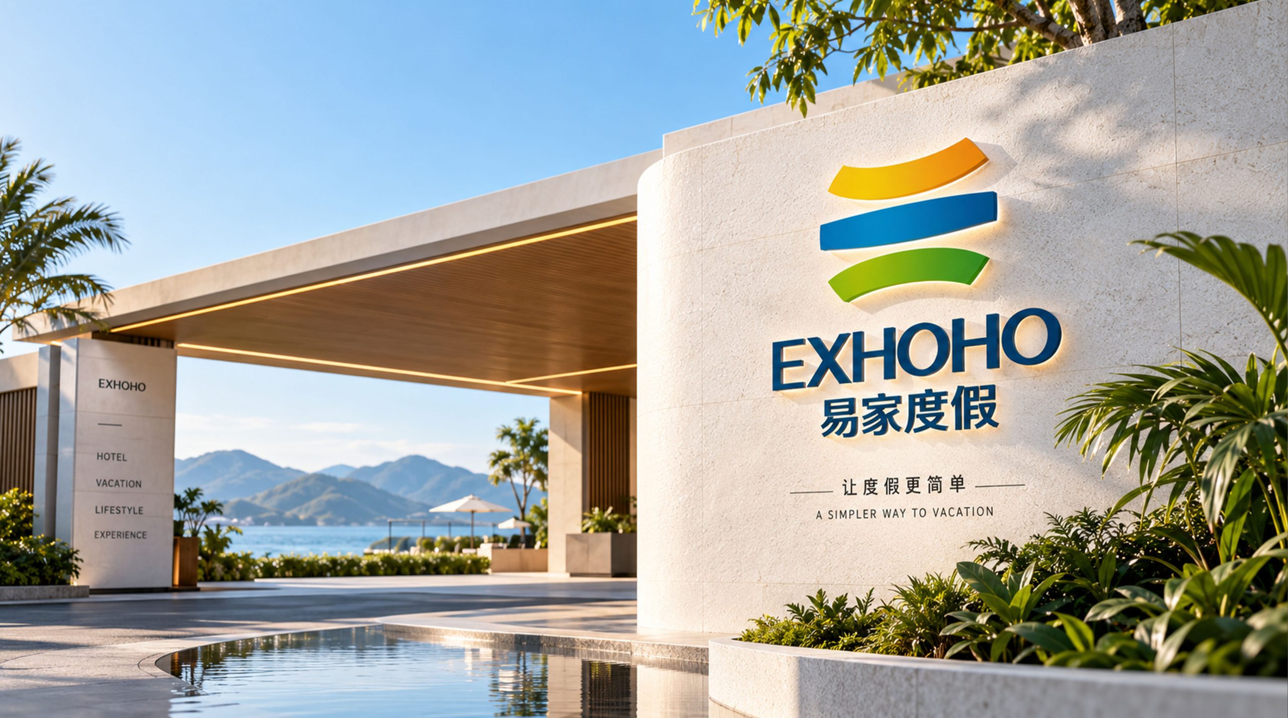
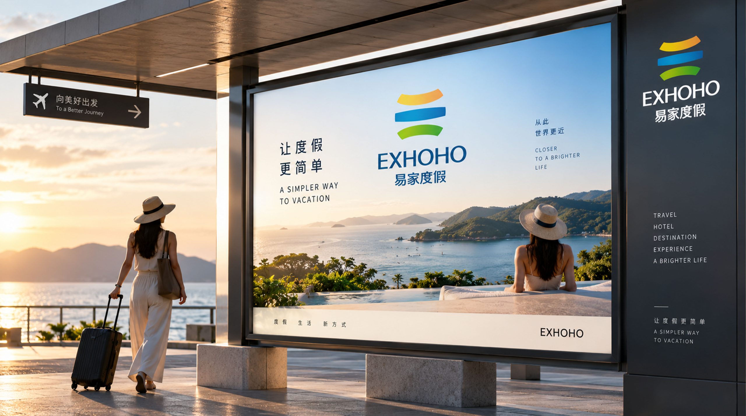
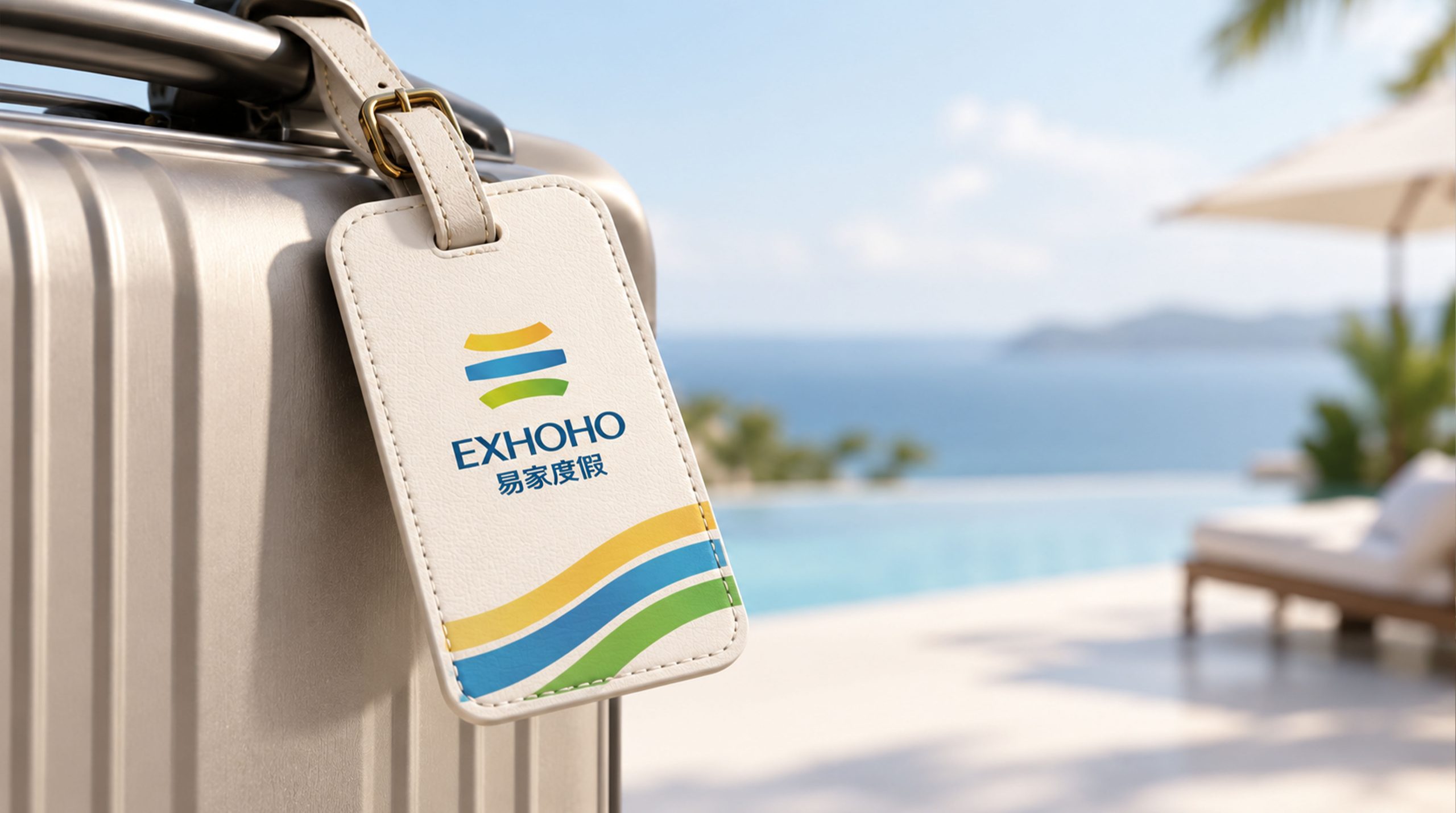
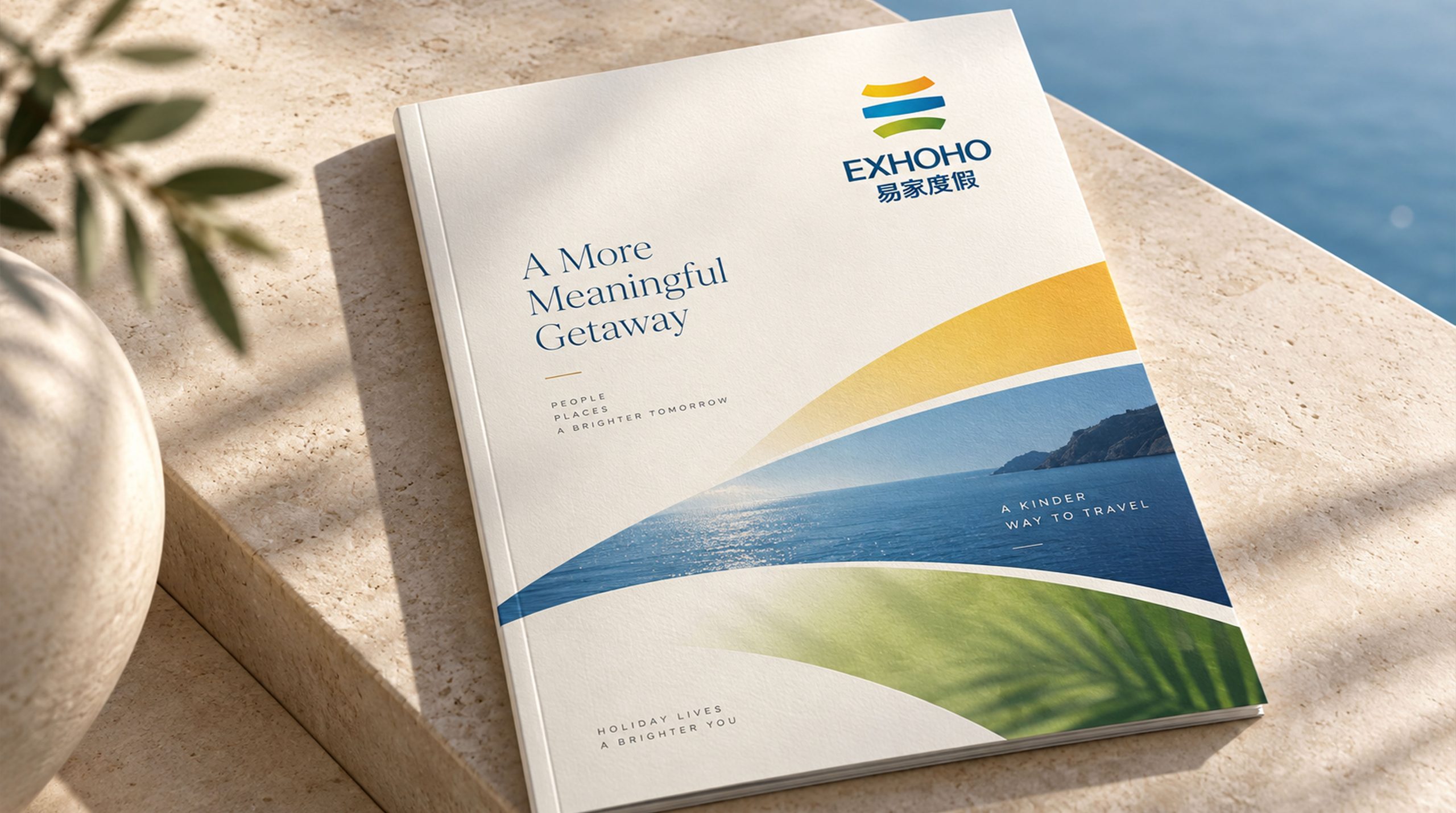
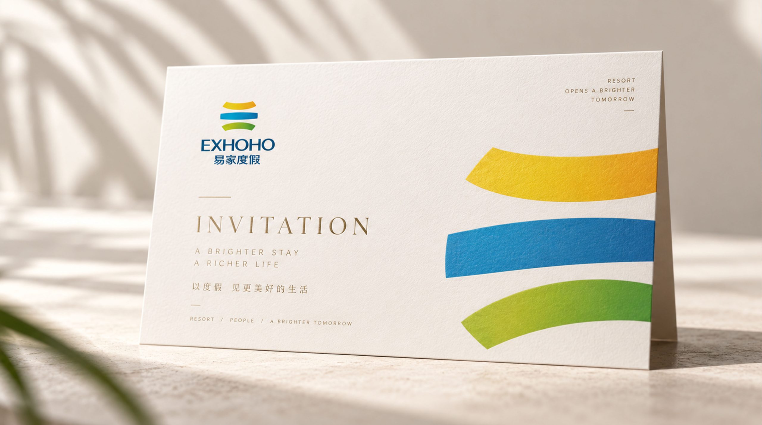
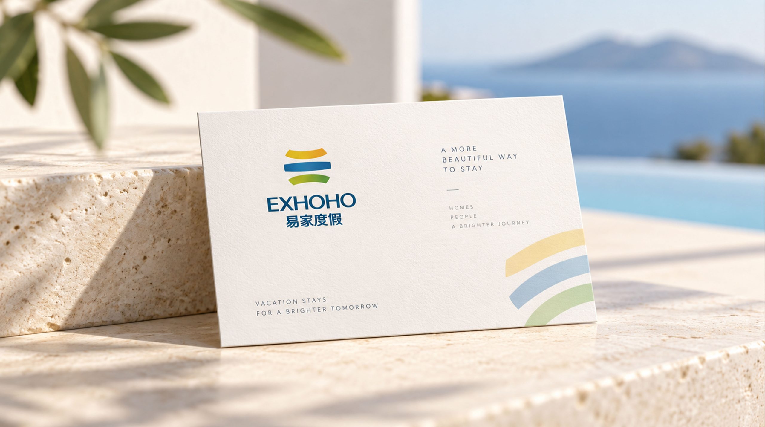
The logo has strong system scalability and can be widely used in the image of vacation property project sales centers, model rooms, community entrances and property service centers; brand brochures, property brochures, project leaflets and investor relations materials; official websites, vacation booking platforms, mobile APP interfaces and social media images; images of international tourism real estate exhibitions, industry forums and partner promotion conferences; membership cards, guest room supplies, brand gifts and vacation peripheral cultural and creative products. In the dynamic vision, three arcs can stretch out from the center of the picture and pop up, just like the earth slowly rotating to reveal three-color stripes. The final word mark gradually emerges from the bottom of the sphere, symbolizing the brand growth process of Yijia Vacation from one world to a global territory. The three-color arc can be extended into a visual mother element and used for environmental color systems, guide stripe patterns, brand dividers and digital interface decoration.
The logo contains the three core images of the Yijia Vacation brand: Joyful Vacation - the three colors of sunshine gold, ocean blue and grass green reflect the happy and joyful natural mood of Yijia Vacation; Trusted Property - the thick and full arc shape conveys the professional trustworthiness of the resort property brand; Global Vision - the earth graphic composed of three stripes reflects the global strategic layout and development ambition of Yijia Vacation. The overall design conveys Yijia Vacation's brand vision of "Happy Yijia, Vacation Worldwide".
Improper Usage (Protection Specification)
Do not change the arrangement order, curvature or thickness ratio of the three arcs; do not modify the hue or gradient direction of the three colors of yellow, blue and green; do not replace thick arcs with thin lines or stroke styles; do not add shadows, outer glow, texture or three-dimensional effects to the logo; do not rotate, tilt or extract part of the arc separately for overall use; keep the white space around the logo not less than 25% of the height of the graphic; the minimum display width must not be less than 30mm.
design results
After the release of the logo, Yijia Vacation's brand recognition and emotional affinity in the field of vacation properties and leisure accommodation have been significantly improved. "Three-color natural earth", with its concise, bright, thick and reliable visual language, has become the core identification symbol of Yijia Vacation brand system. It is widely used in project sales, marketing communications and international exhibitions, showing the brand vision of "Happy Yijia, Vacation Worldwide".