










Encore International, Inc. is an international enterprise deeply involved in the field of film and television media and content distribution. It has been rooted in the Chinese market for ten years. With its high-quality film and television content resources and professional international distribution capabilities, it has established extensive industry influence and brand trust in the Chinese media industry.
On the occasion of its tenth anniversary, the brand specially planned and launched the tenth anniversary commemorative logo to pay tribute to the ten-year journey and look forward to future development. This time, Qingmei Future was commissioned to lead the tenth anniversary logo design.
The design goal of the brand logo is to reflect the company's industry characteristics and corporate culture on the basis of inheriting the original brand visual genes of Yingjia International, highlight the celebration atmosphere of the tenth anniversary, and convey the brand confidence and milestone significance of "ten years of accumulation and prosperity".
Design concept and graphic language
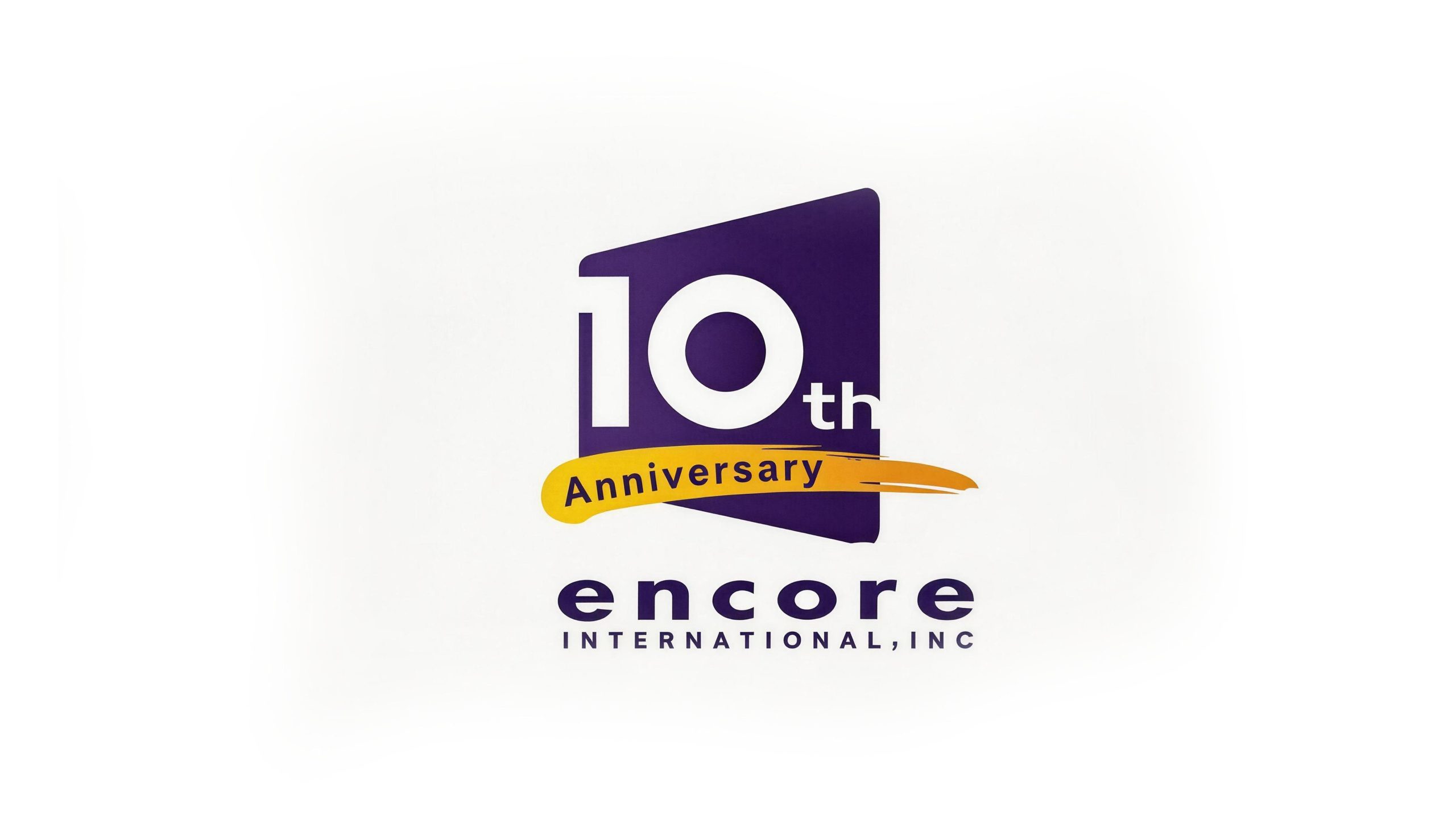
The logo takes "A Decade on Screen" as the core concept, with a purple trapezoid as the main background, and the white Arabic numeral "10" in the center of the screen, supplemented by a golden handwritten flying pen and the word "Anniversary" to construct a commemorative logo that combines industry attributes and a celebratory atmosphere. The design inherits the iconic purple color of Yingjia International brand logo, ensuring the continuity and visual continuity between the 10th anniversary logo and the original brand system. The overall design exudes vitality in a steady atmosphere, reflecting Yingjia International's ten years of deep cultivation in the media industry and its high-spirited attitude toward the future.
The purple trapezoid background is the most industry-recognizable graphic element in the logo. Its trapezoidal outline, which is narrow at the top and wide at the bottom, is just like a TV screen. It intuitively and skillfully expresses the industry attributes of Yingjia International as a film and television media company. The right edge of the trapezoid is slightly tilted and expanded, giving the static graphics dynamic tension, implying the ever-expanding boundaries of the media industry and the continued growth of Yingjia's business. The white Arabic numeral "10" is placed on the purple screen in an eye-catching bold font. "1" is tall and strong, and "0" is round and full. The proportions of the two are coordinated and the priorities are clear. "th" is marked in small fonts on the upper right side of "10", which directly highlights the tenth anniversary theme and allows the core information to be accurately received at the first time. A golden handwriting flying pen crosses from the lower left to the upper right of the picture. The strokes are natural and free, and the strength gradually increases from light to heavy and then ends lightly. It is like a celebratory firework crossing the night sky. It forms a sharp contrast with the purple background, adding a strong sense of celebration and commemoration. The flying pen carries the word "Anniversary", embedded in dark italic and golden strokes, to indicate the commemorative meaning. The overall composition uses three visual layers of "screen + numbers + flying pen" to construct the "ten-year celebration", conveying the brand's milestone glory and vigorous vitality.
Font composition and color system
The number "10" adopts a customized bold sans-serif font with thick and steady strokes and an open structure. The white color is presented on the purple background to form the strongest visual contrast, ensuring the absolute visual priority of the tenth anniversary theme. "th" is marked in a lightweight, small sans-serif font, forming a main and secondary hierarchy with "10", which is concise and clear. "Anniversary" adopts an elegant italic writing style, with smooth and natural strokes, echoing the handwriting texture of the golden flying pen, conveying the warmth and sense of ceremony of the celebration. The brand name "encore" is presented in Encore International's original lowercase round font to ensure consistency with the regular brand identity; "INTERNATIONAL, INC" is arranged below in a standard uppercase sans-serif font, with regular fonts and strict spacing, maintaining the formality and international image of the company.
The main color, Yingjia Purple #4A2082, is the core color of the logo and is directly inherited from the original brand logo of Yingjia International. It represents the creative depth of the media industry, the cultural depth of the brand and the steady strength accumulated over ten years; purple has the dual attributes of nobility and imagination in visual psychology, which is in line with the industry temperament of film and television media companies. Celebration Golden #E8A820 → #D4941A is used for the handwriting fly pen and the "Anniversary" background area. It forms a strong contrast with the purple in complementary cold and warm. The warmth and brightness of the golden color directly evoke the emotional associations of celebration, harvest and glory, adding to the festive atmosphere of the tenth anniversary. Pure white #FFFFFF is used for the "10" number and the highlight area of the trapezoidal screen. It uses the purest color to carry the core information, and at the same time symbolizes the purity and clarity of the original intention during the ten-year journey. The overall color system is composed of purple, gold and white, which is steady and full of vitality, reflecting the commemorative theme of "ten years of precipitation, golden blooming". It not only maintains the continuity of Yingjia International brand vision, but also uses golden celebration elements to give the logo a unique sense of milestone ceremony.
Application extension and brand significance
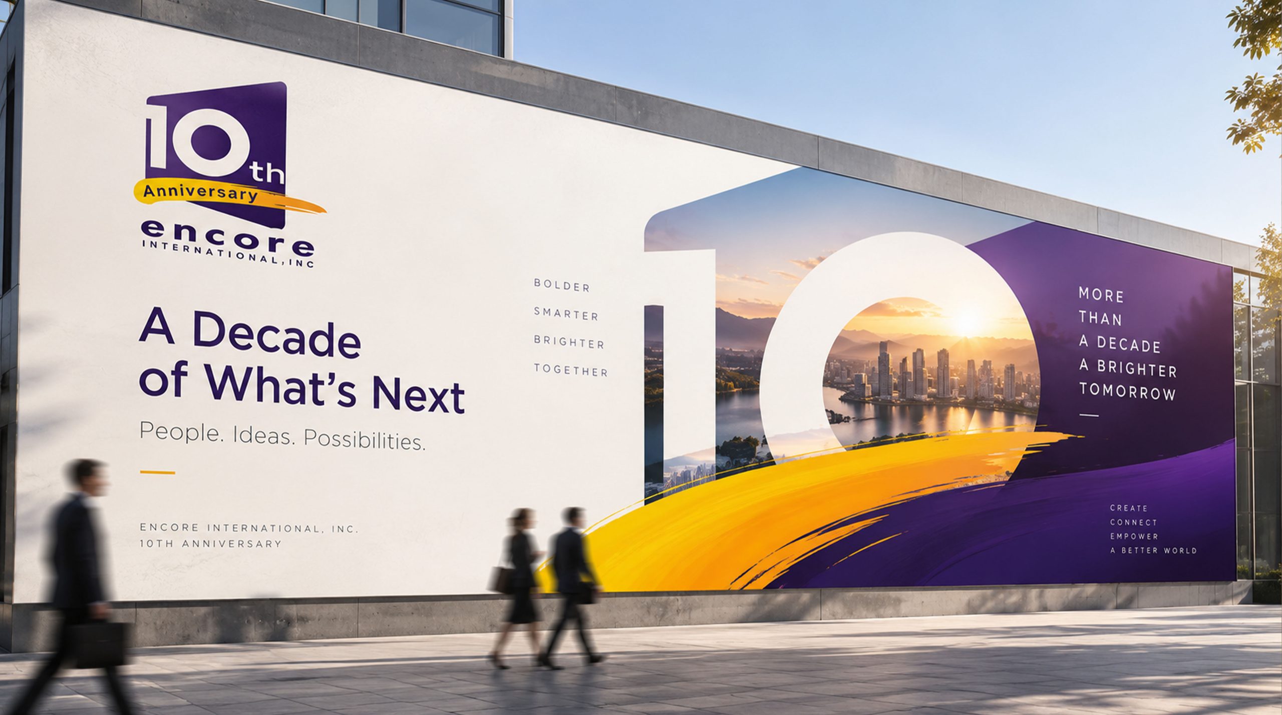
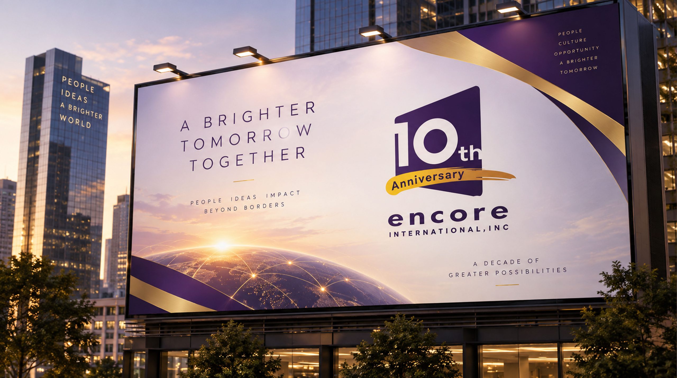
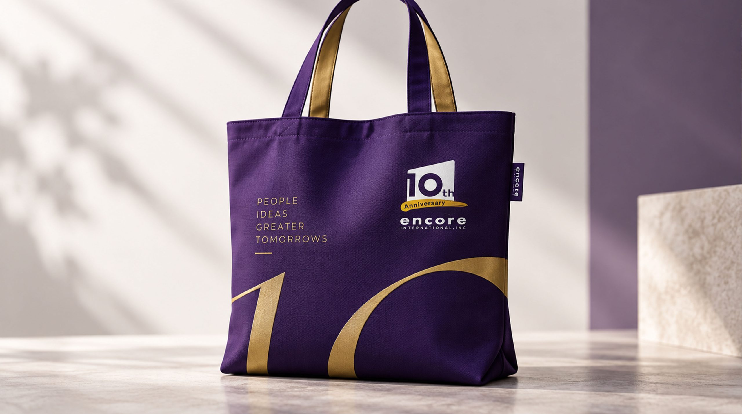
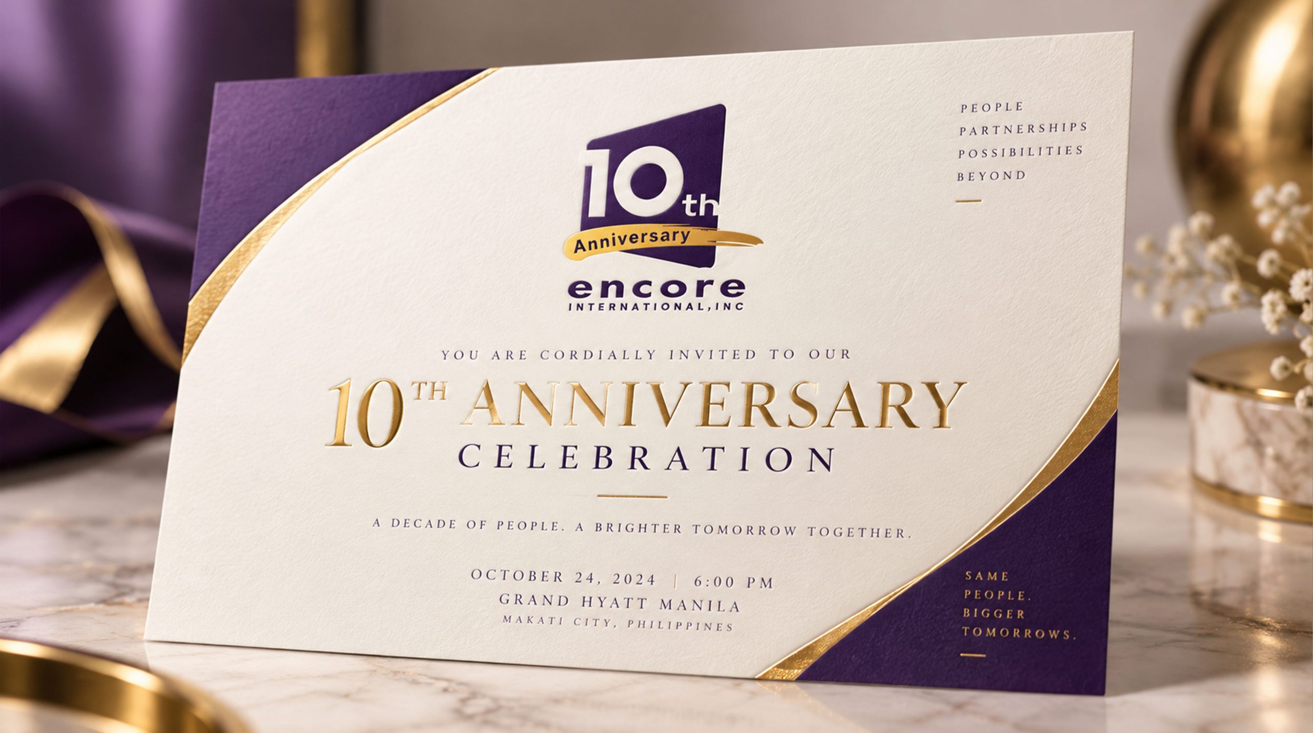
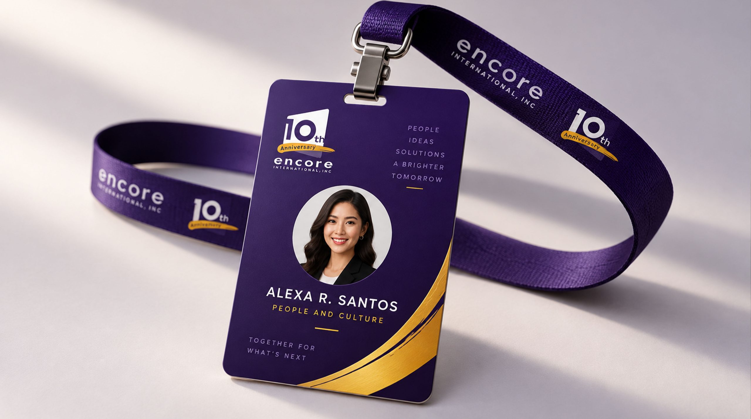
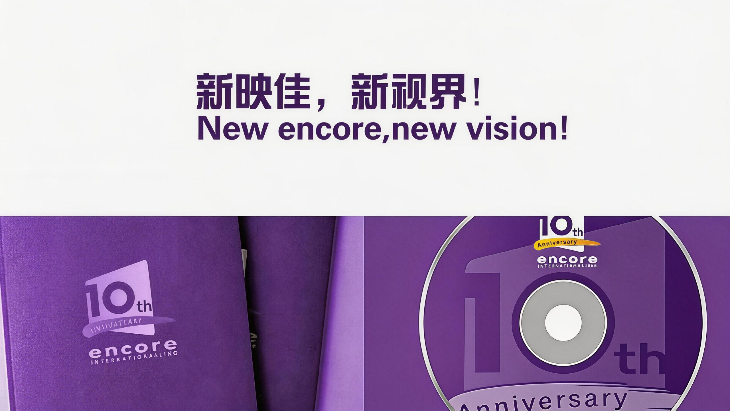
The logo has flexible system scalability and can be widely used in the main visual, stage background and sign-in wall of the 10th anniversary celebration; commemorative albums, corporate yearbooks, ten-year development history promotional video titles; employee souvenirs, partner thank-you letters, 10th anniversary limited gift boxes and surrounding cultural creations; official website 10th anniversary special page, social media avatars and celebration communication materials; industry award ceremonies, film and television festivals and international partner exchange activities images. In the dynamic vision, the purple trapezoidal screen lights up like a TV is turned on, and the white "10" appears. The golden flying pen moves gracefully from left to right, and the word "Anniversary" gradually appears on the flying pen, symbolizing the flow of light and shadow in the past ten years and the continuous excitement. The trapezoidal screen and golden flying pen can be extended into visual mother elements, used for the visual unity and brand pattern system of the 10th anniversary series of activities.
The logo contains three core images of the 10th anniversary brand of Yingjia International: A Decade of Legacy - the continuation of the purple main tone represents the persistence of the brand's genes and the cultural depth accumulated over the past ten years; Screen Excellence - the trapezoidal TV screen conveys Yingjia International's professional identity and industry status in the field of film and television media; Rising Momentum - the upward flying gesture of the golden flying pen symbolizes Yingjia's vigorous development trend and unlimited possibilities in the Chinese market. The overall design conveys Yingjia International's brand vision of "ten years of light and shadow, endless excitement", symbolizing Yingjia's booming development in China.
design results
After the release of the 10th anniversary commemorative logo, Yingjia International has aroused widespread brand attention and emotional resonance among the media industry and partners. "Purple screen + white 10 + golden flying pen", with its steady and lively visual language, has become the core identification symbol of Yingjia International's 10th anniversary series of celebrations. It is widely used in anniversary celebrations, industry activities and brand communication, showing the brand confidence of "ten years of accumulation and prosperity".