










Abalone Prince is a brand enterprise focusing on the field of high-end abalone and seafood. It uses high-quality abalone ingredients resources and exquisite processing technology to provide top-notch seafood delicacies to consumers who pursue the ultimate gourmet experience.
The brand name "Abalone Prince" combines the ocean's most precious "abalone" with the noble status "prince", implying the brand's kingly status in the abalone industry and its young and fashionable brand vitality, and carries the brand vision of "taking the ocean's most precious treasures and respecting every nobility". Qingmei Future was commissioned to lead the brand identity design.
The design goal of the brand logo is to demonstrate the industry status of Abalone Prince as a high-end abalone brand through the visual language of marine treasure quality, noble kingly bearing and vivid brand personality, and to convey the brand image of "top quality, noble experience, fresh vitality".
Design concept and graphic language
The logo takes "Ocean Crown" as the core concept and an artistic abalone shape as the main graphic. The natural arc of the abalone shell is refined and transformed into the outline of an elegant crown, creating a dual image symbol that is both an ocean treasure and a symbol of nobility. The unique progressive spiral texture and pearl-like glossy texture of the abalone shell are cleverly transformed into the decorative arc of the crown - several arc-shaped ridges on the upper edge of the shell slightly arch upward, just like the continuous arches at the top of the crown. The shape is not only faithful to the natural appearance characteristics of the abalone, but also naturally presents the solemn outline of the crown. One form has two meanings and is natural, allowing consumers to receive the dual brand information of "Abalone" and "King" at the same time. The overall design integrates the natural aesthetics of marine life with the classic symbols of royal dignity, reflecting the dual attributes of the Abalone Prince brand between top-quality ingredients and noble experience.
The abalone shell is presented from a side view, with a full arc-shaped outline that stretches gracefully from the lower left to the upper right. Several parallel arcs are used on the surface of the shell to outline the unique growth texture of abalone. The thickness and spacing of each arc have been carefully considered to achieve a high degree of graphic summary and decorative beauty while maintaining the recognition of natural biological forms. The soft curved surface on the inner side of the shell hints at the unique mother-of-pearl luster of the abalone's inner wall - the iridescent texture that flows and changes under the light, which is the most intuitive visual proof that abalone is the "treasure of the ocean". The arc-shaped ridge above the shell arches upward to form a continuous arc of the crown. The number of arcs is consistent with the number of natural textures of the abalone shell, ensuring the seamless integration of the two shapes of "abalone" and "crown". The lower part of the shell is gathered in a simple arc, just like the stable base of abalone attached to the reef, conveying the industry foundation of the brand taking root in the ocean and having stable quality.
An abstract "prince" silhouette is cleverly integrated into the center of the graphic - minimalist lines are used to outline the facial contours of a young aristocrat, with a high forehead, a straight bridge of nose, and a sharp chin line. The top of the head just connects with the arc of the crown of the abalone shell, as if this "prince" is wearing a natural crown made of the most precious things from the ocean. The side silhouette of the prince is presented in the shell in the form of negative space. The lines are extremely restrained and only the minimum strokes are used to convey the outline of the character, avoiding the complexity that may be brought about by concrete figures and ensuring that the overall graphics maintains a simple and elegant brand tone. The image of the prince injects personalized charm and youthful vitality into the brand, sublimating "Abalone Prince" from a product name into a brand character with warmth, personality and story. The overall composition constructs "Ocean Prince" with a multi-layered nested structure of "abalone is the crown and prince is the brand", conveying the brand's treasure positioning and noble personality.
Font composition and color system
The Chinese "Abalone Prince" adopts a customized round and bold font, with full and thick strokes, rounded and soft corners, and a generous and approachable font. The word "abalone" is presented in slightly thick strokes to convey the richness and quality of the ingredients; the word "prince" is treated in a slightly lively font to convey the young and fashionable personality and vitality of the brand. The four-character overall style strikes a balance between high-end quality and youthful affinity, avoiding the excessive solemnity and distance common to traditional Haizhen brands, giving the brand both the quality and height of a "king" and the youthful charm of a "prince". The English "ABALONE PRINCE" is arranged below the Chinese characters in a standard uppercase sans-serif font. The fonts are regular and concise, and the spacing is calm, ensuring the brand's recognition and professional image in international trade and high-end catering scenes.
The main color, ocean blue #004B87, is the core color of the logo and represents the deep sea, purity and natural attributes of ocean treasures. The deep ocean blue is like the deep sea environment where abalone inhabits, conveying the purity and naturalness of the source of the ingredients, and at the same time establishing the quality trust of the high-end Haizhen brand with the calm tone. Auxiliary pearl gold #C5A55A is used to embellish the crown arc, noble elements in the brand system and high-end packaging, representing preciousness, nobility and top quality. The color of pearl gold is like the luster of mother-of-pearl on the inner wall of an abalone shell, conveying the product value of "the most precious thing from the ocean" in the most intuitive color language. Gold also echoes the noble status of "Prince" and strengthens the brand's high-end positioning with classic golden symbols. Auxiliary coral orange #E8734A is used in the dynamic elements, promotional materials and youthful communication scenes in the brand system. It represents freshness, deliciousness and appetite. It uses warm and bright warm colors to evoke consumers' intuitive associations with food, and injects a youthful and energetic market atmosphere into the brand. Pure white #FFFFFF is used for standard background color and graphic space to ensure the clarity and transparency of the logo. The overall color system uses blue gold as the core and coral orange as the supplement, reflecting the brand temperament of "deep sea treasures, noble and fresh", and establishing a visual bridge between high-end sea treasures and the young market.
Application extension and brand significance
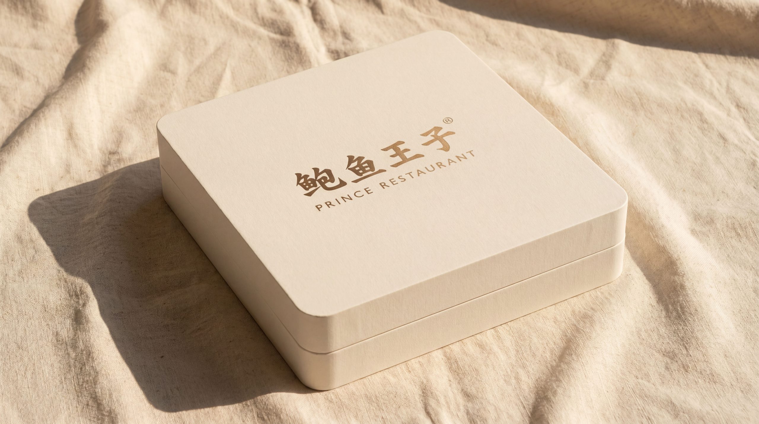
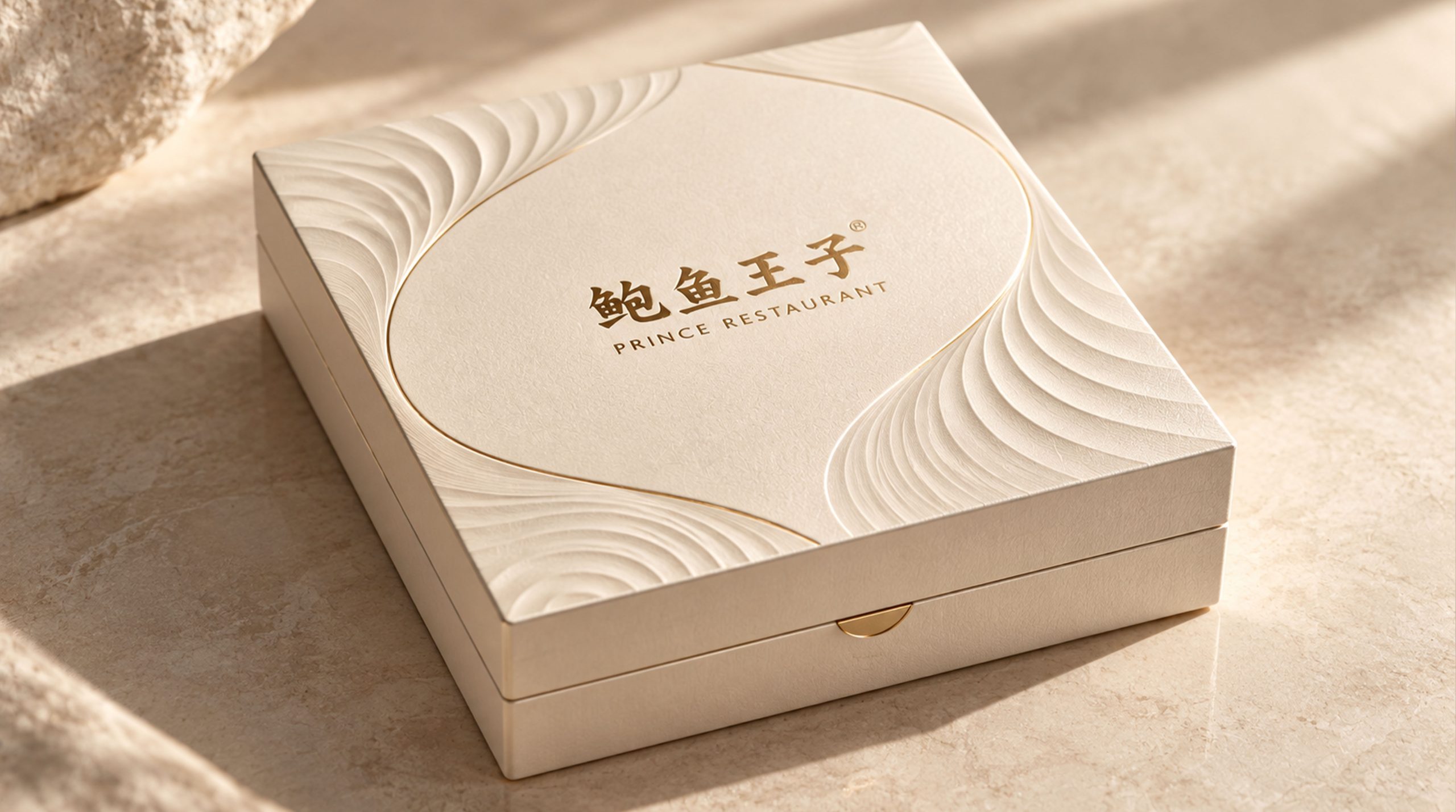
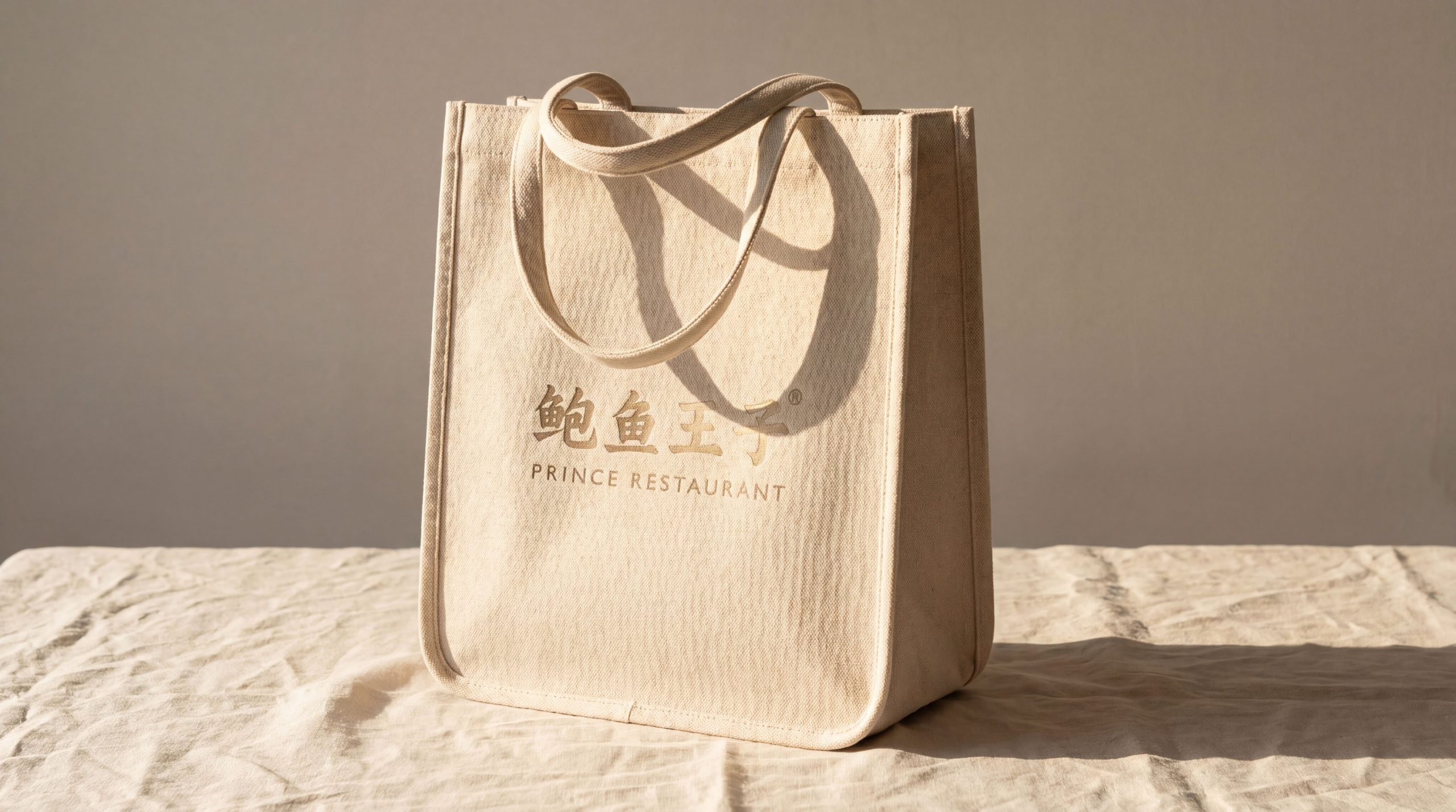
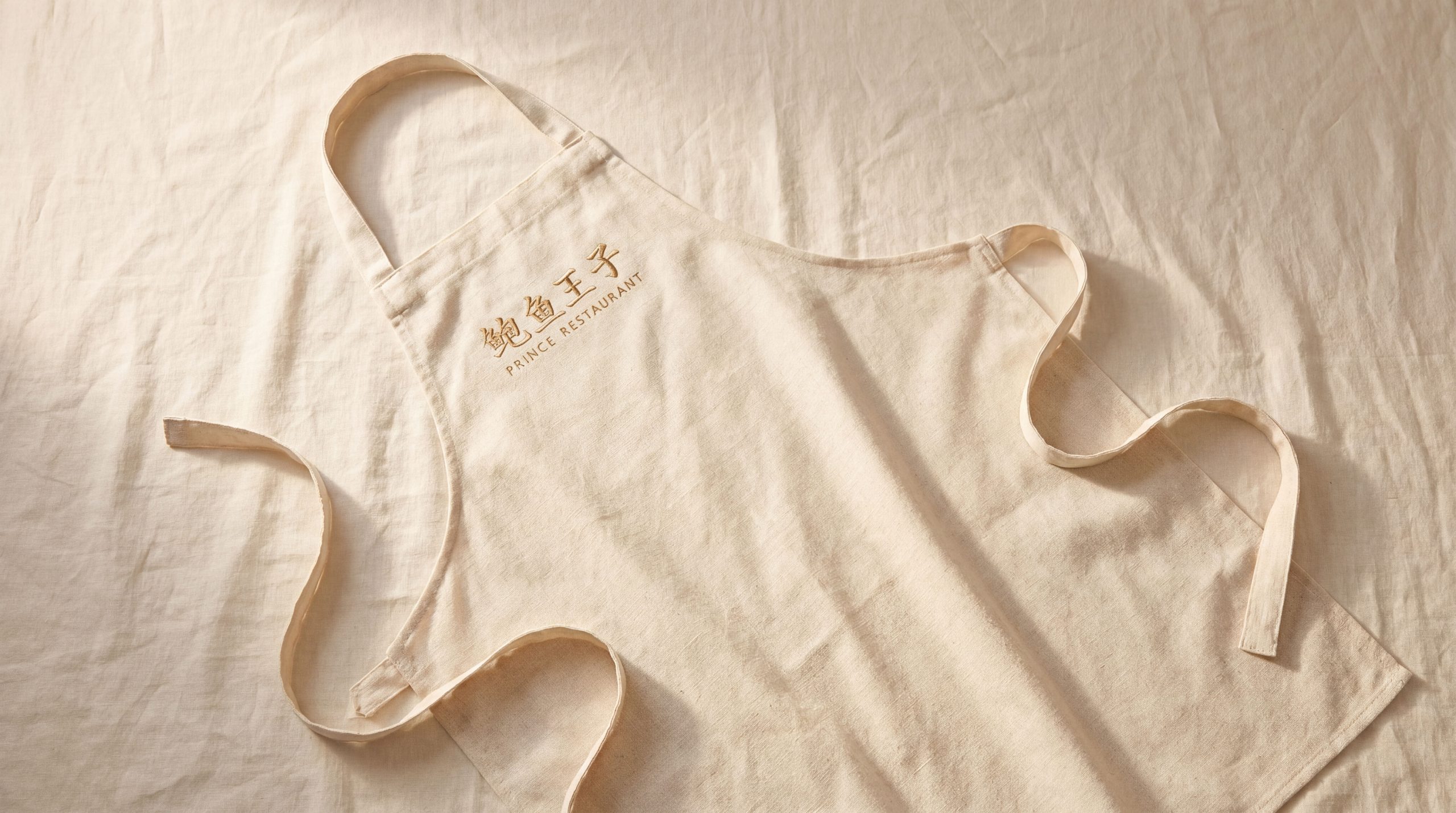
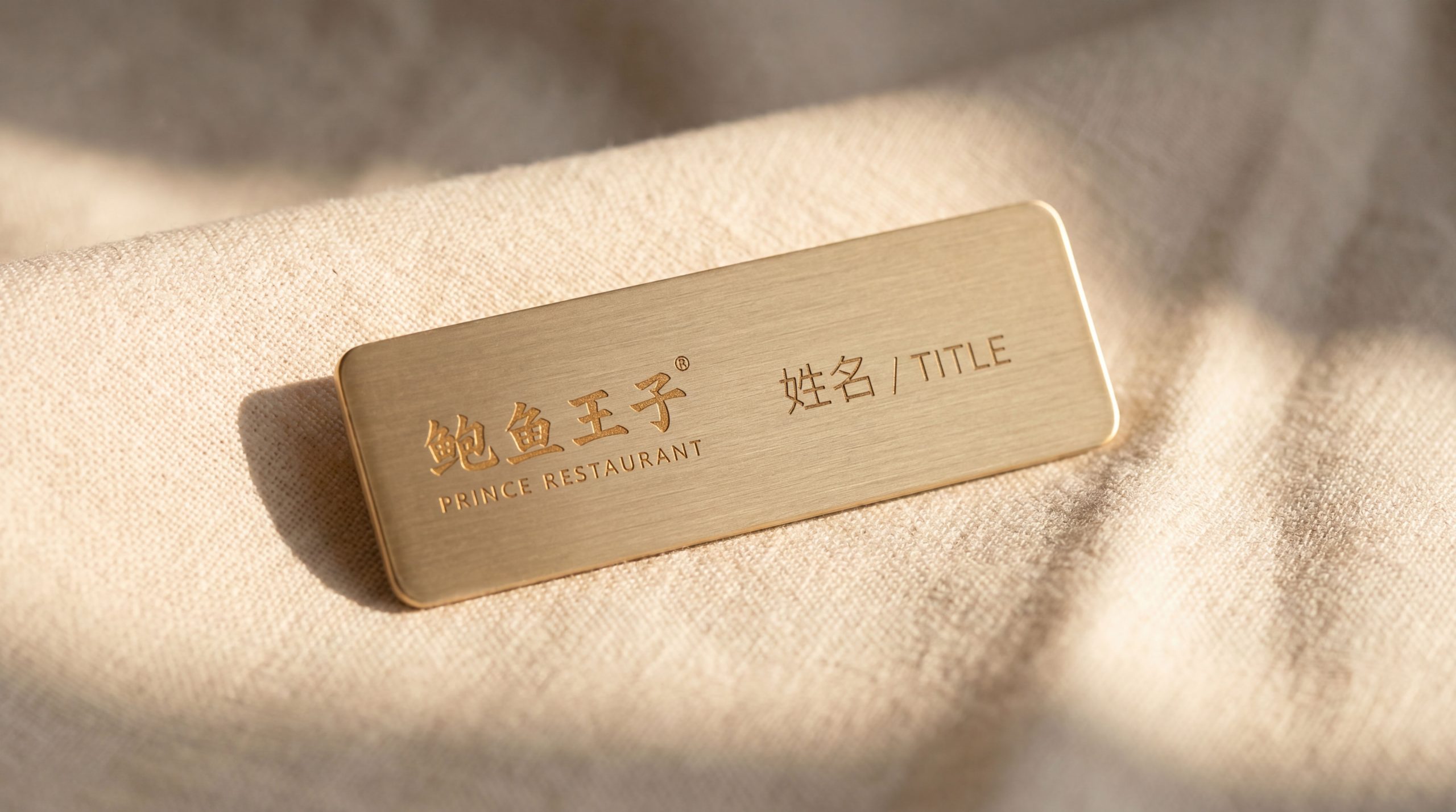
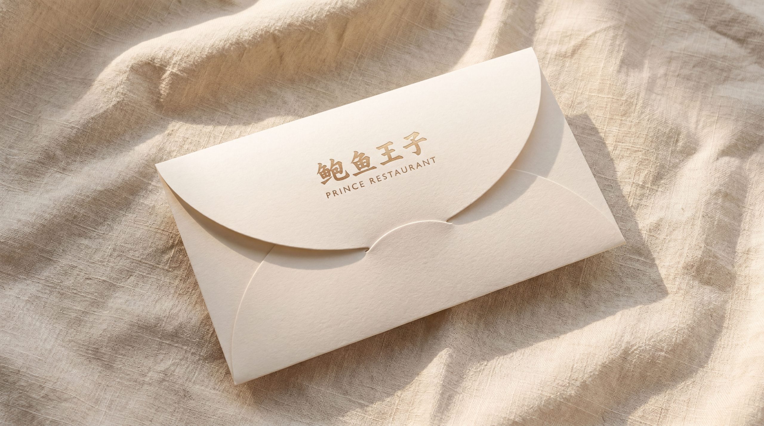
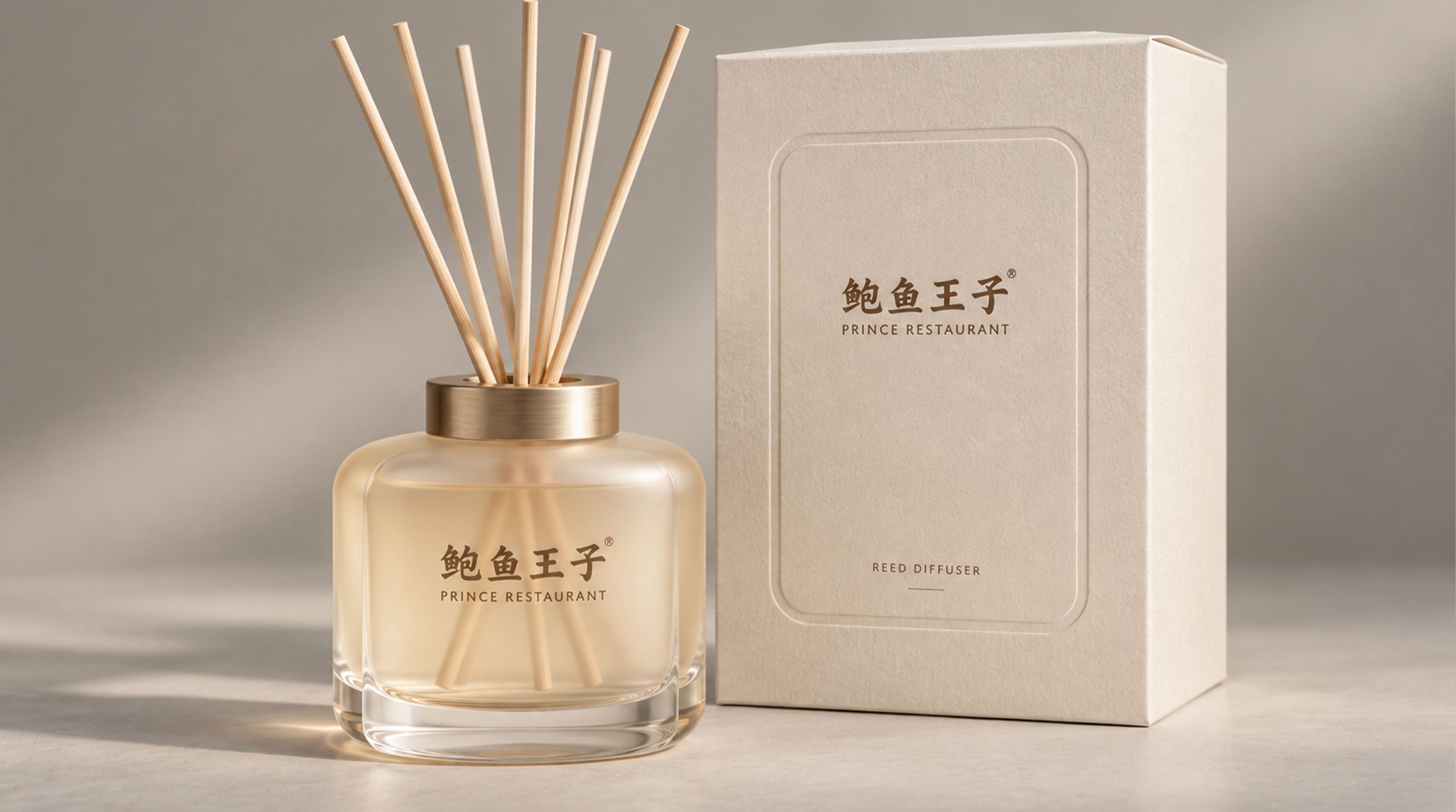
The logo has strong system scalability and can be widely used in abalone product outer packaging boxes, vacuum bags, can labels and gift box envelopes; brand flagship store fronts, seafood counter displays, cold chain distribution box logos and restaurant cooperation nameplates; official websites, e-commerce details pages, social media images and gourmet content marketing materials; food expos, seafood festivals, high-end catering tastings and industry exhibition images; brand peripheral gifts, membership cards, holiday gift boxes and cross-border co-branded products. In the core application scenario of high-end gift box packaging, the ocean blue background color and the logo with pearl gold hot stamping present the ultimate precious quality, which is suitable for high-end gift-giving scenarios during important festivals such as the Spring Festival and Mid-Autumn Festival. In the dynamic vision, the abalone shell can slowly float out of the deep sea, the texture of the shell surface gradually becomes clear, and the upper edge arc gradually arches to form a crown shape. The silhouette of the prince naturally emerges in the shell, symbolizing the noble journey of the ocean treasure from the deep sea to the dining table. The abalone shell texture can be extended into a visual mother element and used for packaging shading, brand pattern systems, tableware decoration and digital interface design.
The logo contains the three core images of the Abalone Prince brand: Ocean's Finest - the natural shape of the abalone shell directly conveys the brand's core product attributes as a supplier of top-quality seafood ingredients; Royal Quality - the crown outline and pearl gold tone highlight the brand's kingly status and high-end quality commitment in the abalone industry; Vibrant personality (Vibrant) Character) - The personification of the prince's image gives the brand a unique personality of youthful vitality, making the high-end Haizhen brand no longer cold and distant, but approachable, approachable and full of charm. The overall design conveys Abalone Prince's brand vision of "taking the most precious things from the ocean, giving you a noble taste, and showing off your princely style".
Improper Usage (Protection Specification)
Do not change the curved outline, the number of textures, or the shape of the crown arc of the abalone shell; do not modify the outline proportions of the prince's side silhouette or its positional relationship in the shell; do not change the hue, brightness, or primary and secondary relationships between ocean blue and pearl gold; do not add strokes, outer glow, or excess to the logo Gradient or texture overlay effects; do not separate the abalone shell and the prince image into independent elements for use alone; do not rotate, mirror the overall orientation of the graphics or delete the shell texture details; keep the white space around the logo not less than 25% of the height of the graphics; the minimum display width must not be less than 30mm.
design results
After the release of the logo, Abalone Prince's brand recognition and noble image in the high-end seafood and abalone market have been significantly improved. With its unique visual language that combines the natural aesthetics of abalone with the noble demeanor of a king, "Ocean Crown" has become the core identification symbol of the Abalone Prince brand system. It is widely used in product packaging, high-end catering and market communications, showing the brand vision of "the treasure of the ocean, the style of a prince". The brand's personified "Prince" image has aroused widespread brand favorability and memory recognition among young consumer groups, and has successfully expanded the audience boundaries of the high-end Haizhen brand.