










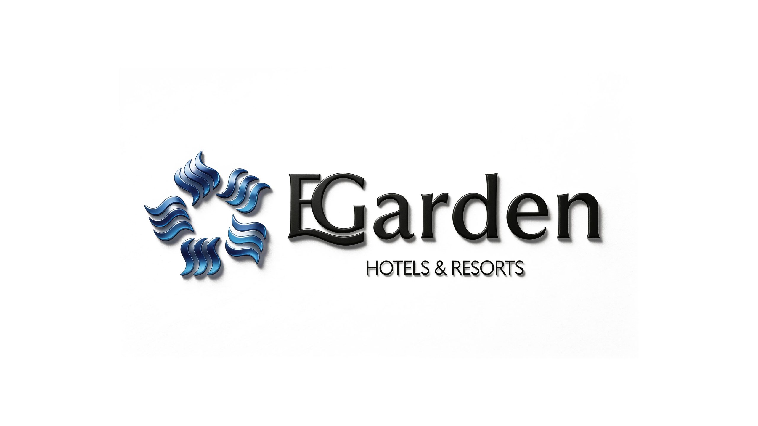
YIGE HOTEL is a hotel brand positioned in the high-end boutique market. With the brand philosophy of "Leisure, Accord", it is committed to providing business travel elites and quality life pursuers with an accommodation experience that combines oriental artistic conception and modern comfort. "Yi" means comfort and transcendence, representing a state of life in which the body and mind are at ease; "ge" means pavilion or elegant pavilion, representing an exquisite and sophisticated living space.
The design goal of the brand logo is to demonstrate the brand positioning of Yige Hotel as a boutique high-end hotel through the oriental artistic conception, boutique style and quiet and elegant visual language.
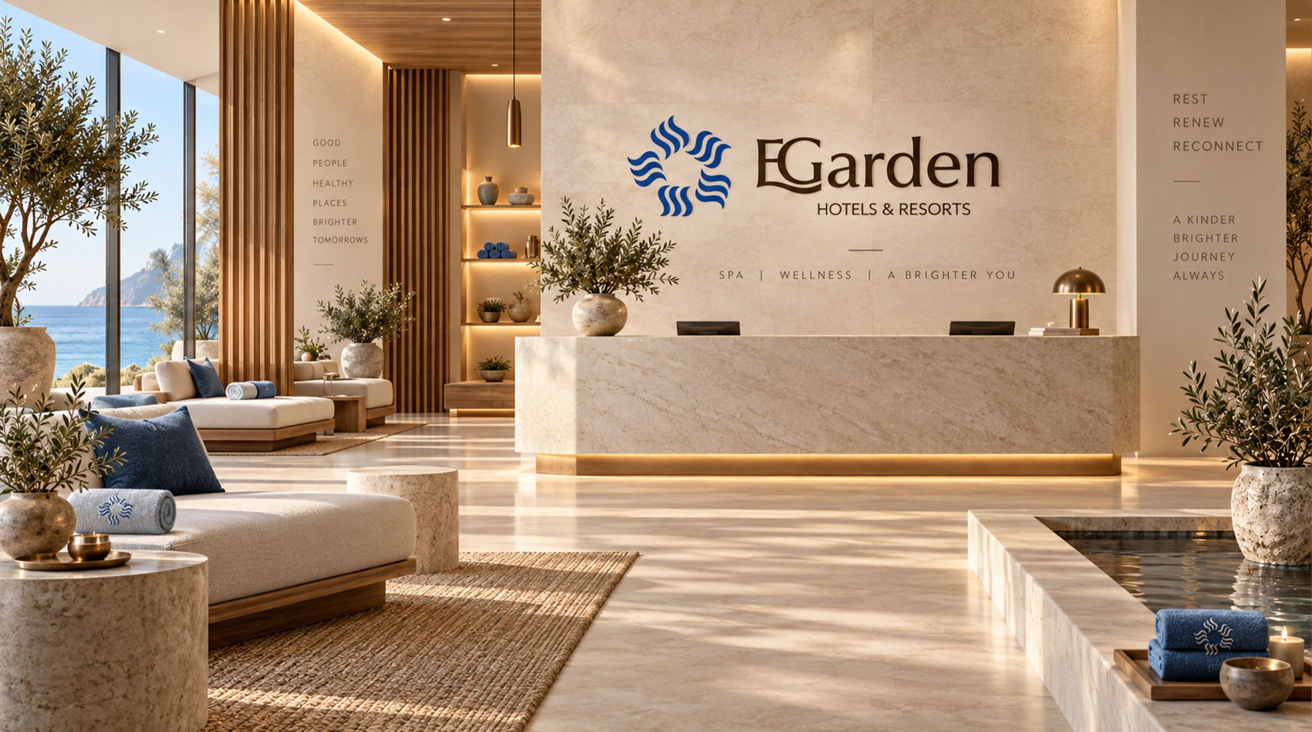
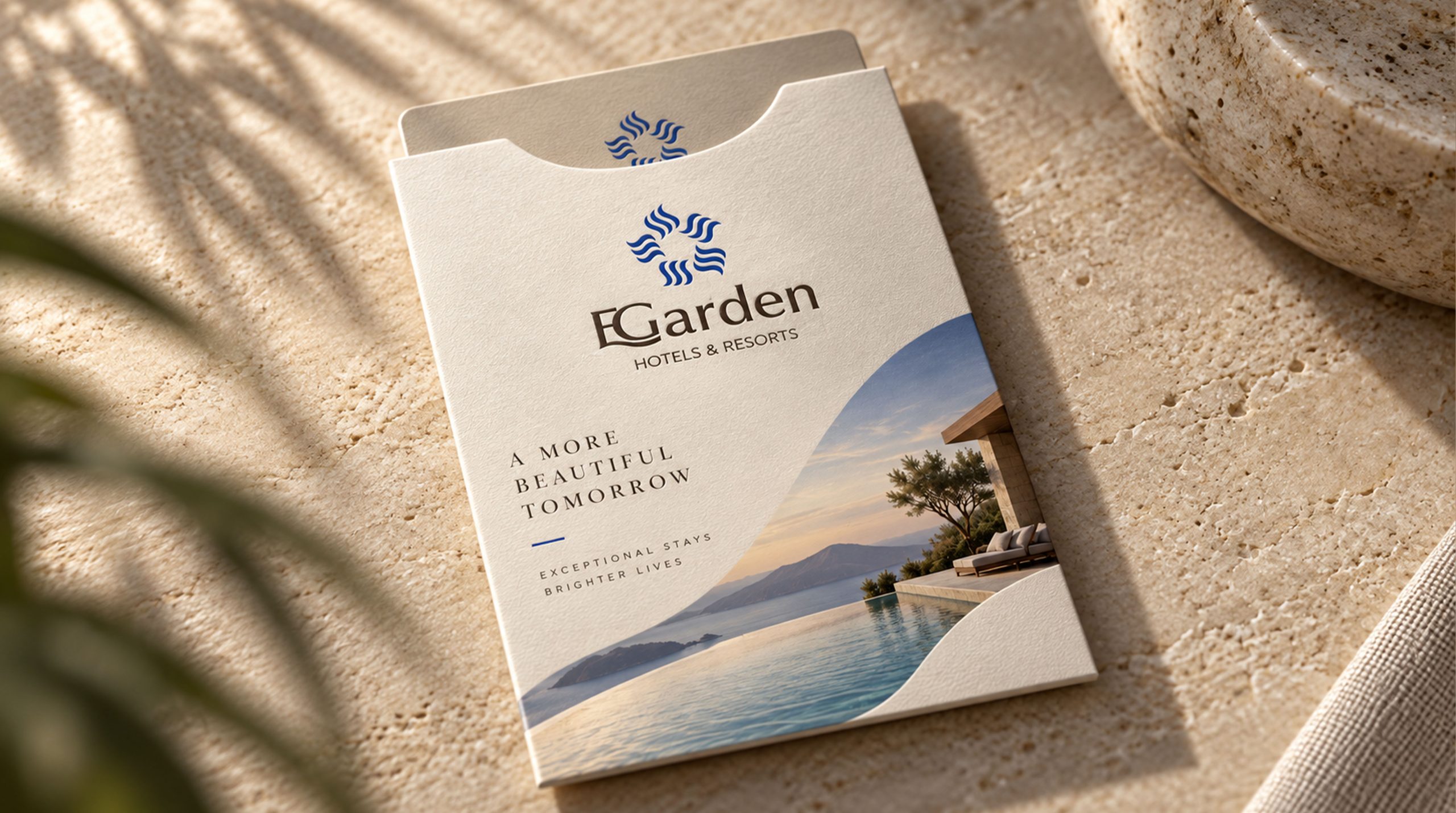
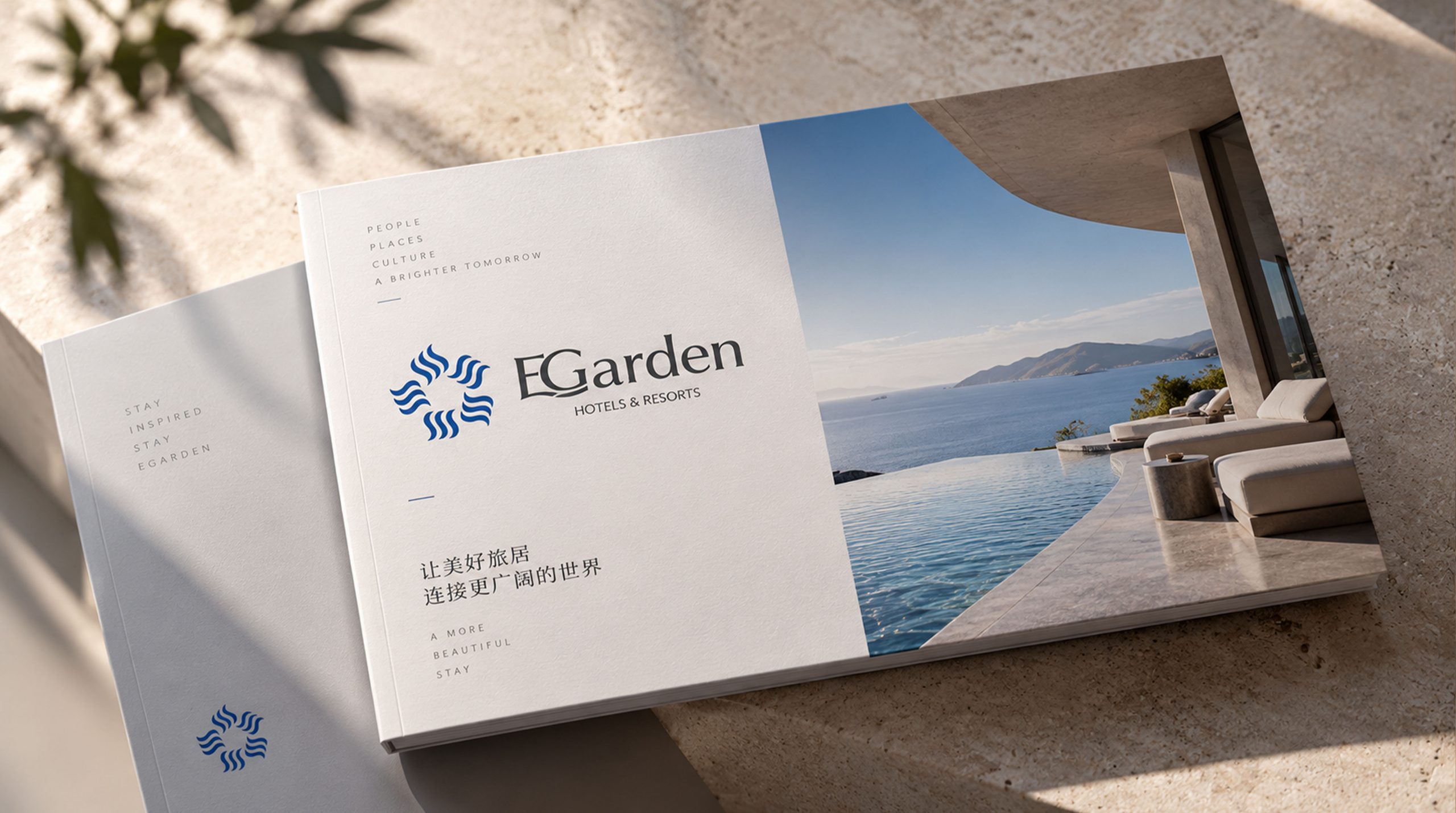
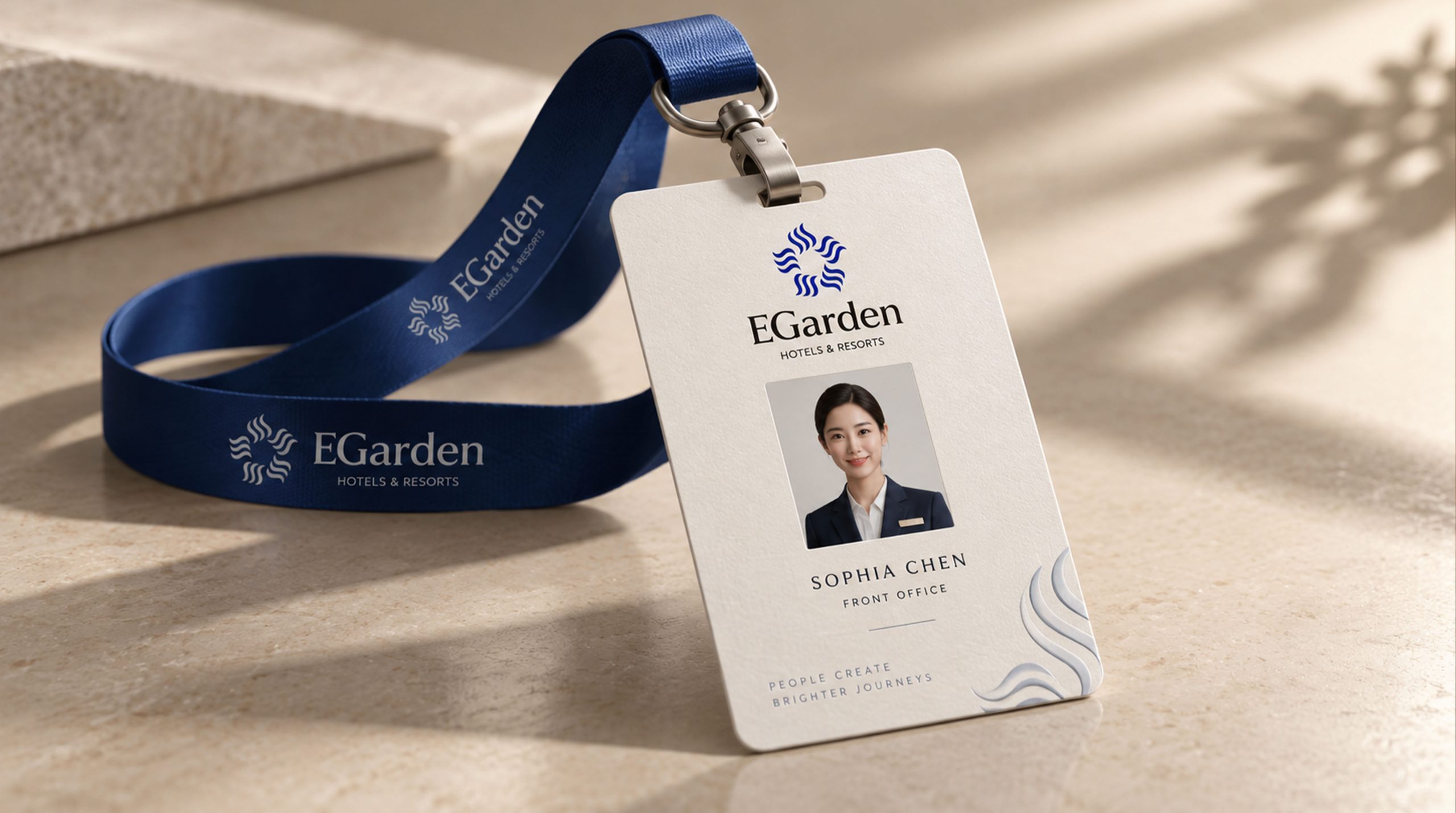
design concept
The logo takes "Ink Wash Pavilion" as the core concept and an artistically refined oriental pavilion as the main graphic. The pavilion is composed of minimalist lines and color blocks, just like the finishing touch in an ink wash sketch - a few strokes, the artistic conception is complete. The curves of the cornices in the graphic represent the charm of oriental architecture and the transcendence of "yi", which means "living in the elegant pavilion and enjoying the beauty of ease". The overall design reflects the dual attributes of the Yige brand's oriental cultural heritage and modern high-quality services.
graphic language
The cornice arc is the most recognizable visual element of Chinese classical architecture. It rises gracefully to both sides like a bird's wings, conveying oriental poetry and elegance. The cascading pavilion uses a wide and thick base at the bottom to symbolize the stability of the brand. The divided pavilion at the middle level conveys the exquisite level of the space, and the cornices on the top floor inject elegance and agility. A slender vertical line beside the pavilion is like the silhouette of green bamboo in the courtyard, creating an oriental courtyard artistic conception of "bamboos beside the pavilion and scenery outside the window". The graphics use a large area of white space, such as the "planning white for black" technique in Chinese landscape paintings, to convey the brand spirit of "leisure and ease" through invisible space. The overall composition uses asymmetrical ink freehand aesthetics to construct a "Pavilion of Escape", conveying the brand's cultural depth and exquisite style.
Font composition
The Chinese "Yige" uses customized modern calligraphy fonts, which are between smooth running script and regular regular script. The bottom of the word "Yi" is written with a stretched arc, like a boat floating on the water; the word frame of the word "Ge" is stable and straight, like the frame of an attic door and window. The English "YIGE HOTEL" is arranged below the Chinese characters in a slim uppercase serif font. The fonts are slender and elegant, and the spacing is loose and leisurely, conveying the unique unhurriedness and unhurriedness of boutique hotels. A vermilion square seal is stamped next to the Chinese and English words, just like the inscription of a literati's calligraphy and painting, and a little red is used to liven up the entire elegant tone.
color system
The main color, ink gray #4A4A4A, represents the highest realm of ink, calmness and oriental aesthetics, conveying the brand character of "not noisy, not impetuous". Auxiliary sandalwood brown #6B4226 symbolizes the color of precious wooden furniture, injecting warmth and intimacy like home. Auxiliary Moon White #D6E4E1 is like moonlight shining on white walls and green tiles, conveying elegance and tranquility. The finishing touch of Zhuyinhong #CC3333 is only used for seal elements, such as the finishing touch of "a little red in the green bush". Pure white #FFFFFF uses maximum white space to highlight the elegant texture. The overall color system reflects the Oriental aesthetic philosophy of "simple and beautiful".
Application extension
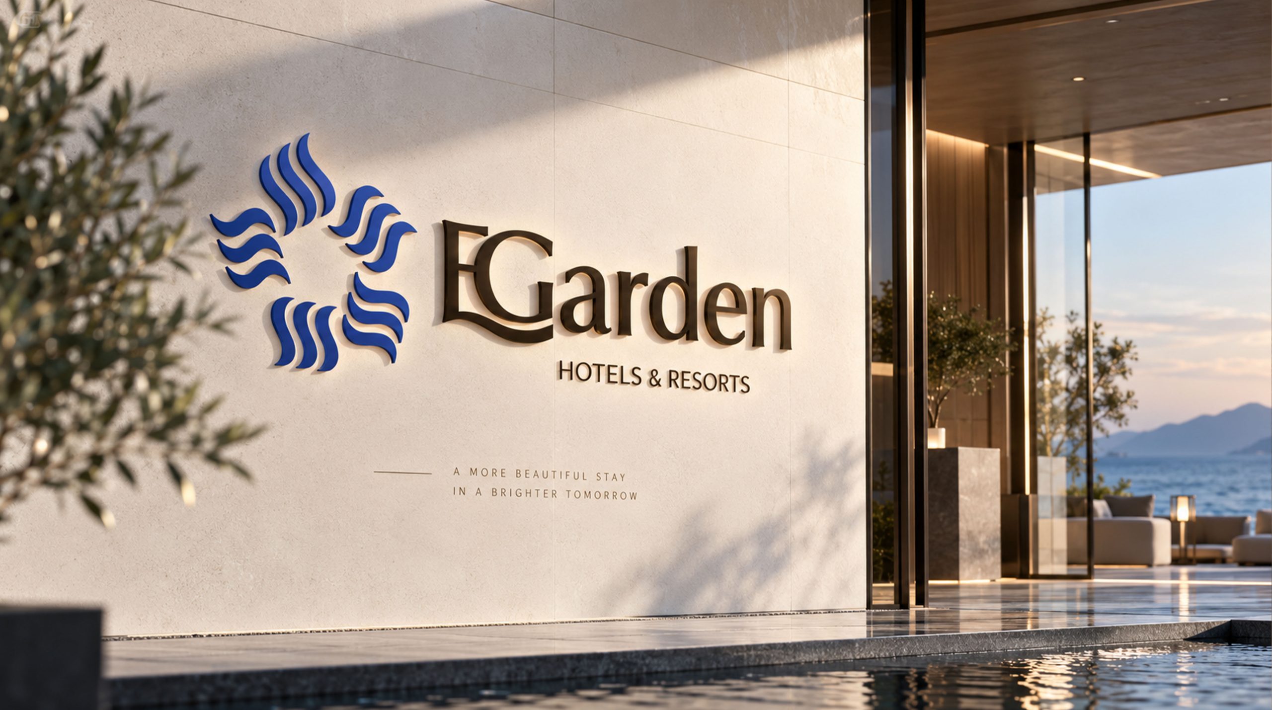
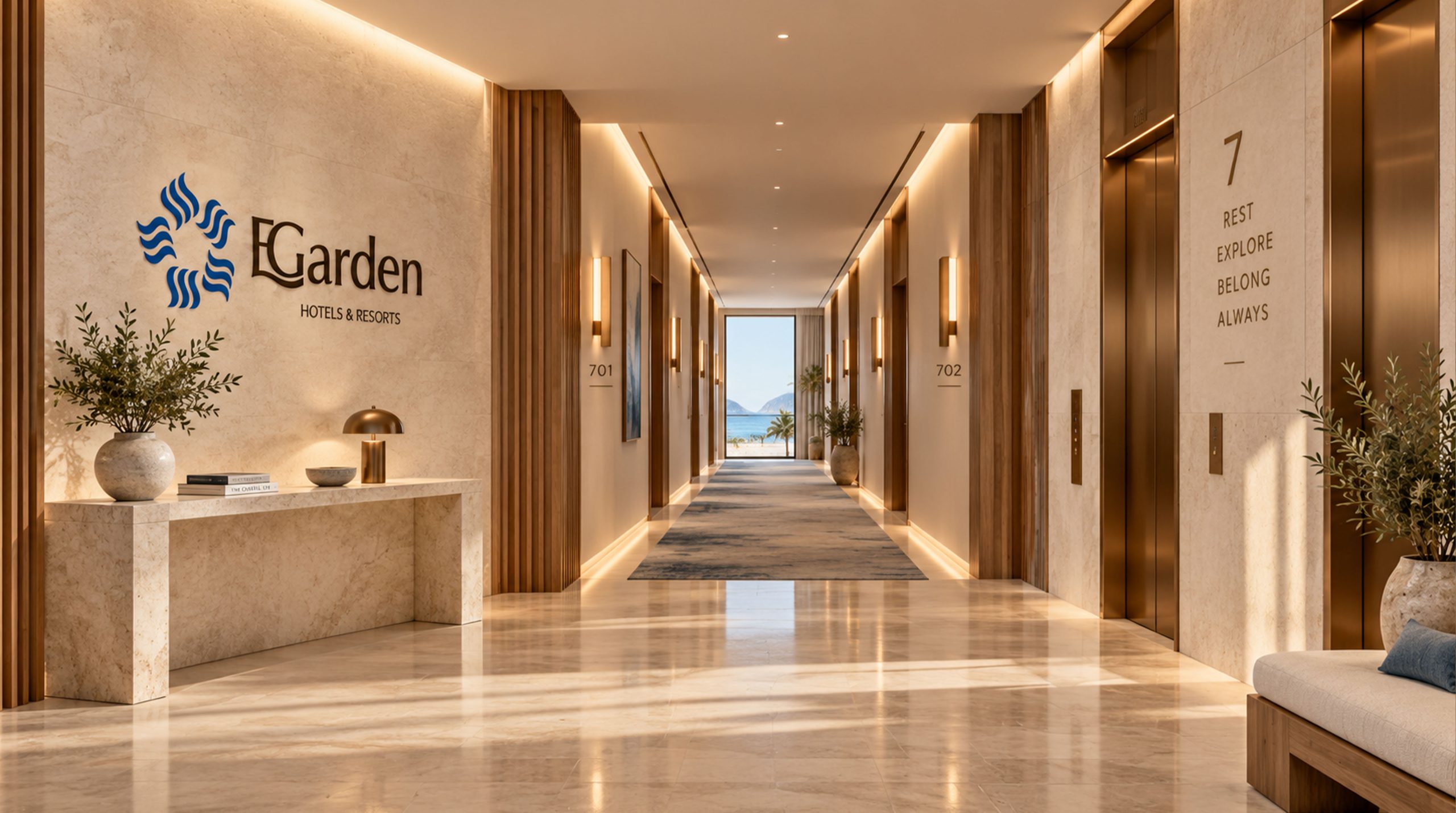
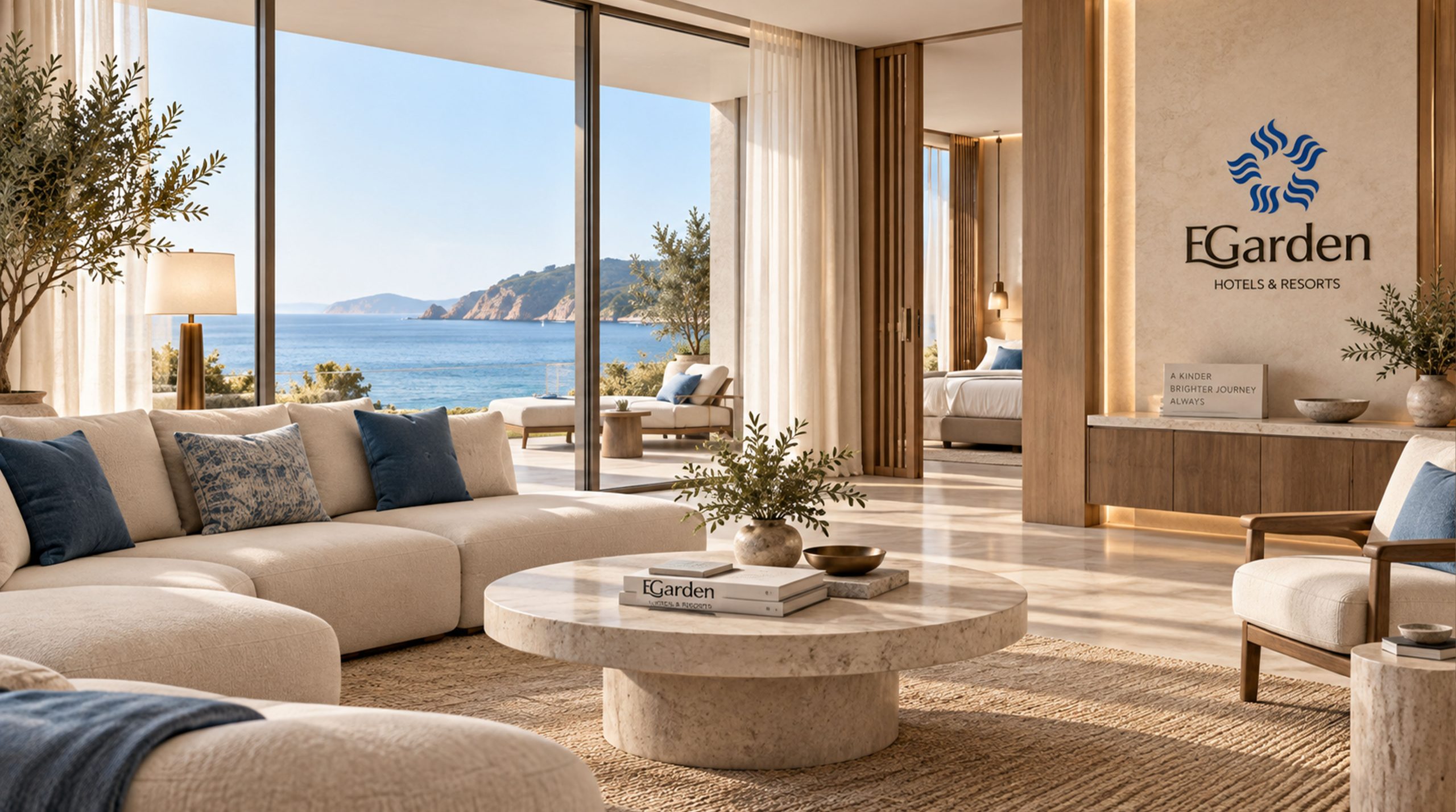
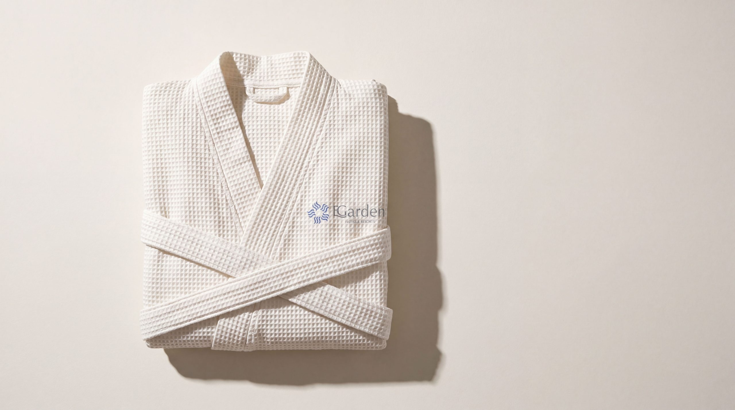
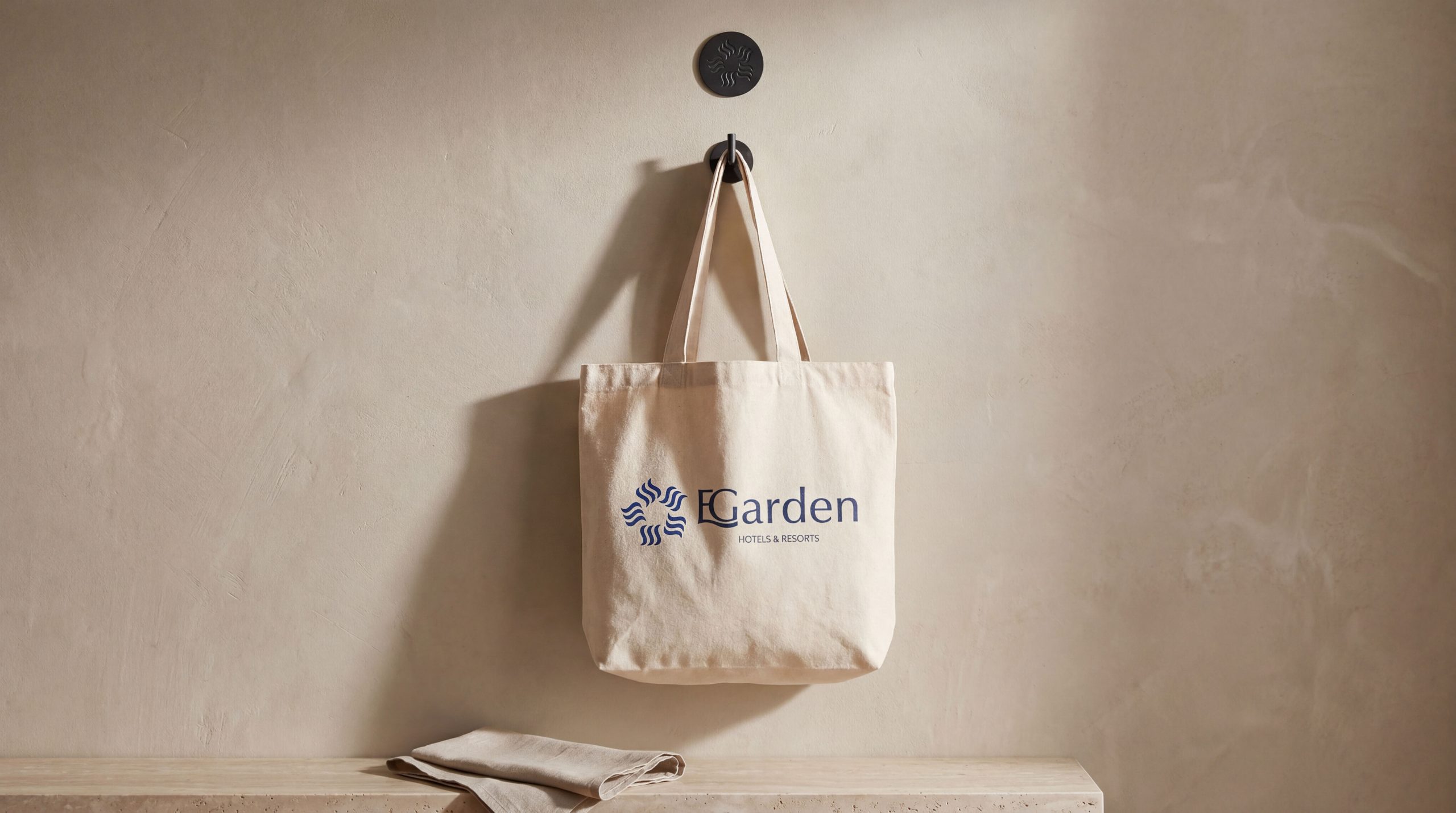
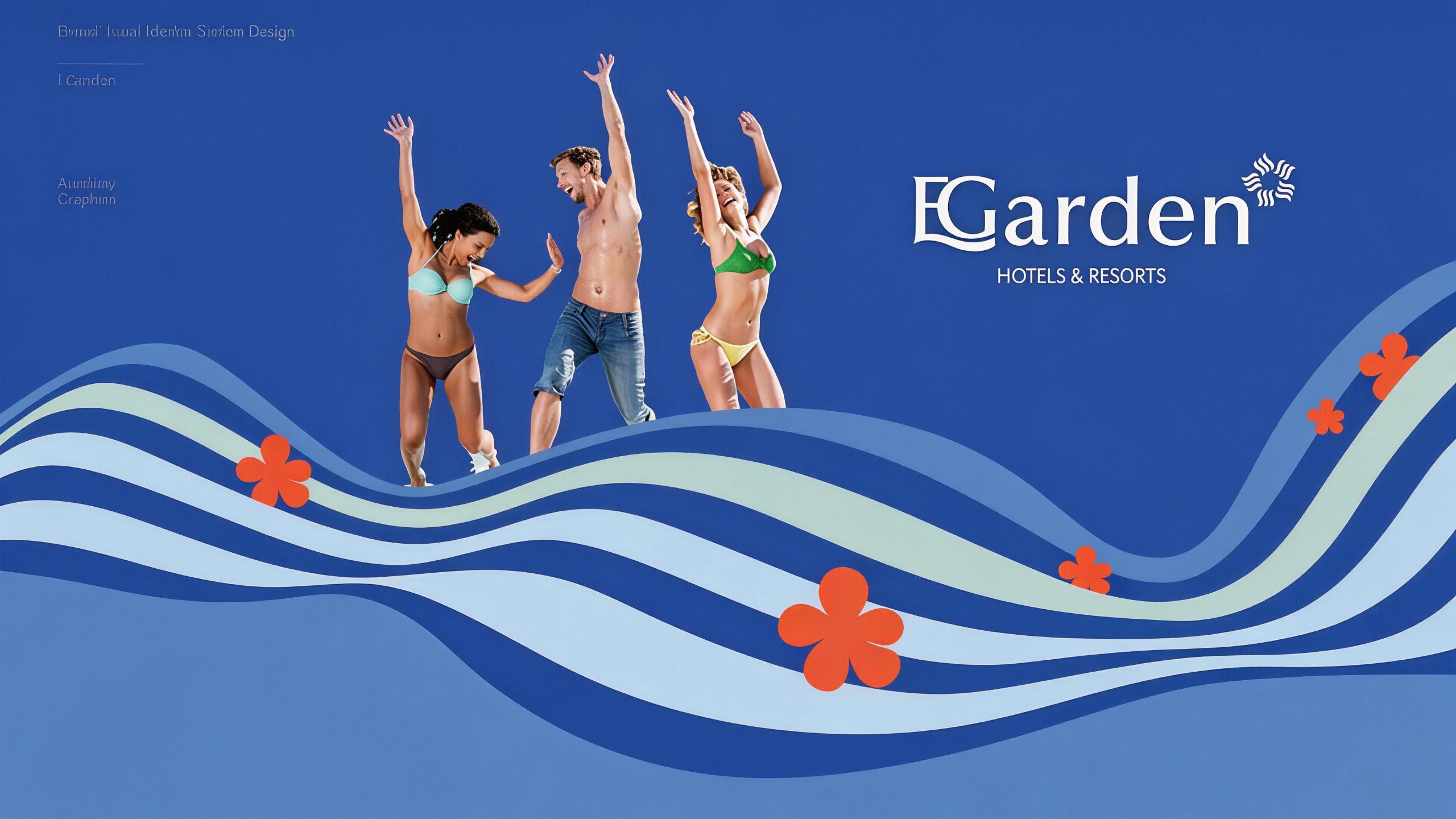
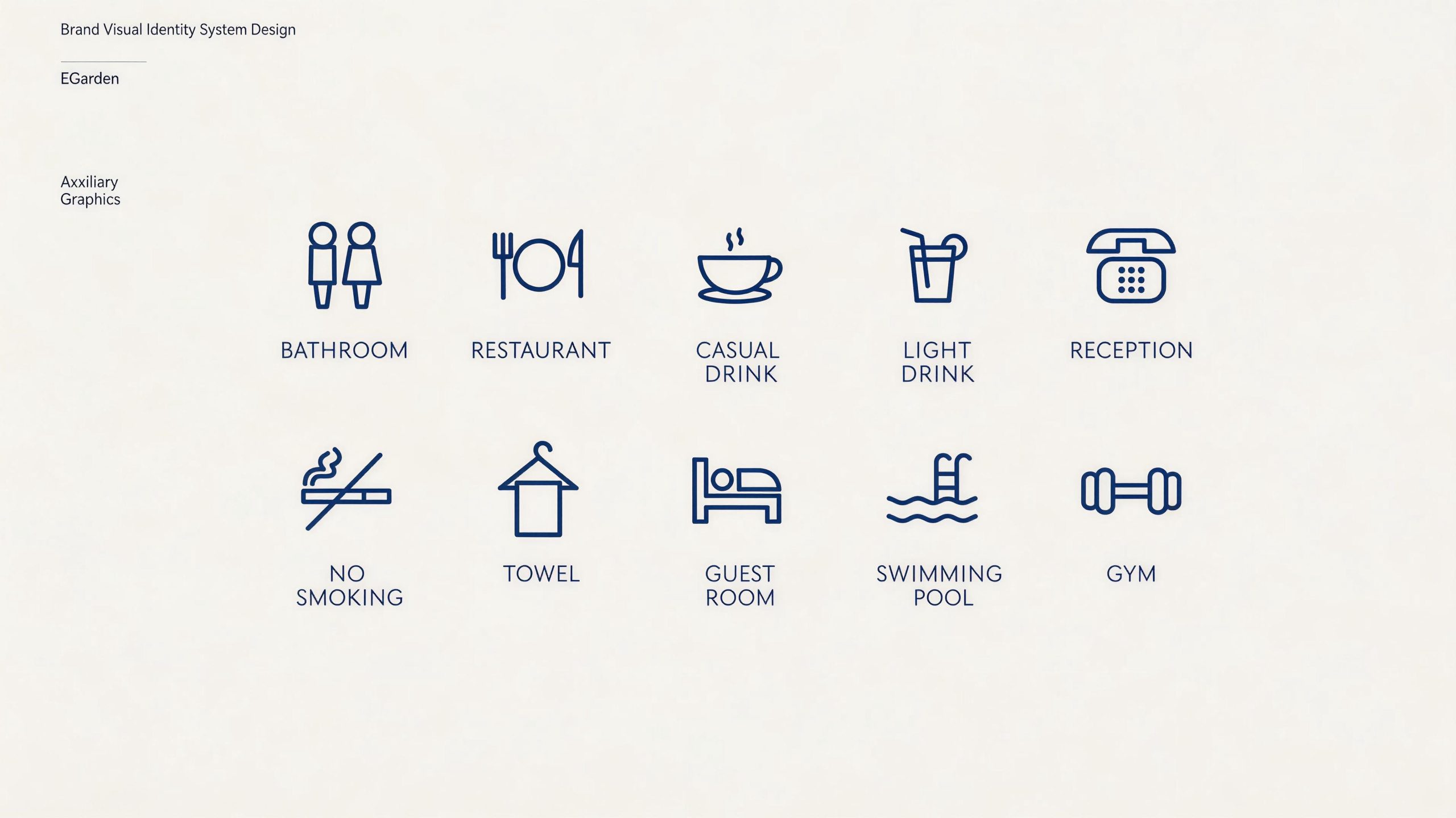
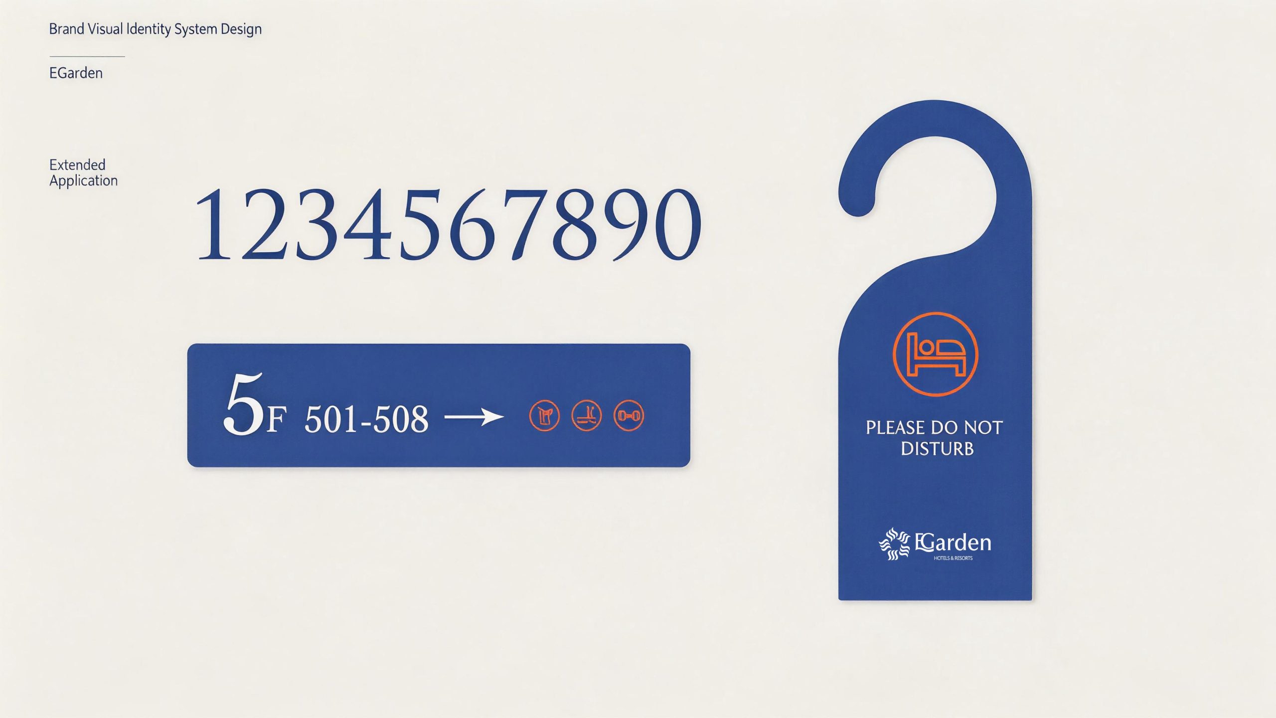
The logo has strong system scalability and can be widely used in hotel building facades, lobby image walls, front desk nameplates and floor guides; guest room door numbers, room card covers, toiletries labels, bathrobe embroidery and bedding woven labels; brand official websites, online booking platforms, mobile APP interfaces and social media images; brand albums, business invitations, membership cards and high-end gift packaging. In the dynamic vision, the outline of the pavilion is slowly outlined with brush writing - the arc of the cornice spreads like a bird's wing, the lines of the pavilion body are calm and settled, and green bamboo grows gently beside the pavilion. The silhouette of the pavilion and the arc of the cornice can be extended into visual mother elements and used for space decorative patterns, fabric patterns, lighting projections and brand pattern systems.
brand meaning
The logo contains the three core images of the Yige Hotel brand: Oriental Ambiance - the freehand shapes and blank compositions of the ink pavilions convey the life philosophy of "poetic dwelling"; Boutique Elegance - the minimalist geometric refinement and elegant colors convey the ultimate pursuit of quality details; Tranquil Ease) - The elegant curves of the cornices and large areas of white space convey the brand promise of being at ease physically and mentally and staying away from the hustle and bustle. The overall design conveys the brand vision of Yige Hotel to "live in Yige and feel at ease".
Improper Usage (Protection Specification)
Do not change the stacked structure of the pavilion, the curvature of the cornices or the overall proportion; do not modify the main color of ink gray or expand the main color of vermilion red; do not add gradients, strokes or modern special effects inconsistent with the ink style; do not fill the blank space or place disturbing elements; do not rotate or mirror the pavilion graphics or split the pavilion and bamboo elements; keep the white space ≥ 30% of the height of the graphics; the minimum display width must not be less than 30mm.
design results
After the release of the logo, Yige Hotel's brand recognition and cultural appeal in the boutique hotel and high-end accommodation fields have been significantly improved. "Ink Pavilion + Vermilion Seal" has become the core visual identity symbol of its Oriental boutique hotel positioning. The logo is widely used in hotel environments, service touchpoints and market communications, showing the brand vision of "living in Accord and feeling at ease".