










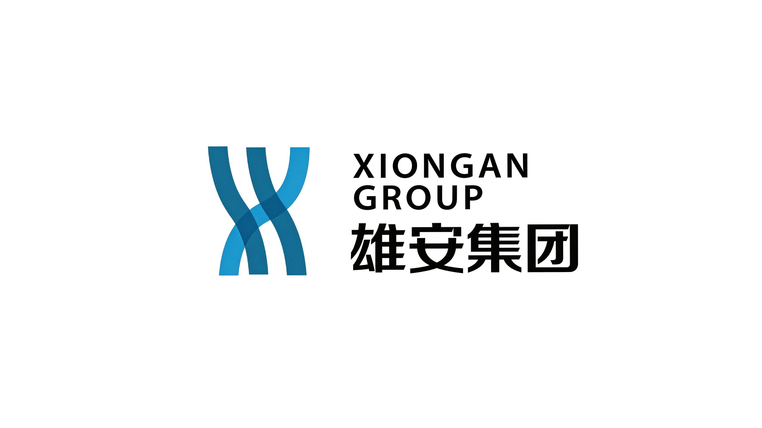
Xiongan Group is the core platform enterprise for the development and construction of Xiongan New Area and shoulders the national mission of promoting the planning and construction, industrial introduction and urban operation of the new area. Xiongan New Area is a millennium plan and a national event. It is positioned as a centralized place to relieve Beijing's non-capital functions and is committed to building a green, ecological and livable new city and a leading area for innovation-driven development.
"Xiong" means majestic and majestic, symbolizing the grand pattern of the millennium plan; "An" means stability and tranquility, symbolizing the beautiful vision of people living and working in peace and contentment. Qingmei Future was commissioned to lead the brand identity design.
The design goal of the brand logo is to demonstrate the strategic position of Xiongan Group as the core construction subject of the national new district through the visual language of national strategic heights, green ecological concepts and future urban vision.
design concept
The logo takes "City of the Future" as its core concept and integrates the abstract city skyline with green ecological elements to create a dual image symbol that not only represents the power and order of modern urban construction, but also conveys the concept of green ecological livability. The design starts from the planning concept of "world vision, international standards, Chinese characteristics, and high-point positioning" to convey the brand vision of "rising a future-oriented thousand-year city on the bank of Baiyangdian".
graphic language
The main body of the graphic consists of several ascending vertical color blocks forming an abstract city skyline. The heights are staggered and the rhythm is orderly, just like a future city rising from the ground. The tops of the color blocks converge at different heights to form a jagged urban outline, reflecting the urban spatial pattern of Xiongan New Area's "density and interweaving of blue and green". The lower part of the figure lifts up the entire skyline with a stretched arc, which is like the water ripples of Baiyangdian - Baiyangdian is the largest freshwater wetland in the North China Plain. "The city is on the water and the water is in the city" is a unique endowment that distinguishes Xiongan from other new districts. The softness of the arc of the water injects natural warmth into the strength of the skyline above, conveying the core concept of "harmony between man and nature". The overall graphic shows an upward dynamic trend, symbolizing the construction process of Xiongan New Area from "a blank piece of paper" to "a thousand-year city". The overall composition uses a double-layer structure of "upper city and lower water, combining rigidity and softness" to build a "future city by Baiyangdian".
Font composition
The Chinese "Xiong'an Group" uses modern boldface, with thick and square strokes, and an open and powerful structure, conveying the authority and sense of mission of a national platform enterprise. The English "XIONG'AN GROUP" is arranged below the Chinese characters in standard capital sans-serif fonts to ensure clear identification of the brand in international investment promotion and global city communication. Chinese, English and graphics form a horizontal brand structure of "pictures on the left and text on the right", which is overall robust and majestic.
color system
The main color, Xiongan Blue #1A5FAC, represents national strategy, technological innovation and smart cities, conveying the unshakable strategic determination of the Millennium Plan with a calm tone. Auxiliary ecological green #3AAE5B represents green ecology and sustainable development, directly reflecting the planning concept of "blue and green intertwined, fresh and bright" - blue is the water of Baiyangdian Lake, green is the forest of thousand-year-old beautiful forest, and the intertwining of blue and green is the ecological gene of Xiongan. Auxiliary morning glow gold #D4A85C symbolizes the rising sun and the renewal of all things, conveying a bright future from blueprint to reality. Pure white #FFFFFF symbolizes the starting point of "a blank sheet of paper to draw the most beautiful and latest pictures". The overall color is blue and green as the dual core, reflecting the brand temperament of "a smart new city intertwined with blue and green".
Application extension
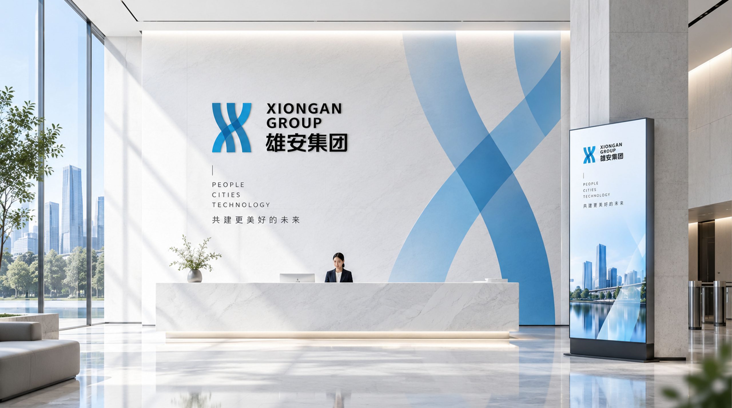
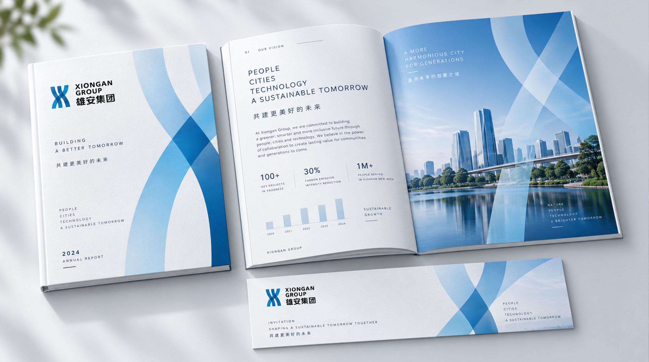
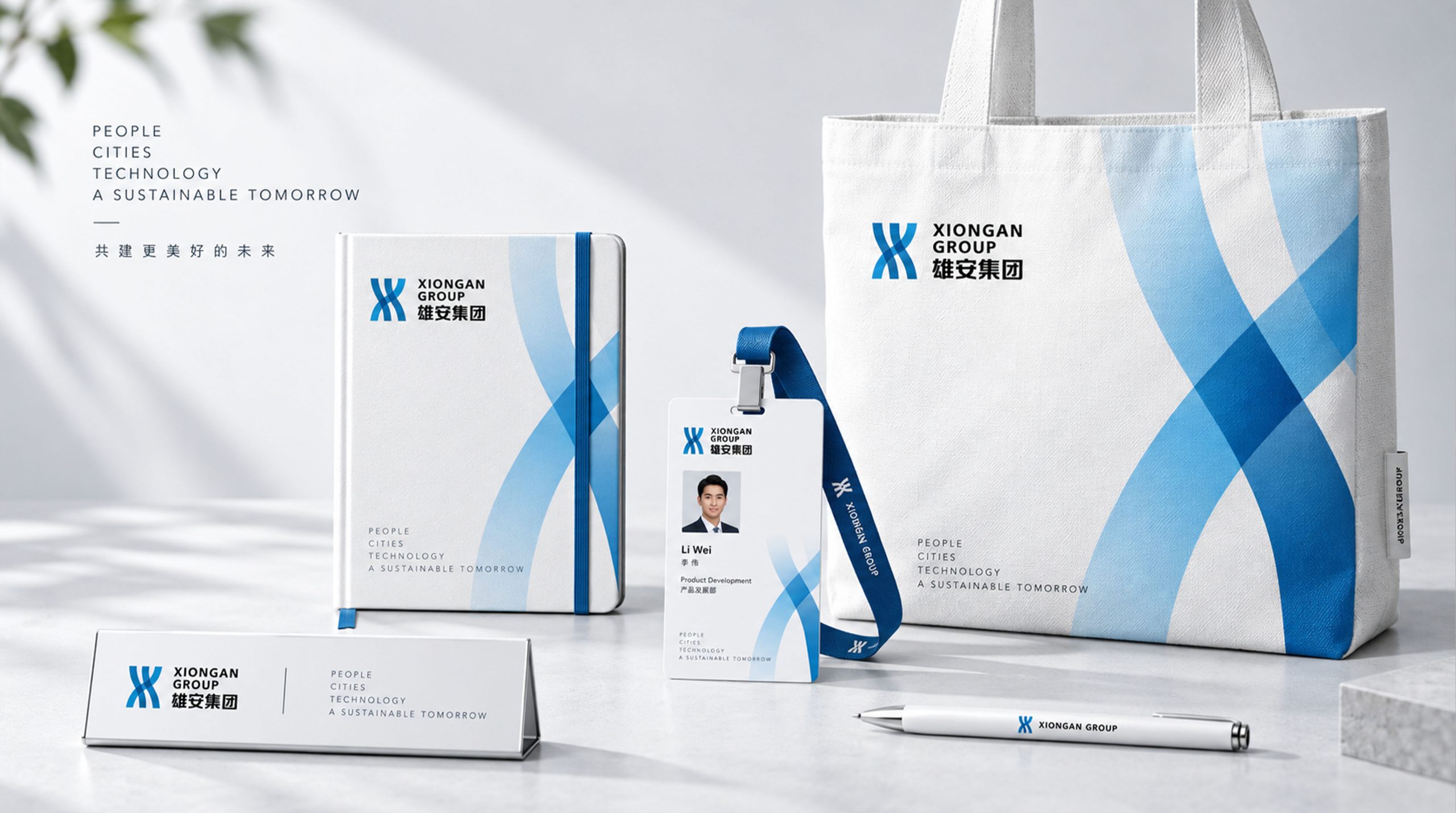
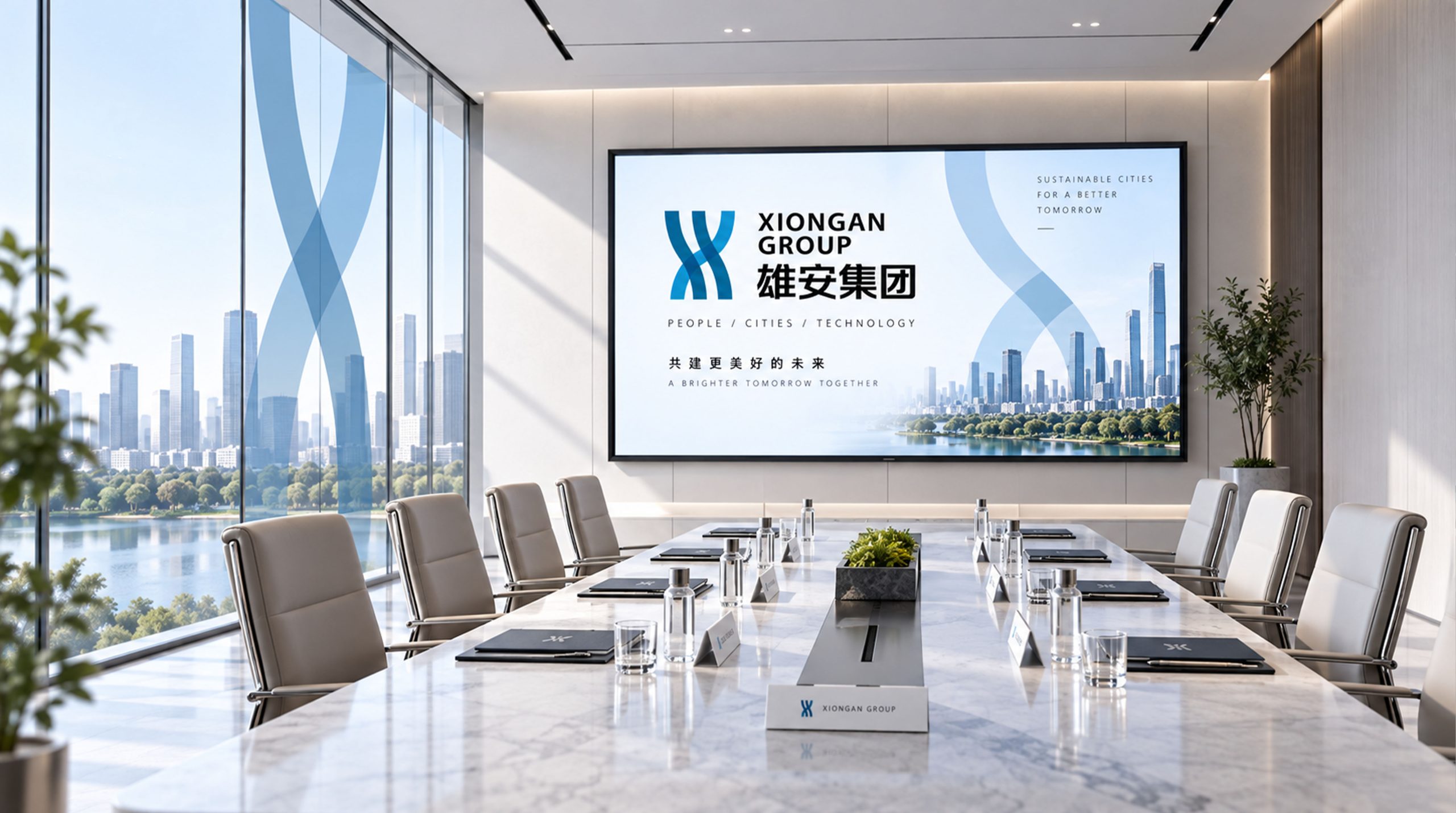
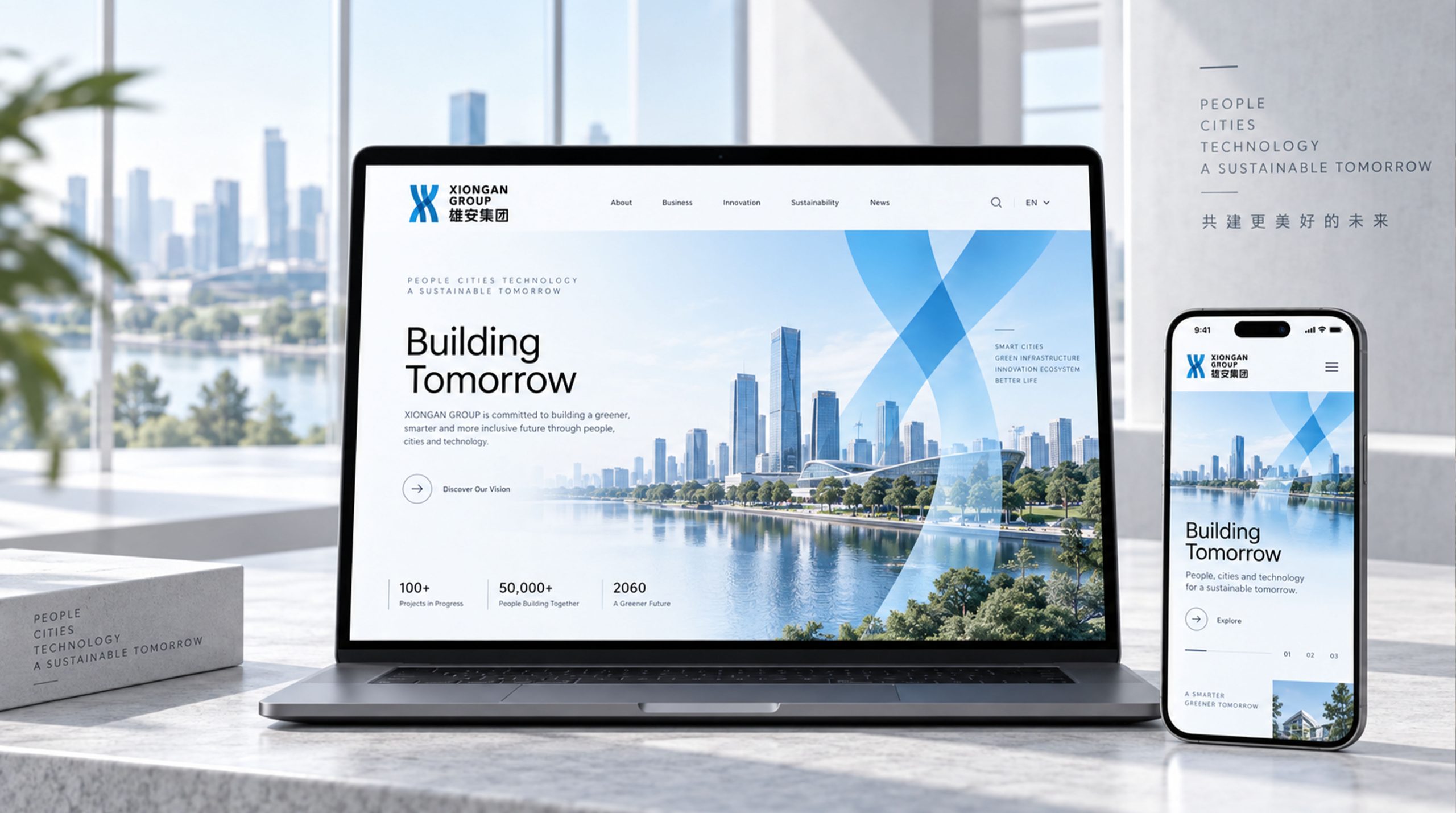
The logo can be widely used in new district planning exhibition centers, group headquarters buildings, construction site enclosures and urban guidance systems; investment brochures, project documents and investor relations materials; official websites, smart city management platforms and digital service APPs; national planning reports, Beijing-Tianjin-Hebei Collaborative Development Forum and international smart city conference images. In the dynamic vision, the arc of water waves ripples from the bottom, and the city skyline rises from the water in sequence, symbolizing the construction journey of Xiongan New Area from blueprint to reality. The skyline and water arc can be extended into visual parent elements for construction progress charts, city zoning signs, and smart city data interfaces.
brand meaning
The logo contains three core images: Millennial Plan - the upward rise of the city skyline conveys the national strategic construction ambition; Blue-Green Symbiosis - the dual-core blue and green color scheme reflects the ecological planning concept; City of Tomorrow - the integration of the city outline and water waves symbolizes the rise of a future-oriented smart city on the banks of Baiyangdian. The overall design conveys the brand vision of "building a thousand-year city and building a future Xiongan".
Improper Usage (Protection Specification)
Do not change the number, height rhythm or spacing ratio of the skyline color blocks; do not modify the curvature or supporting relationship of the water wave arc; do not change the hue or primary and secondary relationships of the blue and green dual-core color matching; do not add strokes, shadows or excessive decorative effects; do not separate the skyline and the water wave arc for separate use; keep the white space ≥ 25% of the graphic height; the minimum display width shall not be less than 35mm.
design results
After the release of the logo, Xiongan Group's brand unity and strategic image in the fields of national new district construction and smart cities have been significantly improved. "City of the Future" has become the core identification symbol of Xiongan Group's brand system and is widely used in new district construction, investment promotion and international exchanges, demonstrating the brand vision of "building a thousand-year city and building a future Xiongan".