










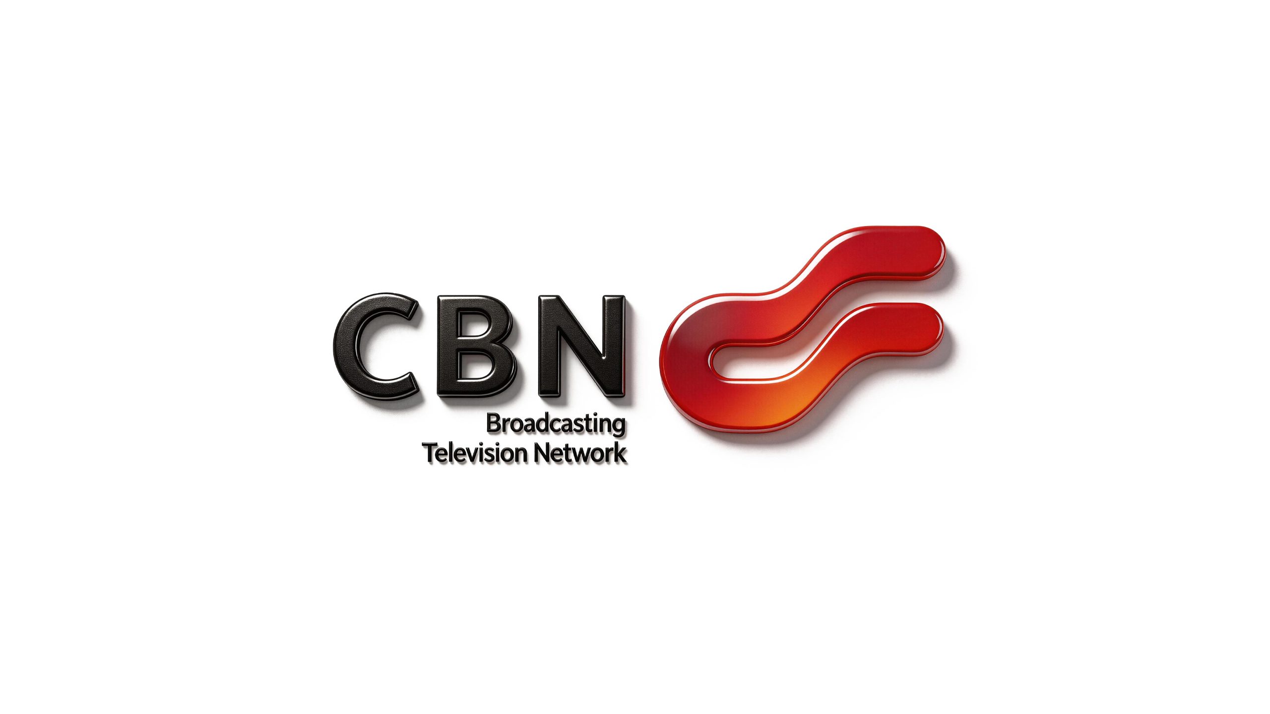
China Broadcasting Network (CBN) is the main operator of the national radio and television network. As the fourth largest basic telecommunications operator in China, it shoulders the important mission of building a national cable network, 5G communications and media integration platform.
With the strategic vision of "China's voice connects the world and science and technology communication faces the future", the brand is committed to building a new generation of broadcast communication infrastructure that covers the country and connects the world. Qingmei Future was commissioned to lead the brand identity design.
The design goal of the brand logo is to demonstrate the strategic height of China Radio and Television as a national communication and information infrastructure operator through a sense of technology, authority and global visual language.
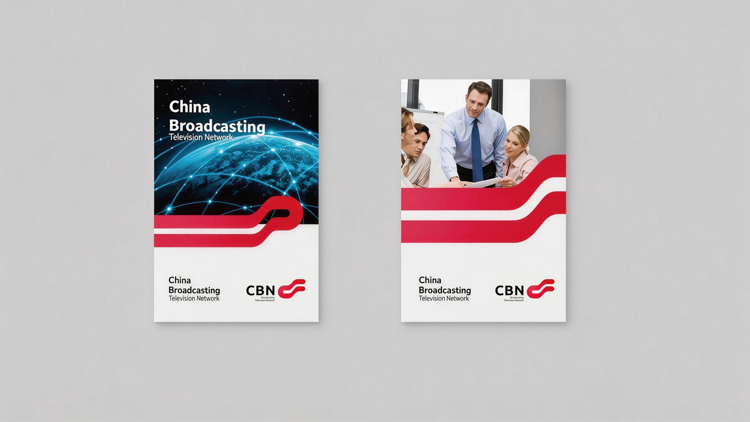
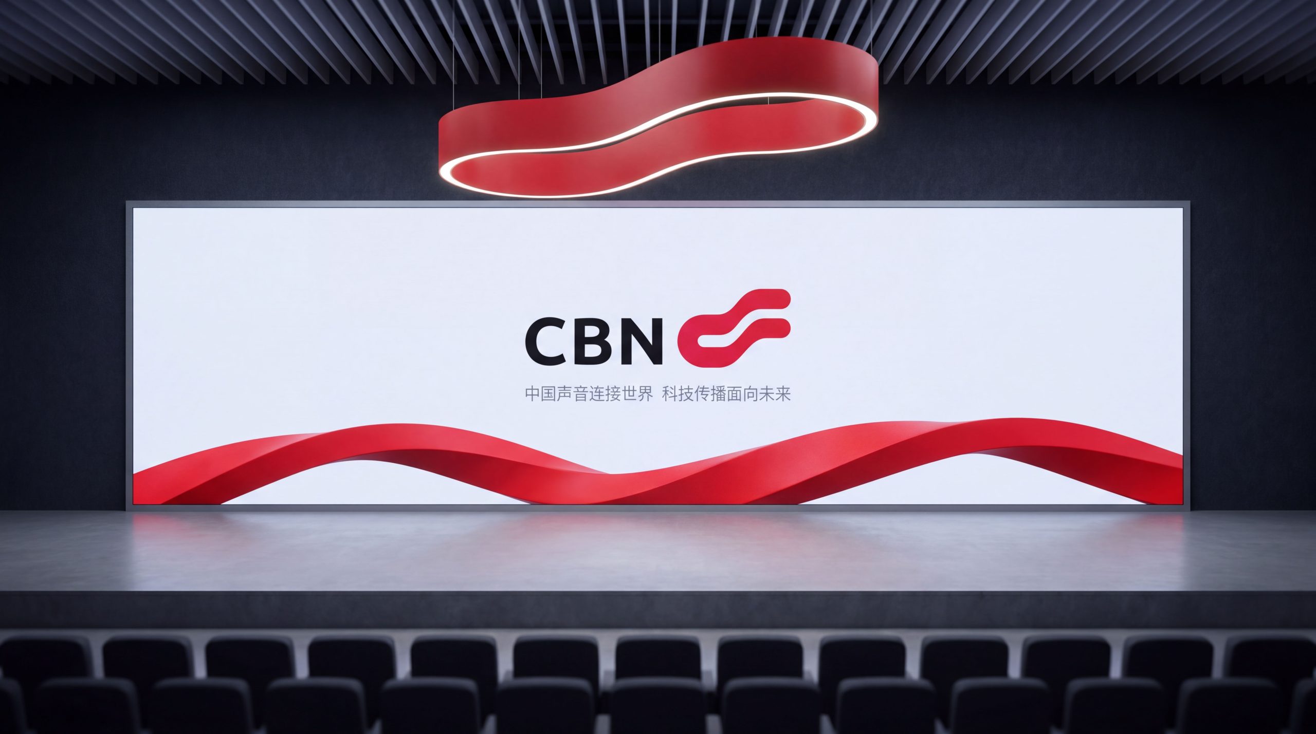
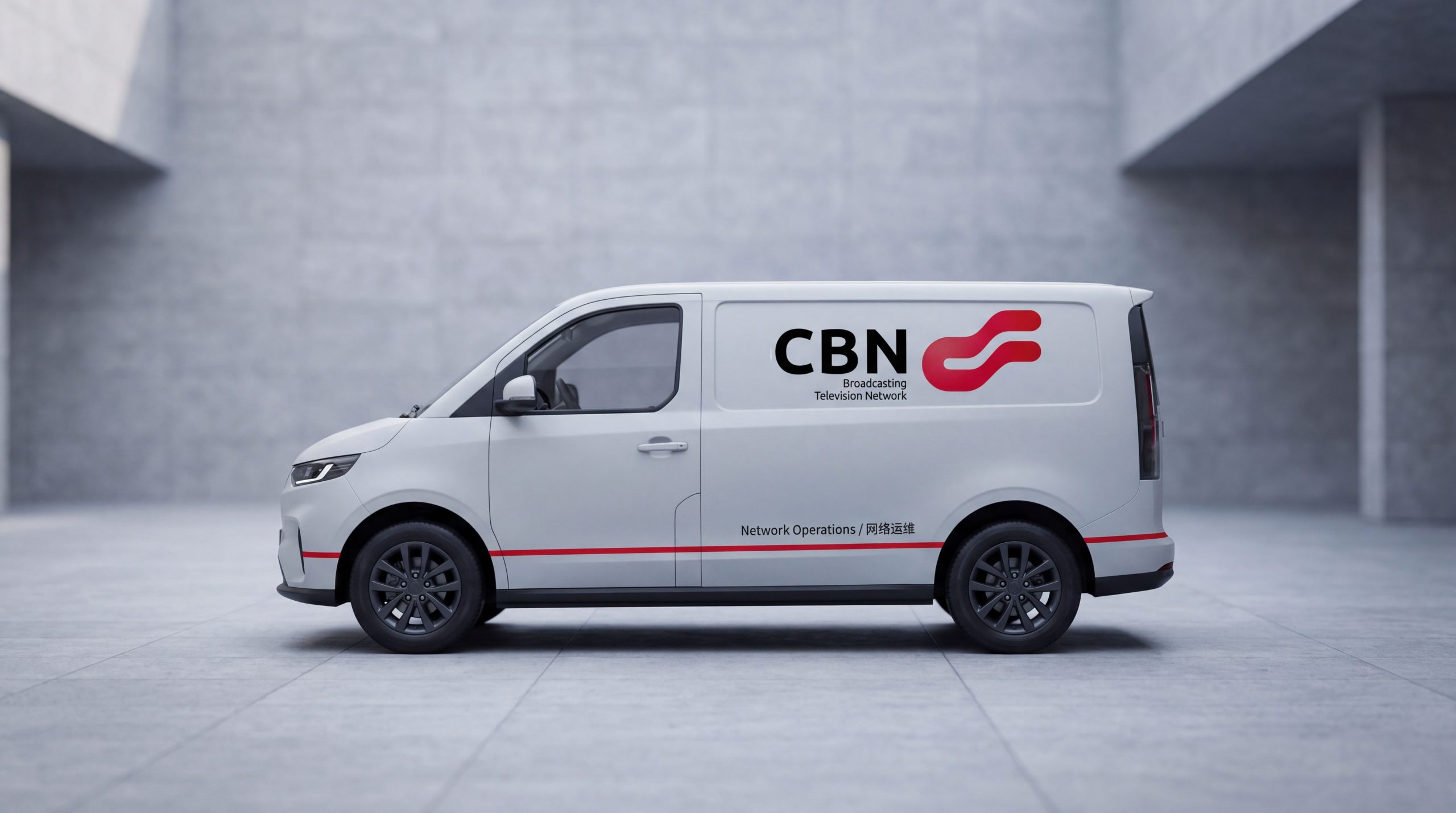
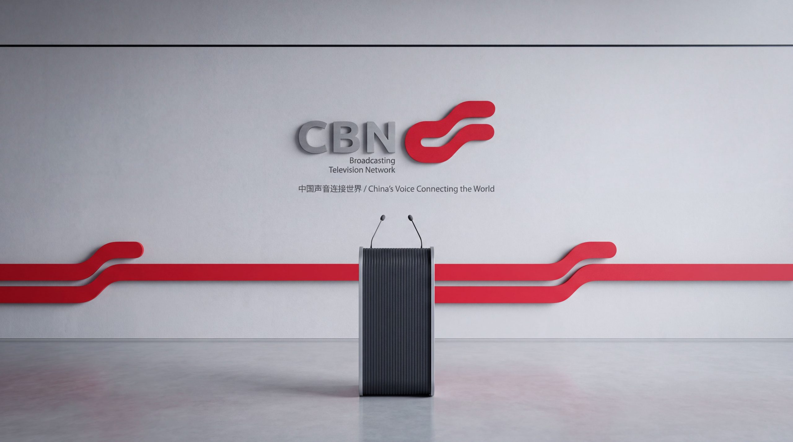
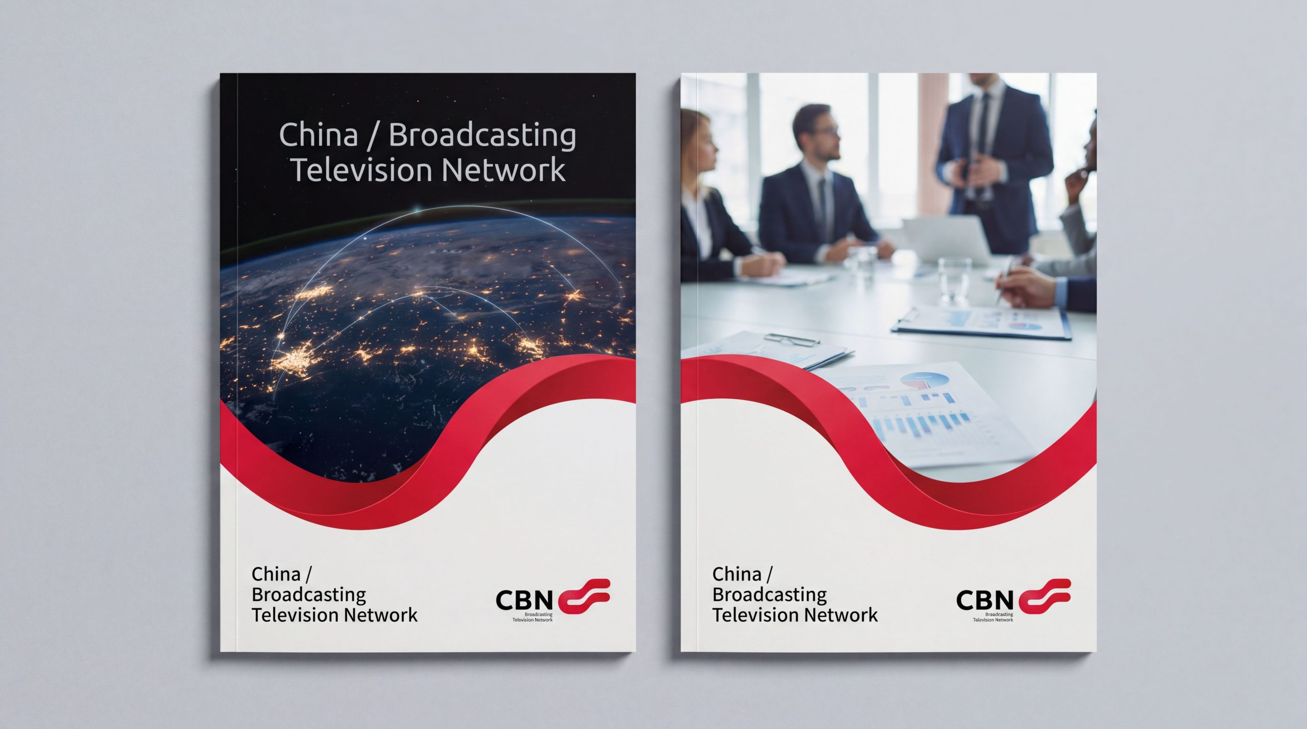
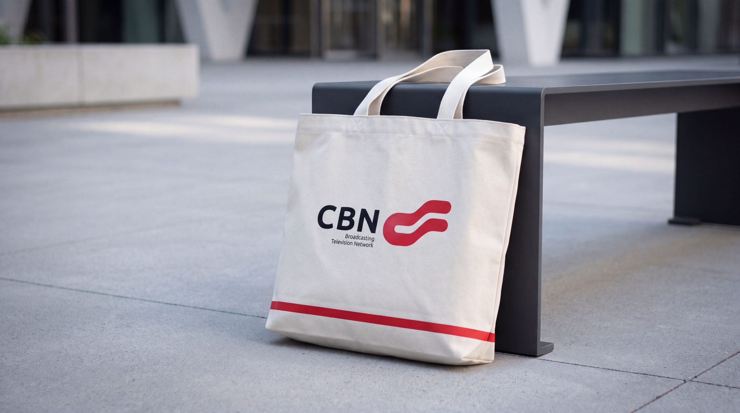
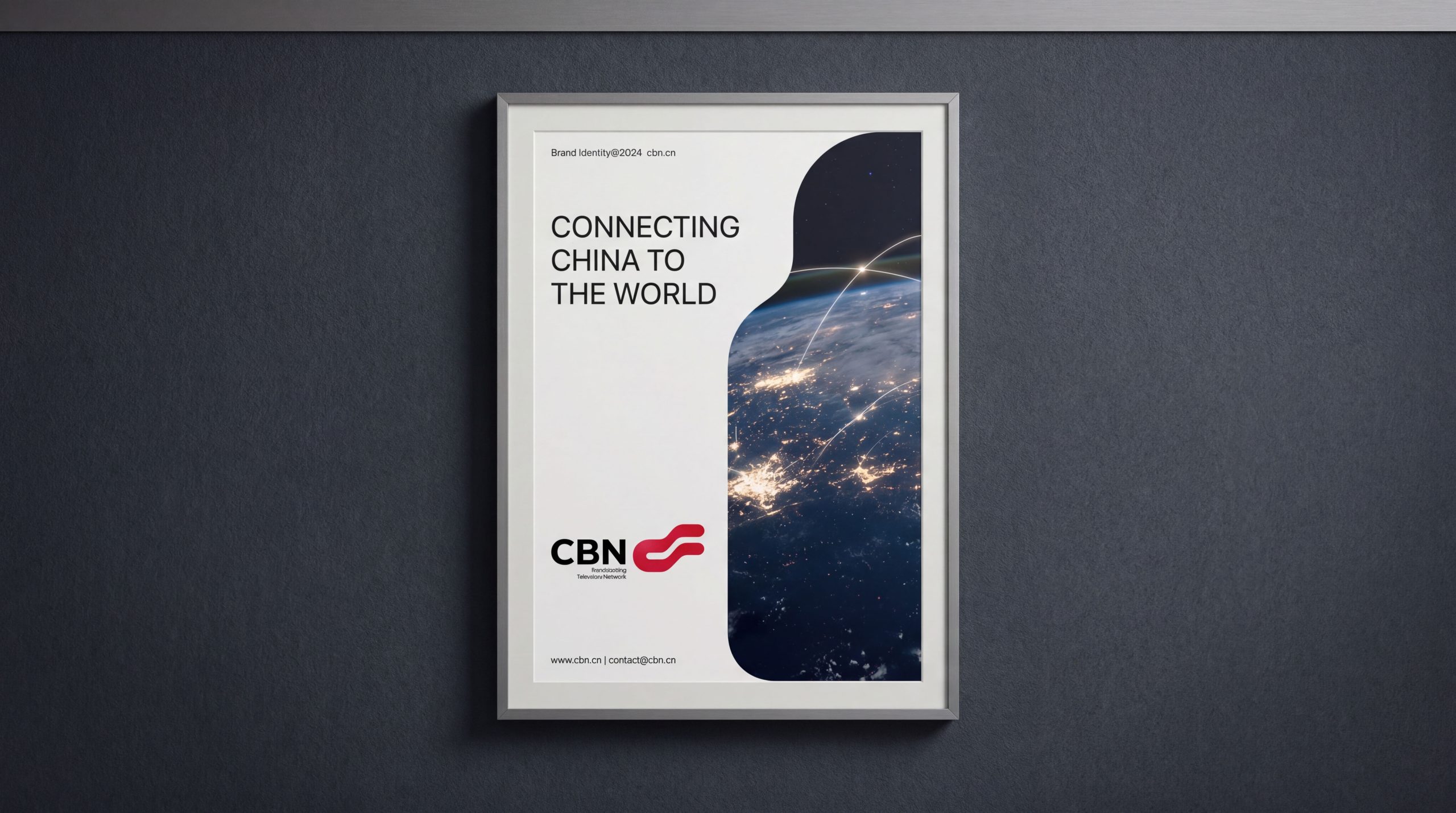
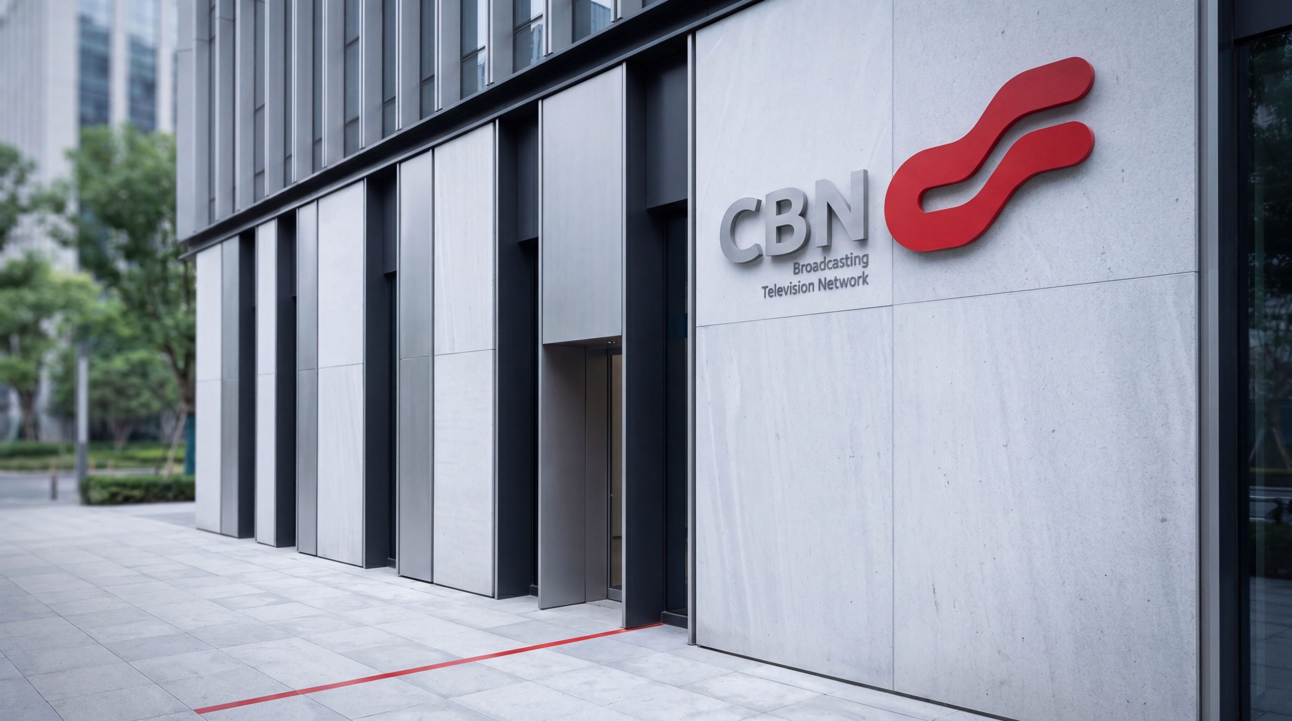
design concept
The logo takes "Information Globe" as the core concept, with a blue sphere as the main body and a surrounding light arc pattern, symbolizing the coverage trajectory of global broadcast networks and communication signals. The dynamic arcs in the graphics represent information flow and spectrum fluctuations, implying "China's voice connects the world and science and technology spreads the future." The overall design reflects the dual attributes of media integration and digital communication of the radio and television brand in the new era.
graphic language
The spherical structure is the visual core of the logo, presenting the grand scale of the global communications pattern and national network system in a complete circle. The spherical surface uses a gradient transition between dark and light blue to create a three-dimensional sense of spatial depth, just like the magnificent perspective of overlooking the earth from space. Several radiating arcs extend outward from the surface of the sphere, representing broadcast signal propagation, data flow and smart communication. Each arc is like an electromagnetic wave emitted from a signal tower, traveling through space at the speed of light to reach thousands of households. The vertical and horizontal lines of longitude and latitude on the surface of the sphere imply the multi-dimensional network structure and interconnection. Each intersection node is a signal base station, data center and smart hub. The blue gradient space transitions from dark blue at the center of the sphere to bright blue at the edge, reflecting the depth of technology and the sense of the future. The overall composition uses a rigorous geometric order to build a "ball of technology communication" to convey the brand's global vision and systematization capabilities.
Font composition
The English letters CBN use a stable square sans-serif font, with broad and thick fonts and linear strokes, conveying the authoritative temperament of a national brand. The Chinese "China Radio and Television" is presented in a modern boldface with a balanced structure, with straight strokes and moderate spatial proportions, ensuring visual consistency when Chinese and English are mixed. The blue horizontal line runs between Chinese and English, symbolizing "signal bandwidth and information channel", forming an overall systematic brand logo composition.
color system
The main color, technological blue #1A4D8F, represents communication technology, radio and television authority and national image, conveying the professionalism and reliability of national operators with a calm and rational tone. Auxiliary silver gray #A7ADB3 symbolizes modernization, rationality and international vision, conveying the precision and efficiency of information infrastructure with a calm and restrained metallic texture. High-gloss white #FFFFFF is used for signal arcs and spherical light to enhance the technological level. Dark blue gradient #0D274E → #1A4D8F expresses the depth of communication and the flow of energy, symbolizing the complete flow path of information from the core to the terminal. The overall color system reflects the solemnity and futuristic feel of the "National Science and Technology Communication Agency".
Application extension
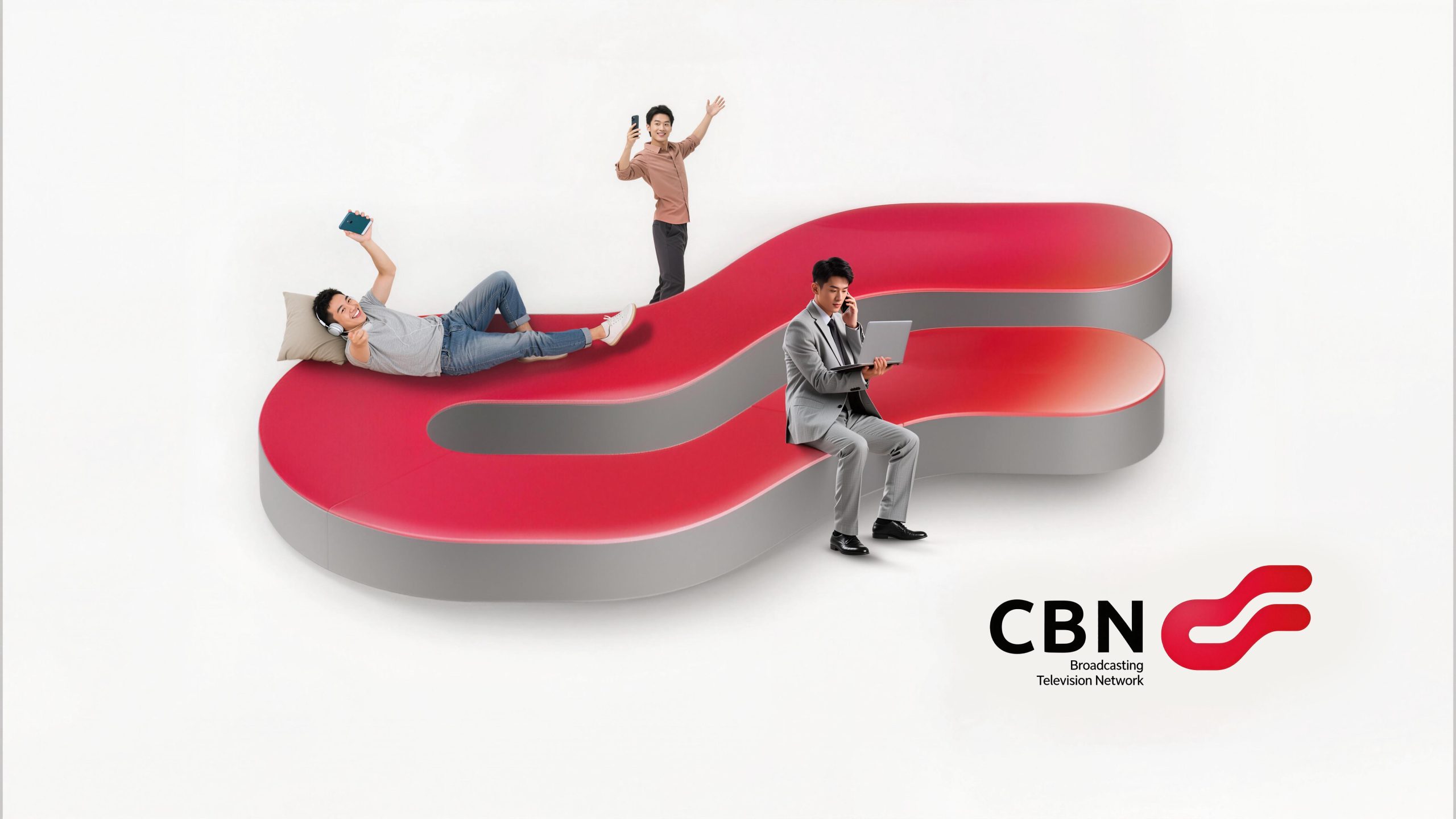
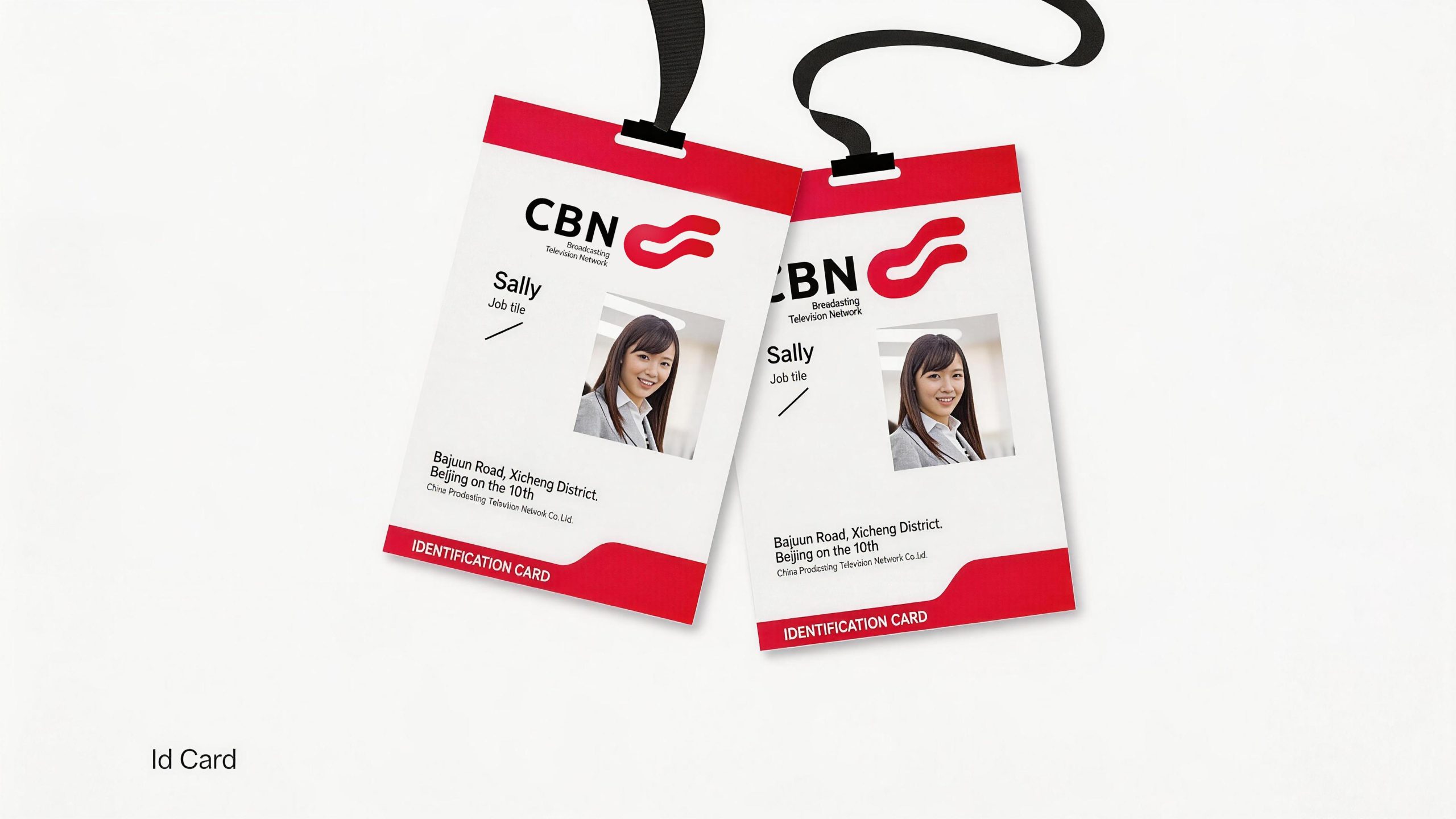
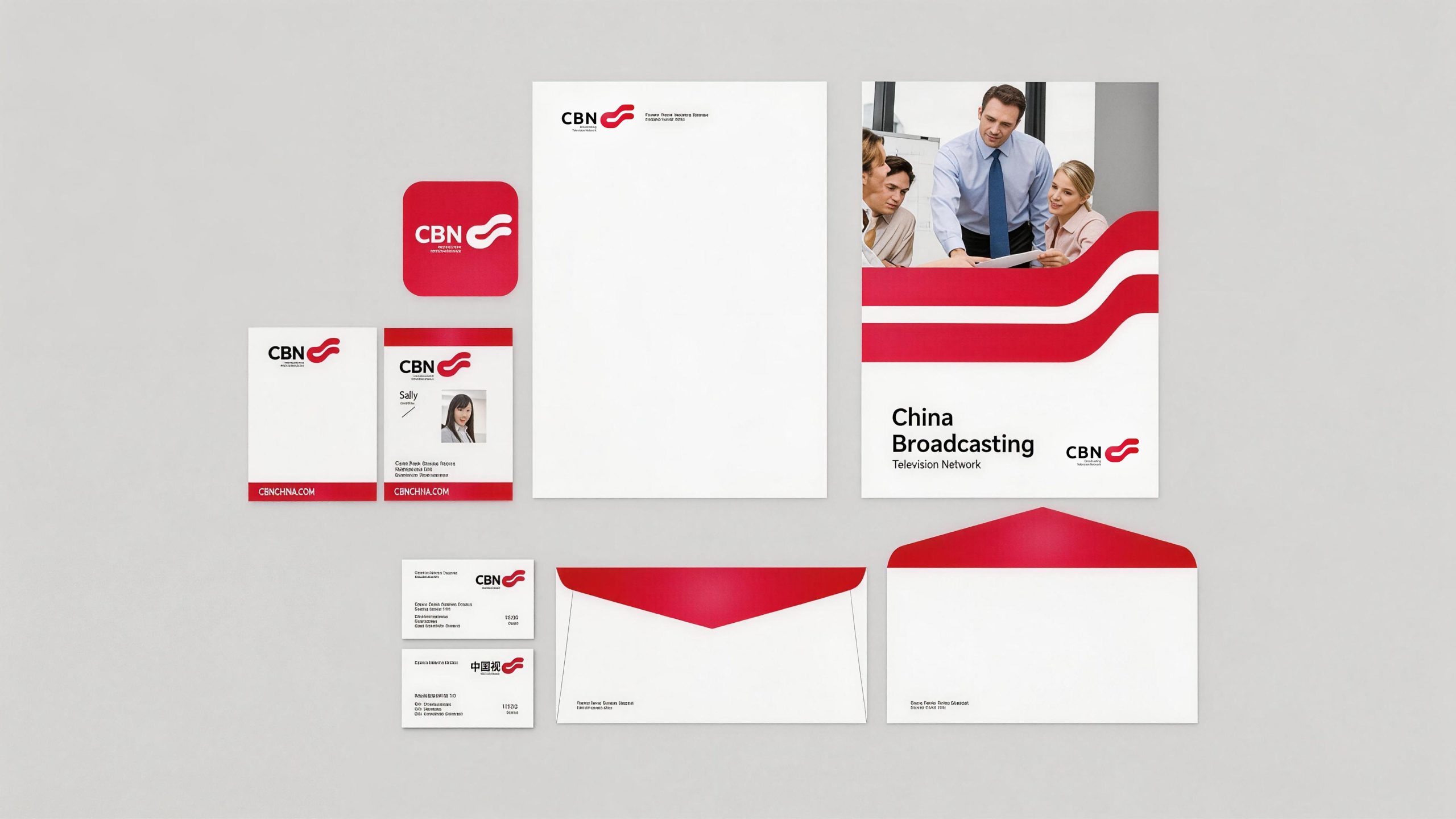
The logo can be widely used in the State Administration of Radio, Film and Television, communications operation platforms and 5G terminal equipment; media news channels, studio guides and signal transmission equipment; radio and television building facades, press conference backgrounds and international exhibition images; 5G business hall door headers, digital service platforms and user terminal packaging. In the dynamic vision, the arc can rotate around the sphere, symbolizing the never-ending flow of global information; the sphere can gradually emerge from the deep blue space, and the longitude and latitude lines on the surface light up in sequence, symbolizing the strategic process of China Radio and Television's comprehensive upgrade from radio and television to 5G communications. Graphic spheres can be extended into visual parent elements for channel logo animations, data visualization charts, and brand graphics systems.
brand meaning
The logo contains three core images: National Communications Hub (National Network) - the sphere represents the strategic height of the global broadcast communications pattern and the national network system; Smart Media (Smart Media) - the arc symbolizes the flow of data, the high-speed transmission of 5G signals and radio and television signals; Culture Connects the World (China Voice) - the blue light represents the international communication of Chinese culture, delivering the communication mission of "letting the voice of China reach every corner of the world". The overall design conveys China Radio and Television's national communication pattern of "based on China and facing the world".
Improper Usage (Protection Specification)
Do not change the number, direction or proportional relationship between the arc and the sphere; do not modify the main blue color or gradient level; do not add shadows, strokes or decorative light effects inconsistent with the technological style; do not rotate, tilt the sphere or use part of the arc alone; keep the white space ≥ 25% of the diameter of the graphic; the minimum display width shall not be less than 35mm.
design results
After the release of the logo, China Radio and Television's brand unity in the national media and communications industry has significantly improved. "Blue Earth + Dynamic Arc" has become the core visual identity symbol of its 5G and media integration business. The logo is widely used in international conferences and national-level projects, demonstrating the brand vision of "Chinese Voice, Global Communication".