










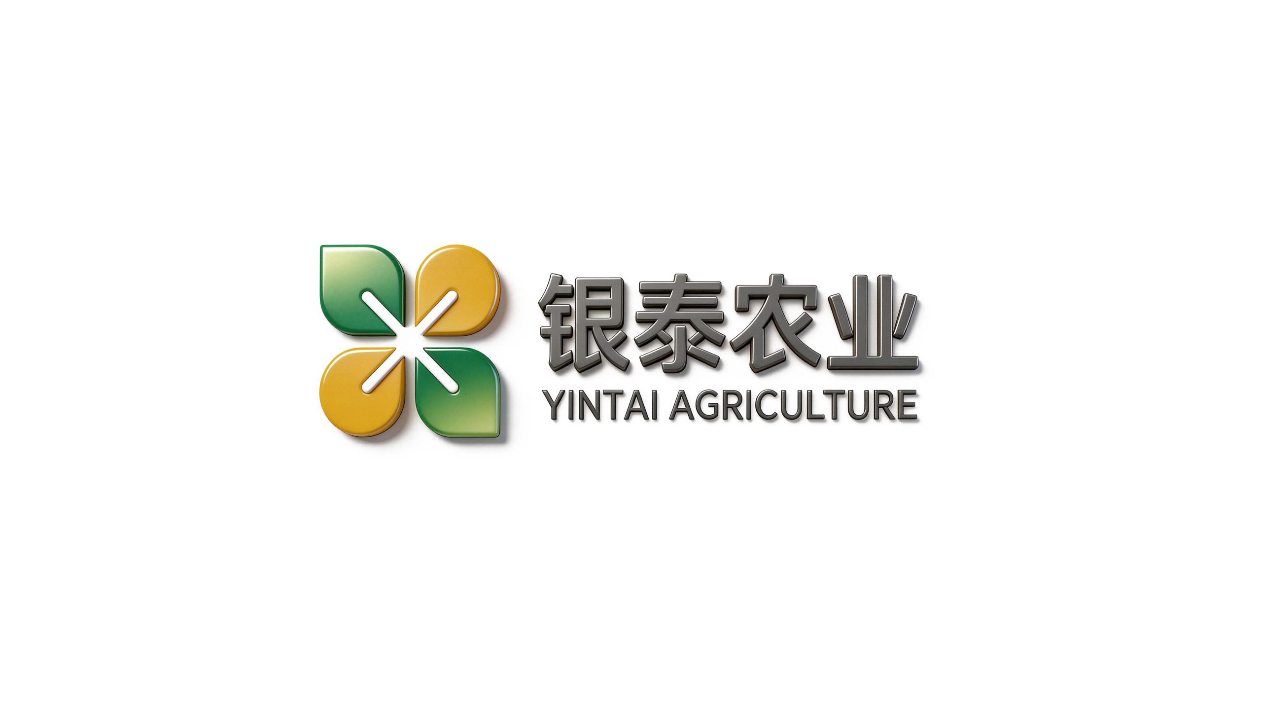
Yintai Agriculture is a comprehensive agricultural enterprise with modern agricultural industrialization as its core. Its business covers the cultivation of high-quality agricultural products, green food processing, agricultural technology research and development, and agricultural product supply chain management. It is committed to empowering traditional agriculture with technology and enhancing the value of agricultural products with quality.
The brand name "Yintai" contains the beautiful meaning of good harvest and peace and tranquility - "Yin" means silver and abundant silver, symbolizing the richness of the harvest and the precious value of agricultural products; "Tai" means Antai and Tongtai, symbolizing the steady and smooth agricultural management and the peaceful and harmonious growth of all things. Qingmei Future was commissioned to lead the brand identity design.
The design goal of the brand logo is to demonstrate the industry positioning of Yintai Agriculture as a modern agricultural enterprise through the visual language of green ecology, abundant harvest and modern agricultural technology, and to convey the brand image of "green harvest, science and technology to promote agriculture, and safe and peaceful thousands of families".
design concept
The logo takes "Silver Harvest" as the core concept and integrates a bunch of plump wheat ears with upward-growing green leaves to create a brand symbol that not only conveys the joy of harvest but also carries green ecology. Wheat ears are the most intuitive visual symbol of global agricultural brands - the heavy ears symbolize the harvest and the gifts of the earth; the green leaves represent the ecological foundation of agricultural production and the concept of sustainable development. The integration of the two enables the brand to achieve a unified expression between "harvest value" and "green quality".
graphic language
The main body of the graphic takes an artistically refined bunch of wheat ears as the visual core. The wheat ears are presented in a slightly curved arc, with plump and drooping heads and tall and powerful stalks, just like a heavy bunch of mature wheat ears gently nodding in the breeze in the autumn field - plump but not ostentatious, rich but not frivolous, conveying Yintai Agriculture's business attitude of dual pursuit of quality and yield. The grains are alternately arranged in several ovals along both sides of the cob, with a uniform and orderly arrangement. Each grain is plump and round like a miniature seed, conveying the substantial quality of agricultural products and the image of a good harvest when the grains are returned to the warehouse.
A stretched leaf stretches out on each side of the wheat ear. The leaves spread out from the base of the ear stem in a smooth arc. The shape is naturally stretched and full of vitality, just like the natural posture of a plant that thrives under the nourishment of sunlight and moisture. The arc of the leaves tilts upward slightly, giving the overall figure a high-spirited and upward growth momentum, conveying the vigorous corporate vitality of Yintai Agriculture and the industrial trend of modern agriculture's continuous upward breakthroughs. The leaves and wheat ears naturally gather at the base of the ear stalk, just like the organic unity of stems, leaves and ears of a plant, conveying the complete life cycle of the agricultural industry from sowing to harvesting.
The overall outline of the figure is in the shape of a shield or a teardrop that converges upward. The structure is narrow at the top and wide at the bottom like a full seed - a seed is the starting point of all agricultural values, and a seed contains a harvest field. The outer contour lines are rounded and smooth, using soft arcs to avoid sharp edges and corners, conveying the gentle temperament of an agricultural brand that is close to nature and close to the land. The overall composition constructs "Silver Sui Fengtai" with the growth structure of "ears stand on leaves and leaves grow on seeds", conveying the brand's pursuit of harvest and green foundation.
Font composition
The Chinese "Yintai Agriculture" uses a stable modern boldface, with thick and even strokes and a straight and open structure. The word "Yin" conveys the precious value of a good harvest, the word "Tai" conveys Antai's business belief of smoothness, and the word "Agriculture" directly clarifies the nature of the industry. The four characters are overall stable and majestic, conveying the sense of scale and professionalism of modern agricultural enterprises. The English "YINTAI AGRICULTURE" is arranged in standard uppercase sans-serif fonts with regular and clear fonts to ensure standardized recognition of the brand in agricultural product export trade and international agricultural cooperation. Chinese, English and graphics form a standard brand composition arranged up and down or left and right.
color system
The main color, harvest green #2E7D32, represents agriculture, ecology, growth and green quality. The deep and full green is like the rich emerald green of crop leaves in the fields in midsummer, conveying the ecological foundation of agricultural production and the natural health of the products. Harvest green is different from the light and tender sprout green. It uses mature and thick tones to convey the corporate maturity of Yintai Agriculture, which has passed the initial stage of entrepreneurship and entered a period of steady development. The auxiliary wheat ear gold #D4A017 is used as a harvest element in the wheat ear graphics and brand system. It is like the golden color of mature wheat ears in the sun in autumn, which directly activates people's instinctive emotional association with "harvest". The combination of green and gold is the most classic color combination for agricultural brands - green is the process of growth, gold is the result of harvest, and the juxtaposition of green and gold is the complete narrative of agriculture from sowing to harvest. Auxiliary fertile soil brown #6D4C2A is used as the earth element in the brand system and as the basic color of packaging. It is like the deep color of fertile black soil, conveying the brand foundation of Yintai Agriculture that is rooted in the land and respects nature. Pure white #FFFFFF is used as the standard background color and product packaging background. The overall color uses green gold as the dual core and earth brown as the supplement, reflecting the agricultural brand temperament of "green growth, golden harvest, and earth foundation".
Application extension
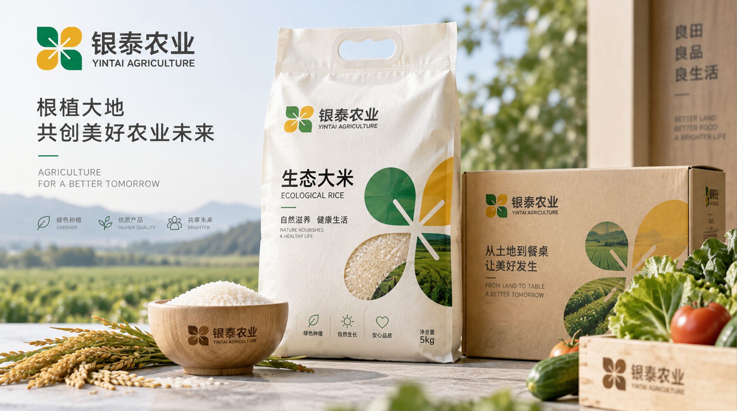
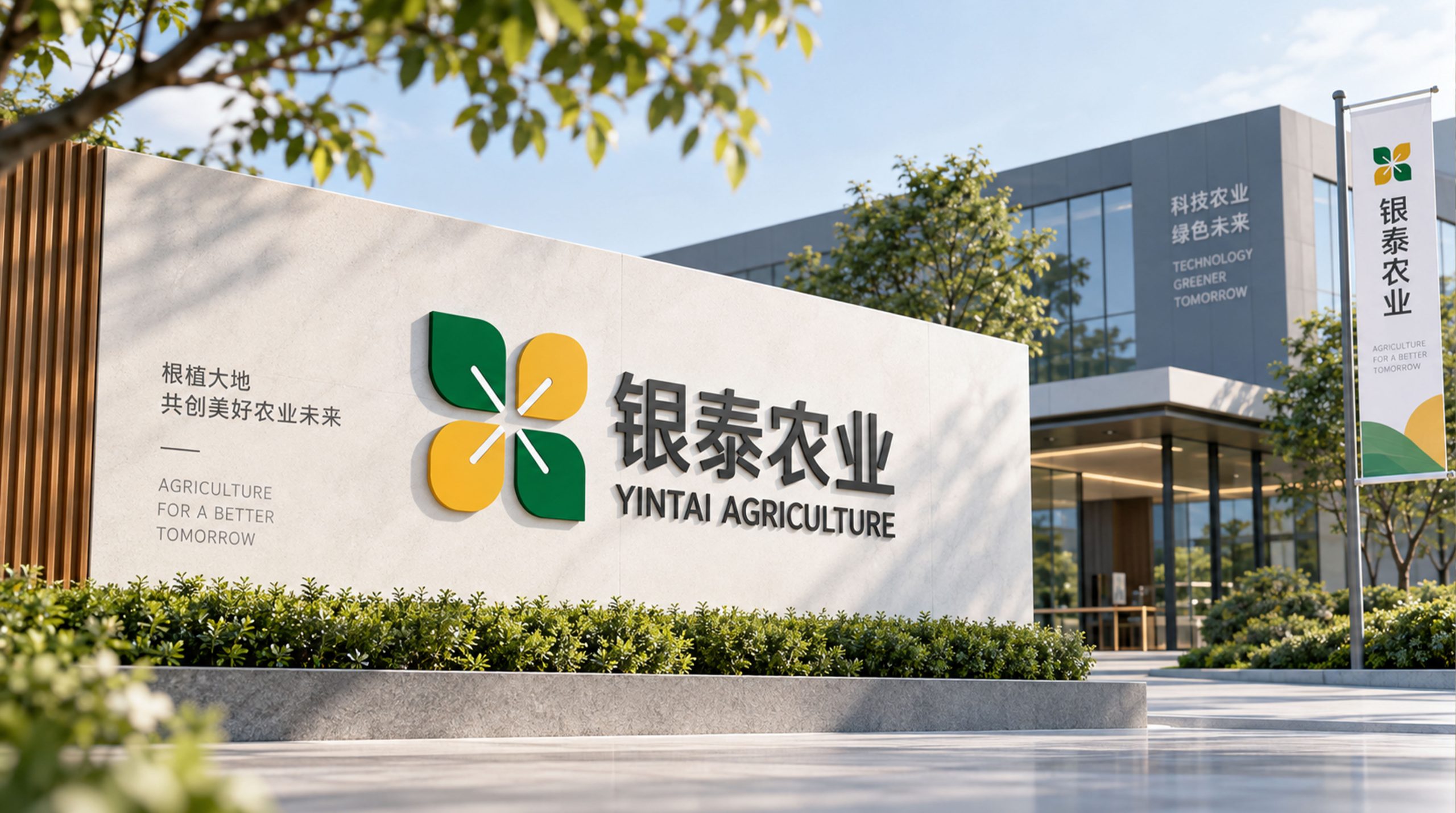
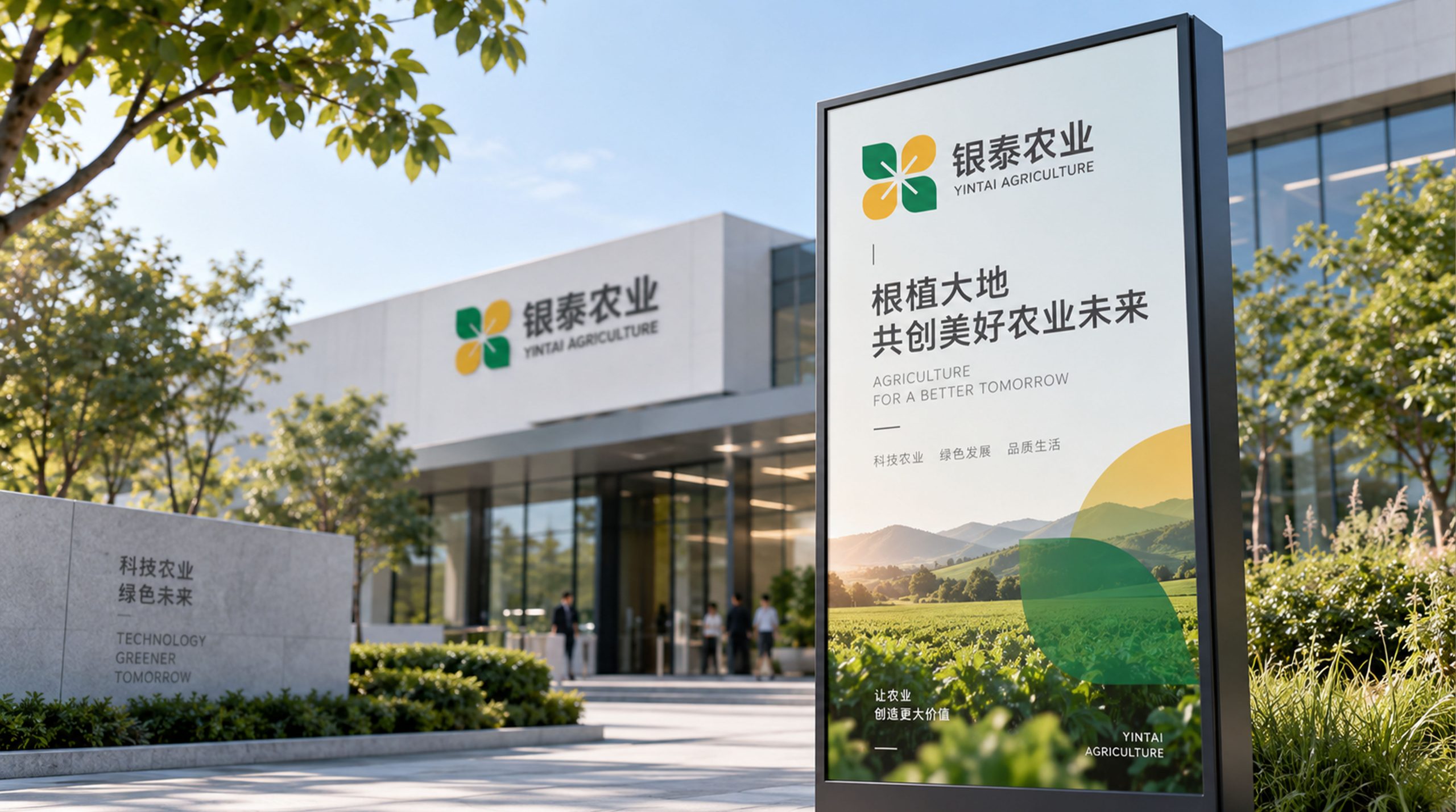
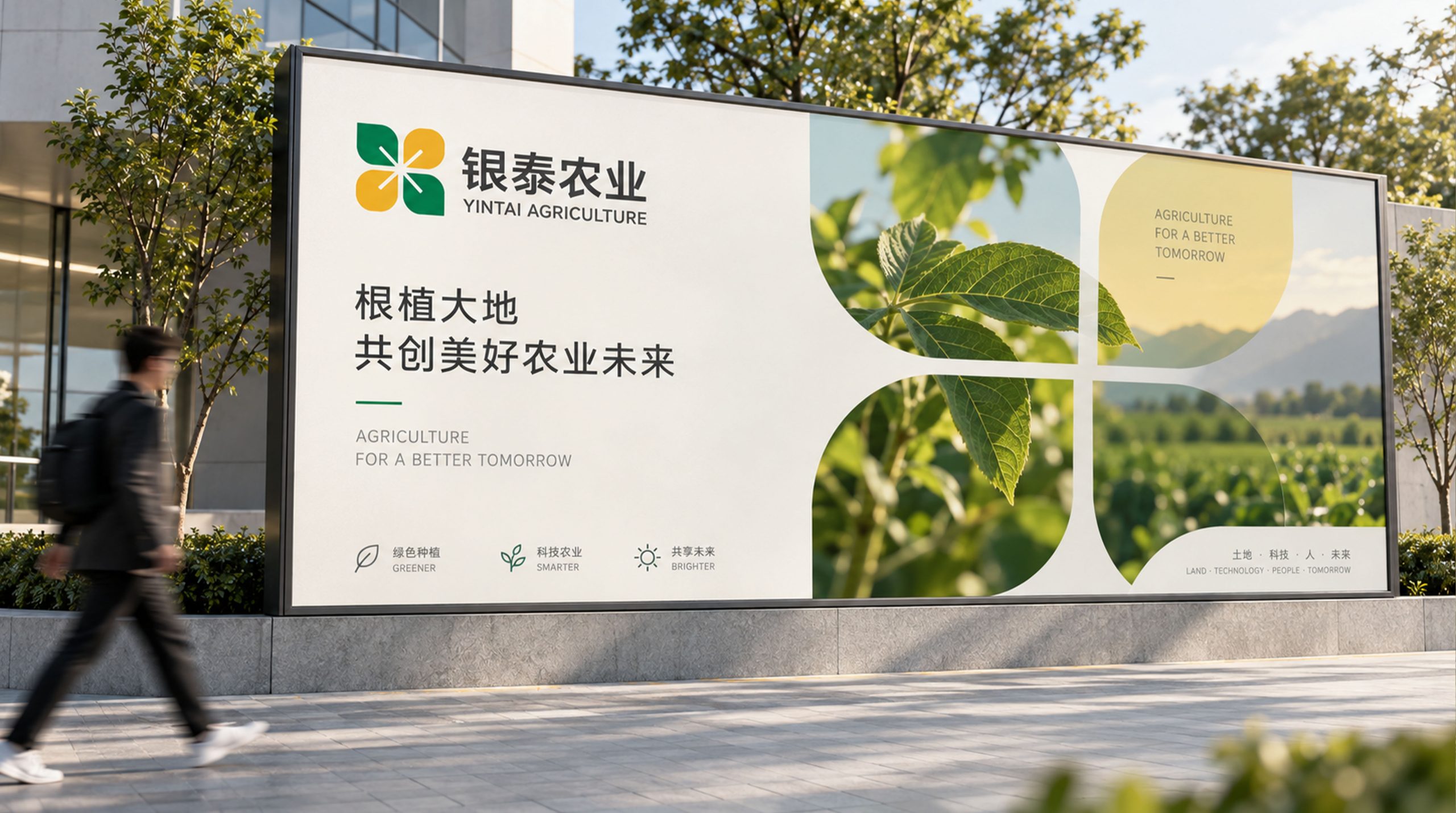
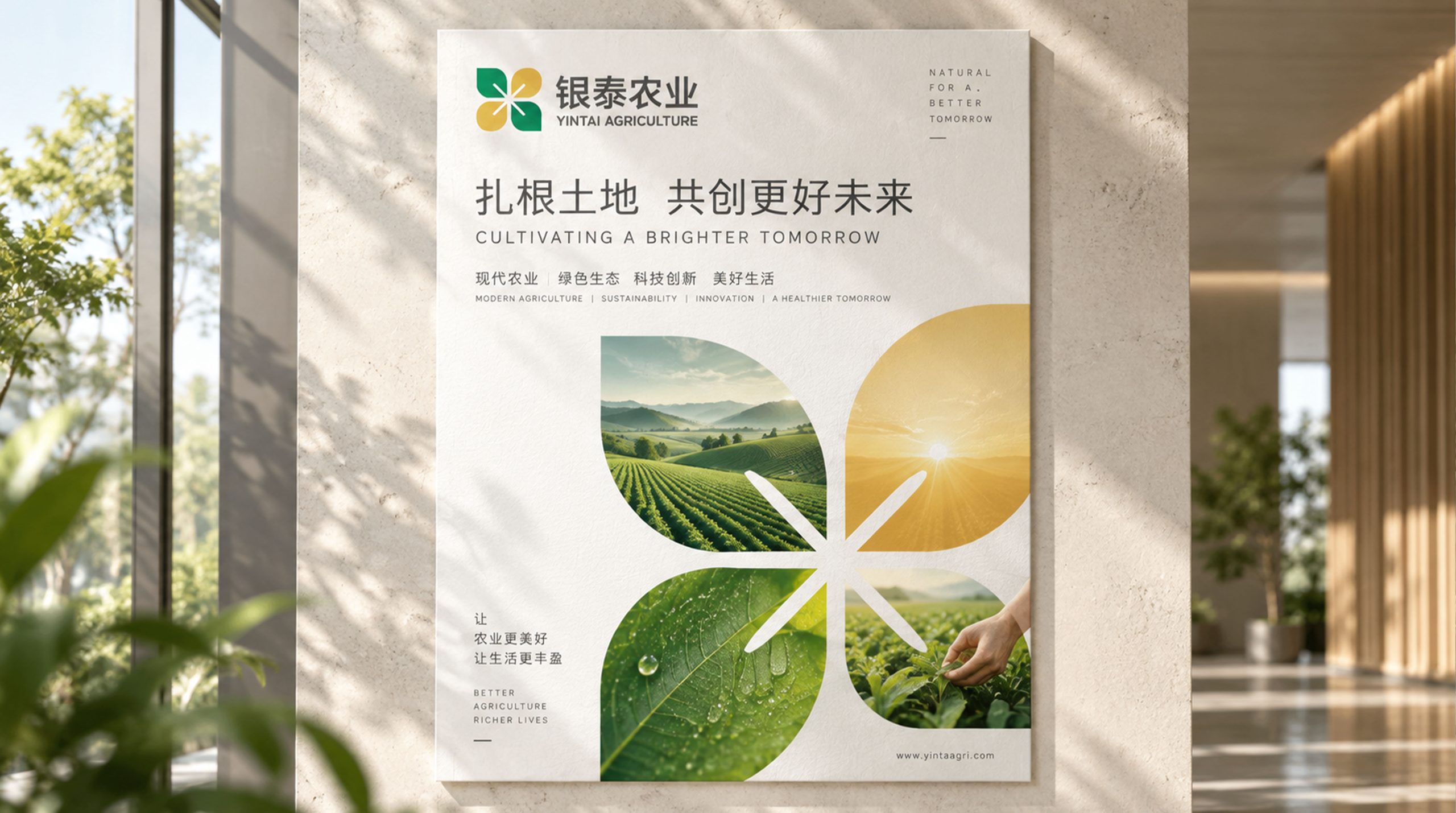
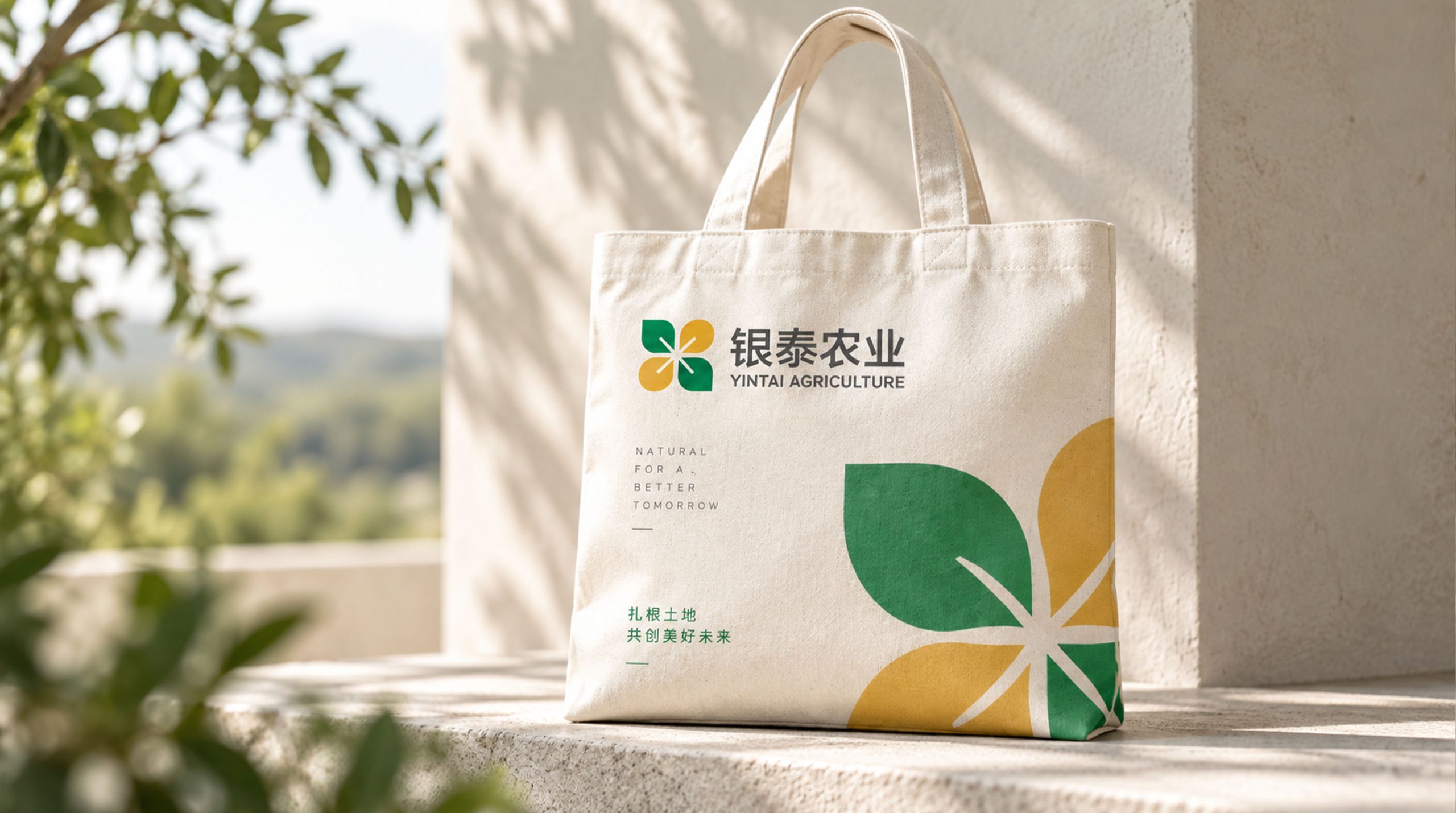
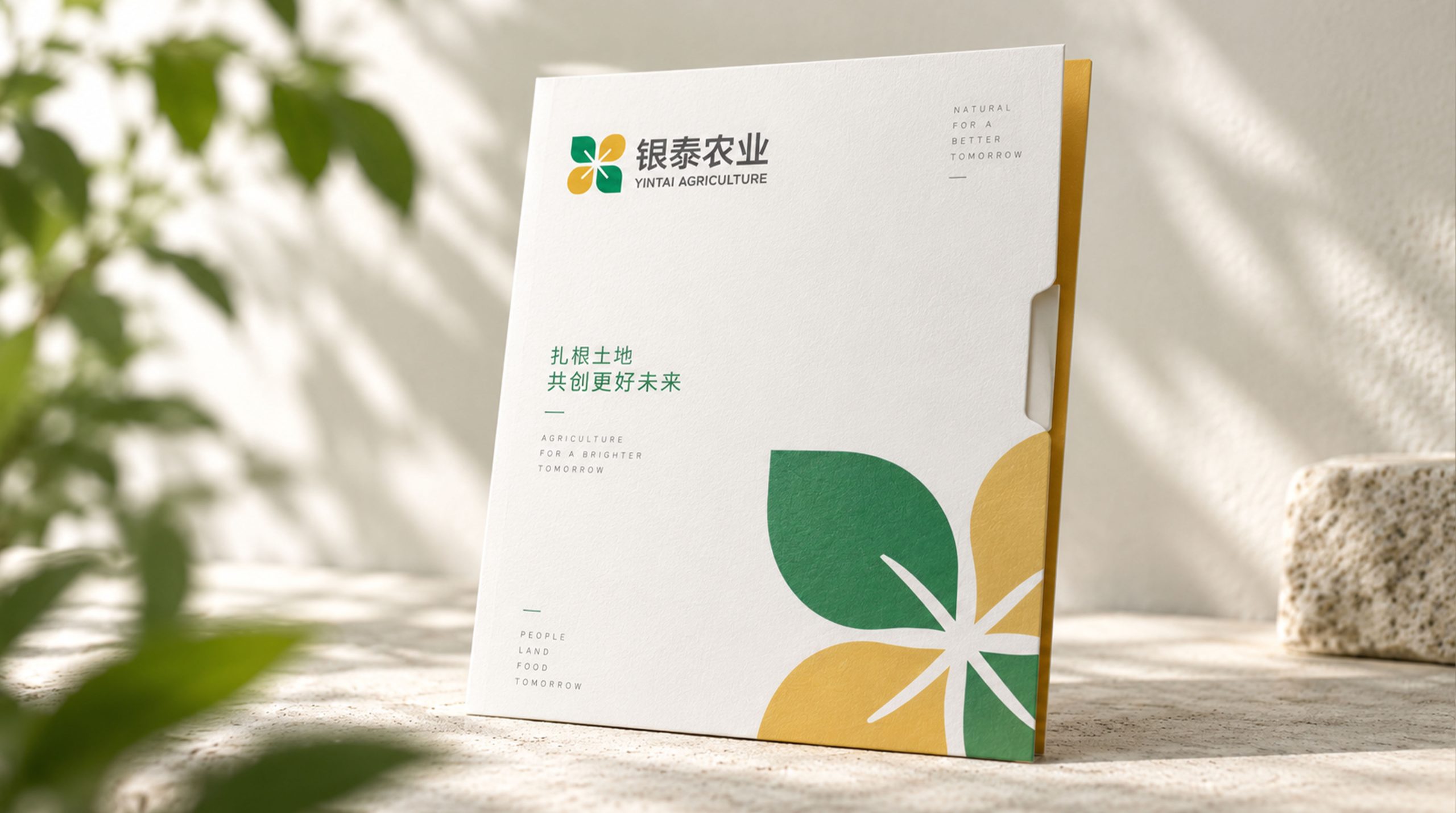
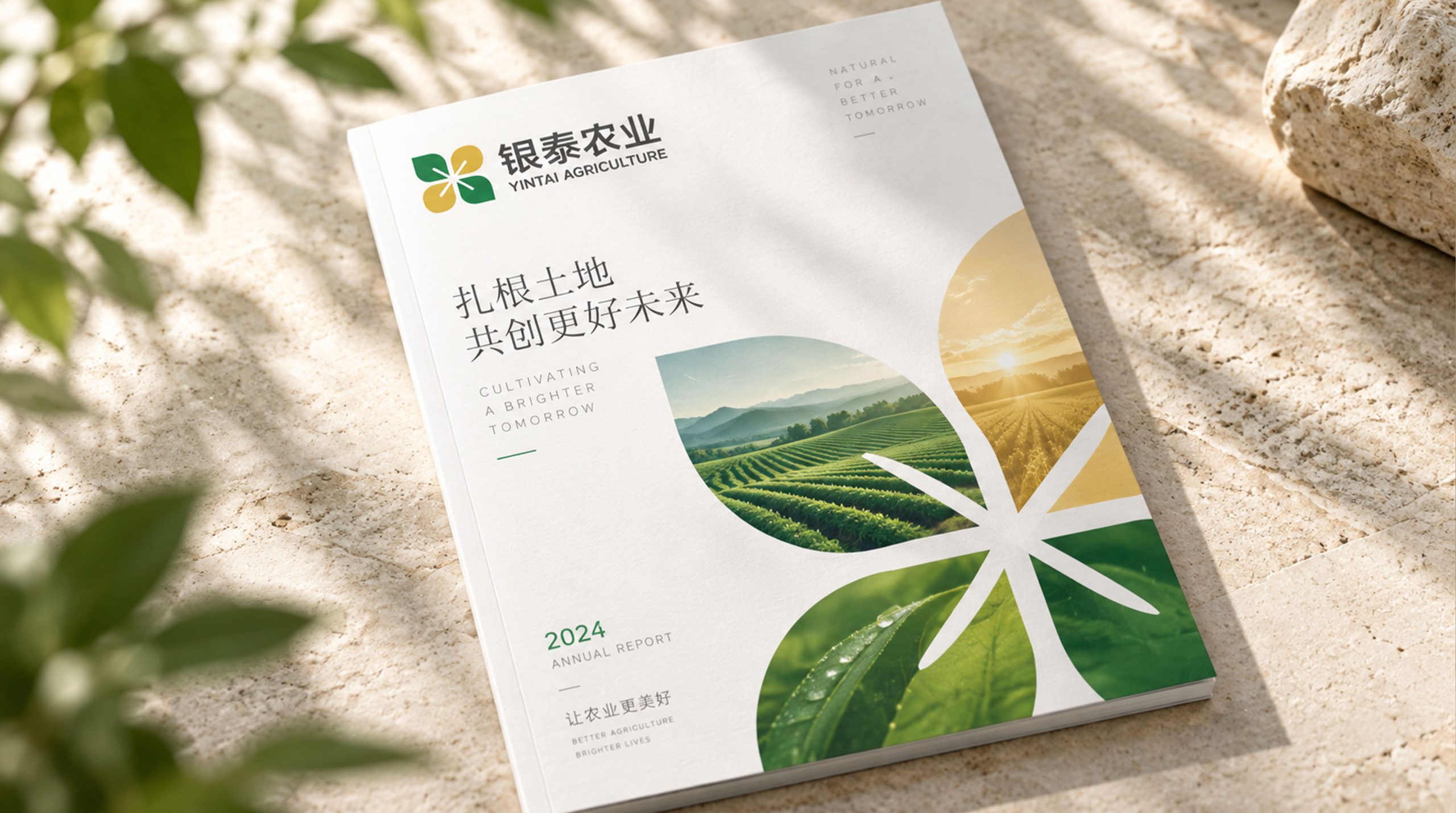
The logo can be widely used in corporate headquarters buildings, planting base entrances, processing plants and warehousing and logistics center logos; agricultural product packaging, gift box sets, product labels and traceability code carriers; official websites, e-commerce platform stores, social media images and agricultural product content marketing materials; agricultural expos, green food exhibitions, agricultural science and technology forums and government agricultural project cooperation images; corporate brochures, investment brochures, supply chain cooperation documents and investor relations materials. In the core brand touch point of agricultural product packaging, the harvest green and wheat ear gold logos are presented on the front of the product in a simple and fresh design, allowing consumers to recognize Yintai Agriculture's green quality commitment at a glance on supermarket shelves. In the dynamic visual, a seed breaks out of the ground from the center of the picture, the stem joints and grows, the leaves stretch in sequence, the wheat ears gradually pull out at the top, the ears are plump and formed one by one, and finally bend the golden ears - the whole process condenses the life course of a crop from sowing to harvest, symbolizing the brand story of Yintai Agriculture in exchange for ingenious hard work and abundant returns.
brand meaning
The logo contains three core images: Green Ecology - leaves and harvest green convey Yintai Agriculture's industrial foundation of taking root in green ecology and adhering to natural quality; Harvest Value - full ears of wheat and golden color convey the substantial quality of agricultural products and the industrial value of abundant harvests; Tech-Driven Agriculture - geometric modern graphic processing conveys Yintai Agriculture's innovative spirit of empowering traditional agriculture with technology and promoting industrial upgrading. The overall design conveys Yintai Agriculture's brand vision of "green harvest, science and technology to promote agriculture, and Antai thousands of families".
Improper usage (normative protection)
Do not change the curvature of the wheat ears, the number or arrangement of the ears; do not modify the stretching direction of the leaves or the connection relationship with the ear stems; do not change the hue or the primary and secondary relationships between harvest green and wheat ear gold; do not add strokes, shadows or industrial treatments that are inconsistent with the agricultural style to the logo; do not separate the wheat ears and leaves for separate use; keep the white space ≥ 25% of the graphic height; the minimum display width must not be less than 25mm.
design results
After the release of the logo, Yintai Agriculture's brand recognition and market trust in the fields of modern agriculture and green food have significantly improved. "Yinsui Fengtai", with its unique visual language that combines the joy of harvest and green ecology, has become the core identification symbol of Yintai's agricultural brand system. It is widely used in agricultural product sales, industrial cooperation and brand communication, demonstrating the brand vision of "green harvest, science and technology to promote agriculture, and Antai thousands of families".