










Shenwan Hongyuan Securities is China's leading comprehensive securities company. It was formed in 2015 through the merger of Shenyin Wanguo Securities and Hongyuan Securities. It inherits decades of deep accumulation of the two securities firms and its business covers fully licensed financial services such as securities brokerage, investment banking, asset management, research and consulting, futures and international business.
The brand name "Shenwan Hongyuan" is formed by combining two characters from each of the two predecessor institutions - "Shenwan" inherits Shenyin & Wanguo's Shanghai-style financial style of "based on Shanghai and connecting all countries", while "Hongyuan" continues Hongyuan Securities' deep foundation of "big plans, long-term strategy and long history". The four characters combined into one convey the brand-new image of the merged brand as "grand pattern, gathering of all sources". Qingmei Future was commissioned to lead the brand identity design.
The design goal of the brand logo is to demonstrate Shenwan Hongyuan's industry status as China's leading comprehensive securities company through the visual language of financial professional authority, merger and integration strength and century-old heritage, and to convey the brand image of "gathering Hongyuan to create Shenwan".
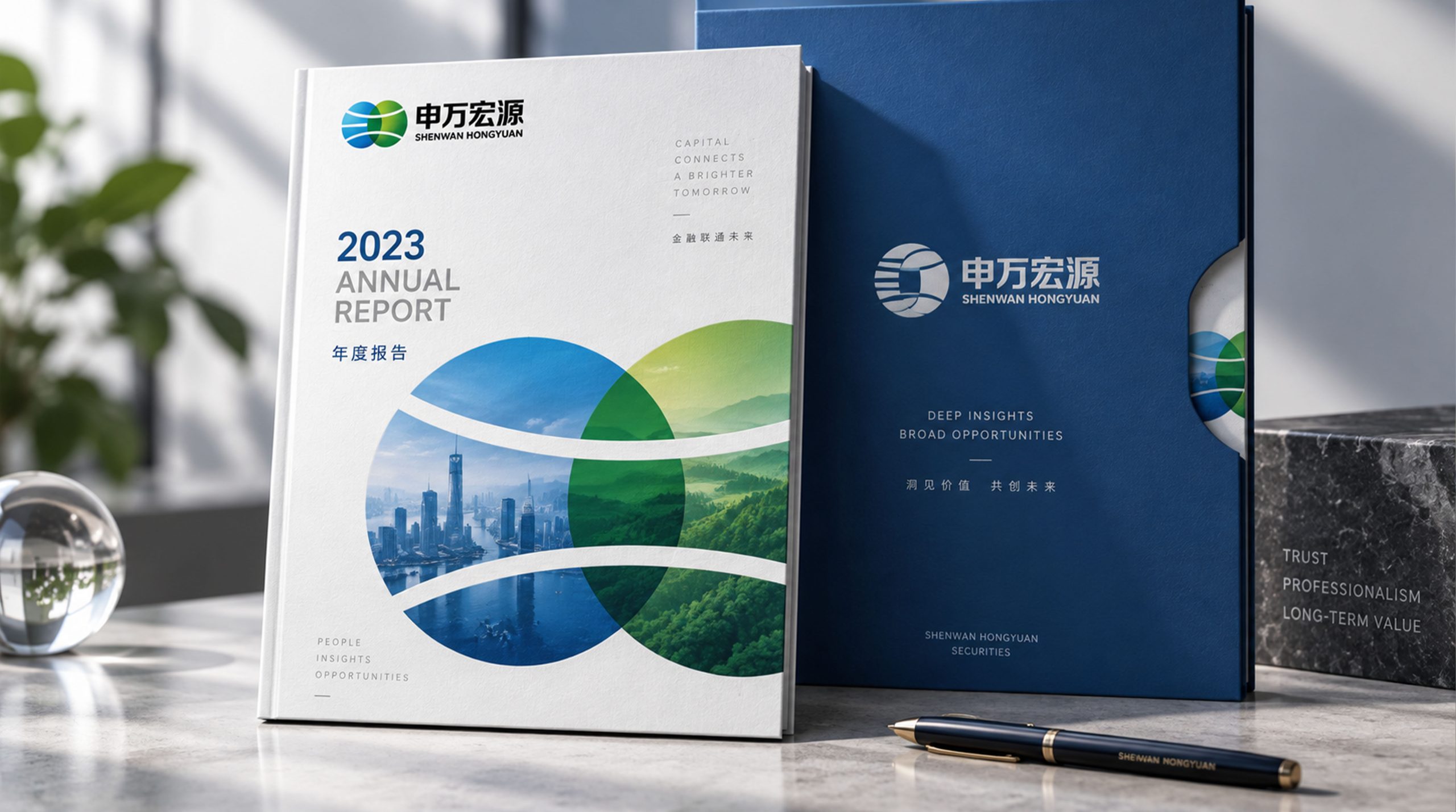
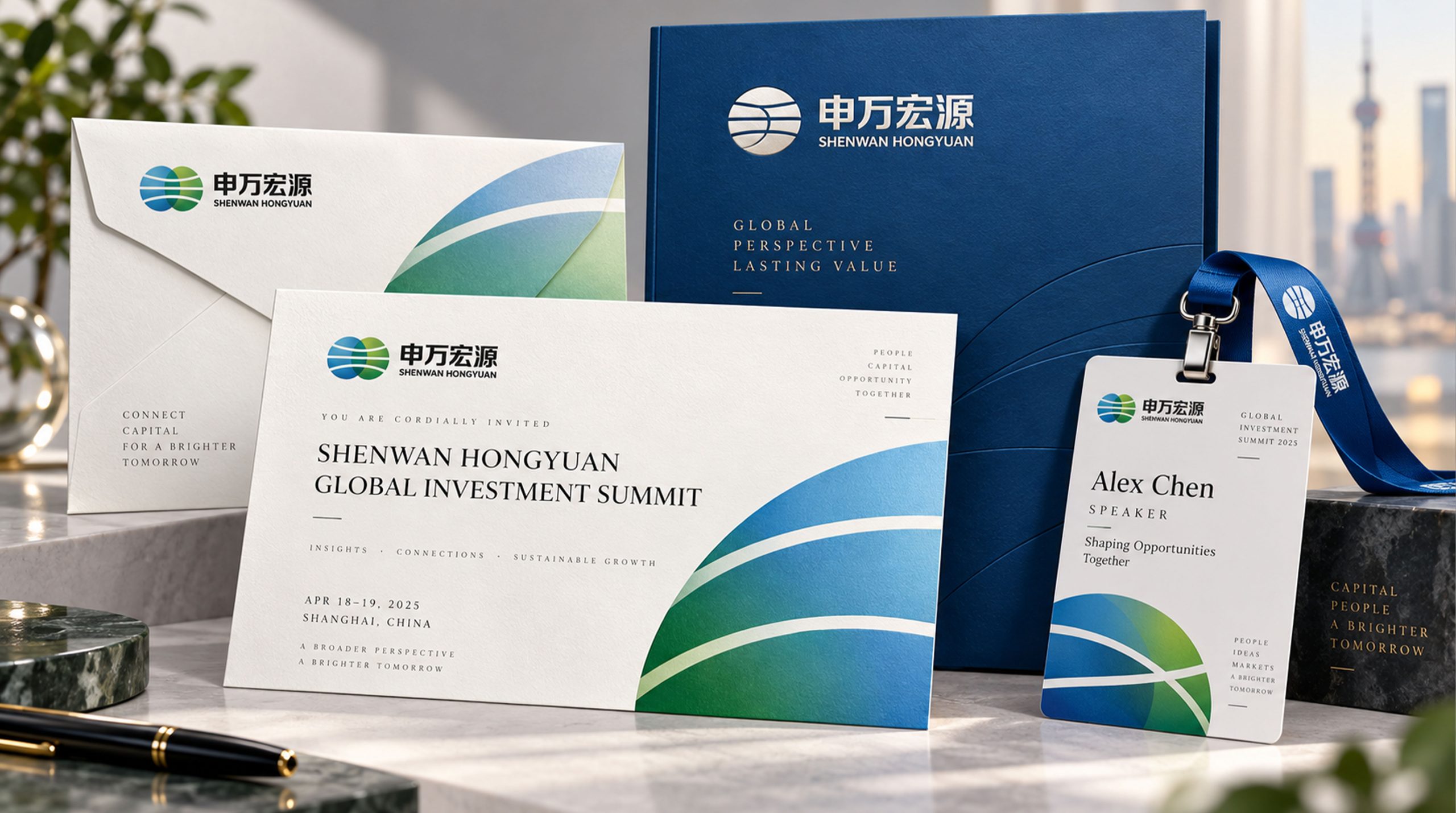
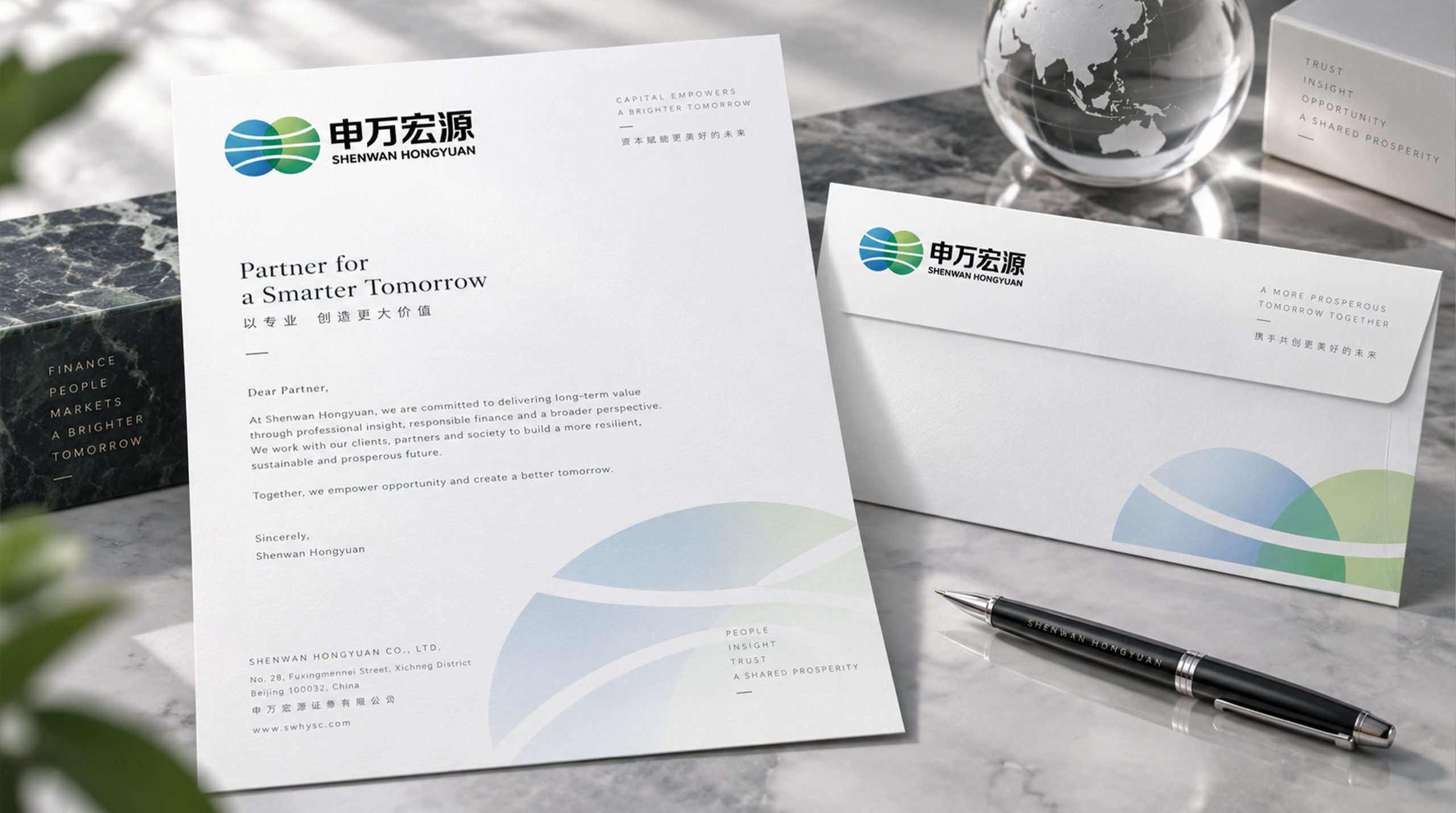
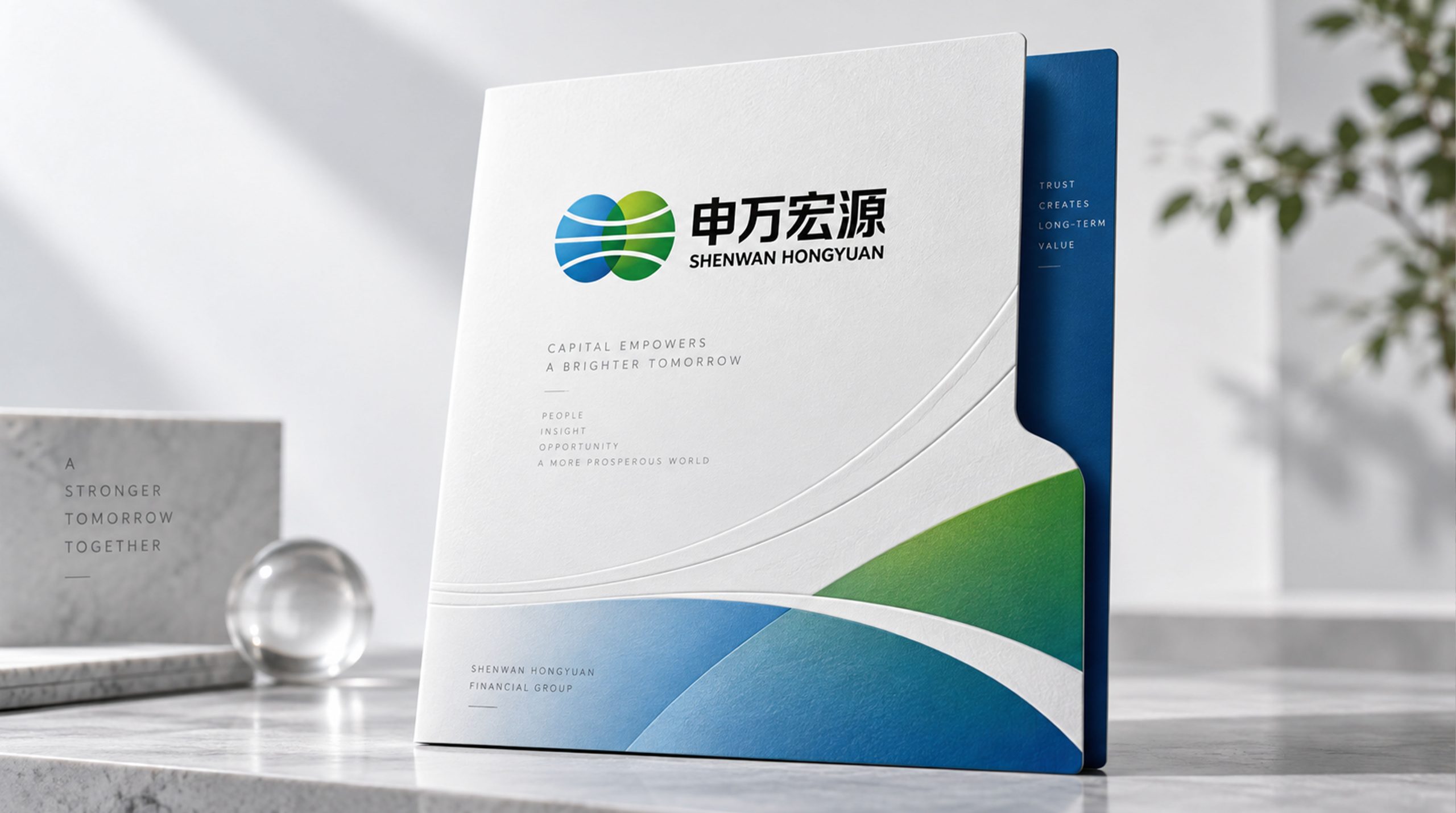
design concept
The logo takes "Confluence of Two Rivers" as its core concept, condensing the natural image of two rivers converging into one into the core visual symbol of the brand. The two rivers respectively symbolize the two predecessors of Shenyin & Wanguo and Hongyuan Securities - each has a long history and is running magnificently. They merge into one at the intersection of history and form a more mighty river rushing forward. "Convergence" is the most accurate visual metaphor for the history of brand mergers. At the same time, "flow" itself is also the essential feature of the financial industry - capital flow, information flow, value flow, everything in finance is in flow.
graphic language
The main body of the graphic takes two flowing arcs as the core elements. The two arcs start from the upper left and lower left directions of the graphic, just like two rivers originating from different mountains starting from their respective sources - the upper arc represents the Shanghai-style financial tradition of Shenyin & Wanguo, with a broad and lofty momentum; the lower arc represents the deep foundation of Hongyuan Securities, with a steady and long-lasting trend. The two arcs meet and merge in the middle of the graphic. The intersection is not a blunt collision, but two streamlines naturally merge into the same river with graceful curvature - just like the cultural genes of two securities companies merged with each other and achieved each other during the merger process, conveying the equality and organic nature of the merger.
After the intersection, the arcs merge into one, extending to the right with a thicker and more powerful single line. The lines gradually widen from the medium thickness at the intersection to the distance, just like the river surface is more open and the water volume is more abundant after the confluence of two rivers, conveying the scale advantage and synergy effect of the merged brand "1+1>2". The end of the converging line is not closed, but extends infinitely to the right in an open attitude, conveying the brand's infinite possibilities for sustainable development in the future.
Before the intersection, the two arcs maintained independent streamline trajectories, with slightly different arcs - the upper arc has a larger arc and a more stretched posture, while the lower arc has a smaller arc and a more steady trend. The subtle differences convey the different corporate personalities and cultural genes of the two predecessor securities companies, and at the same time proves that the convergence of diversity is more valuable than the superposition of homogeneity. The negative space between the two arcs takes on the shape of an unfolding wedge before the intersection, narrows to a straight line at the intersection, and disappears to zero after the intersection. The gradual transformation process of this negative space is like a time narrative of two companies from independence to gradual integration and then to complete integration. The overall composition uses a three-section horizontal structure of "double streams originate, meet in the middle, and merge to reach the distance" to build a "double stream confluence" to convey the brand's merger process and development pattern.
Font composition
The Chinese "Shen Wan Hongyuan" adopts customized modern Song style, with thin horizontal lines and thick vertical lines, and exquisite and clear strokes. The character "Shen" runs vertically like the central axis of Shanghai, conveying the regional foundation of Shanghai-style finance; the character "Wan" folds and stretches horizontally, conveying the open pattern of universal access; the character "Hong", the roof radical, is like a stable financial structure, conveying the strategic height of the grand plan; the three-dot water in the character "Yuan" flows smartly, echoing the graphic language of flowing water in the logo, conveying the long-standing historical accumulation. The four characters maintain the professional authority of financial institutions in the classic and solemn Song style. The English "SHENWAN HONGYUAN" is arranged in a standard uppercase serif font. The font is broad and steady, and the serifs are straight and clear. The abbreviation "SWHY" can be used as an auxiliary identification mark in digital and international communication scenarios.
color system
The main color Shenwanhong #B01C2E represents the vitality of China’s finance, enterprising and securities industries. Red has unique cultural significance in the Chinese securities market - the Chinese stock market uses red to represent rising prices, and red is the visual synonym for "bull market" and "profit". Choosing this color directly establishes a psychological connection between the brand and the positive signals of the capital market. Shen Wanhong's depth and solemnity are different from Dahong's enthusiastic publicity, and conveys the unique historical depth and strategic determination of leading securities companies with a restrained and calm color temperature - not the urgent announcement of emerging institutions, but the calm confidence of established securities companies after decades of accumulation. Auxiliary Hongyuan Blue #1A3C6E is used for the institutional image, research reports and compliance documents in the brand system. Blue conveys the rationality, professionalism and risk control awareness of financial institutions. At the same time, as the second main color, it vaguely retains the visual memory of Hongyuan Securities’ original brand genes, so that the merged brand pays tribute to both predecessors in a unified new image. The combination of red and blue conveys the dual brand character of "progress and stability, passion and rationality" in the financial brand. Auxiliary gold #C5A55A is used for wealth management, high-net-worth customer service and honor recognition elements in the brand system, conveying investment value and noble protection of customer assets. Auxiliary dark gray #333333 is used for basic text and system ancillary information. Pure white #FFFFFF as standard base color. The overall color is red and blue as the dual core, supplemented by gold and gray, reflecting the securities brand temperament of "inheritance, integration, professionalism and long-term development".
Application extension
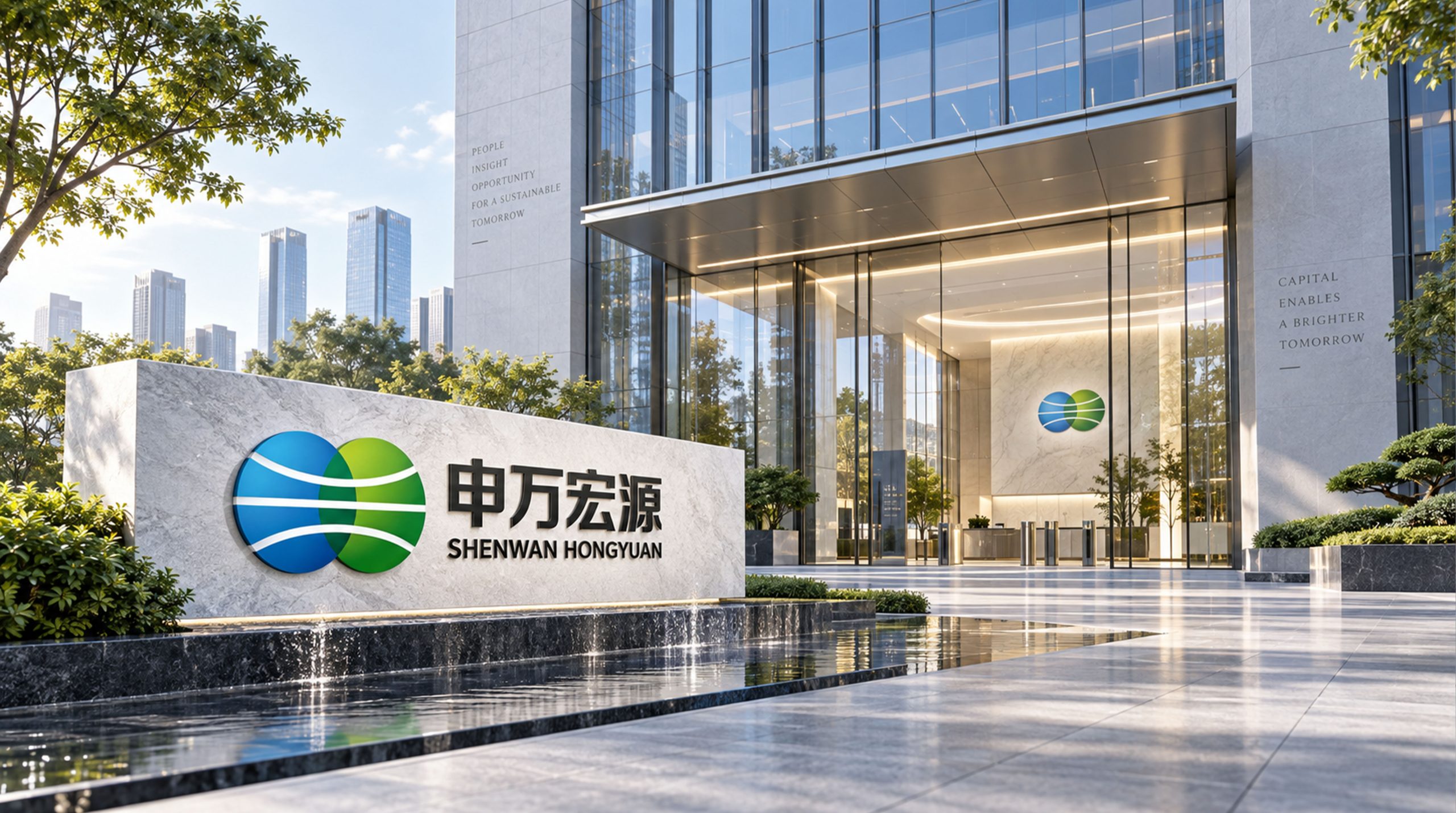
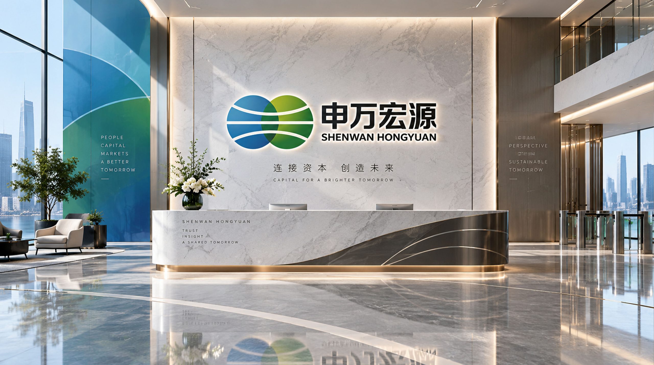
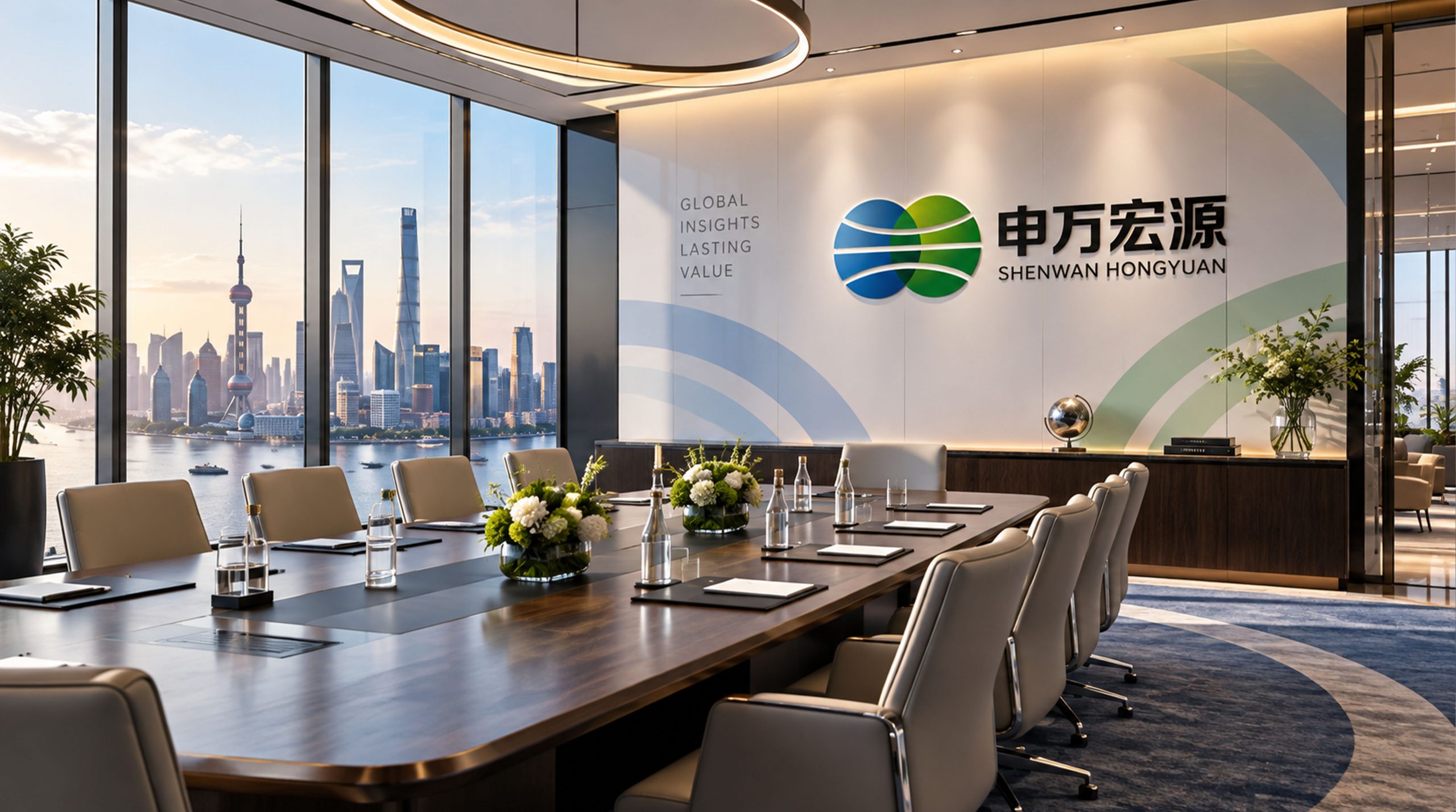
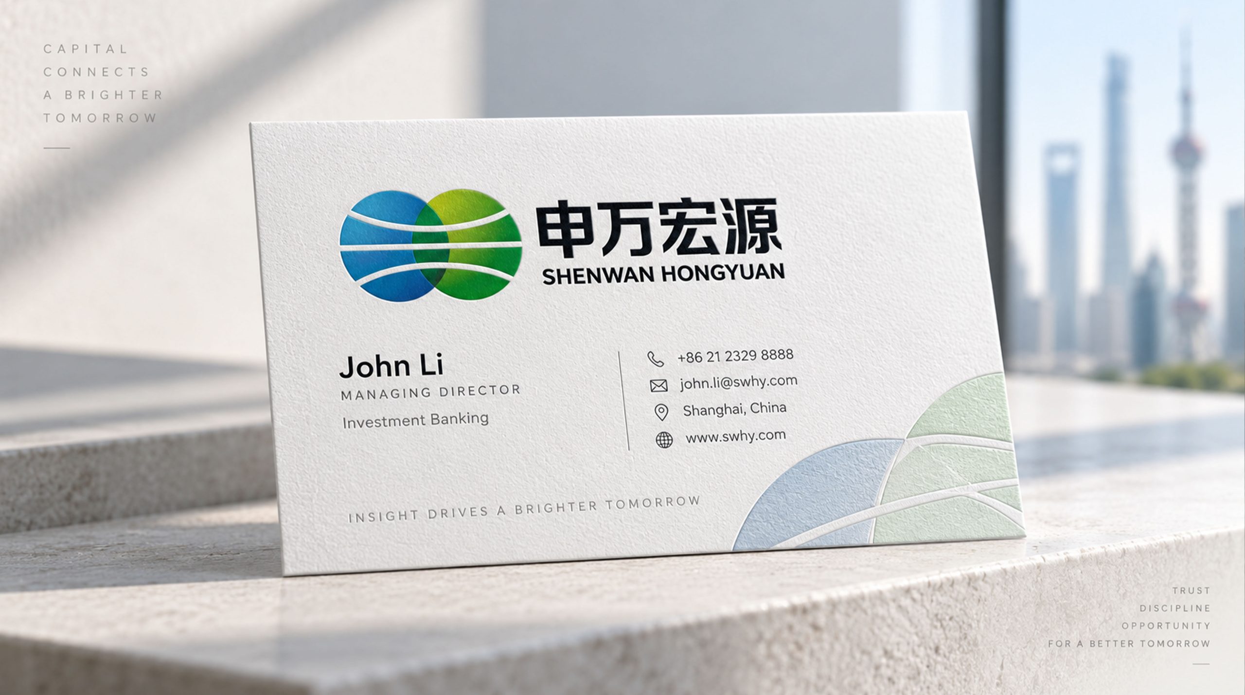
The logo can be widely used in business department heads, image walls of headquarters buildings, trading floors and VIP financial room logos across the country; research report covers, investment bank project documents, IPO roadshow materials and customer service manuals; official websites, mobile trading APPs, online trading platforms and investor education content; capital market forums, securities industry summits, listing ceremonies and brand cooperation event images; employee badges, business cards, corporate brochures and brand stationery systems. In the IPO listing ceremony, the most glorious scene of the securities brand, the Shenwanhong logo and the golden bell of the exchange complement each other. The graphic of the two flows is like a magnificent picture of funds flowing from the primary market to the secondary market, conveying the professional value of Shenwanhongyuan as an important intermediary in the capital market. In the dynamic vision, two arcs start from both sides of the picture, flow and converge toward the center, sparking a golden light at the intersection. The merged single line extends powerfully into the distance, symbolizing Shenwan Hongyuan's creation of a more ambitious future with the convergence of two traditions.
brand meaning
The logo contains three core images: Confluence - the graphic narrative of the intersection of two streams conveys the historical milestone and cultural integration of the two major brands of Shenyin & Wanguo and Hongyuan Securities; Heritage Forward - two arcs with long history convey the historical heritage accumulated by the two predecessor securities companies for decades and the future development prospects after the merger; Professional Convergence (Professional) Convergence) - The more generous and powerful lines after the merger convey the scale advantage and comprehensive competitiveness of the combined brand's full license business system. The overall design conveys Shenwan Hongyuan's brand vision of "gathering Hongyuan and creating Shenwan together".
Improper Usage (Protection Specification)
Do not change the starting direction, intersection position or extension angle of the two arcs; do not modify the arc difference of the two arcs or make them completely symmetrical and the same shape; do not change the hue or primary and secondary relationship between Shenwanhong and Hongyuan Blue; do not add strokes, shadows or decorative effects that are inconsistent with the financial style to the logo; do not split the two arcs and use them separately or delete the extended line segments after the confluence; keep the white space ≥ 25% of the graphic height; the minimum display width must not be less than 30mm.
design results
After the release of the logo, Shenwan Hongyuan's brand unity and merger identity in China's securities industry and capital market have significantly improved. "Double Streams Convergence", with its unique visual language that accurately conveys the merged narrative and financial professionalism, has become the core identification symbol of Shenwan Hongyuan's brand system. It is widely used in the national business network, capital market services and brand communication, demonstrating the brand vision of "gathering Hongyuan and co-creating Shenwan".