










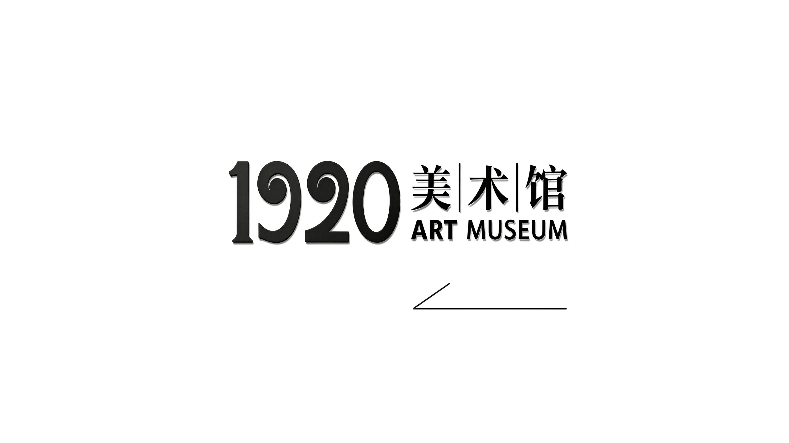
1920 Contemporary Art Museum is a professional art museum with contemporary art exhibitions, academic research and public aesthetic education as its core. It takes "connecting history and contemporary times, dialog between classics and pioneers" as its academic positioning, and is committed to presenting the most experimental and forward-looking contemporary art practices in the spatial context of a century-old architectural heritage.
The brand name "1920" directly refers to a key historical coordinate - the 1920s was the golden age of the global modern art movement. Bauhaus, Dadaism, Constructivism and Surrealism competed to bloom during this period. It was also the awakening moment for the vigorous development of China's New Culture Movement. The name "1920" declares that the museum is rooted in the historical origin of modern art, and at the same time re-examines and activates this century-old tradition from a contemporary perspective. Qingmei Future was commissioned to lead the brand identity design.
The design goal of the brand logo is to demonstrate the academic height of the 1920 Contemporary Art Museum as a professional art institution through the spirit of pioneering experimentation, historical depth and contemporary visual language, and to convey the brand image of "century-old echo, contemporary expression".
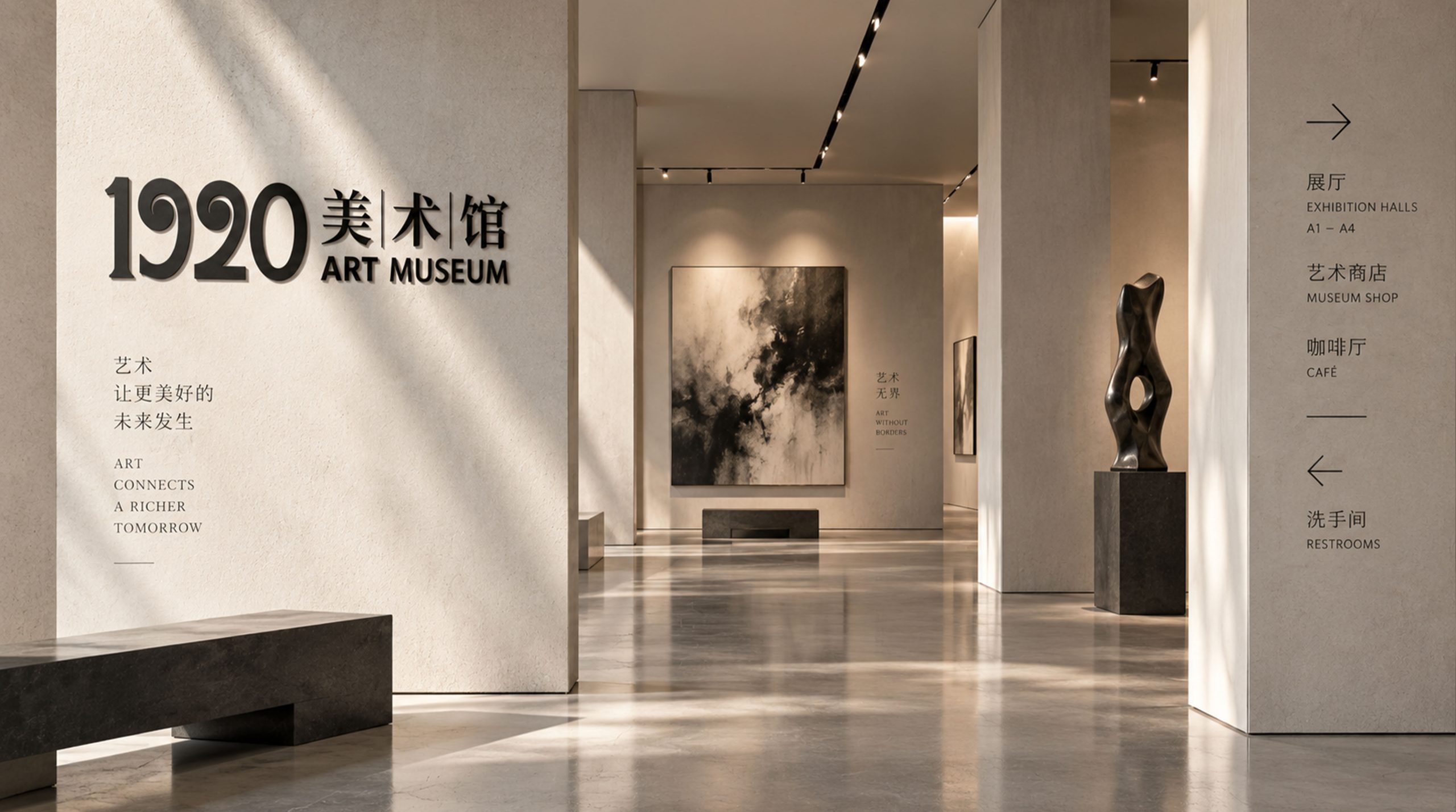
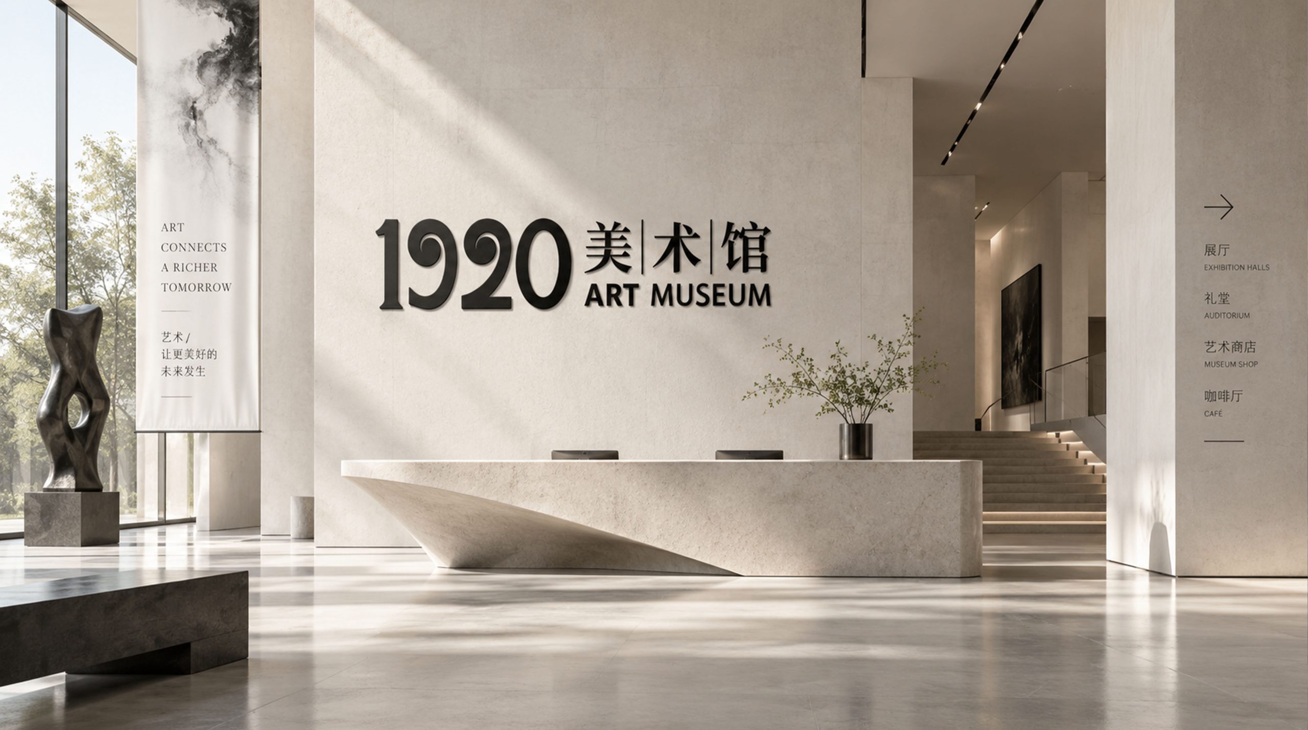
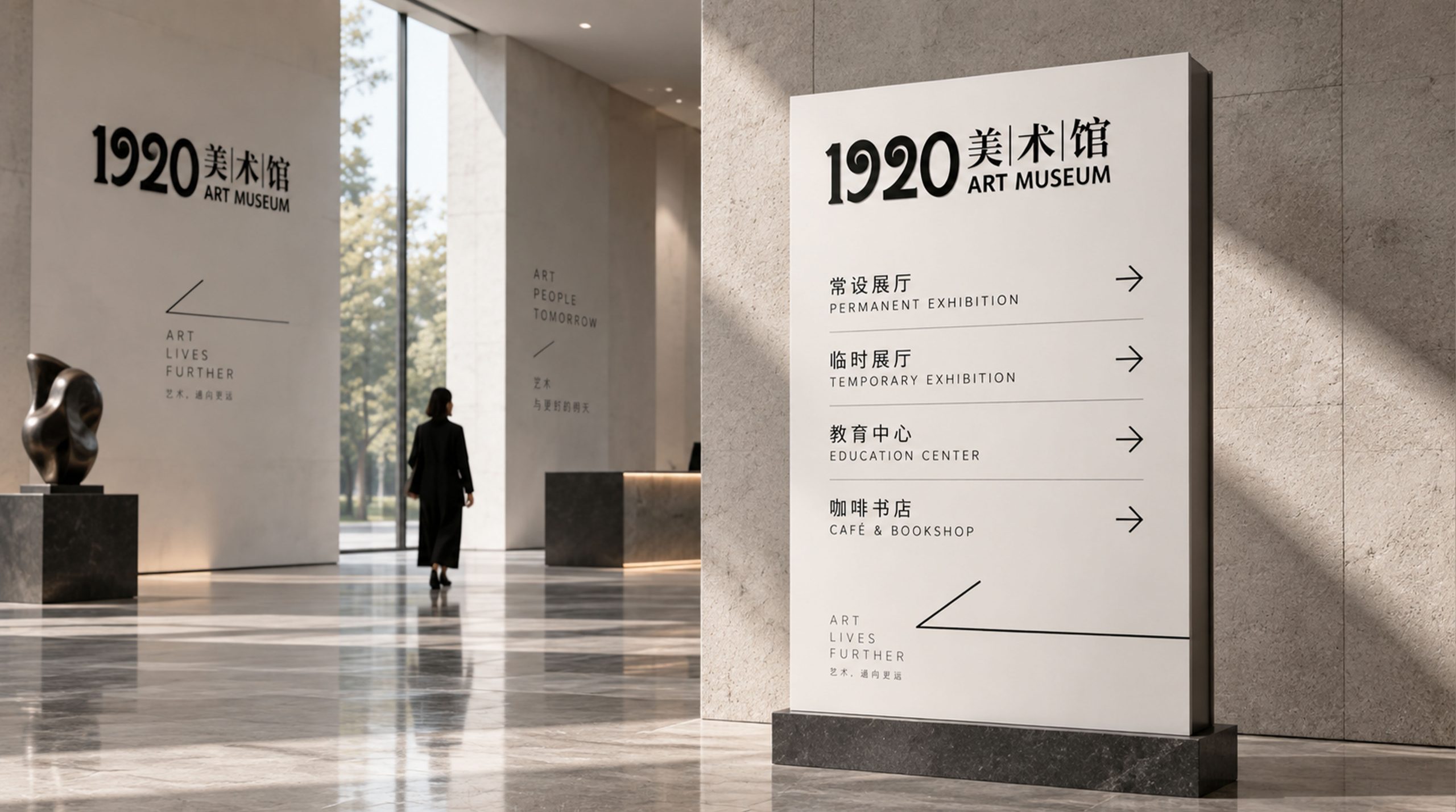
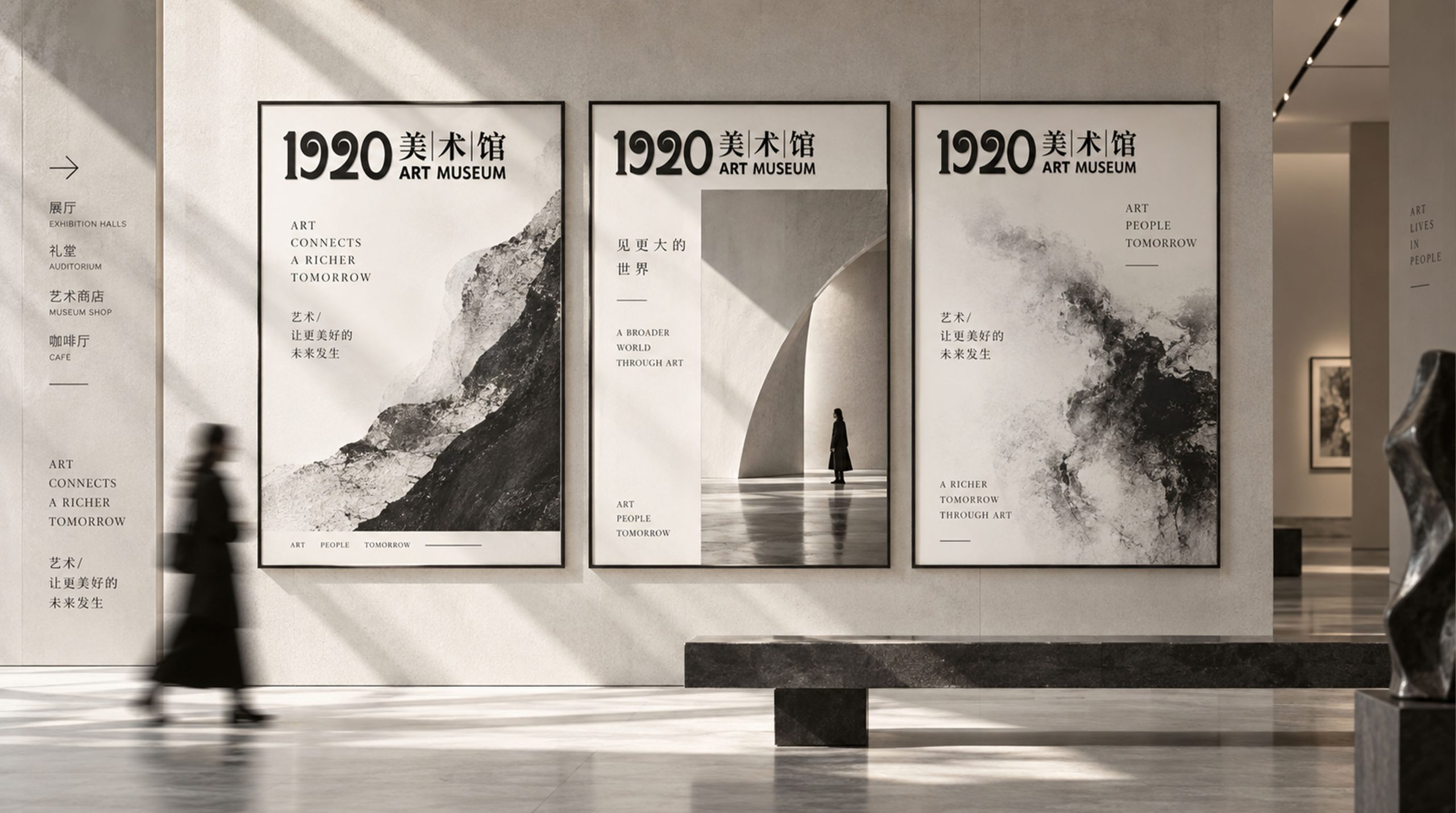
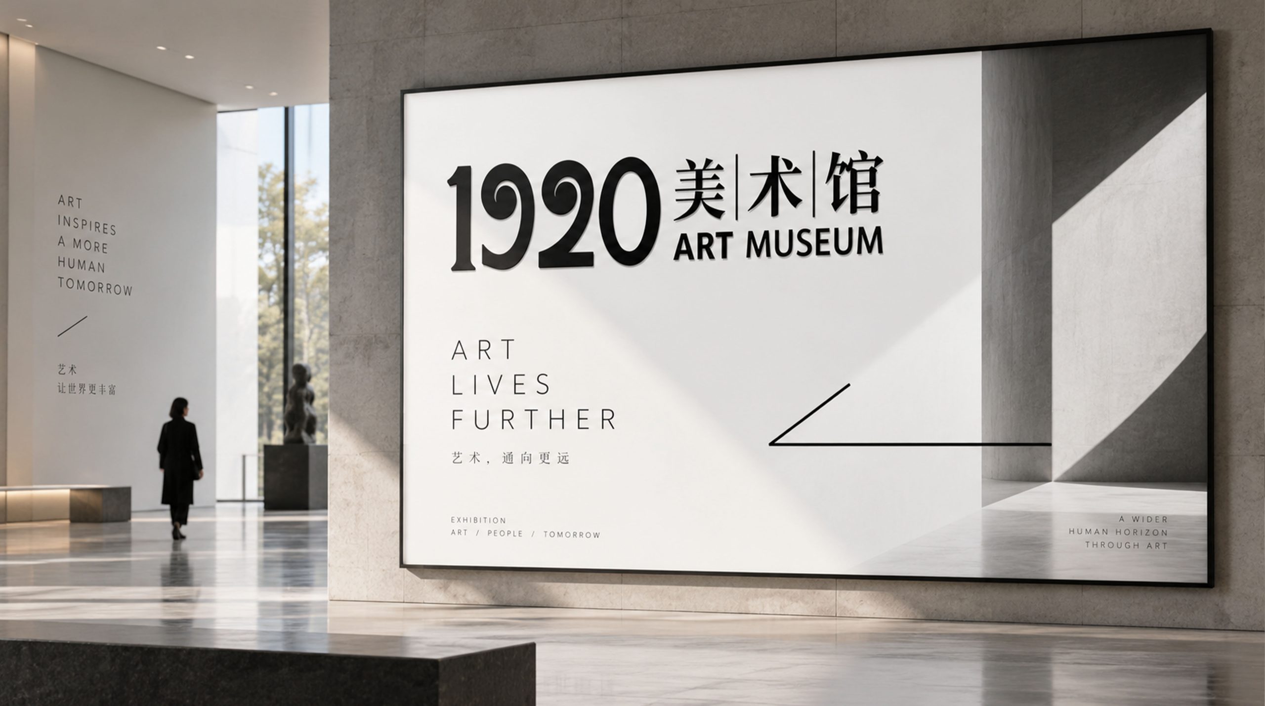
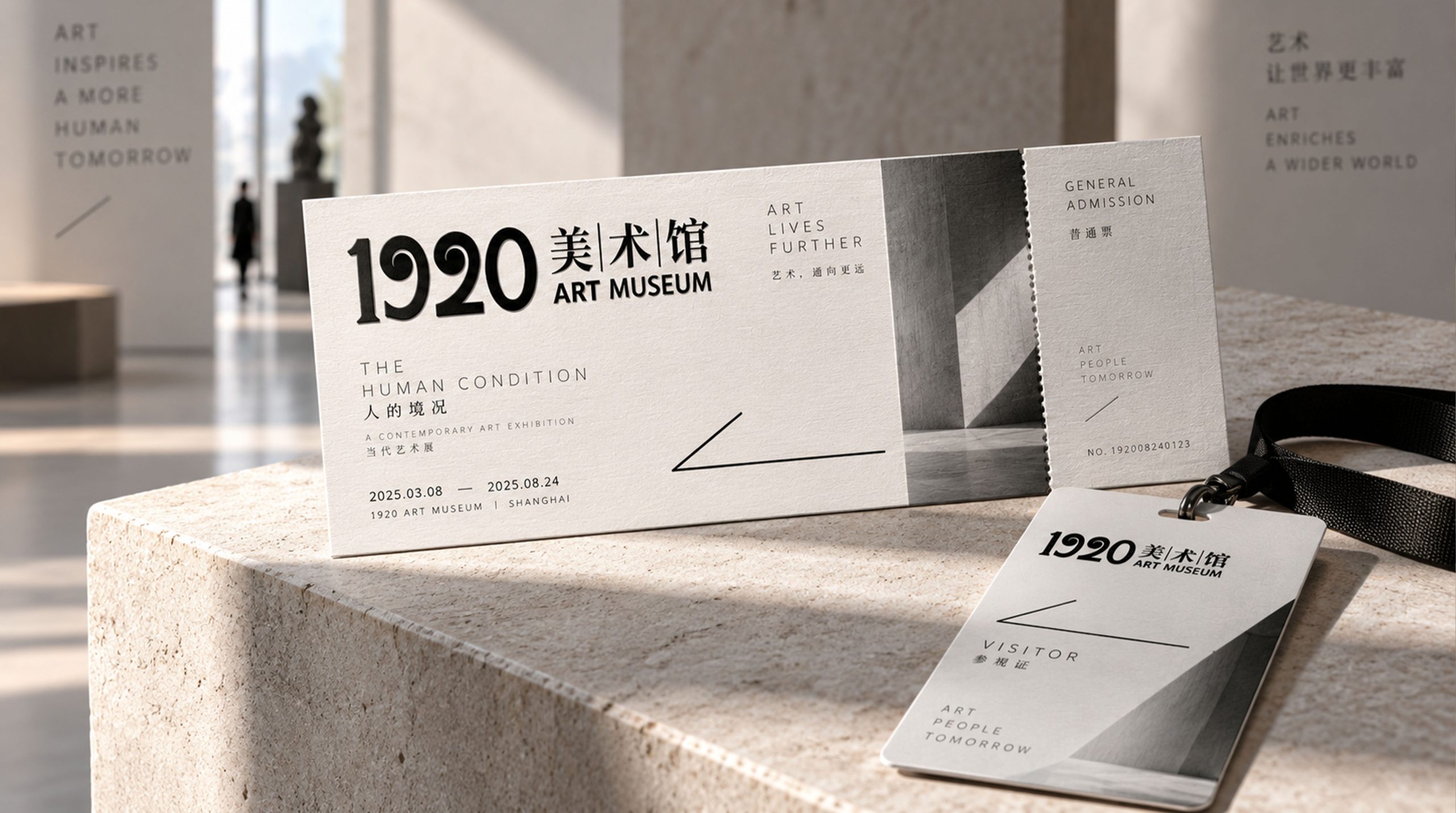
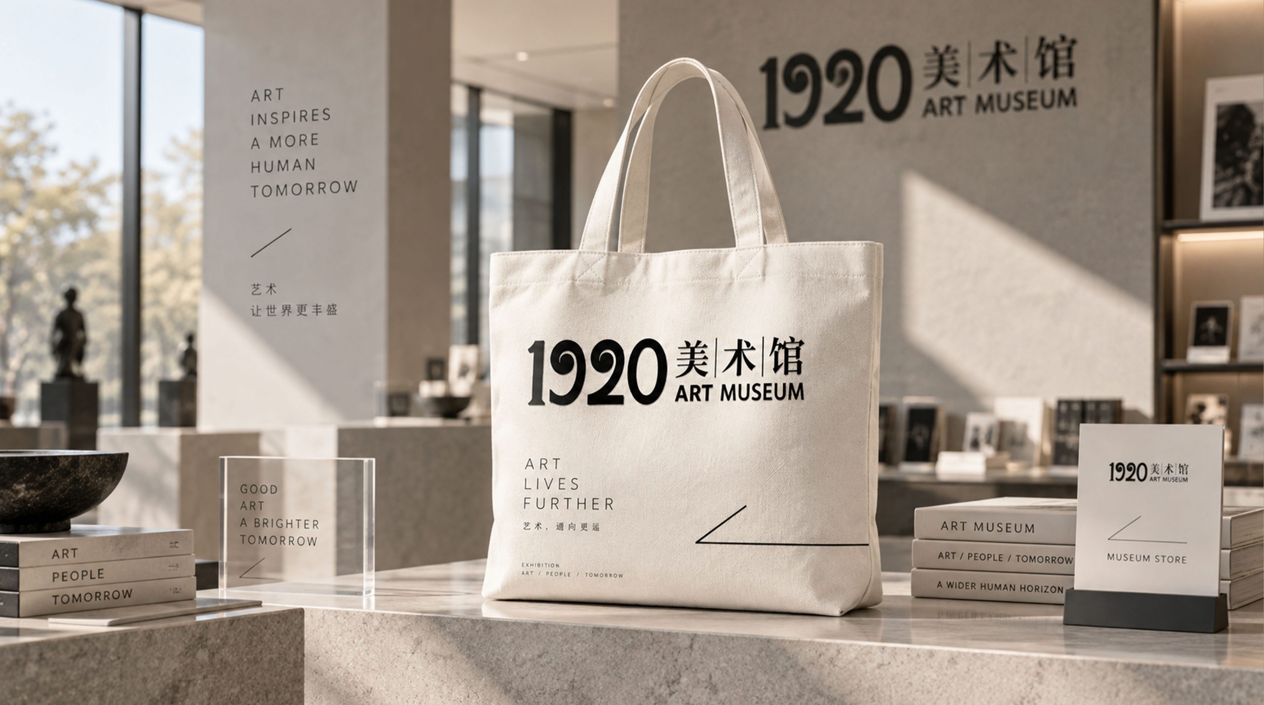
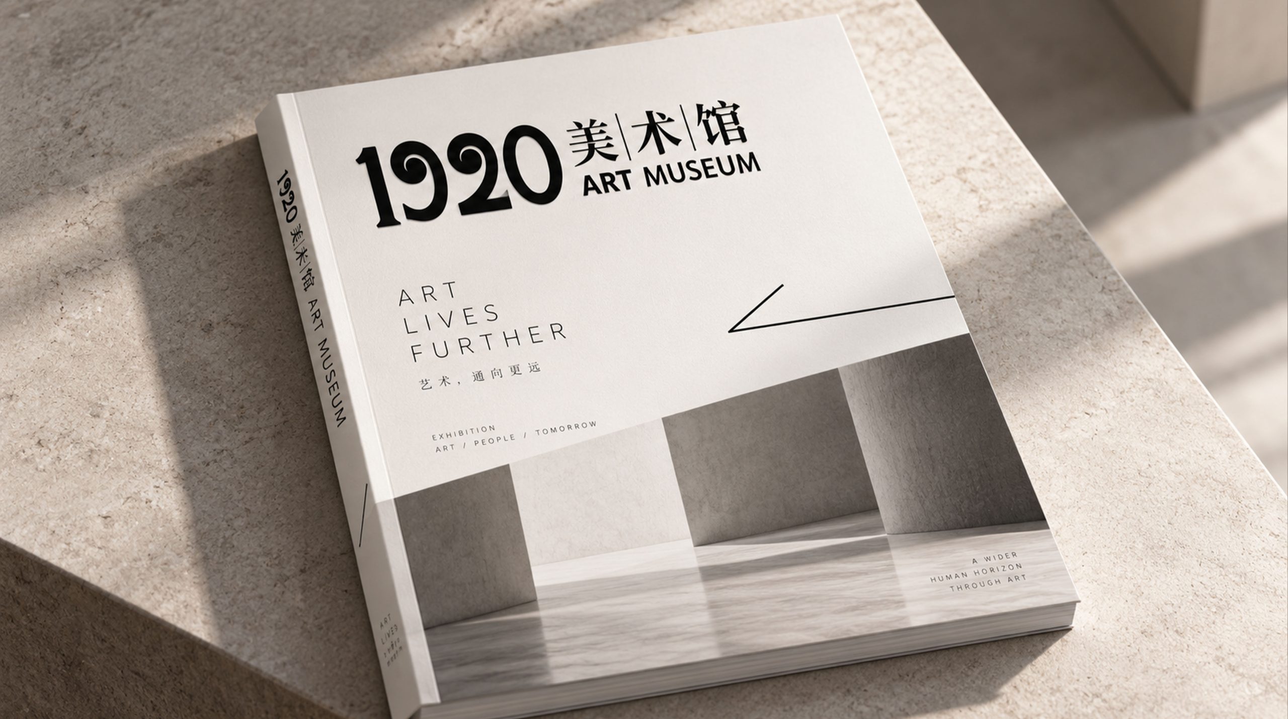
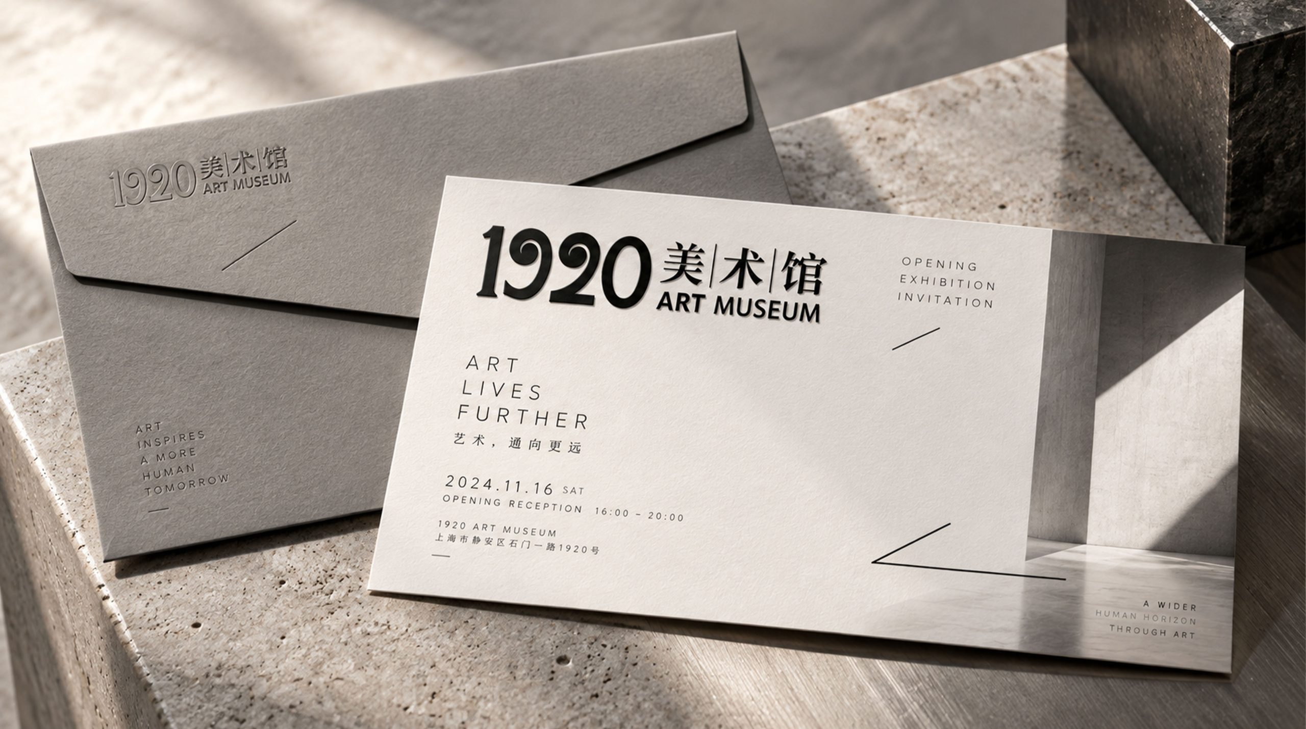
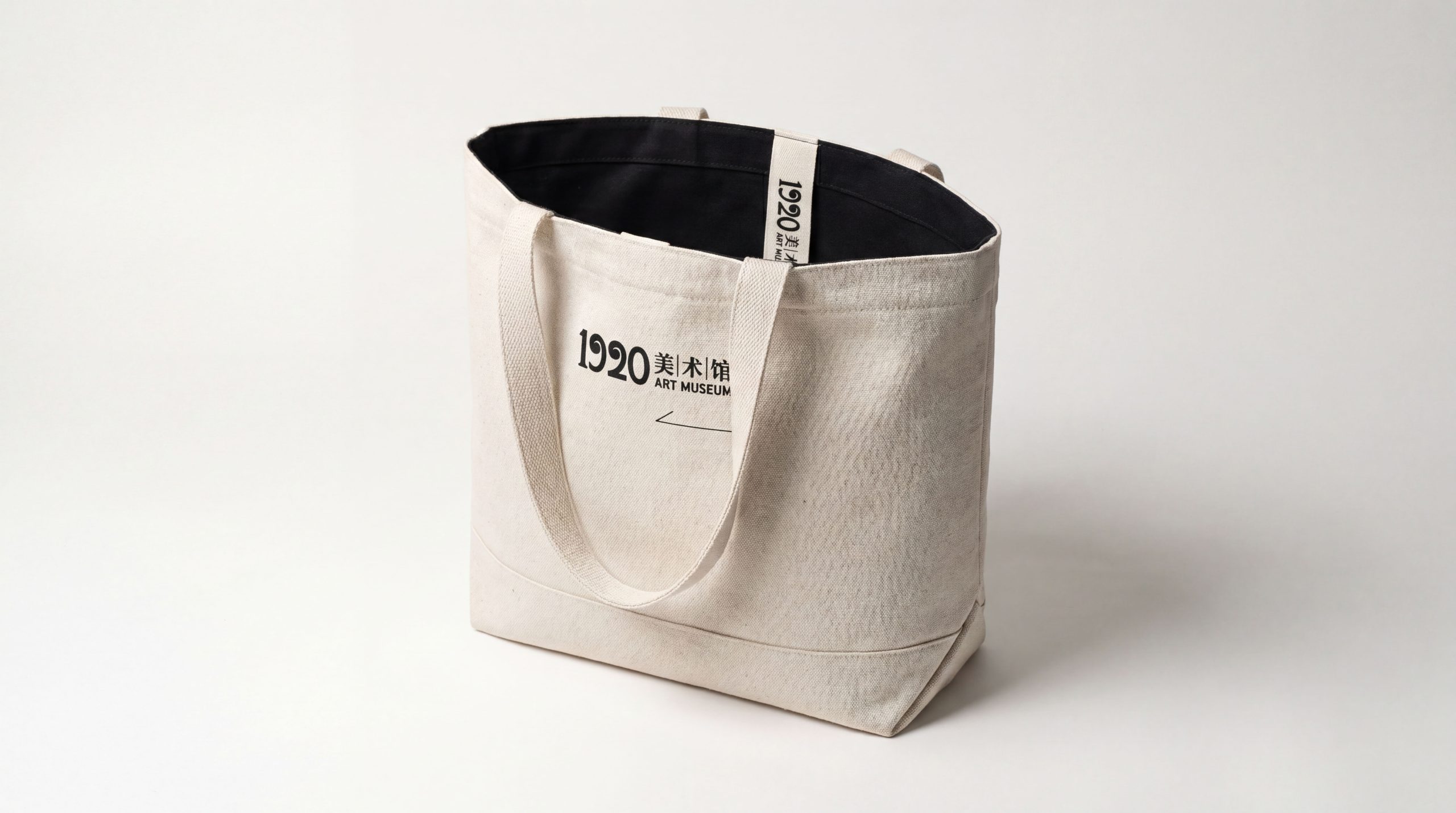
design concept
The logo takes "Cross-Section of Time" as its core concept and treats the number "1920" as a visual device with an architectural and sculptural feel, making the four numbers themselves a contemporary art work. The design does not add additional decorative graphics to the number "1920", but allows the number itself to become the entire content of the logo through font design, space cutting and visual tension - this minimalist strategy of "less is more" is itself a contemporary tribute to the "form follows function" design statement of the Bauhaus movement in the 1920s.
graphic language
The number "1920" is presented in a highly customized geometric font. The strokes of the four numbers are composed of uniform equal-width lines. The line thickness is consistent, and the corners are processed at sharp right angles, just like the pure geometric forms drawn with rulers and compasses in the Constructivist art of the 1920s. Each stroke is rational, precise and de-emotional - this is the response of the art pioneers of that era to the aesthetics of the industrial era, and it is also the visual reference of this logo to that period of history.
"1" is presented as a tall vertical line, just like the section of a load-bearing column in an art museum building. It is extremely simple but supports the entire structure. The arc of "9" is composed of a geometric three-quarter circle. The arc and the vertical pen are cut at right angles instead of natural transitions at the connection point, forming a deliberate "sense of fracture" - this fracture is the time rift between history and contemporary times, and the tension of dialog between classics and avant-garde. "2" is composed of a horizontal horizontal line and a diagonal line that descends diagonally. The sharp inclination of the diagonal line is like a blade cutting into the canvas, conveying the spirit of contemporary art's deconstruction of the existing order. "0" is presented as a standard geometric circle or ellipse. The circle is the only curve element among the four numbers. It is like a soft breathing space in a rigid environment full of straight lines and right angles, symbolizing the eternal circle in the art world - no beginning, no end, infinite loop.
The four numbers are arranged with tight spacing, and the gaps between the numbers are extremely narrow, just like the carefully calculated spacing between works in the exhibition hall of an art museum - both maintaining their independence and forming an overall narrative. The overall outline of the number group is a long horizontal rectangle, and the proportion is close to the golden ratio of the building facade, making "1920" not only a set of numbers, but more like the front elevation of a miniature building - four numbers are four exhibition halls, and a group of numbers is an art museum. Parts of the digital strokes can be treated with subtle "incompleteness" - the end of a certain stroke is disconnected or missing in an irregular manner, just like the mottled historical traces on the wall of a century-old building, injecting the temperature of time and the breath of history into the precise geometric order. The overall composition uses the minimalist logic of "numbers are architecture and fonts are art" to construct a "time slice" to convey the academic spirit and contemporary stance of the museum.
Font composition
The Chinese "Contemporary Art Museum" uses restrained modern blackface, with even and slender strokes, clear and regular structure, and the word weight is deliberately controlled at a lighter level - not to snatch the visual dominance of the "1920" digital logo, but to accompany it with a quiet gesture, just like the inconspicuous but indispensable exhibition label text on the white wall of the museum. The word "contemporary" conveys the time coordinate and academic stance of the museum, while the three words "art museum" clarify the institutional attributes. The English "CONTEMPORARY ART MUSEUM" is arranged in a capital sans-serif font of equal width, with loose and even letter spacing, just like the sequence of works arranged at equal intervals in the exhibition hall, conveying the unique sense of order and breathing of the museum space. Chinese and English are placed under "1920", forming a two-layer brand structure of "numeric logo + institution name" with a clear hierarchical relationship.
color system
The main color is pure black #000000, the only main color of the logo, which represents absolute, pure and ultimate. Black is the most essential color in contemporary art and museum spaces—black exhibition walls, black picture frames, and black printing. Black carries the possibility of all colors with its absolute silence. The choice of pure black as the only main color is a visual echo of the museum's "White Cube" space concept - on the pure white wall, the pure black logo conveys the brand message with the highest contrast and the least visual interference, as restrained and powerful as a minimalist work of art. Auxiliary Art Museum White #FFFFFF is used as the standard background color and negative application color. The logo is also valid when black and white are interchanged - black characters on a white background are used for daily communication, and white characters on a black background are used for exhibition posters and nighttime facades. The two are positive and negative to each other, just like the yin and yang rubbings of prints. Auxiliary Exhibition Gray #999999 is used as a secondary information layer in the brand system, as a low-key grayscale for secondary exhibits in the exhibition hall. Special colors can be temporarily introduced according to the exhibition theme of each quarter - a touch of Klein blue for the spring exhibition and a touch of Yves Klein gold for the autumn retrospective, so that the logo can gain color vitality that changes with the exhibition on the eternal tone of black and white. The overall color is pure black as the absolute core, reflecting the contemporary aesthetics of "carrying the most possibilities with the least color".
Application extension
The logo can be widely used in museum building facades, entrance nameplates, exhibition hall guidance systems and public space signs; exhibition posters, academic albums, curators' notes and artist interview publications; official websites, online virtual exhibition halls, social media images and digital communication materials; international biennales, art fairs, academic seminars and touring exhibition cooperation images; tickets, membership cards, art derivatives and museum store packaging. In the city-level brand touchpoint of the art museum building facade, "1920" is installed in an oversized metal font above the main entrance of the building. The industrial texture of the numbers complements the historical texture of the century-old building, making the sign itself a permanent installation art in the city's public space. In the dynamic vision, the four numbers "1920" appear sequentially in a frame-by-frame animation - each number is rendered and superimposed in a different contemporary art style: a pixelated "1", a liquid flowing "9", a wireframe structure of "2", and a solid color-filled "0". Finally, the four styles are merged and unified into a pure black geometric font, symbolizing that the 1920 Contemporary Art Museum has converged into a unified contemporary stance with diverse perspectives of a century of art history.
brand meaning
The logo contains three core images: Century Echo - the historical coordinate of "1920" conveys the museum's academic depth and cultural depth rooted in the source of the modern art movement; Contemporary Voice - the geometric minimalist font design conveys the museum's academic stance of reinterpreting art classics with contemporary visual language; Spatial Spirit - the architectural digital proportions and exhibition hall-like word spacing convey the museum's professional capabilities as an art space creator and the spirit of the place. The overall design conveys the brand vision of 1920 Contemporary Art Museum of "Centennial Echo, Contemporary Expression".
Improper Usage (Protection Specification)
Do not change the geometric font structure, stroke thickness or right-angle connection of the four numbers "1920"; do not modify the number spacing or the overall aspect ratio; do not use colors other than pure black and pure white as the main color of the logo (except for exhibition co-branded special colors); do not add gradients, shadows, strokes or any decorative effects to the logo; do not add borders, graphics or disturbing elements around the number group; keep white space ≥ 30% of the graphic height; the minimum display width must not be less than 30mm.
design results
After the release of the logo, the brand recognition and academic influence of 1920 Contemporary Art Museum in the field of contemporary art and cultural institutions have been significantly improved. "Time Slice", with its unique visual language that combines historical depth and contemporary minimalist aesthetics, has become the core identification symbol of the museum's brand system. It is widely used in exhibition communication, academic publishing and international exchanges, demonstrating the brand vision of "century-old echo, contemporary expression".