










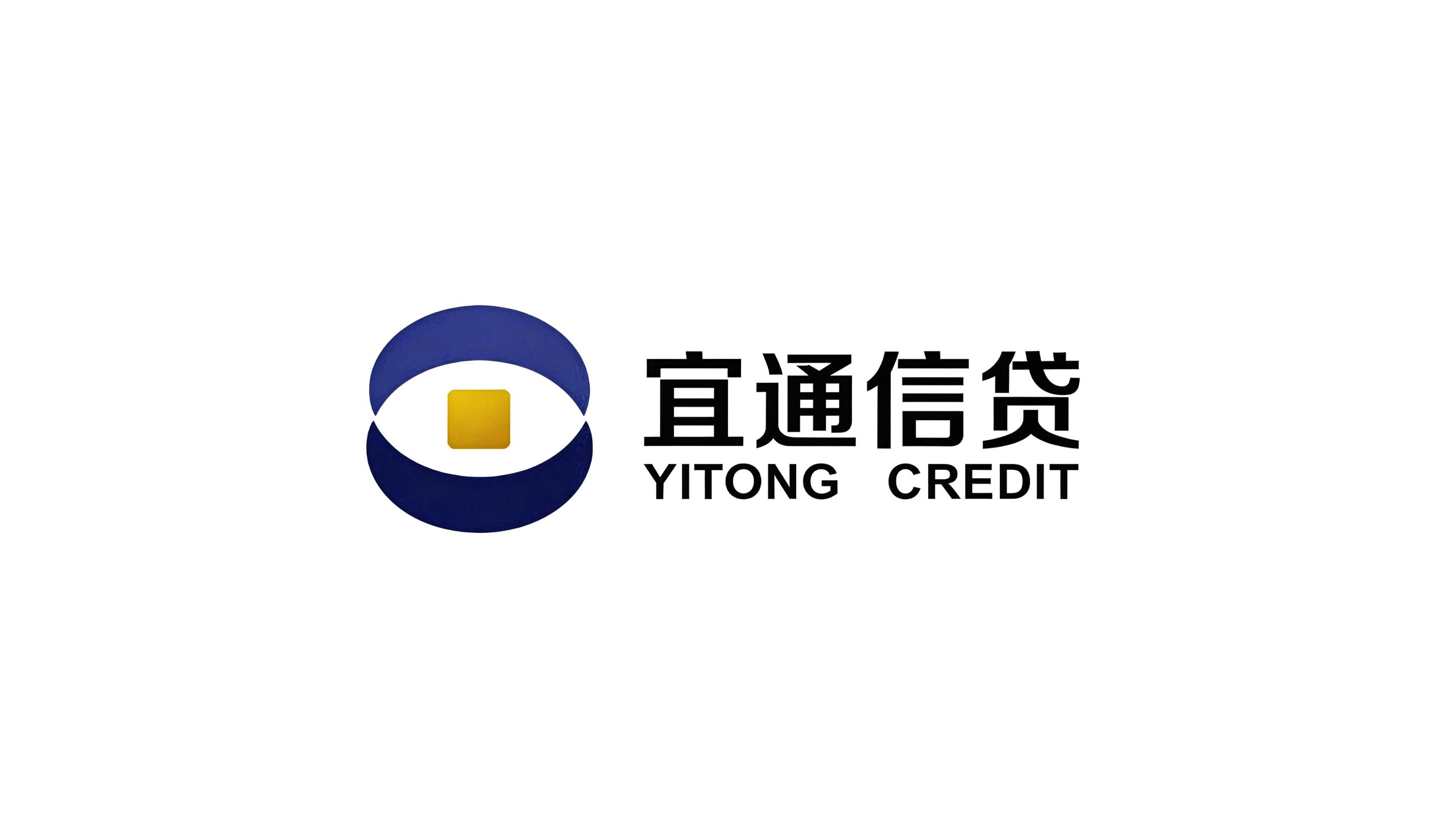
Yitong Credit is a financial technology company focusing on inclusive credit services. It is committed to providing convenient, transparent and efficient credit solutions for individual users and small, medium and micro enterprises.
The brand name "Yitong" conveys a clear service commitment - "yi" means appropriate and cheap, symbolizing the reasonable pricing of credit products and flexible solutions that meet user needs; "tong" means smooth and accessible, symbolizing the efficiency and convenience of the approval process and the smooth flow of funds. Yi is goodwill toward customers, and Tong is the pursuit of efficiency. Qingmei Future was commissioned to lead the brand identity design.
The design goal of the brand logo is to convey the brand image of "pleasant credit, smooth and worry-free" through the visual language of convenience, efficiency, safety, reliability and inclusive warmth.
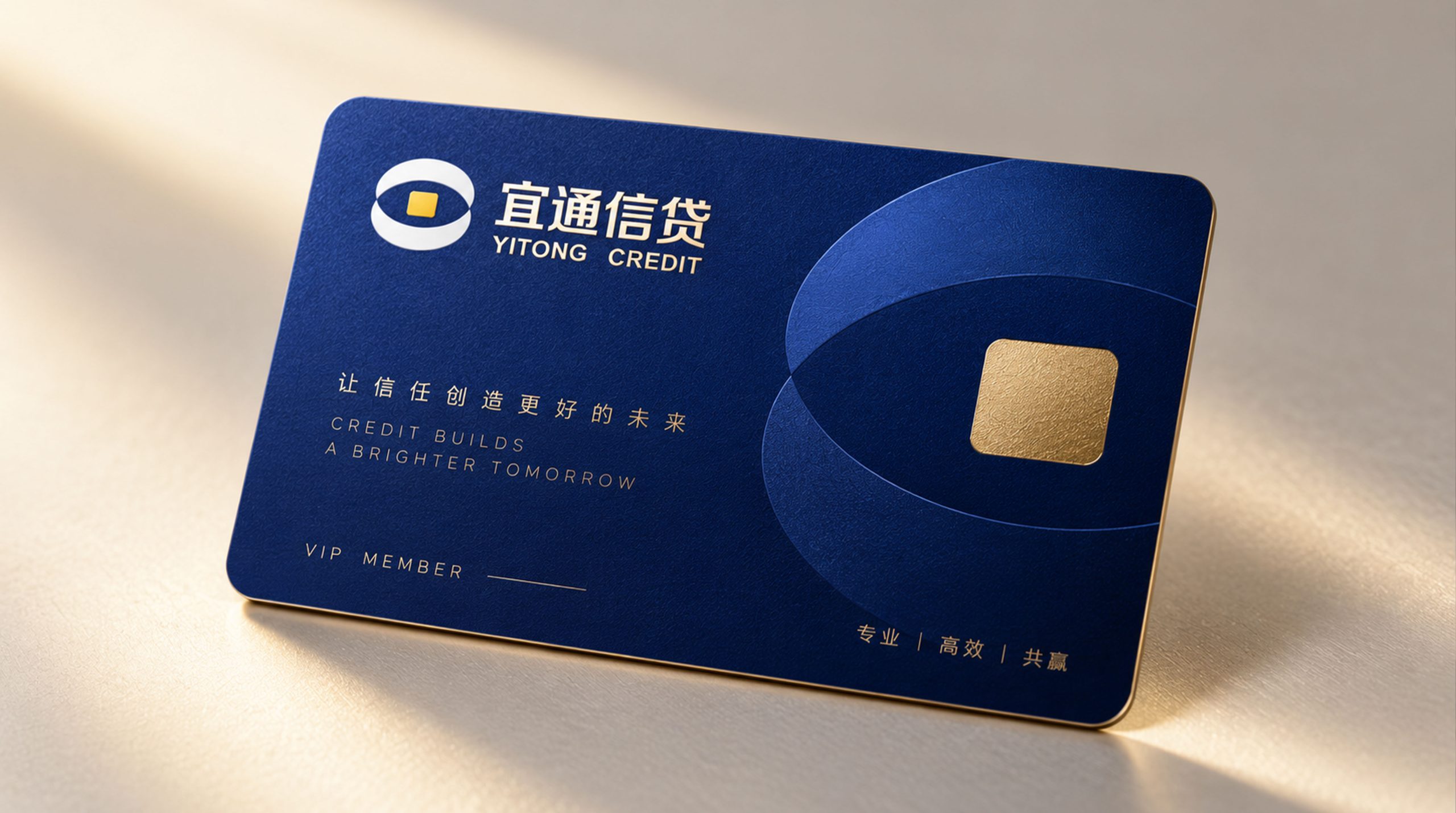
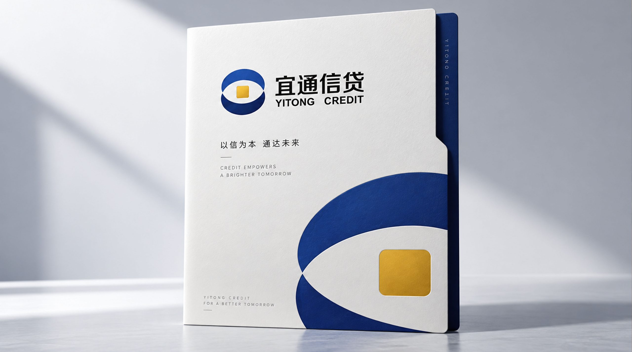
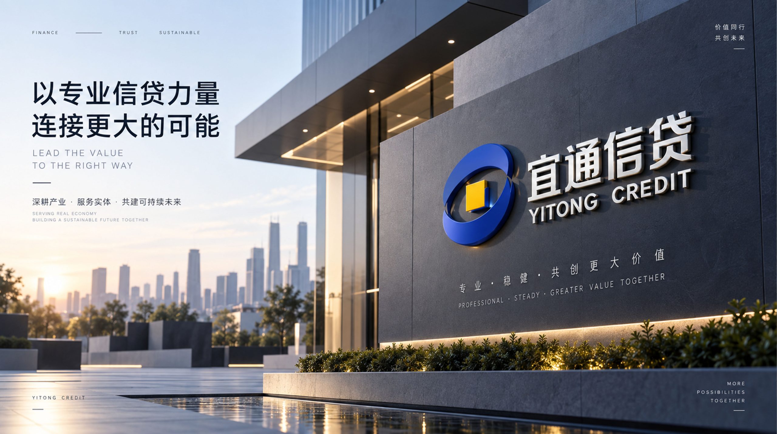
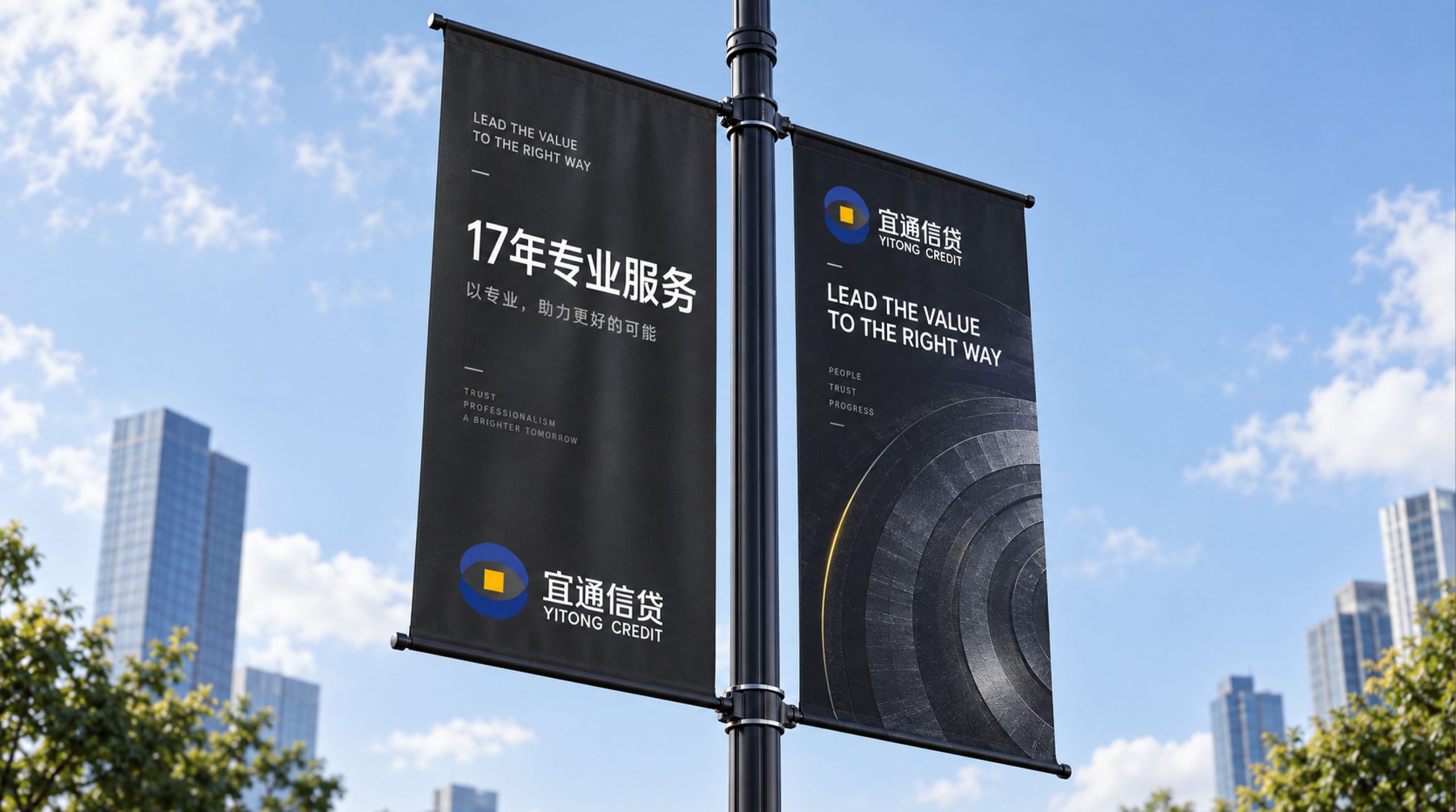
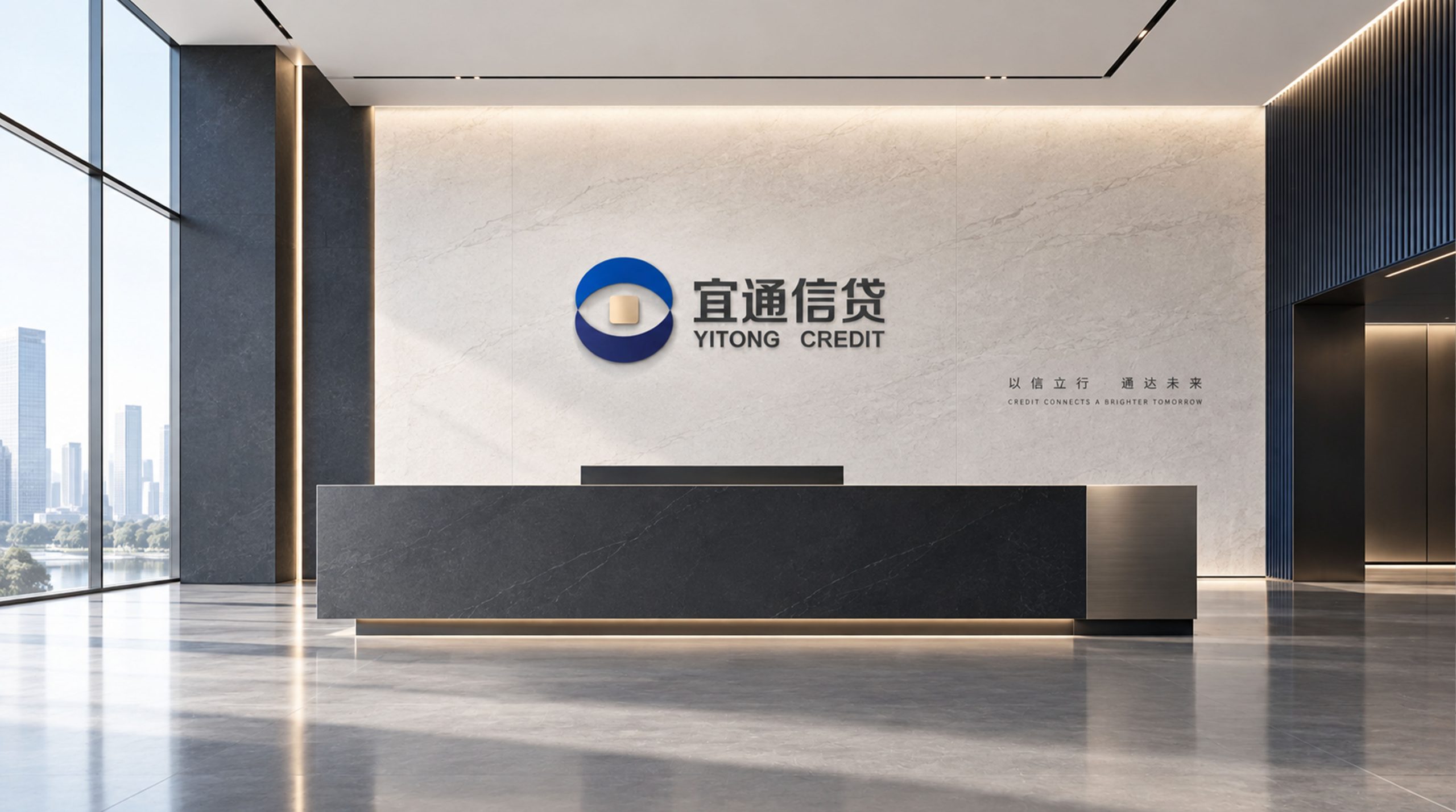
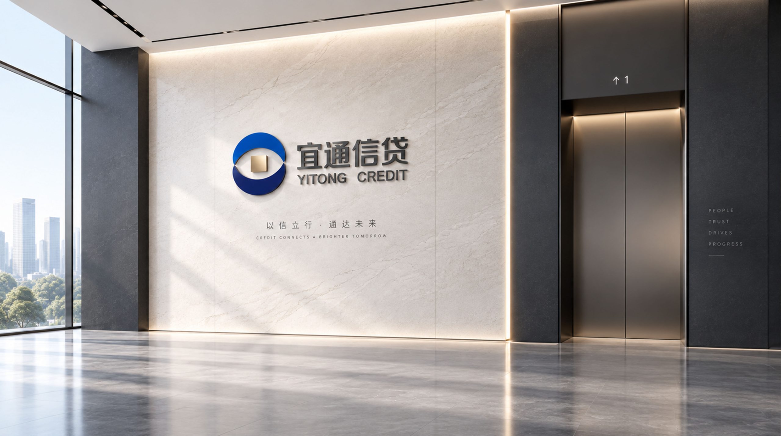
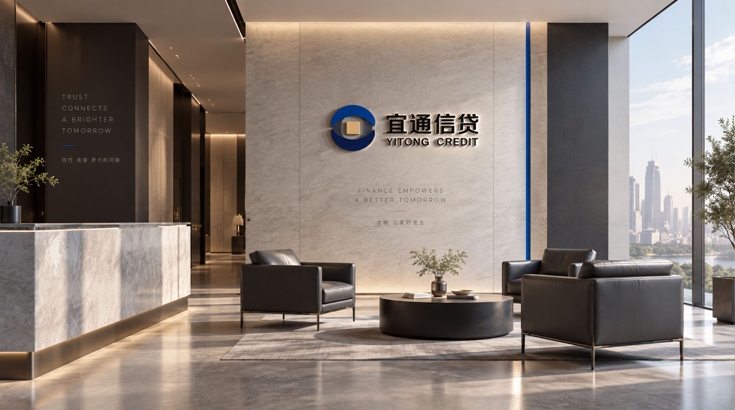
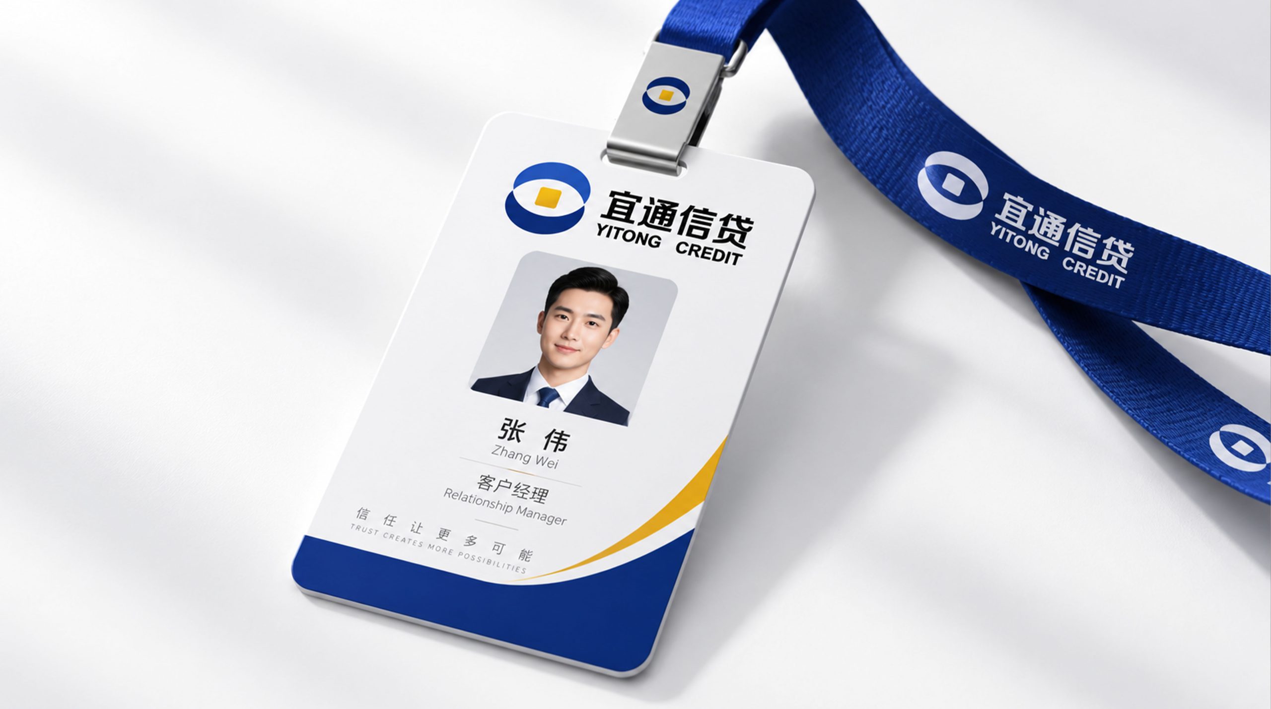
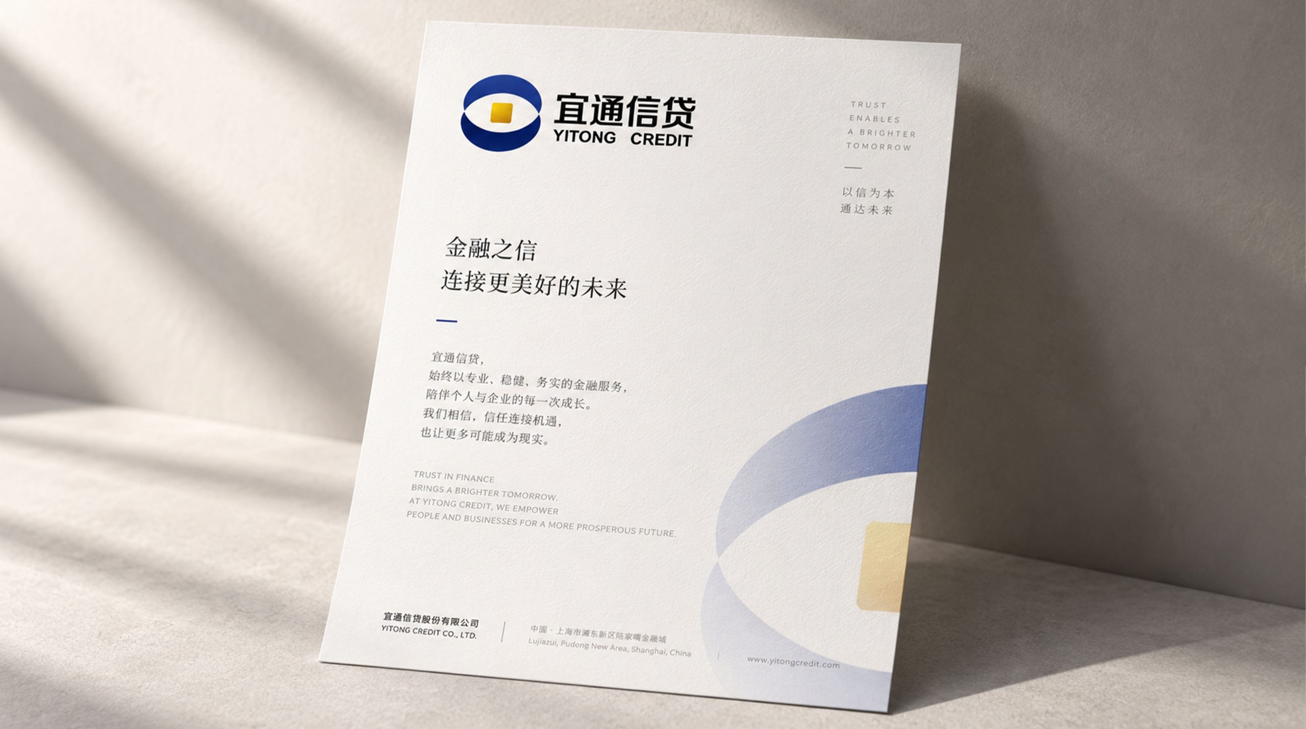
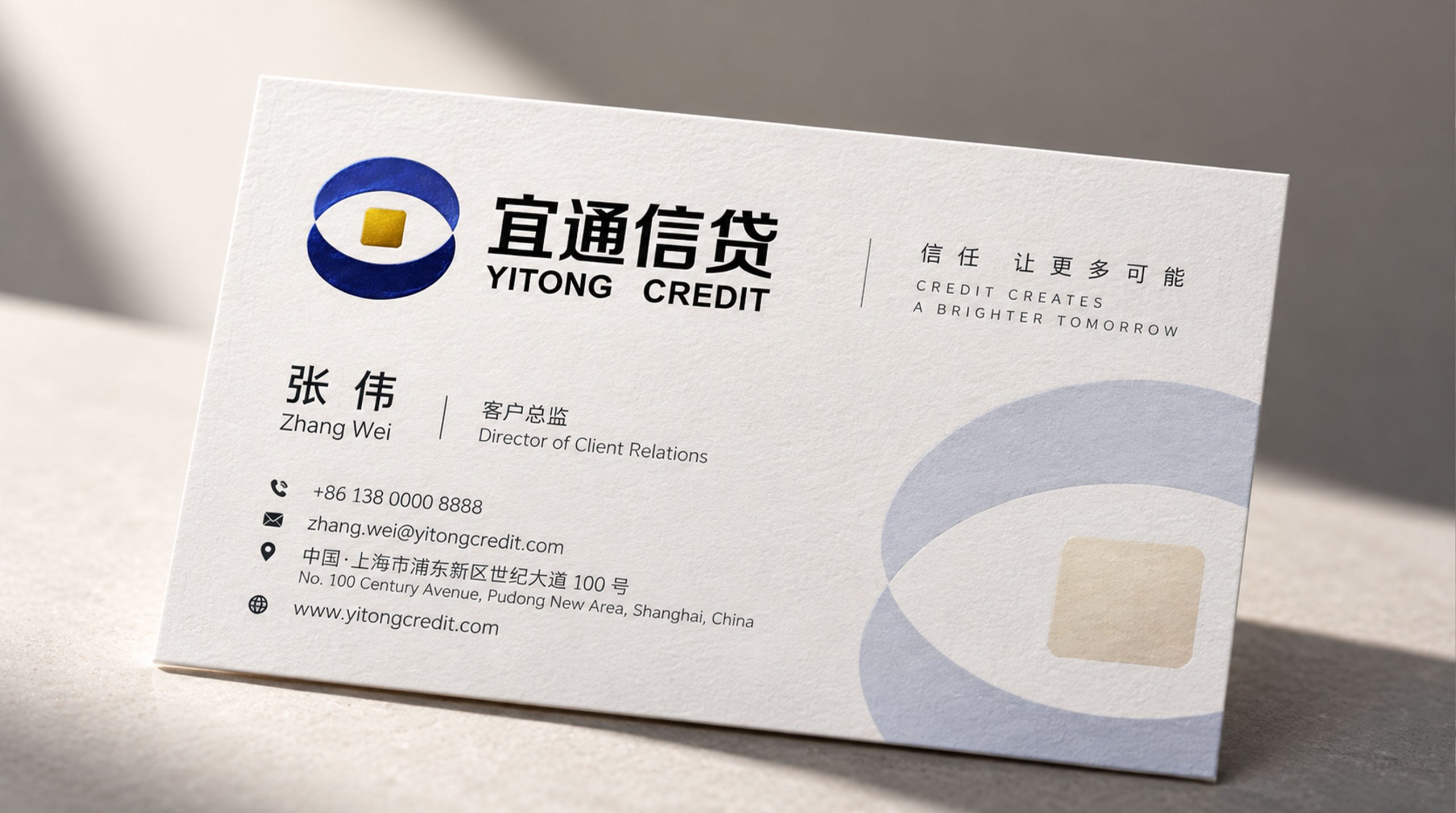
design concept
The logo takes "Gateway of Trust" as its core concept, integrating an open door with the symbol of circulating funds. Door is the most intuitive visual metaphor of the word "tong" - opening the door for users to obtain funds, so that credit services are no longer a privilege for a few people, but a channel that everyone in need can easily pass through.
graphic language
The main body of the graphic consists of two symmetrical vertical arcs forming the outline of an open door. The two arcs start parallel from the bottom and expand slightly upward, just like a door slowly opening to both sides, conveying the open attitude of "welcome to enter, unimpeded". The tops of the door-shaped arcs are connected with a horizontal arc to form an arch structure - the arch is the most stable stress-bearing structure in architecture, conveying the safe and reliable technical structure of the credit platform.
The door-shaped interior has an upward flowing curve running through the center. The curve is like a river of funds flowing smoothly from bottom to top, conveying the efficient and smooth flow of credit approval from application to loan. The end of the curve ends with a dot, which is like the end signal that funds have arrived in the user's account - the application is approved, the funds are received, and everything is completed smoothly. The overall composition conveys the service essence of the brand with the simple structure of "Open Doors and Access".
Font composition
The Chinese "Yitong Credit" uses a modern black font with rounded corners, even and soft strokes, and a clear and crisp structure, conveying the affinity and reliability of the inclusive finance brand. "Yitong" is highlighted in slightly thicker characters to highlight the brand name, and "Credit" is used to clarify the business attributes. The English "YITONG CREDIT" is arranged in standard uppercase sans serif font to ensure the brand is clearly identifiable in the digital scene.
color system
The main color Yitong Blue #2B6CB0 represents trust, security and professional financial services. Blue directly conveys the trust signal of "safety of funds and reliable information" in the credit industry, dispelling users' psychological concerns about lending behavior with a rational and calm tone. Auxiliary Smooth Green #34A853 is used for positive status feedback such as approval and loan success, and greenly delivers the service experience of "green light all the way, smooth flow". Auxiliary warm orange #F5A623 is used for marketing activities and user care elements, injecting the warmth of inclusive finance into the rational blue and green. Pure white #FFFFFF is used as the standard background color and the basic color of the APP interface. The overall color is blue as the core and supplemented by green and orange, reflecting the brand temperament of "safe, trustworthy, convenient and warm".
Application extension
The logo can be widely used in mobile APP icons and interfaces, official websites and H5 marketing pages; offline service outlet doors and business processing area logos; brand promotional materials, user agreement covers and customer service manuals; financial technology industry summits and inclusive financial cooperation project images. In the dynamic visual, the door-shaped arc slowly opens to both sides, the central capital curve flows smoothly from bottom to top, and the top dot lights up like a payment reminder, symbolizing that Yitong Credit opens a convenient and efficient capital channel for every user.
brand meaning
The logo contains three core images: Easy Access - the open door shape conveys the core experience of low credit service threshold and smooth process; Secure & Trusted - the arch structure and calm blue convey the technical safety and financial guarantee of the platform; Inclusive Warmth - the rounded corner shape and warm colors convey the original intention of the brand of inclusive finance to "serve everyone". The overall design conveys the brand vision of "pleasant credit, smooth and worry-free".
Improper Usage (Protection Specification)
Do not change the symmetrical structure of the door arc or the arc of the vault; do not delete the central fund curve or change its flow direction; do not change the hue of the main color of Yitong Blue; do not add strokes, shadows or decorative effects that are inconsistent with the financial style; keep white space ≥ 25% of the graphic height; the minimum display width shall not be less than 20mm.
design results
After the release of the logo, Yitong Credit's brand recognition and user trust have been significantly improved in the fields of inclusive credit and financial technology. "Gateway to Access", with its visual language of conveying convenience, efficiency, safety and reliability, has become the core identification symbol of the brand system, showing the brand vision of "pleasant credit, smooth and worry-free".