










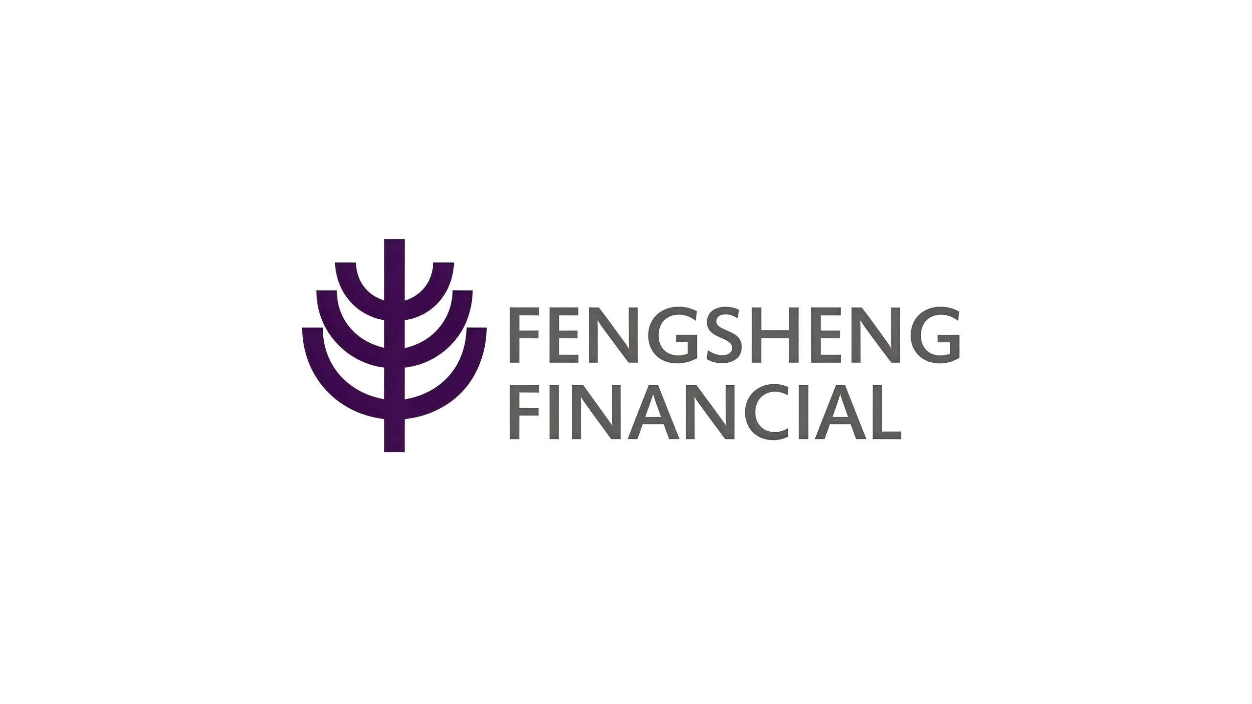
Mapletree Financial is a professional financial institution with asset management and investment services as its core. It is committed to realizing the continuous appreciation of assets and the inheritance of wealth from generation to generation for its customers with stable investment strategies and long-term value vision.
The brand name "Fengshu" has a profound meaning - "Feng" means harvest and abundance, symbolizing the rich return on investment and the abundance of customer wealth; "Shu" means big tree and establishment, symbolizing that the enterprise is as deep-rooted and luxuriant as a century-old tree, with everlasting foundation. Abundance is the fruit, and the tree is the foundation. Only when the roots are deep can the fruit be abundant. Qingmei Future was commissioned to lead the brand identity design.
The design goal of the brand logo is to convey the brand image of "deep roots, abundant growth and long-term value" through the visual language of solid foundation, abundant growth and long-term value.
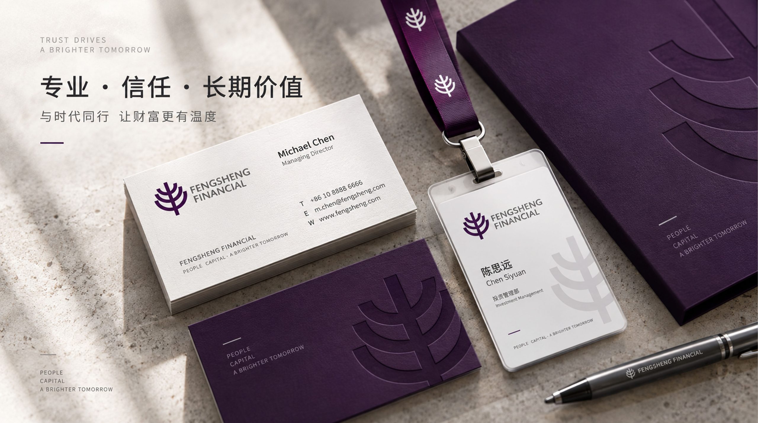
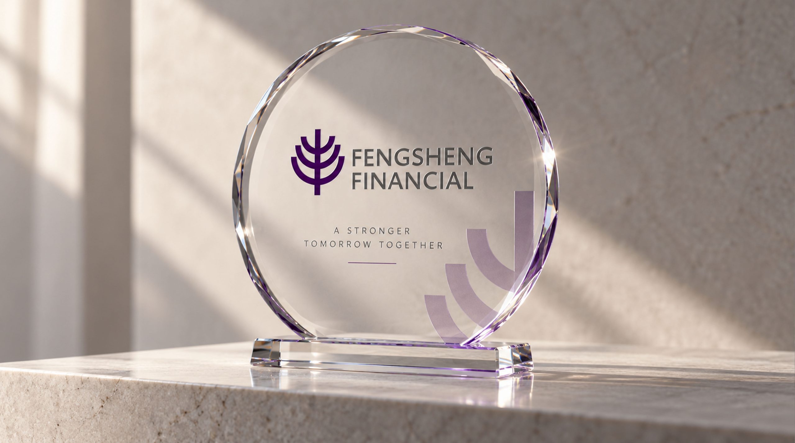
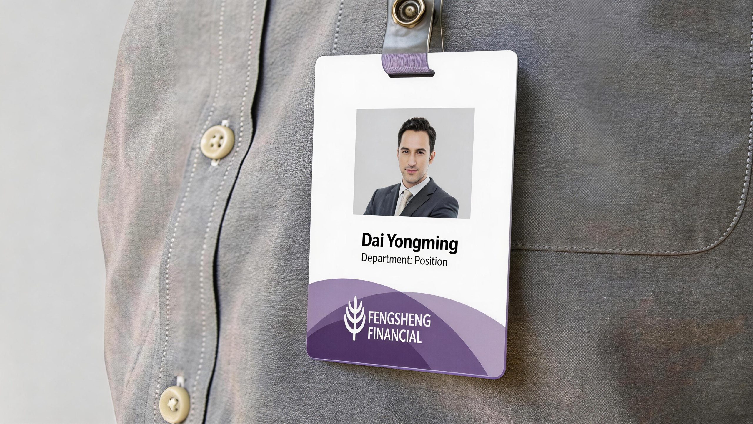
design concept
The logo takes "Evergreen Harvest" as the core concept, condensing a large tree with luxuriant branches and abundant fruits into the brand symbol. Big trees are the most perfect example of "long-termism" in nature - not eager to sprout buds in one season, but to take root for decades in exchange for hundreds of years of towering; not to be greedy for temporary flowers, but to exchange continuous nourishment for annual harvests. With the big tree as the core of the logo, it conveys the investment philosophy of financial institutions of "cultivate deeply, grow slowly, and eventually gain abundance".
graphic language
The graphic features a refined silhouette of a large tree. The crown of the tree is composed of several full leaf-shaped arcs stacked on top of each other. Each leaf is round and full, like a heavy fruit during the harvest season - it is both a leaf and a fruit, conveying the fullness of the word "Feng". The leaf-shaped arcs are stacked in three to five pieces from the center to the outside, forming a plump but not cluttered canopy outline, conveying the asset management logic of "diversified allocation and clear hierarchy" of the investment portfolio.
The tree trunk extends downward from the center of the canopy in a steady vertical line. The vertical line is thick and straight, like the unshakable bottom line of risk control and compliance foundation of a financial institution. The bottom of the trunk bifurcates into two symmetrical arcs extending to both sides, just like the roots of a tree firmly rooted in the earth - the deeper the root system, the lusher the crown, conveying the causal relationship of "a solid foundation supports abundant returns".
The topmost leaf-shaped arc in the crown is slightly upward, just like the highest branch of a big tree still growing upward, conveying the company's continuous growth power of "already lush and still upward". The overall graphic is presented in a symmetrical and stable structure, conveying the "unbiased, balanced and stable" operating style of financial institutions. The composition is based on the vertical structure of "the crown is rich at the top, the stem is stable in the middle, and the roots are deep at the bottom" to build a "rich tree and evergreen".
Font composition
The Chinese version of "Mapletree Financial" adopts a stable modern Song font, with thin horizontal lines, thick vertical lines, and clear strokes. The character "Feng", three horizontally and one vertically, resembles ears of harvest, the character "tree" stands tall and tall to echo the image of a big tree, and the word "finance" ends calmly. The English "MAPLETREE FINANCE" is arranged in a standard uppercase serif font with a generous and solemn font to ensure the brand's professional recognition in the capital market and international cooperation.
color system
The main color, Maple Green #2C6E49, represents growth, evergreen and sustainable wealth appreciation. Green is like the color of the evergreen leaves of a big tree all year round - it will not wither and flourish due to the winter and summer of the market, conveying the investment determination of financial institutions to "cross cycles and increase long-term value". Auxiliary Harvest Gold #B8943E is used for wealth returns and high-end customer elements in the brand system. The golden color is like the warm luster of ripe fruits under the autumn sun, conveying the richness of investment returns and the joy of value realization. The combination of green and gold conveys "evergreen patience + harvest rewards". Auxiliary growth ring brown #5D4037 is used as an element of historical precipitation and trust in the brand system, just like the deep color of the growth rings of a big tree. Pure white #FFFFFF as standard base color. The overall color uses green and gold as the dual core, reflecting the brand temperament of "evergreen, stable and rich in value".
Application extension
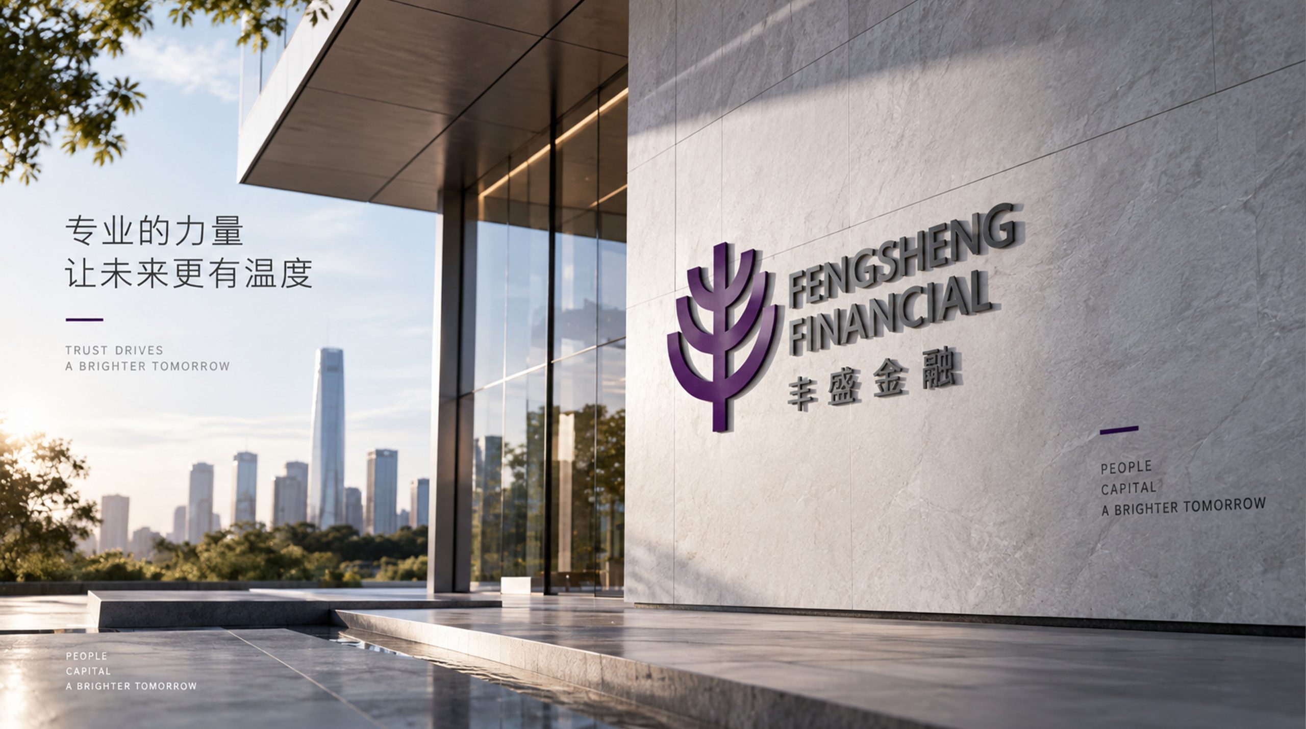
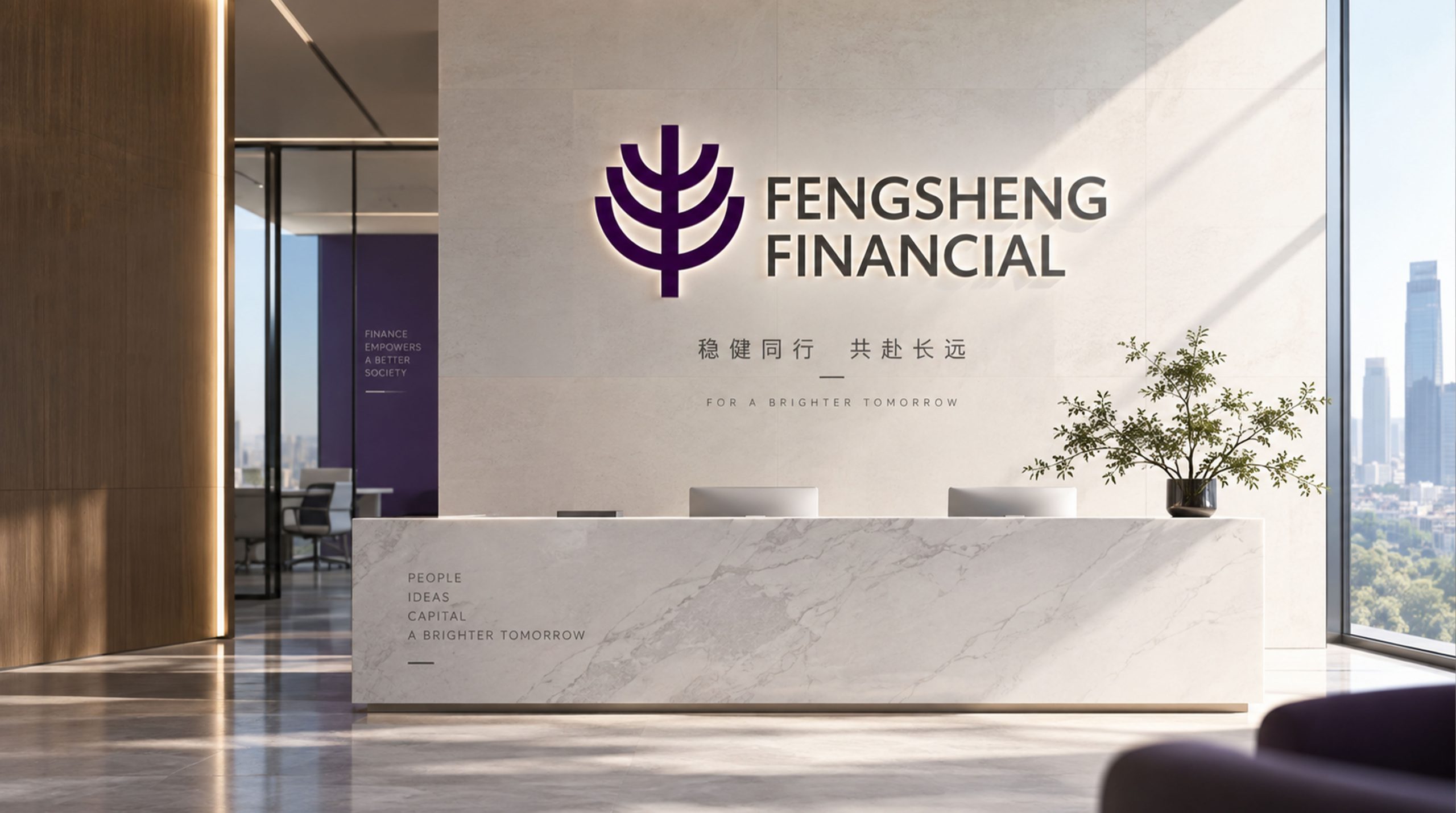
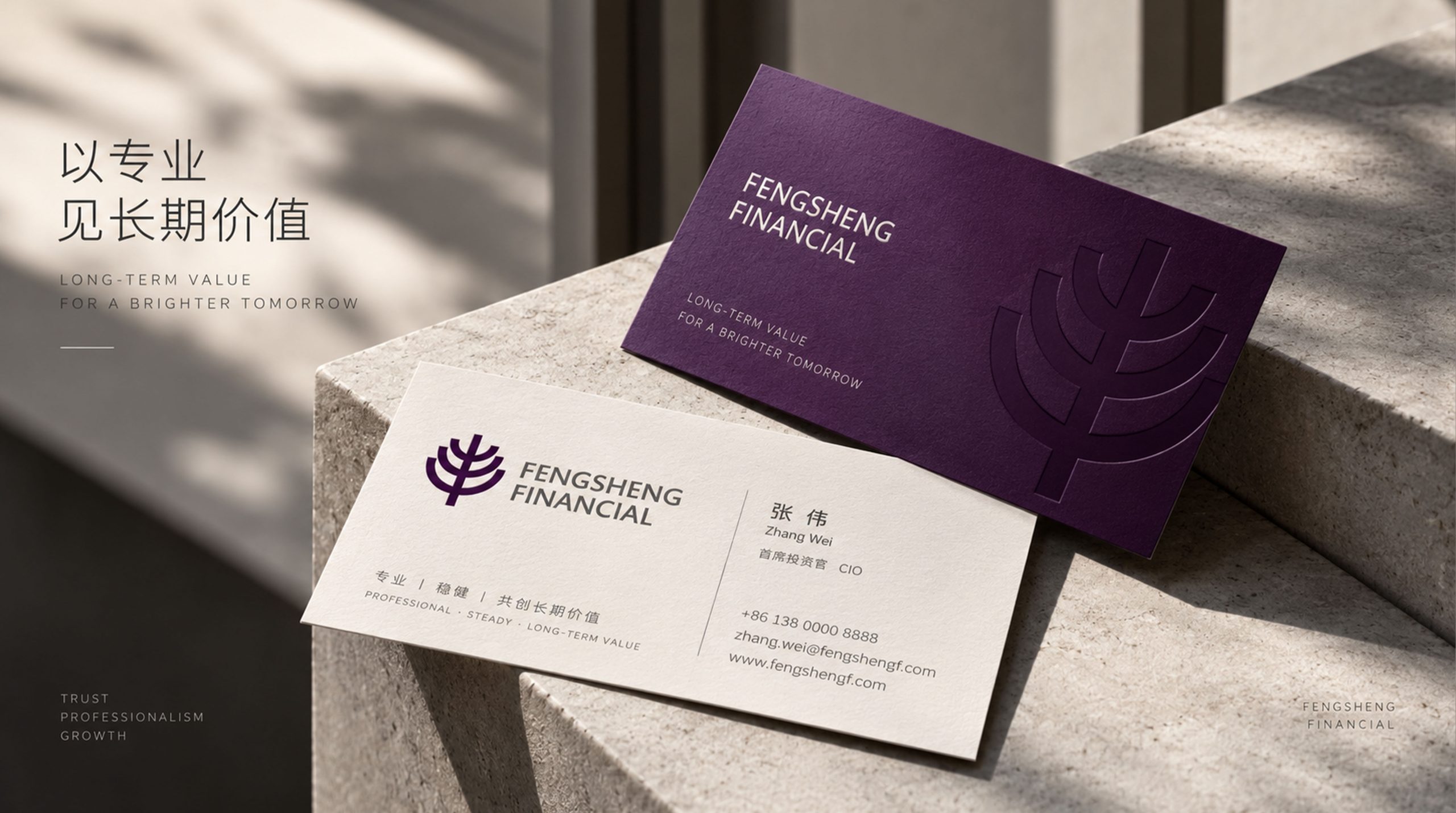
The logo can be widely used in institutional headquarters and branch office logos; asset management reports, investment plans and customer service manuals; official websites, wealth management platforms and digital communication materials; investment industry summits, wealth management forums and brand event images. On the cover of the annual report for high-end customers, the golden tree logo on the Maple Green background is presented with hot stamping technology. The richness of the crown and the depth of the roots convey on the exquisite paper that "your wealth is growing steadily under the protection of a towering tree." In the dynamic visual, the roots of the tree penetrate deeply from the bottom of the picture, the trunk stands steadily and erect, the leaves of the canopy stretch and bloom layer by layer, and the tip of the top leaf gently rises, symbolizing Mapletree Financial's deep foundation to protect the continuous abundance of customers' wealth.
brand meaning
The logo contains three core images: Abundant Returns - the full canopy conveys the richness of investment returns and the abundant growth of customer wealth; Deep-Rooted Stability - the thick trunk and spreading roots convey the professional quality of financial institutions with deep roots and stable risk control; Evergreen Growth - the evergreen tree conveys the investment philosophy of transcending market cycles and continuing to create long-term value. The overall design conveys the brand vision of "deep roots, lush leaves, abundant and far-reaching".
Improper Usage (Protection Specification)
Do not change the number of stacks or full arcs of the leaf-shaped arcs of the tree crown; do not delete the tree root arc or change its symmetrically unfolded structure; do not change the hue of the main color of the tree green; do not add gradients, strokes or decorative effects inconsistent with the financial style; do not separate the crown and trunk for separate use; keep the white space ≥ 25% of the graphic height; the minimum display width shall not be less than 25mm.
design results
After the release of the logo, Mapletree Financial's brand recognition and customer trust in the asset management and investment services fields have been significantly improved. With its visual language that combines solid foundation and abundant returns, "Maple Tree Evergreen" has become the core identification symbol of the brand system, showing the brand vision of "deep roots, lush leaves, abundant and far-reaching".