










Human organ donation in China is a national-level public welfare undertaking jointly promoted by the Red Cross Society of China and the National Health Commission. It is committed to establishing a citizen voluntary organ donation system, promoting social awareness and public participation in organ donation, and allowing every gift of life to continue the hope of another life.
The brand name directly carries the lofty mission of the cause - "China" indicates the national public welfare attribute, and "Human Organ Donation" points out the core content of the cause in the simplest and most straightforward expression. There is no embellishment or metaphor, because this thing itself is one of the greatest acts of kindness of mankind - extending life with life. Qingmei Future was commissioned to lead the brand identity design.
The design goal of the brand logo is to convey the brand image of "relay of life, eternal love" through the visual language of life continuation, boundless love and warm hope.
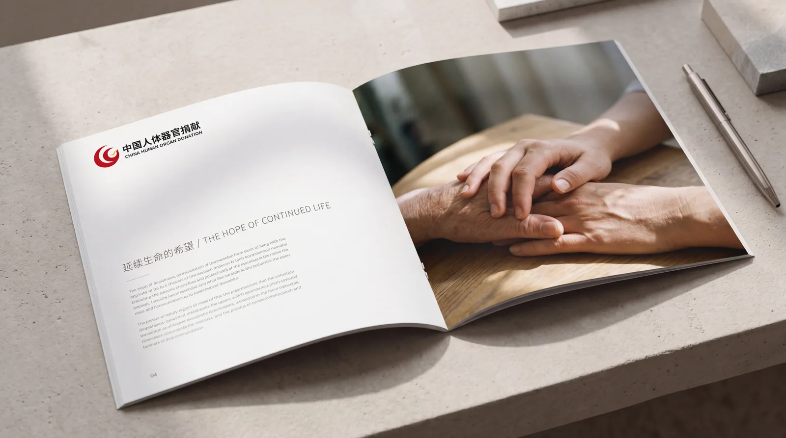
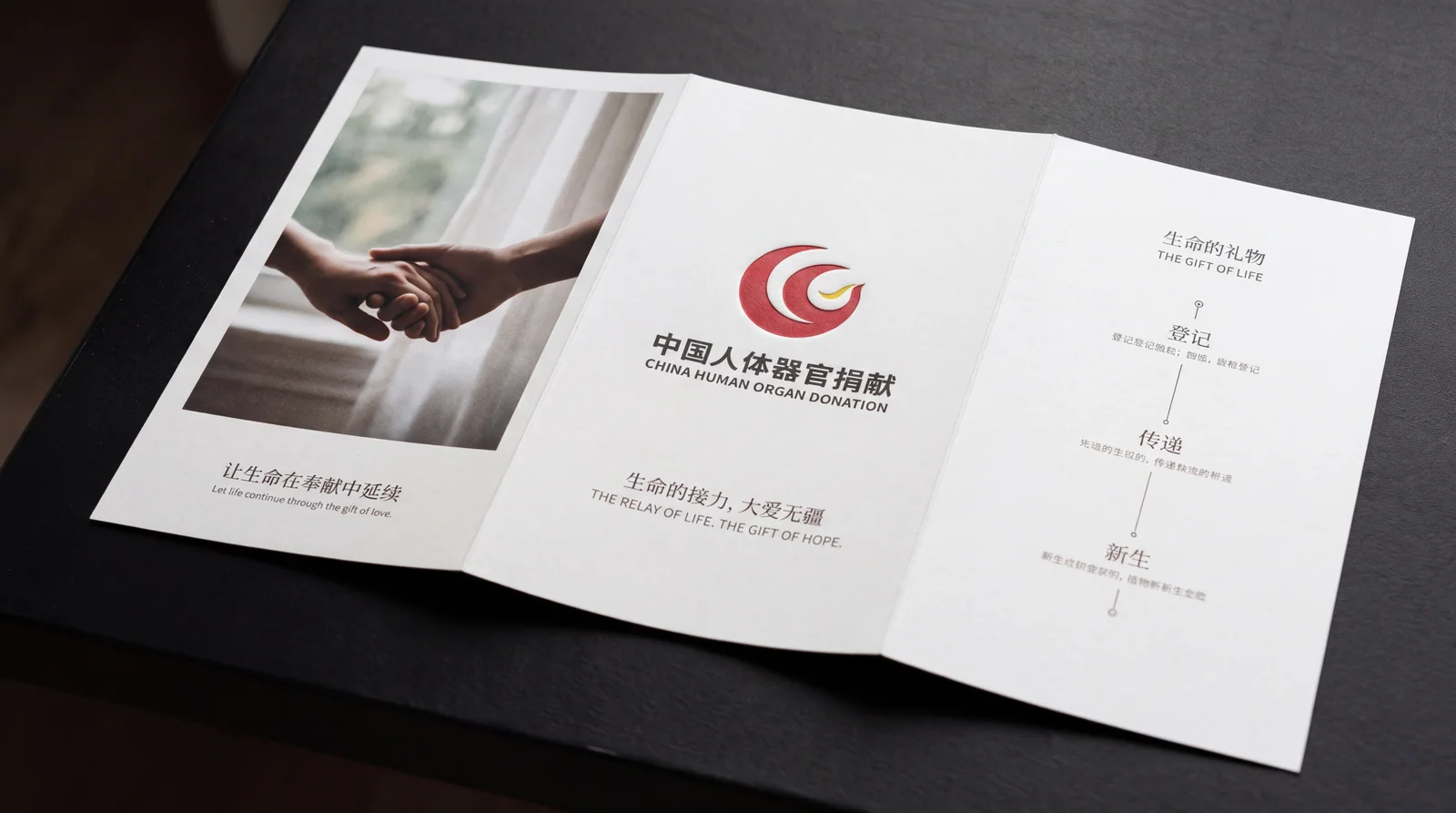
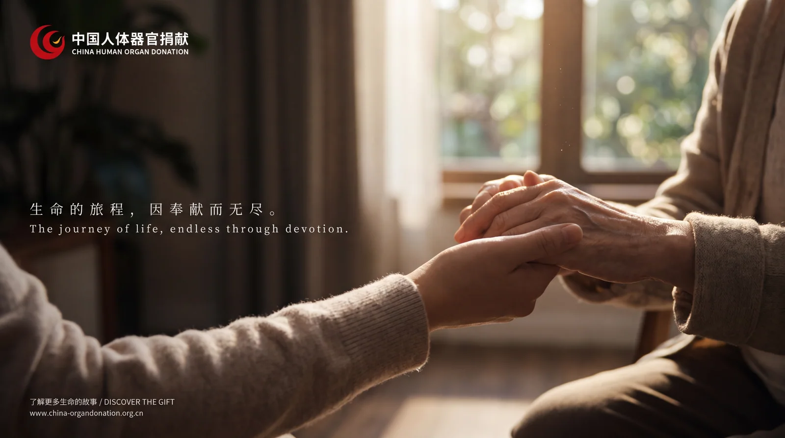
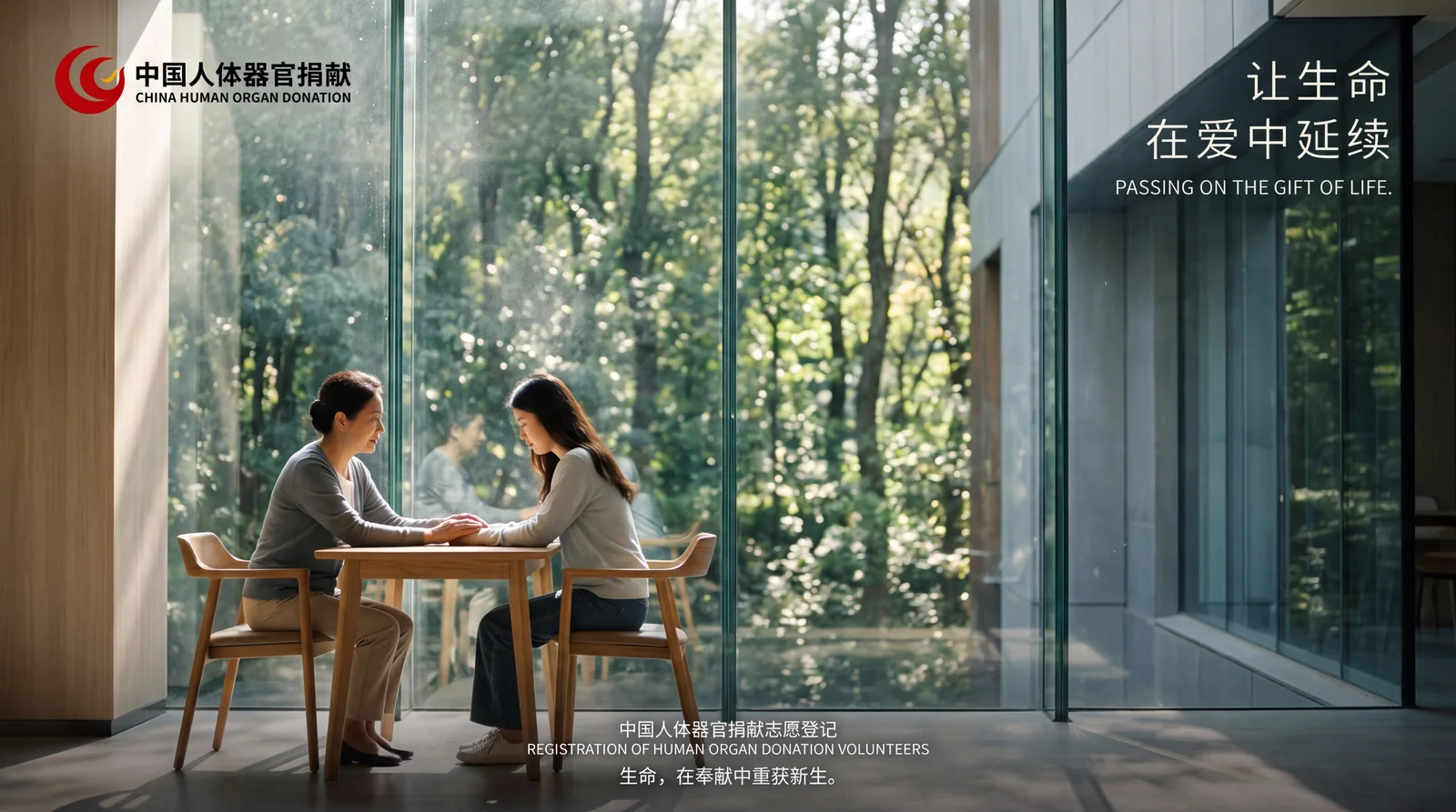
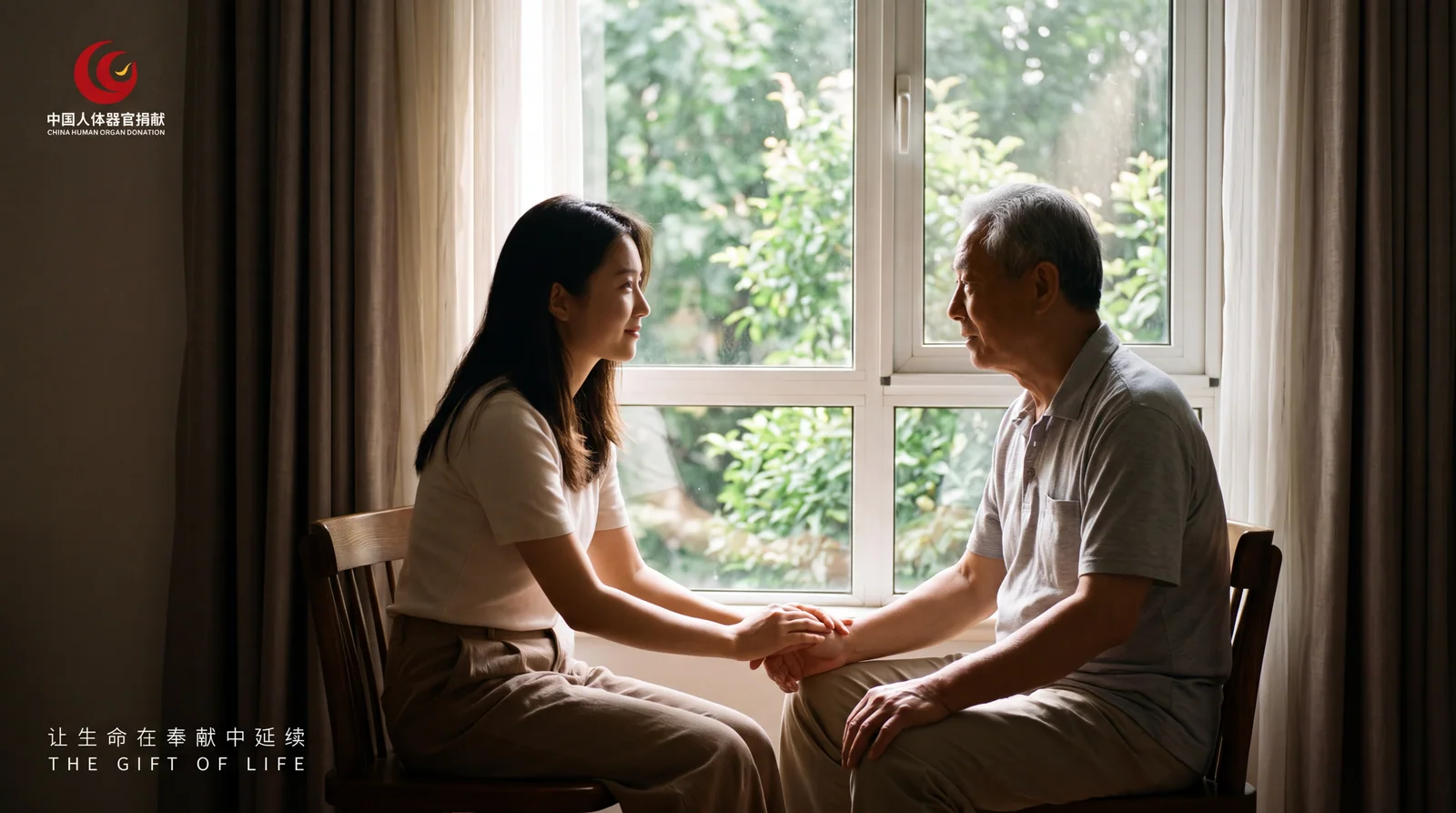

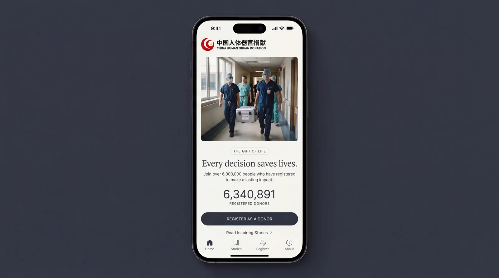
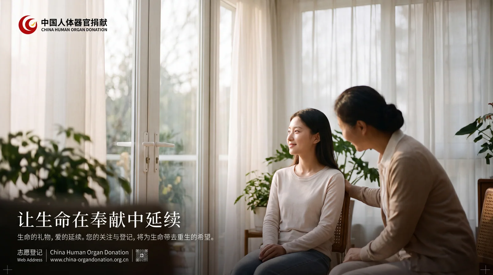
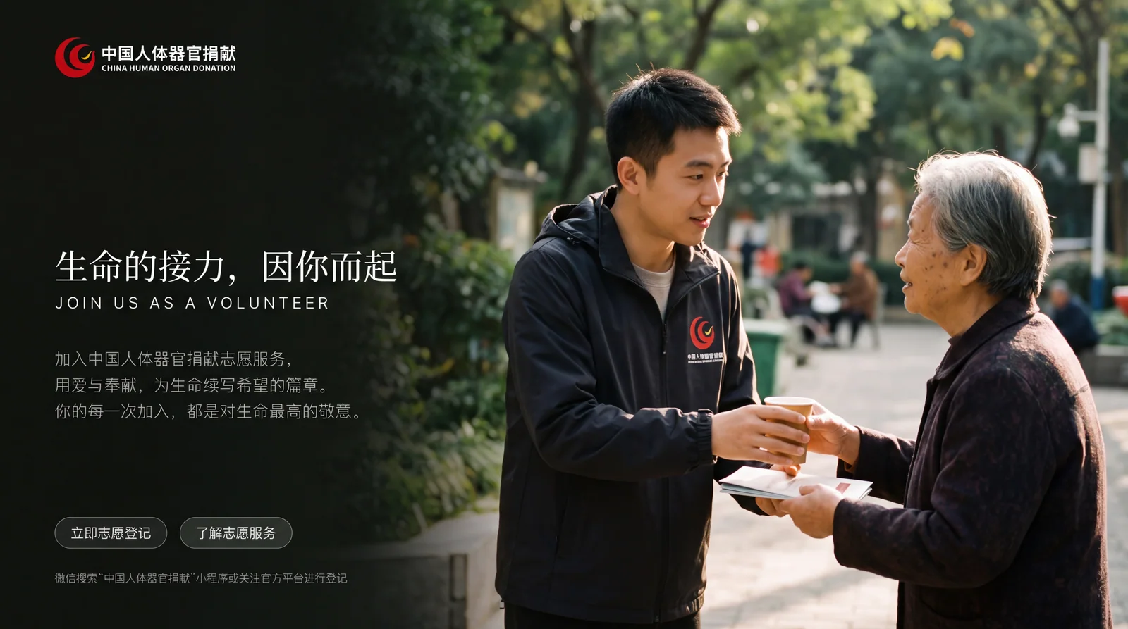

design concept
The logo takes "Hands of Life" as the core concept, integrating two pairs of hands passing each other with a beating heart. The essence of organ donation is the transfer of life - one hand solemnly holds it out, and the other hand gratefully accepts it. What is passed between the two hands is not only the organ, but also the continuation of life, the hope of the family and the most selfless love in the world.
graphic language
The main body of the graphic consists of simple silhouettes of two hands. The hands above are presented with their palms facing down, as if they are gently entrusting a precious thing - the fingers are slightly open, conveying the giving gesture of "solemnity, gentleness, reluctance and determination". The hands below receive the gift with their palms upward, as if they are gratefully receiving a priceless gift - the fingers are slightly closed, conveying the acceptance gesture of "treasure, gratitude, and solemnity".
A heart shape is centered in the space between the two hands. The heart shape is not filled in solidly, but is outlined with simple lines - light and transparent, like a beating heart. The heart is in an in-between state of being "being passed on" between two hands - leaving one hand but not yet reaching the other, like the sacred journey of life from one body to another in organ donation. The heart shape symbolizes the core of organ donation—not just the heart, but all gifts of life driven by love.
The overall outline of the two hands is presented in a soft arc, avoiding all sharpness and harshness - this is a symbol of love and life, and every stroke should be as gentle as a whisper. The arcs of the upper and lower hands naturally close on the left and right sides, forming an oval-shaped protective space, which wraps the heart like a safe embrace, conveying the solemn promise of "protecting life and cherishing every gift". The overall composition constructs the "hand of life" with a vertical transmission structure of "the upper hand entrusts, the lower hand takes over, and the heart is in between".
Font composition
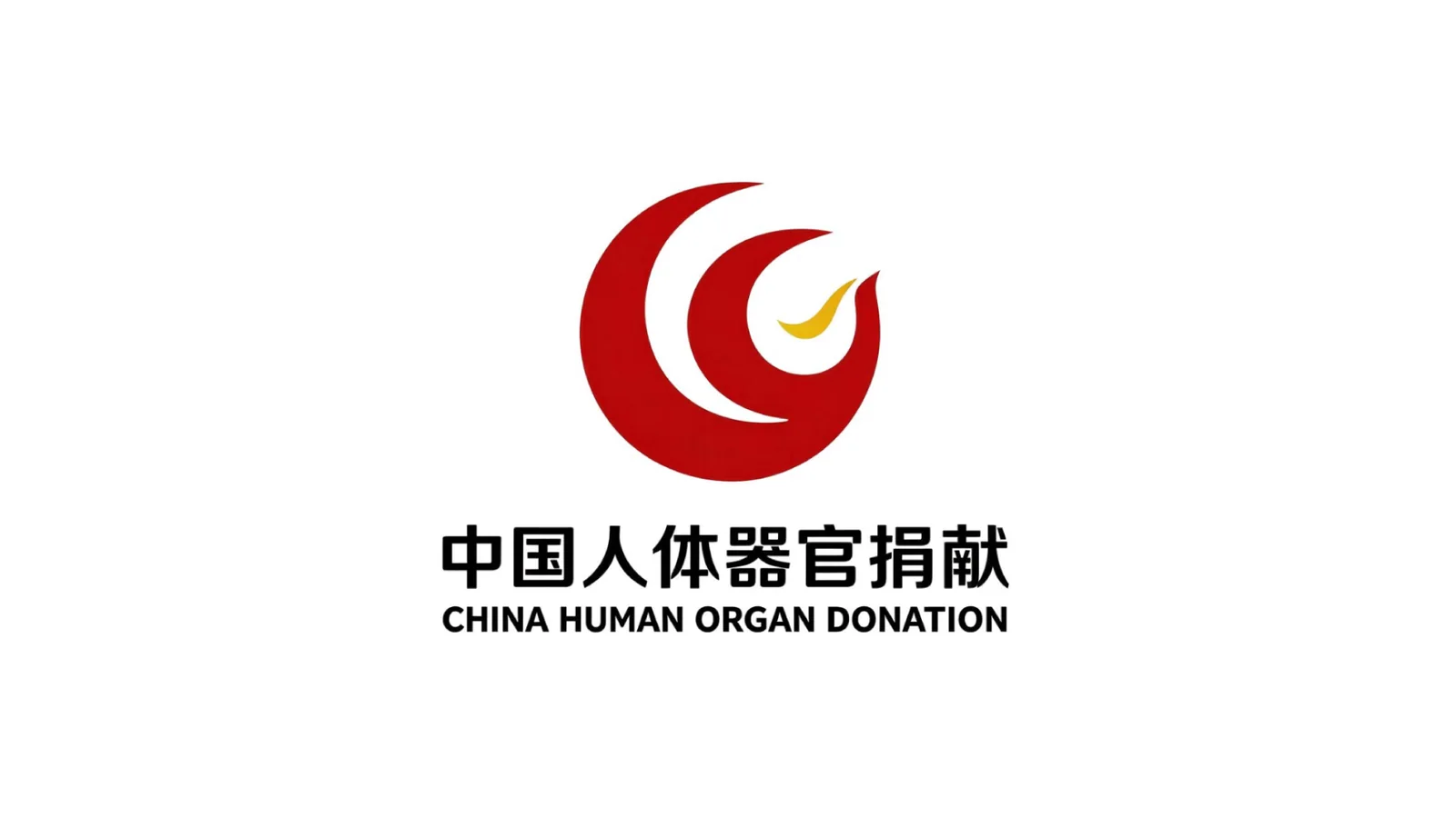
The Chinese "Human Organ Donation in China" is written in upright modern boldface, with even and steady strokes and a solemn and clear structure. The font does not have any decorative treatment, conveying the seriousness and credibility of national public welfare undertakings in the simplest manner. The English "CHINA ORGAN DONATION" is arranged in a standard uppercase sans-serif font with a regular and regular font to ensure clear recognition in international organ donation cooperation and public welfare communication.
color system
The main color of life red #C0392B represents heart, blood, life and love. Red is the core symbolic color in the global organ donation and Red Cross public welfare fields - red is the color of blood, the color of heart beating, and the most essential color of life. The choice of this color directly conveys the supreme significance of "life-related" organ donation, and is consistent with the brand color system of the Red Cross Society of China. Auxiliary Hope Green #27AE60 is used in the brand system as an element of hope for life continuation and rebirth. Green is like the resurrection of all things in spring - organ donation allows life to sprout again in another body. Green conveys the core belief of "life does not end, hope lasts". Auxiliary warm orange #F39C12 is used as an affinity element in the brand system for publicity and volunteer activities. The warmth of orange conveys the popular vision of public welfare undertakings that "everyone can participate and there is warmth everywhere". Pure white #FFFFFF as standard base color. The overall color is red and green, reflecting the public welfare temperament of "life first, hope for sustainability".
Application extension
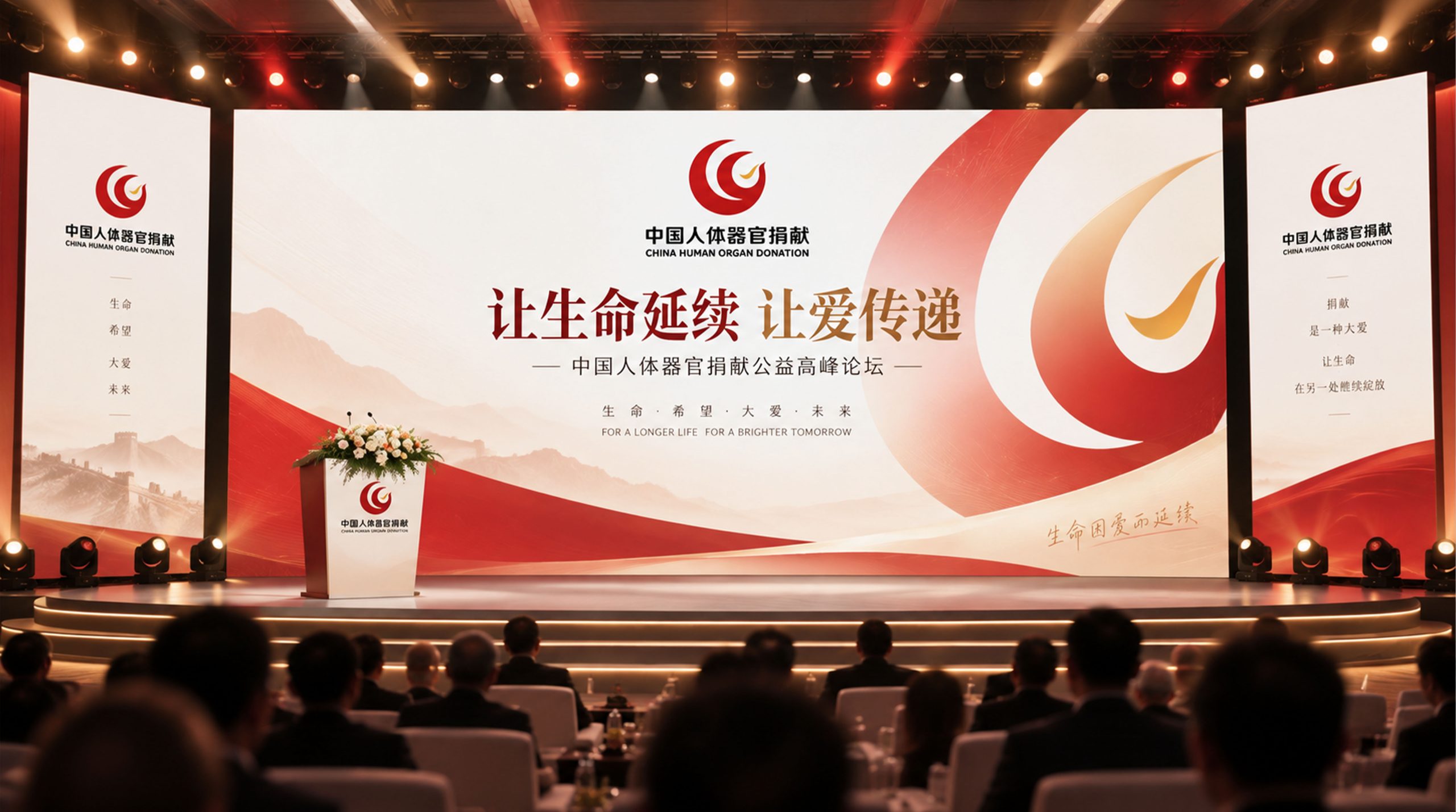
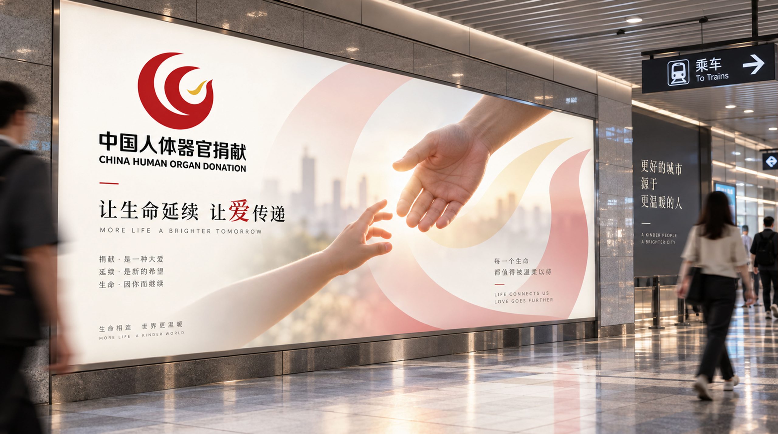
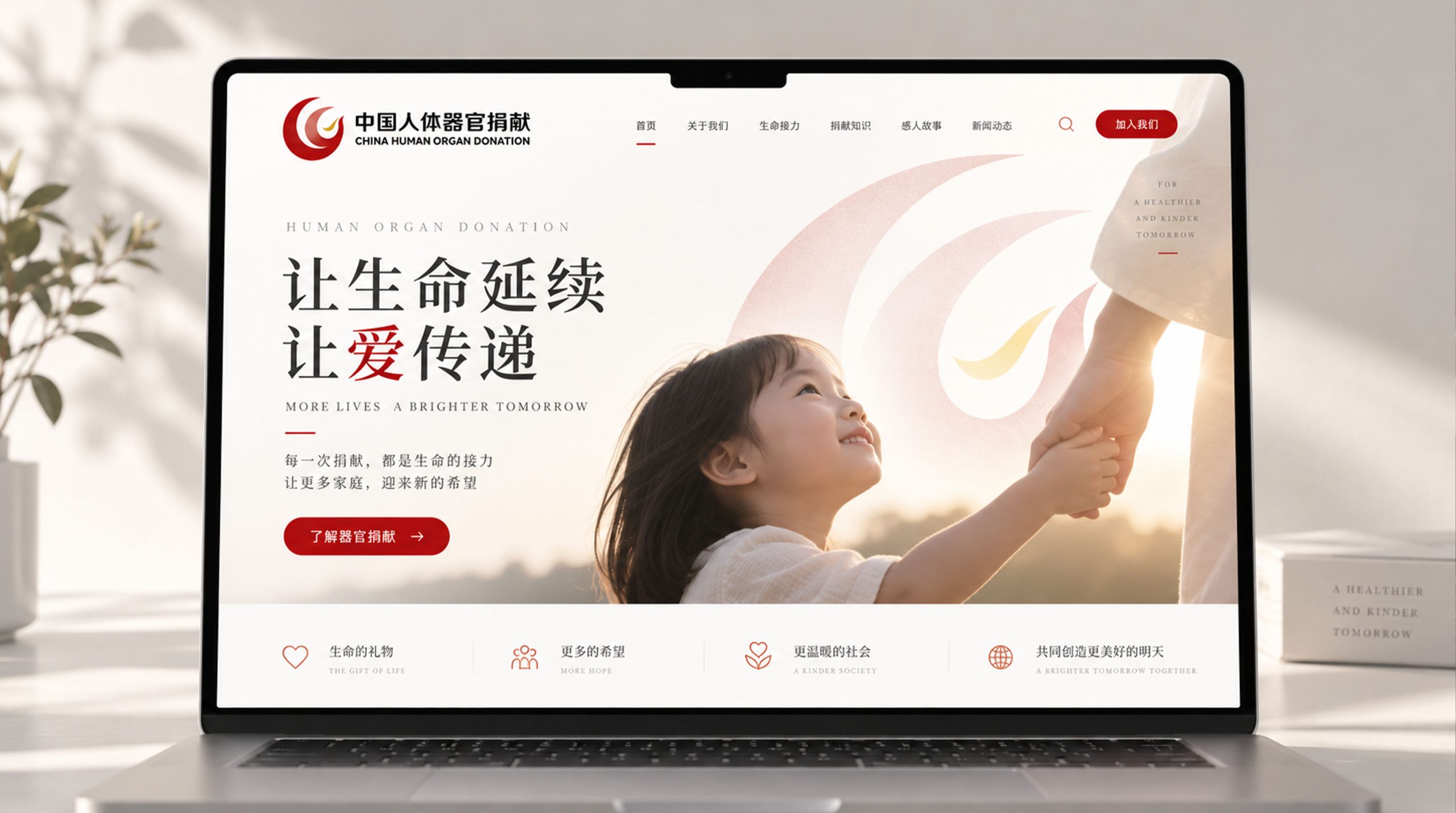
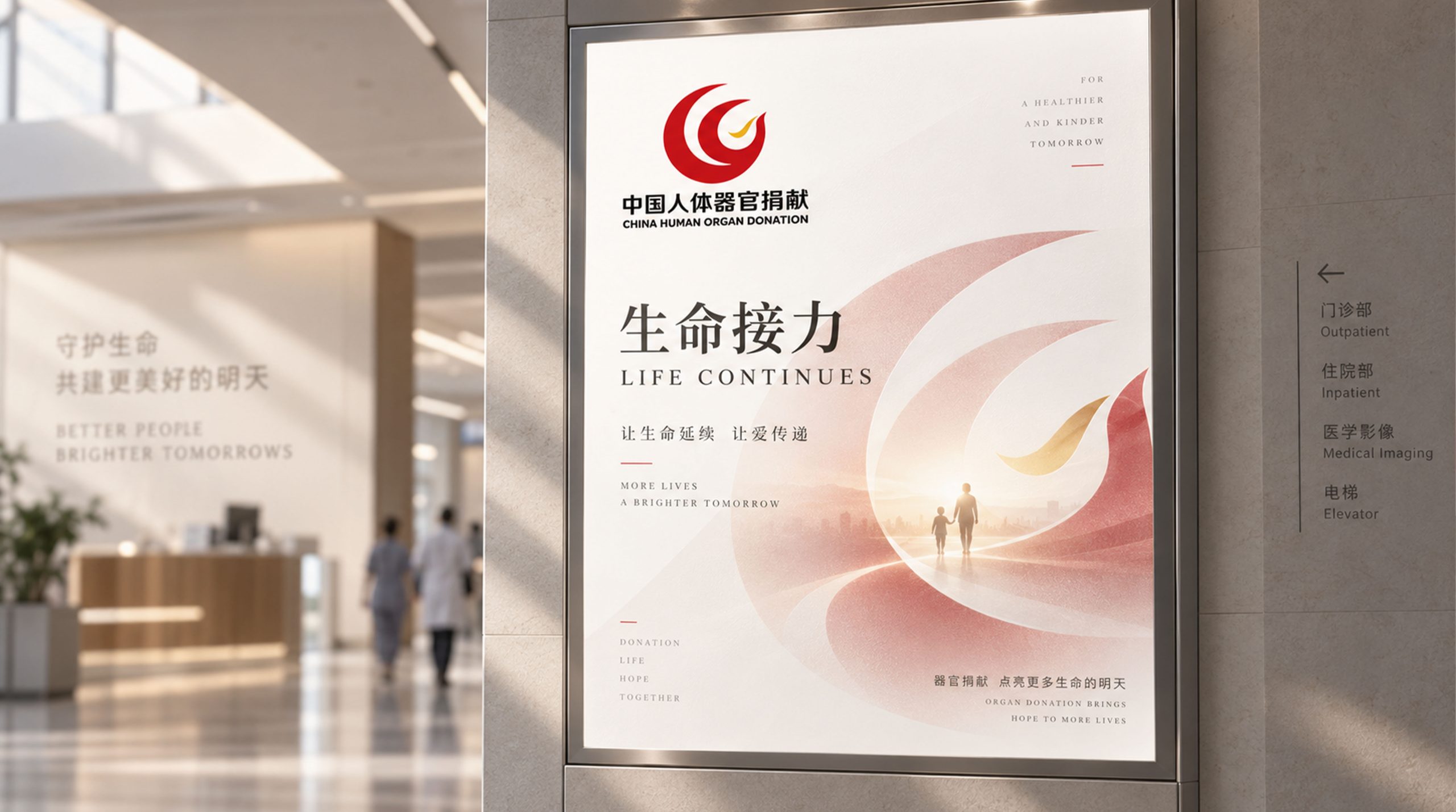
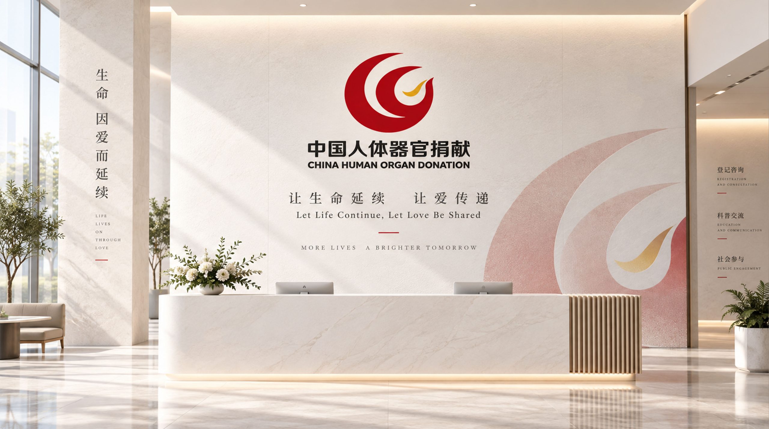
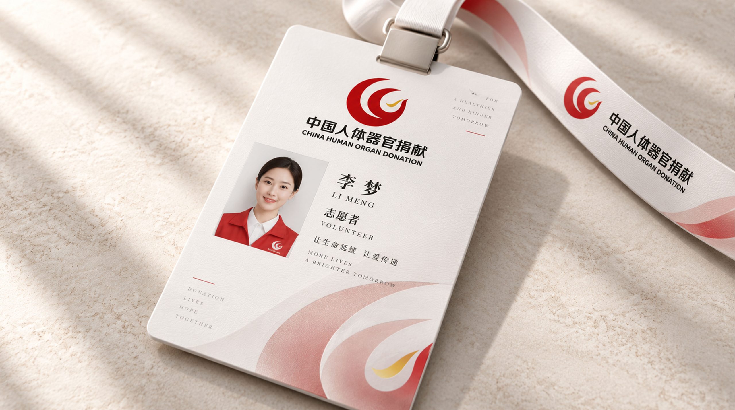
The logo can be widely used in the logos of organ donation registration centers and Red Cross offices across the country; organ donation registration cards, promotional brochures and public education materials; official websites, organ donation registration platforms and social media public welfare communication images; World Organ Donation Day activities, life education public welfare lectures and memorial ceremony images; public service advertisements, urban public space bulletin boards and transportation media placement. In front of the organ donor memorial wall, the Hands of Life logo is solemnly presented in stone carving or copper casting. The eternal passing gesture of two hands and a heart accompanies every family member and public who come to pay tribute, silently telling the noble story of "life is eternal because of giving". In the dynamic vision, the upper hand slowly unfolds, and the heart shape rises gently in the palm. The lower hand gently takes over, and the heart shape falls steadily. The transfer of a life is completed in a few seconds - simple, solemn, and moving.
brand meaning
The logo contains three core images: Life Passed On - the heart shape passed between hands conveys the core mission of organ donation to "extend life through life"; Boundless Love - the giving and receiving hands convey the selfless love between the donor and the recipient across life and death; Hope Renewed - the heart-shaped beating gesture and green auxiliary color convey the beautiful belief that every donation brings hope for rebirth to another family. The overall design conveys the public welfare vision of "Relay of Life, Sustainable Love".
Improper Usage (Protection Specification)
Do not change the up-and-down relationship of the two hands or the central position of the heart; do not replace the heart with a solid fill or other graphics; do not change the hue of the main color of life red; do not add gradients, shadows or commercial decorations that are inconsistent with the public welfare style; do not separate the hands and the heart for separate use; keep white space ≥ 25% of the height of the graphic; the minimum display width must not be less than 25mm.
design results
After the release of the logo, the public awareness and social participation of China's human organ donation industry have increased significantly across the country. "Hands of Life", with its visual language of conveying the transmission of life and boundless love, has become the core identification symbol of China's organ donation industry. It is widely used in public education, volunteer registration and commemoration, showing the public welfare vision of "life relay, great love goes on".