










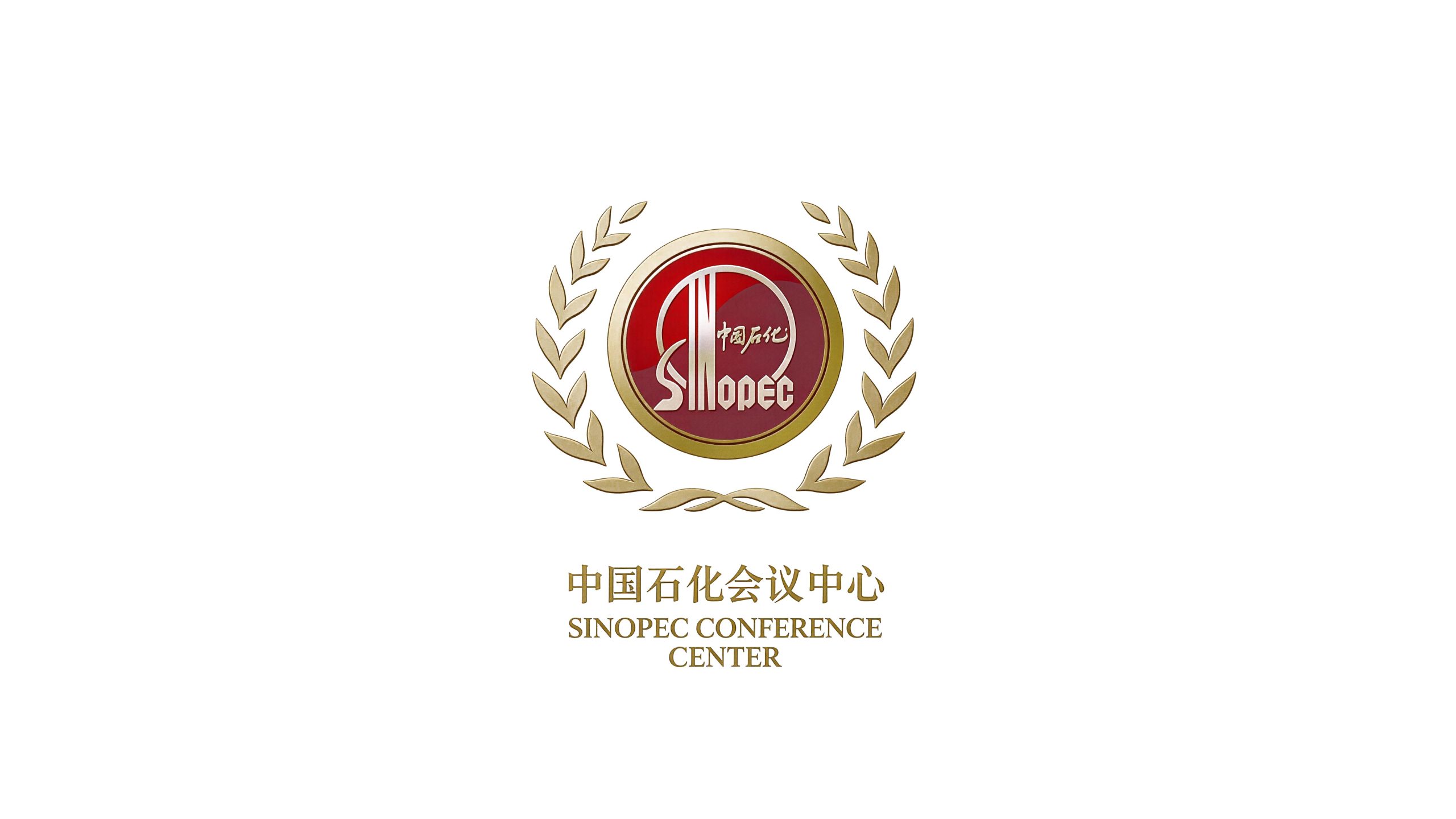
Sinopec Conference Center is a comprehensive conference service and business reception institution affiliated to China Petroleum & Chemical Corporation. Its core business is large-scale conference hosting, business training, high-end banquets and accommodation services. It is committed to providing government agencies, enterprise groups and industry organizations with first-class conference reception experience based on the service quality and professional and efficient conference capabilities of central enterprise standards.
The brand name directly carries the highest endorsement of the parent brand - "Sinopec" is one of the most influential state-owned enterprise brands in China, and "Conference Center" clearly defines the functional positioning of the organization. Qingmei Future was commissioned to lead the brand identity design.
The design goal of the brand logo is to integrate the industry attributes of conference services on the basis of continuing the visual genes of Sinopec's parent brand, and convey the brand image of "state-owned enterprise quality, conference service model".
design concept
The logo takes "Sinopec Hall" as its core concept and creatively integrates the iconic sunrise graphic element in the Sinopec logo with the dome structure of the conference building. The rising sun is the visual totem of the Sinopec brand, conveying the authoritative endorsement of the parent brand; the dome is the most recognizable architectural element of the large conference hall, conveying the functional attributes of the conference center. The morning sun rises above the dome - the light of central enterprises shines on every high-profile meeting.
graphic language
The upper part of the graphic uses the iconic semicircular rising sun in the Sinopec logo as the core element. The semicircular sun is located at the top of the graphic, with a full and stable arc, like a red sun rising from the horizon - this is the core visual memory of the Sinopec brand. The thickness and curvature of Chaoyang’s arc strictly follow the proportion specifications of Sinopec’s parent logo to ensure the pure inheritance of the brand’s genes.
The lower edge of the rising sun is naturally connected with the building structure. The sun is not an independent symbol suspended above the building, but rises from the dome of the building - just like the roof of the conference center greets the first ray of rising sun in the morning, conveying the service spirit of "every day's meeting starts with a new beginning".
Font composition
The Chinese "Sinopec Conference Center" adopts a standard font system that is unified with the Sinopec parent brand to ensure that the brand vision is consistent. The four characters "Sinopec" maintain the original style and proportion of the parent brand's standard characters without any modifications - the parent brand's standard characters are the core identification elements of brand endorsement and must remain absolutely unified. "Conference Center" is presented in a font that is consistent with the standard character style of the parent brand, and the font size is slightly smaller than "Sinopec", conveying the master-slave relationship - "Sinopec" is the brand identity, and "Conference Center" is the functional attribute. The English "SINOPEC CONFERENCE CENTER" is arranged in standard uppercase sans serif font to ensure clear recognition in international conference reception scenes.
color system
The main color, Petrochemical Red #E60012, strictly follows the standard red of the Sinopec parent brand. Red is the core visual asset of the Sinopec brand - without any shift in hue, brightness or saturation, ensuring the pure inheritance of the parent brand's color genes. Petrochemical red is used in the sunrise element and brand standard words, which establishes the brand ownership judgment of "this is a subsidiary of Sinopec" at the first moment of vision.
Auxiliary conference blue #003C71 is used for conference services and business professional elements in the brand system. The dark blue conveys the "rigorous, efficient and professional" conference capabilities of the conference center. At the same time, it forms a solemn complementary match with the petrochemical red - the red and blue combination conveys the highest visual authority of "national institutions" in the brand system of China's state-owned enterprises. Auxiliary ceremony gold #B8943E is used for high-end banquets, VIP receptions and award ceremony elements in the brand system. The gold color conveys the noble quality of the central enterprise conference center. Auxiliary warm gray #F0EDED is used as the background basic color of the brand system, just like the warm texture of the light-colored stone in the conference center lobby. Pure white #FFFFFF as standard base color. The overall color is dominated by petrochemical red, which reflects the brand temperament of "legacy of central enterprises and quality first".
Application extension
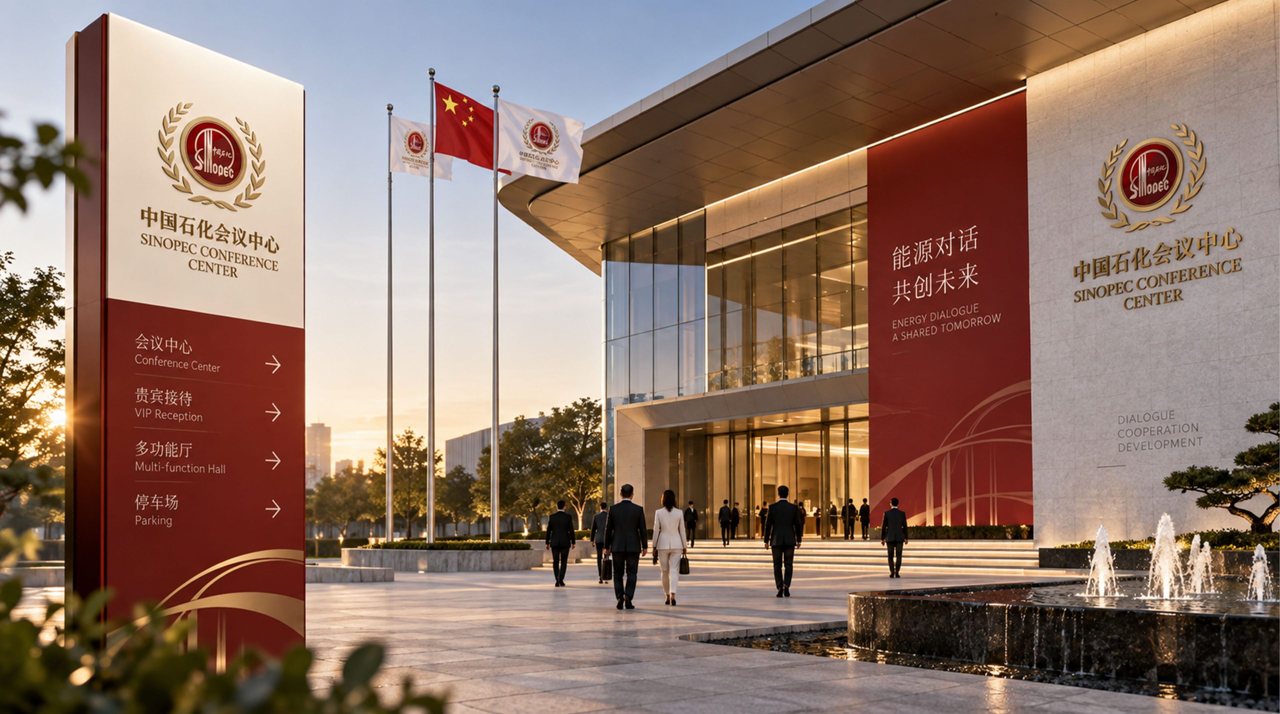
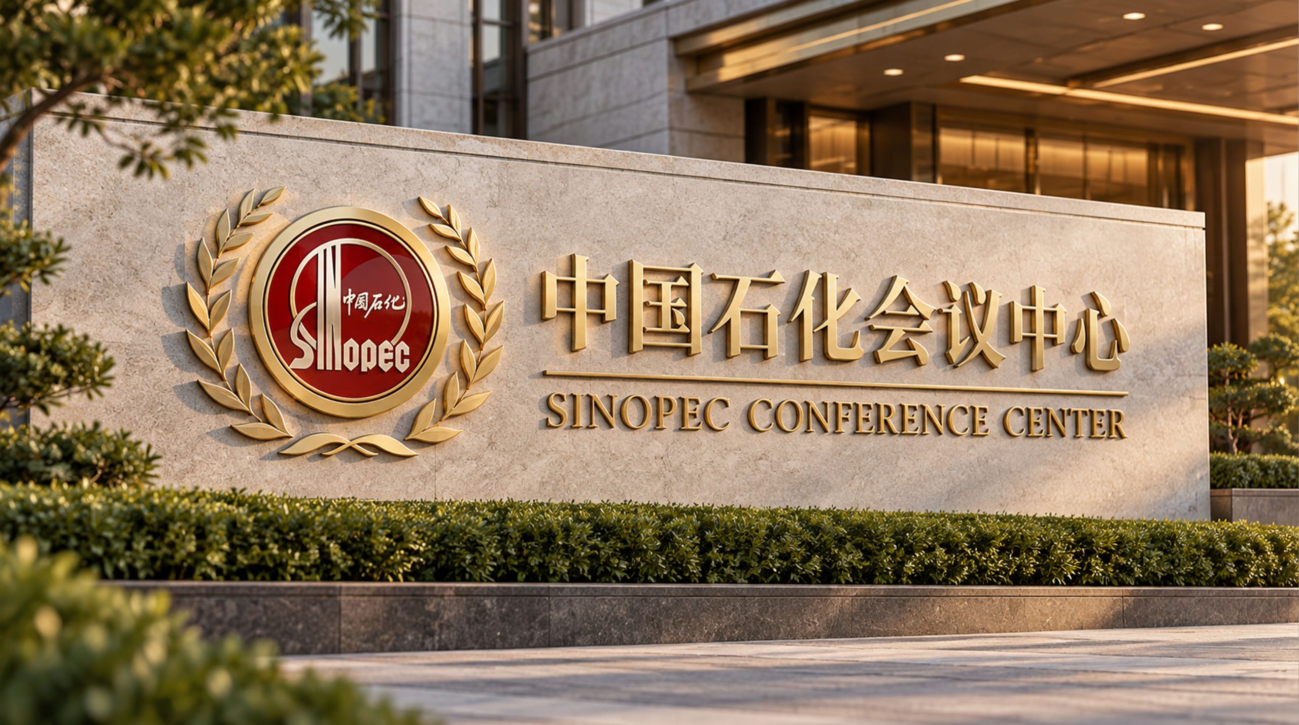
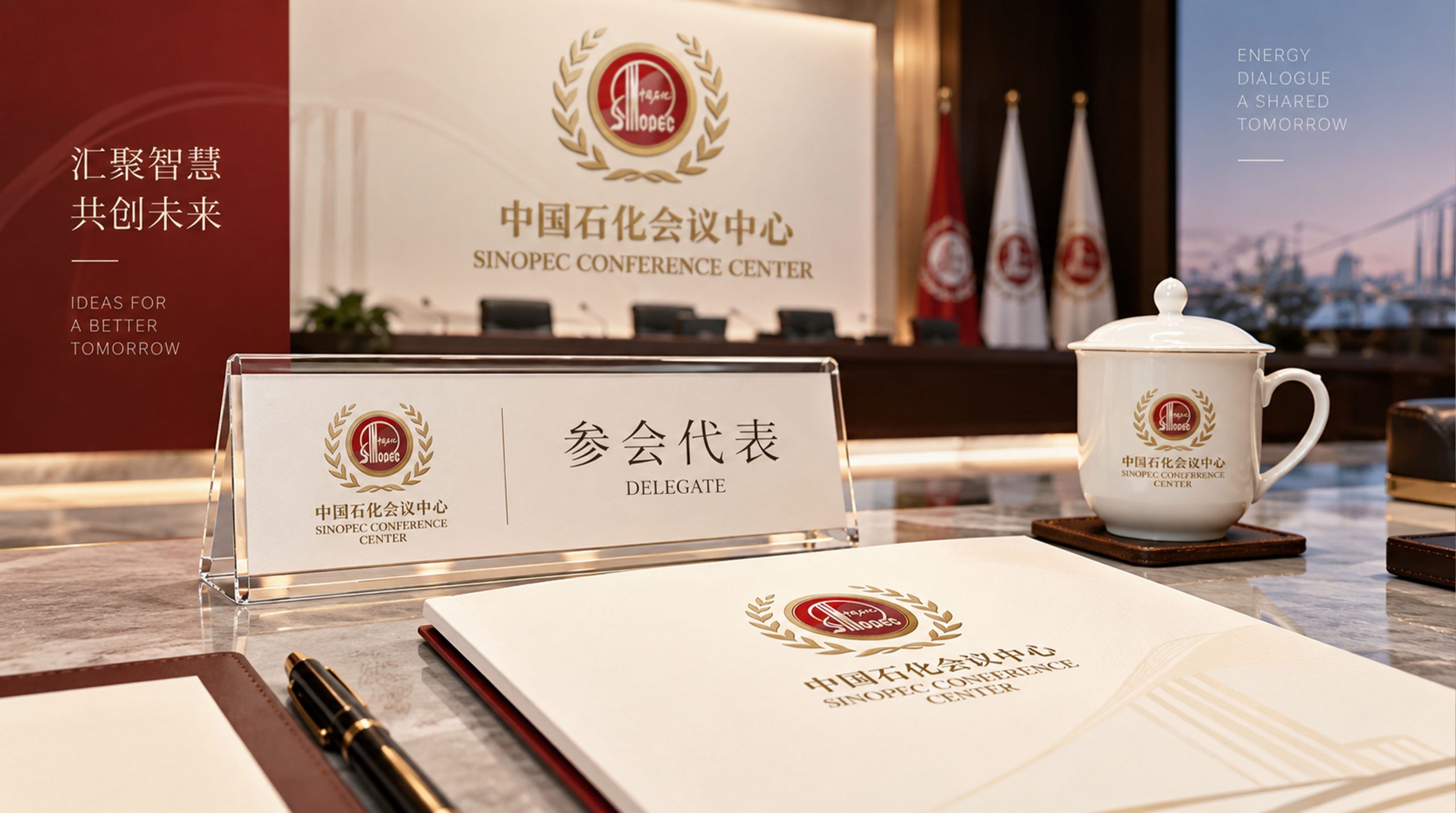
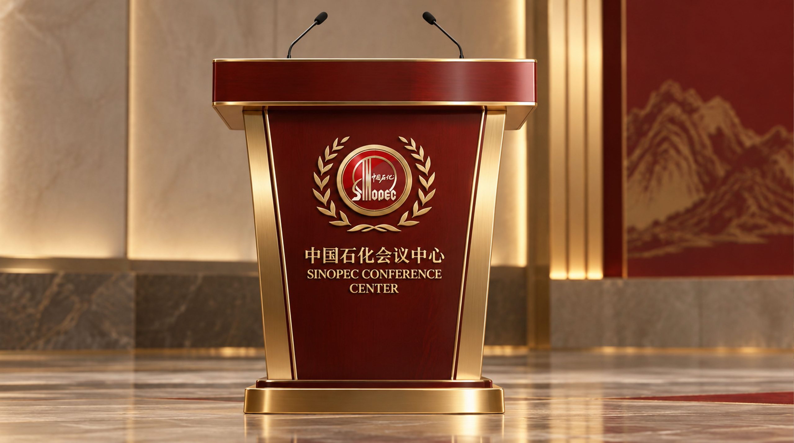
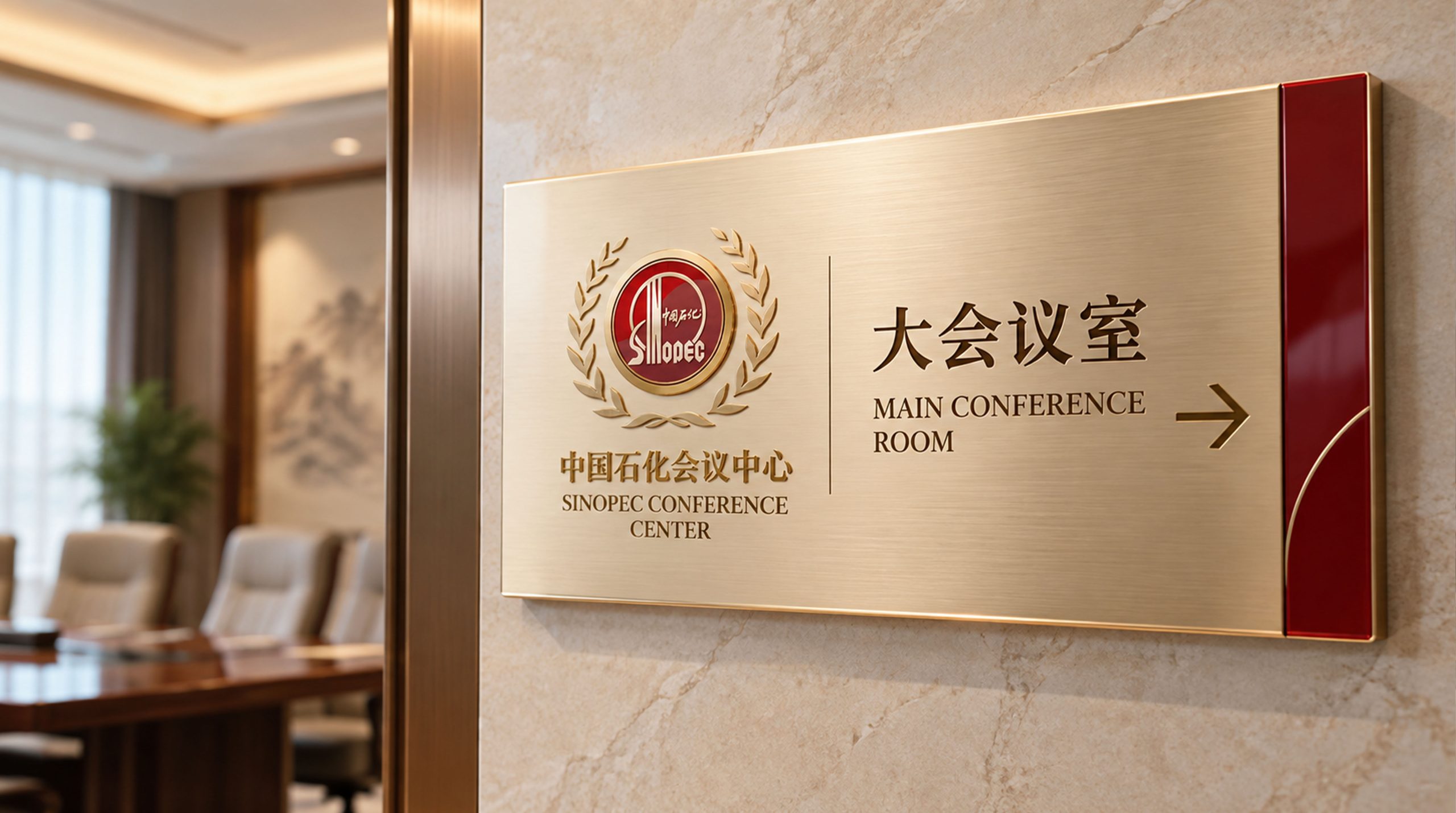
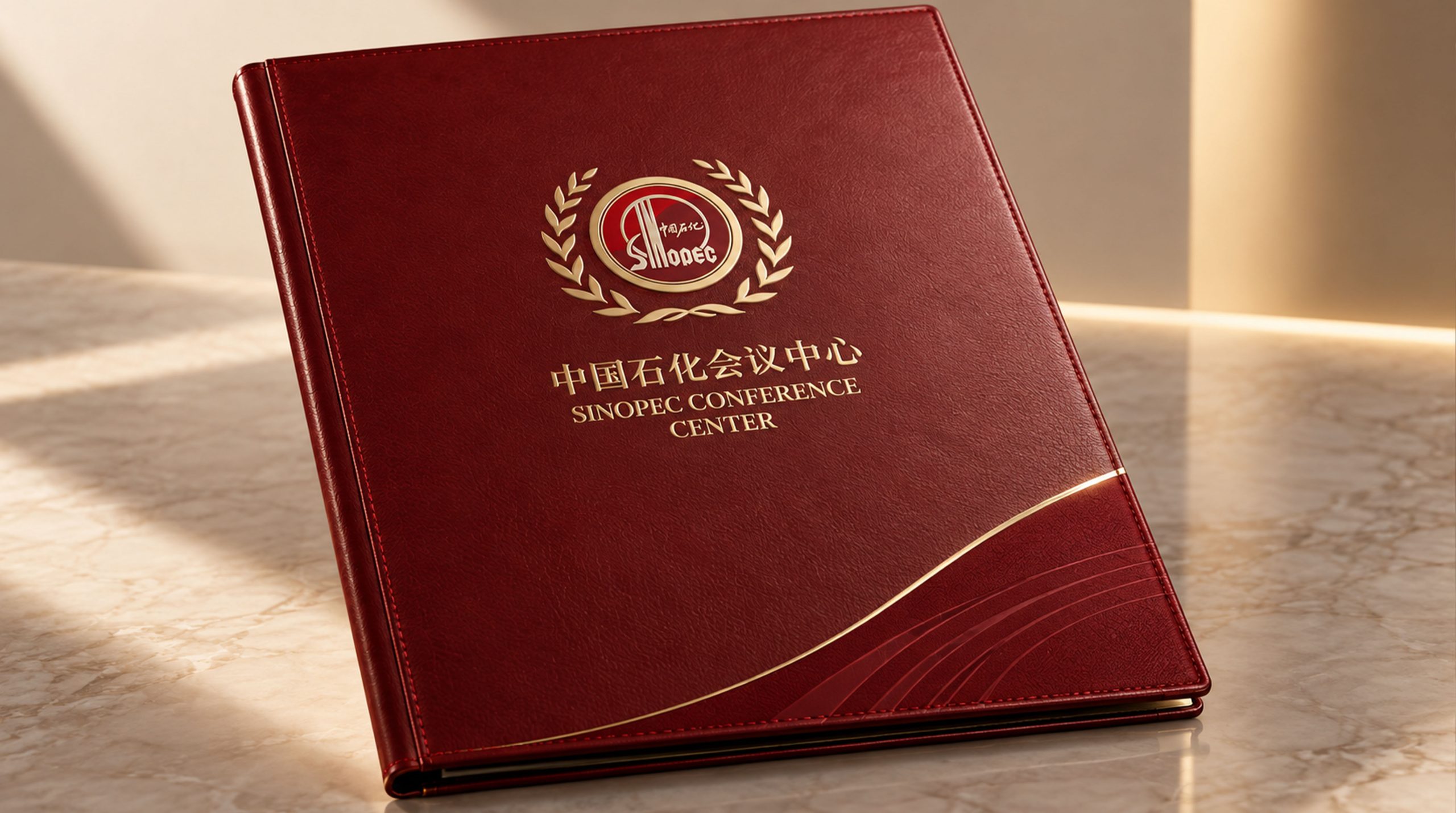
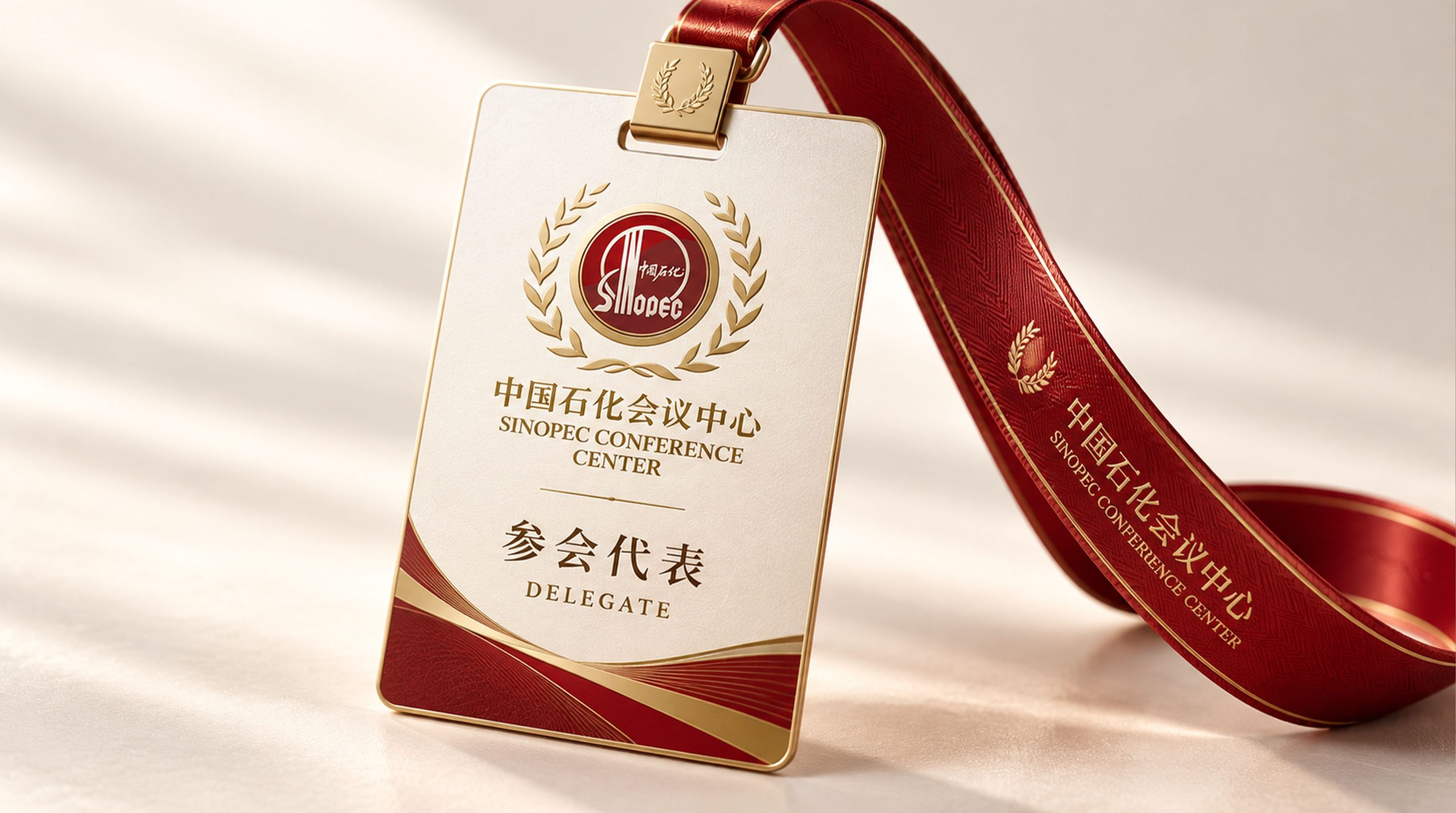
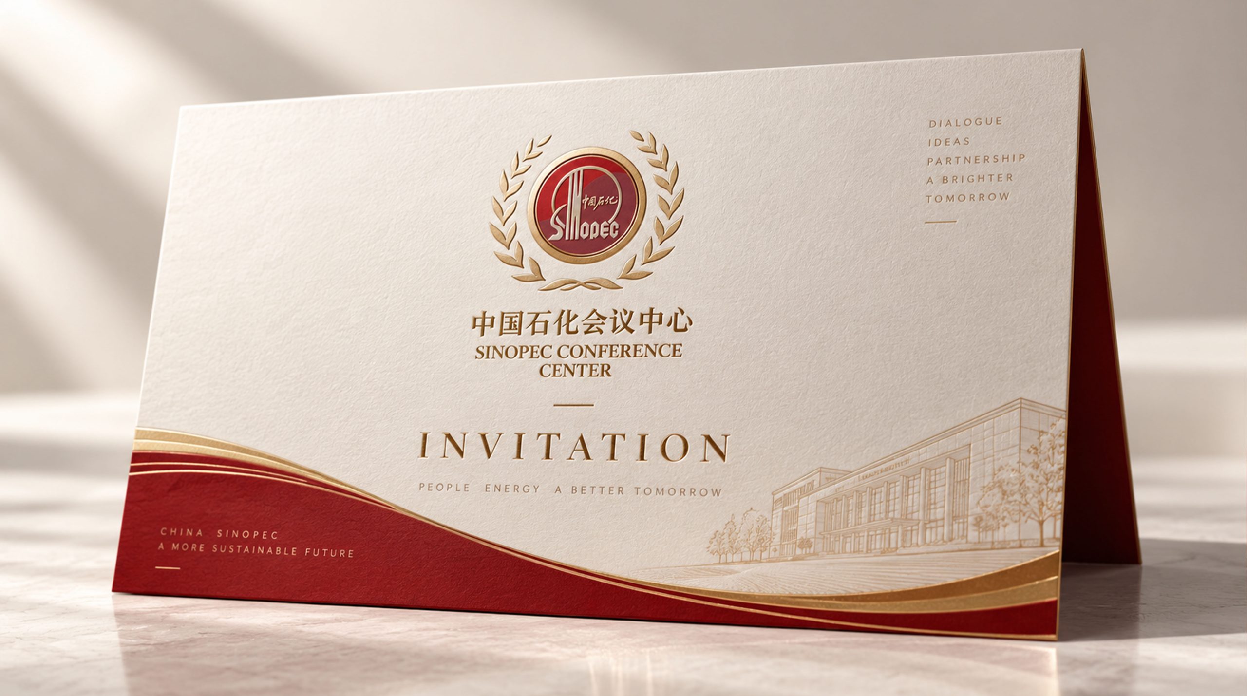
The logo can be widely used in conference center building facades, lobby entrances and front desk image walls; conference guides, conference manuals, table signboards and banquet menus; official websites, online booking platforms and social media images; main visuals of large-scale conferences, forum background boards and press conference images.
On the image wall of the lobby of the conference center, the logo is presented as a precision-cast metal relief on a light stone background. The red color of the sun and the metallic texture of the dome building complement each other under the soft light, conveying the solemnity and grandeur of the conference affairs organization of a central enterprise. On the main background board of the large-scale conference, the petrochemical red logo is located above the center of the stage. The sunburst graphics and dome structure are like the visual dome of the venue, setting the tone of "high specifications, upright quality, and dedicated service" for the entire conference.
On the conference table sign, the logo is printed in a small size on the upper left corner of the card. The Sinopec Red Chaoyang is conveyed on the white card surface in the most concise way to convey the brand identity. Participants can feel the brand endorsement of Sinopec the moment they pick up the table sign. In the dynamic vision, the outline of the dome building is steadily taking shape, the sun rises slowly from the arc of the dome, and the red light spreads softly, symbolizing the new beginning of the Sinopec Conference Center to welcome every important meeting with the quality of a central enterprise.
brand meaning
The logo contains three core images: State-Enterprise Authority - the pure inheritance of the sunrise element directly conveys the highest authority and quality assurance of the Sinopec parent brand; Conference Excellence - the dome architectural structure conveys the functional positioning and professional conference capabilities of the large conference center; Prestigious Standard - the symmetrical composition and petrochemical red main color conveys the upright and quality-oriented service standards of the state-owned enterprise conference service organization. The overall design conveys the brand vision of "state-owned enterprise quality and conference service model".
Improper Usage (Protection Specification)
Do not modify the arc proportion of the sunrise element or deviate from the visual specifications of the Sinopec parent brand; do not change the shared connection relationship between the dome arc and the sunrise arc; do not change the hue or brightness of the petrochemical red standard color #E60012; do not break the symmetrical central axis structure of the figure; do not add gradients, strokes or decorative effects that are inconsistent with the style of central enterprises on the logo; do not separate the sunrise and the building for separate use; keep the white space ≥ the height of the figure 25%; the minimum display width shall not be less than 30mm.
design results
After the release of the logo, the brand recognition and customer trust of Sinopec Conference Center in the fields of central enterprise conference services and business reception have been significantly improved. With its design method of organically integrating the sunrise elements of the parent brand and the conference dome building, the "Sinopec Hall" completes the dual recognition of "Sinopec Group + Conference Service Organization" at the first visual level, becoming the core identification symbol of the brand system, showing the brand vision of "state-owned enterprise quality, conference service model".