










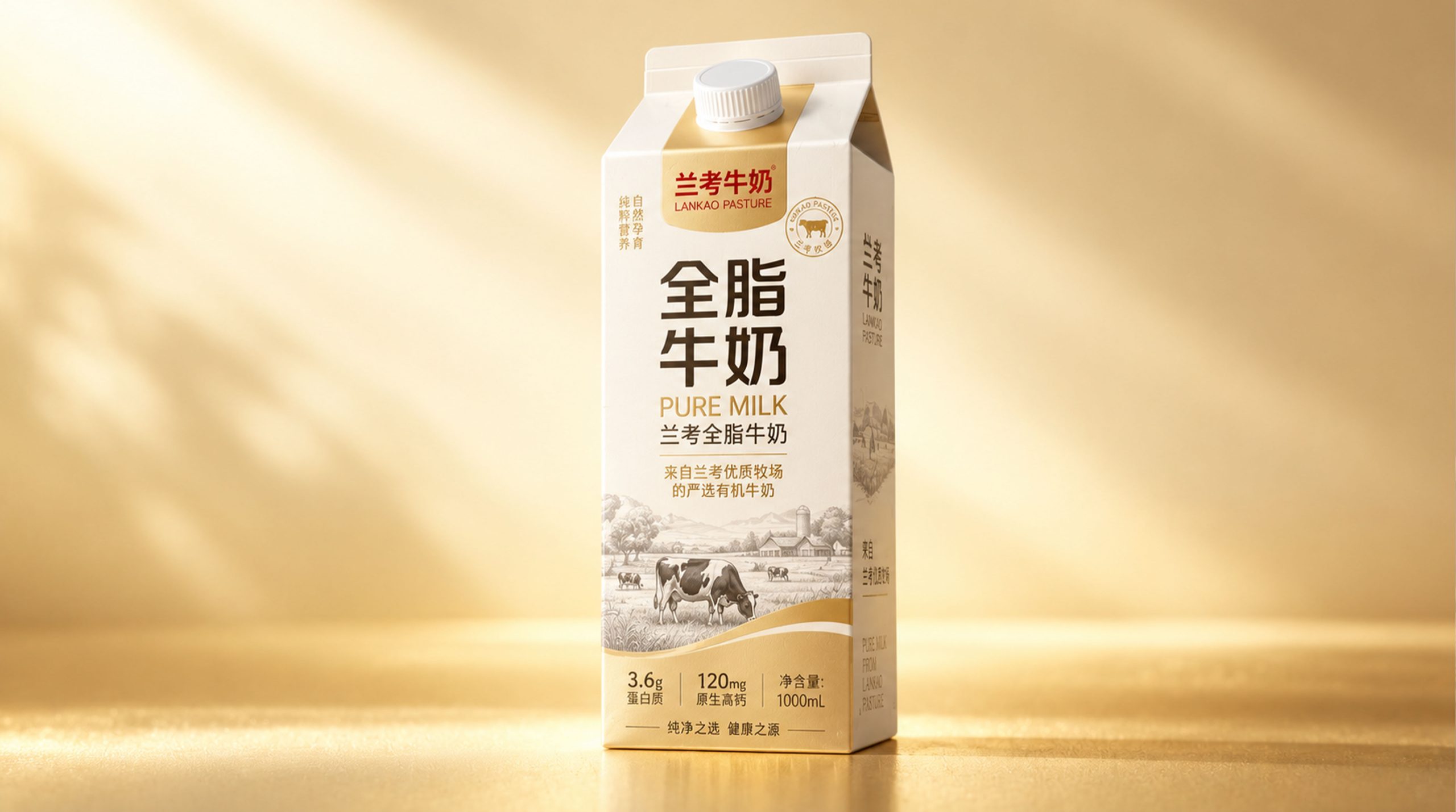
Lankao milk, as one of China's well-known dairy brands, has always won the favor of consumers with its pure and natural product quality. The core concept of Lankao Milk is "nature and health", and it adheres to the goal of providing consumers with high-quality, nutritious dairy products. Its packaging design also continues this concept, striving to make every bottle of milk convey natural, healthy and delicious emotions.
The image of Lankao milk brand reflects the characteristics of "equal emphasis on high-end and health". The packaging design not only conveys the brand value, but also increases the visual experience in a modern and simple way to attract consumers and bring them a pleasant visual experience.
Brand Essence
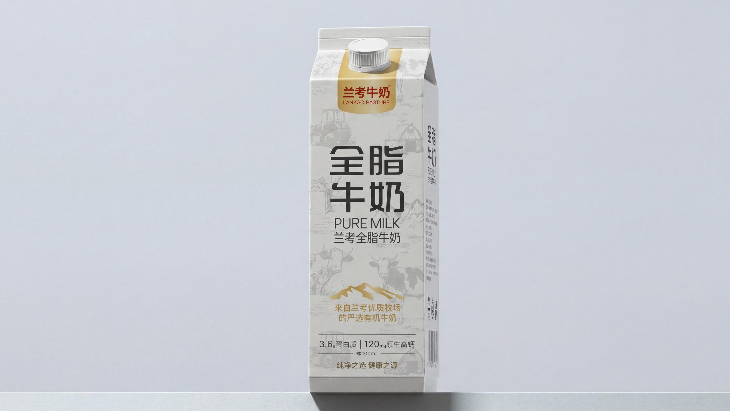
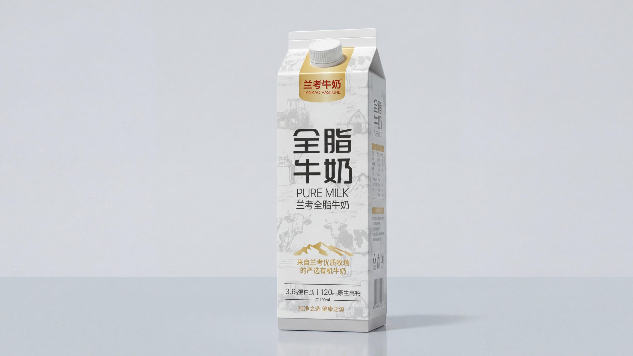
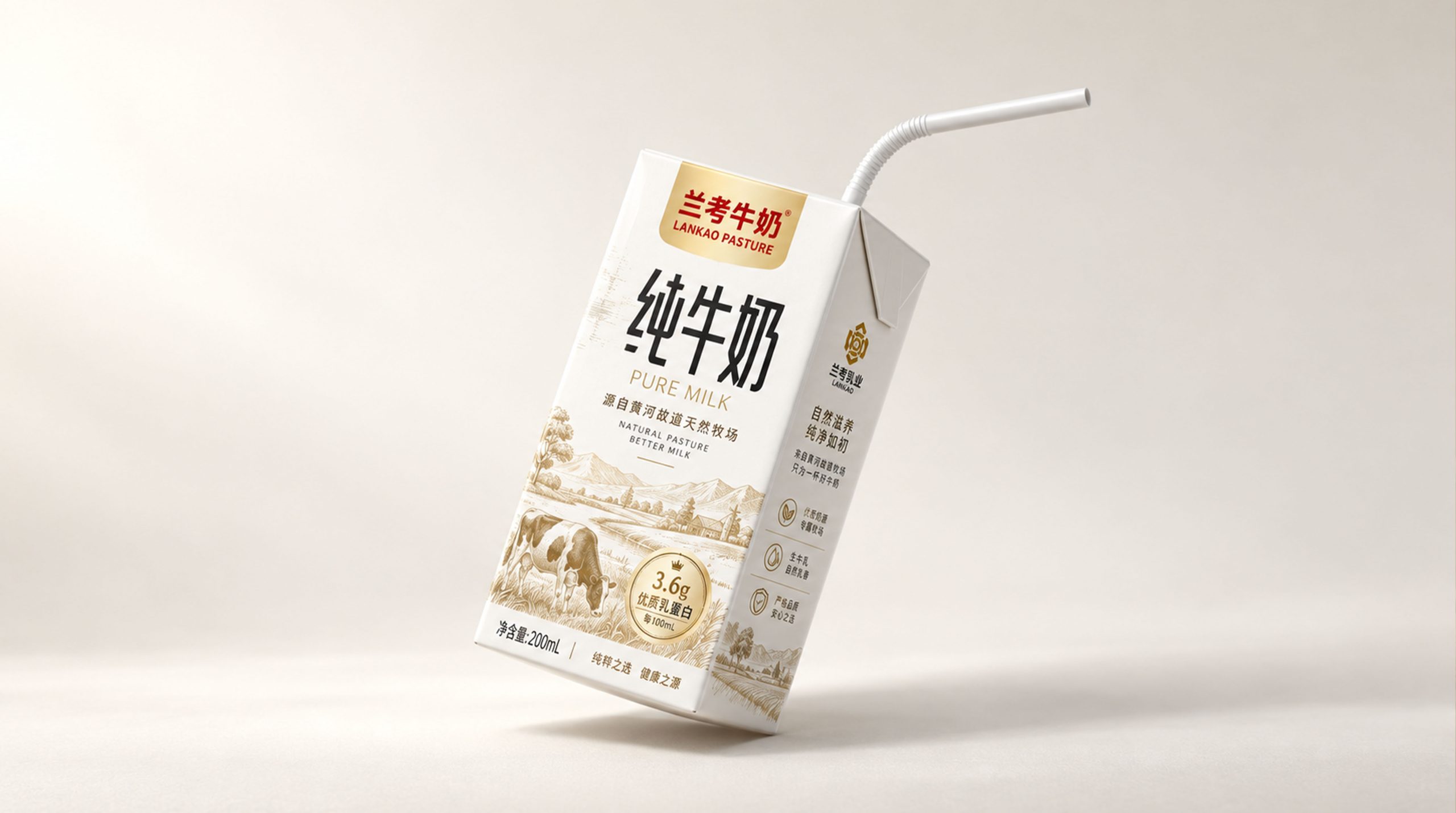
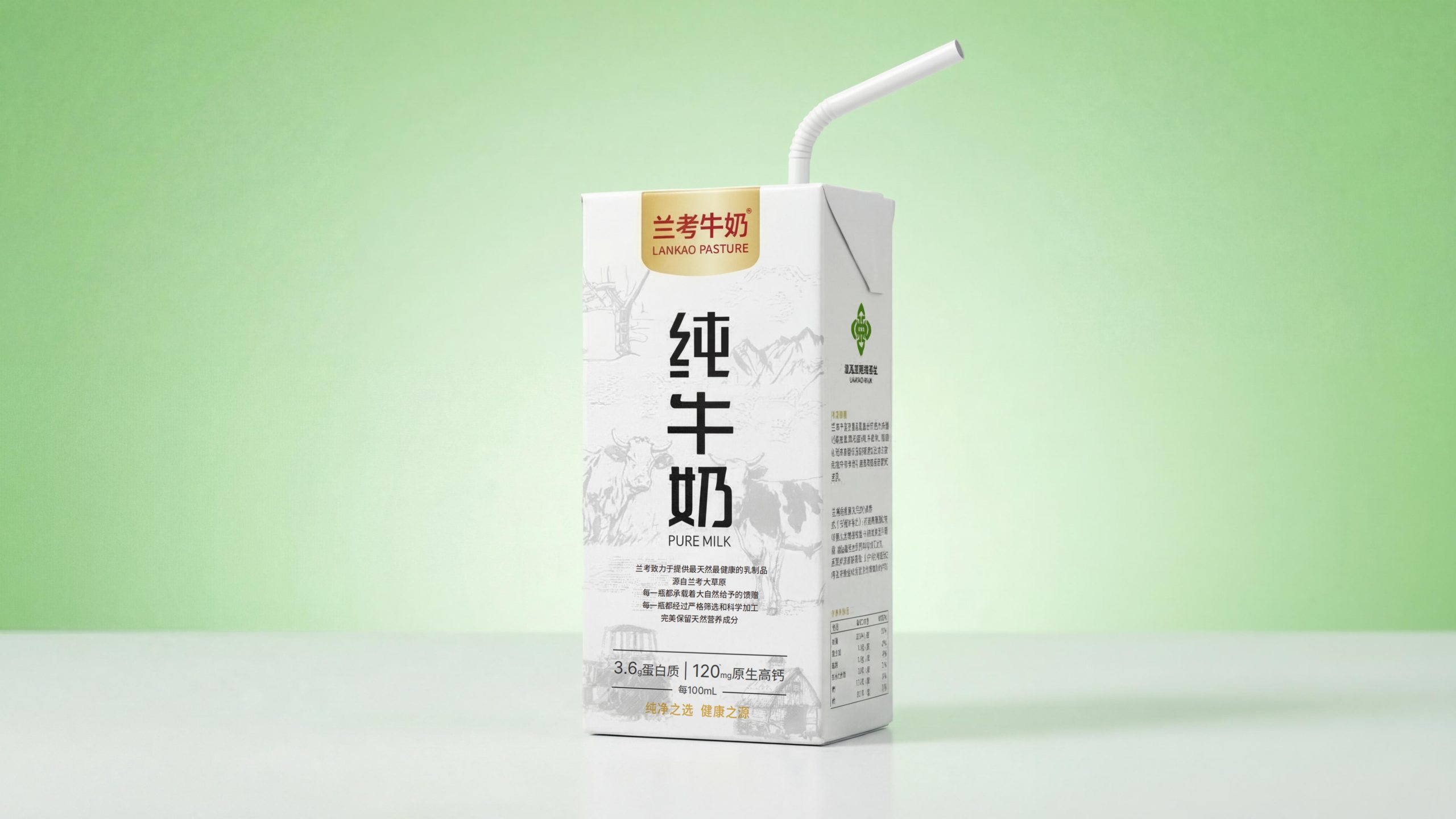
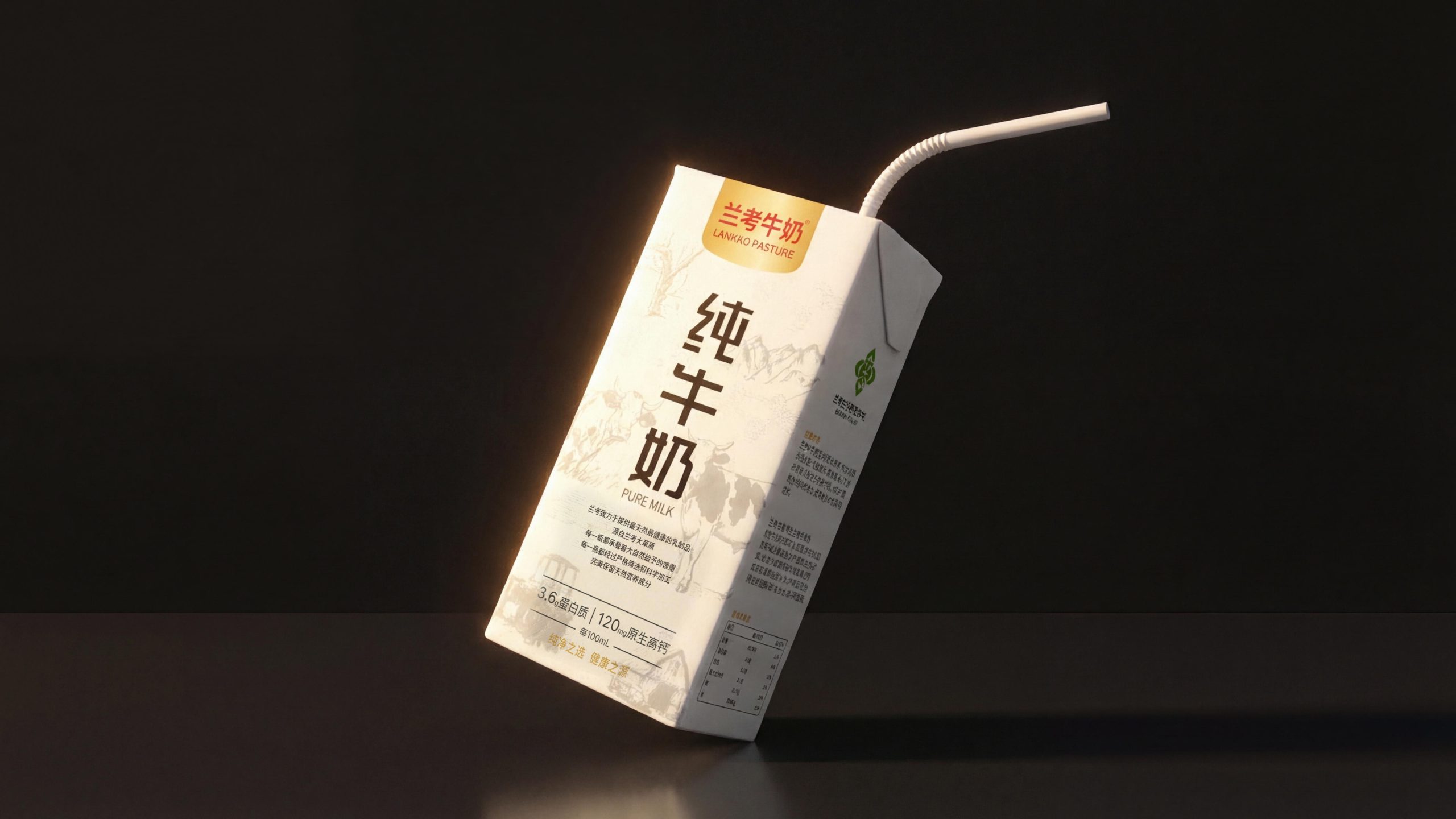
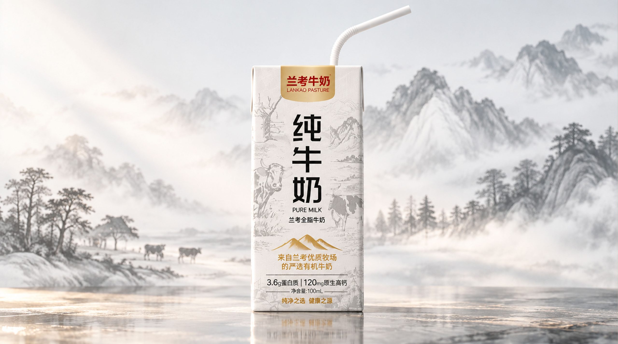
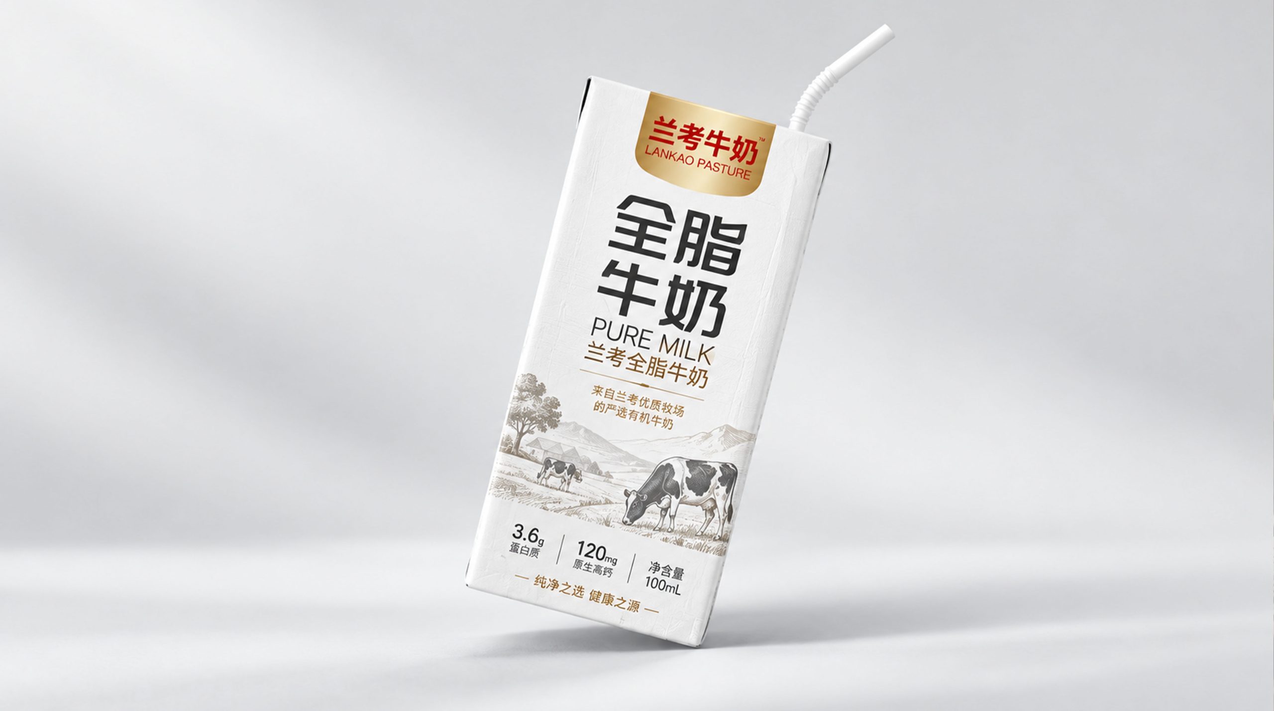
The design concept of Lankao milk packaging emphasizes the integration of modernity and traditional healthy image. In terms of overall design, the packaging is dominated by simple tones and patterns, using natural and fresh color combinations and modern layout methods to ensure the visual impact of the product and the transmission of the brand spirit.
The colors of the packaging use green and white, which represent nature and health, symbolizing purity and freshness, aiming to allow consumers to feel the natural ingredients and additive-free health properties of the product at a glance. At the same time, concise fonts and graphics make the packaging more modern and in line with modern consumers’ pursuit of high quality.
Design Philosophy
The packaging of Lankao milk adopts a traditional carton structure and is combined with food-grade environmentally friendly materials to ensure product safety and hygiene. The design of the packaging box not only has stability and protection functions, but also effectively prevents external pollution and sunlight erosion, keeping the milk fresh.
The paper material of the packaging is very tough and glossy, giving it an elegant appearance. At the same time, the environmental protection characteristics of paper packaging also meet the current society's demand for sustainable development. The packaging has a smooth appearance and comfortable touch, which not only enhances consumers' desire to buy, but also enhances the quality of the product.
Visual Language
The packaging visual design of Lankao milk is simple and elegant, and the color matching is very particular. The main colors are soft white and natural green, highlighting the purity and naturalness of the product. In terms of the overall design, the packaging layout is very simple and uses modern fonts to make it easy for consumers to quickly identify the product.
The simple and elegant words "Lankao Milk" are used on the top of the package. The font is clean and neat, and the font size is just right, making it easy for consumers to identify on the shelf. The center of the packaging is designed with symbolic natural elements, such as grass leaves, etc., reflecting the natural and healthy attributes of Lankao milk.
Packaging Structure and Details
The packaging of Lankao milk adopts a traditional carton structure and is combined with food-grade environmentally friendly materials to ensure product safety and hygiene. The design of the packaging box not only has stability and protection functions, but also effectively prevents external pollution and sunlight erosion, keeping the milk fresh.
The paper material of the packaging is very tough and glossy, giving it an elegant appearance. At the same time, the environmental protection characteristics of paper packaging also meet the current society's demand for sustainable development. The packaging has a smooth appearance and comfortable touch, which not only enhances consumers' desire to buy, but also enhances the quality of the product.
Tone of Voice
The packaging visual design of Lankao milk is simple and elegant, and the color matching is very particular. The main colors are soft white and natural green, highlighting the purity and naturalness of the product. In terms of the overall design, the packaging layout is very simple and uses modern fonts to make it easy for consumers to quickly identify the product.
The simple and elegant words "Lankao Milk" are used on the top of the package. The font is clean and neat, and the font size is just right, making it easy for consumers to identify on the shelf. The center of the packaging is designed with symbolic natural elements, such as grass leaves, etc., reflecting the natural and healthy attributes of Lankao milk.
Brand Experience
The design of Lankao milk packaging not only focuses on visual beauty, but also on the overall consumer experience: Visual appeal: Through simple tones and unique natural element design, the packaging effectively attracts consumers' attention and enhances shelf recognition.
Tactile experience: The packaging is made of environmentally friendly materials, with smooth surface texture and comfortable hand feel, bringing consumers a high-quality tactile experience. Emotional resonance: By conveying the concepts of nature and health, the packaging design allows consumers to have emotional resonance when using it, thereby enhancing brand loyalty.
Brand Statement
Lankao milk packaging design is a powerful reflection of the brand concept. Every design detail of the packaging conveys the brand spirit of Lankao Milk that focuses on nature and health. From the choice of colors to the use of fonts to the design of patterns, every part strengthens the "healthy, natural and pure" brand image of Lankao Milk.