










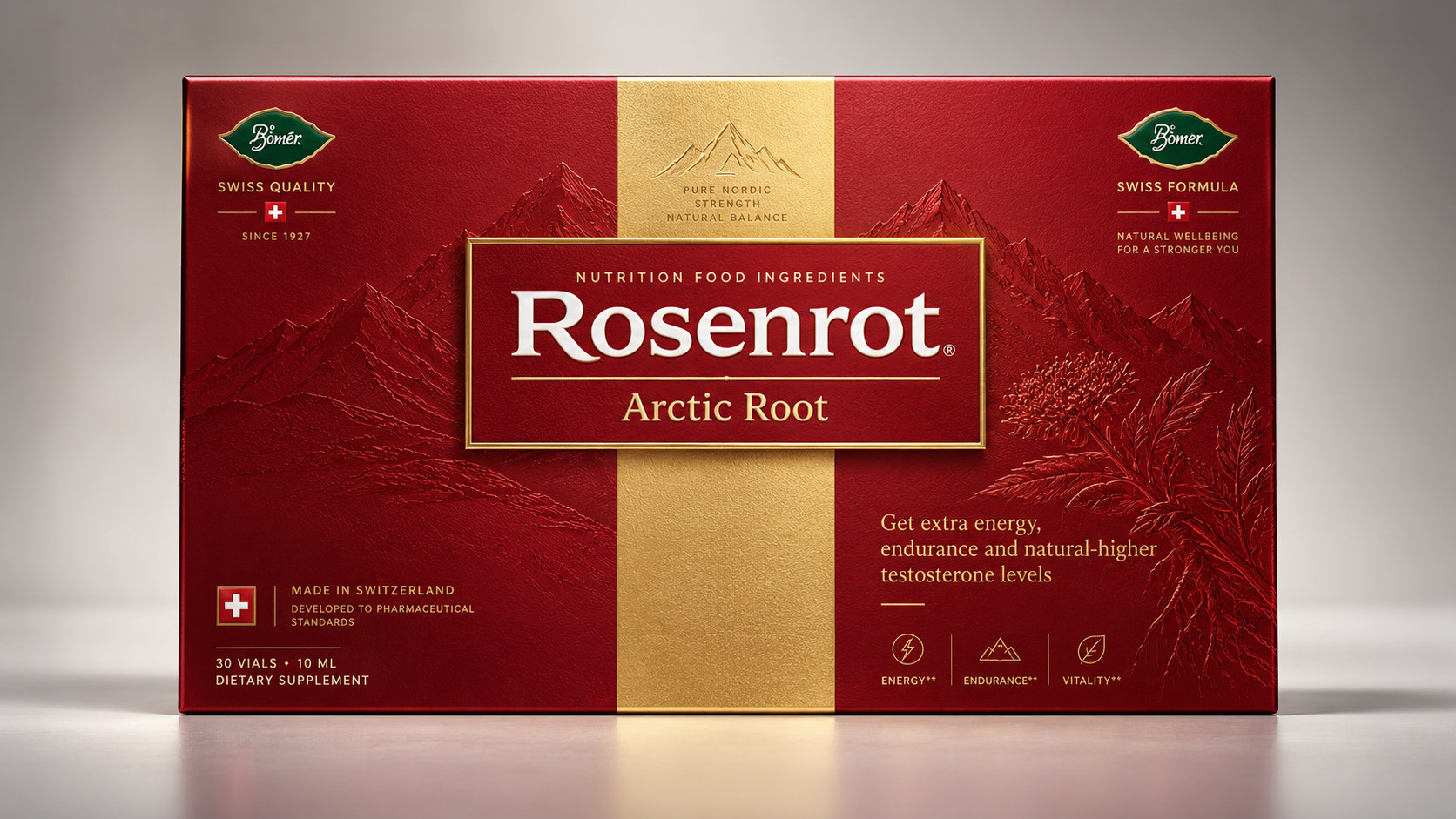
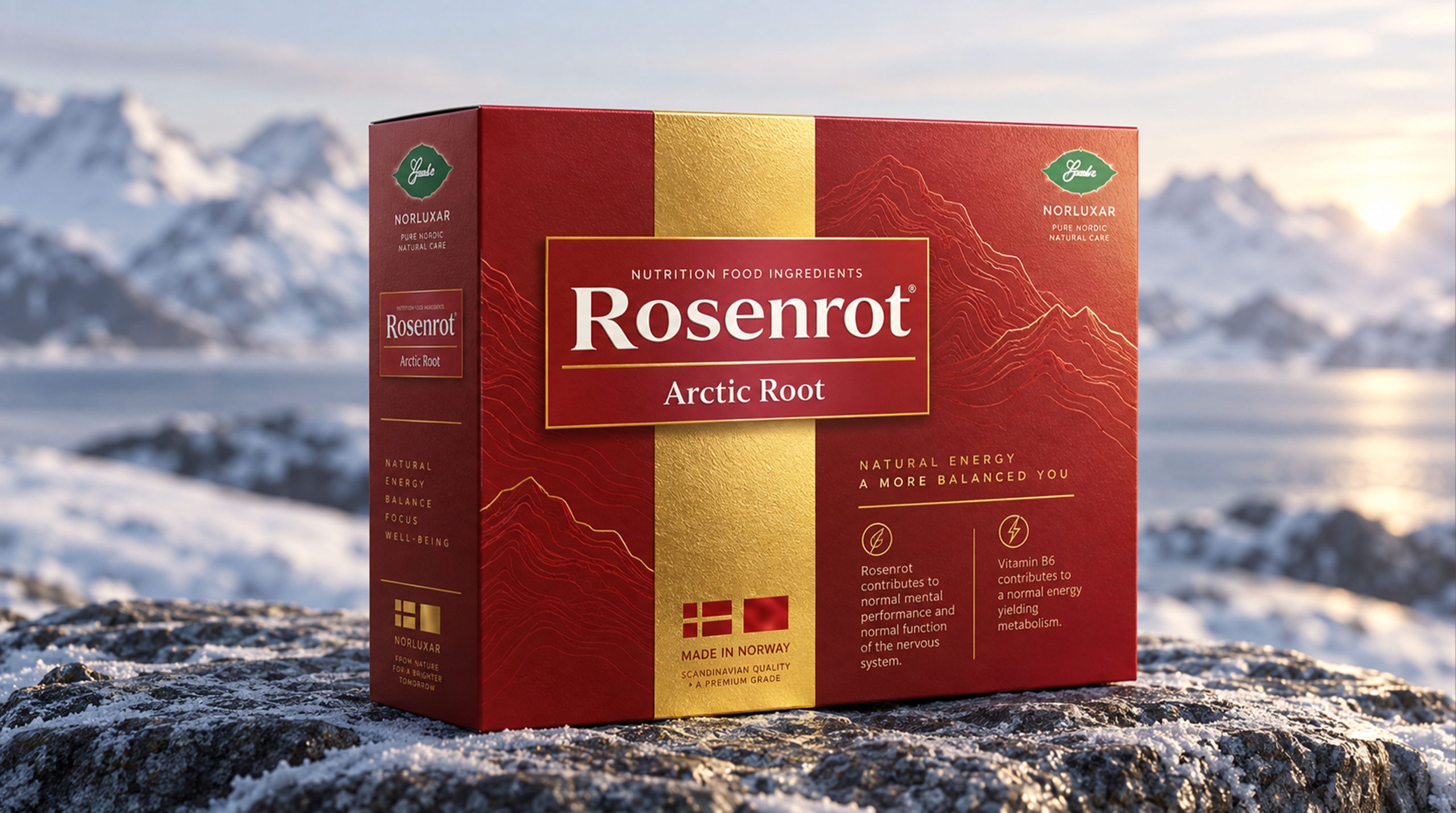
Rosenrot Arctic Root is a dietary supplement product that expresses Nordic alpine plant imagery and Swiss nutritional technology as its core. The packaging uses a dark red gift box, a vertical golden central axis, a dark snow mountain pattern and a centered brand nameplate to establish a visual image that is calm, strong and gift-worthy. Information such as "SWISS QUALITY", "SWISS FORMULA" and "MADE IN SWITZERLAND" are concentrated on the front, and formula contents such as Arctic Root, Panax Ginseng, Goji, Tribulus, Cordyceps, and Ginger Root are marked to quickly convey the origin, ingredients and functional positioning of the product to consumers.
In terms of packaging design, Rosenrot has built a nutritional and healthy visual system with "red × gold × mountain" as the core. The deep red color carries energy, vitality and maturity, the golden central axis strengthens quality and order, and the dark pattern of the snowy mountains symbolizes the alpine environment, plant resilience and natural origin. The three visual languages work together to complete a proposition - this is not only a box of daily nutritional supplement products, but also a set of health solutions with a sense of professionalism, power and formal gift value.
Brand spirit
The core ethos of Rosenrot Arctic Root packaging design can be boiled down to:
Strength × Stability × Control
Natural × Professional × Noble
"Power" is the most intuitive visual feeling of packaging. Deep red covers most of the area of the box, and the color is close to that between burgundy and crimson, conveying the association of energy, mobility and awakened physical state. The front copy emphasizes information such as energy, endurance, support and performance, allowing the packaging to establish a clear perception around "vitality supplement". This kind of power is not an intense, sporty expression of speed, but a more mature and stable physical image. The horizontal wide box structure, central golden band and large brand nameplate together form a thick and complete visual center of gravity, making the product closer to a high-end nutrition gift box than an ordinary functional drink or pharmaceutical packaging.
"Stable" comes from the strictly symmetrical layout order. The golden vertical band is located in the center of the box, and the red areas on both sides remain relatively balanced. The brand nameplate spans the central axis, forming a stable cross composition. The "SWISS QUALITY" and "SWISS FORMULA" logos are set on the left and right sides of the top respectively, so that the quality and formula information visually echo each other.
"Royal" is reflected in the symbolic meaning of snow-capped mountains and alpine plants. The packaging connects Arctic Root with images of mountain peaks, endowing the plants with the resilience to withstand severe cold and adapt to extreme environments. The mountains do not appear in the photo, but blend into the red background through low-light dark patterns, like a natural force hidden in the box surface.
"Natural" comes from plant formulas and mountain imagery. The packaging lists a variety of plant and herbal raw materials, allowing consumers to first feel the compound formula properties of the product. The design does not use a large number of raw photos, but establishes a more general natural narrative through snowy mountains, red earth and small plant logos.
"Professional" is undertaken by Swiss Information Systems. Contents such as SWISS QUALITY, SWISS FORMULA, MADE IN SWITZERLAND and pharmaceutical standards appear many times on the front of the package to strengthen the understanding of the origin and manufacturing standards of the product. It should be noted that these belong to the brand information presented on the packaging, and the specific effects should still be based on the product description and applicable specifications.
"Noble" is formed by the red and gold color scheme and the proportion of the gift box. The deep red color has the temperament of traditional gifts and mature consumer products, while the golden band resembles medals, gift seals and quality certifications, making the product naturally suitable for festivals, business or family health gift scenarios.
design concept
Rosenrot’s overall design concept is “an energy gift box from an alpine environment”. Arctic roots and complex plant formulas are product content, Swiss-made information is a quality endorsement, and the red gold gift box transforms these contents into a formal, credible and valuable visual expression. The entire packaging can be divided into three levels: the red box is the "field" of the product, the golden central axis is the "vein" of information, and the dark pattern of the snow mountain is the "source" of nature. The outer layer establishes an energy atmosphere, the central axis strengthens the brand order, and the background graphics connect the source of the formula with the alpine environment.
Crimson Gift Box: Field of Energy
The box adopts a transverse rectangular structure with wide and stable proportions. The deep red color continues from the front to the edges, giving the product a complete and unified visual shell. The red surface has a slight leather or fiber texture, which prevents large-area solid-color printing from looking dull and adds a delicate touch to the packaging. Red here is not simply a festive color, but is connected with energy, blood, body temperature and life status. It allows nutritional products to break away from the common white and green pharmaceutical systems and form a stronger gift attribute.
Golden central axis: the pulse of quality
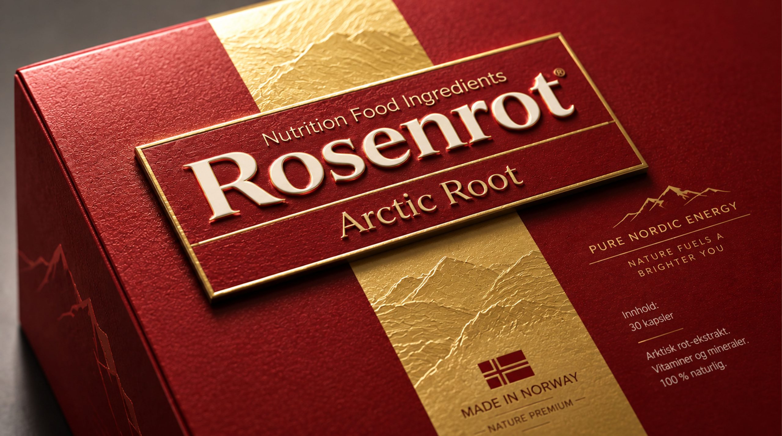
The golden vertical belt runs from the top to the bottom of the box, dividing the horizontal gift box into two areas on the left and right. It is like a core axis connecting brand, origin and formula information, and also like a sealing ribbon on a gift box, giving the product a sense of official opening. The gold areas have a fine matte gold texture without excessive specular reflection, so they remain stable while expressing a sense of value. The Swiss flag, mountain icon and "MADE IN SWITZERLAND" and other information below are concentrated on the golden central axis, making the origin endorsement part of the visual structure.
Central brand nameplate: seal of identity
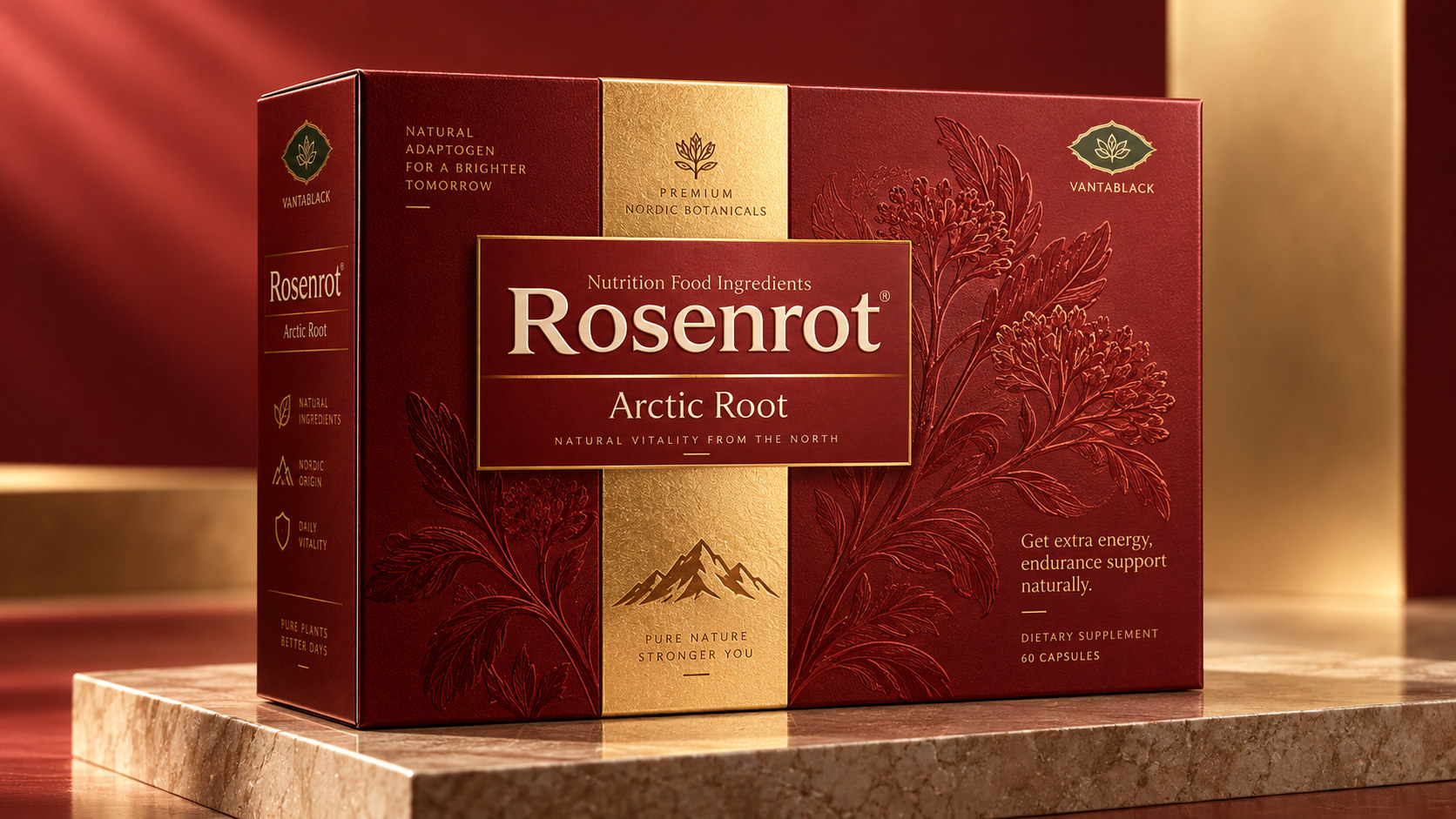
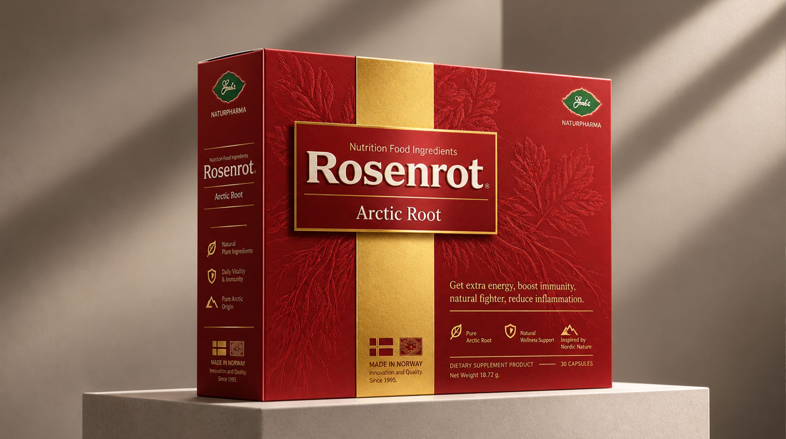
The brand nameplate is located in the visual center of the box and consists of a dark red rectangle, gold thin edges and slight projection. "Nutrition Food Ingredients" is marked at the top, "Rosenrot" is presented in a large white serif font in the middle, and "Arctic Root" is used to clarify the product name below. The nameplate is like a metal nameplate embedded on the front of the gift box, making the brand independent from the background. The white text creates a high contrast with the dark red background, and the golden frame is connected to the central vertical band, making the brand name the core node of the entire composition.
Dark patterns in snow mountains: the source of high cold
The mountain image spans the left and right sides of the gift box, but blends into the red background with very low brightness. It does not interfere with the reading of the brand and text, but gradually becomes apparent upon closer inspection. This hidden graphic avoids the tourist souvenir feel that can come from using straight snow photos. Mountains are more like a symbol: high altitude, low temperatures, pure environment and plant vitality, which together support Arctic Root’s natural origin narrative.
visual language
Rosenrot constructed a visual system with "red gold authority" as its core. The packaging does not pursue lightness, youthfulness or everydayness, but uses symmetrical composition, strong colors and certified information expression to establish a mature, formal and nutritious brand temperament.
color
The entire package mainly uses dark red, matte gold, white and dark green. Dark red is the main color, occupying more than two-thirds of the visual area, representing vitality, maturity and heat energy; gold is concentrated in the central vertical strip, borders and part of the text, responsible for establishing a sense of value; white is used for the brand name and main information to ensure recognition; dark green is only used for the two small brand logos at the top, adding a small amount of plants and natural hints to the red gold system. The colors are in clear proportions: red establishes mood, gold shapes identity, white takes care of reading, and green emphasizes natural origins. Overall, too many auxiliary colors are not used to avoid visual confusion when there is a lot of nutritional information.
graphics
The packaging graphics mainly consist of snow mountains, Swiss flag, mountain symbols and green logo. The snow-capped mountains are the largest background graphic, but are controlled at the lowest visual level; the Swiss flag serves as the identification of origin; the small mountain symbol connects Arctic Root with the alpine natural environment; and the green logo at the top is like a plant trademark or quality seal, adding a sense of brand history to the packaging. These graphics are all presented in a small area and low-interference way, so that the main attention of the packaging always stays on the brand name and product type.
font
"Rosenrot" uses a large white serif font, and the letter strokes have obvious changes in thickness, conveying a sense of tradition, formality and brand history. "Arctic Root" uses a simpler white font, located below the brand name, to bear the responsibility of product name recognition. Other information is mainly in regular sans serif fonts, including SWISS QUALITY, SWISS FORMULA, recipe instructions and quantity information. Serif brand words and sans-serif functional words form a clear division of labor: the former establishes temperament, and the latter ensures reading efficiency.
Packaging details
Rosenrot's packaging structure is based on "Protection × Display × Gifting". The horizontal gift box is not only responsible for the storage of internal ampoules or vials, but also forms a strong shelf display capability through the complete box surface.
Horizontal gift box structure
The width of the box is significantly greater than the height, and the overall proportion is close to that of a standard nutrition gift box. The front has enough area to accommodate the brand, product name, functional information, formula, quantity and origin information at the same time. The corners of the box remain neat and straight, and the edges are tied with thin gold lines, giving the large red box a more refined border. The stable rectangular structure also facilitates stacking, transportation and gift display.
information partition
The information on the front of the package is divided into three main areas: the central area bears the brand and product name; the lower right area displays the functional requirements, formula and product quantity marked on the package; the gold band in the middle and lower part displays Swiss manufacturing and standard information. This structure allows the brand information to maintain maximum visual weight, while controlling smaller text in the lower half to avoid the front being out of order due to more content.
Surface technology
The red area is suitable for matte or tactile films and embossing to simulate the texture of leather, fabric or fine paper. For the golden center axis, you can use matte gold spot color, metallic ink or partial hot stamping to avoid highlighting the entire surface and causing it to be gaudy. The central nameplate can be enhanced with slight embossing and golden hot edges. The dark snow mountain pattern is suitable for embossing with the same color or partial varnish, so that it can only be discovered under side light. This combination of processes can make the packaging simple when viewed from a distance and rich in details when viewed up close.
Internal product carrying
The front of the package is marked "30 VIALS – 10 ML", indicating that the interior may be in the form of multiple small-capacity ampoules or drinking bottles. Each product can be fixed through independent card slots inside the gift box to keep it neatly arranged after opening. This structure not only facilitates the control of single usage, but also enhances the cyclical and planned product experience. Every time consumers take out one, they will form a clear action of using it, transforming the product from an ordinary supplement into a daily health management solution with a sense of ritual.
language and tone
Rosenrot's writing language is based on "Quality Endorsement × Ingredient Description × Functional Appeal" as its core. The packaging does not use emotional stories, but communicates with the brand, product name, origin, formula and usage specifications. "SWISS QUALITY" and "SWISS FORMULA" are located on both sides of the top of the package, forming the first layer of quality recognition; "Rosenrot" establishes the brand identity; "Arctic Root" clarifies the core product type; the formula and quantity information below provide specific basis for judgment. The functional text on the packaging involves expressions such as energy, endurance, testosterone support, performance and vitality. The design aspect improves its readability through golden text and independent partitions, but these contents should be understood as the product appeal presented on the packaging and should not replace medical advice or individual suitability judgment. The tone of the entire language can be summarized as follows: build trust with origin, provide basis with recipes, and reduce understanding costs with specifications. It does not tell complex brand legends, but establishes a sense of professionalism through Swiss, plant-based formulas and standardized information.
Brand Experience
Rosenrot creates a formal and stable nutritional gift box experience for consumers from three dimensions: vision, touch and opening.
visual experience
The product is first strongly identified with deep red and gold colors. The central gold band and brand nameplate quickly focus the eye on the center of the box, and then expand to the snowy mountain background on the left and right and the formula information below. When viewed from a distance, the red gold system conveys a sense of value; when viewed at a close distance, the dark patterns, surface textures and small information of the snowy mountains gradually appear. This reading process from the whole to the details makes the packaging suitable for both shelf display and gift display.
tactile experience
If you use a matte touch film and slight embossing, your fingers can feel the fine texture of the red box surface. The material of the golden vertical band can create a gloss difference with the red area, making it clear when touched. If the central nameplate is embossed, the brand name and frame will change slightly in height, allowing consumers to sense the quality level of the packaging through touch before opening the product.
Start the experience
Horizontal gift boxes are suitable for flip-top, top-to-bottom covers or magnetic structures. After opening, the internal ampoules are neatly arranged, making the product quantity, cycle and usage clear at a glance. From seeing the red gold gift box, opening the lid to taking out a single product, the whole process has a clear sense of steps. This experience transforms nutritional supplementation from a casual act into a more planned daily ritual, and also enhances the sense of formality when a product is given and received as a gift.
brand statement
Originating from the high cold, it condenses energy. Rosenrot Arctic Root uses a deep red gift box, a golden center axis and dark snow mountain patterns to create a packaging language that combines the power of nature, Swiss quality and formal gift attributes. It does not show the formula through complex plant photos, but uses mountain peaks to symbolize the environment, red to express energy, and gold to establish quality order. Deep red is vitality, the golden center axis is the standard, and the dark patterns of the snowy mountains are the natural source. The central "Rosenrot" nameplate connects the three, making the brand the core of the entire visual system. The formula, origin and functional information presented on the packaging are contained in a strictly symmetrical structure. From a distance, it looks like a complete and solemn red gold gift box, while from a closer look, you can find the mountains, logo, formula and manufacturing information. What Rosenrot creates is not a sense of brisk daily consumption, but a mature, stable and planned nutritional experience. It combines the toughness of plants, manufacturing standards and the ritual sense of the gift box, making every opening and use a serious response to the body's state.