










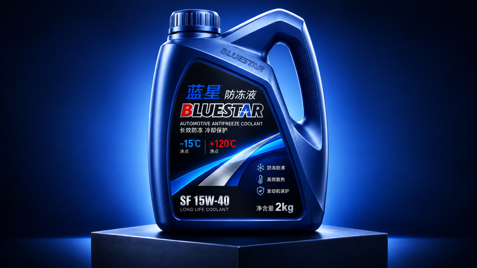
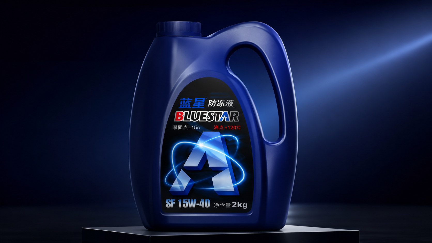
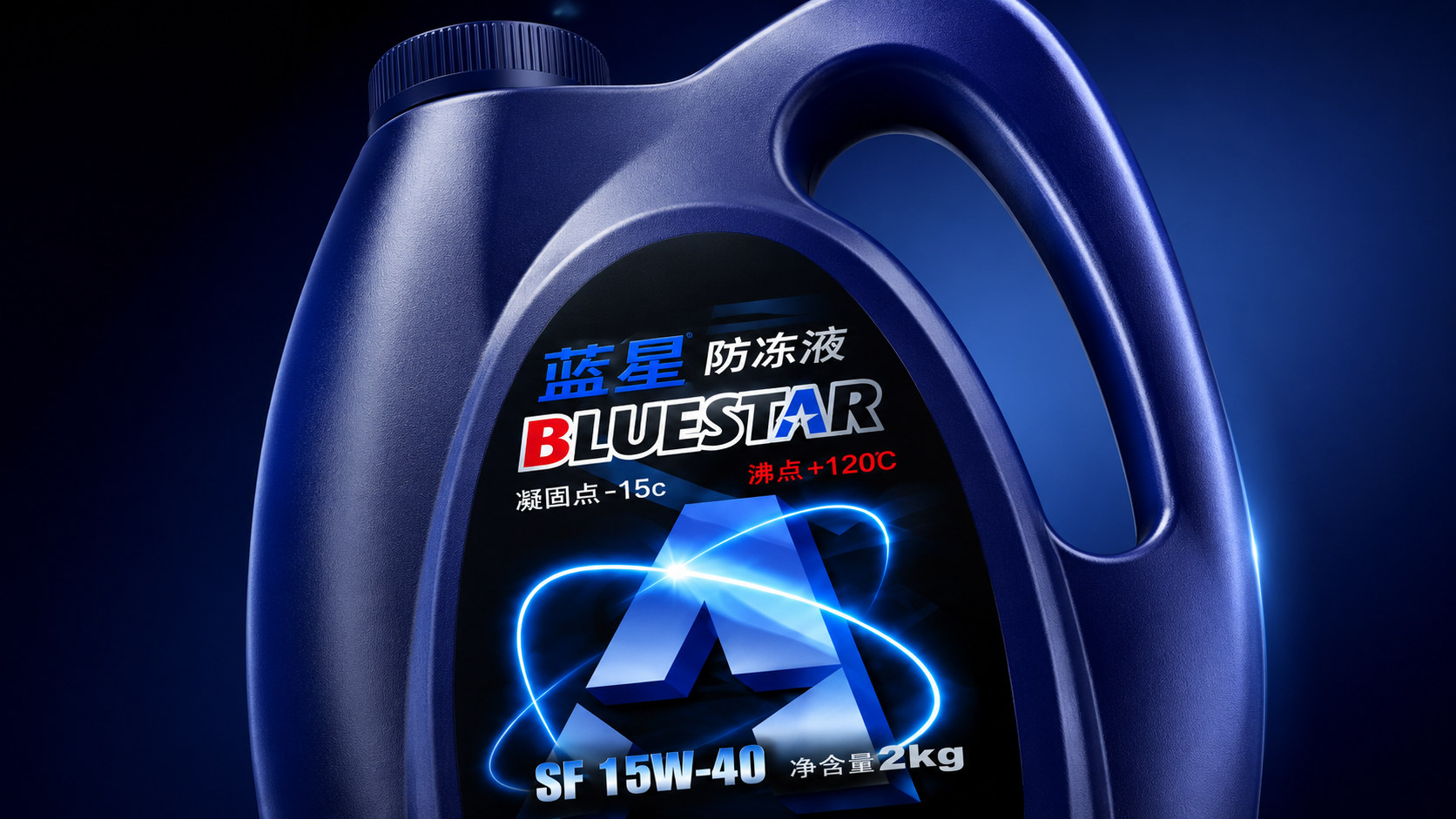
BLUESTAR is a professional antifreeze product for automotive cooling system maintenance scenarios. The brand takes "stable temperature range and continuous protection" as its core value. Through the dark blue barrel, black performance label and blue and white energy light track, it establishes a distinct sense of industry, technology and reliability. Information such as "freezing point -15°C, boiling point +120°C, net content 2kg" is displayed on the front of the package, allowing consumers to quickly identify the product category and basic performance.
In terms of packaging design, Blue Star has built a car maintenance visual system with "dark blue barrel × black label × blue and white light track" as the core. The dark blue container is responsible for stability and protection, and the black label centrally conveys the brand and parameters. The central geometric symbol and surrounding light track symbolize the circulation of coolant in the car system. The three visual languages jointly complete a proposition - antifreeze is not only a basic automotive consumable, but also an important protective medium for maintaining stable engine temperature.
Brand spirit
The core spirit of Blue Star packaging design can be summarized as:
Stability × Cold × Protection
Professional × Momentum × Trust
"Stability" is Blue Star's most important brand value. The packaging adopts a thick barrel outline, a wide bottom structure and a continuous curved surface to stabilize the overall visual center of gravity. Dark blue is not a breezy bright blue, but a calm tone between industrial cobalt blue and midnight blue, conveying calmness, solidity and technical credibility.
"Cold" is reflected in the brand's expression of temperature management capabilities. The blue barrel is naturally associated with ice, water, cooling and low temperature, and the blue and white light track on the label further strengthens the visual association of liquid circulation and heat transfer. The design does not directly use traditional symbols such as ice cubes and snowflakes, but uses luminous tracks to express the continuous operation of the cooling system, making the product more modern and technological.
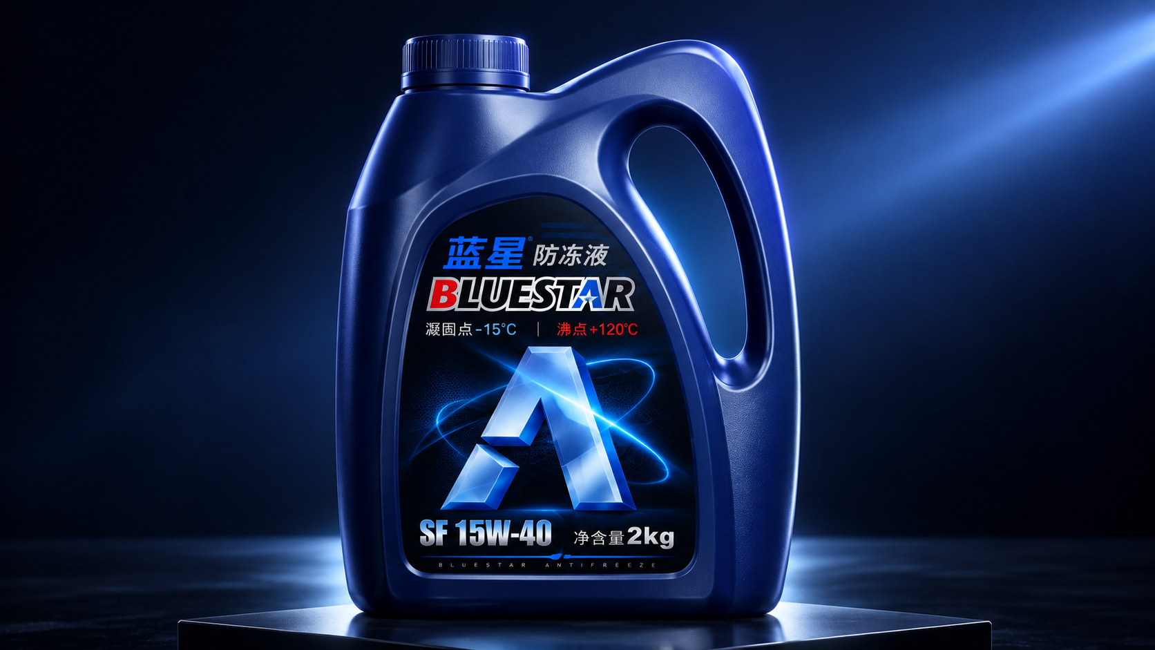
"Protection" is the functional value that packaging ultimately needs to convey. The central geometric figure is surrounded by multiple light tracks, like a protective field built around the core of the engine. The label has an overall shield-shaped structure and is embedded in the arc-shaped groove on the front of the barrel, so that the brand, parameters and product specifications are unified and wrapped in a complete protective structure.
"Professional" is reflected in information organization. The brand's Chinese name, English name, product category, freezing point, boiling point, model number and net content are all concentrated on the front label. Consumers can obtain the main information without turning over the package. The layout does not rely on lengthy copy, but uses clear hierarchies to help users make quick decisions.
The "kinetic energy" comes from the large geometric symbol in the center of the label. The graphic is composed of multiple metallic blue sections, with a sense of upward extending power; the peripheral blue and white light tracks are constantly interlaced, forming an association of liquid circulation, energy exchange and system operation. The stationary packaging thus assumes a visual state of continuous movement. "Trust" is established by container structure, color and information transparency. The wide handle, bottle cap with anti-slip texture, thick barrel and clear parameters allow consumers to have a user experience that is "steady to hold, understandable and easy to use".
design concept
Blue Star takes "two-way temperature protection of a barrel of liquid" as its overall design concept. Antifreeze not only needs to deal with the risk of solidification in low-temperature environments, but also needs to cooperate with the cooling system to face high-temperature changes when the engine is running. Therefore, the packaging displays "freezing point -15°C" and "boiling point +120°C" side by side, with white and red corresponding to low and high temperatures respectively, forming a clear contrast between hot and cold.
The entire packaging is composed of three levels: the blue barrel is the "shell" of the product, the black label is the "cabin" of information, and the central light track and geometric figures are the "field" of performance. The outer layer is responsible for carrying and protecting, the middle layer is responsible for brand recognition and parameter communication, and the inner layer transforms invisible liquid circulation into visual language.
Dark blue plastic barrel: the shell of stability
The container adopts an integrated plastic blow molding structure, and the overall shape is thick and compact. The left side of the barrel is the main liquid storage area, and the right side extends upward to form an integrated handle. A large oval space is reserved inside the handle, making it easy to hold and pour with one hand.
The shoulder of the barrel transitions naturally from the bottle mouth to the handle without unnecessary sharp corners, allowing the package to maintain a sense of strength while presenting a smooth outline. The front label area is surrounded by an arched groove, like an armored panel embedded in the barrel. The wider structure at the lower part further enhances the sense of stability when placing the product.
Black Performance Label: Information Cabin
The label has a dark black background, forming a strong contrast with the blue barrel. Black can improve the recognition of blue brand words, white parameters and red high-temperature information, while creating a professional atmosphere like car dashboards and mechanical control panels.
"Blue Star Antifreeze" is located above the label, and the English brand name "BLUESTAR" is placed in the upper visual center. The temperature parameters are arranged on the left and right, with a large energy graphic in the center, and "SF 15W-40" and "Net content 2kg" at the bottom, forming a complete information reading sequence.
Energy Geometry Core: The Field of Circulation
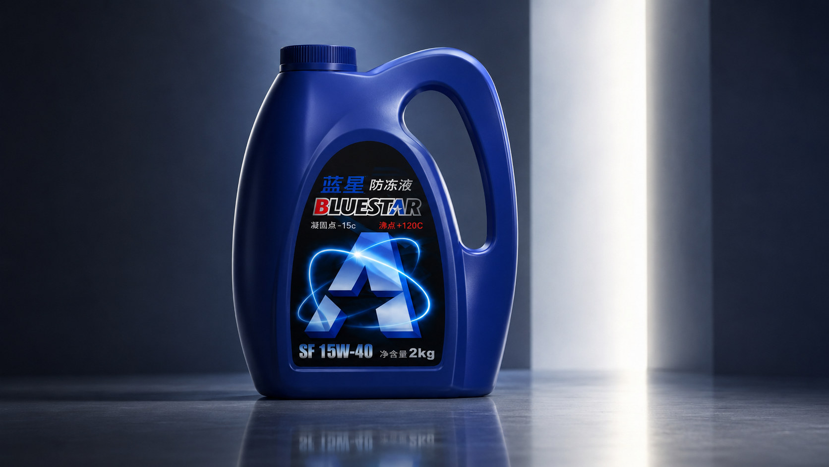
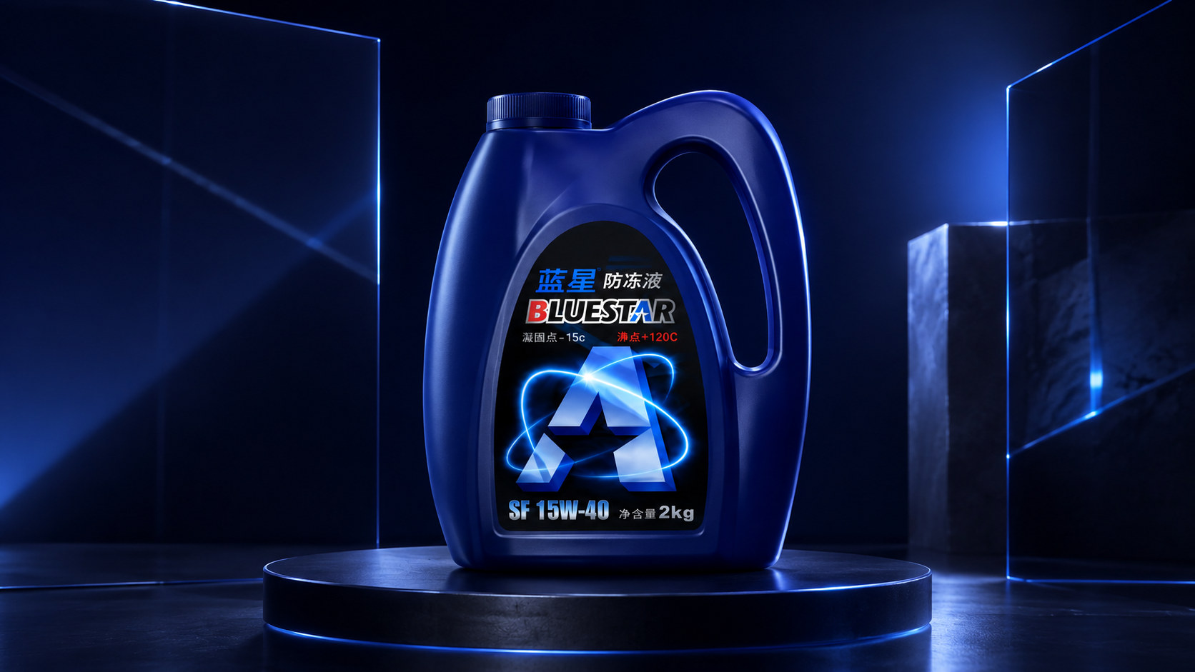
The central graphic of the label is between letters, mechanical structures and cycle symbols. The main body is composed of multiple metallic blue sections, forming gradations between cold blue, silvery white and dark blue. Several luminous trajectories surround it and form highlighted star points at the intersection, symbolizing the activation, transmission and control of the energy within the system.
Graphics can not only serve as super symbols of the brand, but also be understood as the circulation route of coolant in the engine system, transforming product performance from abstract parameters into intuitive visual feelings.
Bidirectional temperature parameters: the scale of cold and heat
"Freezing point -15°C" is represented in white, and "boiling point +120°C" is highlighted in red. One is cold, one is hot, one is left and one is right, creating a clear balance on the page. Red is the least used and most recognizable warm color in the entire blue-black system. It is like a prompt signal on a car dashboard, highlighting the importance of high-temperature parameters.
Specification Information: Usage Identification
"SF 15W-40" appears in larger font size at the bottom of the label, and "Net content 2kg" is marked on the right side. Silver-white text combined with dark shadows has an effect similar to a metal nameplate. The information is spread horizontally along the bottom of the label, making the overall visual focus stable.
visual language
Blue Star has built a visual system with "cold color power" as its core. The packaging does not use a large number of car photos, engine images or complex mechanical illustrations, but refines the three concepts of liquid, circulation and temperature into dark blue, luminous tracks and geometric structures.
color
The complete set of packaging is mainly dark blue, black, white and red. Dark blue occupies most of the area of the barrel, representing cooling, stability and reliability; black is concentrated in the label area, forming a professional and tough industrial background; white is responsible for conveying product categories and basic parameters; red is only used to mark local and high-temperature values in English to form a clear temperature warning. The blue color of the barrel comes from the plastic material itself. Under the light, it will show subtle differences from navy blue to cobalt blue as the curved surface changes. The black label lowers the overall brightness, making the central light track and text information more prominent.
graphics
The main graphics of the packaging consist of geometric structures, surrounding light tracks and highlighted star points. The geometric main body has obvious sections and a sense of volume, simulating the comprehensive texture of metal, ice crystals and transparent media. Peripheral light tracks run criss-crossing through asymmetrical elliptical paths, creating a sense of continuous movement over the static packaging. The central star point is the brightest position in the entire label, like a key node for system startup and temperature control. The low-brightness diagonal structure and layered shadows are also retained in the background of the label, which adds a sense of mechanical space to the main graphics, but does not interfere with the reading of the brand and parameters.
font
The Chinese "Blue Star" uses thick blue fonts, and the strokes have a certain horizontal extension; "Antifreeze" uses white boldface and appears side by side with the brand name, so that the brand and category can be recognized at the same time. The English "BLUESTAR" adopts bold, italic and multi-layer stroke structure, and the whole is tilted to the right, forming a sense of speed common in the field of automobile sports. The blue star symbol is embedded in the letter "A", which directly corresponds to the meaning of "STAR" and also strengthens the brand memory. Parameter text should be high-contrast and easy to recognize as the first principle. The numbers "-15°C", "+120°C" and "2kg" are all appropriately enlarged to facilitate quick reading by consumers on shelves, garages or maintenance environments.
Packaging structure and details
Blue Star's packaging structure is based on "carrying × holding × dumping". It not only needs to complete liquid storage, but also needs to adapt to transportation, display, retrieval and actual filling, so all structures first serve functional efficiency.
Barrel structure
The barrel body is made of high-strength plastic blow molding, with a uniform fine-grained texture on the surface. Frosted particles can reduce the cheap reflection of plastic and also help improve friction when holding. The front is slightly bulging, giving the container a full and solid sense of volume. There is a round bottle mouth on the left side of the top. The bottle cap is made of dark blue plastic of the same color, and the outer ring is densely distributed with vertical anti-slip textures. Even if the user's hands are stained with moisture or oil, they can still obtain better screwing friction.
Integrated carry handle
The handle is located on the upper right side of the barrel. It naturally extends upward from the bottle shoulder and is recovered, forming a complete closed loop with the liquid storage body. The opening is longitudinally elliptical and has a wide top to disperse the pressure on the palm of the hand when filled with liquid. A large negative space is formed between the handle and the bucket body, which not only satisfies practical holding needs, but also forms an important outer contour of the container. Even without seeing the front label, consumers can form a certain identification through the shape of the barrel.
Label groove
The front label area is surrounded by a raised arc, with the upper part arched and the lower part narrowing slightly. The grooves reduce the label from being scratched during transportation and use, and also make the black label look like a functional panel embedded in the barrel, rather than simply attached to the surface. The label information is arranged in sequence according to brand, category, parameters, visual symbols and specifications, which conforms to the reading logic of consumers from "what it is" to "what performance it has".
Barrel bottom and material
The bottom of the container adopts a wide bottom structure to maintain full contact with the ground. Although the bottom edge of the front is slightly curved, the overall center of gravity is stable. Keeping the lower edge of the label away from the ground can reduce the impact of moisture and friction on the printing area. The barrel body retains the roughness and solidity that industrial plastic should have, while the surface of the label is relatively smooth and bright, forming a material contrast between "durable container" and "precision information."
language and tone
Blue Star's text language is based on "parametric expression" and "direct communication". Packaging does not tell long stories or use overly emotional slogans, but conveys information through brand name, product category, temperature parameters, model and capacity. "Blue Star Antifreeze" is the most direct combination of brand and category, without adding generalized modifiers such as "strong" or "all-purpose". Consumers can judge the purpose of the product at first glance, reducing the cost of understanding. "Freezing point -15°C" and "boiling point +120°C" use technical numbers instead of advertising language. The packaging does not use exaggerated expressions such as "not afraid of severe cold" or "challenging high temperatures", but directly amplifies the parameters, allowing consumers to make comparisons and judgments on their own. "BLUESTAR" assumes the functions of brand internationalization and visual memory. Capital letters, slanted structures and star symbols work together to establish a sense of power and speed. The model number and net content information at the bottom serve for actual selection, allowing consumers to quickly distinguish product specifications. The tone of the entire package can be summarized as follows: talk less about emotions and provide information directly; do less explanation and highlight key parameters; do not build trust with complex stories, but complete communication with a clear, stable and professional visual order.
Brand Experience
Bluestar builds a complete car maintenance product experience for consumers from three dimensions: visual recognition, holding operation and scene adaptation.
visual experience
The dark blue barrel is highly recognizable in the automotive supplies display environment. The black label is like an instrument panel embedded in the container, and the central blue and white light track forms a bright visual center, guiding the eye from the graphics to the brand and temperature parameters. The barrel itself is thick and stable, but the inside of the label maintains a sense of high-speed movement. The two form a contrast of "stability on the outside and movement on the inside": the container is stable, but the liquid inside needs to be continuously circulated; the product is placed on the shelf, but the protective function is always directed to the operating state.
Holding experience
The wide handle allows the palm to extend naturally, and the thickness of the top can reduce the strangulation feeling after filling with liquid. The fine texture on the surface of the barrel body and handle provides a basic anti-slip effect, making the product adaptable to more complex usage environments such as garages and maintenance areas. The toothed cap creates a second clear tactile area. Users can get clear resistance feedback when rotating the bottle cap, and achieve stable pouring by holding the handle with one hand and supporting the bottom of the bucket with the other hand.
User experience
Blue Star's usage process emphasizes efficiency. Consumers first confirm the brand, product type and temperature parameters through the front, then hold the handle to take out the product, unscrew the bottle cap and complete filling. The packaging has no outer box, envelope or complicated opening structure, and there are almost no redundant steps from purchase to use. This logic is suitable for scenarios such as maintenance workshops, underground garages, car trunks, and family parking spaces. The high-contrast information ensures the product is still readable in dark environments, the wide-bottom barrel ensures stable placement, and the large handle makes it easy to transport quickly.
psychological experience
When consumers buy automotive functional fluids, what they need most is a sense of certainty: determine what the product is, determine the basic parameters, make sure the packaging is strong enough, and make sure the usage is clear. Blue Star reduces consumers' uncertainty in the selection and use process through calm colors, thick structures and clear numbers.
brand statement
Keep calm on the outside and keep calm on the inside. Blue Star takes the temperature management of automobile cooling systems as its core and builds a distinctive visual system for automobile maintenance through dark blue barrels, black performance labels and blue and white energy light tracks. It does not rely on complex vehicle images or emphasize functions through lengthy slogans. Instead, it establishes direct recognition with clear parameters such as "freezing point -15°C, boiling point +120°C, net content 2kg". The dark blue barrel is for stability, the black label is for professionalism, and the surrounding light track is for circulation. The three together form the core logic of Blue Star packaging: the external structure needs to be strong and reliable, the internal liquid needs to flow continuously, and temperature changes need to be stably managed. The wide handle, toothed bottle cap, wide bottom structure and embedded label enable the packaging to adapt to practical needs such as transportation, display, grasping and pouring; clear brand text, temperature parameters and specification information ensure that the product can still be quickly identified in complex environments. What Blue Star expresses is not a brief visual stimulation, but a continuously running state of protection. The driver cannot see the coolant working process, but relies on it to maintain system stability. The blue and white light track that continuously surrounds the center of the package is a visual representation of this invisible protection - continuous circulation and stable delivery around the core. What is visible is the dark blue packaging, but what is invisible is the continuous protection. Blue Star antifreeze carries the power of flow with its calm appearance, builds professional trust with clear parameters, and protects every operation of the automobile system with stable circulation.