










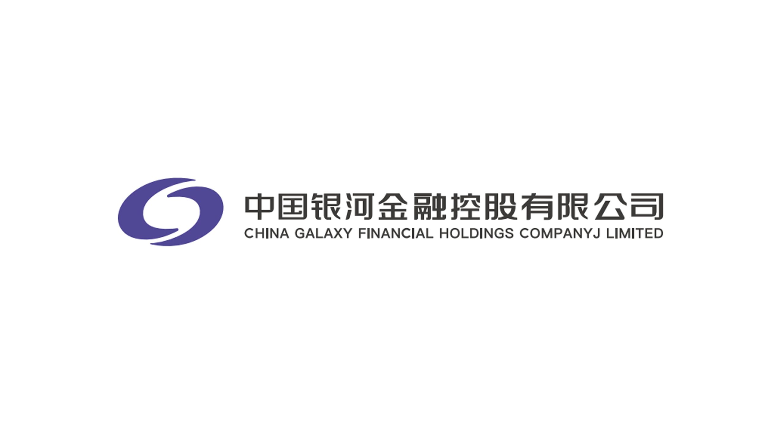
China Galaxy Securities is a comprehensive securities brand with financial services such as securities brokerage, investment banking, asset management and wealth management as its core. It is committed to connecting capital markets, corporate development and personal wealth. The project hopes to use the logo system to show the image characteristics of "Galaxy Convergence, Financial Connection", reflect the balance of professional stability and open innovation, and elevate the brand from a "financial service institution" to a corporate symbol that connects capital and value.

design concept
The logo uses the English letter "G" as the visual core, combining the letter structure with the circular orbit to form an inclusive and malleable galaxy image. The overall graphic resembles the orbit of a star, and also resembles the cyclical relationship between capital and information that continuously gathers and flows, symbolizing China Galaxy Securities’ professional ability to connect investors, enterprises and the capital market. The internal graphics form the identification feature of "G" through a concise negative relationship, which represents the initials of the brand's English name "GALAXY" and also implies efficient communication and value conversion of financial resources on an open platform. Purple, as the main color of the logo, symbolizes wisdom, professionalism, rationality and the future. The overall composition conveys the brand aura of "the galaxy gathers momentum and connects value".
graphic language
Circular orbit configuration: taking the meaning of "Galaxy Movement", representing the flow and gathering of capital, information and resources in the financial market, and also reflecting the sustainable development and expanding vitality of the brand; The central "G" deformation: based on the first letter of the English "GALAXY", the letter structure is integrated into the circular graphic to strengthen the recognition of the brand name and form a visual symbol with international characteristics; Open curve: The external curve does not form a completely closed circle, retaining the openings that extend outward, implying the open connection of financial services, the sustainable development of capital markets, and the future-oriented growth space of enterprises; White space structure: The white space inside the graphic forms a clear visual channel, symbolizing information transparency, smooth communication and value circulation, and also implying rational decision-making and professional judgment.
Fonts and composition
The brand name adopts a Chinese-English bilingual structure: the Chinese "China Galaxy Securities" is presented in a concise, stable and modern font, which combines the professionalism of the financial industry and the clarity of brand communication; the English "CHINA GALAXY SECURITIES" is laid out in a concise sans-serif font to convey the image of internationalization, standardization and modern financial services; the Chinese and English are typed up and down, forming a clear and stable hierarchical relationship, and together with the circular logo on the left, form a complete brand recognition system. The overall composition adopts a horizontal combination, with the purple graphic logo on the left and the Chinese brand name and English auxiliary text on the right. The visual focus naturally extends from graphics to text. Maintain an appropriate spacing between graphics and fonts to form a concise and balanced visual relationship, reflecting the rational, professional and efficient industry characteristics of the securities brand.
Application and extension
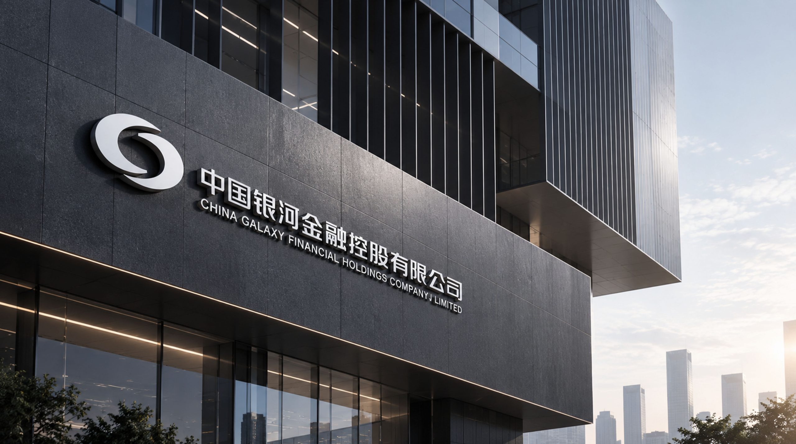
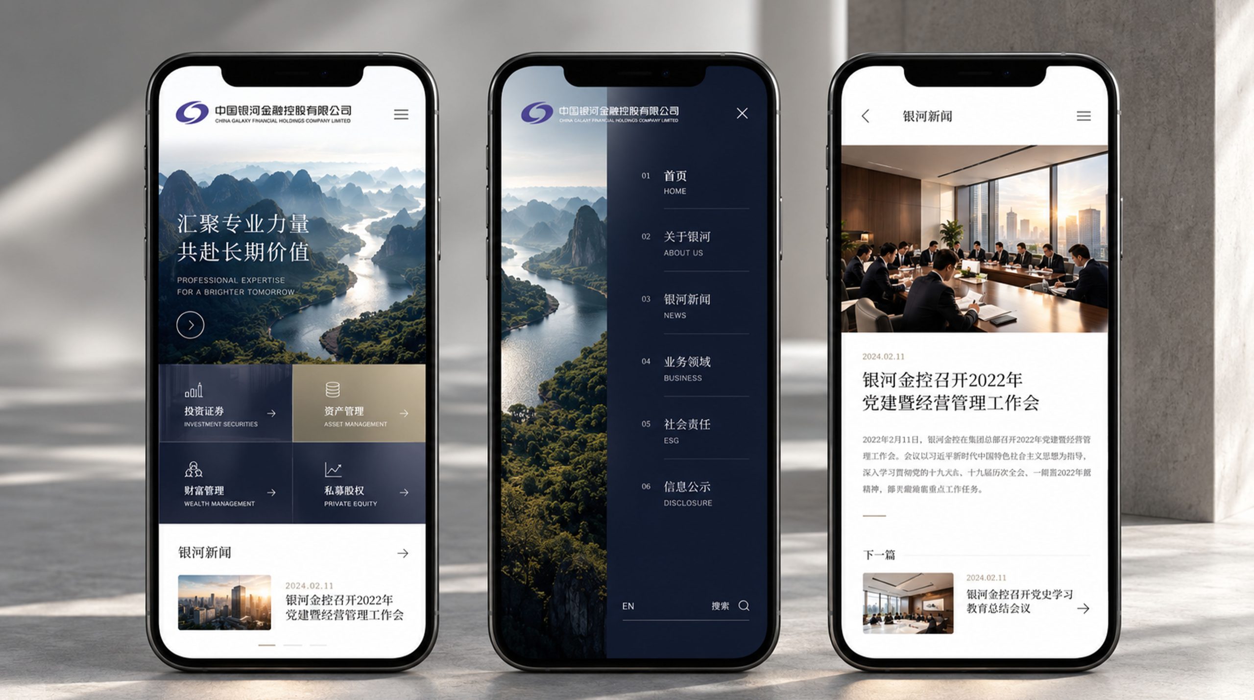
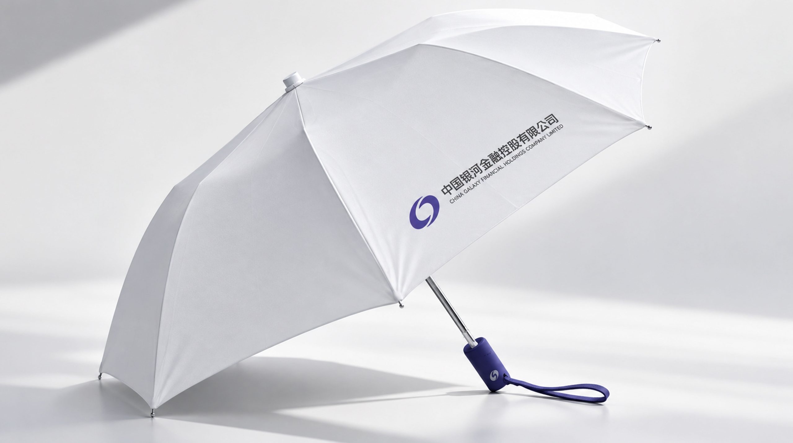
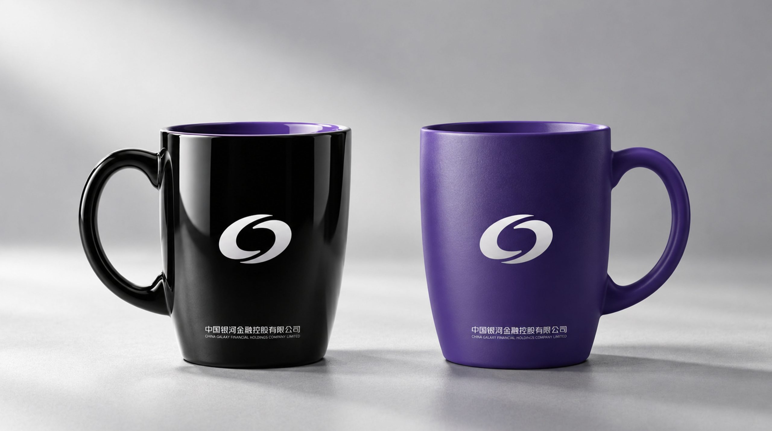
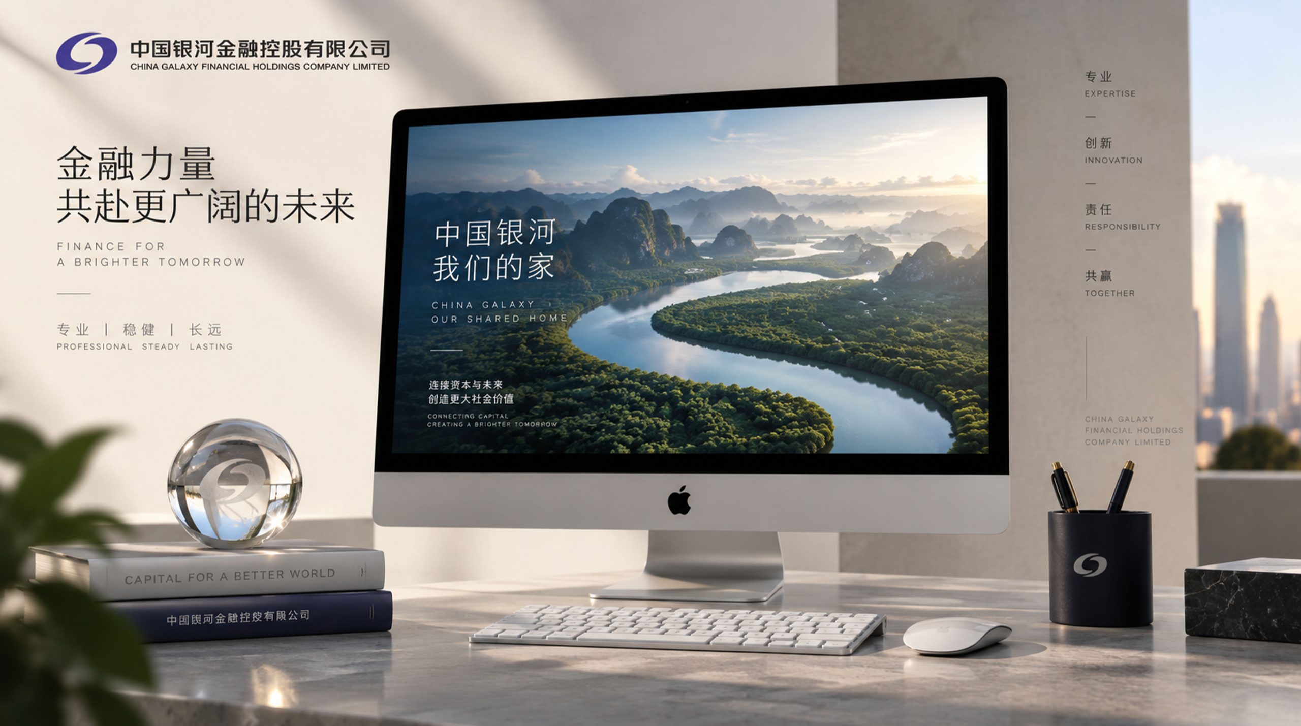
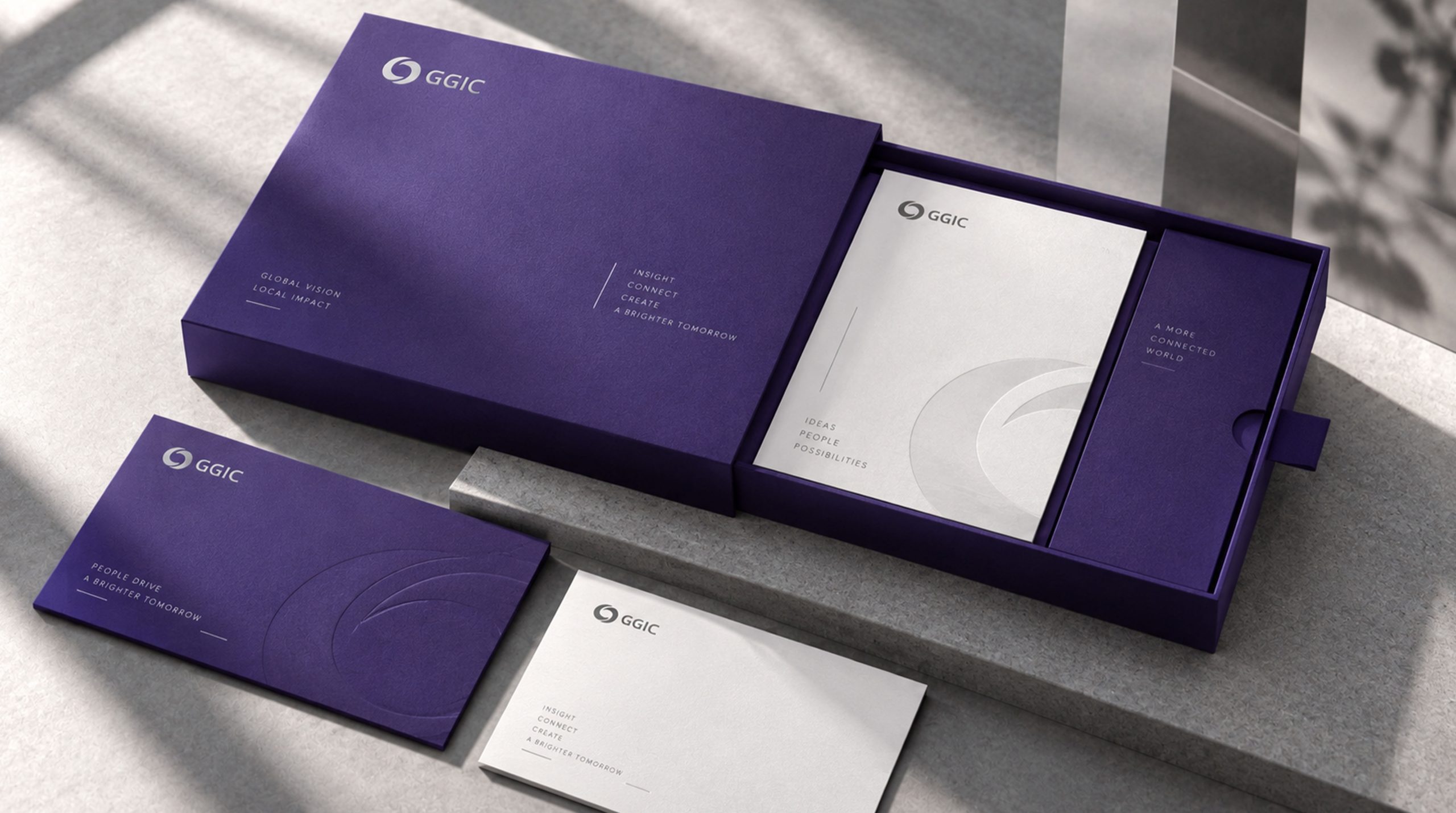
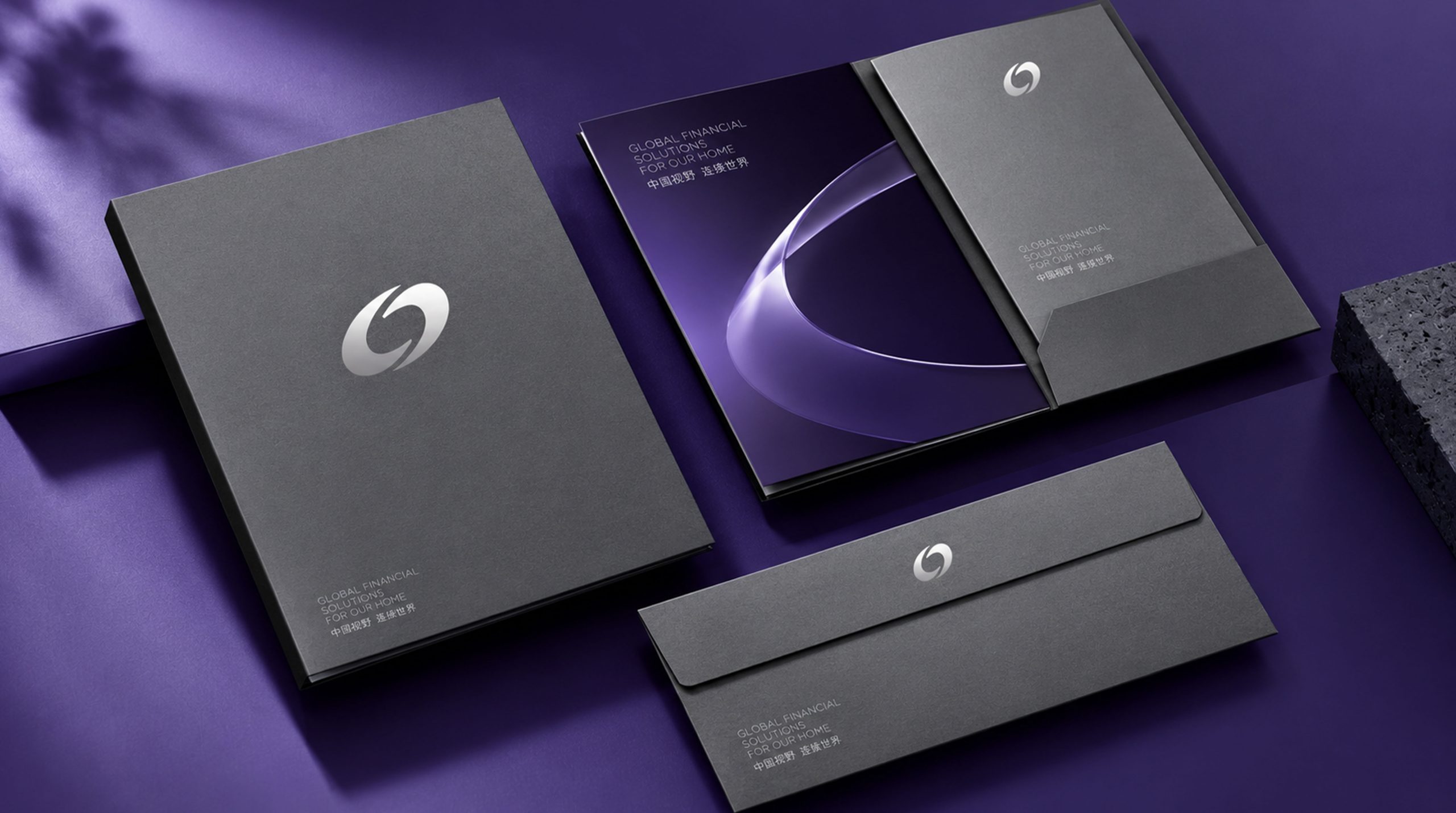
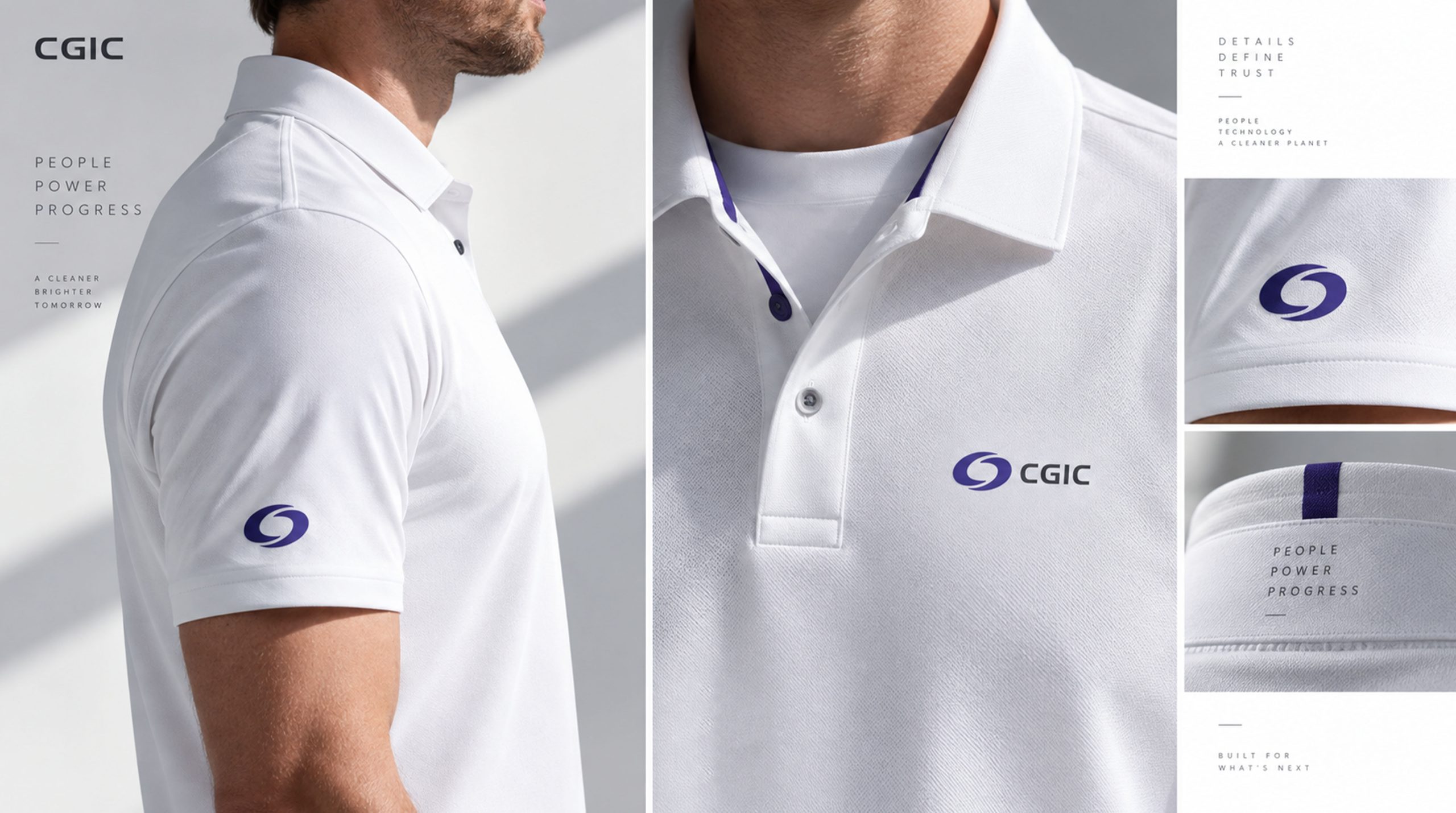
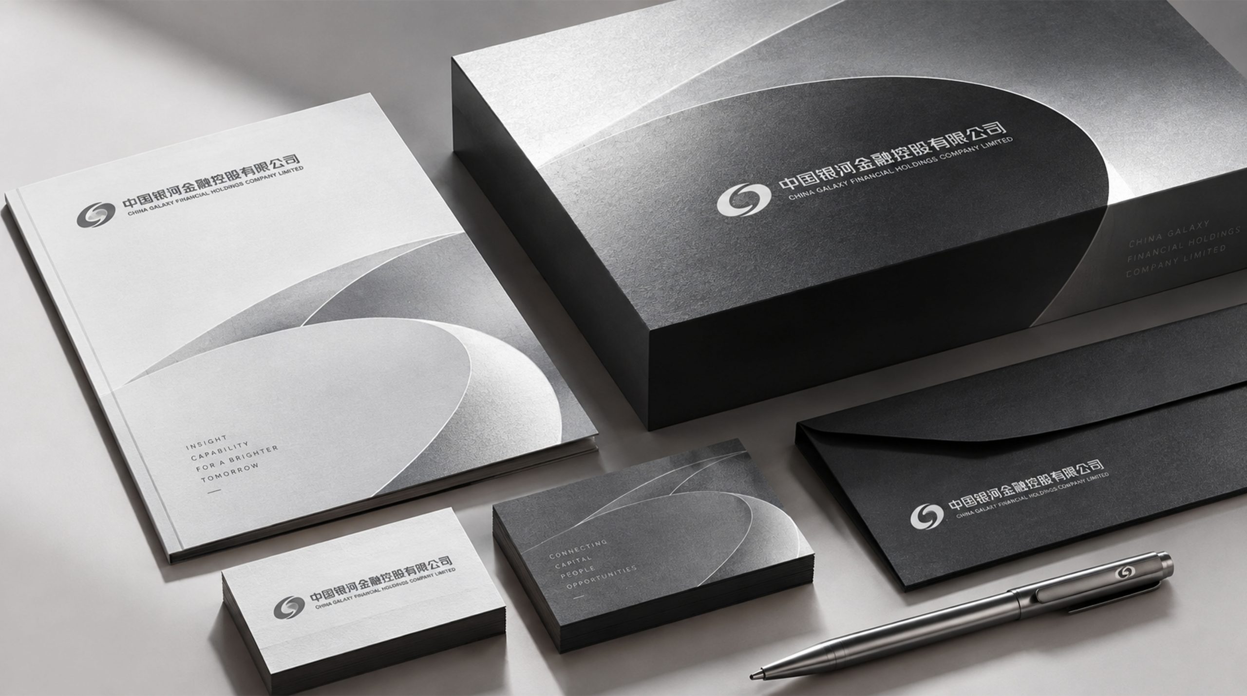
Logos are widely used in securities business halls, office building entrances, guidance systems, office stationery, corporate business cards, conference systems and project promotional materials. Ring graphics can be used independently in financial products, digital terminals, official websites, mobile applications, gift packaging and souvenirs to enhance brand recognition in different media. Its circular track and "G" structure can also be derived into brand auxiliary graphics. Through repetition, rotation, superposition and extension, a visual pattern with a sense of flow and order is formed. Relevant graphics can be applied to business hall wall decorations, light box signs, promotional backgrounds, exhibition spaces and digital interfaces to express the brand characteristics of capital flow, information connection and resource gathering.
brand meaning
Gathering momentum in the ring, the Milky Way is accessible. The logo is shaped like "G" and means "Galaxy", which integrates capital, customers, enterprises and the market, symbolizing that China Galaxy Securities connects multiple entities with professional financial services and promotes resource allocation and value realization. The circular track represents the flow and circulation of the financial market, the open structure represents future-oriented cooperation and development, and the internal blank space reflects transparency, rationality and professionalism. Purple not only represents the wisdom and rationality required by the financial industry, but also conveys the brand’s innovative spirit for the future. The logo integrates Galaxy imagery, capital flows and financial services through concise graphic language, symbolizing China Galaxy Securities’ development vision of being rooted in China’s capital market and connecting global financial resources. This is a visual symbol that combines professional heritage and modern spirit. It not only represents the stability and authority of financial institutions, but also conveys the brand concept of open connection, value co-creation and sustainable development.
Improper Usage (Protection Specification)
The structural proportion of the "G" character and the circular track cannot be changed. The logo graphic cannot be split, stretched, compressed or rotated at will. The relationship between the white space within the graphic cannot be changed. Other unregulated colors cannot be used to replace the original purple. Complex gradients, strokes or three-dimensional effects cannot be used to replace the logo. Accurate color, shadows, halos and other decorative special effects must not be added, the font proportions and arrangement relationships of Chinese and English names must not be changed, the logo must not be used directly on complex backgrounds or low-contrast backgrounds, and sufficient safe space should be reserved around the logo to ensure that graphics and text are clearly legible.
design results
After the release of the new logo, China Galaxy Securities formed a brand recognition system with "Galaxy Convergence, Financial Connection, and Professional Development" as its core. The purple ring logo has been used in securities business halls, office buildings, conference systems, financial products, corporate business cards and various promotional materials, becoming an important visual symbol for the brand to connect customers, the market and corporate value. Through the integration of the circular track and the letter "G", the logo integrates the image of the Galaxy, capital flow and financial services. It not only reflects the professional and stable industry attributes of China Galaxy Securities, but also shows the brand's open, innovative and enterprising development spirit, becoming a brand symbol and financial service logo in China's capital market.