










Jiangnan Chunxiao is a brand project centered on Jiangnan regional culture, urban renewal and high-quality lifestyle. It is committed to showing the cultural temperament of Jiangnan water towns and the aesthetic spirit of modern cities. The project hopes to reflect the brand characteristics of "Jiangnan artistic conception and spring rebirth" through the logo system, establish a balance between traditional culture and modern design, and elevate the brand from a single name recognition to a cultural symbol with regional memory and life warmth.
design concept
The logo takes the regional image of "Spring Dawn in the South of the Yangtze River" as the visual core, integrating elements such as Jiangnan architecture, eaves, waterfronts and morning light into a simple horizontal line structure. The upper lines present a stacked and stretched building or eaves shape, symbolizing the spatial order and urban texture of the Jiangnan water town; the orange triangle and gray dots on the right form the image of "sunrise", implying the rising sun in the morning, and also symbolizing the brand's development, hope and new beginnings.
The overall logo uses gray as the main visual color, conveying the subtlety, elegance and calmness of Jiangnan culture; orange, as the visual focus, represents the spring sunshine, vitality and warm humanity. The relationship between simple lines and white space gives the logo a light, modern and poetic brand temperament.
graphic language
Horizontal line configuration: The upper lines are arranged in a parallel and staggered manner, resembling the eaves, covered bridges and waterfronts of Jiangnan buildings, and also embody the sense of order and ductility of urban space; "Sunrise" graphic: the orange triangle symbolizes the rising sun or distant mountains, representing spring, rebirth and hope; the gray dots next to it are like the sun in the morning light or the light spots on the water in Jiangnan, forming a simple and recognizable visual symbol; Jiangnan architectural image: The combination of horizontal lines and short vertical lines presents the abstract features of roof ridges, window panes, bridges and building facades, reflecting the architectural culture and humanistic memory of the Jiangnan region; White space structure: The logo uses a large area of white space to create an ethereal visual experience of early morning mist and water towns, implying the implicit, restrained and layered spiritual temperament of Jiangnan culture.
Fonts and composition
The brand name adopts a Chinese-English bilingual structure: the English "JIANGNAN CHUNXIAO" is presented in a simple and slim sans-serif font, reflecting the brand's modernity and international image; the Chinese "Jiangnan Chunxiao" uses a simple and elegant font layout, with stretched fonts and balanced spacing, conveying the implicit temperament of traditional culture and the simplicity of contemporary design.
The logo adopts a top-bottom composition, with abstract line graphics and the English name on the top, and "Jiangnan Chunxiao" in Chinese on the bottom, forming a clear and stable visual hierarchy. As the main identification content, the Chinese name has strong cultural attributes; the English name serves as auxiliary information to strengthen the modern communication and international recognition of the brand. The overall composition is simple and balanced, suitable for different scales and various media environments.
Application and extension
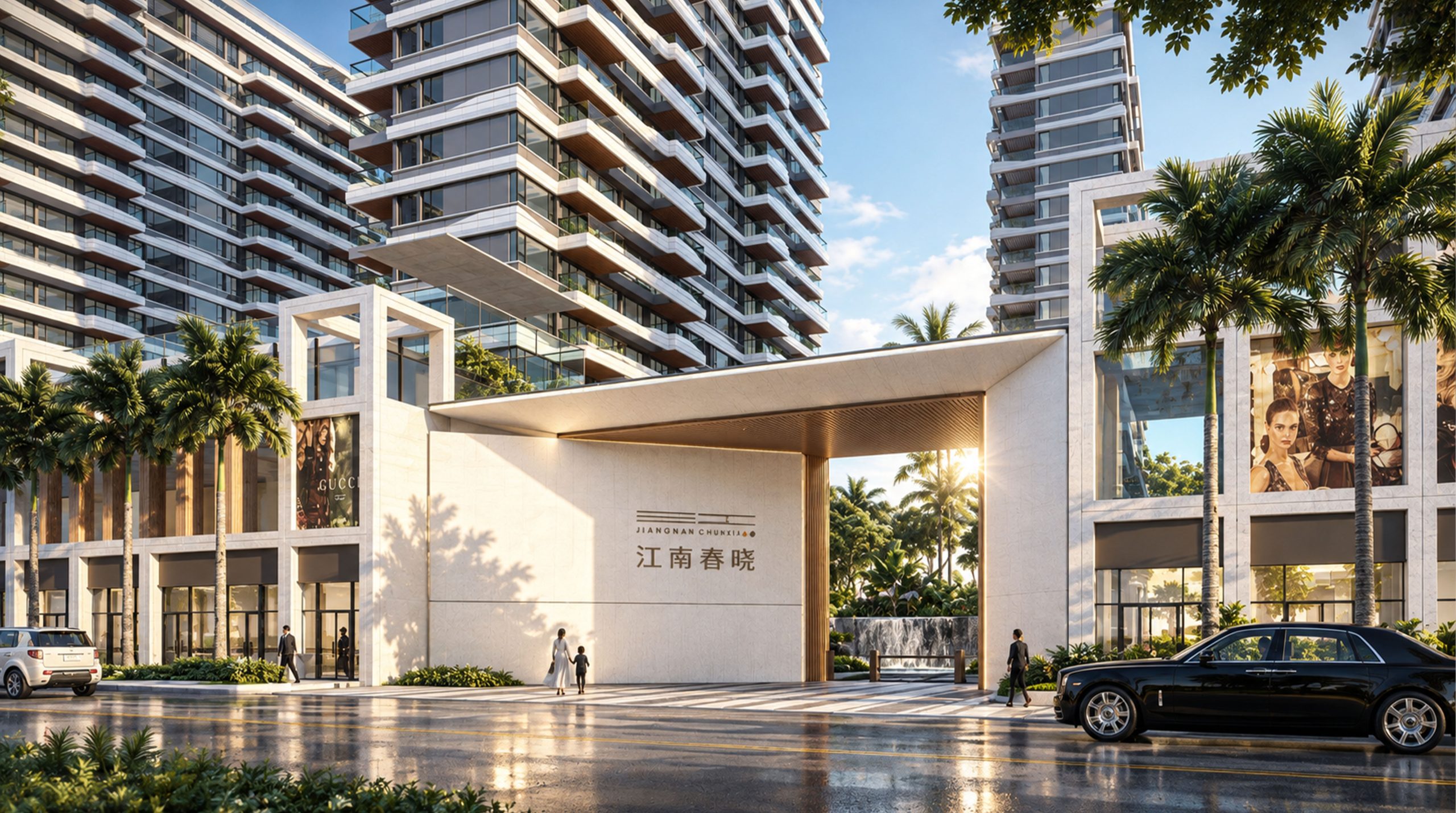
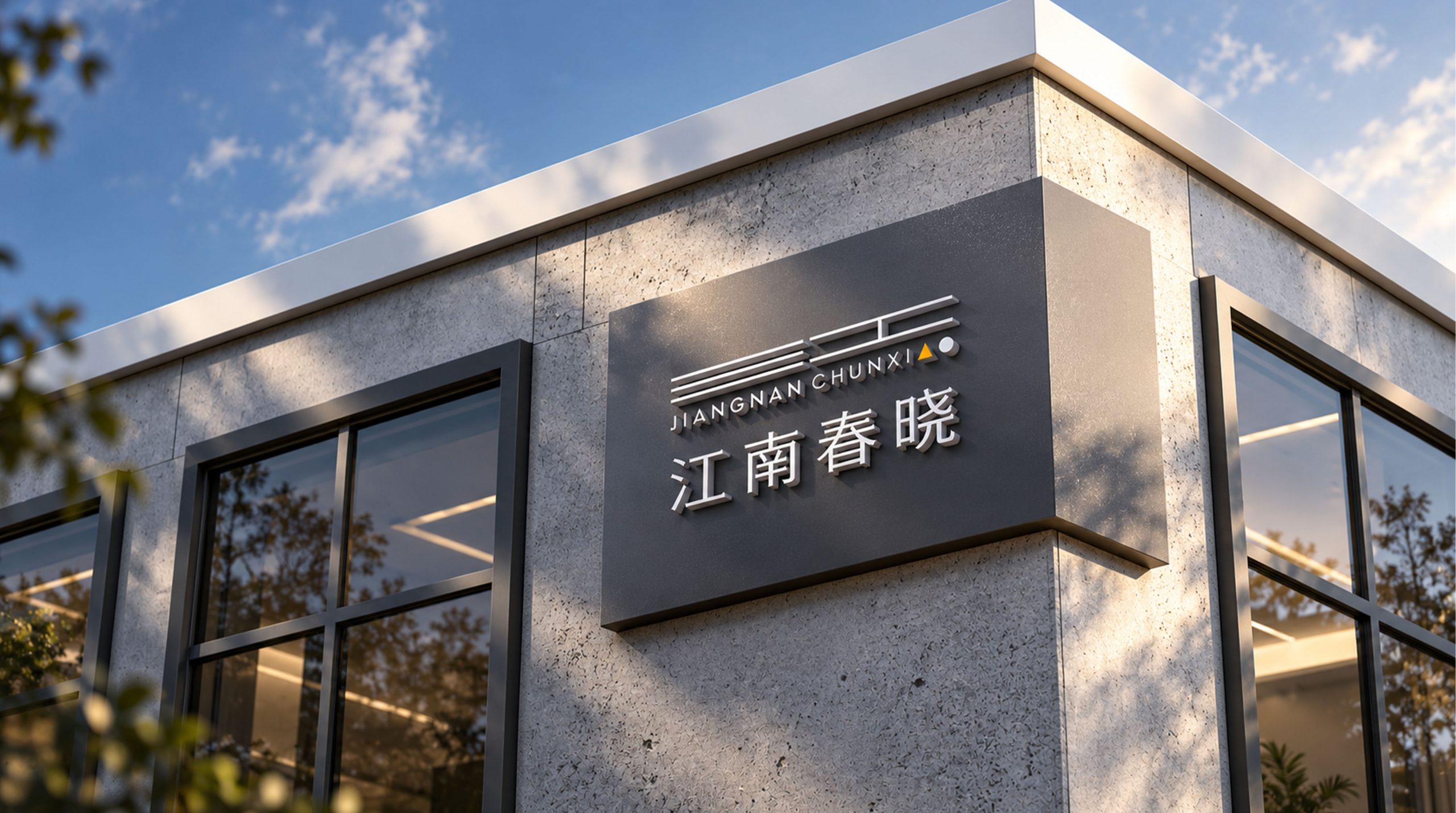
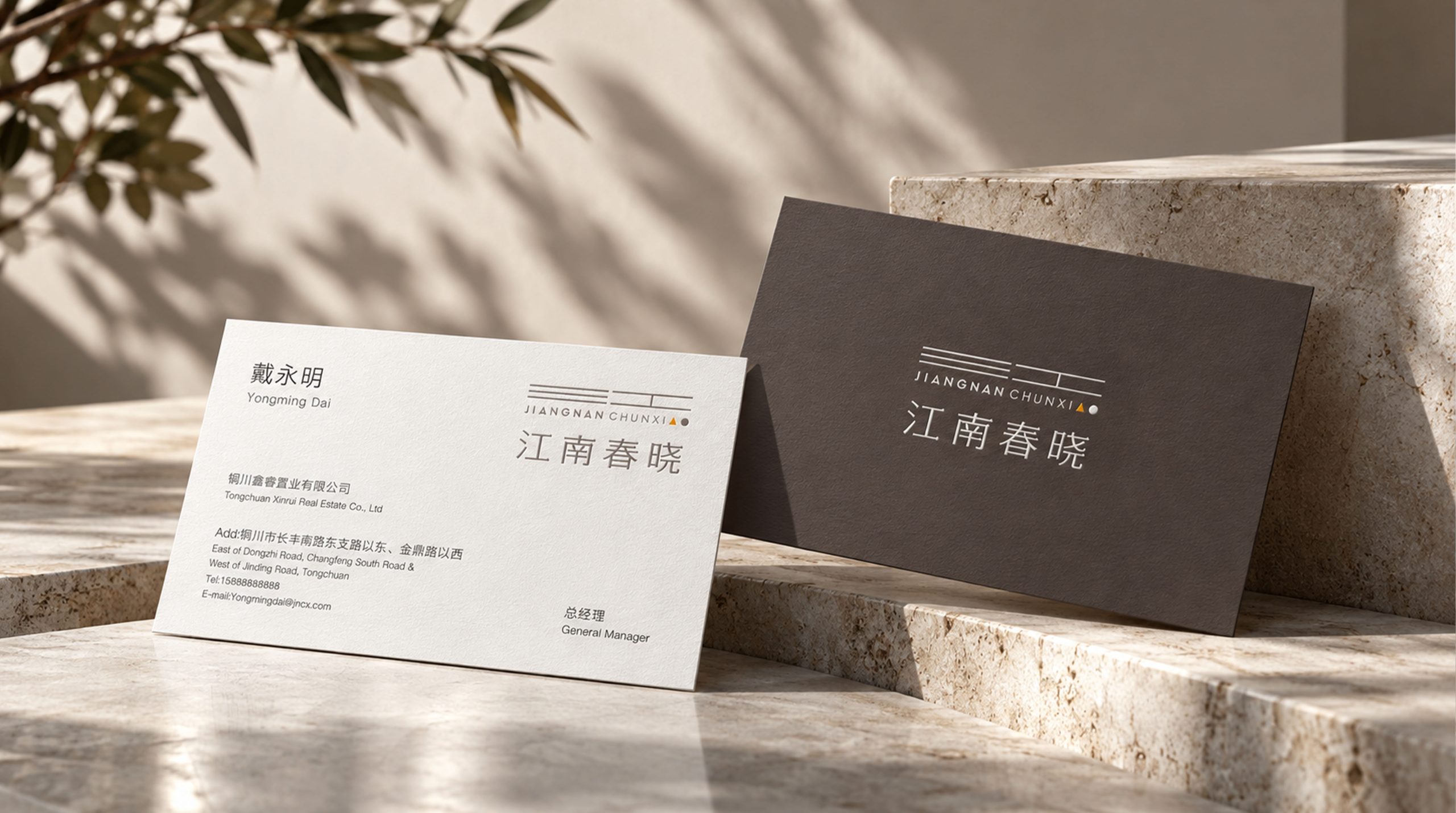
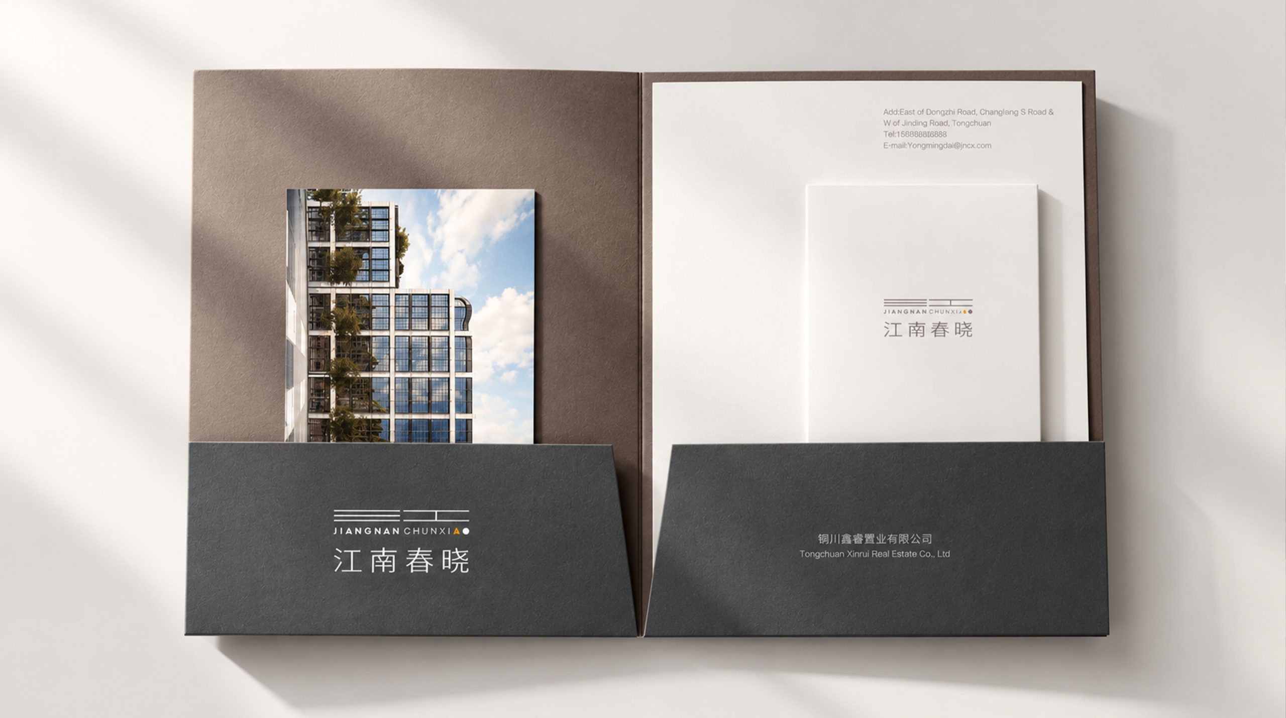
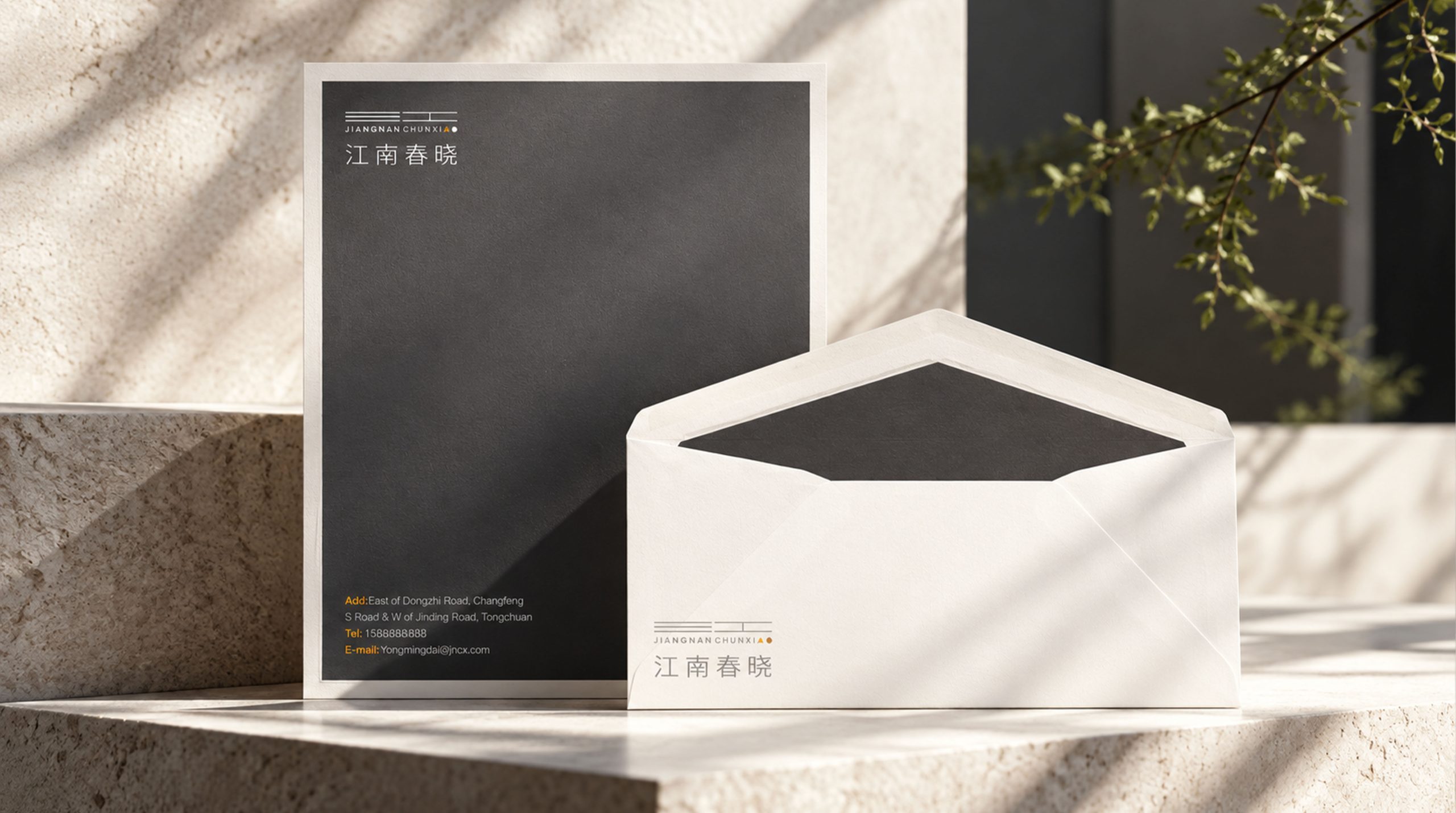
Signs are widely used in building entrances, cultural spaces, real estate projects, wayfinding systems, office stationery, brand albums and project promotional materials. Orange triangles and gray dots can be independently used as auxiliary graphics for "Spring Dawn and Sunrise" and can be used for gift packaging, souvenirs, invitations, event materials and space decoration. The horizontal line system can be extended to building facades, guide signs, light boxes, wall decorations and brand patterns. Through repetition, superposition and staggered arrangement, a visual system with Jiangnan architectural temperament is formed. The lines can also be combined with elements such as water waves, eaves and bridges to express the flow and spatial hierarchy of the Jiangnan water town.
brand meaning
There is scenery in the line, and there is something new in the dawn. The logo takes the shape of Jiangnan architecture and water town lines, and the morning sunrise as its meaning, integrating regional culture, natural artistic conception and modern life. The gray lines represent the tranquility, elegance and cultural accumulation of Jiangnan, and the orange sunrise represents the vitality, hope and future development of spring.
"Jiangnan" reflects the brand's regional roots and cultural memory, while "Spring Dawn" symbolizes a new beginning, urban renewal and a better life. The overall logo not only retains the poetry and implicitness of Jiangnan culture, but also reflects the simplicity and openness of the modern brand. It is a visual symbol that combines traditional heritage, natural beauty and modern spirit.
Improper Usage (Protection Specification)
The proportional relationship of the horizontal lines cannot be changed, the combined position of the orange triangle and the gray dot cannot be changed at will, the logo cannot be stretched, compressed, rotated or tilted, the standard gray and orange must not be replaced by other unregulated colors, shadows, halos, three-dimensional and complex special effects must not be added, core elements in the graphics must not be deleted at will, and the logo must not be used directly on complex backgrounds or low-contrast backgrounds. Sufficient safe space should be reserved around the logo to ensure that the graphics and Chinese and English text are clearly legible.
design results
After the release of the new logo, Jiangnan Chunxiao formed a brand identity system with "Jiangnan artistic conception, spring rebirth, and modern life" as its core. Simple line graphics, elegant Chinese names and orange sunrise symbols have been used in architectural spaces, cultural activities, wayfinding systems, brochures and corporate business cards, becoming important visual symbols for brand external communication. The logo re-expresses Jiangnan culture with modern design language, integrating architecture, water towns, morning light and urban life. It not only reflects the unique charm of regional culture, but also conveys the brand's values of facing the future, continuously updating and pursuing a better life.
Application and extension