










GFCA (Global Future City Industry Association) is dedicated to advancing collaborative innovation in smart cities, sustainable infrastructure and future industries worldwide.
The association brings together leading institutions and enterprises across technology, architecture, transportation, energy and telecommunications, collaborating across sectors to build a smart, green, livable and connected future city ecosystem. The logo was designed to express, through an open, forward-looking, international and collaborative visual language, the technological edge and foresight of a global partnership network.
design concept
Built on the letters “GFCA,” the logo uses clean geometric letterforms and continuous lines to express the association's open, interconnected nature. Its core design language draws on Fusion and Expansion: the horizontal strokes of the F and C join to form an image of a symbiotic urban network. Interwoven blue and green strokes symbolize the coordinated development of technology and ecology, representing GFCA's capacity for comprehensive connection and system integration in the smart city field.
graphic language
Letter fusion: the crossbars of the F and C join seamlessly, symbolizing co-creation across industries and regions; Slanted A: progress, innovation and a future orientation; Open strokes: collaboration, sharing and the flow of information; Borderless composition: the idea of boundless cities and open networks. The composition balances structure × momentum — architectural in its geometry, dynamic in its future-facing energy.
Fonts and composition
The letterforms use a custom geometric sans serif with uniform stroke weight and balanced proportions, reflecting the precision and order of a technology brand. Tightened spacing creates a cohesive, unified mark. The full name, “Global Future City Industry Association,” sits at the lower right in a light weight as a supporting descriptor, forming a clear primary–secondary hierarchy in line with international identity standards.
color system
Tech Blue #2FA2C9: innovation, intelligence and an international technology vision; Eco Green #4DAA83: sustainability, environmental stewardship and the future urban ecosystem; Neutral Gray #5C5C5C: used for secondary text, conveying rationality and professionalism; White #FFFFFF: openness, cleanliness and the purity of the future city. The blue-green gradient stages a balanced dialog between technology and nature, forming the visual core of smart city × human ecology.
Application and extension
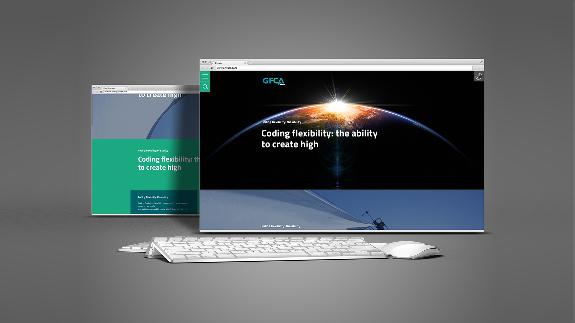
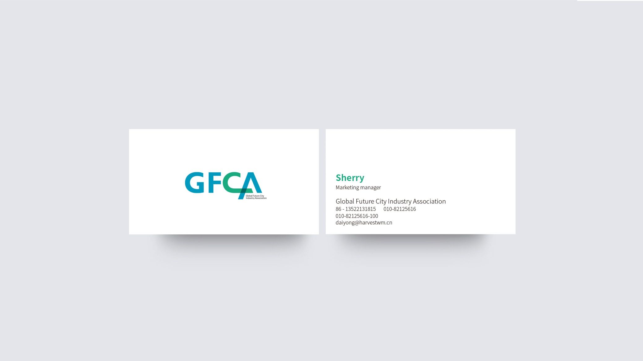
The identity system adapts well to international communication and applies to: key visuals for international forums, summits and annual industry conferences; city brand partnerships, publications and white paper covers; websites, exhibitions, digital interfaces and app icons; city pavilions, conference backdrops and commemorative badges. The overlapping blue-green elements can be extended into a graphic grid for information design and motion graphics systems.
brand meaning
The GFCA logo carries three layers of meaning: Global — blue symbolizes open cooperation and international connectivity; Future — green represents sustainable innovation and ecological intelligence; City Alliance — the interwoven letterforms symbolize a diverse, co-created, technology-driven community of future cities. Together, they embody the association's core mission: building the cities of the future through intelligence.
Misuse (Protection Guidelines)
Do not alter the blue-green ratio or add effects other than the gradient; do not change the letter slant or separate the letterforms; do not use the secondary descriptor without the primary logo; maintain clear space of at least 25% of the logo height; minimum width: 32 mm.
color system
Following its launch, the GFCA logo established a unified identity across platforms such as international smart city congresses and global city forums. Its blue-green visual language has been widely cited by the media and has become a symbol of future city cooperation. The brand identity system was designed by Qingmei Future and featured in the Global Yearbook of Smart City and Sustainable Innovation Brand Identity.