










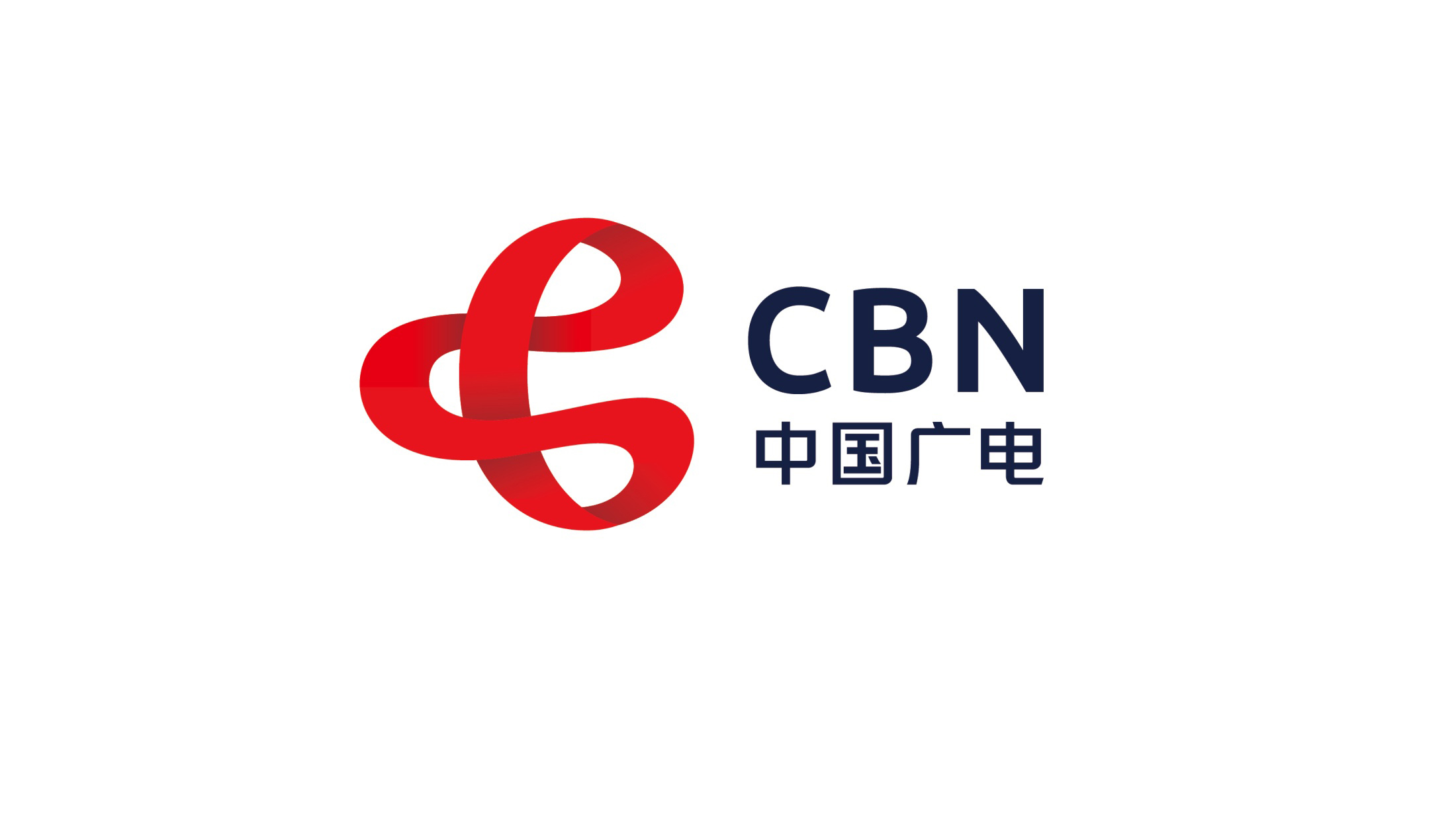
We designed the brand identity and logo system for China Broadcasting Network (CBN).
The core objective: to reshape the image of a national network and communications brand with an international visual grammar, embodying its mission of “three-network convergence, seamless connectivity and intelligent communication.”
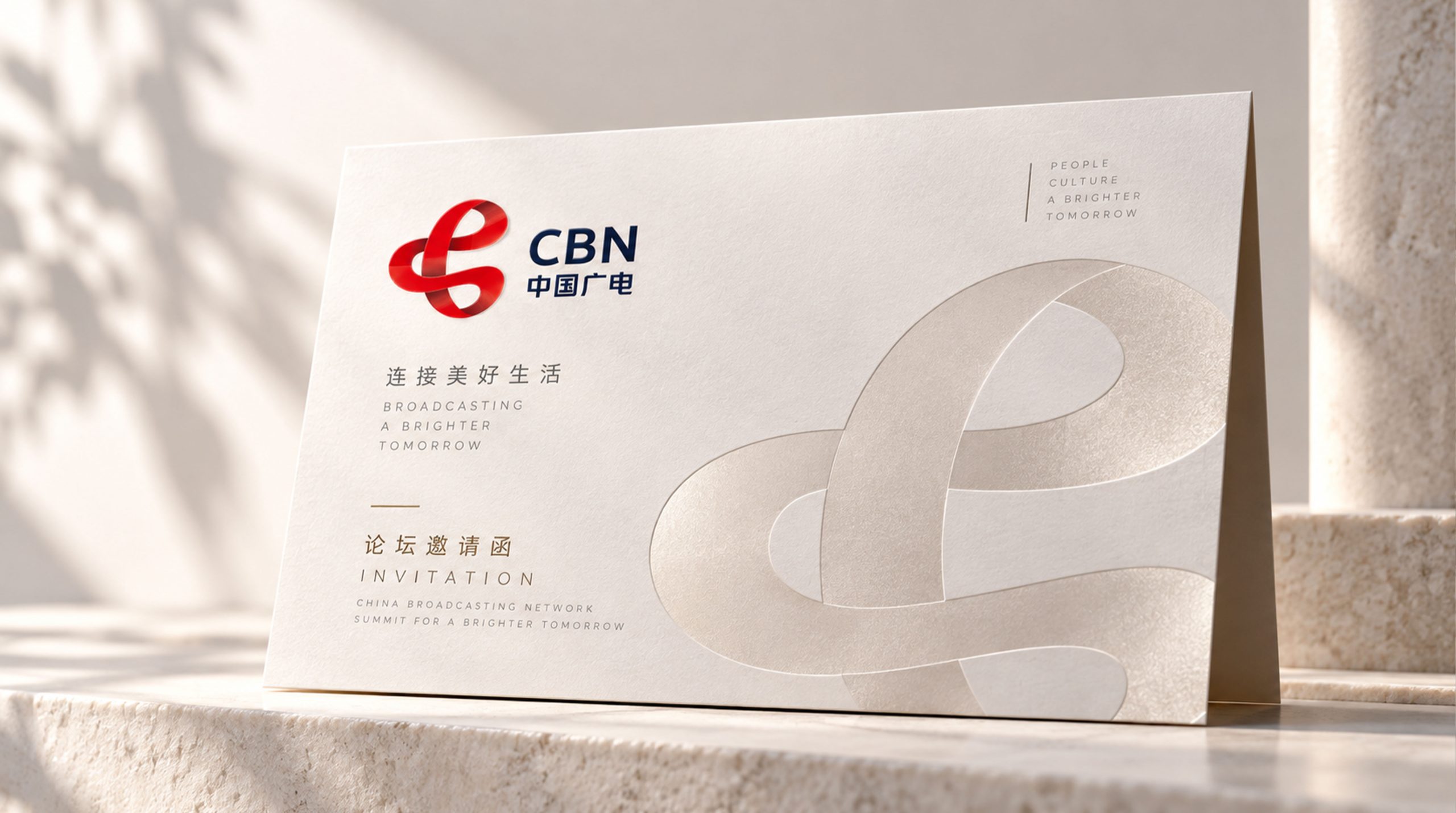
The logo is built on an interwoven structure of the letters C, B and N, symbolizing the multidimensional convergence of media, telecommunications and the internet.
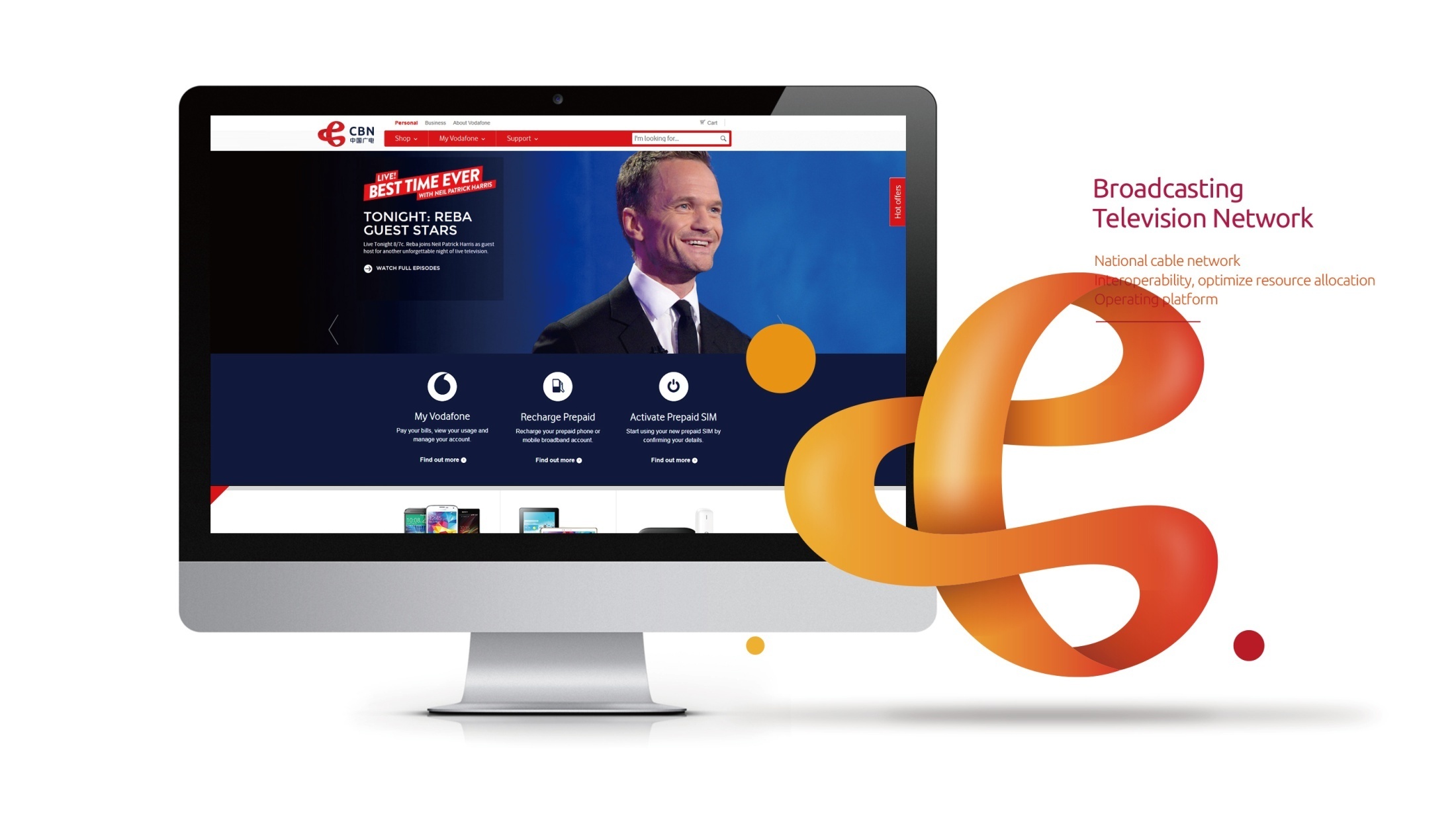
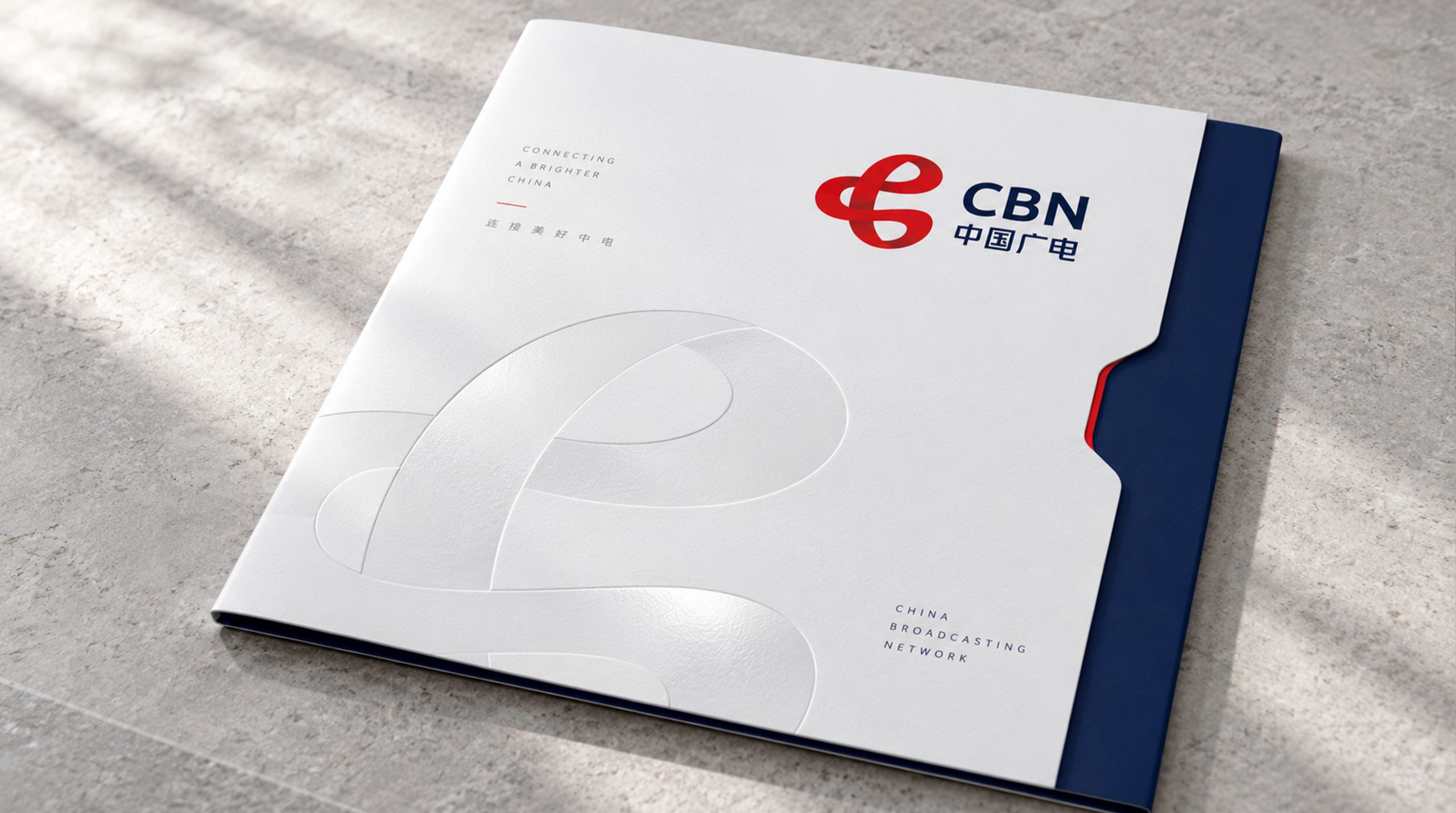
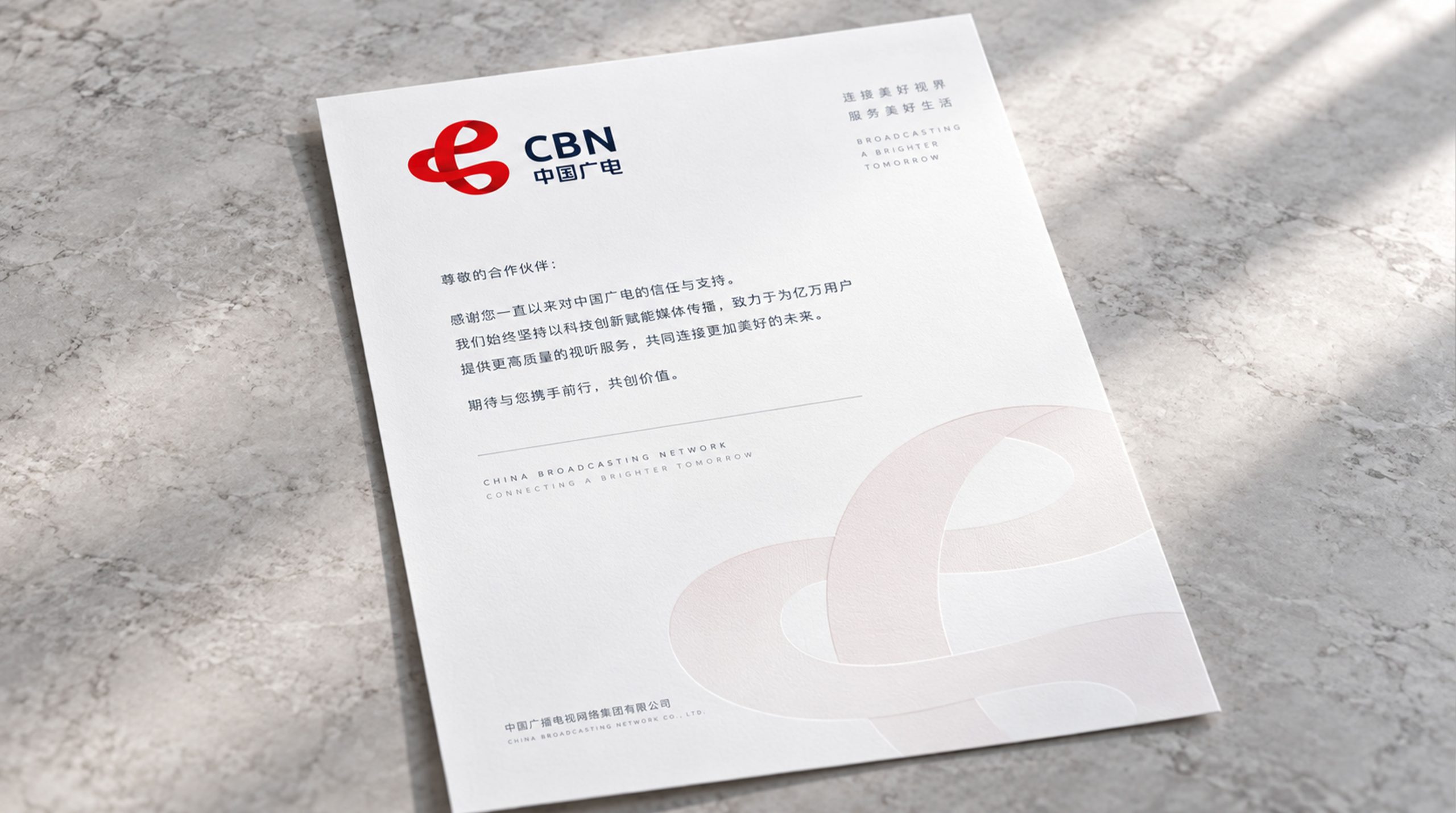
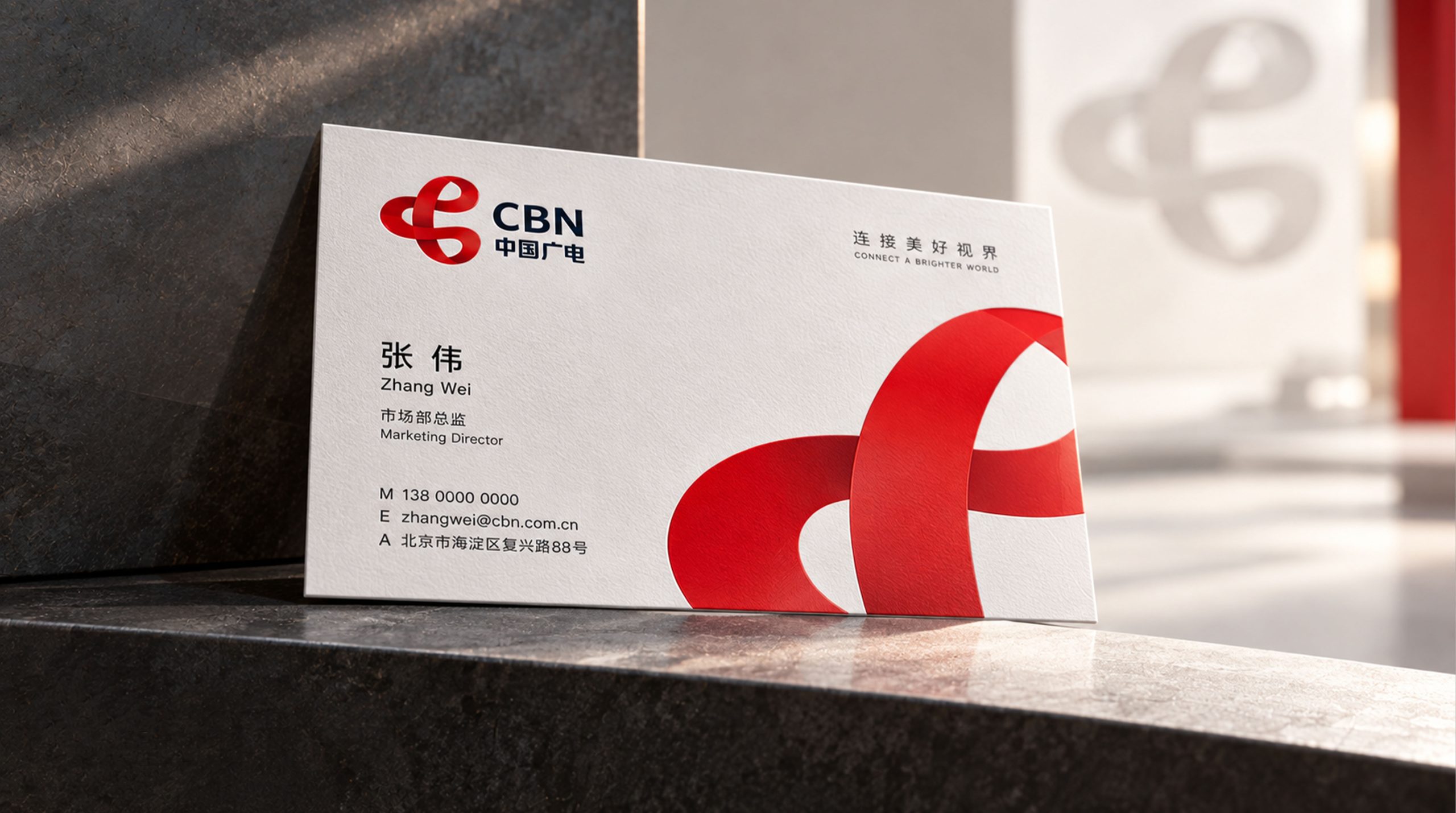
design concept
The logo's core concept stems from Flow & Fusion. Based on the letter C, the mark is animated by a flowing ribbon, symbolizing the efficient transmission of signals, data and content. The encircling ribbon represents interconnected information and the organic linkage of a nationwide network, forming a brand symbol that is open, integrated and intelligent.
graphic language
Flowing ribbon structure: represents signal flow and data bandwidth, capturing the contemporary spirit of media technology; Interlocking loop: represents the convergence of broadcasting, telecommunications and the internet; Inward-and-outward form: signifies communication radiating from the center to connect the entire nation; Dimensional gradient: adds movement and depth, expressing the flow of technological energy. Centered on a red ribbon, the mark forms a “Ring of Communication,” conveying the authority of China's national broadcaster while speaking a contemporary technological language.
Fonts and composition
The CBN wordmark is set in a modern geometric sans serif with steady letterforms and solid strokes, conveying national-level credibility. The Chinese name uses a square-structured typeface with robust, measured strokes, striking a visual balance between global and local. A horizontal lockup, with the symbol on the left and the wordmark on the right, follows international media brand conventions.
color system
China Red #D8352B: passion, communication and national identity; Deep Blue #1A2F54: technology, rationality and trust; White #FFFFFF: openness, purity and the future. Red and blue create strong contrast while expressing the brand's balance of “warmth × reason.” The gradient red ribbon adds depth and modernity, giving the flow of information a visual warmth.
Application extension
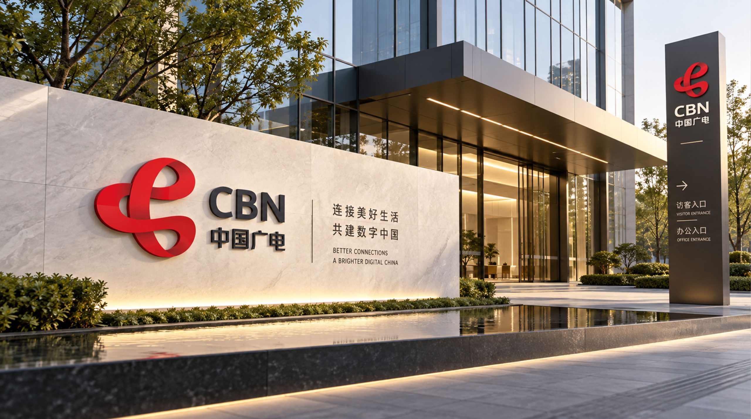
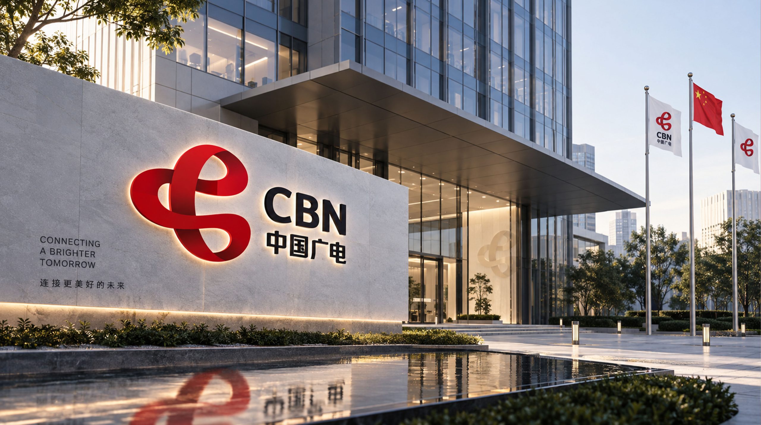
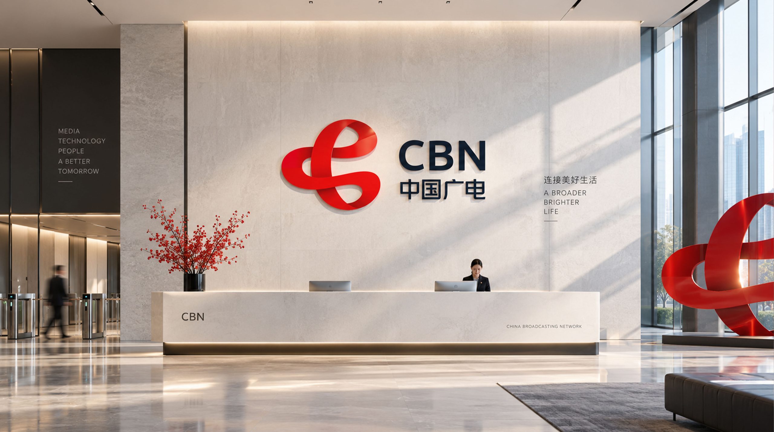
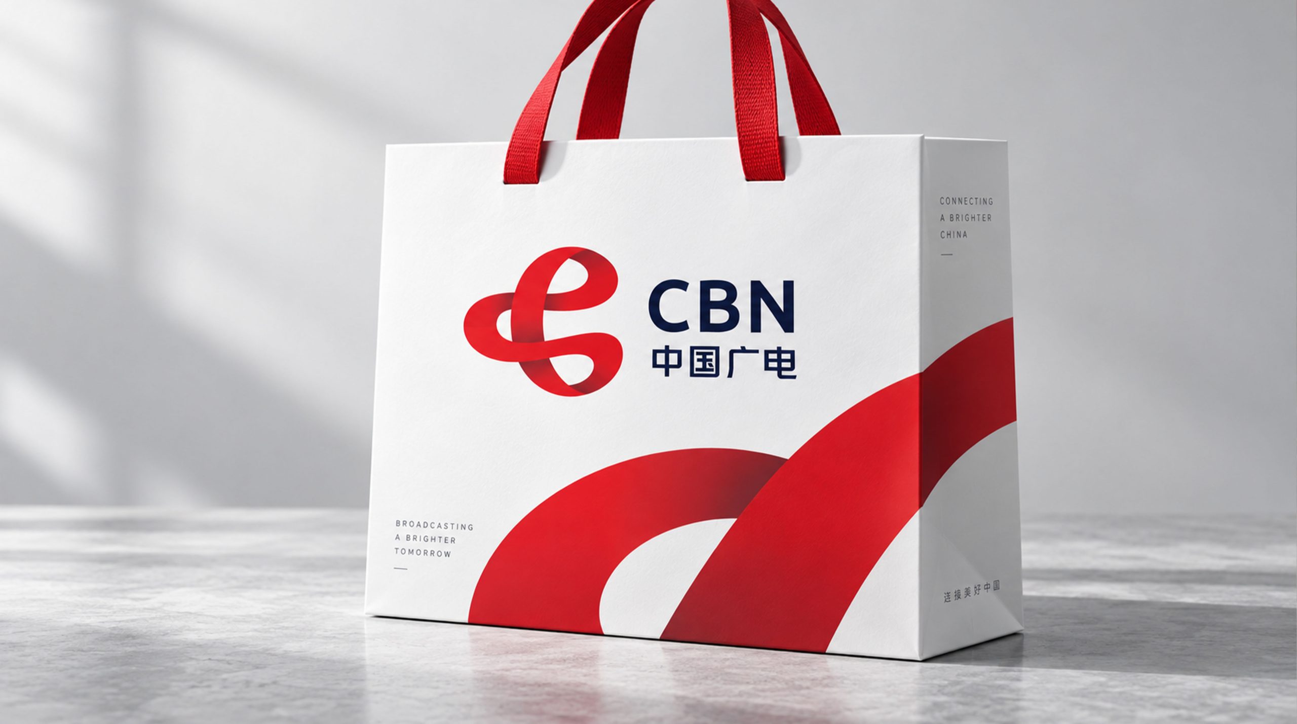
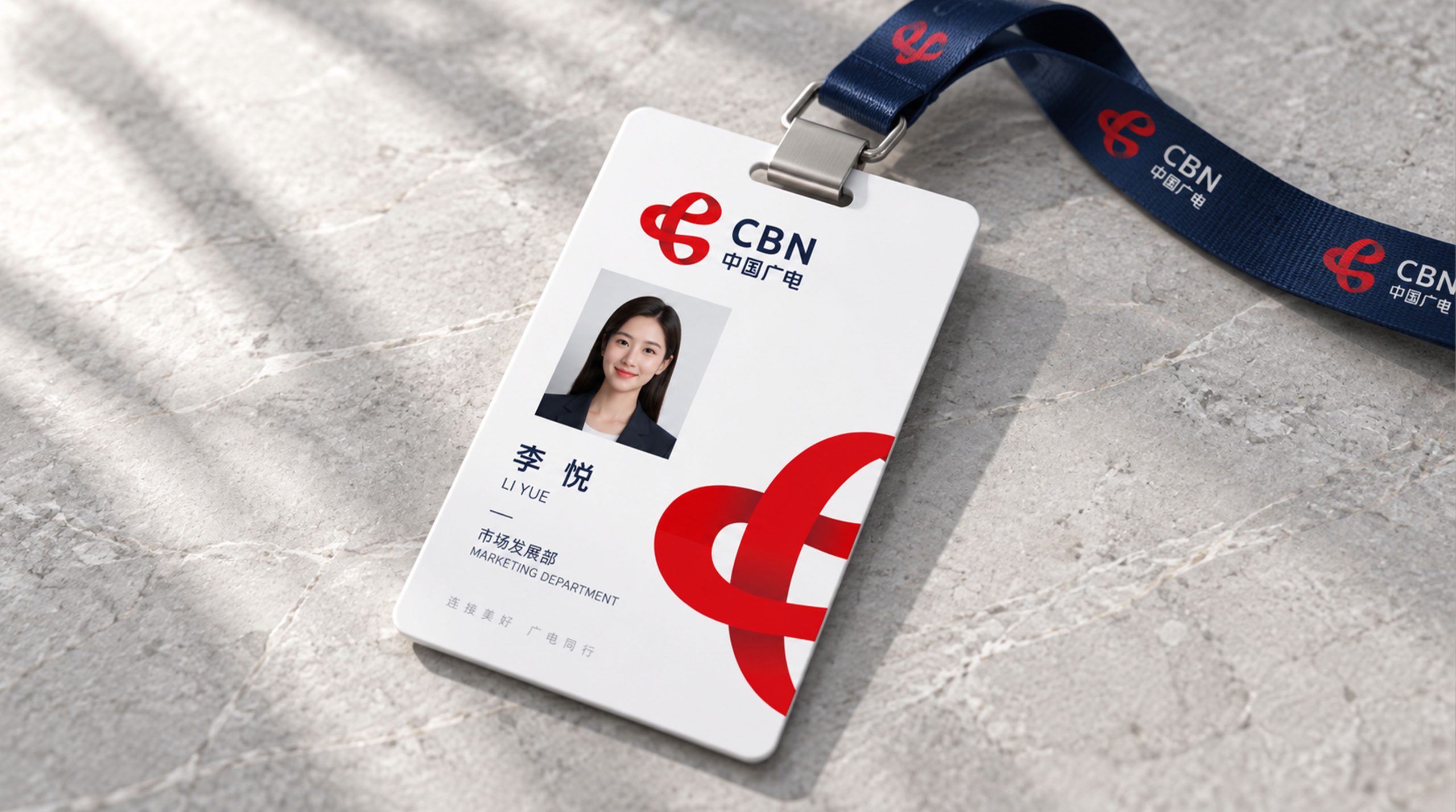
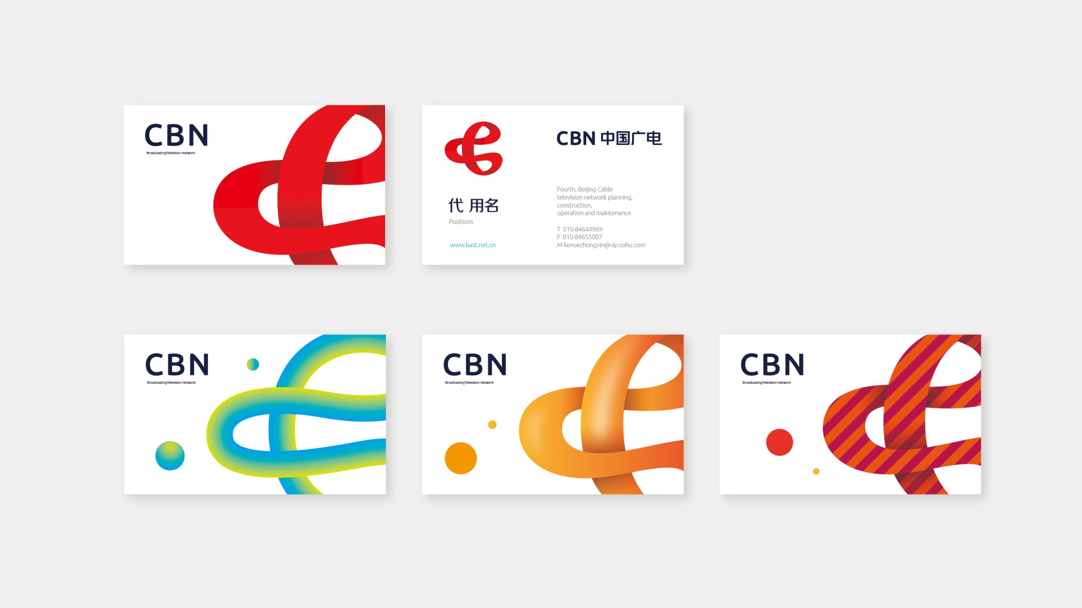
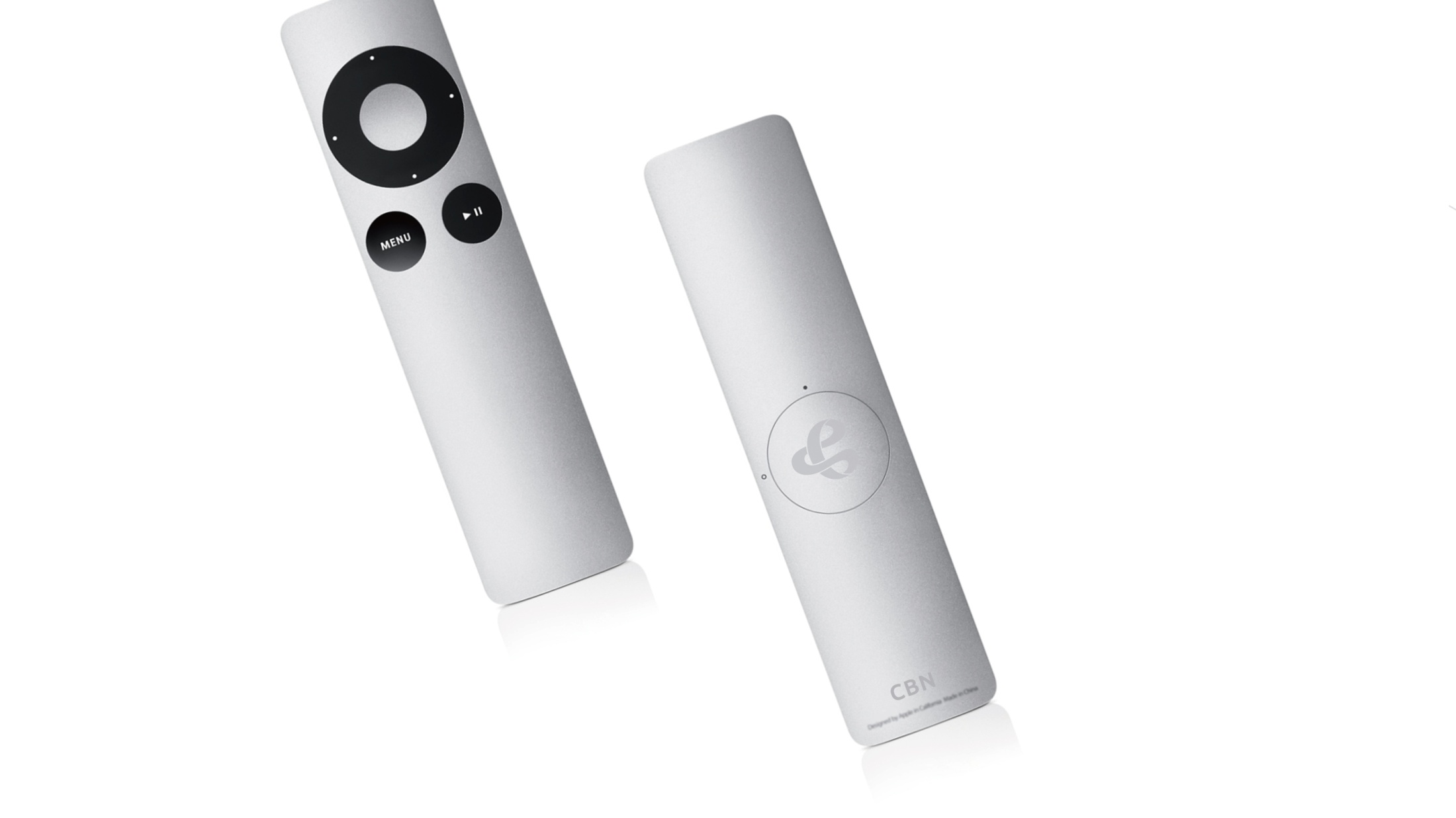
The logo delivers strong recognition and authority across every touchpoint. Corporate: group identity, broadcast, strategic announcements and digital platforms; Product: signal equipment, device interfaces and app icons; Spatial: headquarters architecture, studios and exhibition installations, where it forms immersive visual features. In motion, the ribbon can rotate, flow or sweep with light, reinforcing the core idea of “information flow × communication power.”
brand meaning
The CBN logo embodies the brand's core spirit: “Broadcasting the voice of the nation, building intelligent broadcast networks.” Ribbon → information flow and channels of communication; Loop → connection and convergence; Red-blue contrast → passion and reason; Three-dimensional dynamism → the future and technology. More than a visual symbol, it represents a national communications system, harnessing the power of information flow to connect every voice in China.
Improper Usage (Protection Specification)
Do not alter the ribbon's shape or rotation; Do not change the gradient direction or the red color value; Do not break, skew, or add shadows or outlines; Recommended minimum width: 35mm.
design results
Following the launch, CBN's “red communication × blue technology” visual system established a unified brand image for China's national broadcasting network. The ribbon loop is used widely across broadcast openers, data interfaces and wayfinding, becoming the core visual symbol of the national communications system. The project represents a mature expression of Qingmei Future's work in national brand systems and communication design, unifying visual identity and the wider communications system under one symbol.