










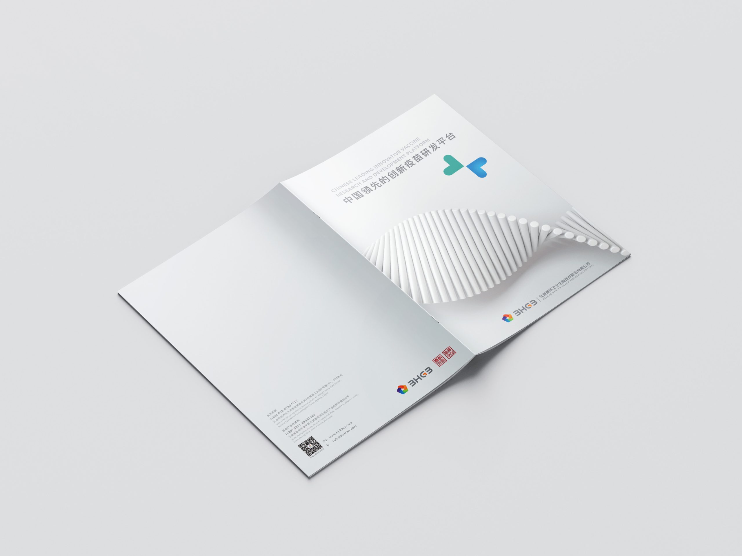
Kanglue Weishi is a vaccine R&D and biopharmaceutical innovation enterprise. Its brand identity design project aims to build 'care' as a core symbol, creating a visual language that combines professionalism, recognition, and warmth.
In the brand repositioning, we proposed a 'Care · Super Symbol' strategy: through a symbol system representing 'care,' we enhance brand recognition and transform Kanglue Weishi from a 'seedling/vaccine company' into a 'biotechnology brand with design sensibility and global vision.'
design challenge
The enterprise operates in a highly specialized, technology-driven field where brands typically convey 'cold tech/pharmaceutical' qualities. The core challenge: how to infuse 'warmth' and 'humanity' without compromising professionalism. The design must balance 'recognition' and 'distinction'—the symbol must be simple and easy to identify while possessing unique brand character, avoiding generic templates. As the brand targets domestic and international markets with aspirations toward 'internationalization,' the positioning of visual language between localization and globalization becomes a critical issue.
Strategy and philosophy
The design centers on the core concept of 'Care · Building a Trusted Future.' Symbol system: an abstracted 'heart' shape serves as the primary visual identifier, fusing technological grids with biological structural elements to create a super symbol that is both emblematic and technologically characteristic. Visual language: lines, grids, and white space compose a sense of order; color palette leans toward cool blue/silver gray + accent colors to express technological sophistication and credibility. Recognition enhancement: consistent symbol application (icons, document covers, product packaging, brand communications) builds a brand recognition network. The overarching strategy: use simple symbolic language to convey the brand's 'care' and 'global vision.'
Design presentation
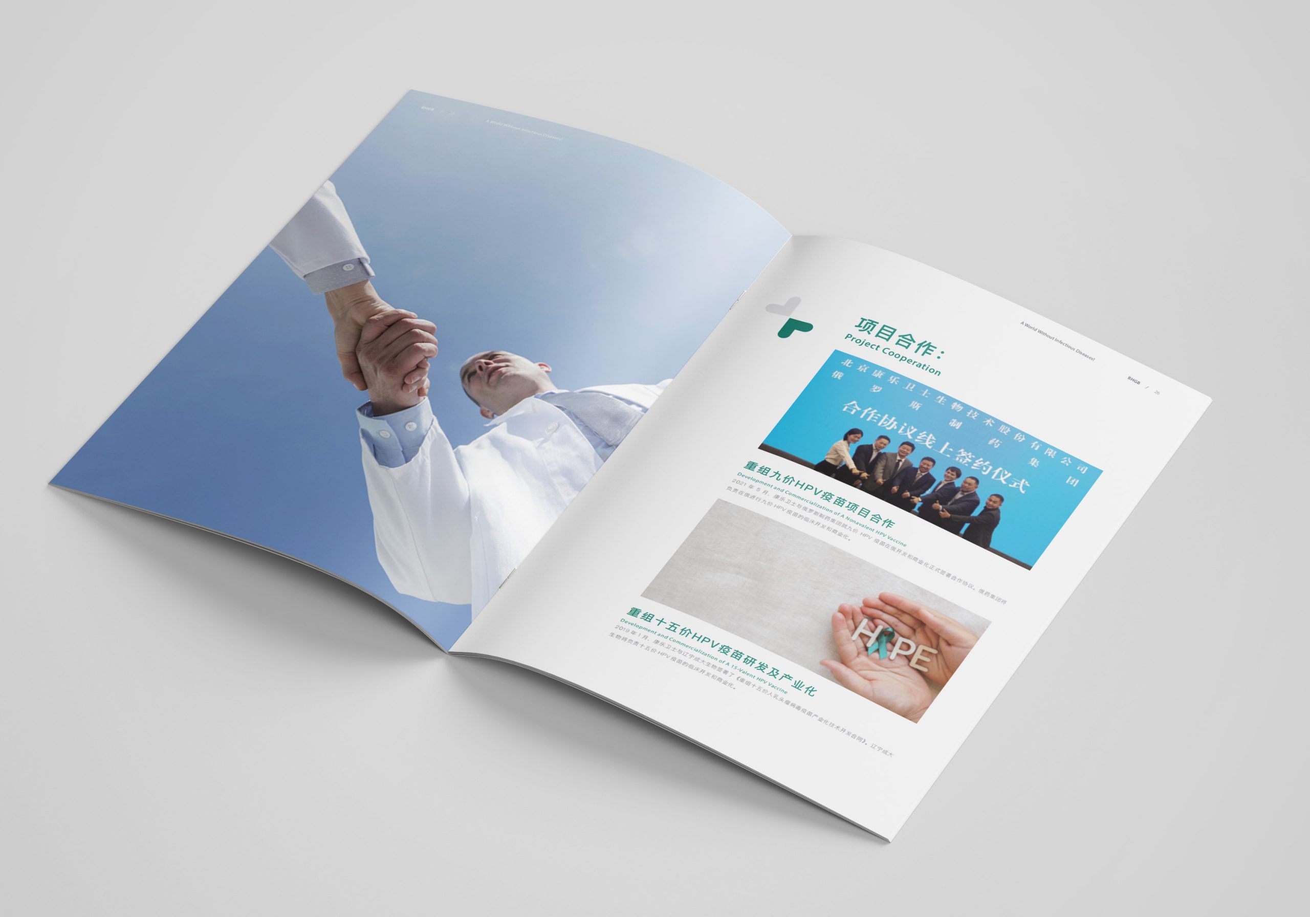
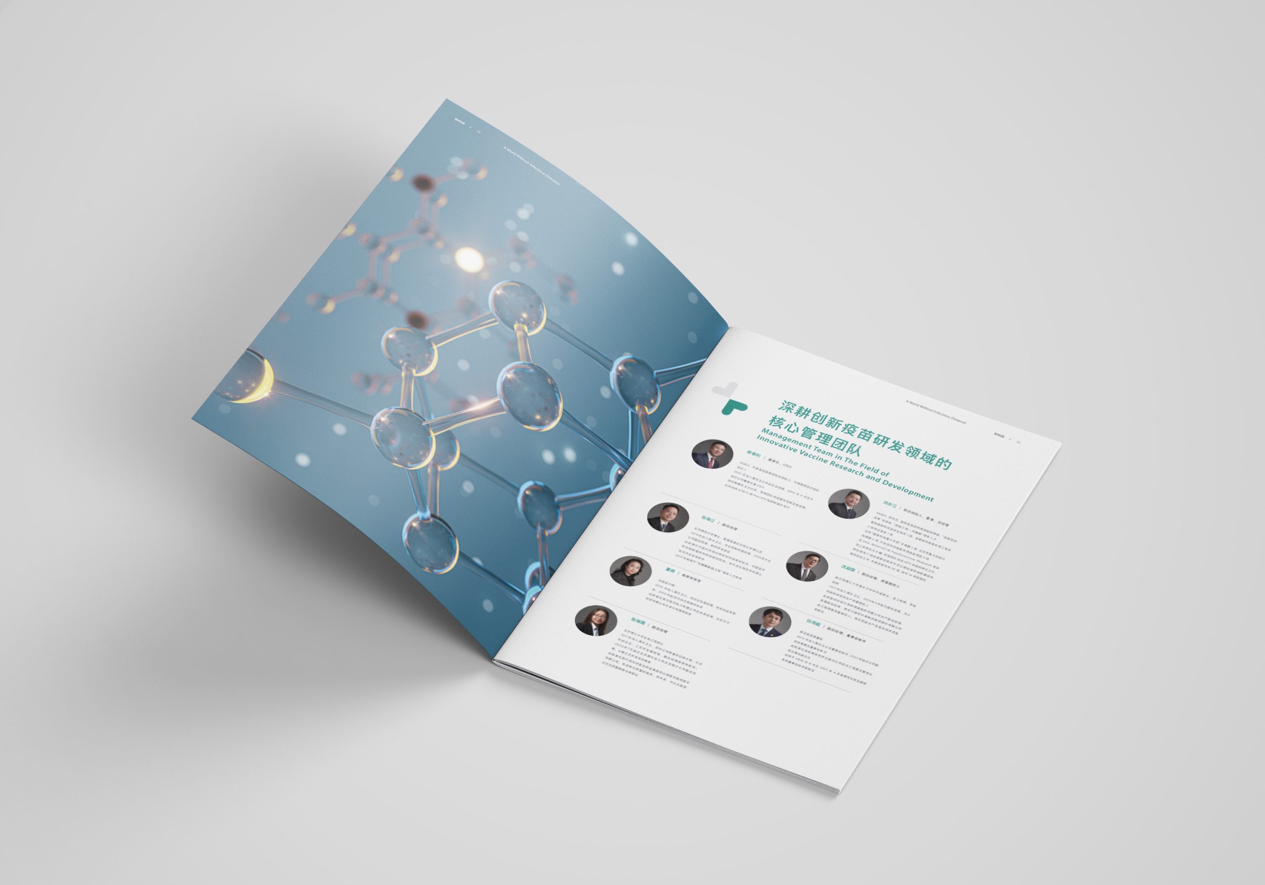
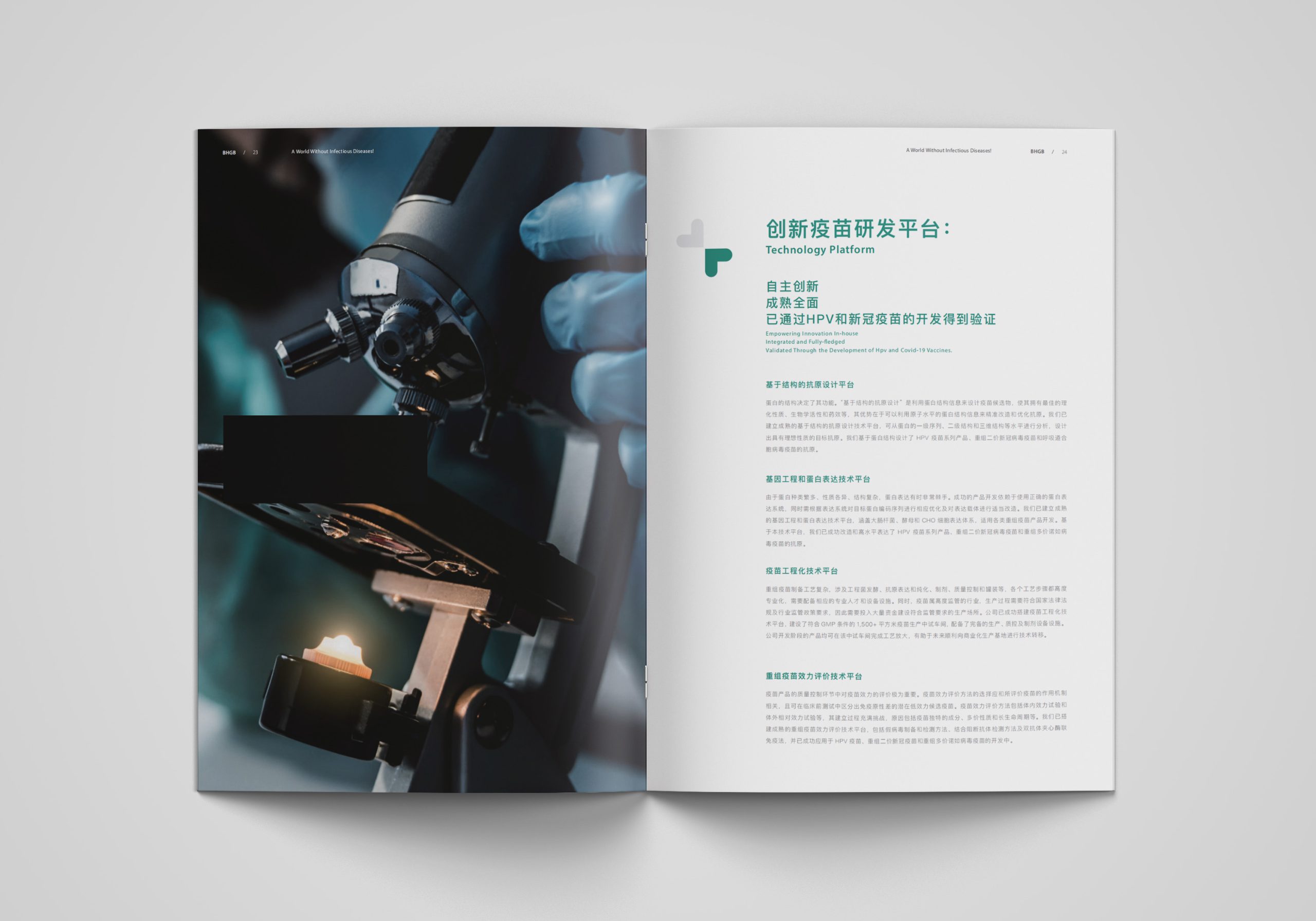
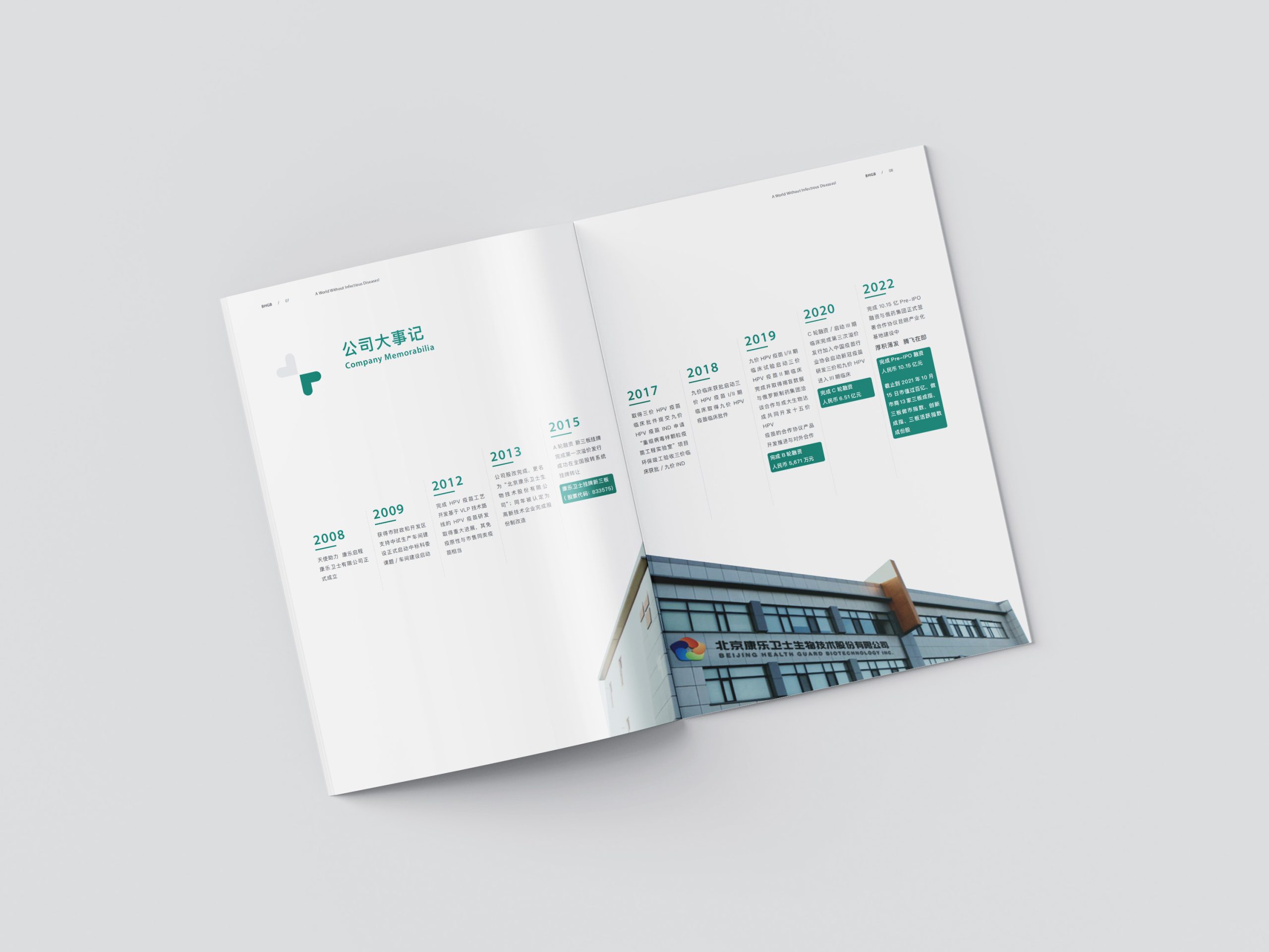
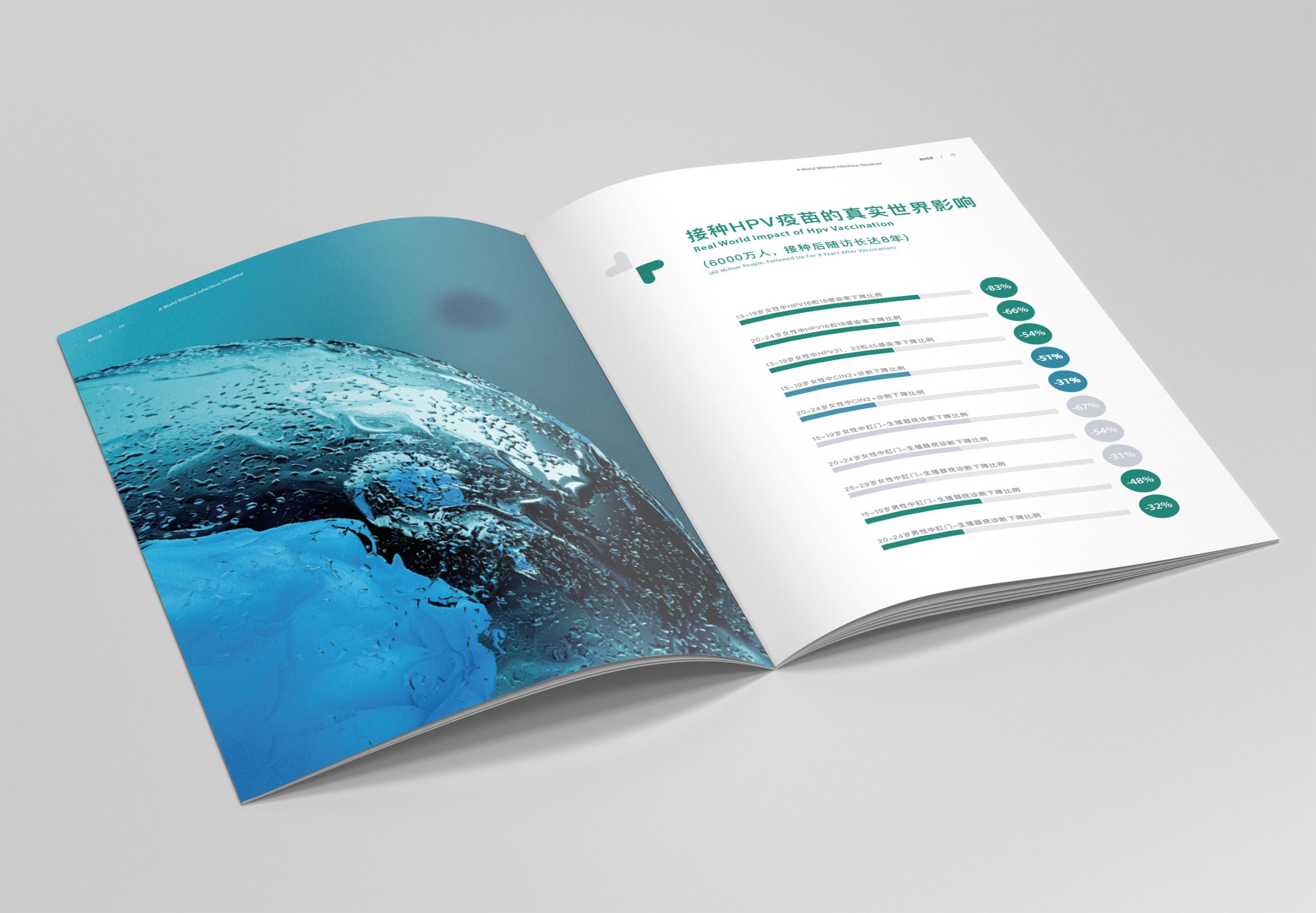
Identity system: the primary mark combines a 'heart' shape with technological grid, complemented by English wordmark and Chinese name. Graphic extension: the graphic system incorporates 'linear pathways' and 'point-link-line' structures to symbolize the journey from cell/seedling growth to vaccine solutions. Color and layout: primary palette of cool blue + silver gray emphasizes professionalism and technology; accent colors highlight key information to strengthen visual memory. Application scenarios: unified use of the symbol system across brand book covers, annual report layouts, presentation templates, and digital communications assets ensures brand visual consistency.
Achievements and Impact
Through the 'Care · Super Symbol' brand identity design, Kanglue Weishi has cultivated a more recognizable and internationally minded brand presence. The brand demonstrates greater unity and professionalism in external communications, investor relations, and partnership presentations, establishing a visual connection between 'technology + humanity.' This design project not only elevated brand recognition but enhanced its visual standing within the domestic and international biopharmaceutical industry.