










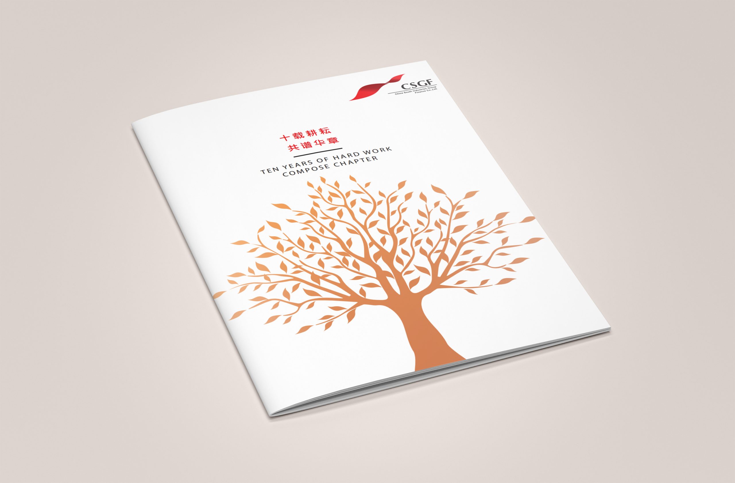
This project is the 10th-anniversary annual report for China South Industries Group Corporation (CSGC). Built on the core concept of “Number of Life,” the design symbolizes the company's decade of growth and evolution and expresses a brand spirit that moves “from energy to order, from machinery to life.”
The book serves both as an annual report and as a symbol of the Group's spirit across a decade of growth. Guided by commemoration, vitality and an international outlook, the design gives its visual language both rational order and the warmth of its time.
design challenge
As a national pillar of China's manufacturing sector, CSGC needed an annual report that balanced rigor and rationality with commemorative warmth.
The core challenges: how to translate the abstract ideas of “growth” and “life” into visual structure; how to sustain reading rhythm and visual breathing room amid the density of an annual report; and how to use materials and color to convey the ceremony and significance of a ten-year milestone. The key was to express the company's vital energy through a rational, systematic structural language.
Strategy and philosophy
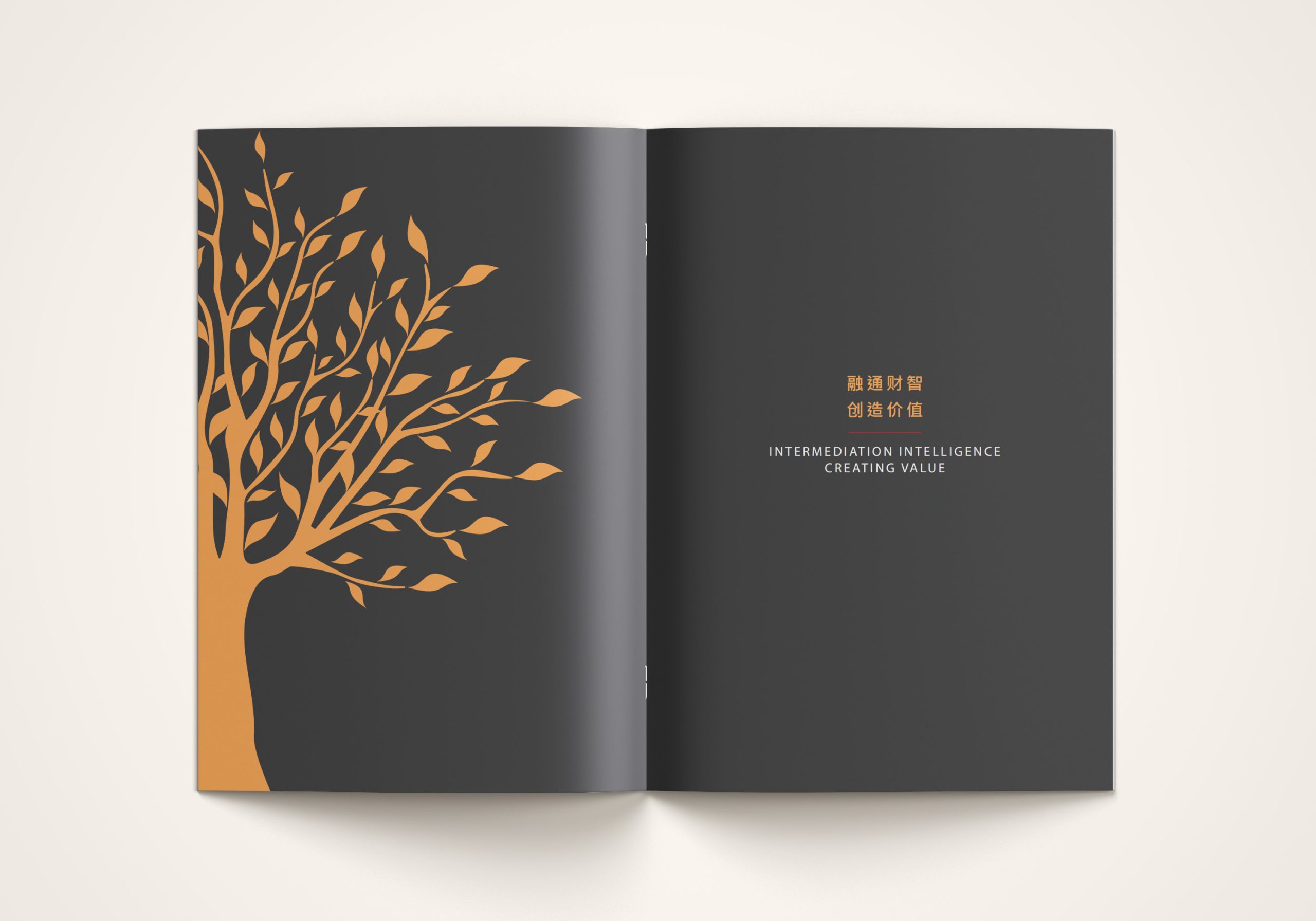
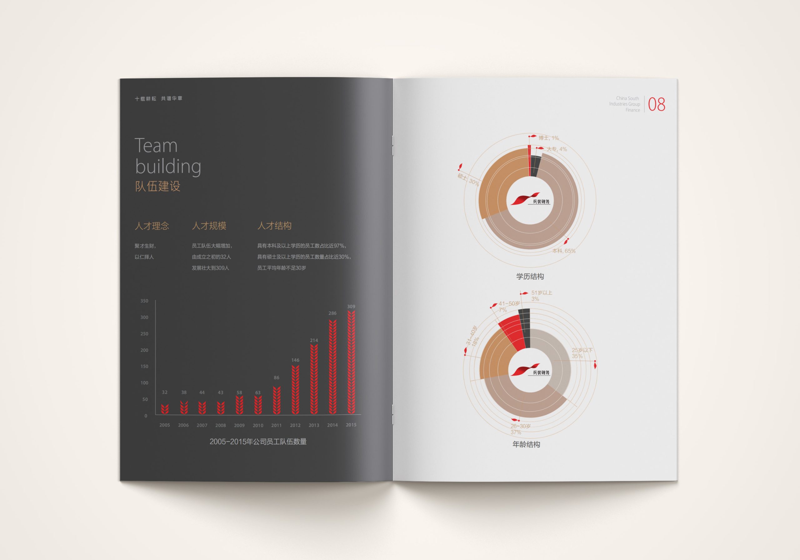
The project is built on the idea of “Number of Life · The Order of Growth.” Structure: the numeral “10” serves as the visual matrix, extending into motifs of “flowing energy” and “cyclical growth.” Composition: lines and geometric forms stand for mechanical order, while gradients and multicolor elements express vitality. Color: gold signifies honor and heritage, black signifies strength and technology, and multicolor gradients signify life and innovation. Information: the chart system uses organic grids and proportional rings to create a visual metaphor of a “living system.” The overall strategy: make the logic of growth tangible, and give numbers a sense of life.
Design presentation
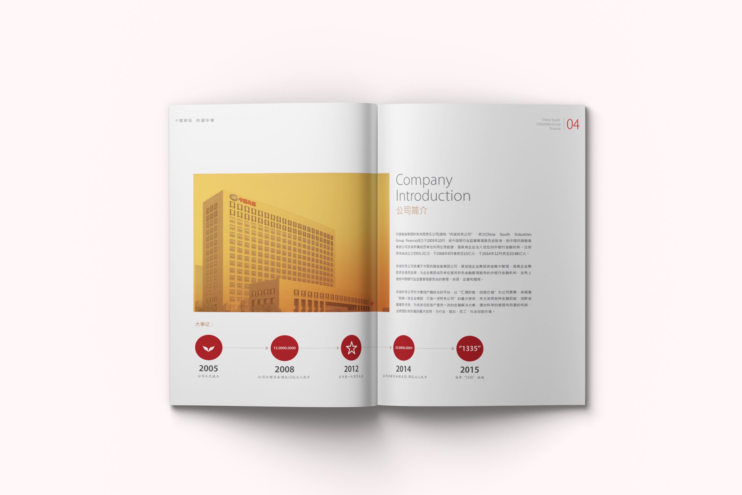
Cover: the numeral “10” takes center stage in layered metallic-gold gradients, with lines tracing the flow of vital energy—a map of the Group's decade of growth. Chapter openers: structured around “Ten Years · Ten Domains,” each chapter represents one dimension of growth (innovation, equipment, technology, responsibility, the future and more). Inside pages: a modular information layout uses ring charts, dynamic proportion charts and timelines to visualize ten years of data. Visual language: geometric lines and multicolor gradients set the rhythm, fusing a sense of technology with a sense of life. Materials and finishing: a black-and-gold cover with hot-foil gold lines and spot UV; heavyweight matte art paper inside enhances color depth and metallic texture. The result is restrained yet full of energy—both commemorative and forward-looking.
Achievements and Impact
The book became the centerpiece publication of CSGC's tenth-anniversary celebrations and annual report. Its “Number of Life” narrative breaks with the visual conventions of traditional manufacturers, pairing rational data with metaphors of life to create a distinctly international commemorative report. It was highly praised by the Group and its external partners alike, and regarded as “a visual embodiment of ten years of brand spirit.”