










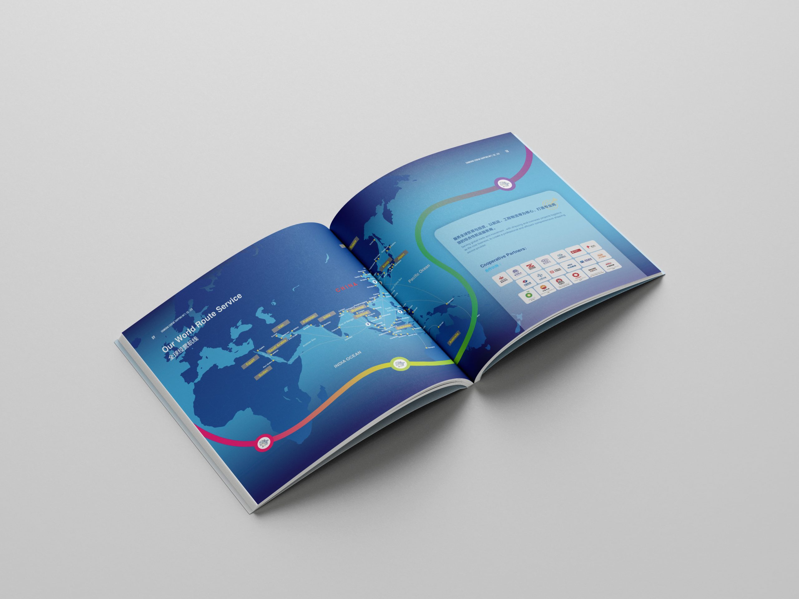
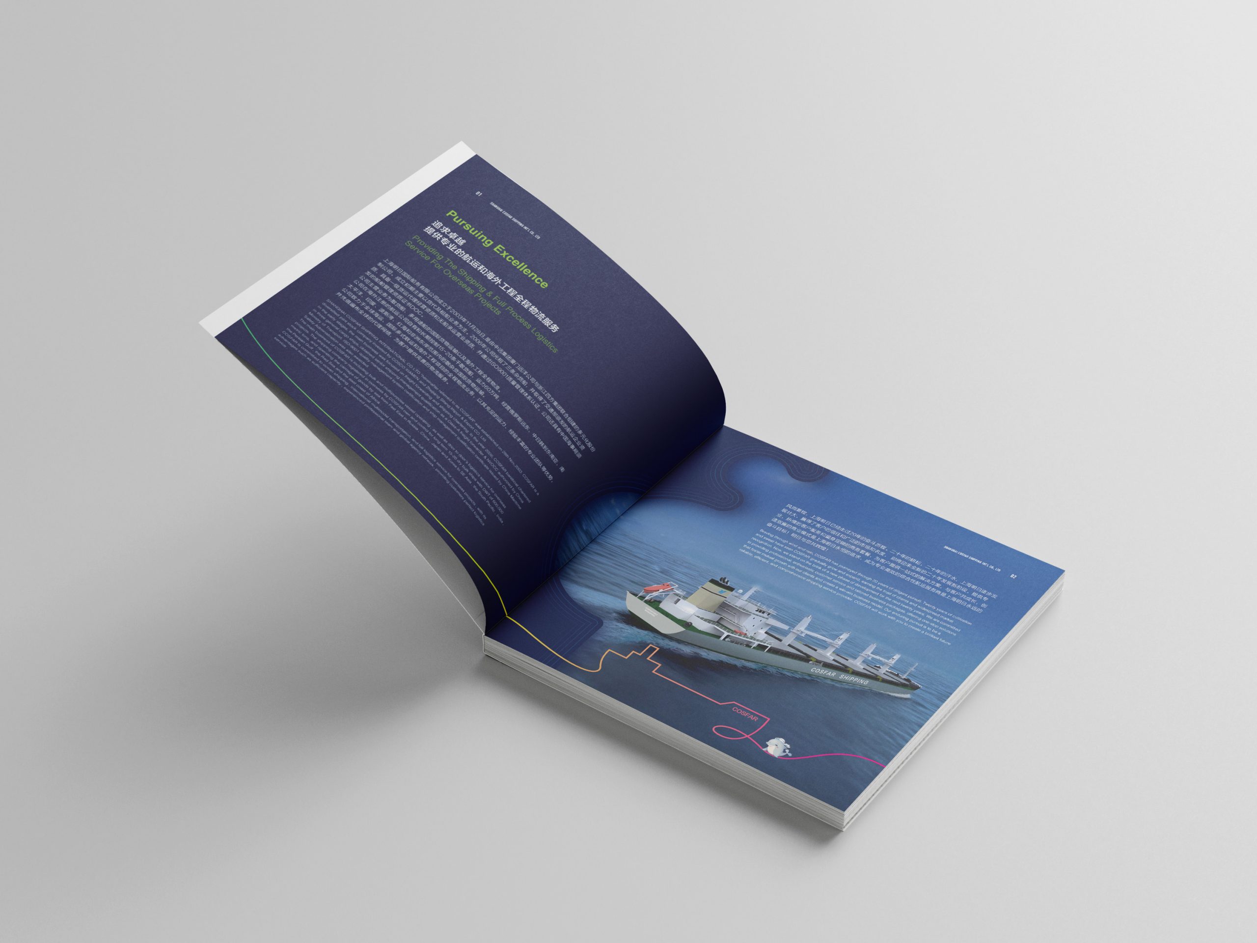
We created a brand book for a group specializing in international transportation and logistics. The goal was to convey the company's reliability across global supply chains and cross-border transport through an international visual structure and a professional brand voice.
Built around the core concept of “The Path of Trust,” the book highlights the company's stable, efficient and sustainable global solutions across complex transport networks. Its clean, systematic visual language meets international publishing standards, reflecting the company's professional caliber and brand stature.
design challenge
Brand communication in transportation tends to be dense with information and complex charts. Against this backdrop, the design had to: meet the reading habits and visual standards of international audiences; balance professional logic with narrative flow; and combine brand trust with visual appeal. The core challenge: using precise design language to translate a “transport system” into a “system of brand trust.”
Strategy and philosophy
The design concept: “The Order of Systems, the Language of Trust.” Structure: an international-standard grid rebuilds the information hierarchy, aligning visual rhythm with the logic of the data. Visual language: lines, paths and grids represent the stability and connectivity of a global transport network. Color: deep blue as the primary color for trust and technology, accented with bright silver and energetic orange for efficiency and momentum. Typography: side-by-side Chinese and English, proportioned to the golden ratio, for an international publishing-grade reading balance. Graphics: abstract route maps combined with infographic design turn transport data into visual structure. The core idea: let the logic of transportation become the brand's visual language.
Design presentation
Cover: geometric path lines abstractly form a “global network,” paired with a metallic logo on a matte black ground to convey international gravitas. Chapter structure: five modules—“Network — Core Services — Solutions — Global Partnerships — Future Strategy”—build the content hierarchy. Information visualization: routes, service modules and lead-time data are presented as charts, enhancing professionalism and readability. Color and texture: deep blue and silver gray signify professionalism and reliability, with touches of orange guiding the eye and expressing efficiency and energy. Materials and finishing: matte-laminated cover with spot UV and hot-foil silver lines; heavyweight matte art paper inside keeps chart lines crisp. The result is rational, composed and credible, in line with international brand communication standards.
Achievements and Impact
The book became the company's core brand material for international trade shows and client communication. Combining international structure, professional expression and visual trust, the design established the company as a “global transport solutions provider” and truly aligned its brand expression with the context of international collaboration.