










This project creates a new brand visual system for Ideal Space, a technology company focused on mobile interactive apps and creative content ecosystems, committed to connecting people with inspiration through technology, making interaction part of everyday life.
The goal was to create a brand identity within an international visual system, inspired by the “butterfly effect.” The identity symbolizes freedom, innovation and limitless connection.

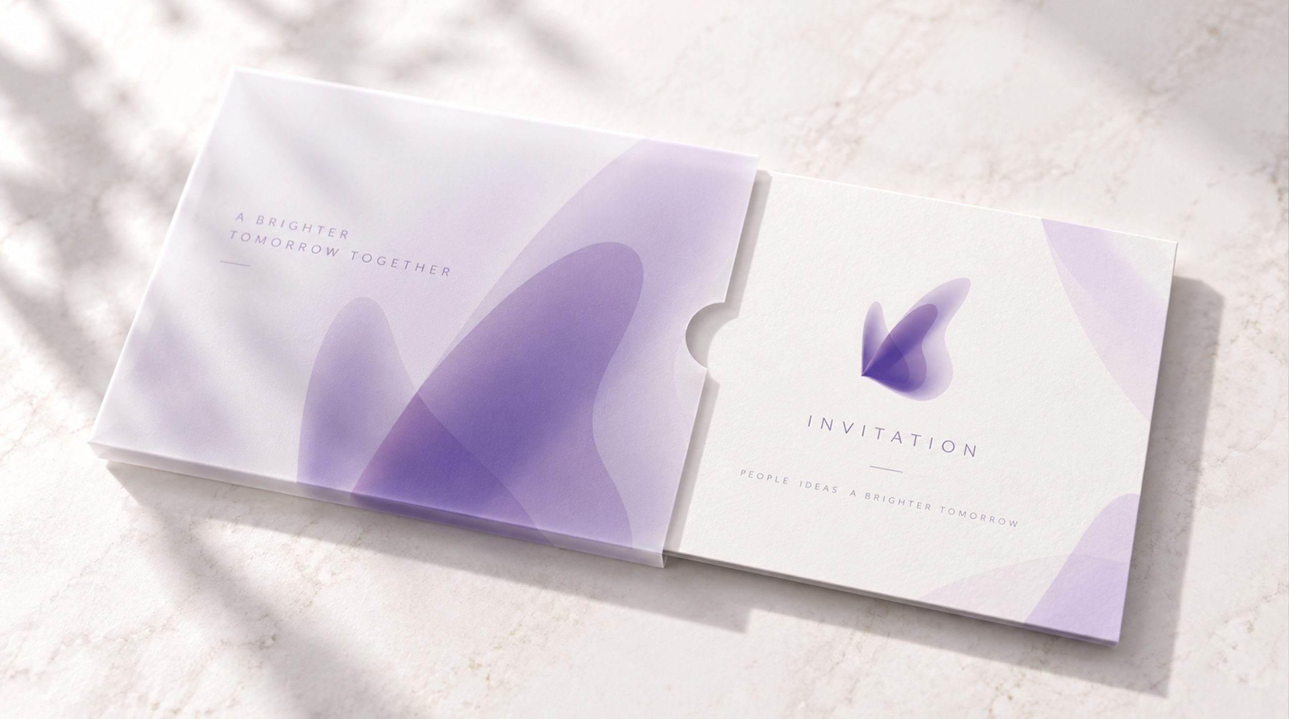
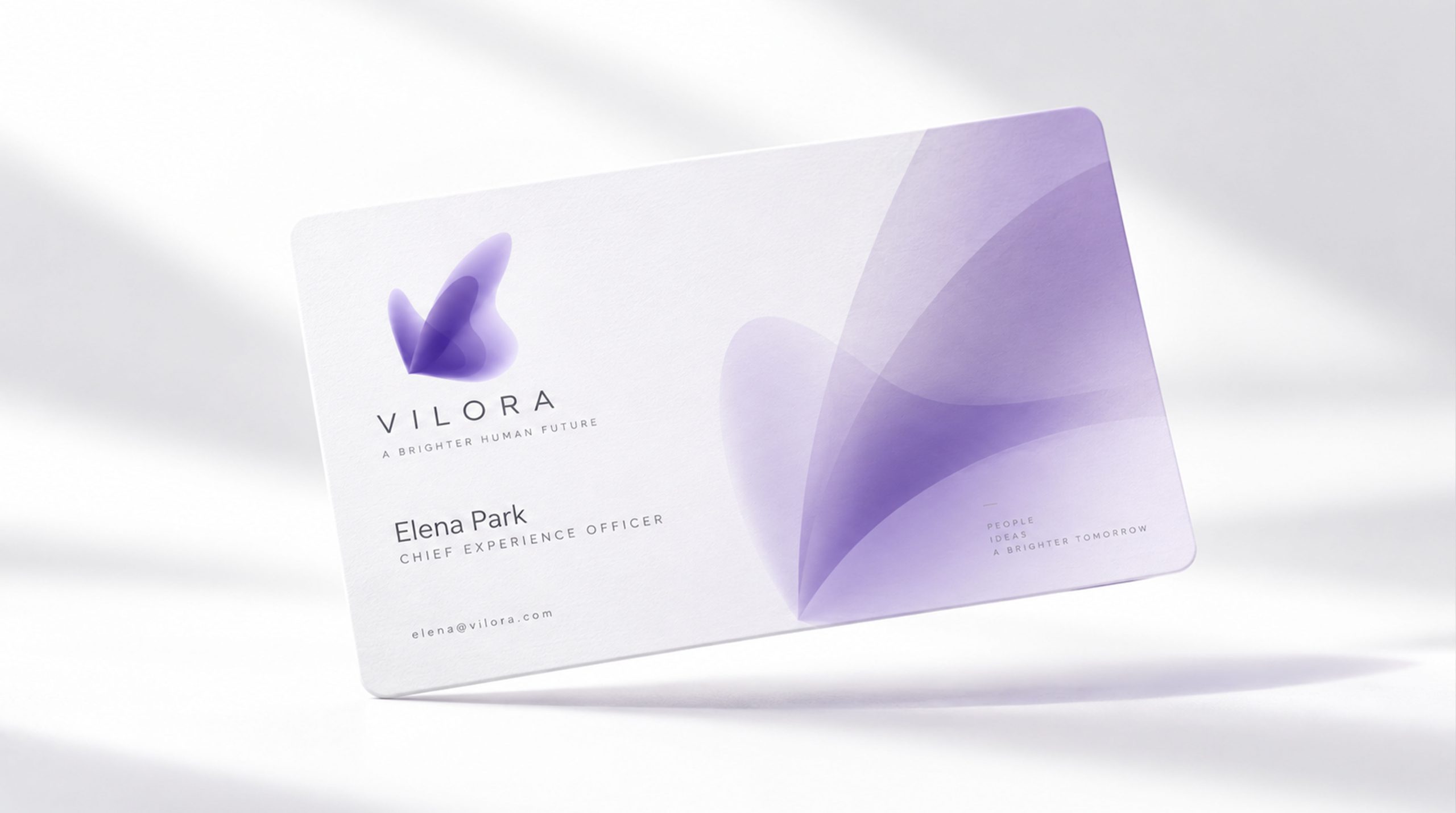
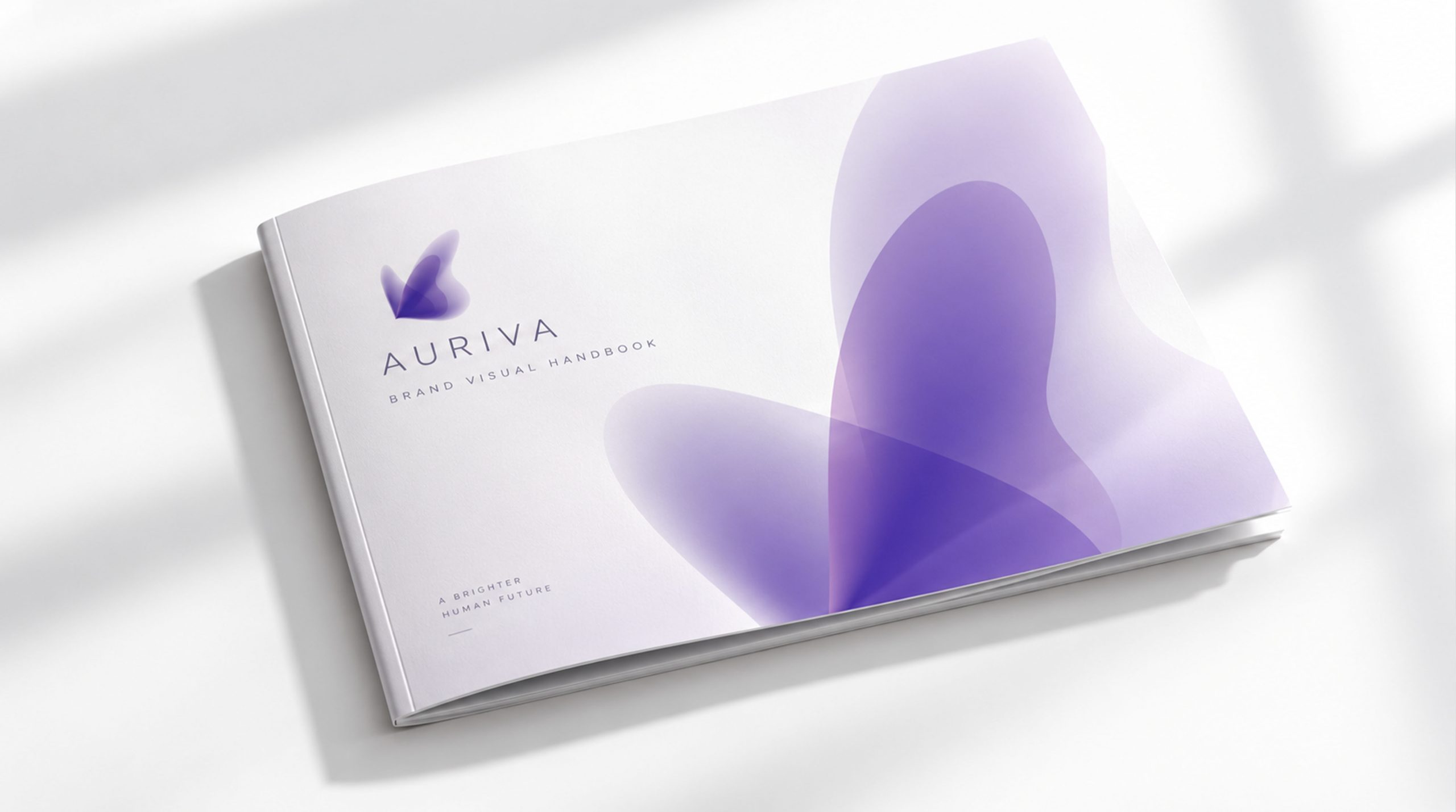
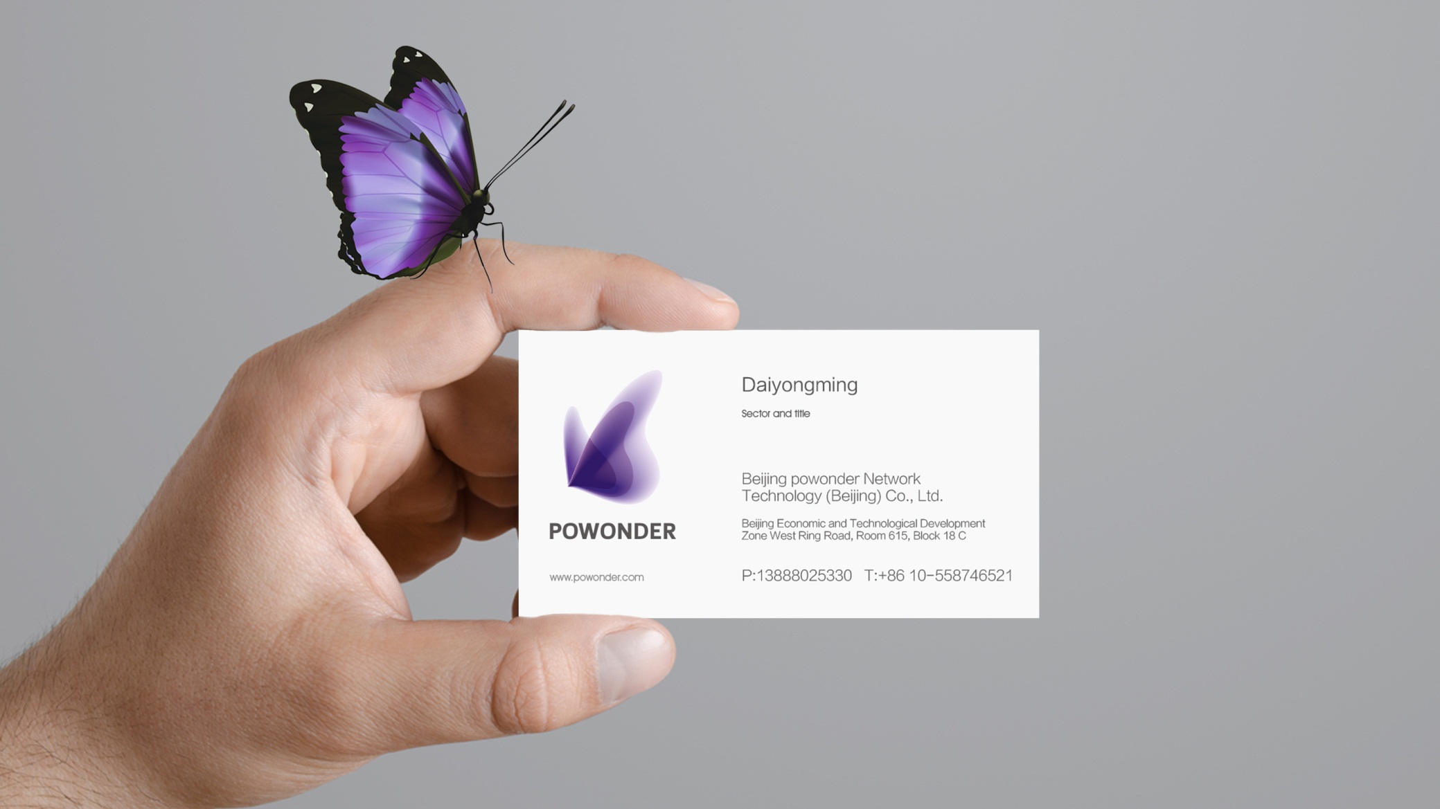
design concept
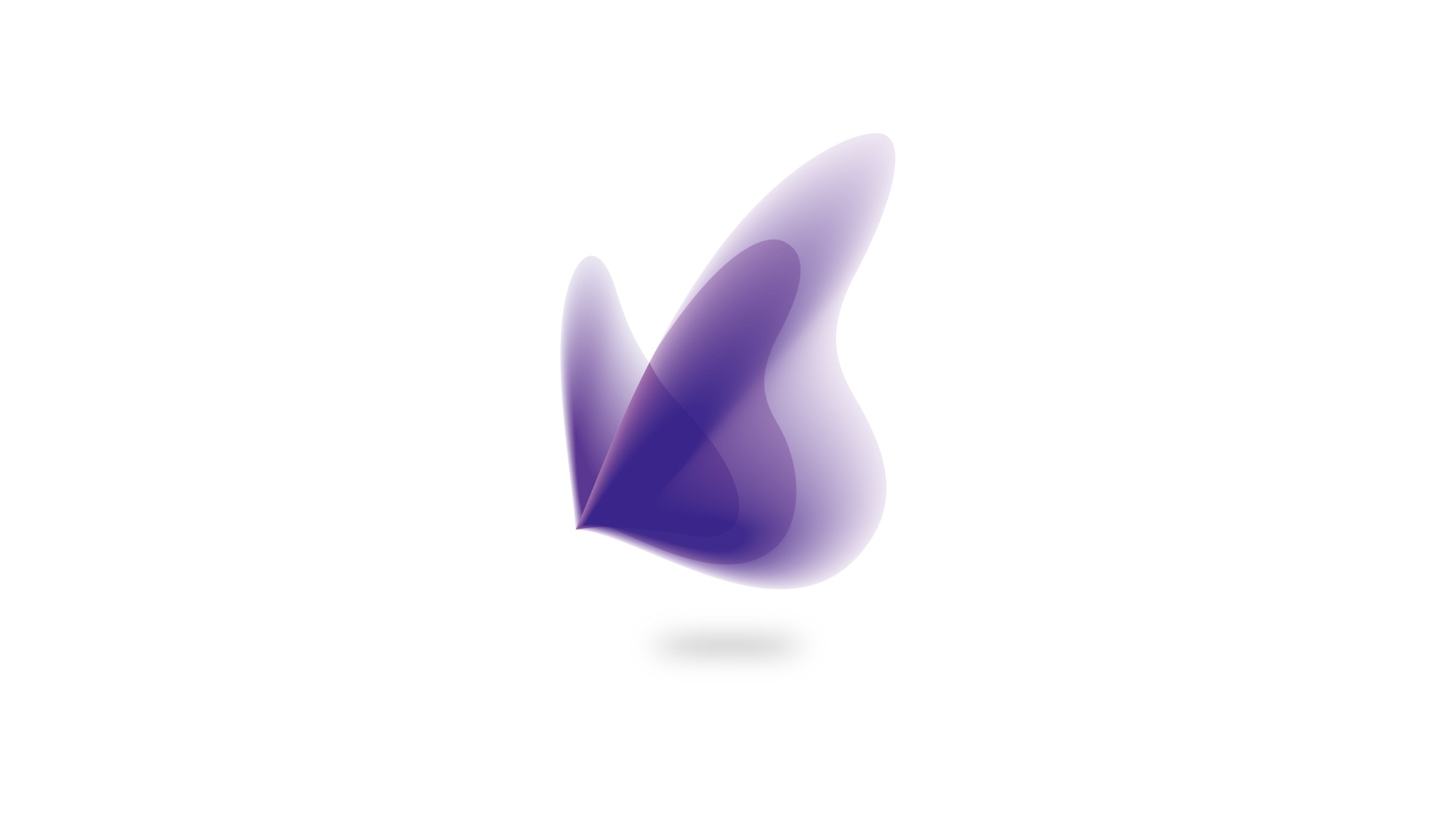
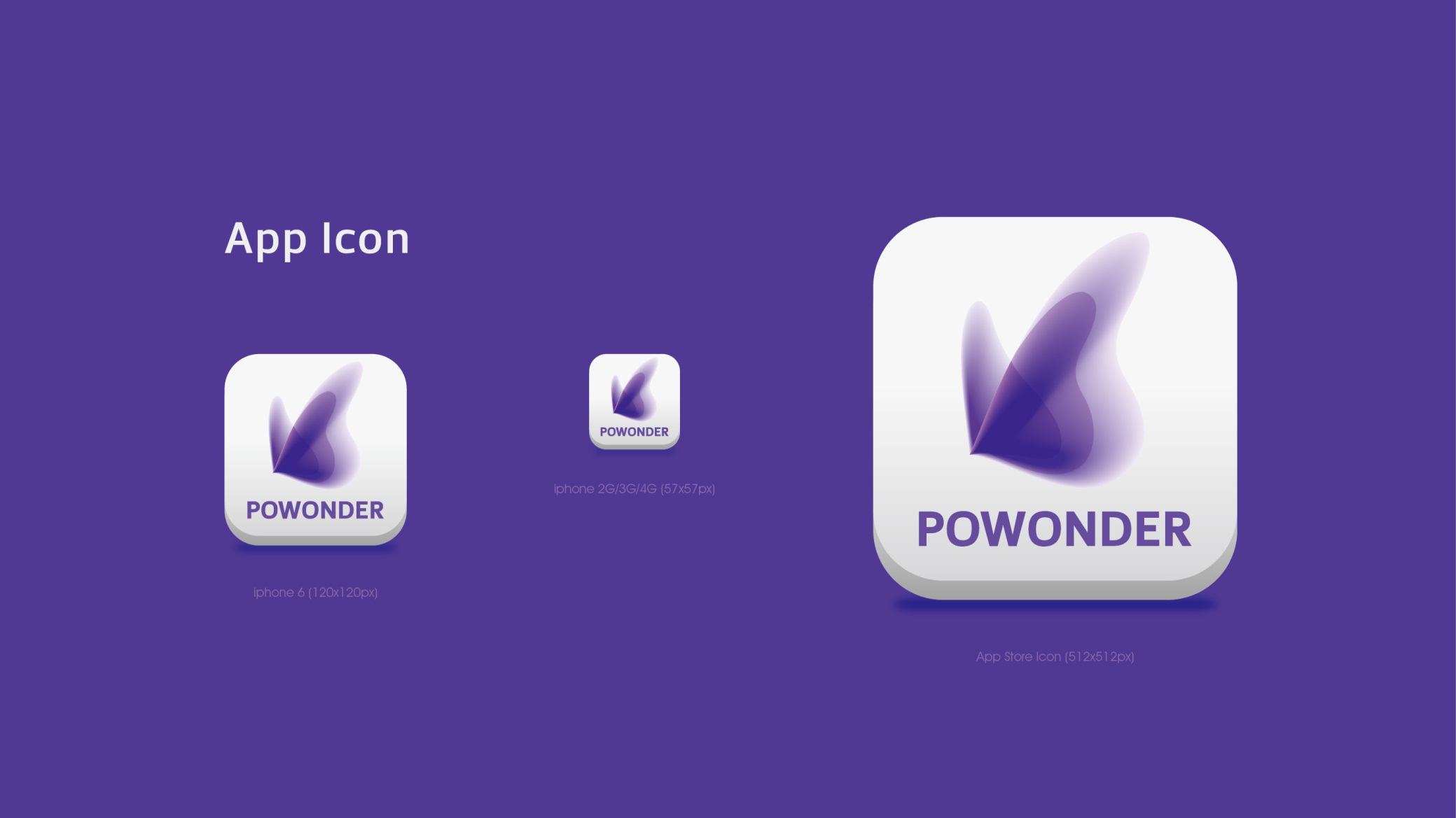
The mark draws on a fusion of “butterfly wings” and “particles of light,” abstractly depicting life energy flowing through light. The butterfly symbolizes rebirth, transformation and freedom, while the gradient of light represents technology, purity and renewed energy. Rather than relying on defined edges, the form uses layered transparency to express “the warmth of science and the breath of life.” The core design idea: Light as wings, life as form.
graphic language
Primary form: two layers of soft wing shapes overlap to create a fluid silhouette, symbolizing growth and the gathering of energy. Transparent gradient: a transition from deep purple to pale lavender conveys both technological sophistication and spiritual beauty. Solid and void: soft, blurred edges create a sense of breath and weightlessness. Base shadow: enhances the floating effect, conveying lightness and elegance. Seemingly formless, the mark holds energy in light and shadow, with a dual “organic and digital” quality.
Fonts and composition
The name LUMIVIA derives from “Luminous + Vital,” meaning “the life of light.” A fine sans-serif typeface, such as Helvetica Light or Avenir Thin, is recommended to stay consistent with the airiness and transparency of the primary mark. The overall visual is built on a symmetrical, center-axis composition that reinforces the brand’s sense of balance and purity.
color system
Primary color, Amethyst #6E56A3: technology, mystery and intelligence. Secondary color, Lavender #C8B7E3: softness, healing and elegance. Highlight White #FFFFFF: light, purity and renewal. The purple gradient system forms the core identity language of “biotech × luminous aesthetics.”
Application and extension
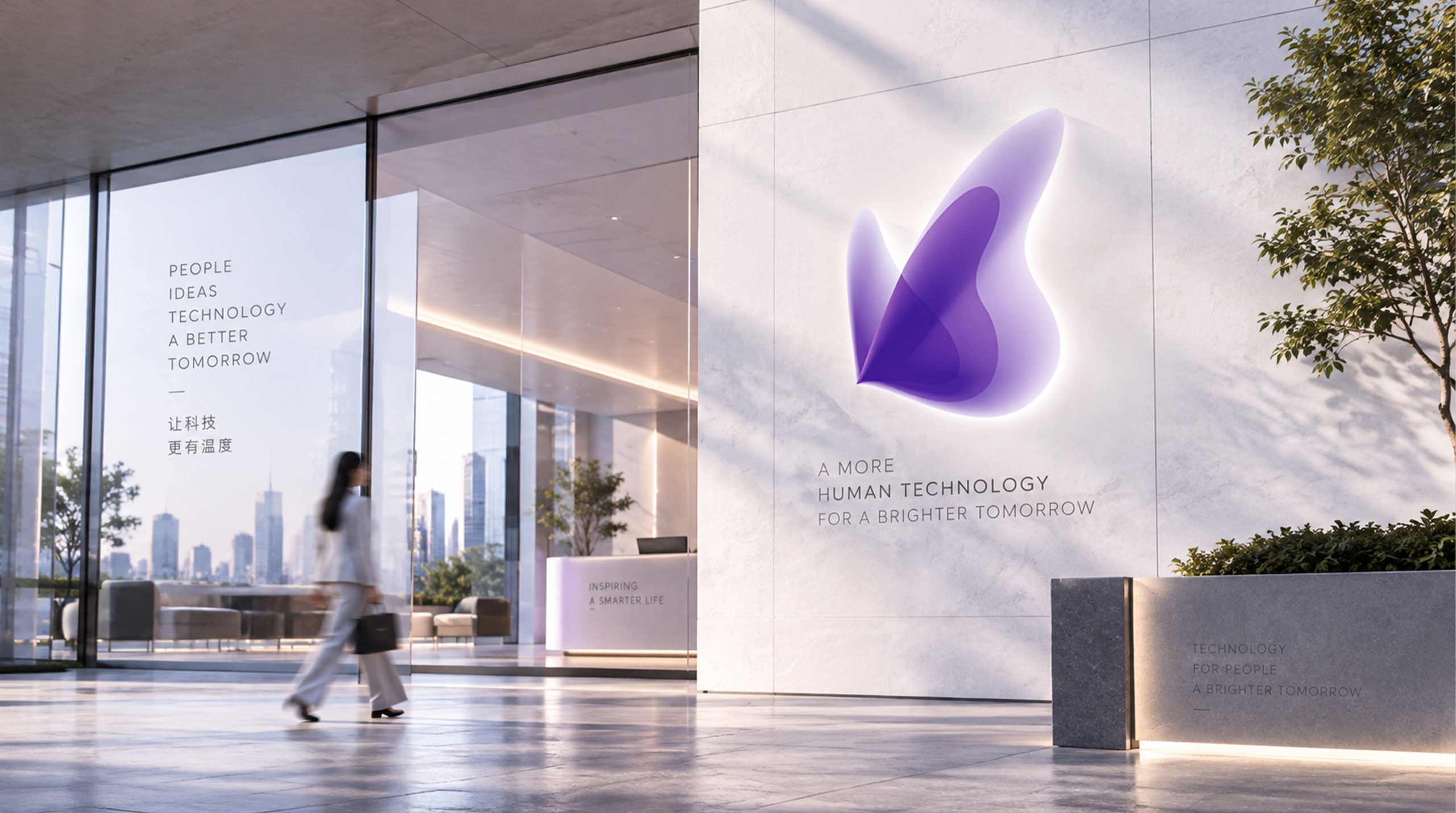
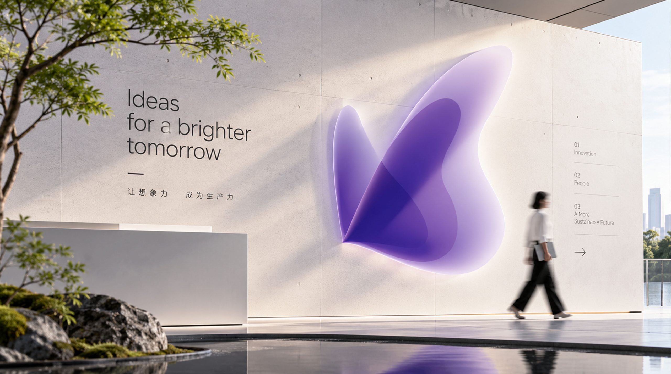
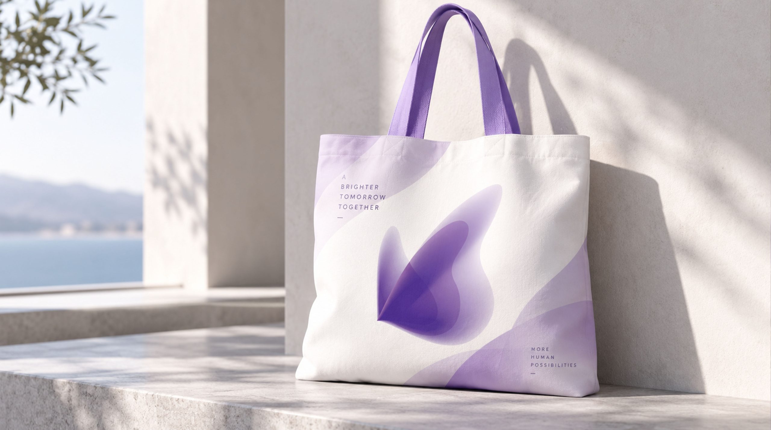
The mark delivers a unified brand experience across multiple contexts. Aesthetic clinics: wayfinding, device nameplates and product packaging. Packaging: the butterfly gradient can evolve into a key visual texture, building recognition across product lines. Brand communications: on the website and in video, the mark can unfold into a flowing animation of butterfly wings, evoking an “awakening of energy.” Spatial installations: rendered in translucent acrylic or as LED light sculpture to reinforce the “wings of light” theme.
brand meaning
The form and imagery of the mark express the brand’s understanding of and respect for “the beauty of life.” Biological inspiration: the butterfly’s form follows nature’s logic of growth, symbolizing skin renewal. Technological power: gradients and soft focus simulate the penetration of optical energy. Philosophy: a light silhouette and negative space form an emotional language of “healing and rebirth.” Together they express the brand’s core belief: “Beauty is not created. It is awakened.”
Improper Usage (Protection Specification)
Do not alter the wing proportions or gradient direction. Do not replace the primary purple palette with other colors. Do not add outlines, shadows or background textures. Recommended minimum width: 30 mm.
design results
Following its launch, the new LUMIVIA mark became a benchmark visual identity in the field of “optical aesthetic medicine × scientific aesthetics.” Its soft gradients and floating motion have been recognized as a classic example of uniting “technological warmth with artistic sensibility.” The project is a mature work by Qingmei Future at the intersection of aesthetic technology, bio-energy and spirit-driven brand design. It successfully translates the coolness of technology into a visual language with emotional resonance.