










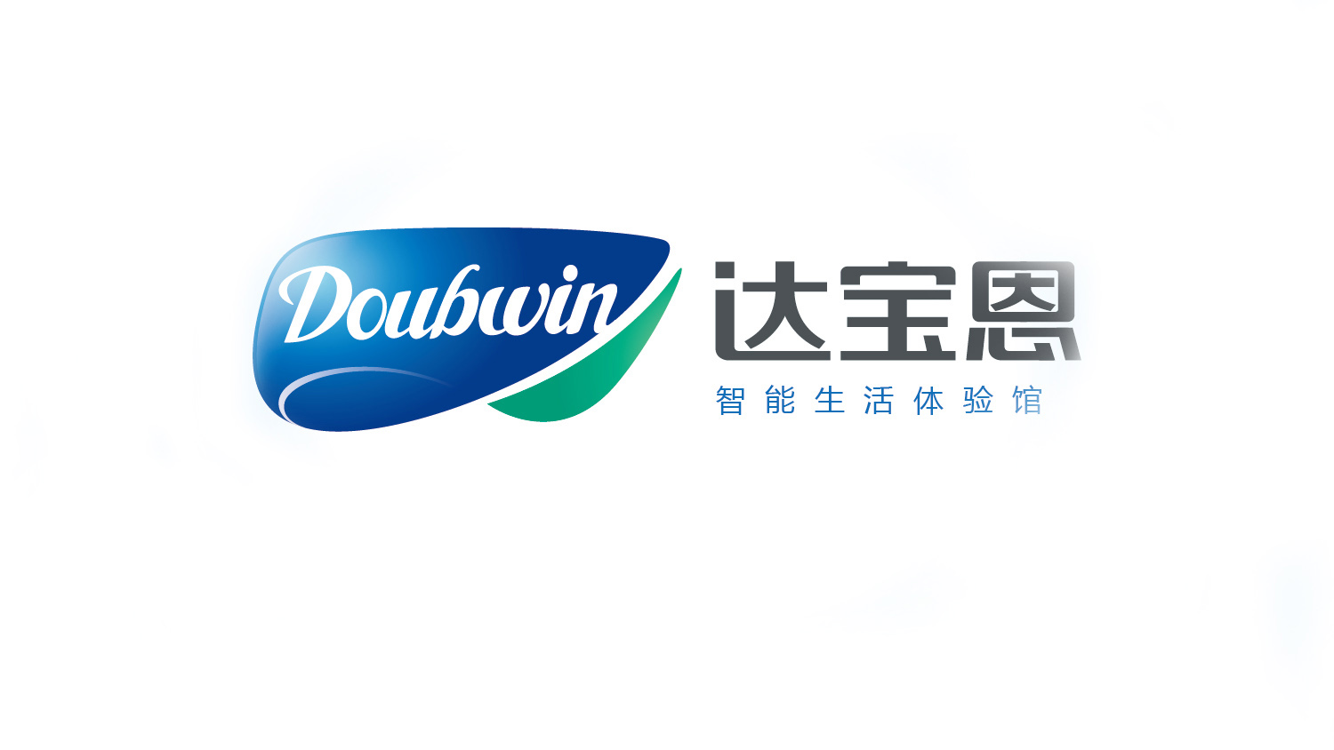
Doubwin is a technology brand focused on smart home and smart living systems, spanning smart appliances, environmental control, energy management, and lifestyle space solutions.
The logo was designed to convey the brand spirit of “intelligence, comfort, trust and vitality” in an international visual language, while highlighting its core idea: technology that elevates the art of living.

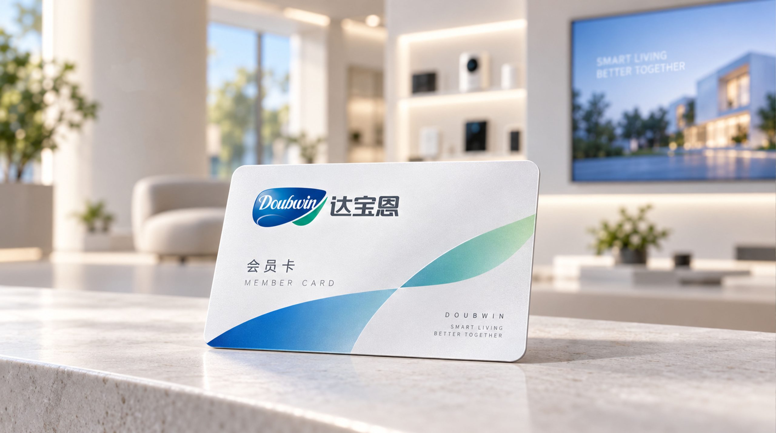
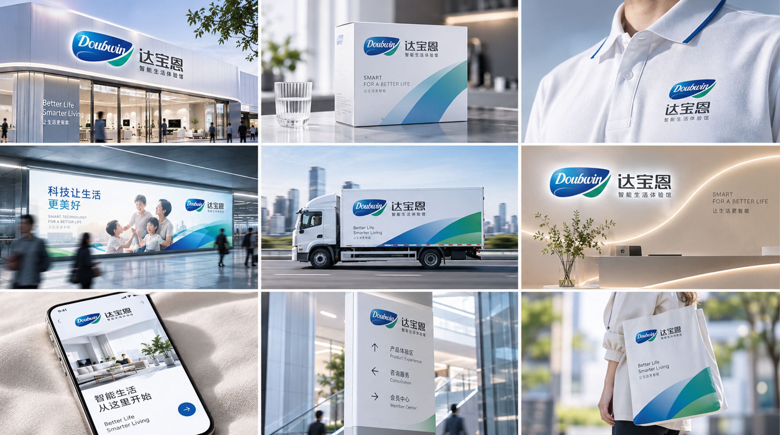
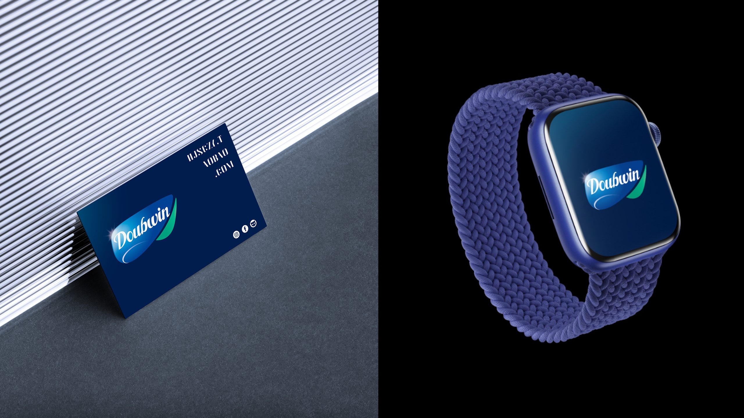
design concept
The logo is built on fusion and flow. A blue-green gradient, double-curved form symbolizes the meeting of technology and life, and the balance of reason and emotion. The Doubwin wordmark uses a dynamic script for a soft, tech-forward character, expressing technology within reach. The Chinese name is set in geometric type, reinforcing the brand's modern, technical edge. The mark resembles a "leaf of intelligence," signifying green technology, sustainable innovation, and intelligent growth.
graphic language
Double-curved form: the two-way fusion of smart technology and human-centered living. Blue upper layer: technology, intelligence and connectivity. Green lower layer: nature, health and sustainability. Streamlined shape: a fluid experience and continuous innovation across smart living scenarios. Script wordmark: the warmth and approachability of a lifestyle brand. The dynamic composition conveys both speed and trust, embodying the visual spirit of a tech company that pairs “rational beauty × human care.”
Fonts and composition
The Chinese type uses steady geometric strokes with added weight, conveying the stability and trust of a technology brand. The English type is a flowing script that reflects the brand's international image and aids recall. The pairing balances soft and strong, motion and stillness, at an overall ratio of about 1 : 1.3 (symbol : type), forming a unified identity system. The tagline "Smart Living Experience Center" is set in a small, light gray-blue sans-serif as secondary information on the brand's function.
color system
Tech Blue #1A4D9C: smart technology, expertise and depth. Eco Green #59B083: health, sustainability and harmony with nature. Silver Gray #A7ADB3: a modern, spatial tech texture. White background #FFFFFF: purity, simplicity and everyday living. The blue-green gradient reflects the brand’s strategic direction of “intelligence × ecology,” creating a distinctive identity system.
Application and extension
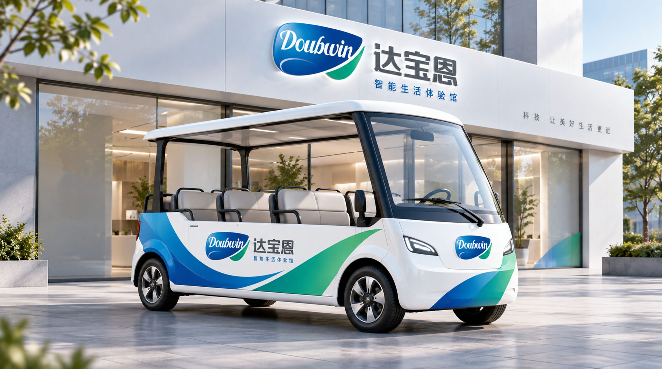
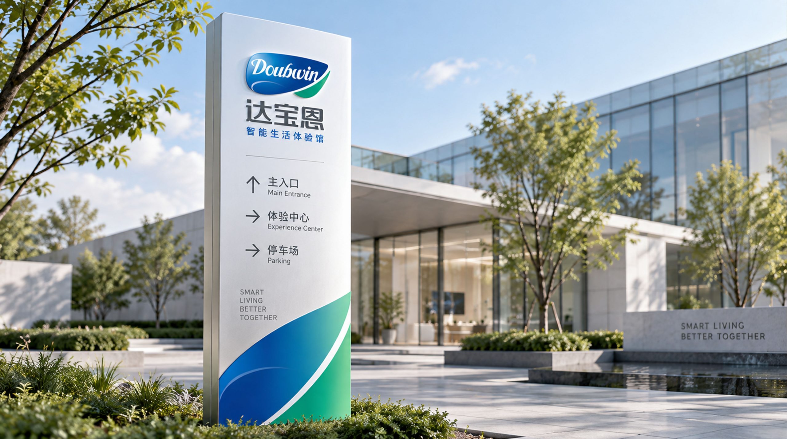
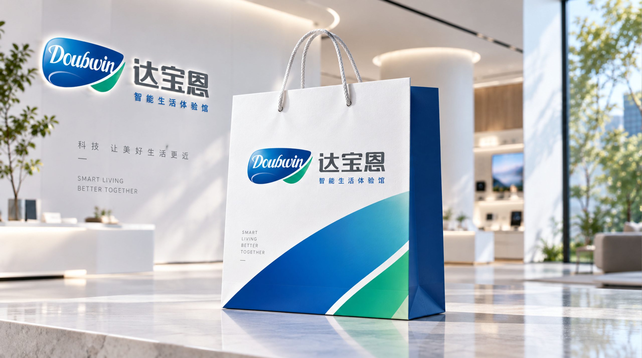
The logo adapts well across scenarios, including: nameplates, boot screens and packaging labels for smart appliances; wayfinding and signage for smart home experience centers; marketing collateral, website visuals, digital interfaces and advertising animation; and app icons and UI motion, where the blue-green gradient creates an “energy flow” effect. The graphic can also stand alone as a primary visual element on walls or interface backgrounds, creating continuity from physical to digital.
brand meaning
The logo embodies Doubwin's three-part philosophy: Smart Living — blue represents the rational logic of intelligent technology; Green Wellbeing — green represents health and a sustainable ecosystem; Graceful Innovation — the curved flow represents gentle innovation and technology with good intent. Together, the mark conveys a human-centered vision: smart technology that makes everyday life better.
Improper Usage (Protection Specification)
Do not change the direction or proportion of the blue-green gradient. Do not alter the structure of the script wordmark. Do not add lighting, outline or shadow effects. Do not rotate, compress or stretch the logo. Maintain clear space of at least 20% of the logo width. Minimum size: 30mm.
design results
Following launch, Doubwin gained strong recognition in the smart home market, establishing itself as a next-generation smart living brand defined by “technology × the art of living.” The visual system is widely used across showrooms, packaging and digital interfaces, with the animated blue-green gradient becoming the brand’s signature visual. Led by Qingmei Future, the project is featured in the Yearbook of Smart Home and New Lifestyle Brand Design.