










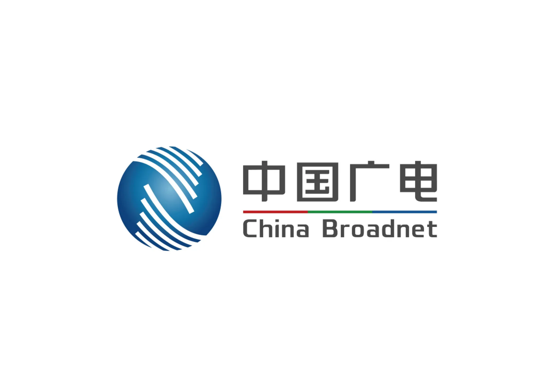
China Broadcasting Network (CBN) is the principal operator of China’s national radio and television network, tasked with building the national cable network, 5G communications and media convergence platforms.
The logo aims to express CBN’s strategic stature as a national communications and information infrastructure operator through a visual language that is technological, authoritative and global.
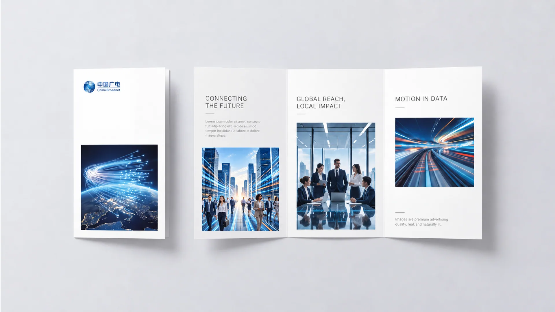

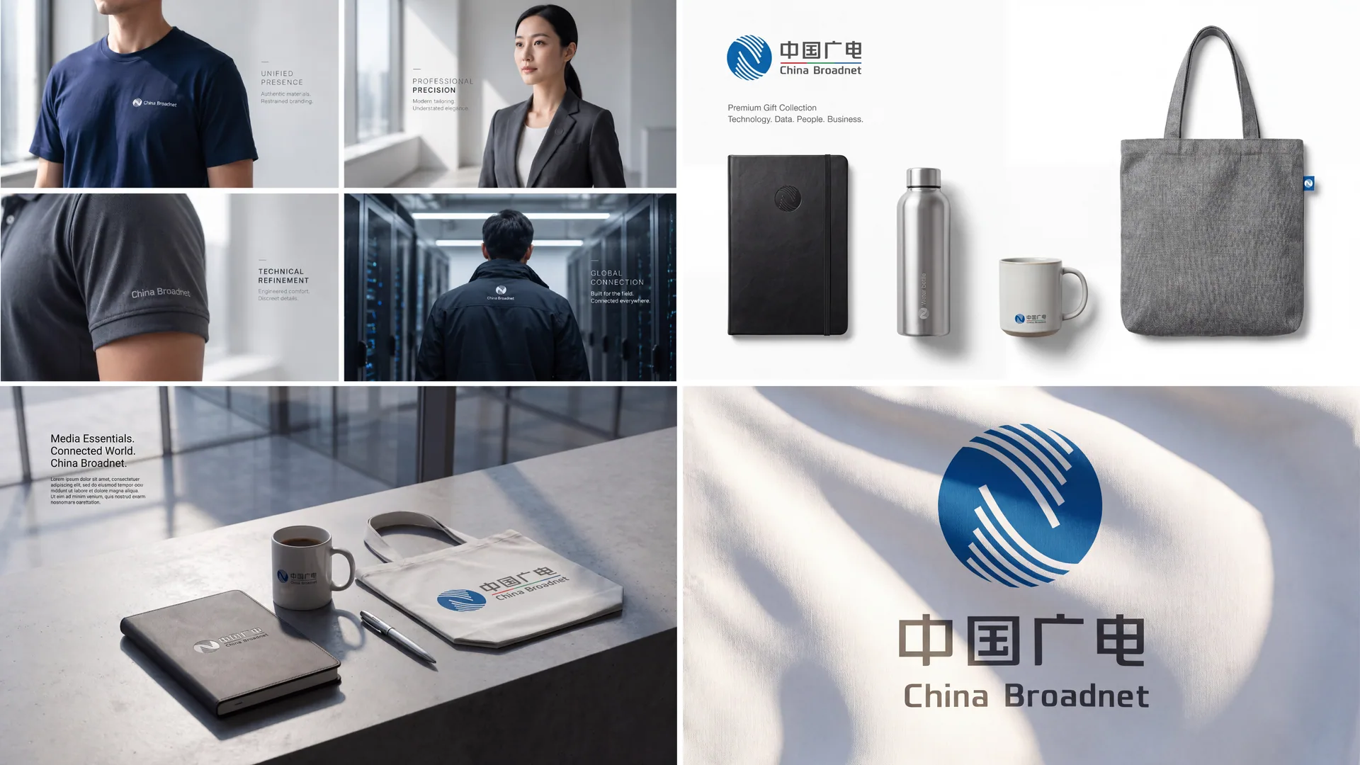
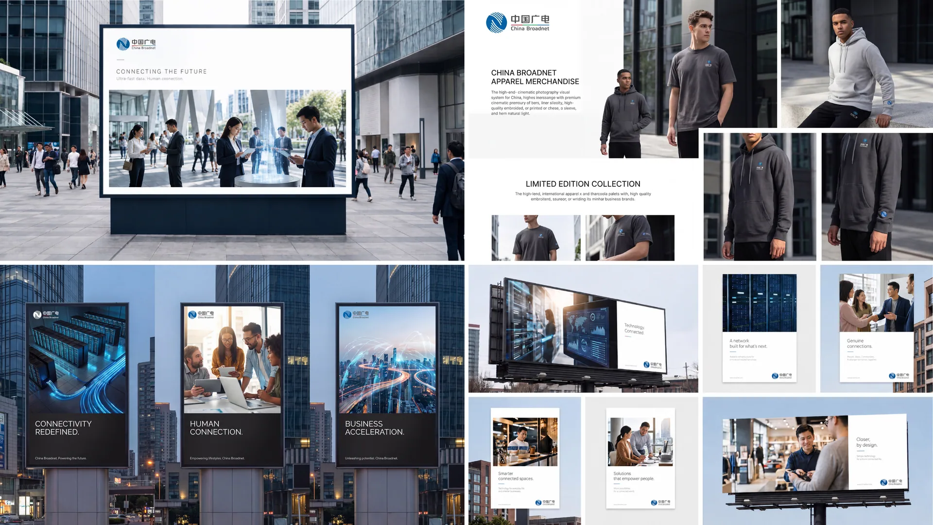
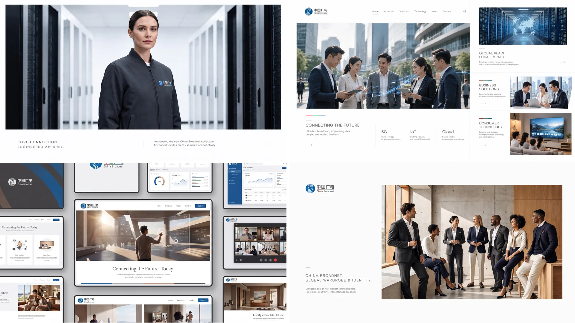
design concept
The logo centers on the concept of an “Information Globe”: a blue sphere encircled by arcs of light, tracing the reach of global broadcast networks and communication signals. The dynamic arcs represent information flows and spectrum waves, signifying “China’s voice connecting the world, technology carrying the future.” The design reflects CBN’s dual identity in the new era: media convergence and digital communications.
graphic language
Spherical structure: the global communications landscape and a national-scale network. Radiating arcs: broadcast signals, data flows and intelligent communications. Interwoven lines: a multidimensional, interconnected network. Blue gradient space: technological depth and a sense of the future. Built on rigorous geometric order, the composition forms a “globe of technology and communication,” conveying the brand’s global outlook and systemic capability.
Fonts and composition
The CBN letterforms use a sturdy, square sans-serif, wide with straight strokes, conveying the authority of a national brand. The Chinese characters are set in a balanced modern gothic with upright strokes and moderate proportions, keeping bilingual layouts consistent. A blue horizontal line runs between the English and Chinese, symbolizing signal bandwidth and information channels, and unifying the mark into one system.
color system
Primary Tech Blue #1A4D8F: communications technology, broadcasting authority and national image. Supporting Silver Gray #A7ADB3: modernity, rationality and an international outlook. Highlight White #FFFFFF: used for the signal arcs and the sphere’s highlights, adding technological depth. Deep Blue gradient #0D274E → #1A4D8F: the depth of communication and the flow of energy. The palette conveys the gravitas and forward-looking character of a national technology and communications institution.
Application and extension
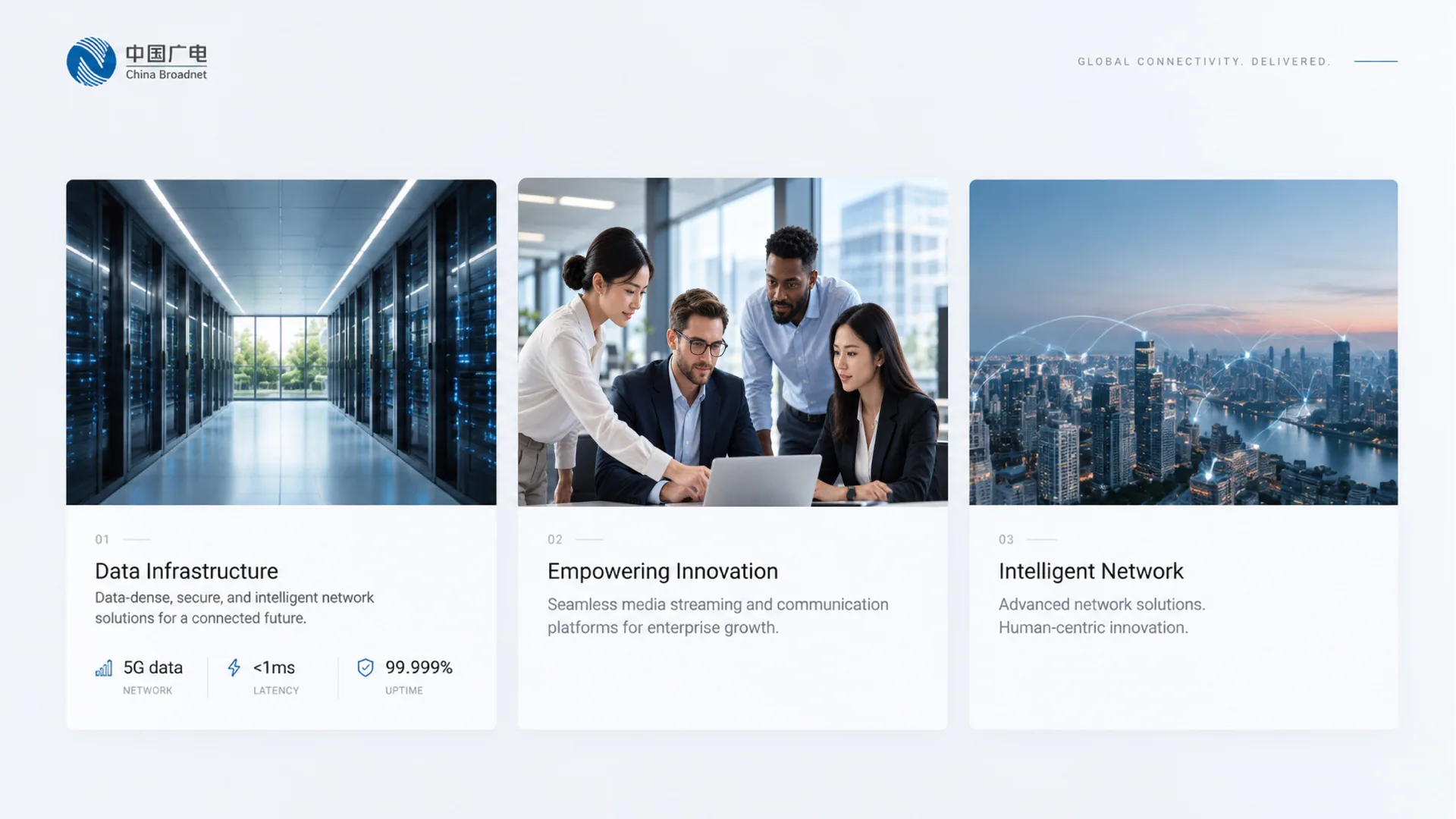
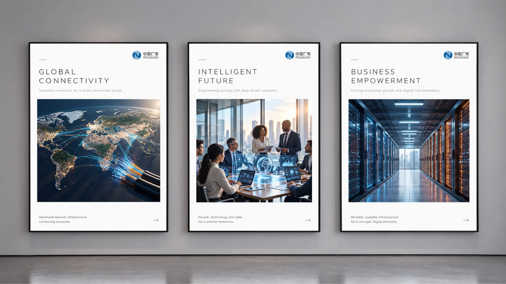
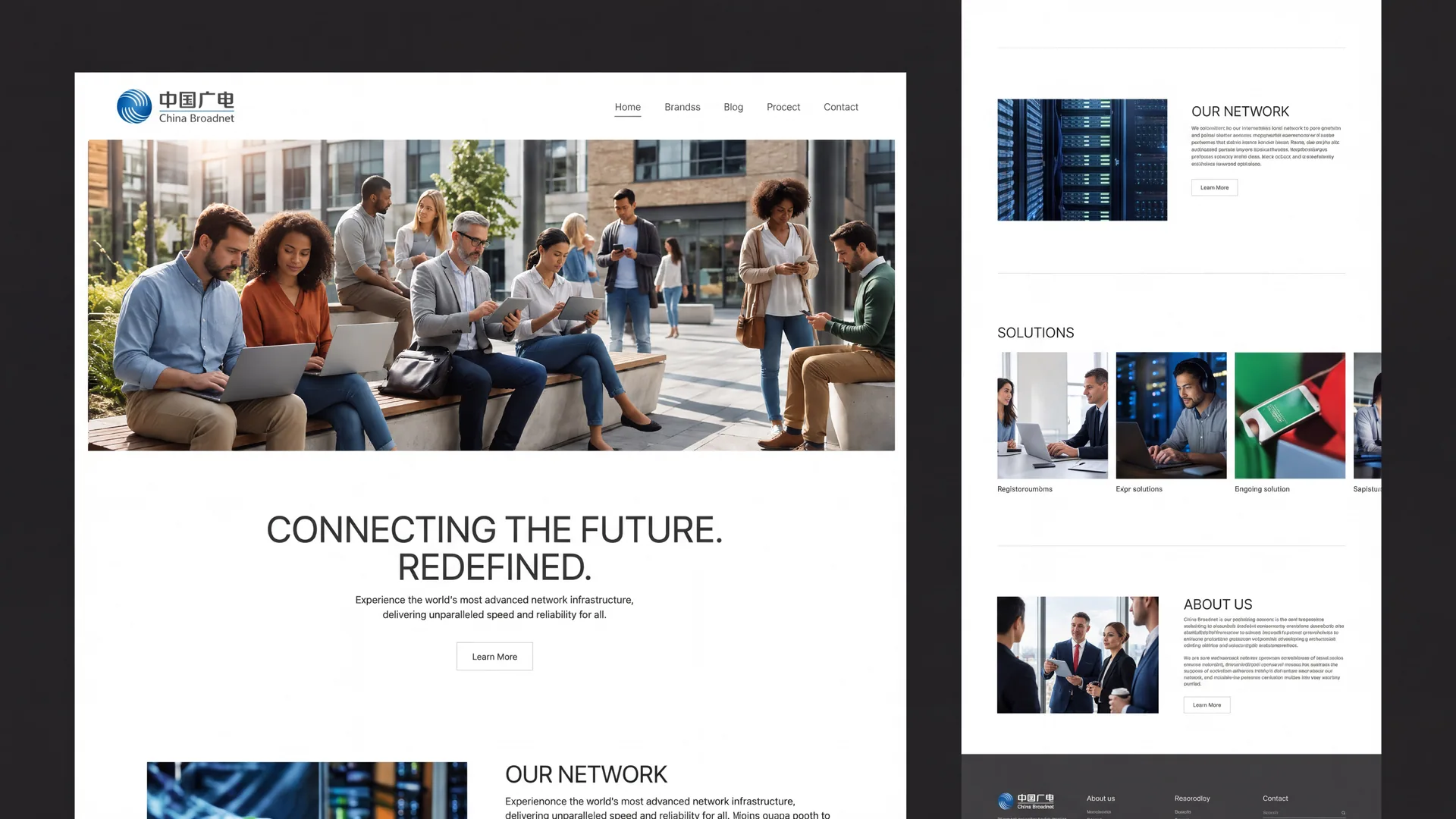
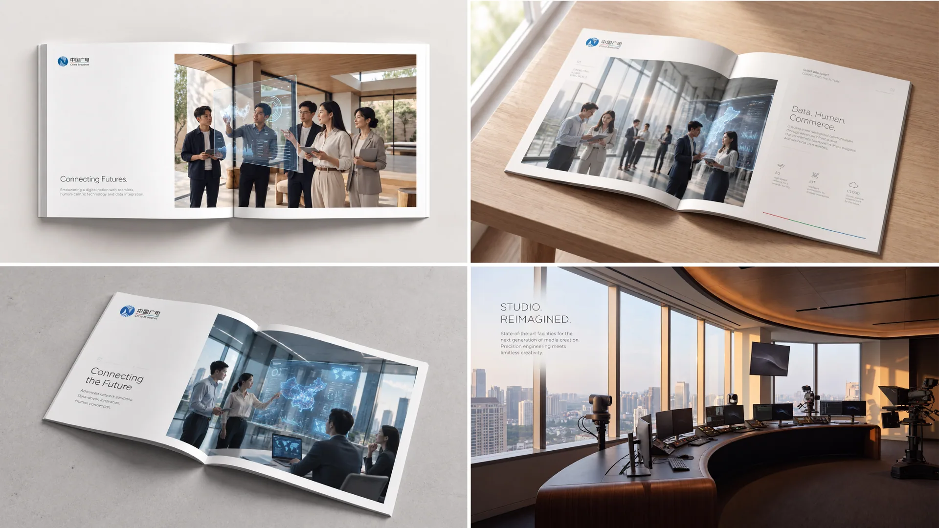
The logo is highly extensible and can be applied across: national broadcasting authorities, telecom operating platforms and 5G devices; news channels, studio wayfinding and signal transmission equipment; building facades, press conference backdrops and international exhibitions. In motion, the arcs rotate continuously to represent the global circulation of information. The sphere can serve as a master visual element for animation, charts and data visualization.
brand meaning
The logo carries three core images of China Broadcasting Network: National Network — the sphere represents the global broadcasting and communications landscape; Smart Media — the arcs symbolize data flow and 5G signals; China Voice — the blue light represents Chinese culture reaching the world. The design expresses CBN's position: rooted in China, facing the world.
Improper Usage (Protection Specification)
Do not change the number, direction or proportion of the arcs. Do not modify the primary blue or gradient layers. Do not add shadows, outlines or lighting effects. Do not rotate, skew or use individual lines on their own. Maintain clear space of at least 25% of the graphic’s diameter. Minimum display width: 35mm.
design results
Following launch, CBN’s brand consistency across the national media and communications sector improved markedly. The “blue globe + dynamic arcs” became the core visual identifier for its 5G and media convergence businesses. Widely used at international conferences and in national projects, the logo embodies the brand vision of “China’s voice, communicated globally.” Led by Qingmei Future, the design is featured in the exemplary case collection Visual Systems for National Institutions and Technology Communication.