











Chenxi is an integrated innovation brand focused on intelligent design, creative consulting and research into technology aesthetics. Guided by its mission, “design that elevates understanding, technology that empowers aesthetic creation,” it serves forward-thinking clients across culture, technology and business.
The new mark set out to establish a visual system combining rational order with artistic tension, expressing the brand's balance of “technology × humanity × wisdom.”




design concept
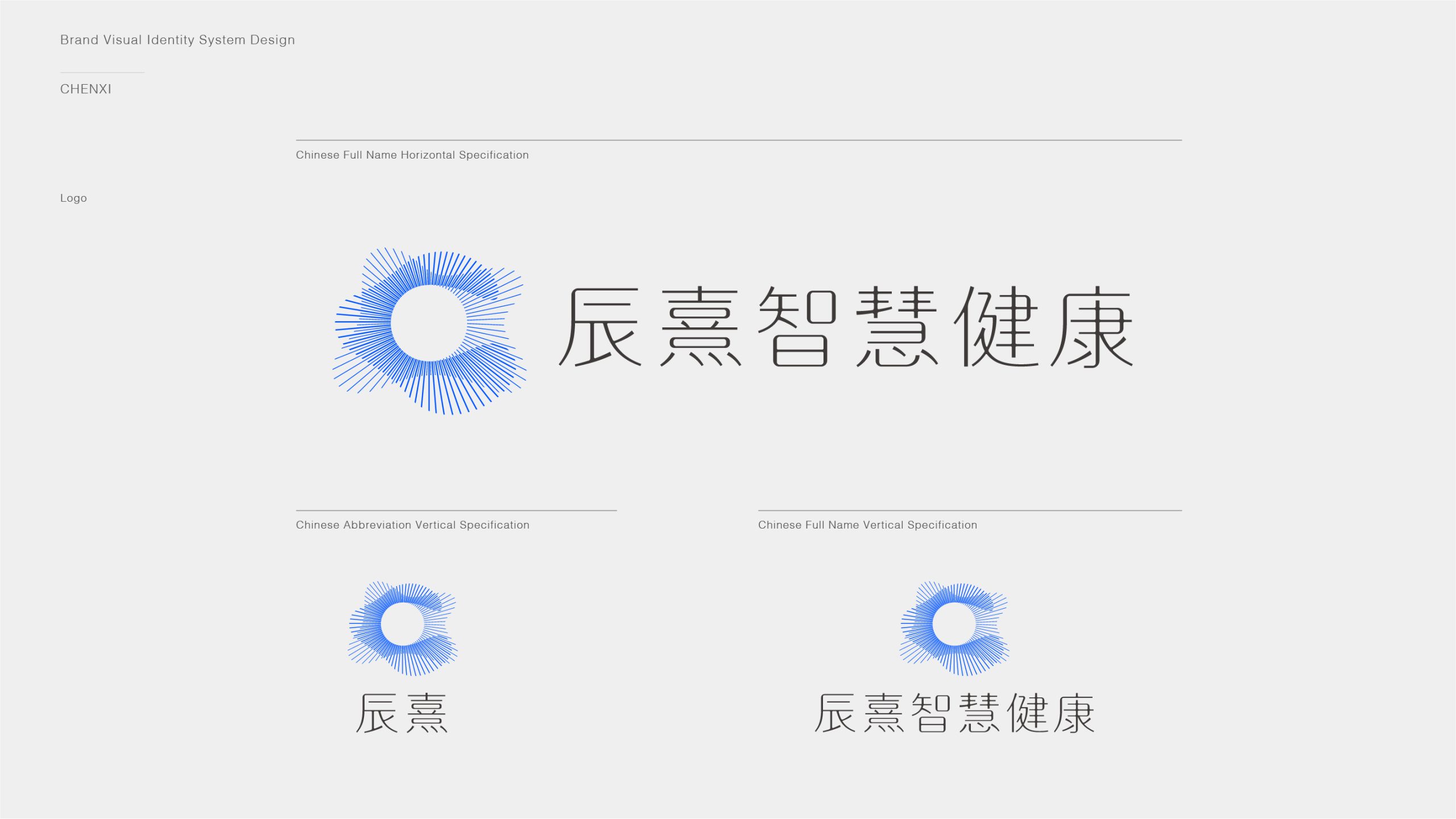
Inspired by “the resonance of light” and “ripples of thought,” the mark forms a dynamic spiral of radiating lines, signifying “the spread of inspiration, the gathering of wisdom and the extension of time.” Built on mathematical logic, the lines radiate from the center to create a sense of visual surge, symbolizing the boundless creative energy the brand unlocks through rational method. Resembling both a halo and the orbit of stars, the form echoes the meaning of the brand name: “creativity that shines like the stars.”
graphic language
Radiating lines: the spread of thought, the flow of energy and the birth of inspiration. Hollow center: the source of wisdom and space for creativity. Geometric spiral: a balance of order and change. Dynamic halo: the brand's creative vitality and forward vision. As a whole, the graphic fuses “rational technology” with “artistic emotion.”
Fonts and composition
The Chinese name Chenxi uses a minimal linear typeface with fine strokes and balanced structure, creating a light visual echo with the symbol. Fine-tuned proportions between horizontal and vertical strokes express rational order and the warmth of Eastern calligraphy. The lockup places symbol left, type right, at a ratio of about 1 : 1.5, ensuring strong recognition and spatial balance across digital interfaces and print.
color system
Primary Blue #4169E1 (Royal Blue): wisdom, depth of thought and technological trust. Secondary Light Blue #A0C4FF: openness, rationality and a sense of the future. Charcoal #333333: for typography, conveying professionalism and stability. White #FFFFFF: emphasizes the purity of space and light. Blue gradients express the flow of “the light of reason,” forming a distinctly contemporary language of tech aesthetics.
Application and extension
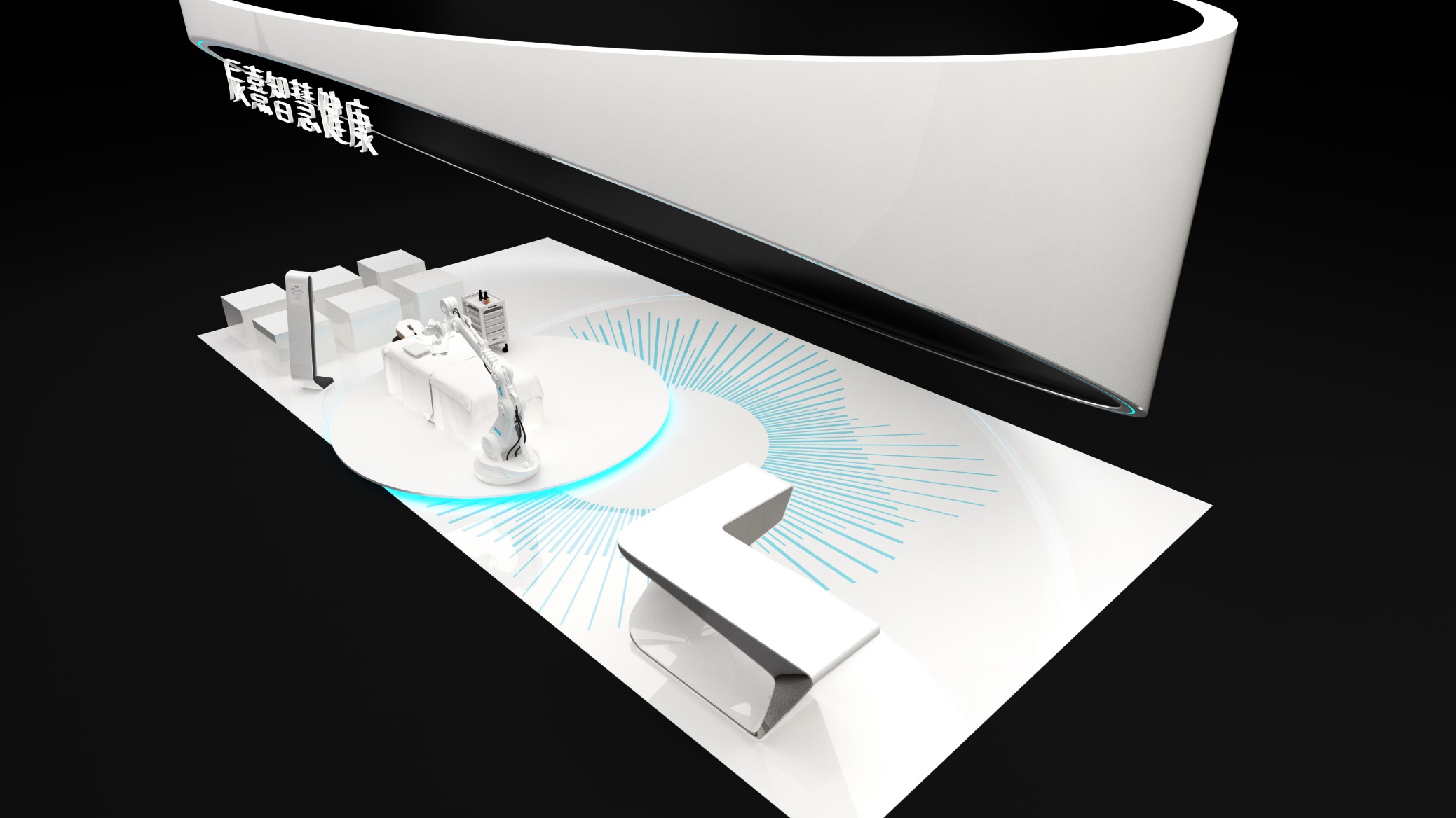
The mark is highly adaptable and extensible across the corporate website, creative reports, digital platforms and showcase videos, as well as conference key visuals, brand documents, staff passes and cultural merchandize. In motion, it expands into a “halo pulse” animation that expresses the flow of creative energy. The structure can also be abstracted into graphic modules and background textures, achieving consistency across all media: from static to dynamic, from print to interactive.
brand meaning
The mark embodies Chenxi's three core values: Wisdom Light, where the light-form structure symbolizes inspiration and illuminated understanding; Design Logic, where the mathematical radial composition reflects a rational design philosophy; and Fusion Creation, where the blue halo expresses the resonance between technology and art. Together, the identity represents the brand's creative belief: “rational design that inspires emotional resonance.”
Improper Usage (Protection Specification)
Do not change the number, angle or density of the radiating lines. Do not reverse or alter the direction of the blue gradient. Do not add shadows, outlines or glow effects. Do not rotate or skew the mark. Maintain clear space of at least 25% of the symbol's diameter. Minimum display width: 28 mm.
design results
Following the launch, Chenxi established a highly recognizable visual asset in the design and technology sectors. The identity has been widely applied at innovation exhibitions, digital launch events and international collaborations, earning a nomination for an Annual Innovation in Visual Identity Design Award. Created by Qingmei Future, the project was featured in the casebook Visual Identity Systems for Tech Aesthetics and Innovative Design Brands as a representative work of “Eastern rational aesthetics × digital creative logic.”