










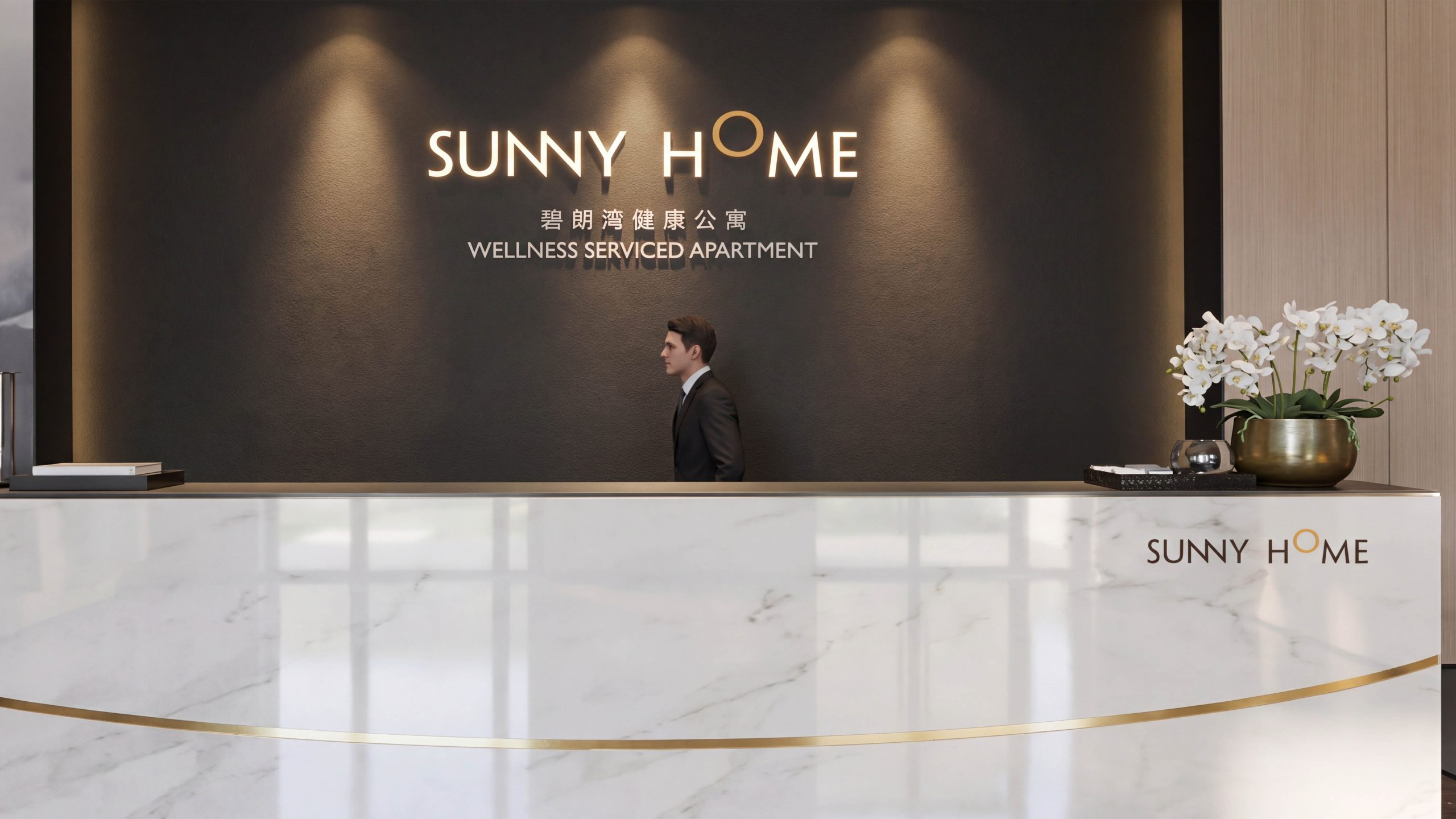
The Bilang Bay Health Apartments wayfinding system establishes a unified, replicable and maintainable standard for identification and guidance across multiple properties.
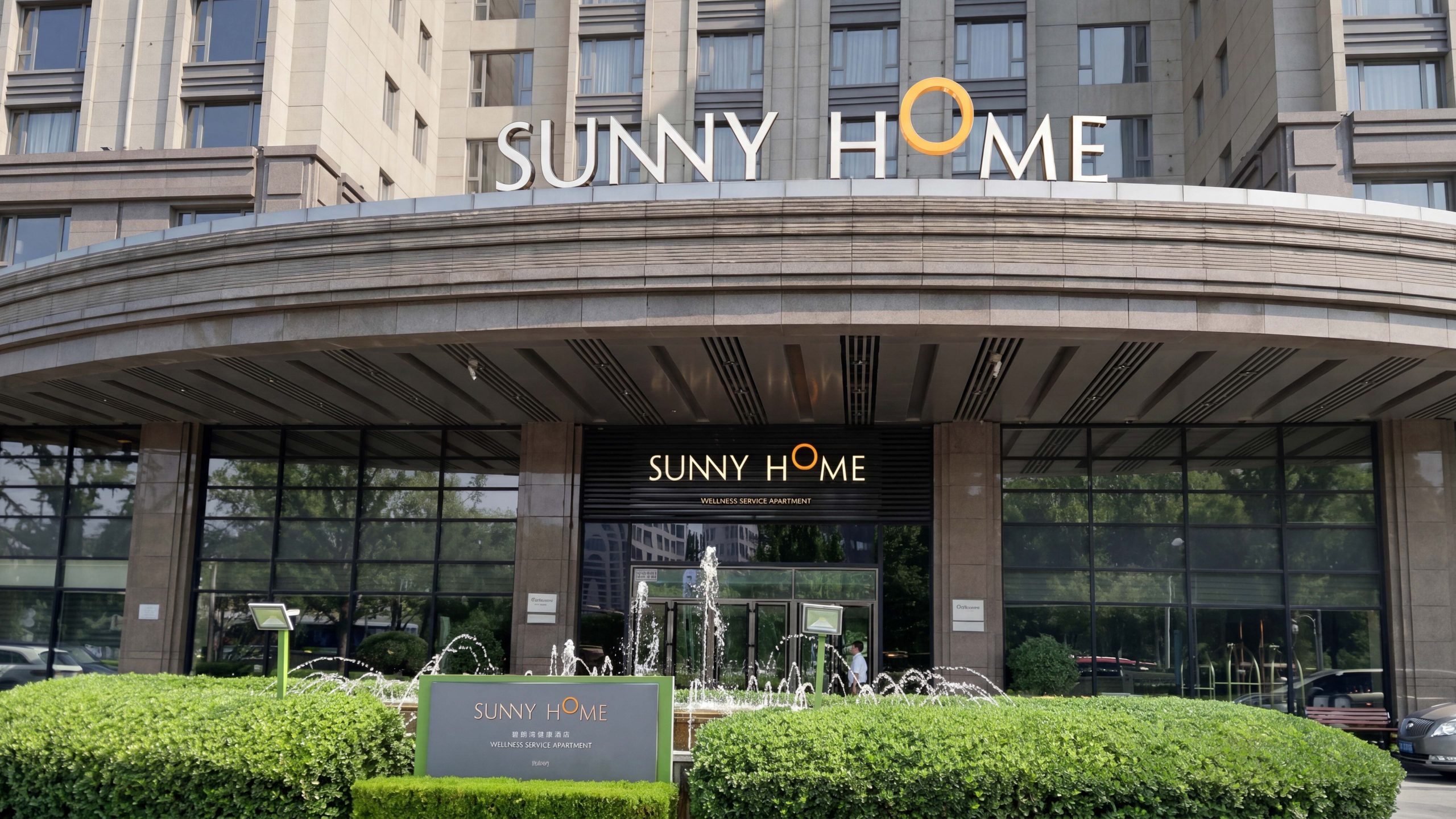
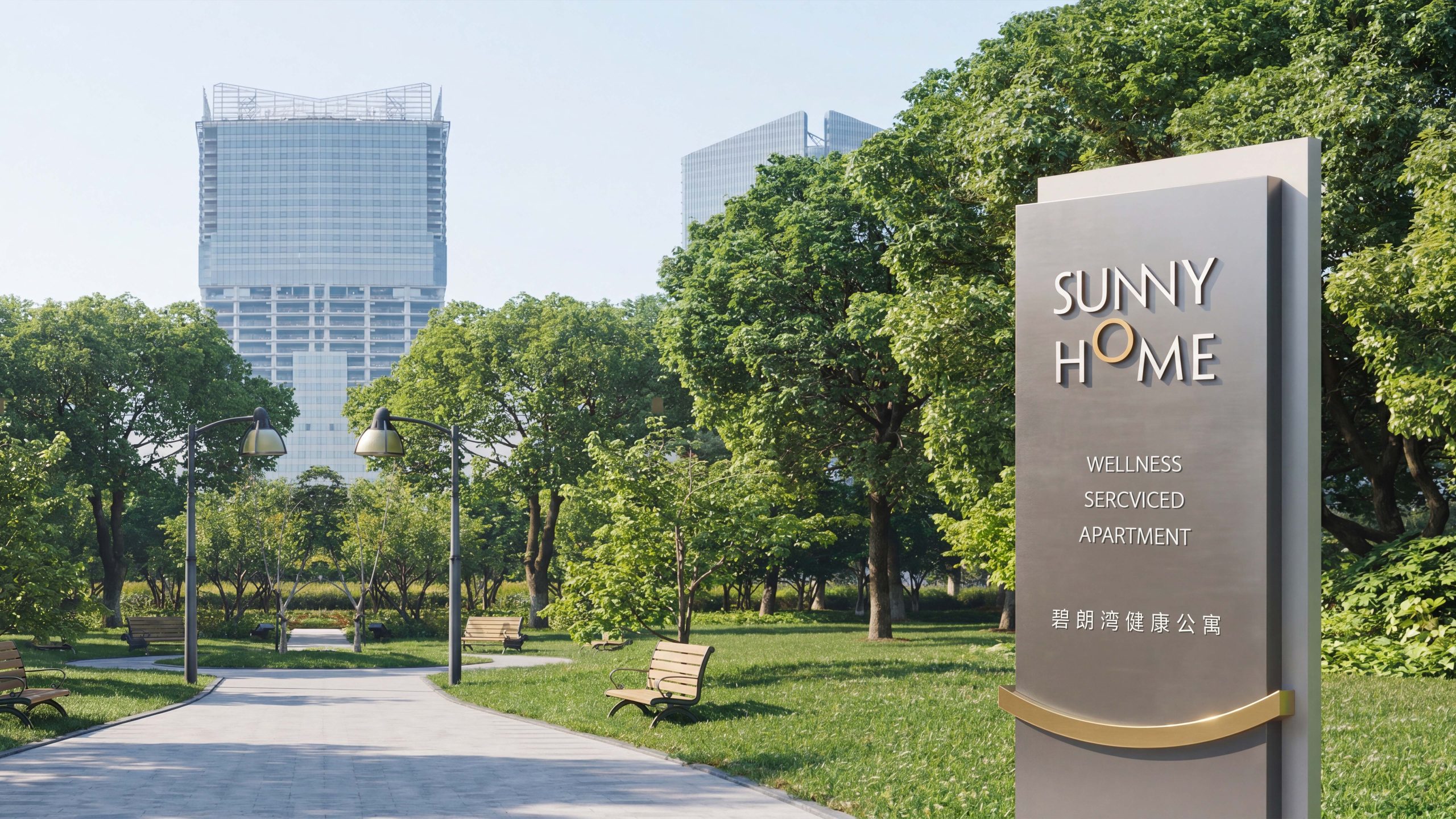
The system spans exterior identity signage, entrances and foyers, reception and elevator lobbies, shared amenities (wellness, dining, fitness, gardens), guest rooms and back-of-house areas, delivering an overall experience defined by “quick orientation, minimal disruption, clear order and compatibility with wellness settings.”
Research and Positioning
Drawing on profiles of long-stay and wellness-oriented residents, time-of-day visitor flows and cross-building circulation studies, we defined a strategy of “decisions made early, shortest routes, minimal information load.” Information is organized into three tiers: Primary (area direction and functional location), Secondary (process and operating prompts) and Tertiary (wellness guidelines and courtesy reminders). Key KPIs include first-visit arrival time, wrong-turn rate, reliance on staff enquiries, nighttime legibility and accessible reach.
Information Architecture and Coding
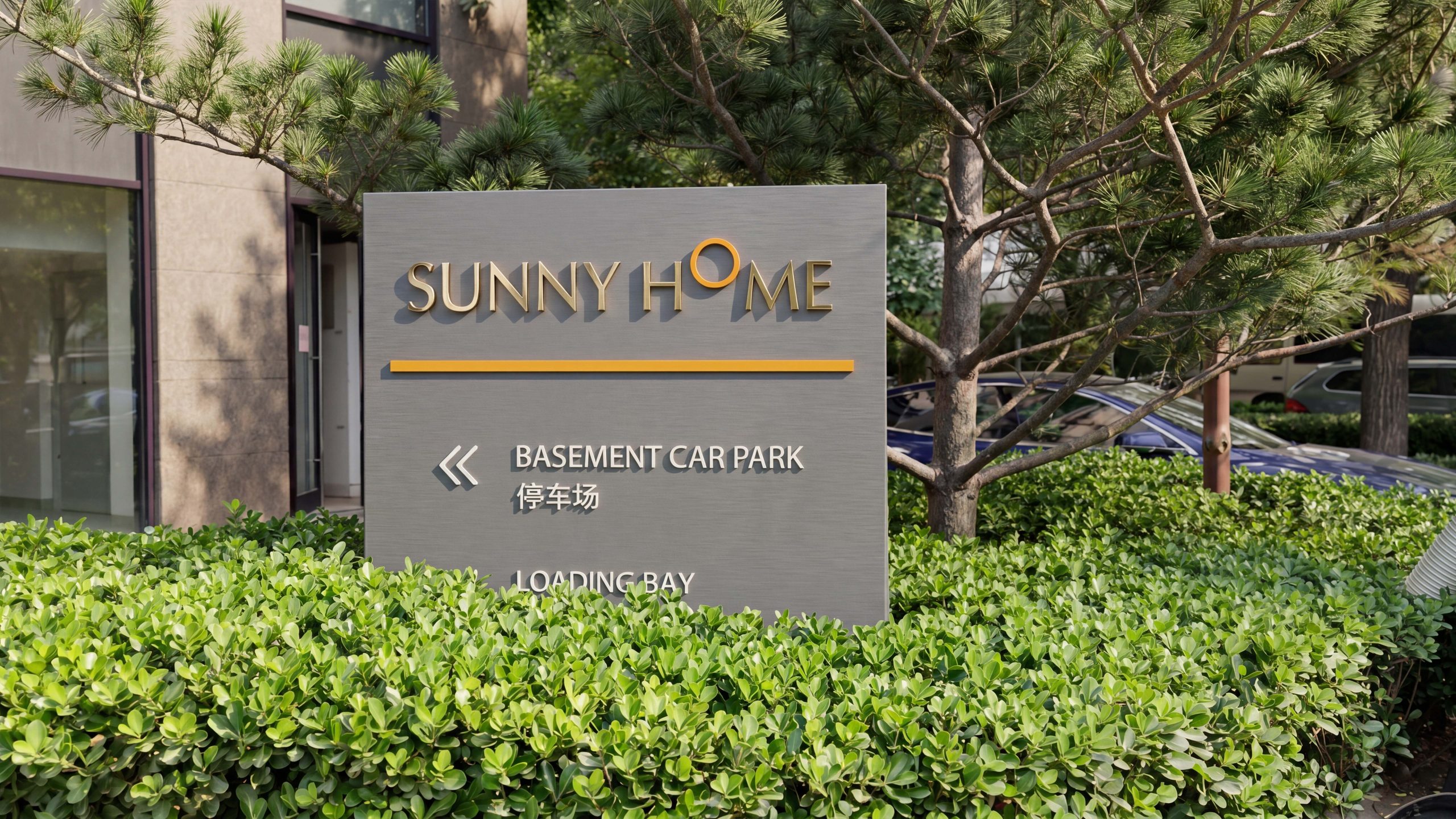
We built a five-level information architecture: “campus – building – floor – zone – room/facility.” Campus level: separating vehicles and pedestrians, guiding inbound arrivals and the garden loop. Building level: entrance identification, reception location and core vertical circulation. Floor level: a three-step progression of section – direction – room number. Facility level: clear labeling of wellness, clinical, activity and quiet-rest areas. An 8 pt baseline grid and fixed type area standardize weights, leading and spacing for headings, body text and supporting information; sign codes map one-to-one to the asset register, supporting inspection, replacement and maintenance.
Visual and Material Standards
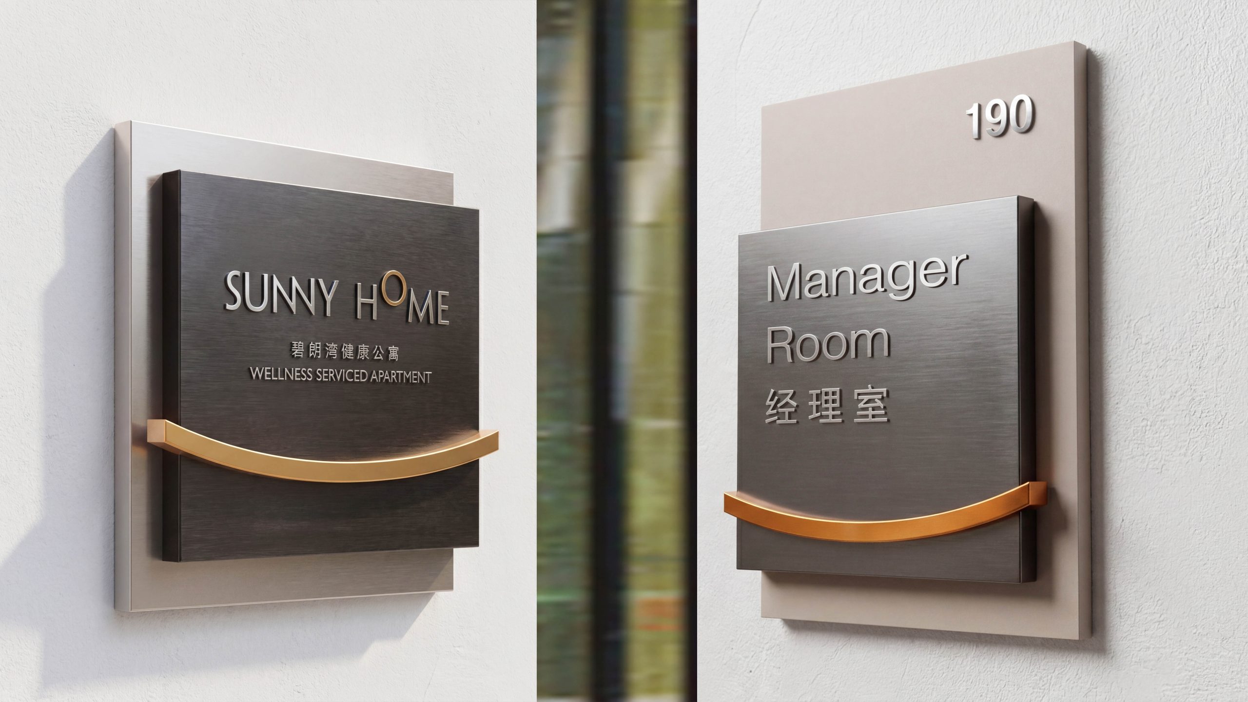
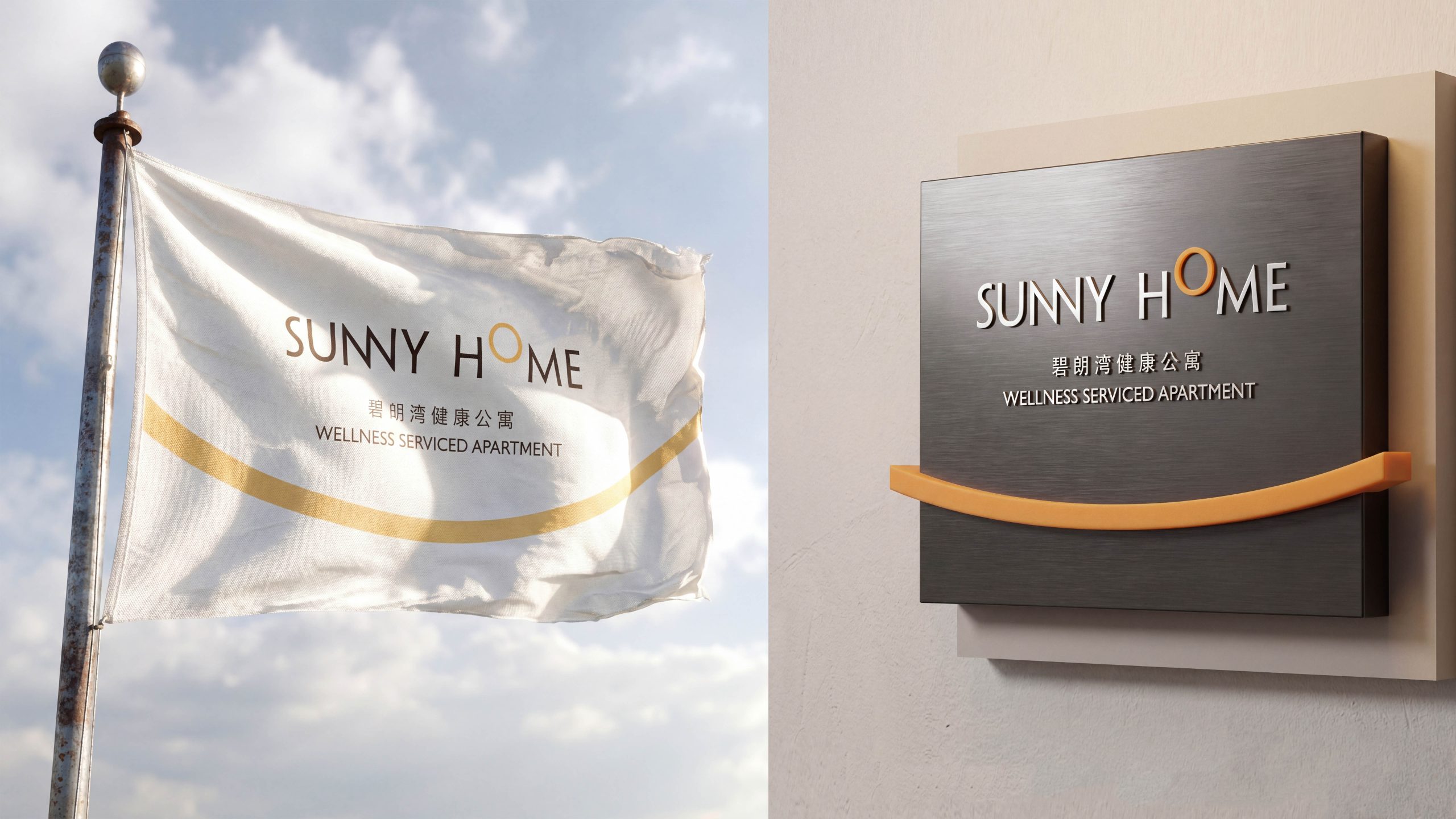
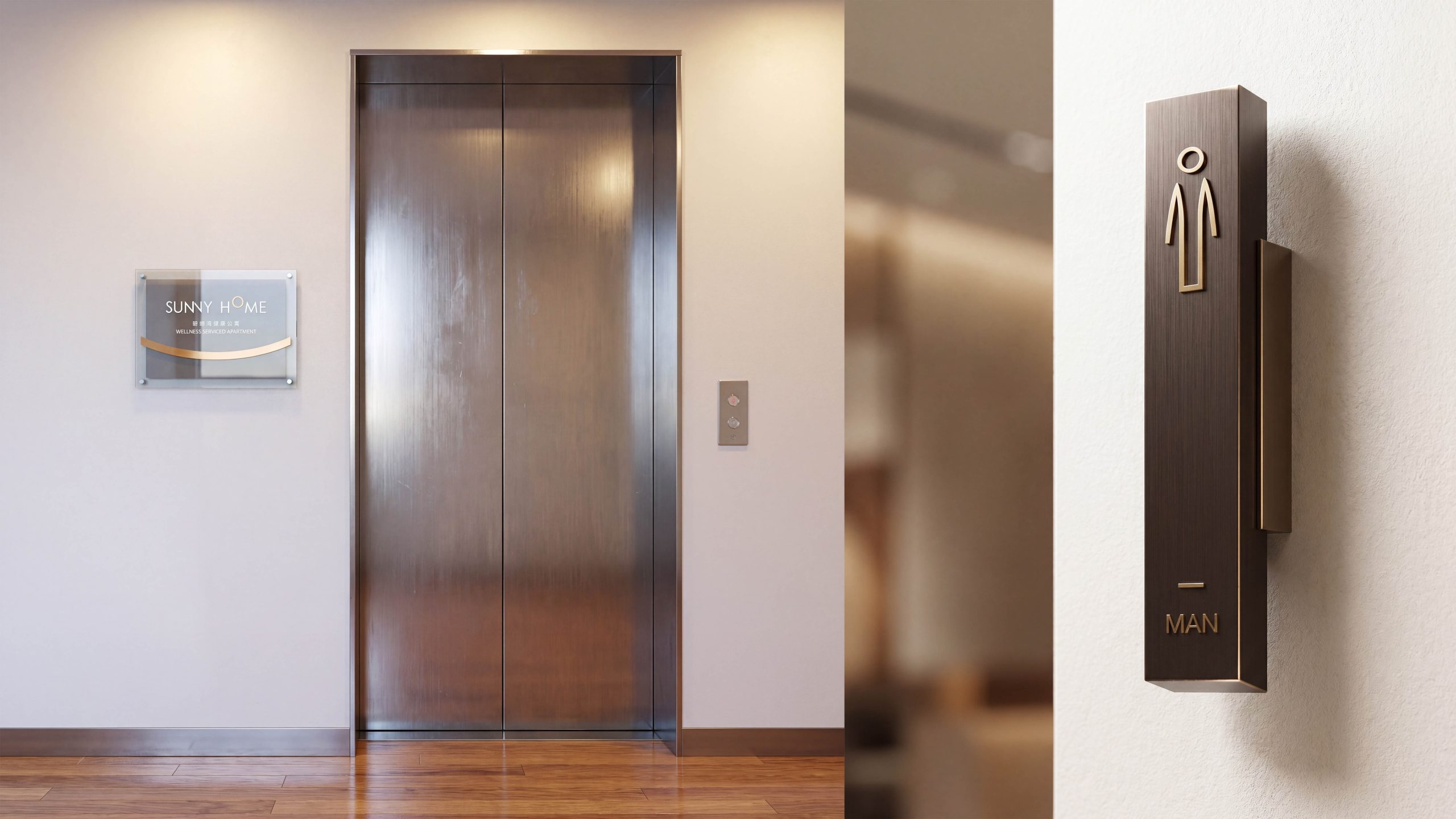
Color: Warm gray and graphite gray carry the information, accented by a gentle daylight orange for health-related identification; emergency and evacuation signage follows international safety colors. Typography: A highly legible Chinese sans-serif family paired with Latin sans-serif for letters and numerals ensures consistent recognition at far, mid and near range; numeral legibility is optimized for room numbers and elevator floor signs. Iconography: Geometric forms with neutral chamfers and uniform stroke weight; key symbols such as accessibility, medical care and quiet zones align with international standards. Materials and craft: Exterior signage uses baked-enamel metal and dimensional letters with dimmable edge lighting; interior floor and room signs use micro-textured panels with soft backlighting, with luminance kept below 1000 cd/m²; high-contact points feature rounded, impact-resistant edges and stain-resistant, easy-clean surfaces.
Touchpoint Layout and Circulation Organization
Façade and entrance: Long-range identification surfaces and close-range overviews clearly separate vehicle and pedestrian flows; contour lighting strengthens the building's presence at night. Lobby and reception: The main sign is presented alongside service zones (reception, enquiries, medical care), with floor graphics and freestanding signs managing queues. Elevator lobbies and floors: Elevator lobbies combine floor directories with key facilities; corridors use a progressive sequence of “section arrow – transition arrow – room number,” with advance prompts at corners to prevent backtracking. Shared amenities: Garden and wellness paths carry continuous route markers and rest-point guidance; quiet and rehabilitation areas use low-contrast, gentle prompts to limit noise and light disturbance. Guest rooms and interiors: Room-number backlighting shares a uniform color temperature; in-room guidelines combine a “key-point checklist + icon instructions” in concise form.
Implementation and Evaluation
We established a closed loop of “standards – implementation – evaluation – iteration.” Standards package: wayfinding manual, color and contrast specifications, type system and icon library, material and installation details, and coding and asset register templates. Implementation package: master siting plan, elevation drawings, details for custom components, illuminance and reflectance verification, prototype samples and acceptance checklists. Evaluation metrics: first-visit arrival time, wrong-turn and enquiry rates, nighttime legibility and glare, accessible reach, and maintenance replacement time and cost. Iteration mechanism: quarterly inspections and annual reviews, with minimal-intervention updates aligned to seasonal operations and wellness program changes, ensuring consistency and reliability across multiple properties and long-term operation. Grounded in systematic strategy and rigorous order, the project translates the care needs of health-focused residences into a clear, sustainable spatial language, improving move-in efficiency and reinforcing stable brand recognition.