










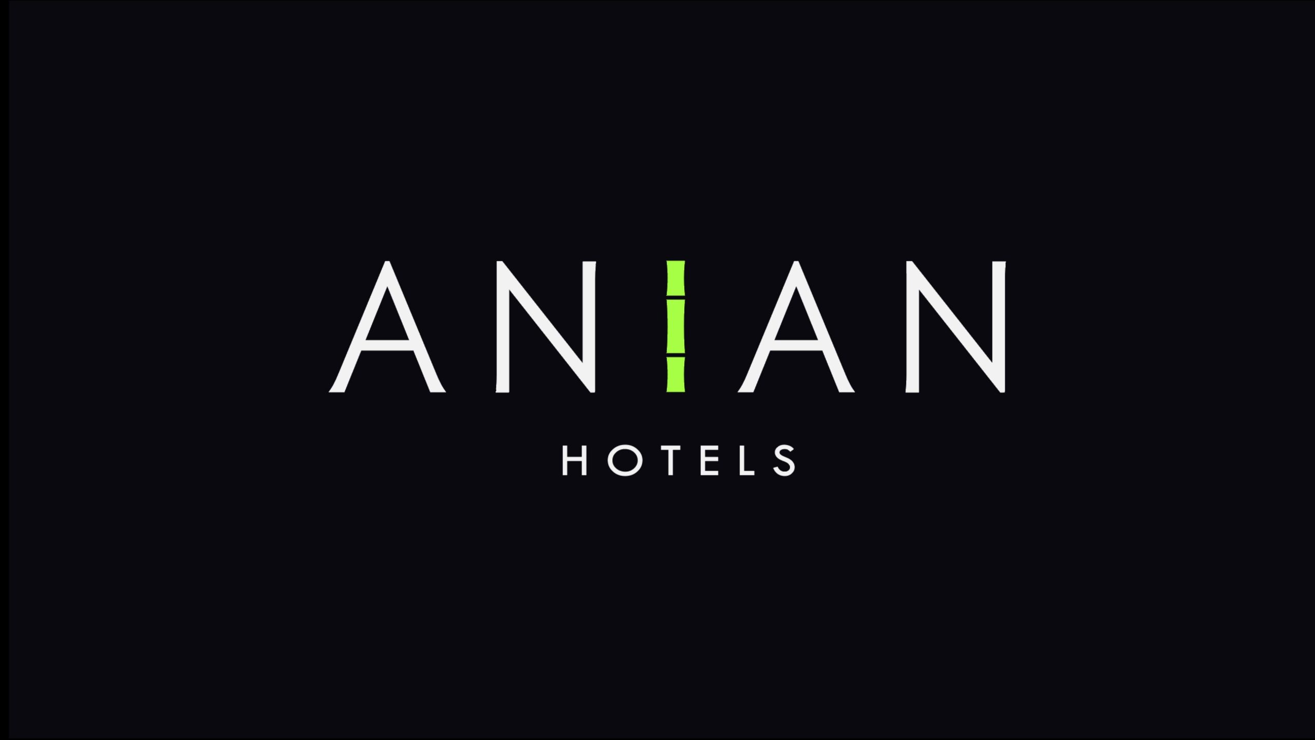
ANIAN HOTELS is an international boutique hotel brand with the philosophy of 'serene dwelling, tranquil moments.' Positioned in the premium hospitality and lifestyle sector, the brand is dedicated to creating 'space as state of mind' guest experiences.
The visual system needs to find balance between 'modern internationalism' and 'Eastern spirituality,' using minimal form to express profound quietude.
design concept
The logo is purely typographic, employing a double-'A' structure echoing the dual meaning of 'peace and serenity,' connected in the middle by a single beam of light (I). This light line symbolizes 'order, illumination, and breathing,' representing the hotel's core philosophy — achieving balance in light and shadow, experiencing tranquility in space. The design's core concept: Let light become the axis of the soul, let stillness become the measure of life.
graphic language
Symmetry: the name ANIAN is built symmetrically for high recognition, reflecting architectural balance. Light: the "I" glows in soft fluorescent green, suggesting dawn, life, and inner energy. Breathing room: wide letter spacing leaves space to breathe, echoing the Eastern idea that emptiness is itself a realm. Hierarchy: the small "HOTELS" below anchors the composition and reinforces the brand's professional character.
Fonts and composition
The primary brand typeface employs minimal geometric sans-serif, with slender strokes and precise proportions, embodying the rationality and elegance of premium hospitality brands. The vertical structure of the letters maintains consistency with the 'light axis I,' forming visual unity. 'HOTELS' uses refined lowercase serif typography, conveying understated luxury and warmth.
color system
Primary black #1A1A1A: Symbolizes stability, calmness, and spatial depth; Core light green #C8E97A: Represents life, hope, and subtle light; Background white #FFFFFF: Symbolizes purity, whitespace, and breathing. The three combine to form a 'black — white — light' spatial language system, embodying the brand's 'tranquil yet vibrant' visual character.
Application and extension
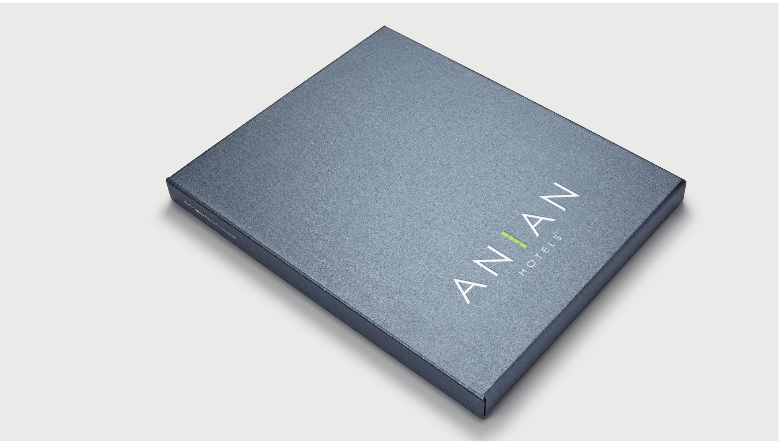
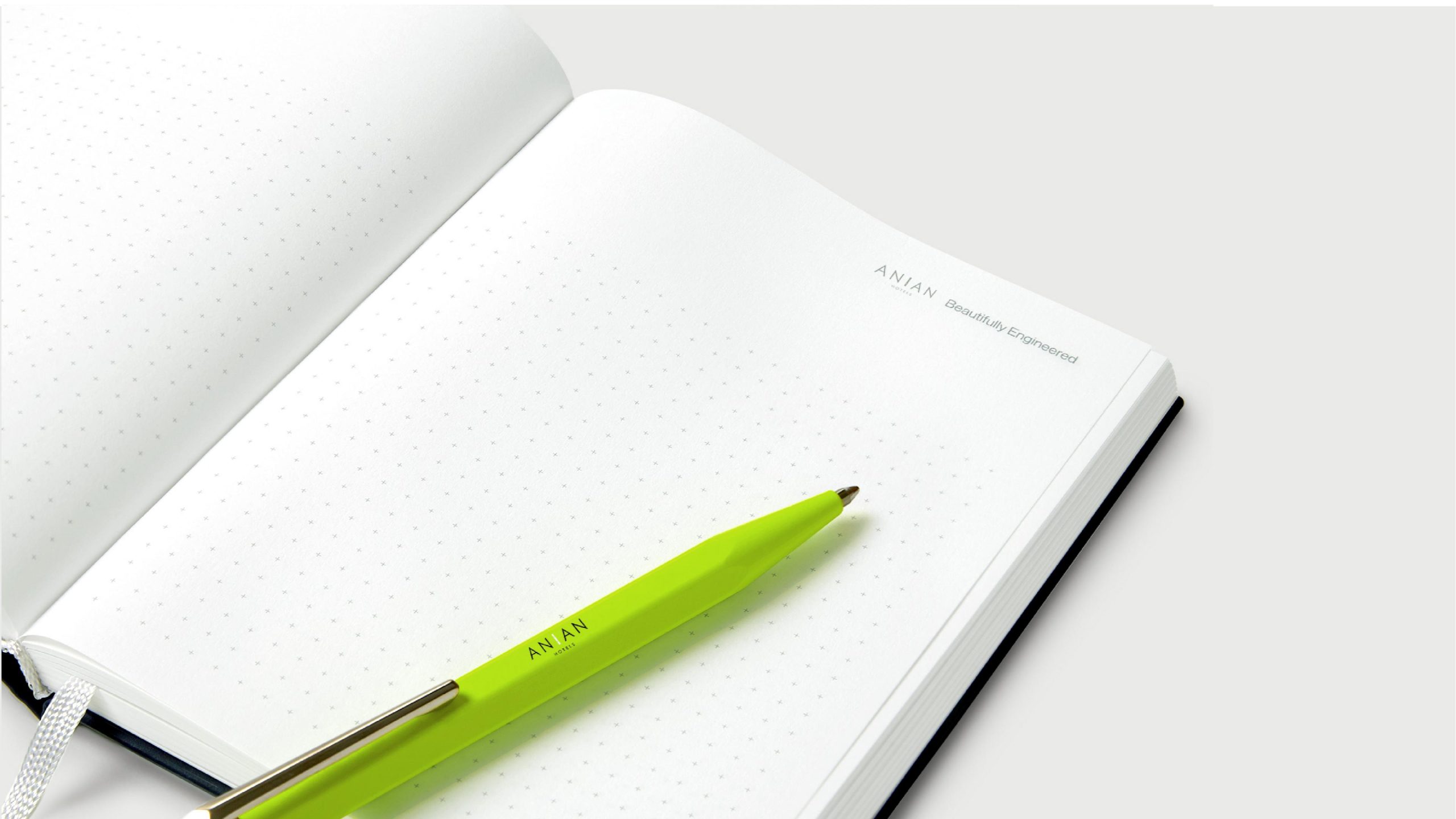
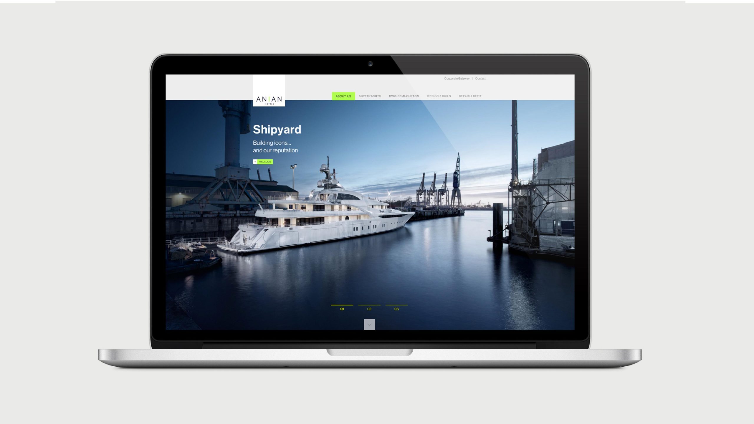
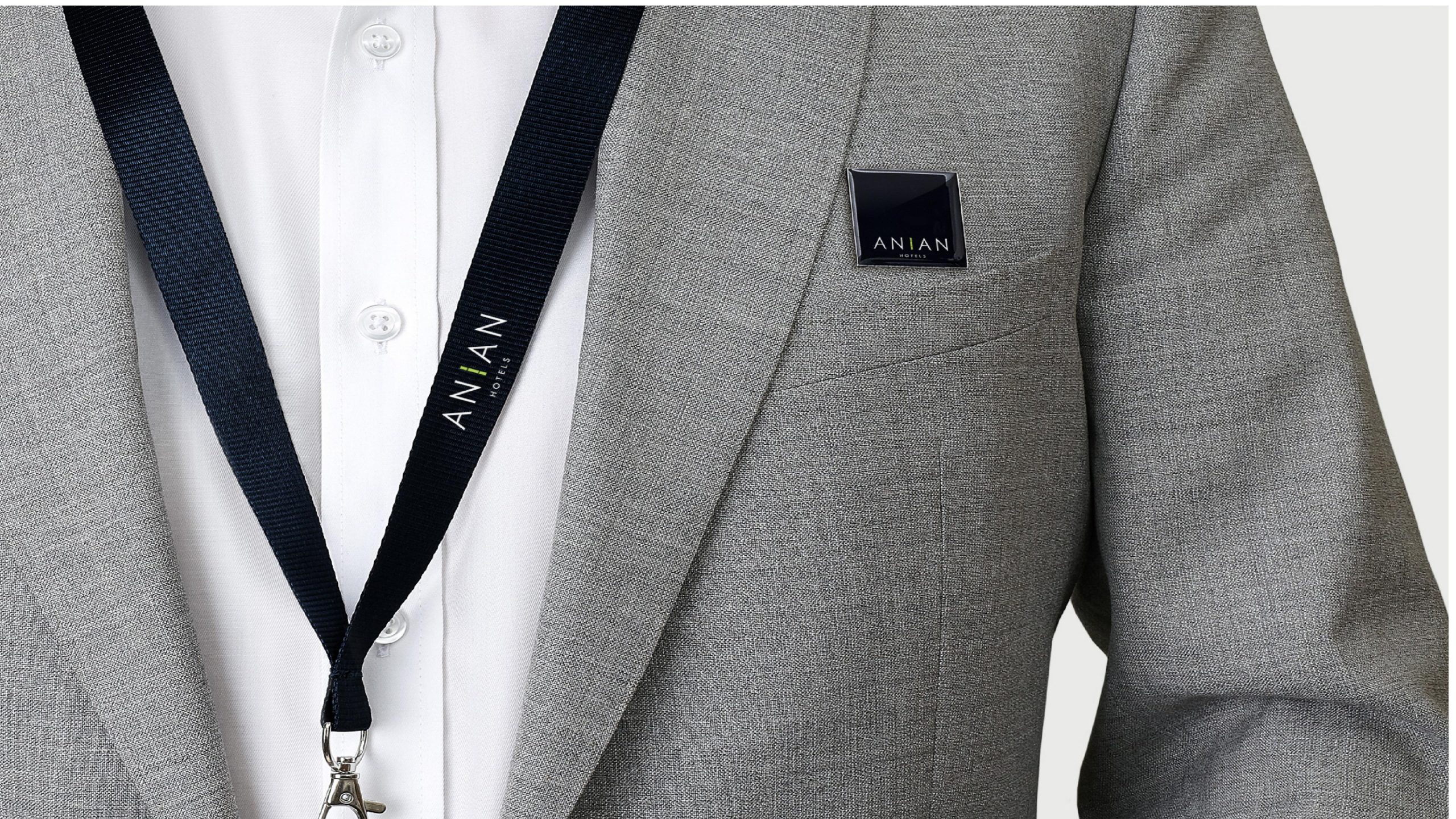
The mark is highly recognizable and artful across every medium. Spatial: applied to hotel door signage, fragrance packaging, guest-room nameplates and art-led wayfinding. Print: business cards, letterheads and invitations are finished with silver foil and debossing. Digital: in website and app animations, the “I” light column pulses slowly, creating a breathing rhythm. Lighting: within hotel spaces, the light column extends into physical light installations, giving the brand a sense of place.
brand meaning
ANIAN’s visual language grows from an aesthetic of quiet luxury. A — Ease: spatial order and a sense of belonging. N — Serenity: the unhurried rhythm of time and life. I — Axis of light: spiritual illumination and connection. Double-A structure: forms a “gateway of the heart,” expressing the idea of meeting the world’s beauty with a mind at ease. Together, the identity conveys the brand philosophy: “Luxury without noise. Warmth without display.”
Improper Usage (Protection Specification)
Do not alter the proportions or color values of the “I” light column. Do not use highly saturated or dark backgrounds that compromise the mark’s breathing space. Do not add outlines or drop shadows. Recommended minimum display width: 40 mm.
design results
Following its launch, the new ANIAN HOTELS mark established a distinctive identity within the international boutique hotel landscape. The “axis of light” became the signature symbol of the brand’s spatial experience, running through a multidimensional system from graphics to architecture. The brand fuses Eastern stillness with modern order, setting a minimalist benchmark for contemporary hospitality aesthetics. The project stands as a defining Qingmei Future work at the intersection of hotel branding, spatial philosophy and visual minimalism, using light as the medium to let a brand speak through stillness.