










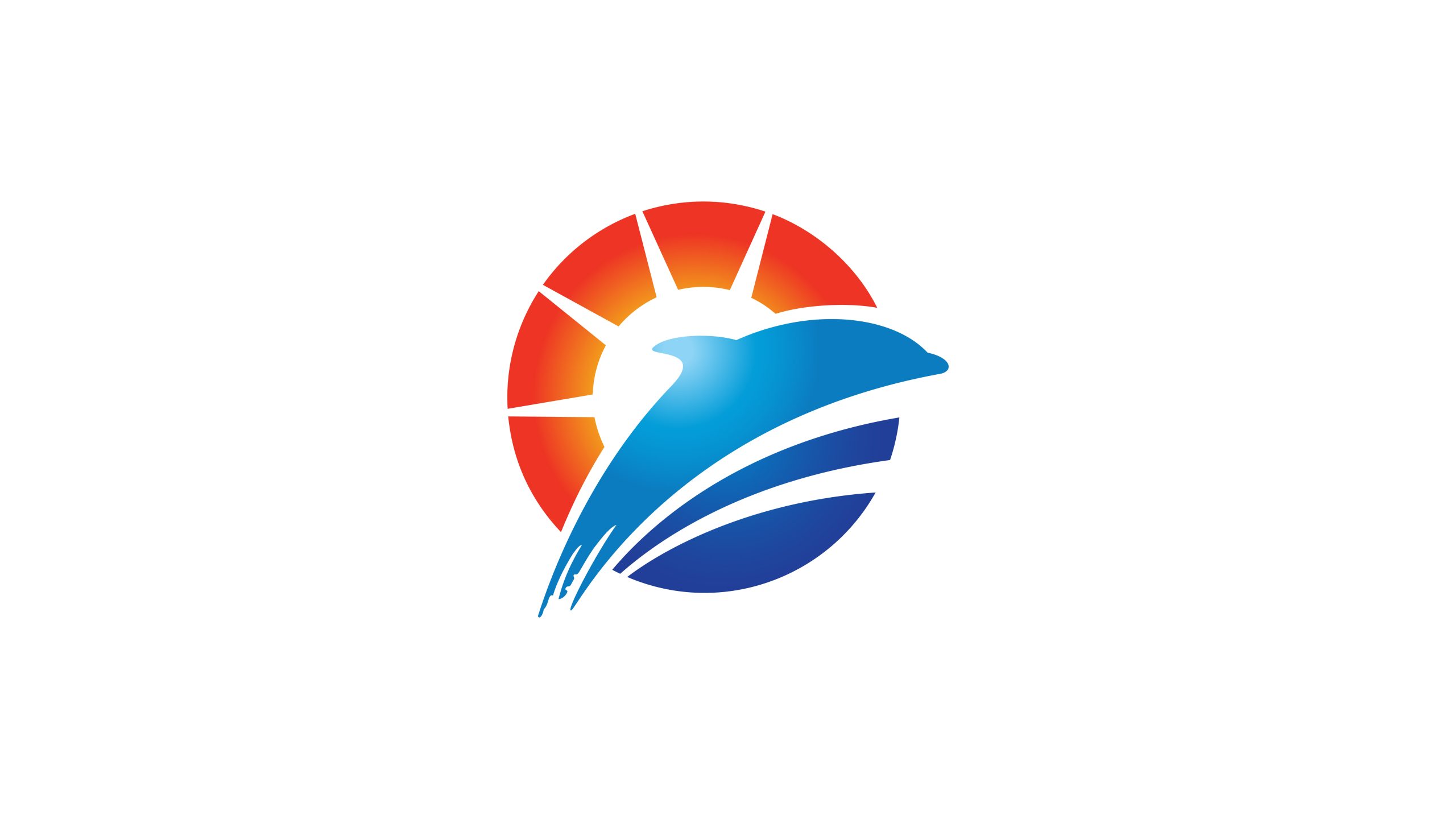
SUNWING Cultural Tourism Group is an integrated brand focused on cultural tourism, eco-leisure resorts and coastal city development.
The group wanted a visual identity that conveys its core spirit of sunshine, freedom, the ocean and vitality, creating a modern cultural-tourism image full of energy and warmth.
The goal was a concise symbolic language that resonates with three ideas: the beauty of nature × the light of culture × the heart of travel.

design concept
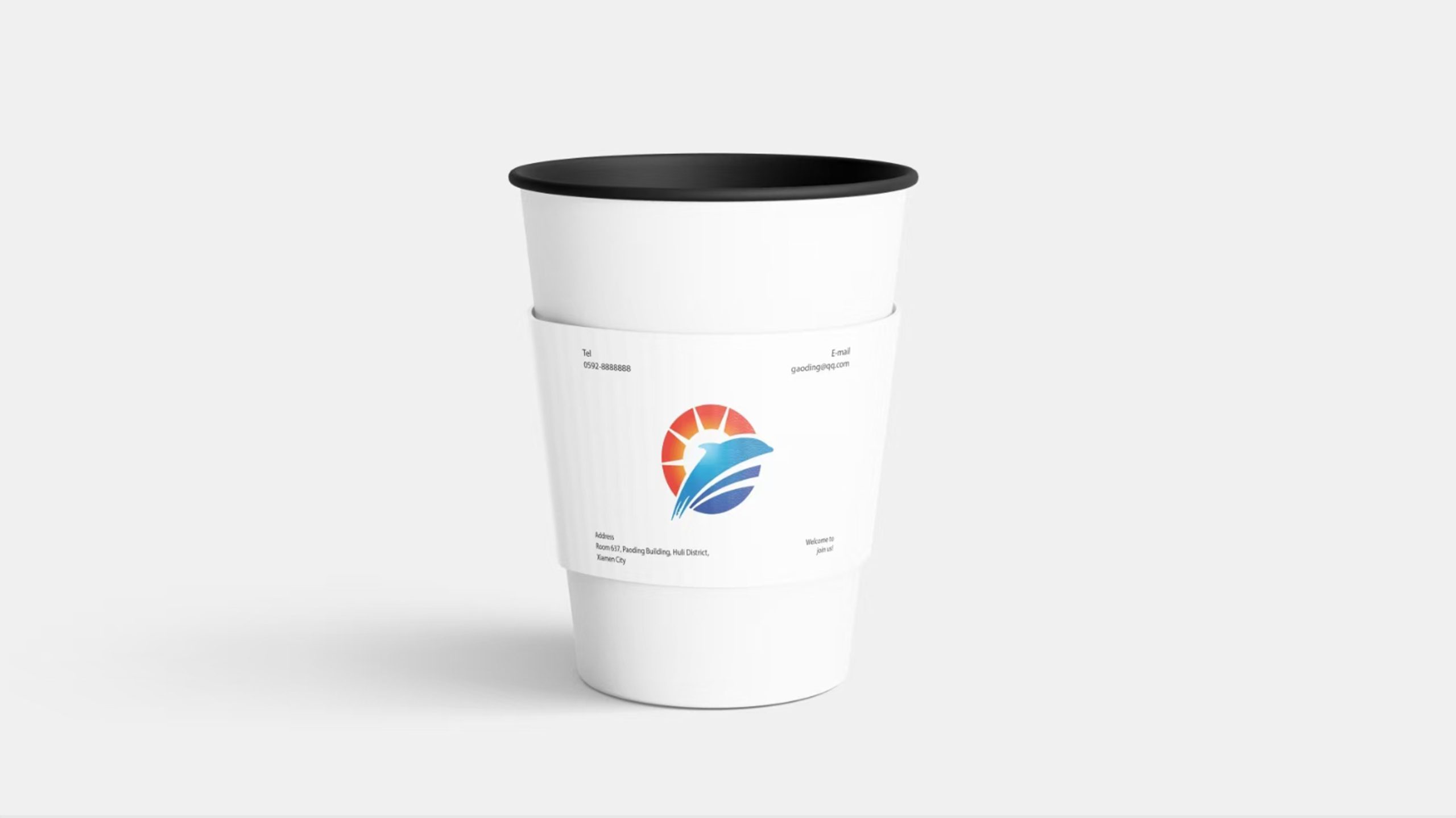
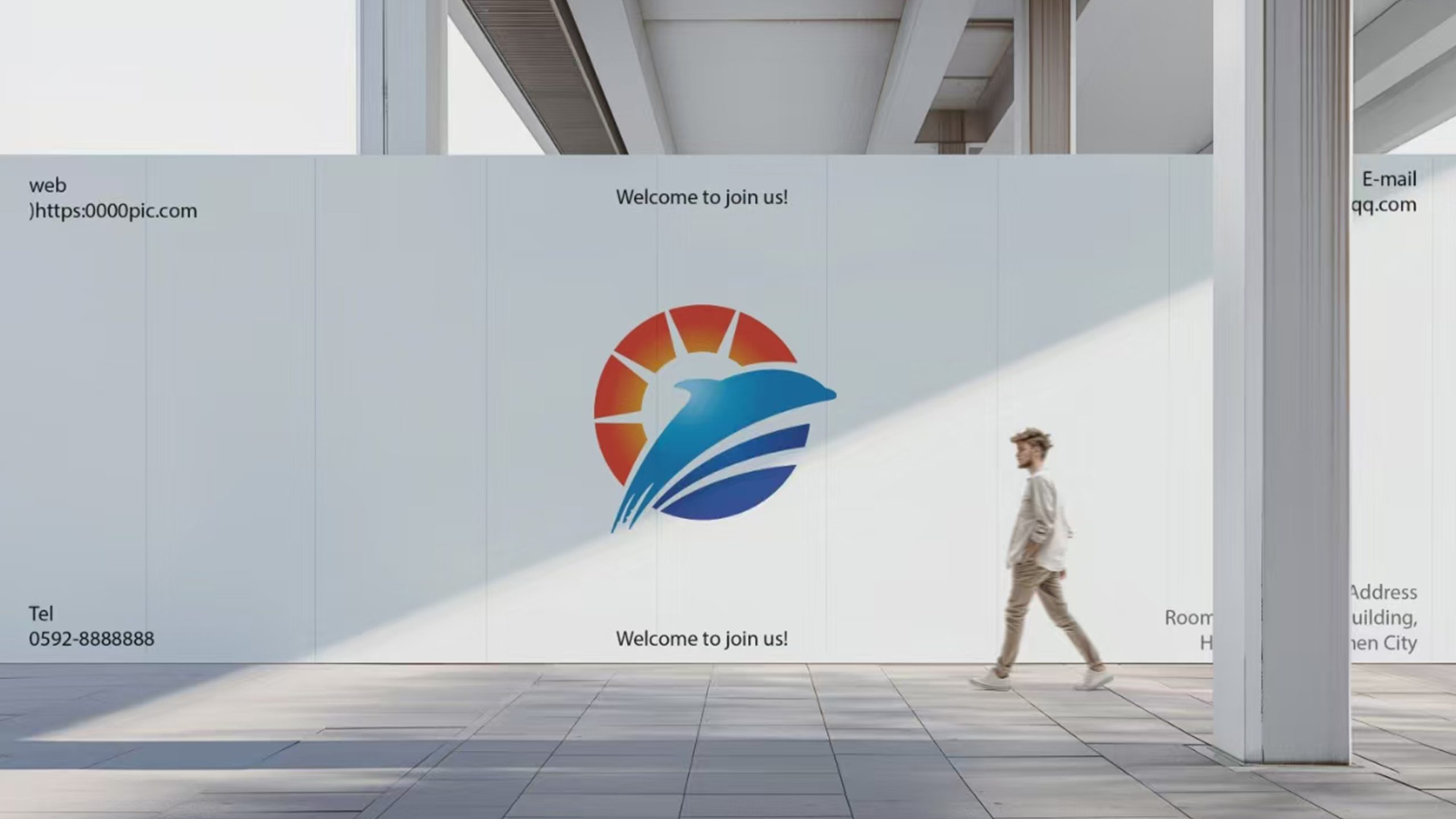
The mark is built on the imagery of “the rising sun and flight over the sea.” A ring of sunlight and a soaring bird combine to symbolize light and freedom, dreams and hope. The bird’s curves echo the motion of waves, expressing the power of natural growth, and the sun’s rays signify the warm radiance of cultural energy. The core idea: make every journey an encounter with the sun.
graphic language
Sun ring: life, hope and the passage of time. Segmented rays: cultural reach and an uplifting, positive force. Bird in flight: an abstracted petrel or wild goose, signifying the pursuit of dreams and the crossing of boundaries. Color in motion: a gradient from golden orange to deep blue creates a visual transition from sunrise to sea and sky, symbolizing harmony between people and nature.
Fonts and composition
SUNWING is set in a custom sans-serif, solid yet fluid, conveying openness and a global outlook. The Chinese for "Culture & Tourism Group" uses a light Song typeface, steady with a humanist character. The type aligns to the lower right, creating an upward movement that echoes the bird in flight and sets a rhythm of moving toward the sun.
color system
Primary Orange Red #E95B2A: passion, energy and sunshine. Secondary Deep Blue #164F9B: the ocean, trust and depth. Gradient #FDBD4F → #1A73E8: a color narrative from sunlight to sea. Together they balance warmth and coolness, reflecting the brand’s ecological and cultural dimensions.
Application and extension
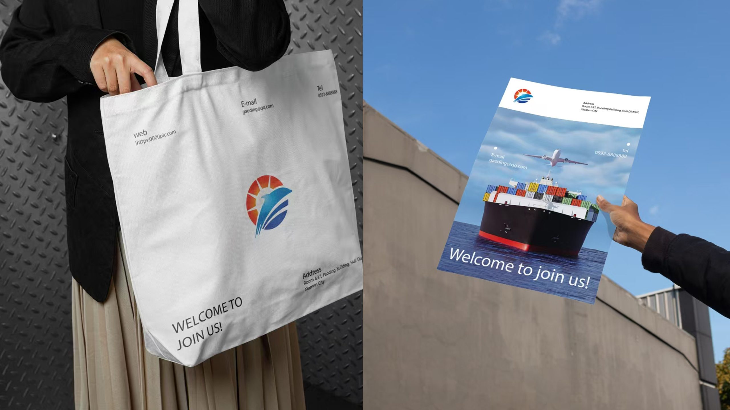
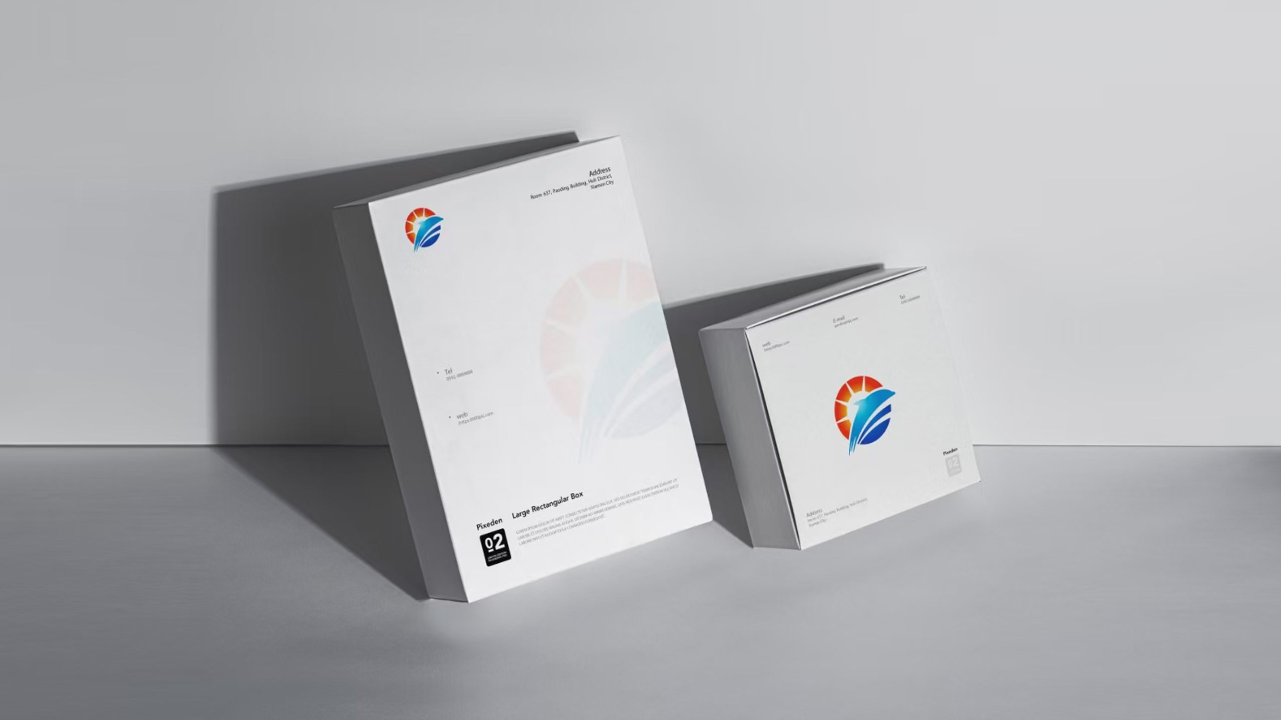
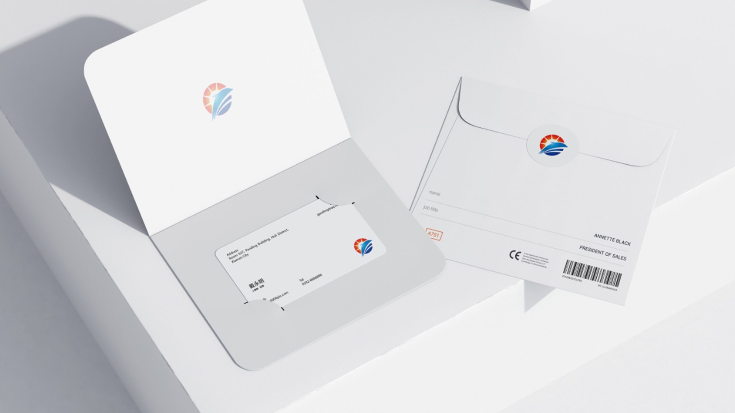
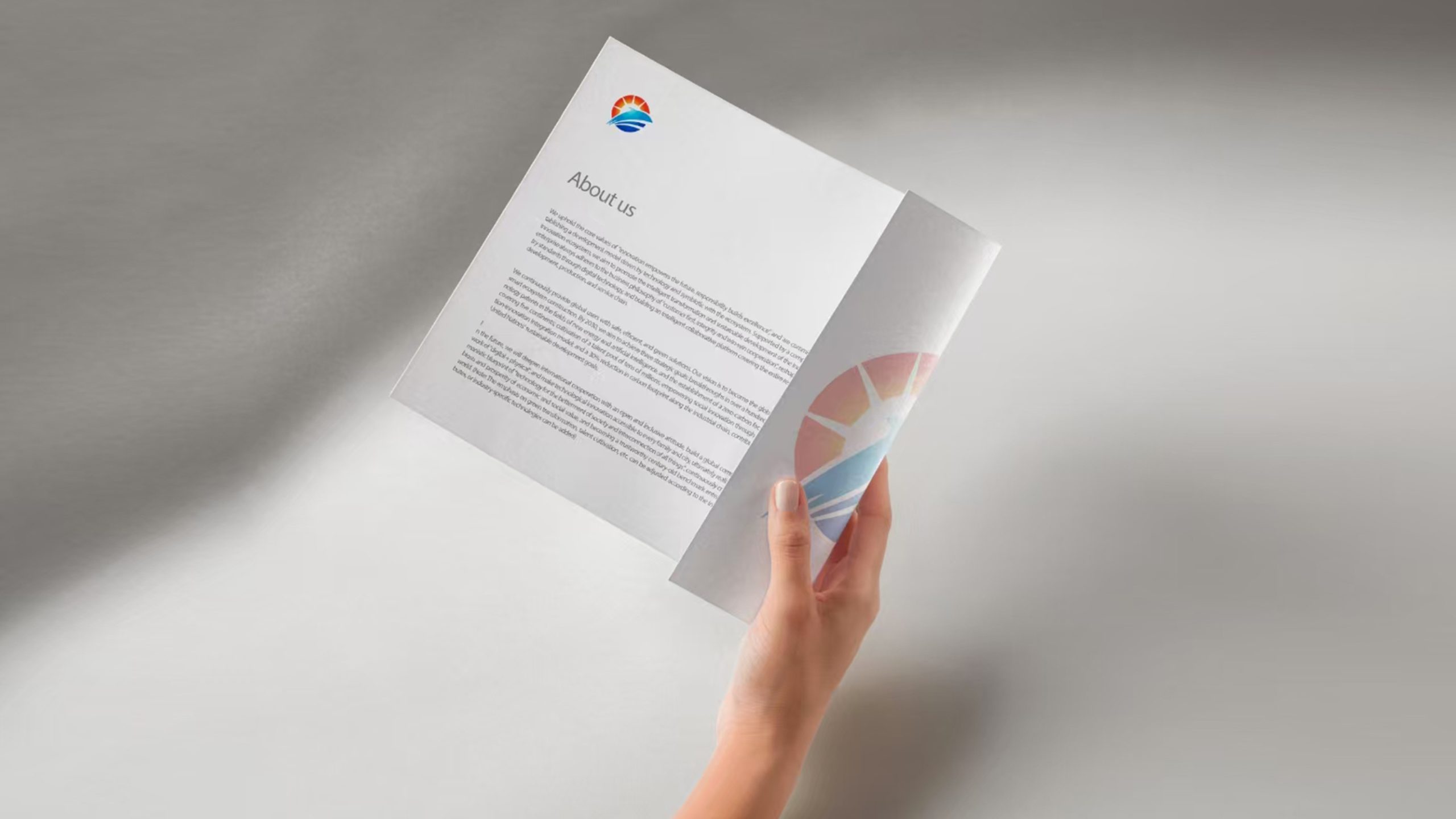
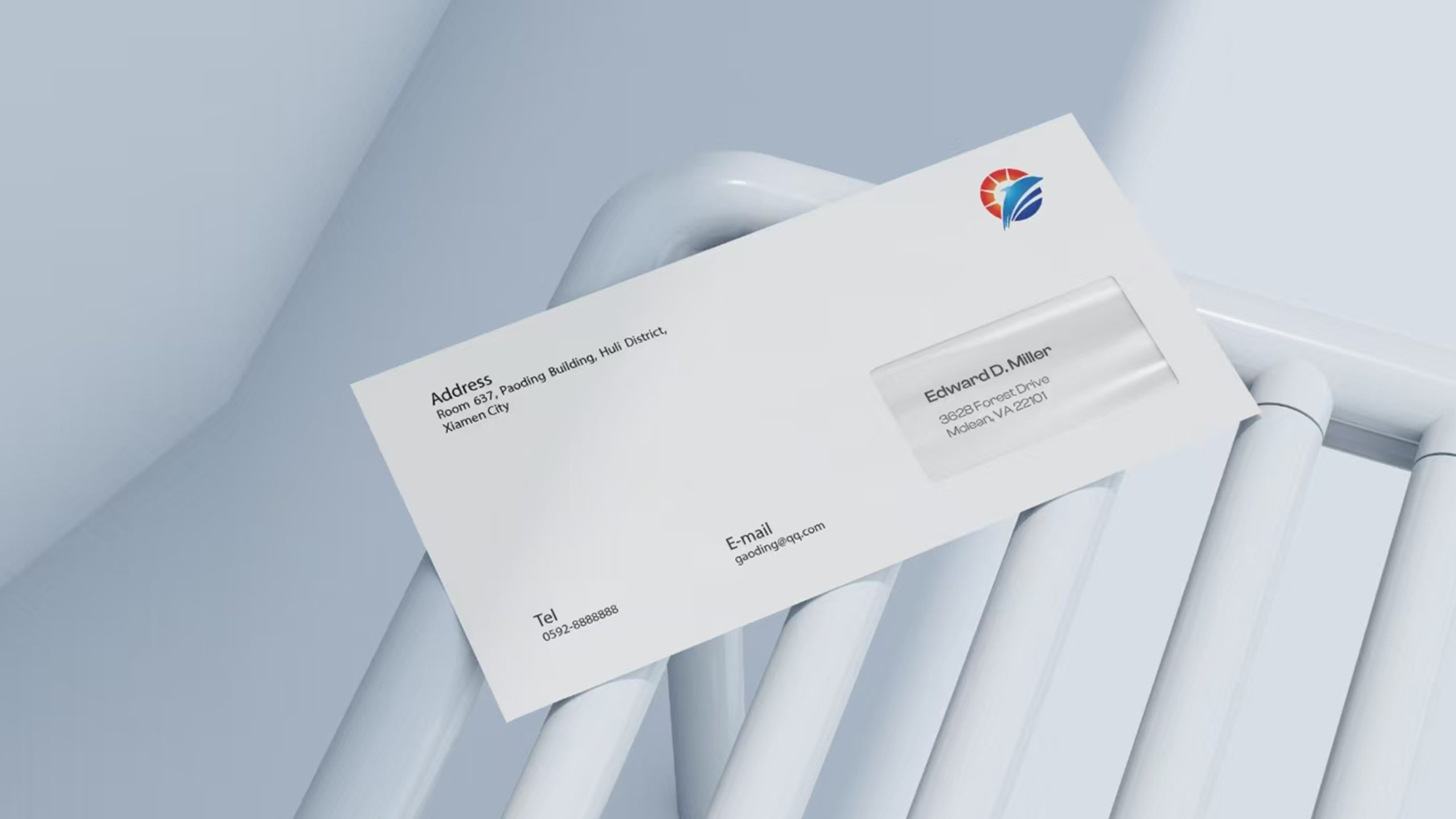
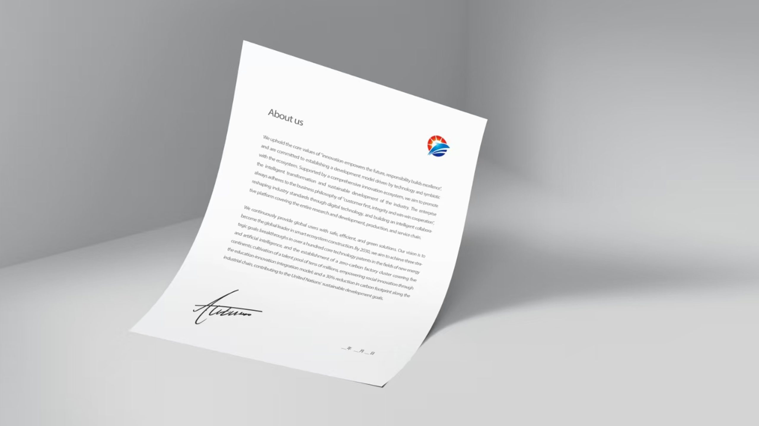
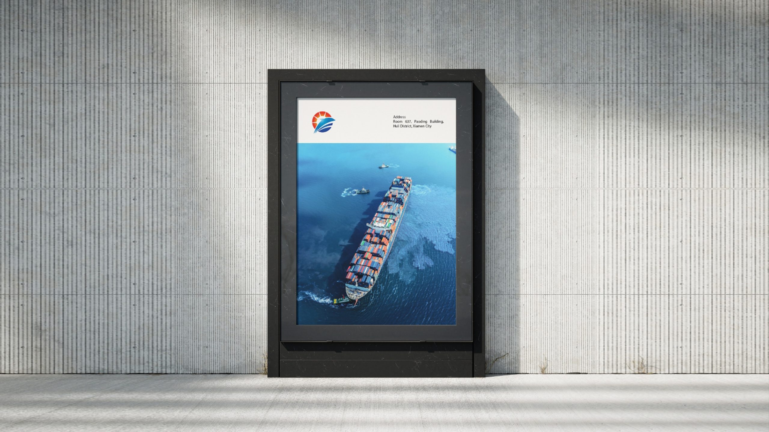
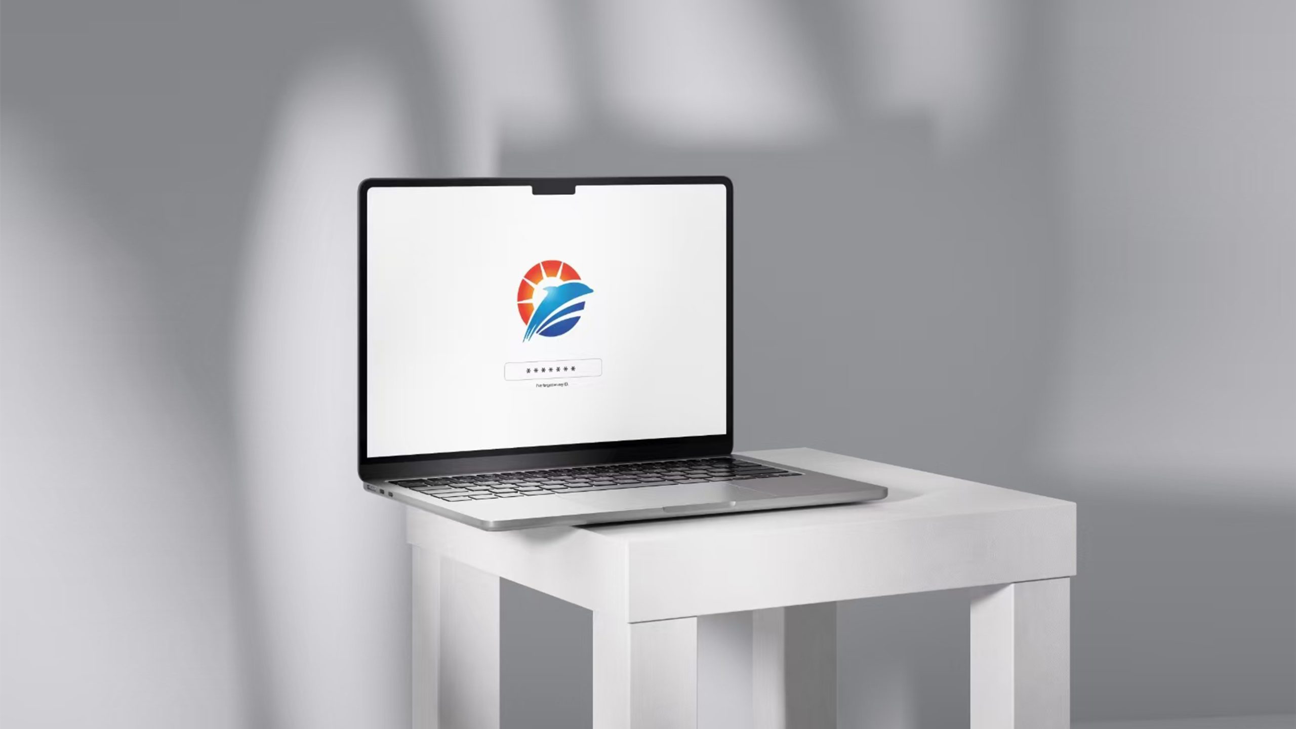
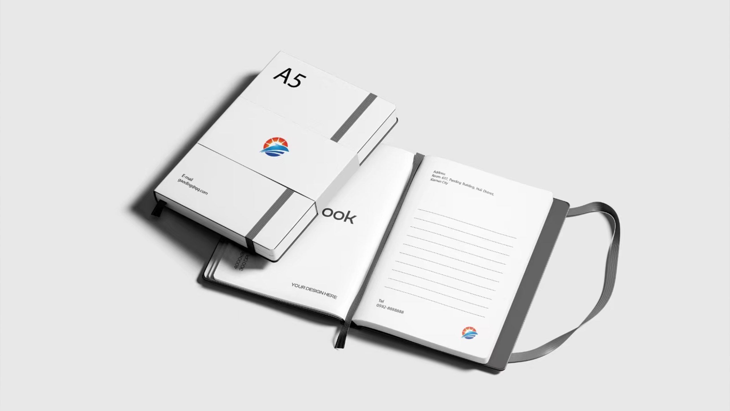
The mark adapts across the full cultural-tourism system. Corporate and government: project launches, investment promotion, brand collateral and wayfinding. Destinations and venues: tourism feature walls, banners, ticketing systems and souvenirs. Digital: animated across websites, short videos and interactive screens, where the bird and rays fade in to convey movement and vitality.
brand meaning
Drawing its vocabulary from nature, the mark conveys the warmth of the human spirit. Sun → culture and hope. Bird → freedom and dreams. Ocean → inclusiveness and ecology. The composition captures “light and shadow flowing between heaven and earth,” expressing the brand’s core idea: culture lights the journey; nature nourishes the soul.
Improper Usage (Protection Specification)
Do not alter the number or proportion of the sun’s rays. Do not change the bird’s angle or the gradient direction. Do not substitute high-saturation colors for the primary orange and blue. Recommended minimum width: 35 mm.
design results
Since the launch, SUNWING Cultural Tourism Group has elevated its brand image across cultural tourism, resort real estate and eco-leisure. The “bird and sun” symbol has become the group’s core identifier in communications and project spaces. The case represents Qingmei Future’s mature work at the intersection of cultural-tourism branding × city image-making × systematic expression of natural imagery. Its symbol system of sun, sea and flight creates an Eastern cultural-tourism aesthetic with a global perspective.