










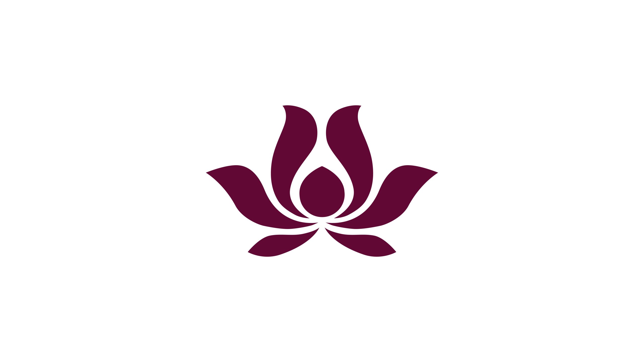
Lotus Residence is a boutique hotel brand blending Eastern Zen philosophy with modern luxury, dedicated to providing guests with serene, comfortable, and soul-restorative hospitality experiences.
The brand wanted its logo to convey stillness, purity, and elegance, reflecting the Eastern aesthetic of finding a world within stillness.
This project takes the lotus as its core imagery, combining minimalist geometric vocabulary with flowing lines to construct a high-end hotel visual identity imbued with spiritual presence.
design concept
Design inspiration derives from the Eastern cultural imagery of 'the lotus emerging unstained from mud.' The lotus symbolizes purity and enlightenment, as well as the spiritual concept of 'finding truth in stillness.' The logo employs symmetrical structure and negative space composition to present understated balance and depth. The core design philosophy: using natural form to construct inner tranquility.
graphic language
Primary structure: the logo comprises six petals in symmetrical arrangement, with the central pistil forming a natural focal point; curved expression: gentle arcs symbolize flowing water and Zen extension, embodying the space's inclusiveness and warmth; central axis negative space: represents breath and luminosity, endowing the logo with spirituality and spatial dimension; visual rhythm: the overall structure is stable yet dynamic, creating an 'Eastern balance of stillness with momentum.'
Fonts and composition
The brand name Lotus Residence employs an elegant serif typeface with delicate, elongated strokes that echo the logo's flowing structure. The bilingual lockup maintains a low center of gravity and appropriate negative space, giving the logo visual 'breathing room.' Typography color aligns with the logo's primary palette, creating unity without sacrificing hierarchy.
color system
Primary color Deep Burgundy #621C3B: symbolizes nobility, serenity, and Eastern temperament; secondary color Warm White #F9F7F4: expresses the purity of nature and space; accent color Gold #D9B56A (optional): used in print and spatial applications to add warmth and refinement. Deep burgundy as the visual foundation conveys the brand quality of 'luxurious without ostentation, serene without coldness.'
Application and extension
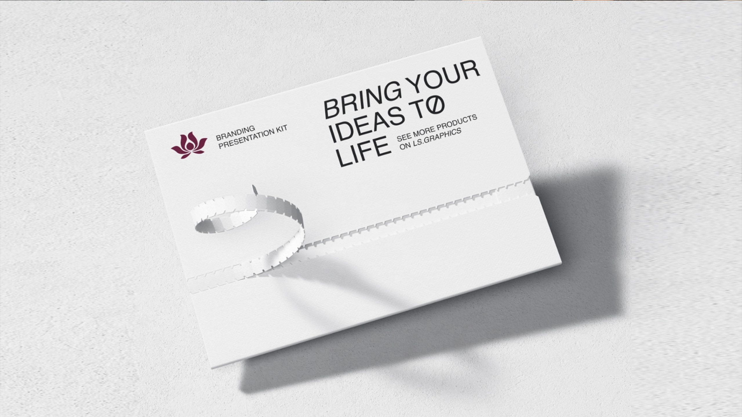
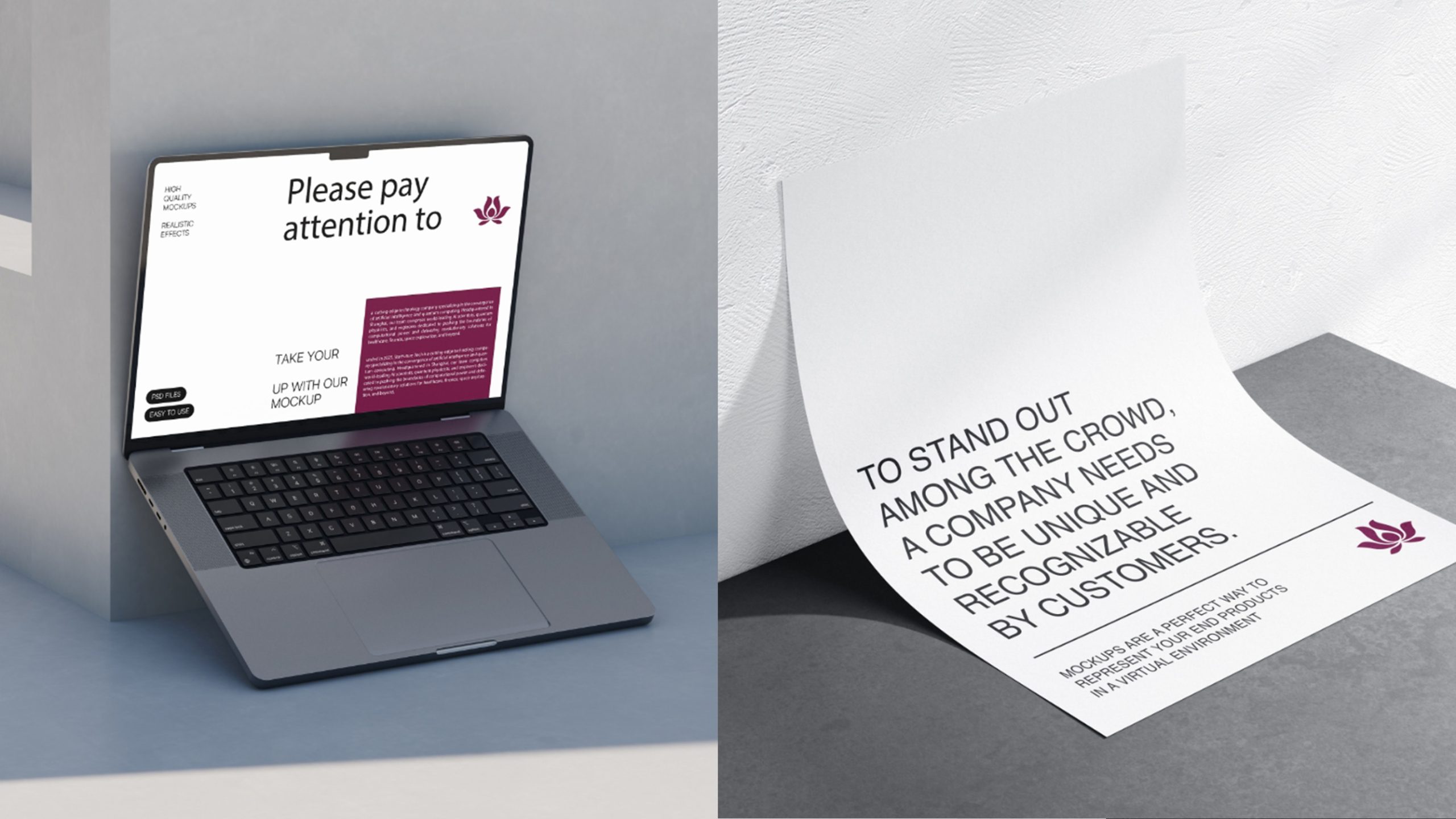
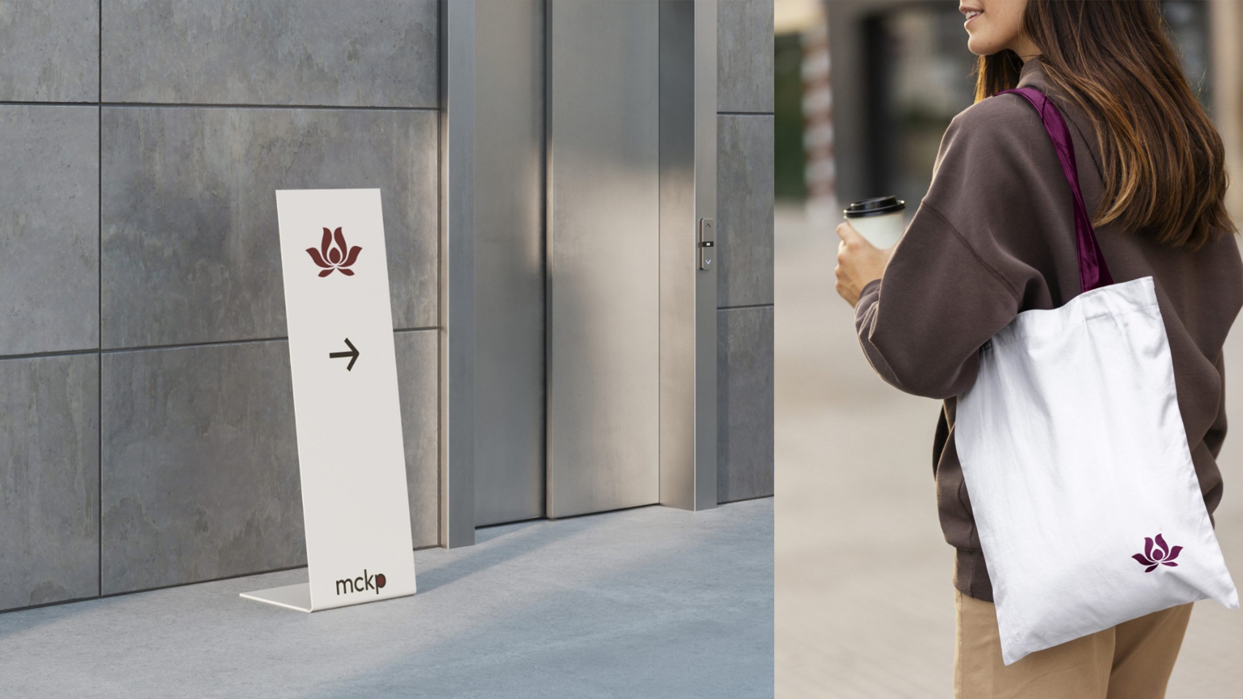
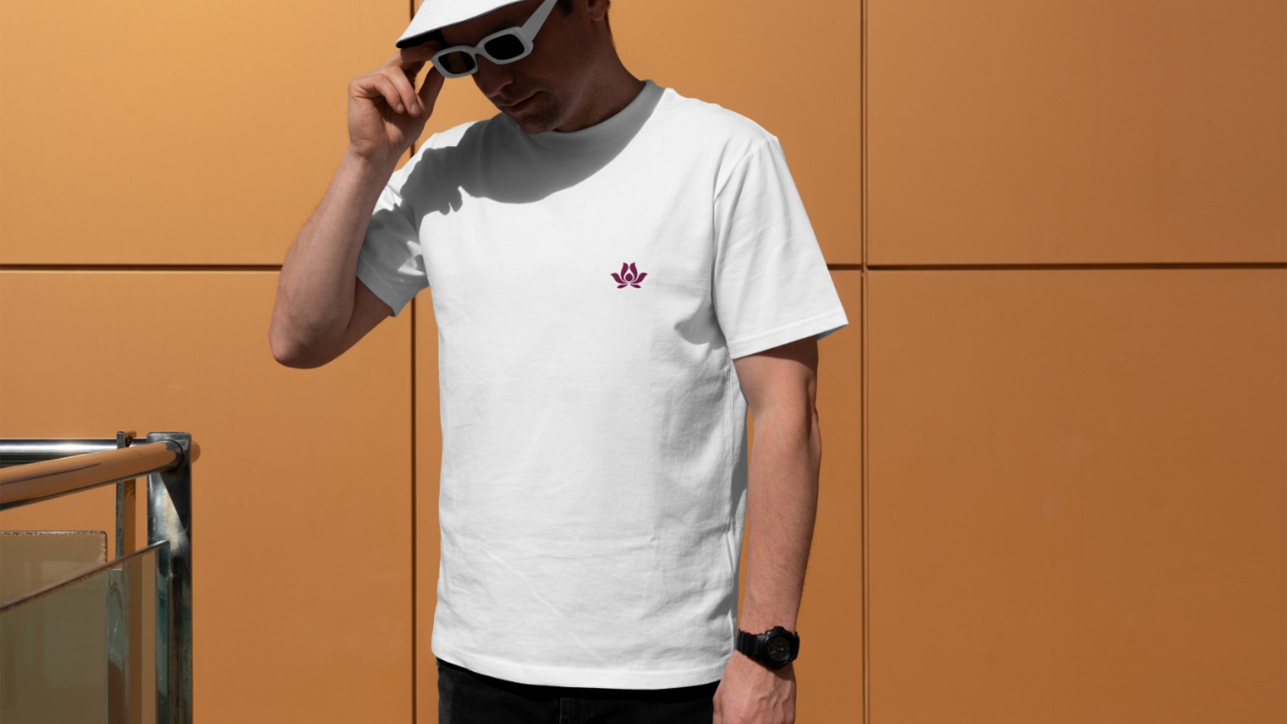
The logo offers strong recognition and artistic range across the hotel's brand system: Spaces: lobby backdrops, key cards, embroidered linens, and fragrance packaging; Communications: brochures, invitations, website, and social media; Craft: hot-foil stamping, embossing, screen printing, or brass plaques on premium materials; Motion: petals slowly bloom as an opening animation, symbolizing "the unfolding of the mind."
brand meaning
The stillness of the lotus lives in the heart; the form of the flower merges with its setting. Through the lotus, the logo gives the hotel's spirit three meanings: Natural beauty: six open petals symbolize the balance of heaven and earth; Inner calm: open space along the central axis, steady as a breath; Spatial philosophy: Eastern simplicity shaped into modern elegance. The spirit of LOTUS RESIDENCE: "Make every stay a place to restore the mind."
Improper Usage (Protection Specification)
Do not alter petal quantity or proportions; do not replace primary color with other palettes; do not add shadows, 3D effects, or gradients; recommended minimum display width ≥ 25mm.
design results
Since the new Lotus Residence logo launched, it has established exceptional recognition in the boutique hotel and luxury resort markets. Its visual system, crafted through 'Eastern imagery × modern order,' has become a core brand asset. The logo's visual warmth and spatial philosophy have earned unanimous praise from the design industry and hotel clientele. This case represents one of Qingmei Future's signature works in Eastern hospitality aesthetics × spatial branding × spiritual imagery visualization, demonstrating the brand philosophy that 'stillness is a form of luxury; simplicity is a form of power.'