










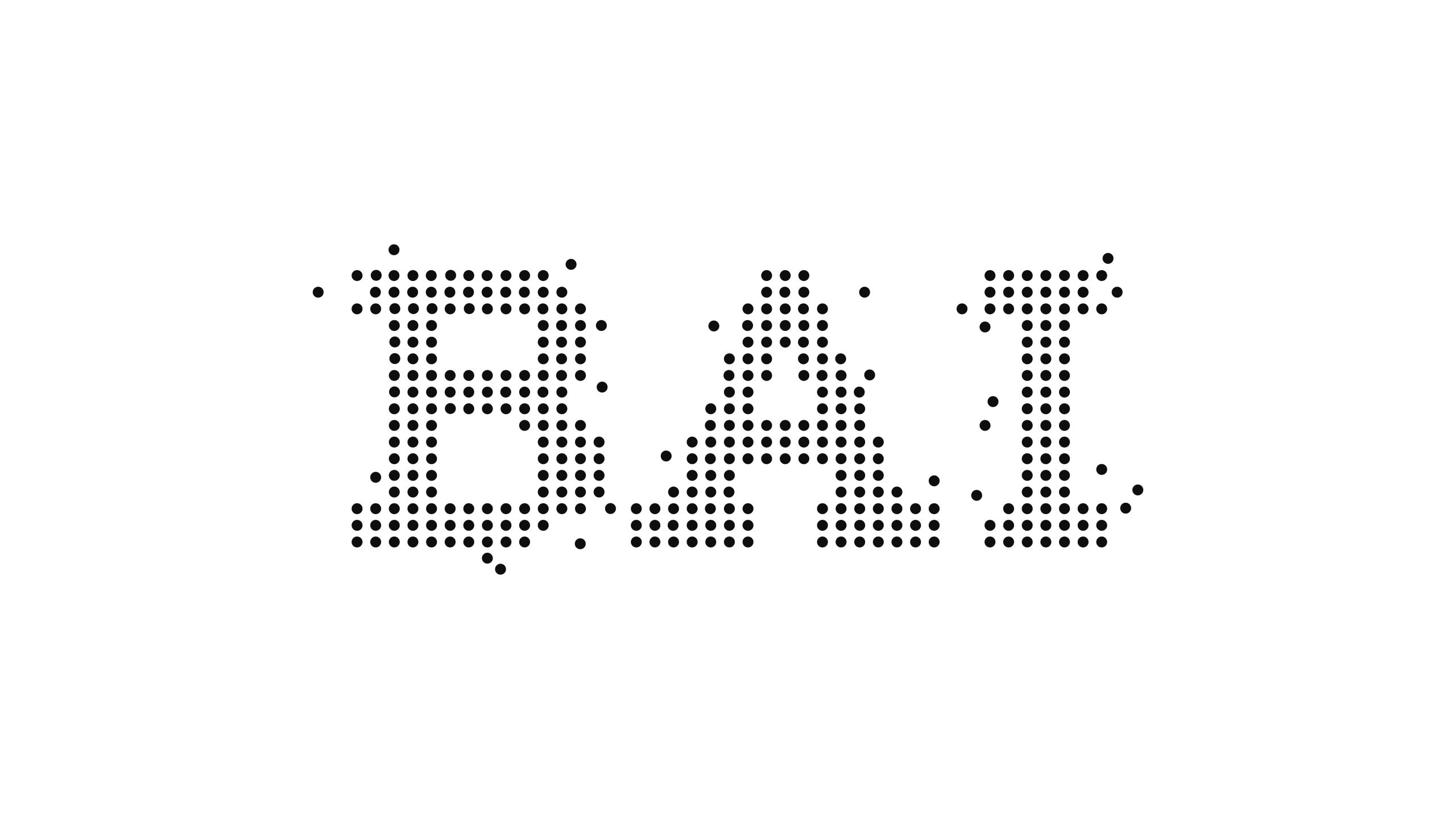
BAI is an innovator in AI algorithms, data intelligence and cognitive computing. Its name stands for “Beyond Artificial Intelligence.”
In the rebrand, the core goal was to make “intelligence visible” and “information fluid” through visual language, creating a symbol with the qualities of digital life so that technology is not merely rational but carries the warmth of thought.

design concept
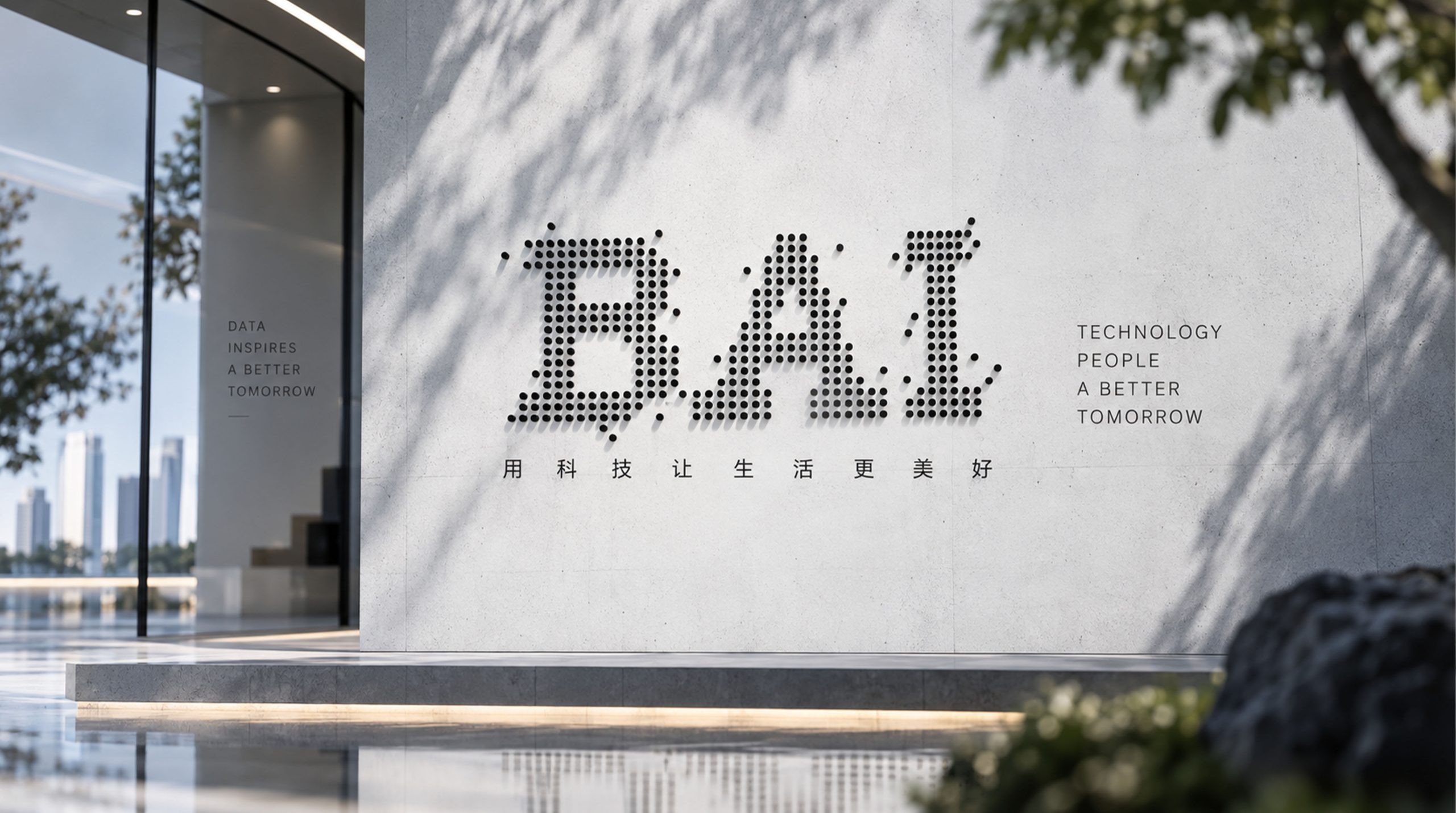
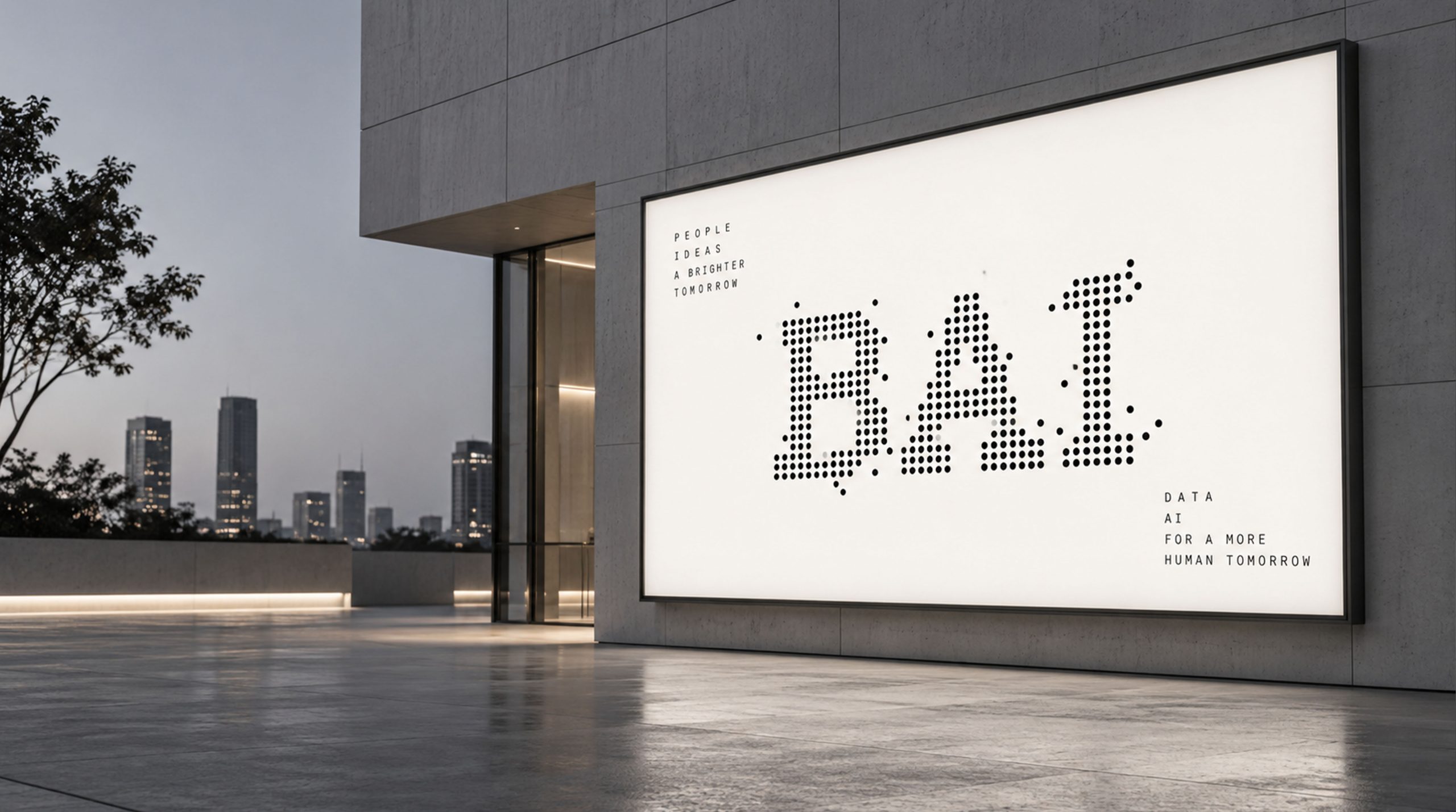
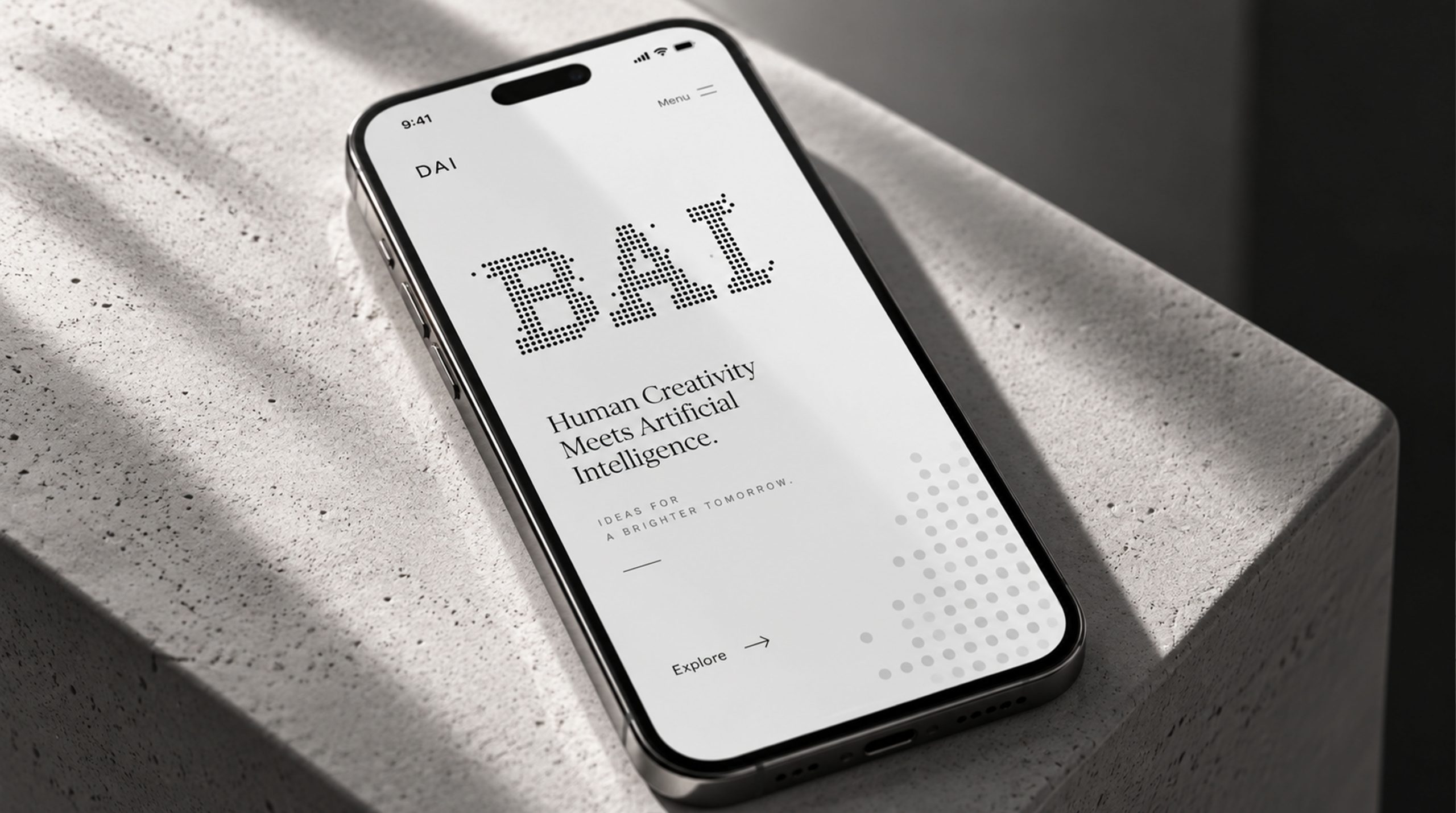
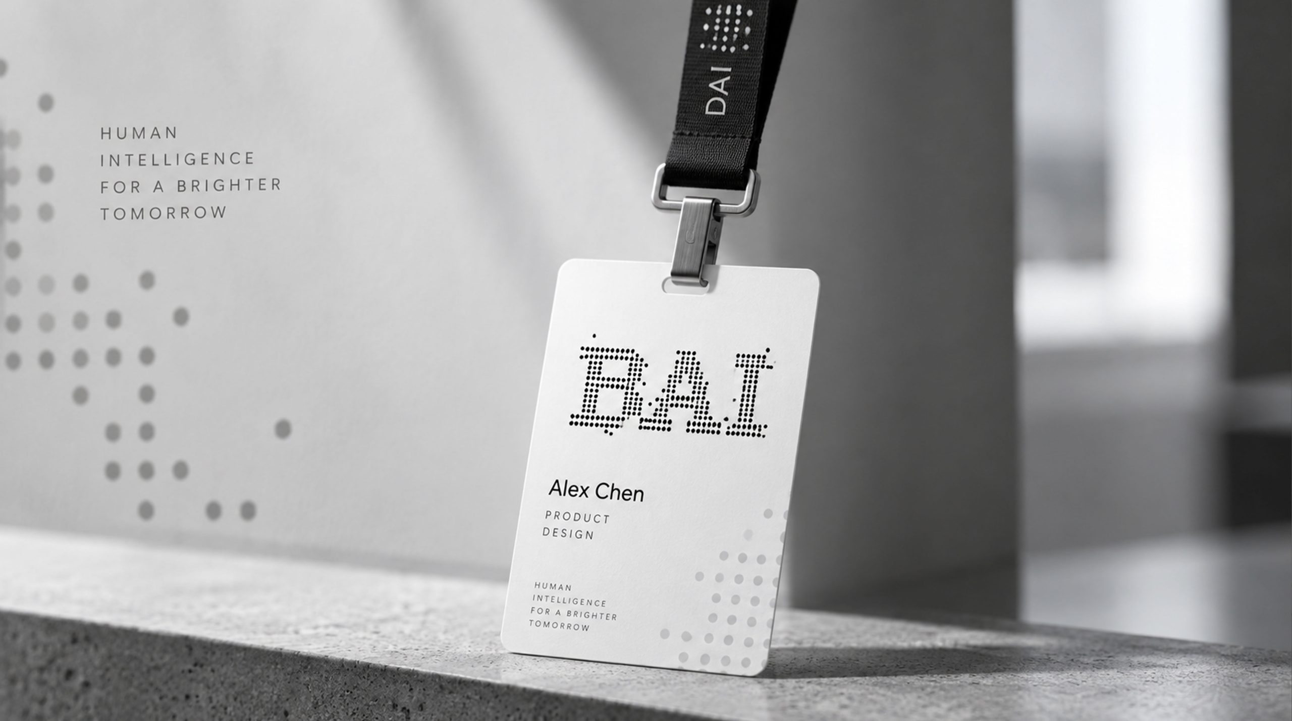
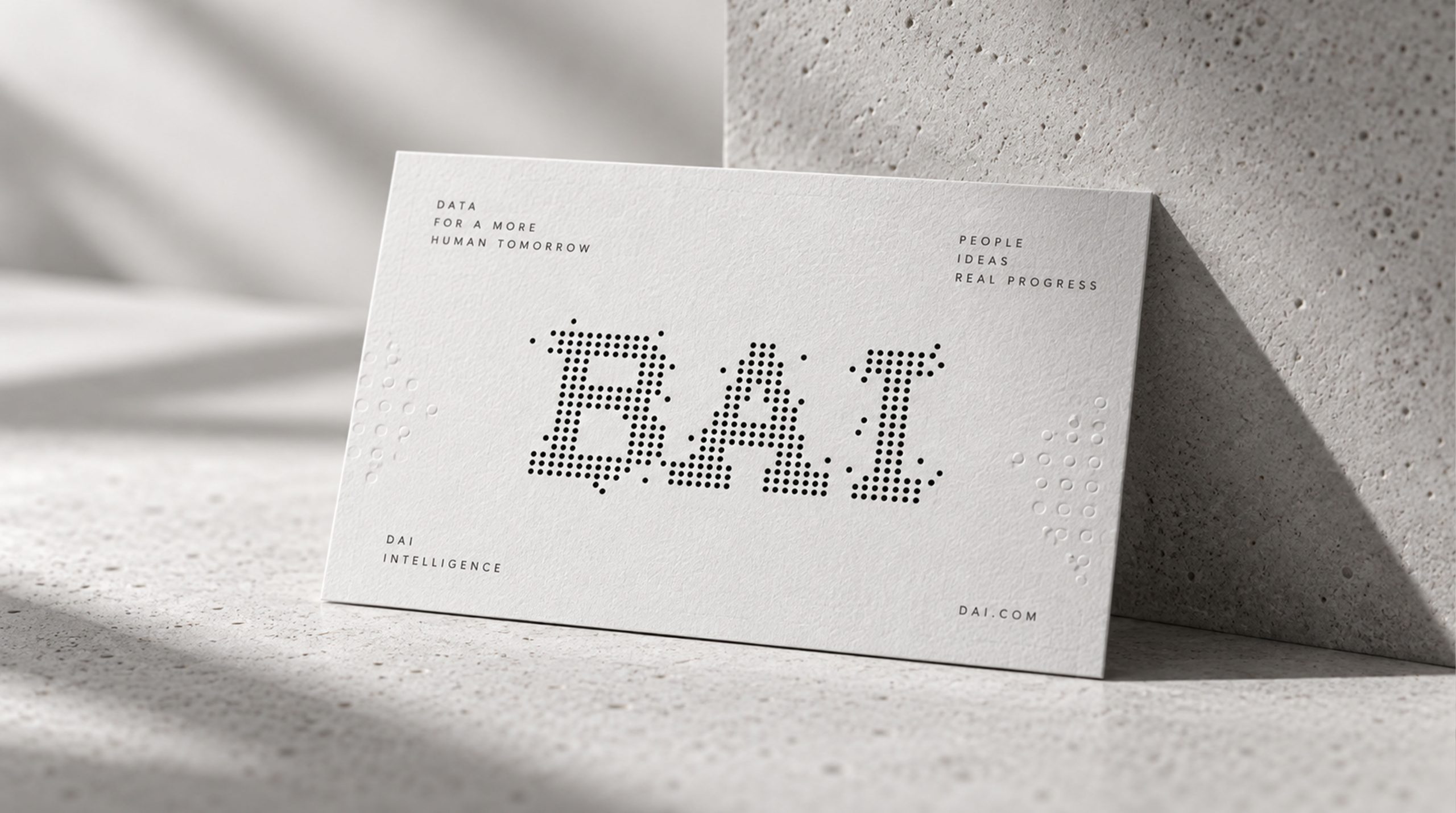
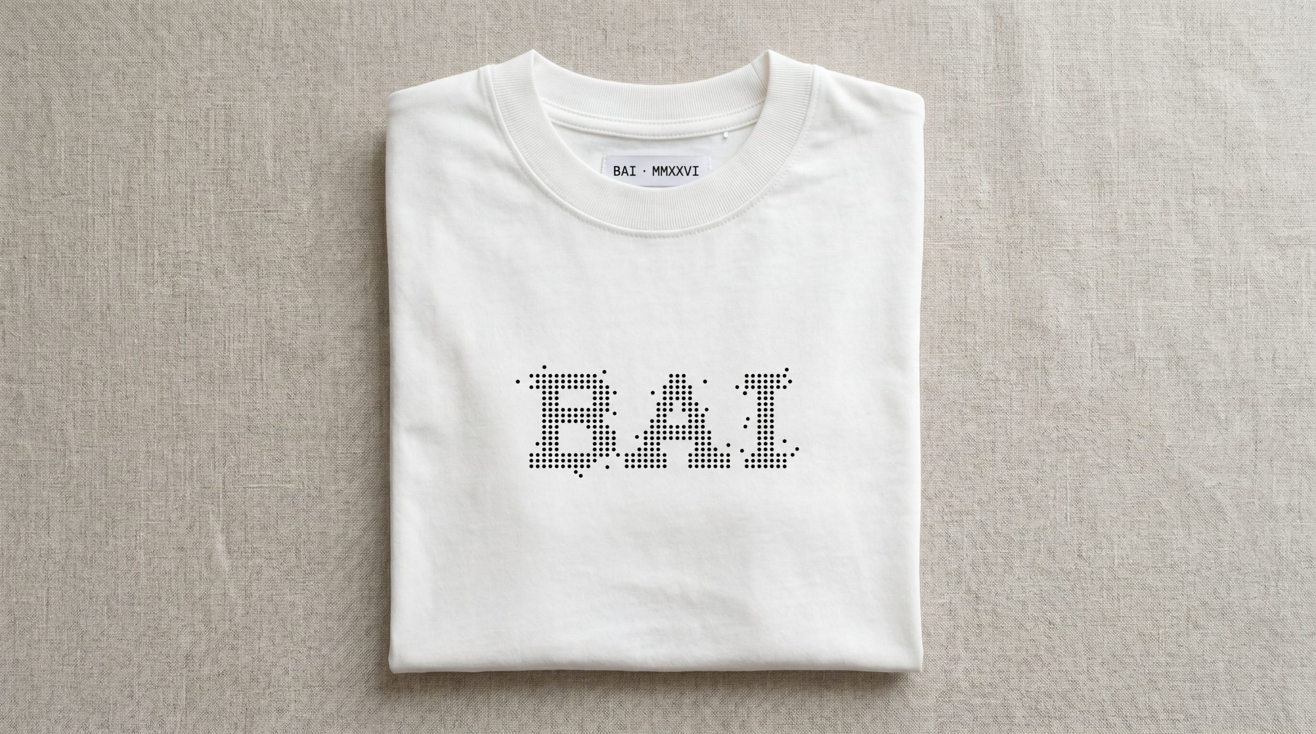
The letters “BAI” are built from data points, using the logic of a dot matrix to represent the basic unit of the data world. Each dot is both a data node and a micro-unit of machine cognition. The letterforms retain the outline of a classic serif, hinting at the meeting of human reason and machine logic. The core idea: make intelligence tangible; make the future perceptible.
graphic language
Dot-matrix structure: letterforms built on an algorithmic grid, forming a pixelated visual language. Hierarchy: variations in dot density mimic weight distribution in neural networks, signaling the intensity of information. Dissolving edges: dots grow sparser toward the perimeter, suggesting data spreading and extending through space. Dynamic meaning: latent energy within stillness, reflecting AI’s continuous learning and self-iteration.
Fonts and composition
The BAI wordmark uses a custom dot-matrix serif that fuses classical structure with digital grammar. Sturdy letterforms and precisely calculated spacing balance a technological feel with legibility. It can appear static or animated across media: the static version stands for a stable algorithmic system, while the animated version serves as an “intelligence activation” motion effect.
color system
Primary Black #000000 represents technological rationality, the unknown and the boundless space of deep learning; secondary Light Gray and White #EAEAEA / #FFFFFF symbolize light, cognition and the birth of insight; and optional accent Blue Violet #5A5AF5 is used in digital interfaces to heighten a cool, futuristic tone. The minimal black-and-white palette emphasizes the order and power of the dot matrix.
Application and extension
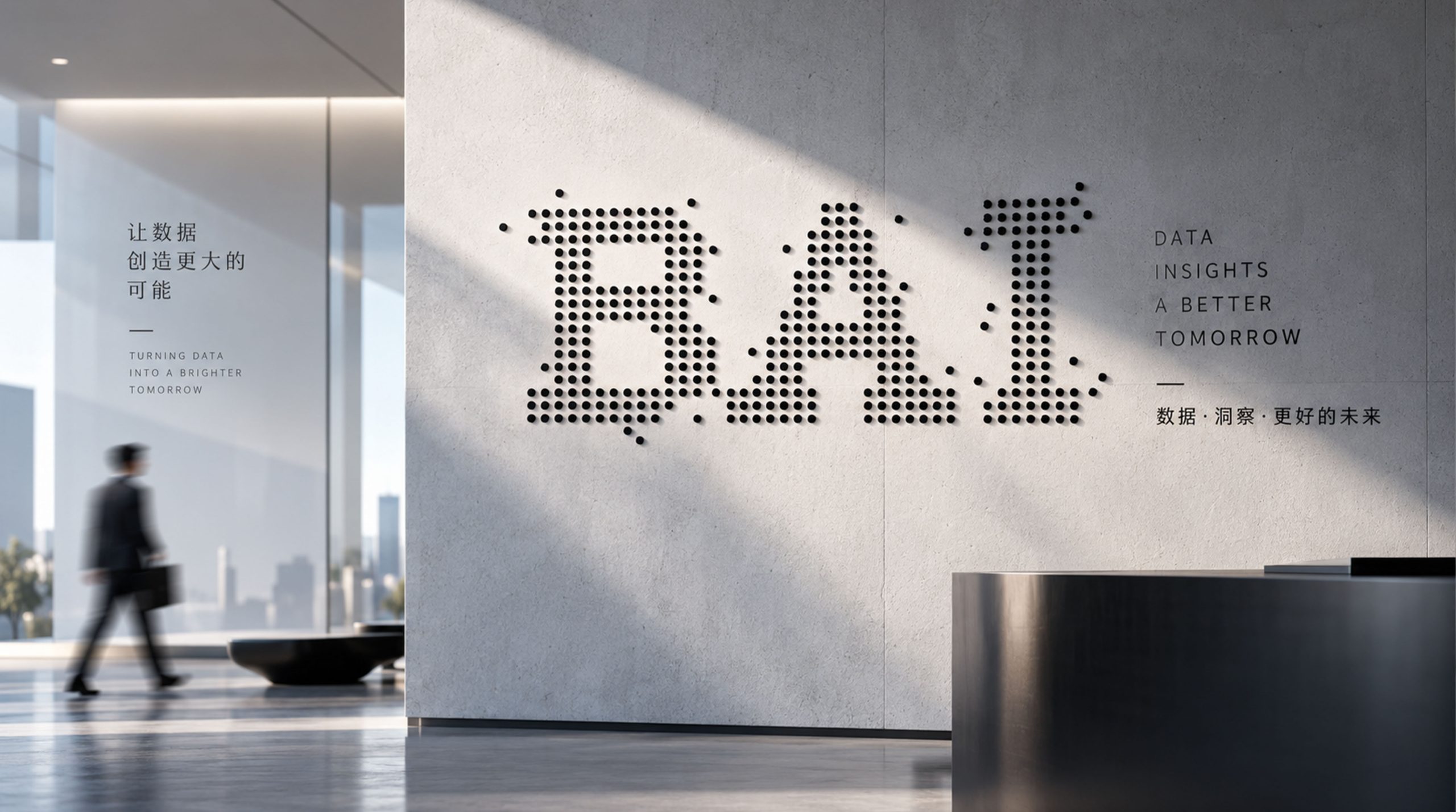
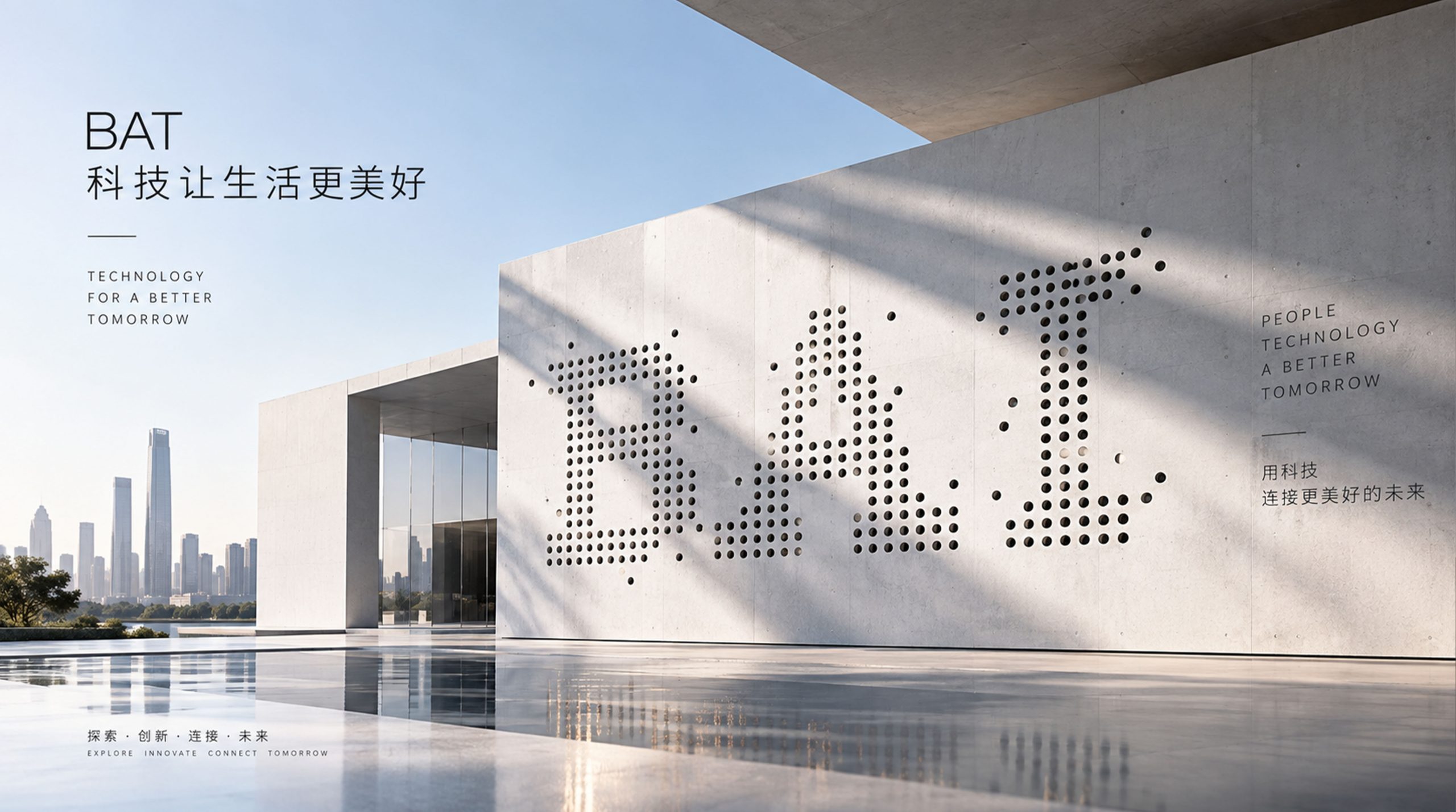
The mark is highly adaptable in digital media. Algorithm visualization: it can extend into data-point animations that simulate AI computation. Product interfaces: splash animations, loading indicators and recognition watermarks for AI systems. Spatial wayfinding: it can become illuminated dot-matrix installations that bring the intelligent network into physical space. The dot system also serves as a visual master template for brand graphics, exhibition design and data report covers.
brand meaning
The mark represents “the microstructure of intelligence” and “the generative logic of technology.” Each dot is a piece of data, an act of learning, a moment of cognition; together the dots form the consciousness of intelligence; and the shift from dense to sparse traces an algorithm’s journey from input to evolution. It turns intelligence from an abstract concept into a tangible image, embodying the brand’s mission: give data a mind, give technology a soul.
Improper Usage (Protection Specification)
Do not alter dot density or letter proportions. Do not add gradients, outlines or distracting colors. Do not use the black dot matrix on busy backgrounds. Recommended minimum width: 40 mm.
design results
Since launch, the BAI mark, with its distinctive visual language of “rational order × emotional tension,” has become an emblematic symbol in the AI industry. Its dot-matrix system brings a strong sense of the future and technological texture to international AI exhibitions and brand communications, while remaining highly extensible and systematic. It is one of Qingmei Future’s signature projects in algorithmic aesthetics and the visualization of intelligence.