










A diversified group focused on urban development, asset investment and intelligent spaces.
Through its rebrand, the group sought a minimal visual language to express a philosophy of building with stability, progressing step by step and defining value through structure.
The logo uses abstract geometric order to reflect architectural logic and business discipline, giving the brand a dignified, timeless presence as it expands internationally and engages with capital markets.
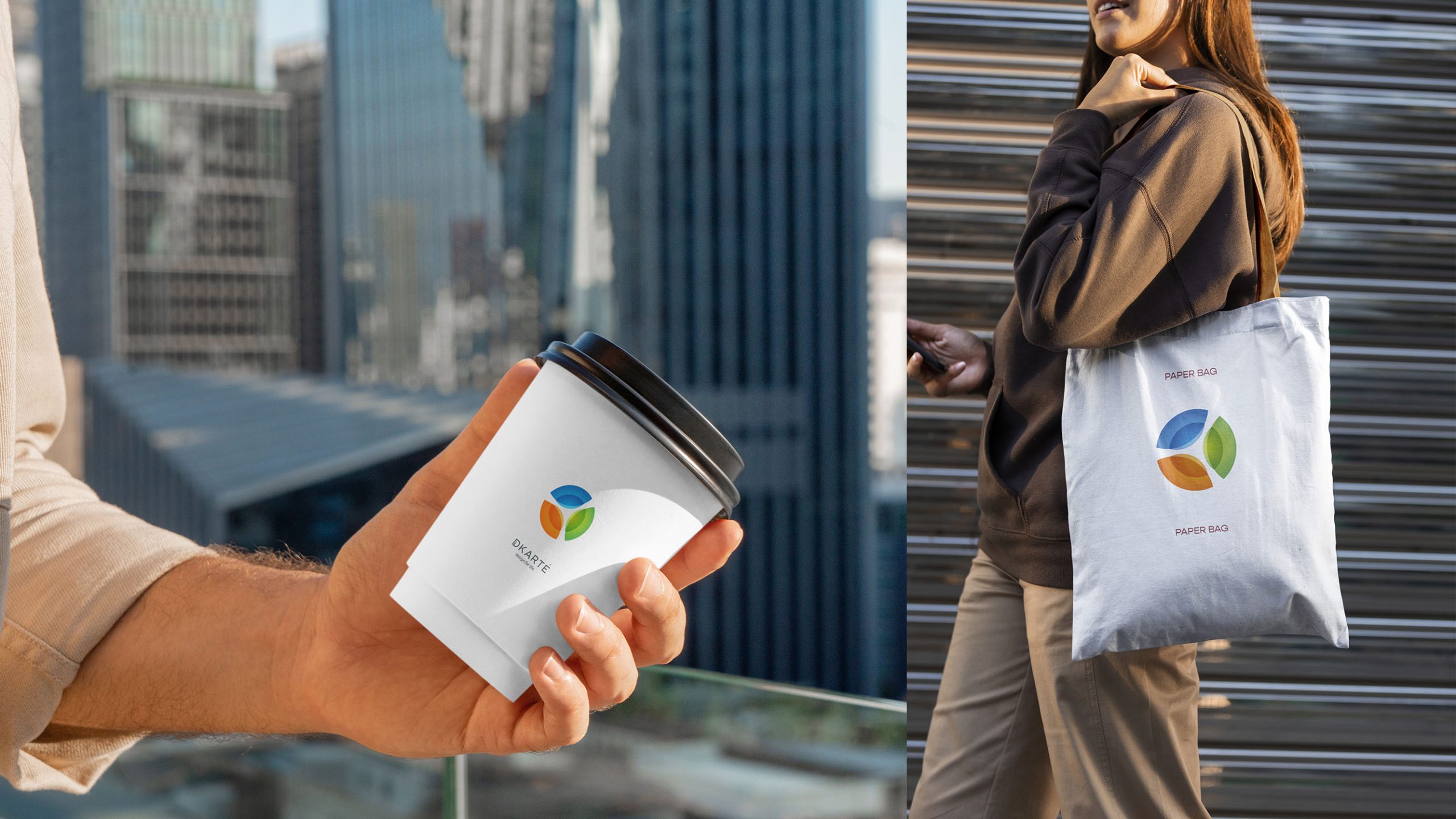
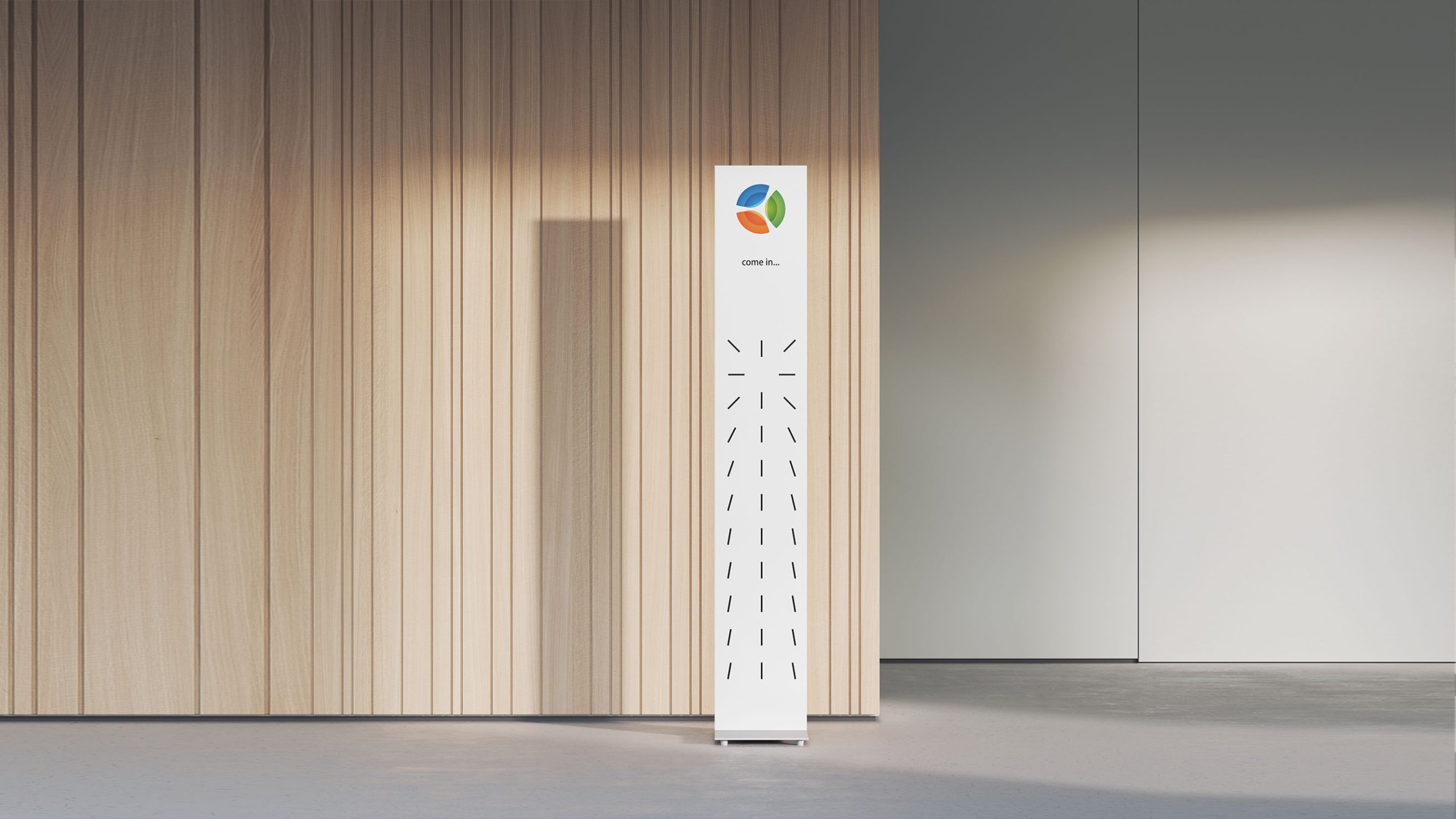
design concept
Structure, order and strength form the core of the design. An array of parallel, angled rectangles creates a symbol that recalls both an architectural facade and a financial chart. Each element represents a core business division; together, they convey growth, stability and ambition. The design follows a clear principle: reason shapes form, and form carries meaning.
graphic language
Core structure: Four groups of parallel diagonal lines create a stable geometric framework, representing collaboration and shared progress across the group’s businesses. Upward direction: The rising angle conveys growth and momentum. Spatial order: Precisely calculated spacing establishes rhythm and architectural openness. Visual metaphor: The form can read as either a building facade or a data chart, combining discipline with movement.
Fonts and composition
The symbol leads the identity, with a modern sans serif such as Helvetica Neue or Gotham used alongside it as required. Balanced horizontal and vertical strokes echo the logo’s geometric construction. Dark gray or a black-and-gold palette is recommended to maintain a professional presence across architecture, finance and investment.
color system
Primary sand gold-brown #A08E7A signifies stability, value and permanence. Supporting deep gray #4C453D conveys discipline, expertise and trust. Neutral off-white #F4F3EF provides space and visual clarity. Inspired by architectural stone and the sheen of metal, the palette celebrates structural beauty and the authentic character of materials.
Application and extension
The logo adapts across media. In architecture and interiors, it works on office facades, wayfinding and engraved door signs. In finance and investment communications, it provides consistent recognition on report covers, brand manuals and equity investment materials. On websites and mobile platforms, the lines can animate into view and rise, expressing a vision of continued growth. The geometric framework also provides a basis for backgrounds, business card textures and workplace interiors.
brand meaning
The four groups of parallel lines represent the company’s core values: Stability, Structure, Integrity and Future. Together, they express a belief in building trust through structure and opening the future through order. The logo also embodies a way of thinking: a structured approach to shaping the company’s view of the world.
Improper Usage (Protection Specification)
Do not alter the line angles or spacing ratios. Do not replace the original palette with highly saturated colors. Do not add shadows, gradients or three-dimensional effects. Recommended minimum display width: 25 mm.
design results
Since its launch, Structure Group’s new identity has been applied across architecture, real estate and capital investment, establishing a cohesive and highly recognizable visual language. Its geometric order and disciplined aesthetic have been praised as an architectural approach to modern corporate identity. The project is a signature example of Qingmei Future’s work in translating structural thinking into corporate identity, bringing form, meaning and function together.