










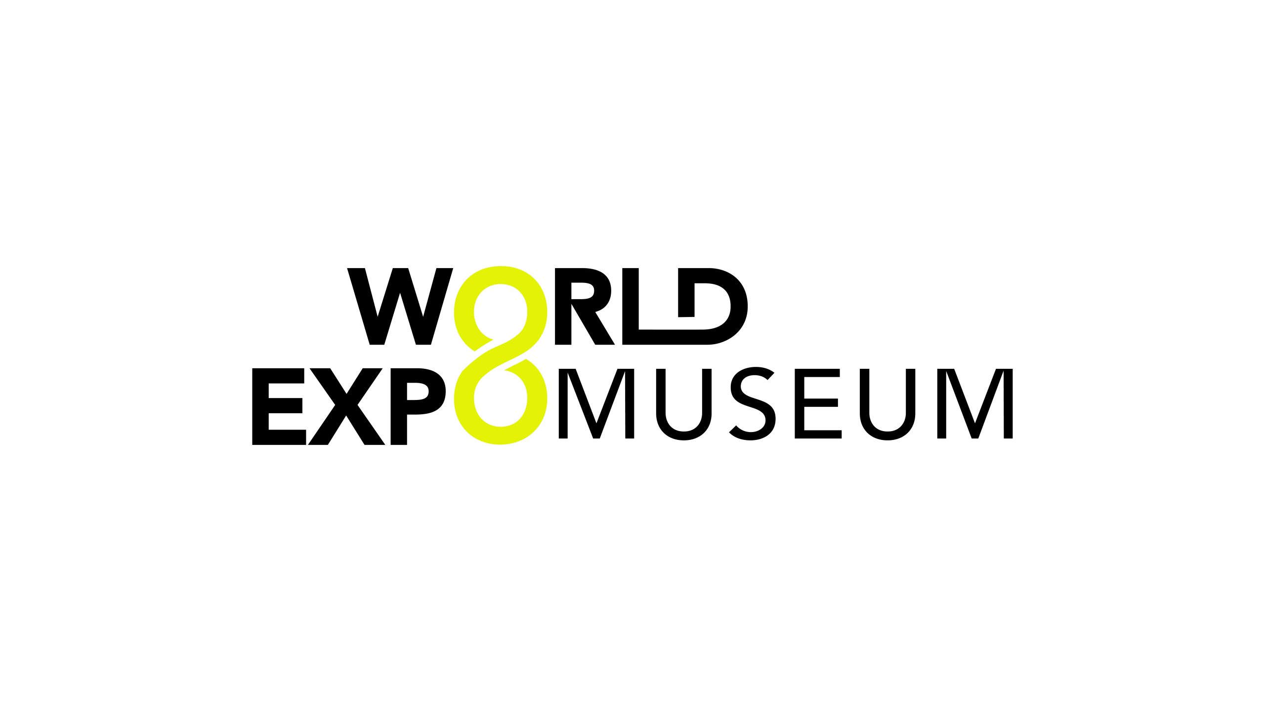
Established jointly by the Bureau International des Expositions (BIE) and the Chinese government, the World Expo Museum is the world’s first official museum dedicated to World Expos.
Its visual identity must communicate a global mission: connecting past and future while bringing together the world’s spirit of innovation.
The goal was to express the Expo spirit of exchange, innovation, inclusion and collaboration in shaping the future, balancing cultural depth, artistic character and international recognition.
design concept
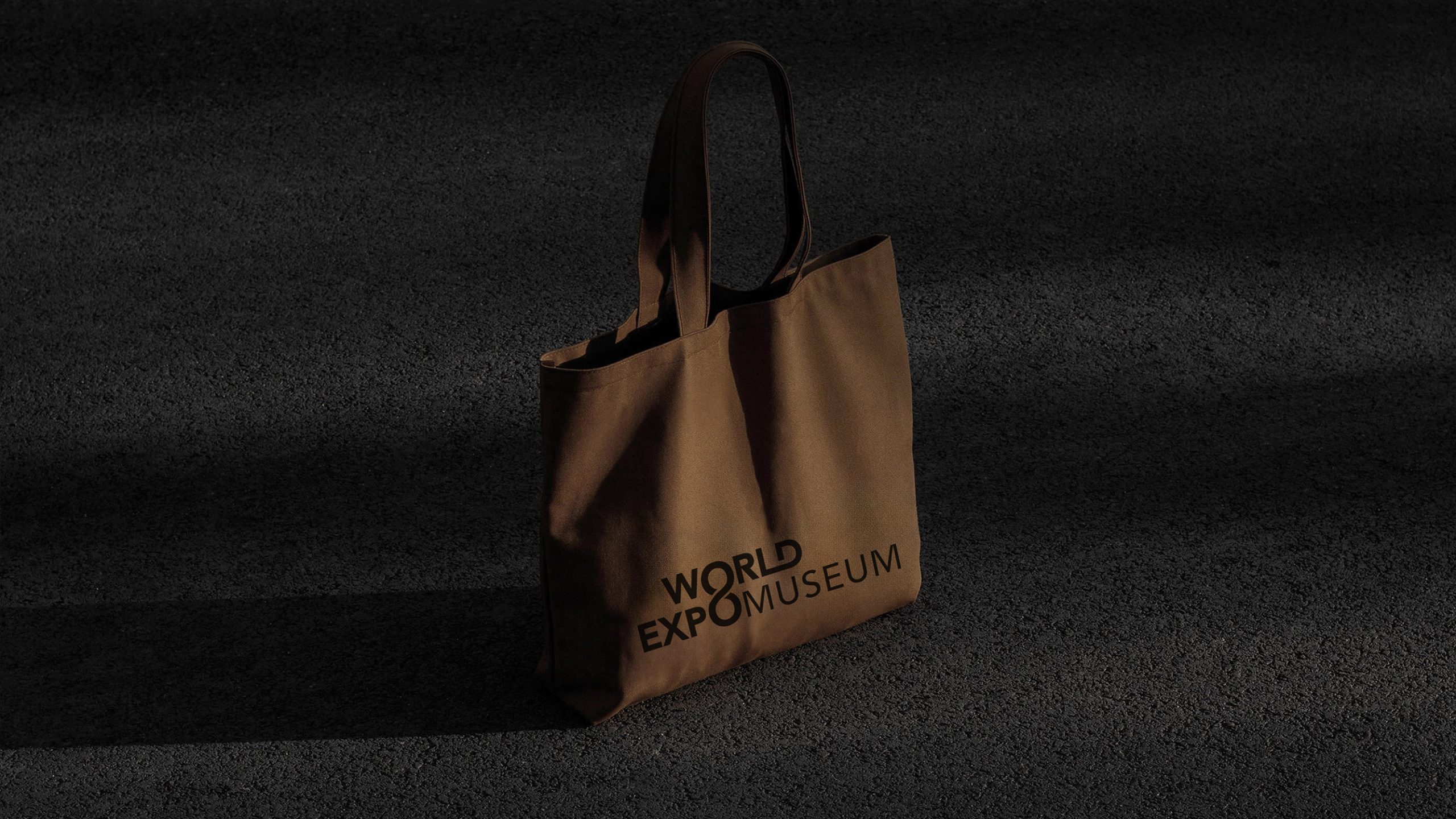
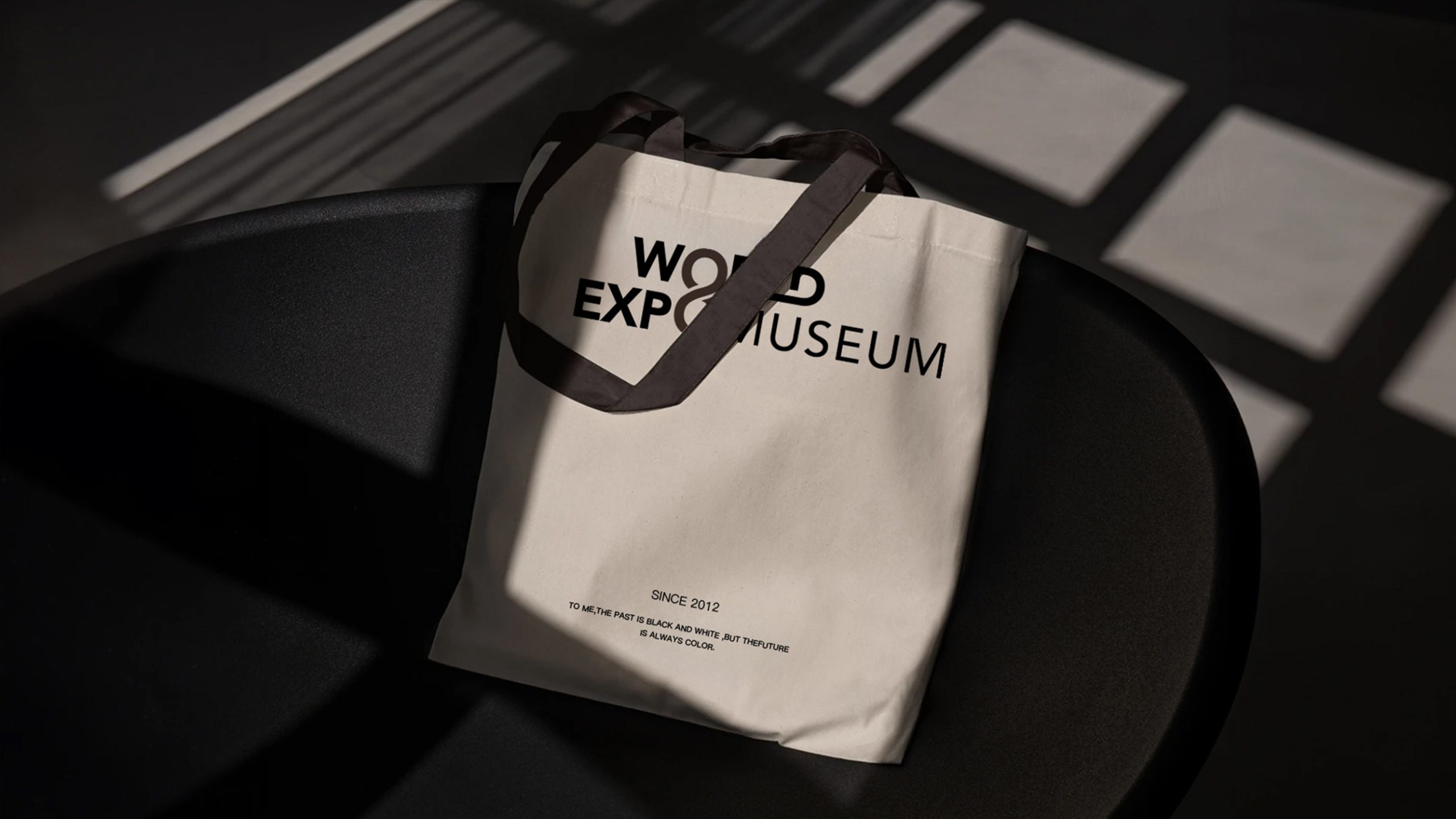
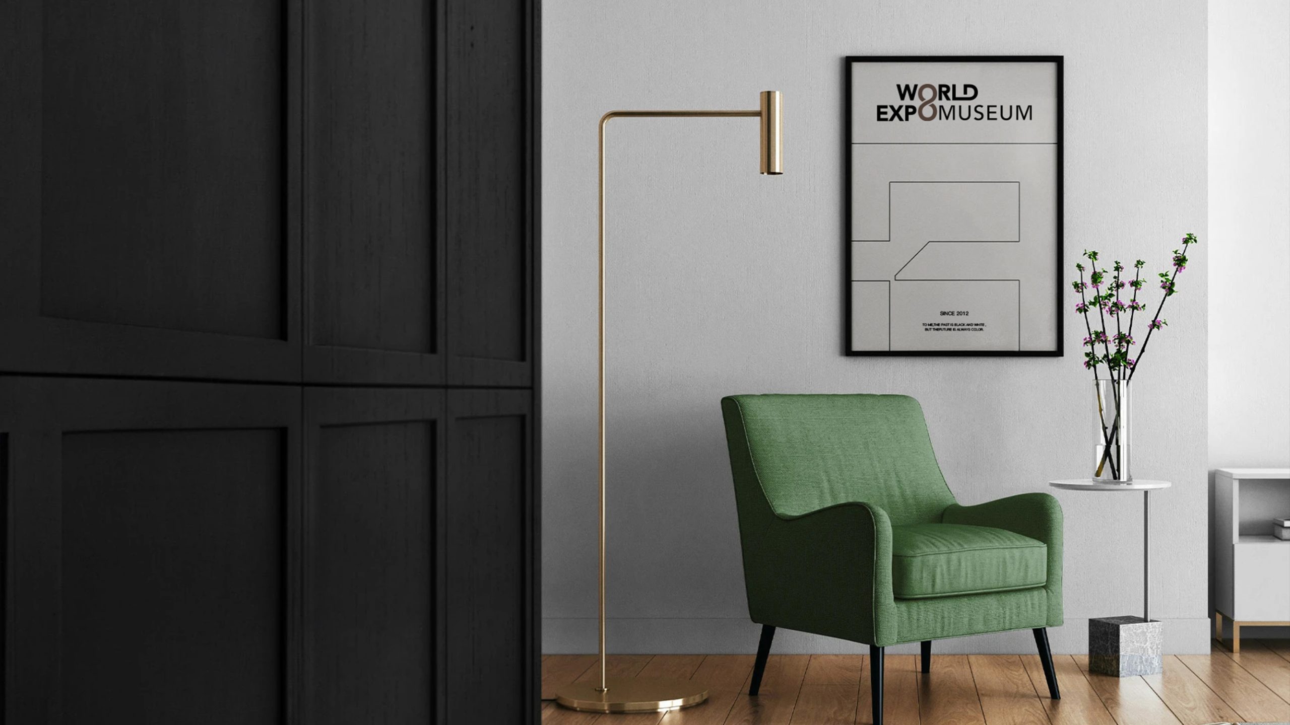
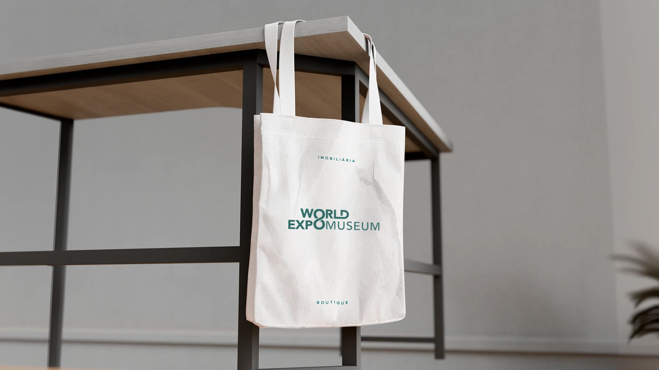
The logo is built around typography, with the infinity symbol, ∞, providing the central idea of connection and limitless possibility within EXPO. An 8-shaped form sits between EXPO and MUSEUM, representing the continuing reach of the Expo spirit and its circulation around the world. The identity presents the Expo as an enduring engine of human creativity, connecting past, present and future through continual innovation and the shared evolution of civilizations.
graphic language
Integrated letterforms: A clean, modern sans serif gives WORLD EXPO MUSEUM a cohesive typographic structure, with the embedded 8-shaped form creating a memorable signature. The 8/∞ motif: Represents limitless cultural exchange and the Expo’s eight key themes. Horizontal layout: Balances stability with openness, conveying institutional authority and an international outlook. Negative space: Black-and-white contrast establishes rhythm and a minimal, contemporary character. Restrained yet full of potential, the logo gives form to innovation, continuity and global exchange.
Fonts and composition
A modern geometric sans serif provides clear construction and balanced strokes, reflecting contemporary design, technical precision and international legibility. Controlled differences in weight establish hierarchy: WORLD EXPO appears in bold as the primary identifier, while MUSEUM uses a lighter weight to create a measured visual rhythm and guide the eye. Chinese and English can appear together, with Source Han Sans or Founder Lanting Hei recommended for a consistent contemporary character.
color system
Primary bright yellow #E8E550 signifies light, energy and innovation, expressing the boundless creativity of human civilization. Supporting black #000000 conveys intellectual rigor, scholarship and authority. White space communicates openness and inclusion while giving the composition room to breathe. The strong yellow-and-black contrast creates immediate recognition, balancing the dignity of a museum with the contemporary character of an international arts institution.
Application and extension
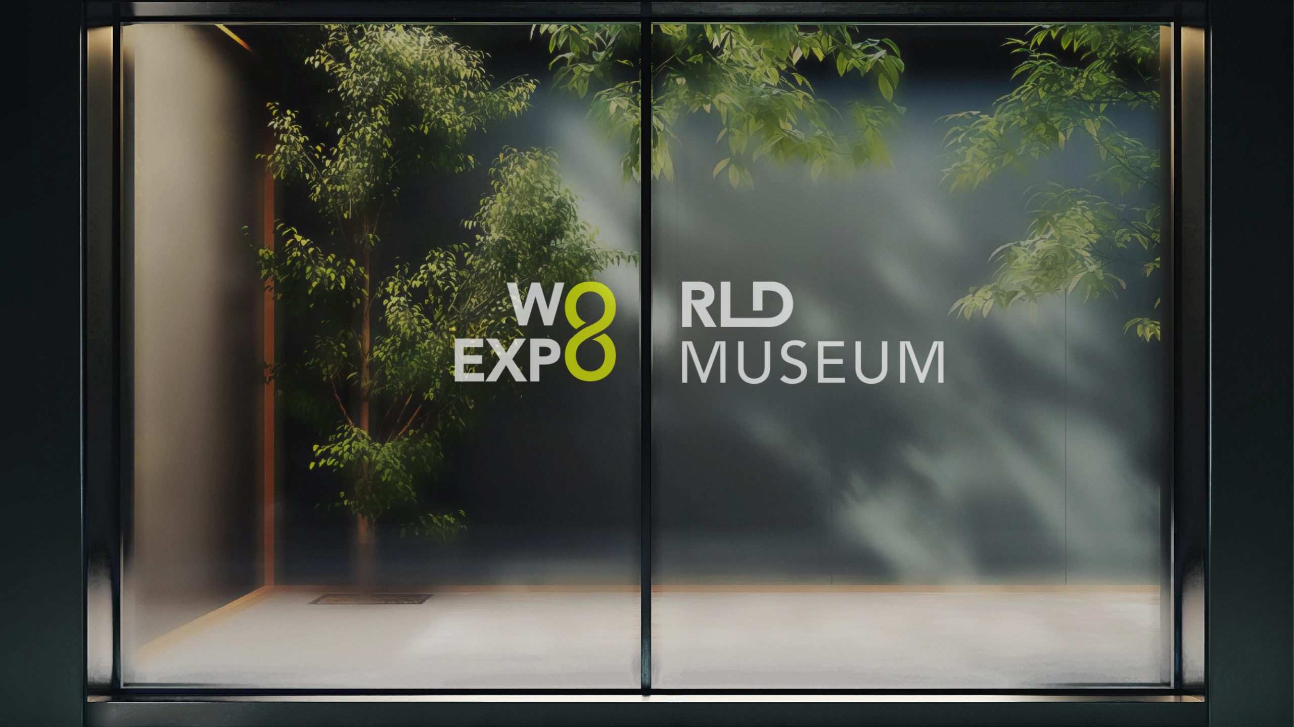
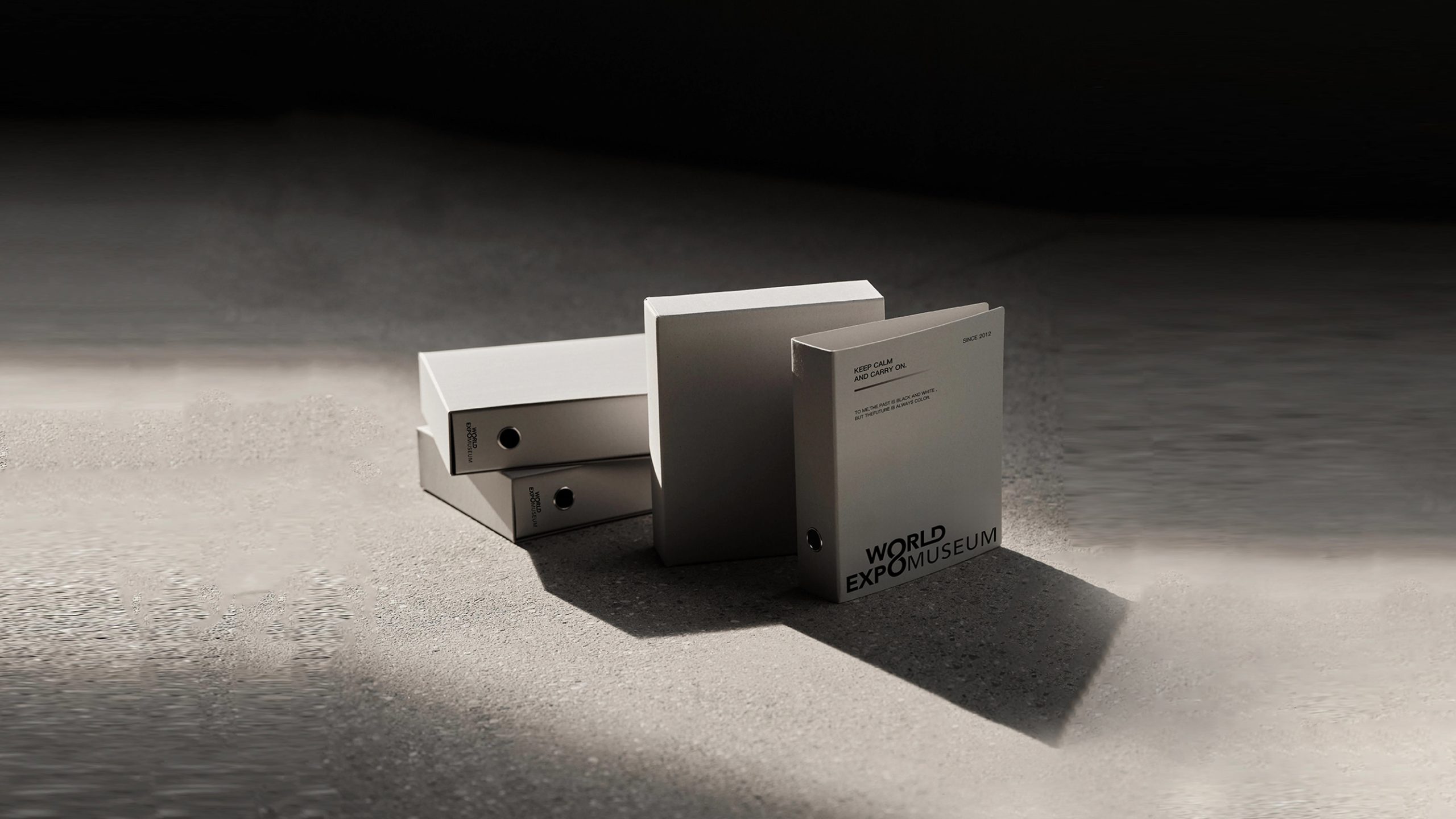
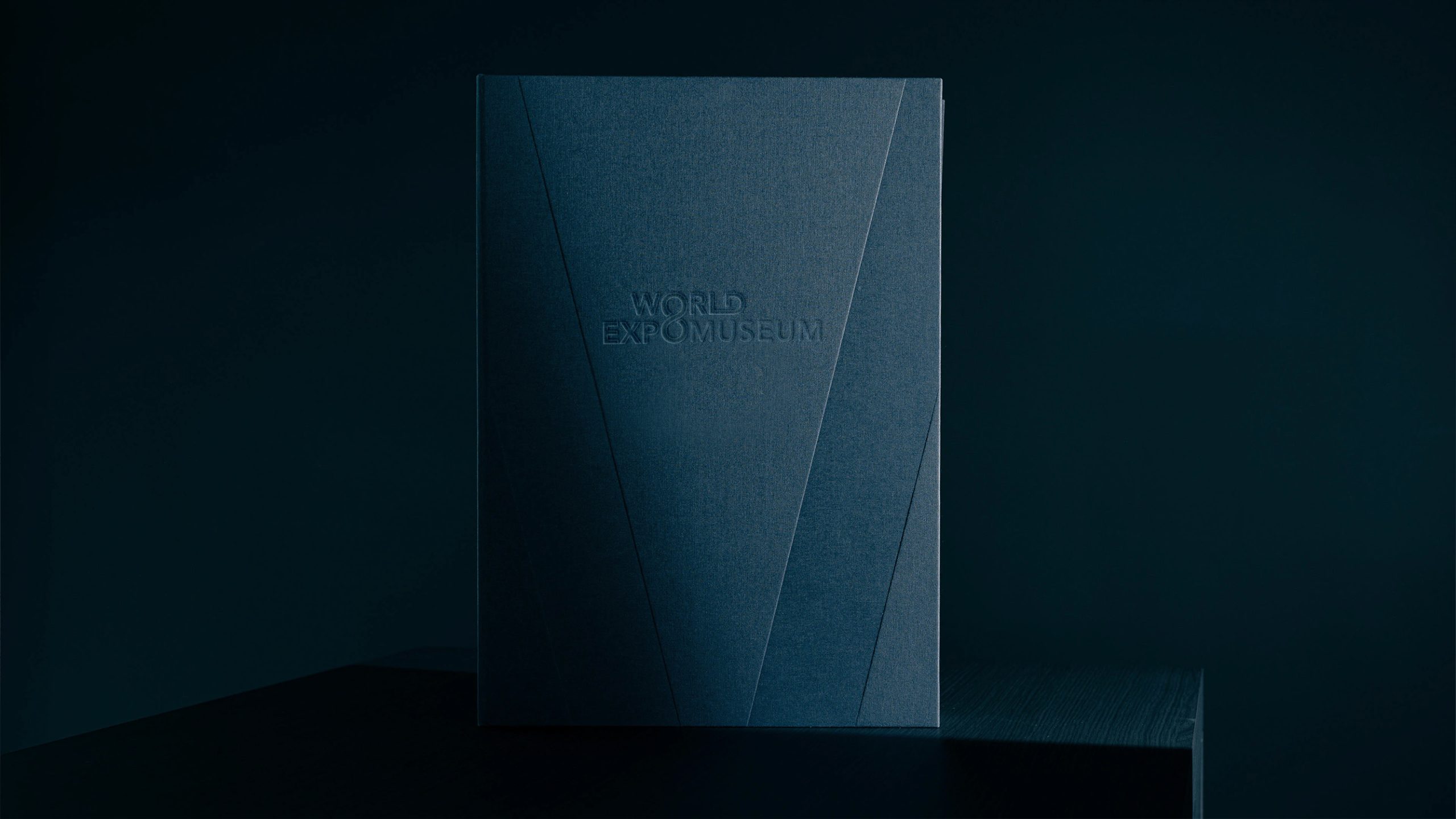
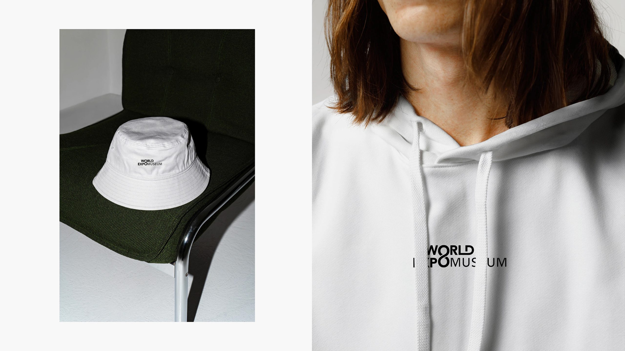
The logo works across exhibition graphics, entrance signage, souvenirs, publications, wayfinding and digital media. The 8/∞ motif can stand alone in animation, spatial installations and merchandize. In digital applications, rotation and fluid movement can express the continuing exchange between civilizations. The identity maintains clear recognition and consistent presentation across print and screen.
brand meaning
The infinity symbol is the logo’s central metaphor, representing the enduring spirit of human innovation and the connections between civilizations. The World Expo Museum is both a place to explore history and a platform for future innovation and cultural dialog. Its identity distills the Expo spirit into four values: Connect | Innovate | Collaborate | Sustain. Together, these establish the museum as a global cultural symbol of human ingenuity in continuous dialog.
Improper Usage (Protection Specification)
Do not change the proportions of yellow and black or reverse the color scheme. Do not alter the position or form of the 8/∞ symbol. Do not add shadows, outlines or gradients. Maintain the specified 1:1.3 typographic proportions; do not compress or stretch the lettering. Minimum display width: 30 mm.
design results
Following the launch, the World Expo Museum’s brand recognition increased by 60% across international cultural communications. The infinity symbol became a core visual asset, appearing throughout exhibitions, tickets, commemorative coins and digital platforms. The design uses a minimal structure to express the continuity of human civilization in a tangible visual form. Qingmei Future now features the project as a leading example of its cultural and public institution identities, offering a reference for museum and cultural identity design worldwide.