










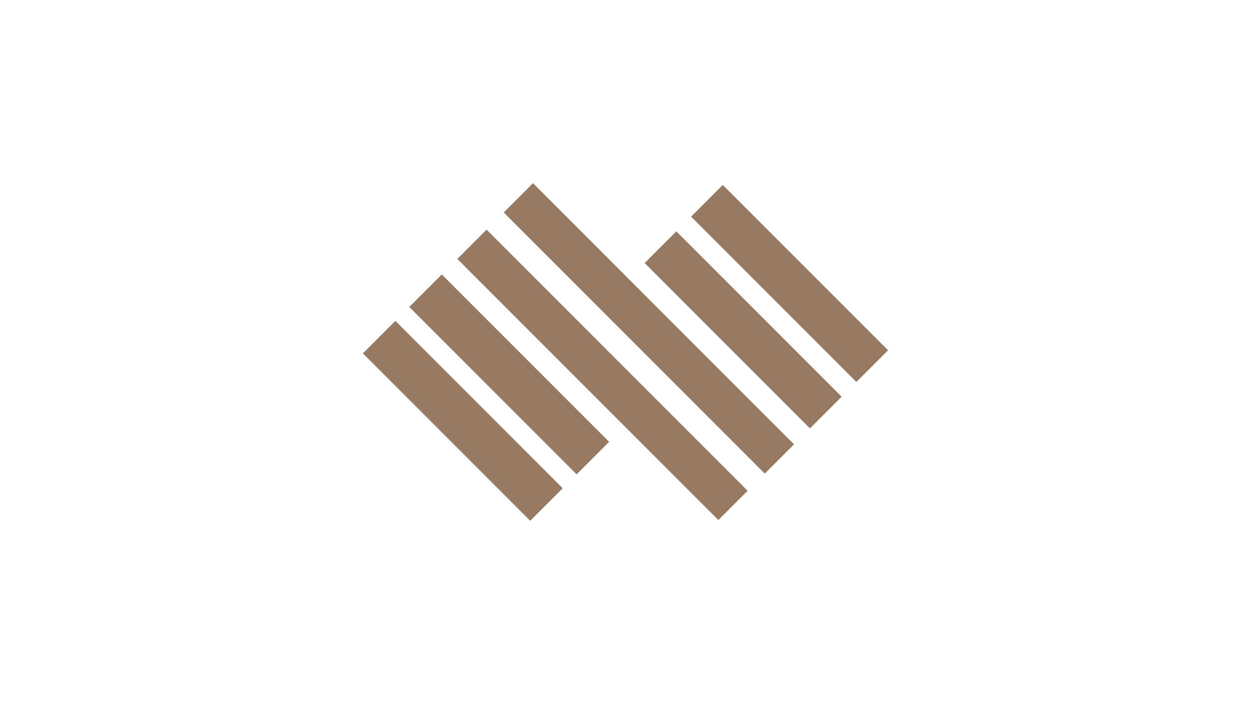
Zhigou Group is a diversified enterprise focused on architectural technology, structural engineering and intelligent manufacturing. As the business evolved, it needed an identity that could convey professional discipline, structural intelligence and the beauty of engineering, supporting its international expansion in construction, urban infrastructure and new materials. The logo uses geometric composition to express the brand’s central belief: building the future through rational thinking.
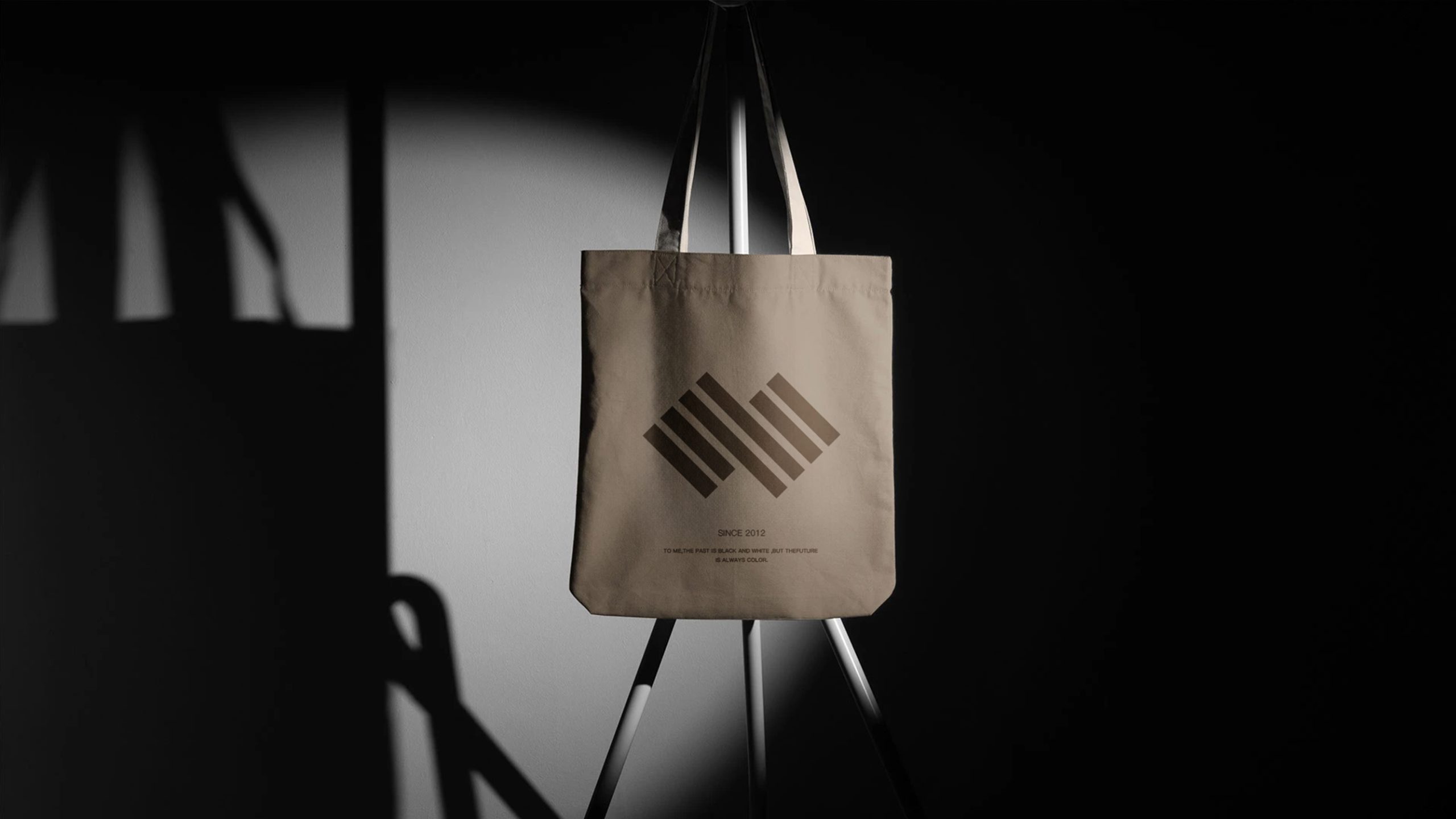
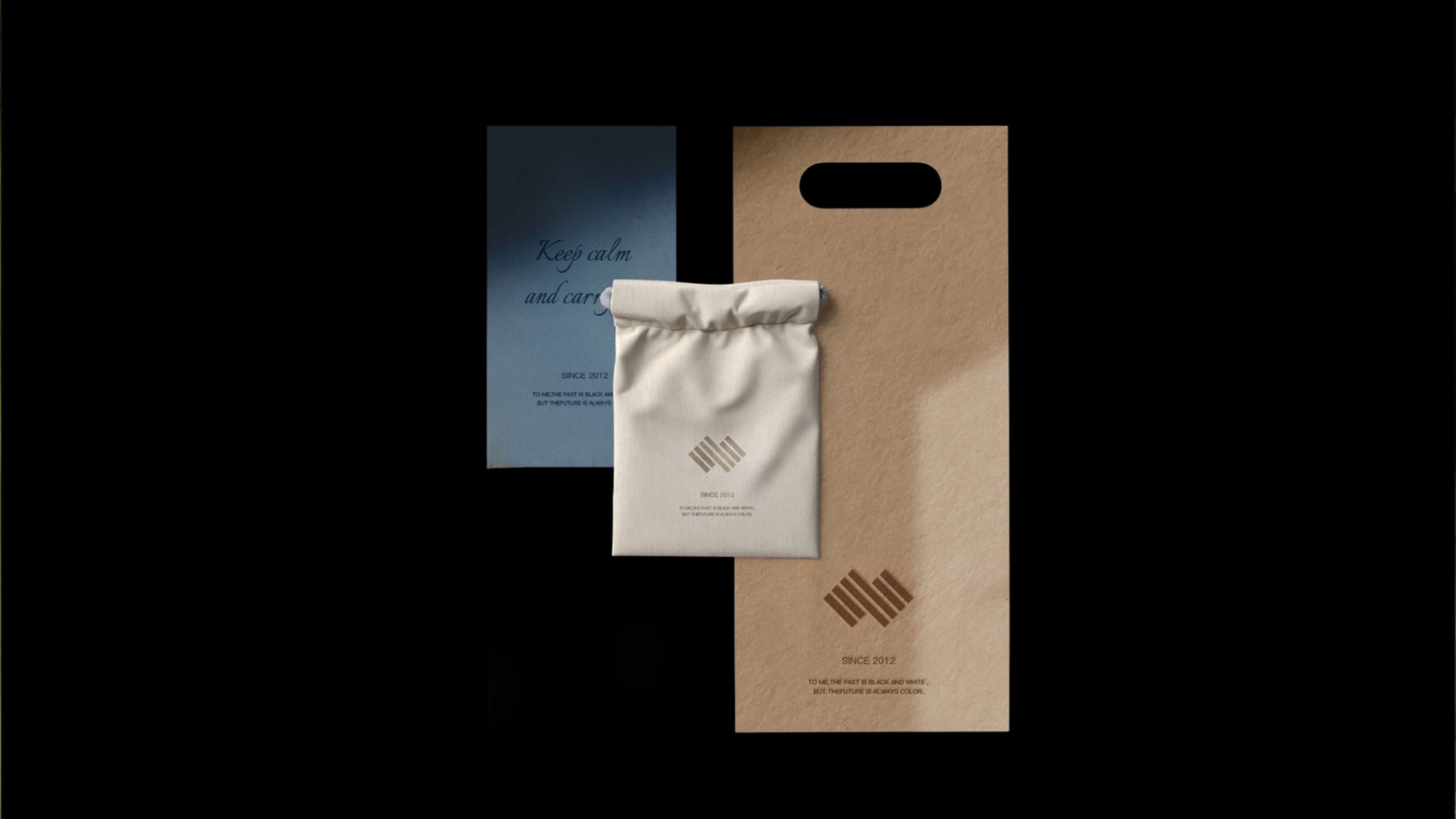
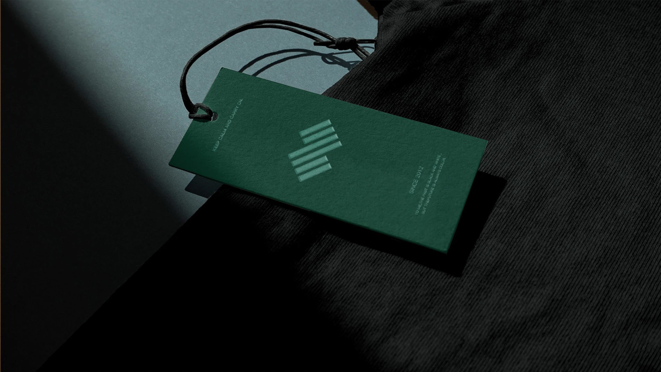
design concept
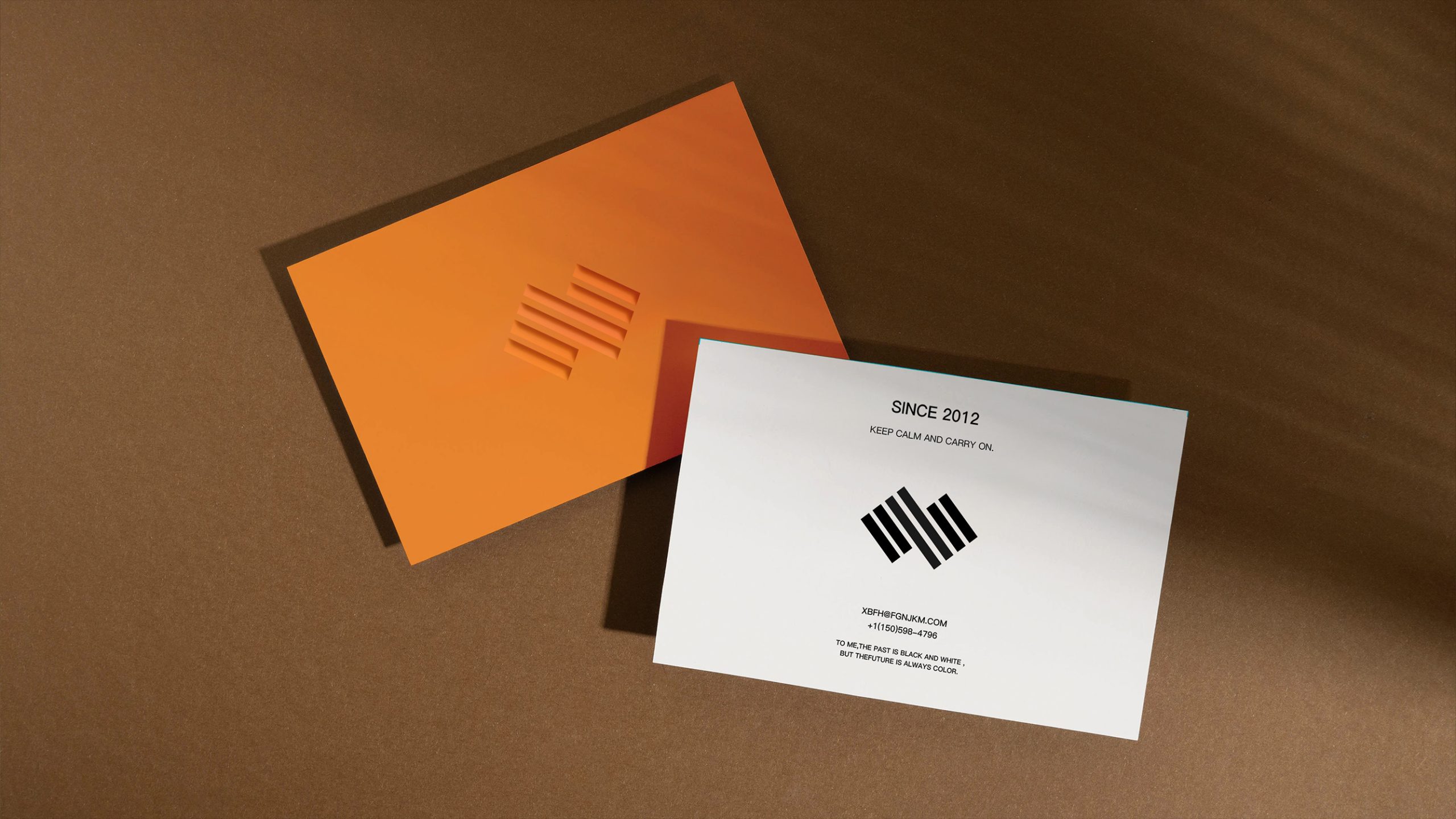
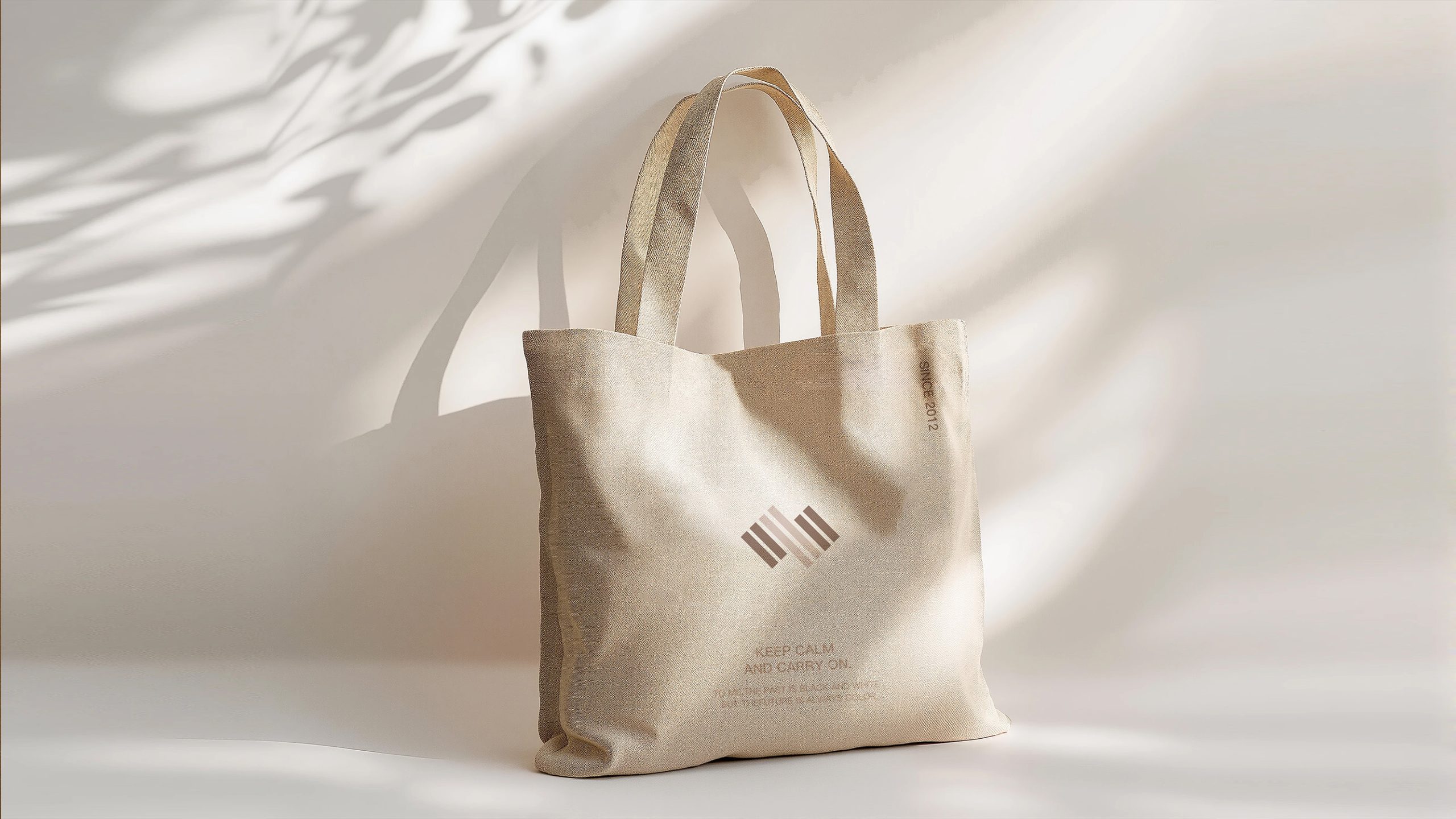
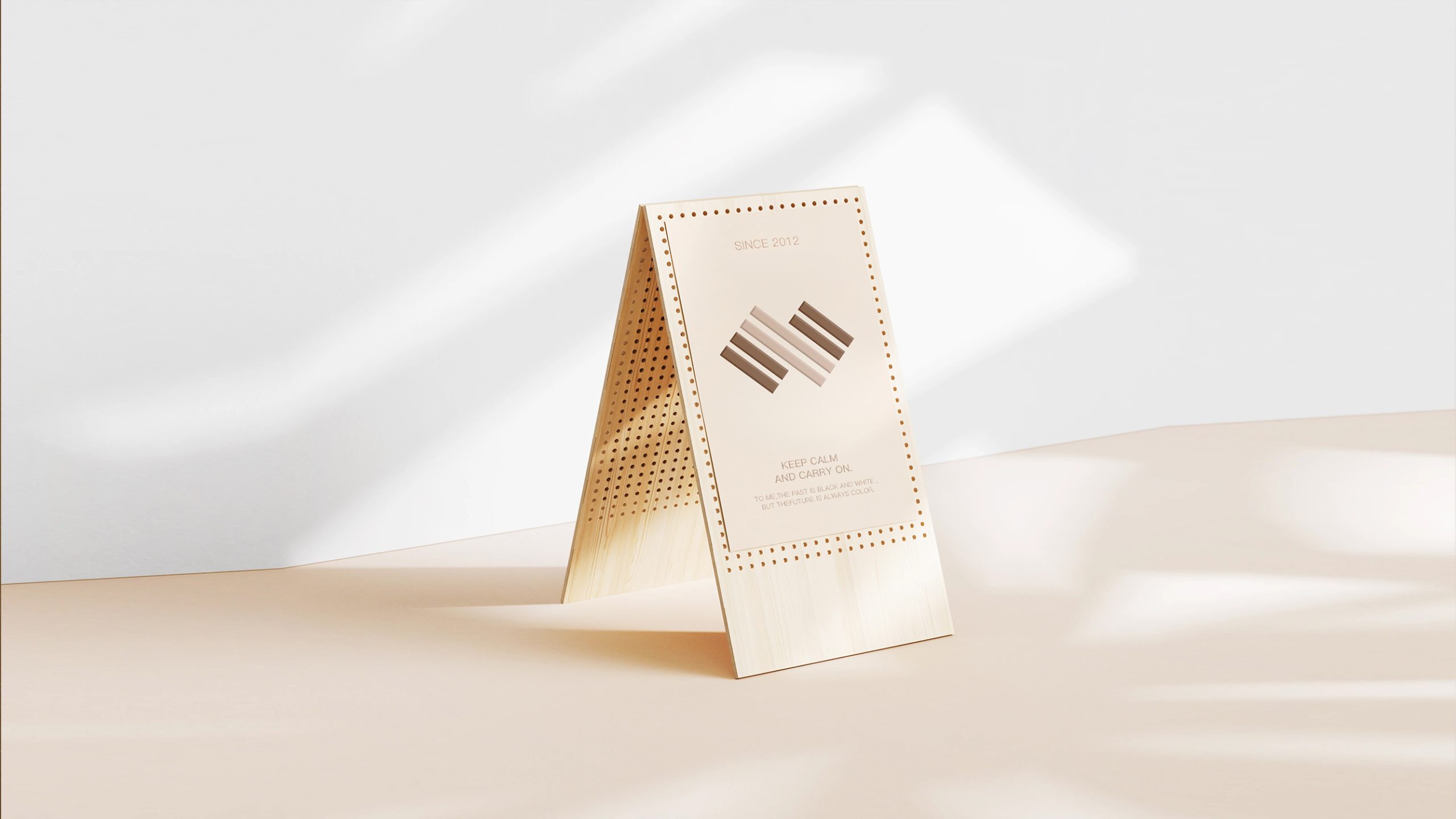
The logo is built around the idea of “structural lines and balanced order.” Five parallel diagonal lines come together to evoke architectural beams, frameworks and systematic management. Their evenly spaced arrangement creates a sense of visual order and stability, while expressing the brand’s philosophy of “intelligent making, building and connecting.” The 45-degree angle suggests continued upward momentum and growth, reflecting the company’s forward-looking role in intelligent construction and structural technology.
graphic language
Parallel diagonals represent structural logic and engineering order. Even spacing reflects systems thinking and process-driven management. The 45-degree angle signals ambition, innovation and a future-focused outlook. The layered lines suggest collaboration between people and technology. Together, they form an abstract “S,” echoing “SmartStruct.” The result combines the presence of architectural structure with the clarity and precision of technological logic.
Fonts and composition
A geometric sans serif such as Helvetica Neue or Harmony Sans is recommended, paired with clean, precisely aligned typography that echoes the logo’s linear structure. Dark gray or graphite black reinforces a sense of professionalism and stability. A Chinese-to-English proportion of 1:0.85 is recommended to ensure a cohesive, international presence across building facades, documents and digital interfaces.
color system
Structural Brown #9B7A60 is the primary color, evoking building materials, reliability and warmth. Silver Gray #BDB6AE is the supporting color, representing rationality, technology and precision. White #FFFFFF provides a sense of space and clarity. The palette draws on the material language of contemporary architecture, balancing industrial rigor with human warmth.
Application and extension
The logo is designed for broad application across construction hoardings, project signage and office wayfinding; corporate documents, letterhead, data reports and technical white papers; construction equipment, engineering vehicles, uniforms and hard hats; as well as websites, apps, exhibition graphics and promotional video openings. Its lines can also extend into a supporting graphic language of continuous grids and data-flow patterns, creating a cohesive visual system.
brand meaning
Through rational geometric order, the logo conveys the core values of Zhigou Group. Order: each line represents the modular management of a core business area. Innovation: the angle points to the future of building technology. Collaboration: the parallel lines suggest coordination across the group’s diverse businesses. Together, they express the brand spirit of “the beauty of structure × the power of intelligent making.”
Improper Usage (Protection Specification)
Do not alter the number, angle or spacing of the lines. Do not add shadows, gradients or three-dimensional effects. Do not rotate the logo or change its color palette. Maintain clear space equal to at least 20% of the logo’s height. Minimum size: 30 mm.
design results
Following the launch of the logo, Zhigou Group significantly strengthened its brand presence across architecture and technology. Recognition among employees and partners rose by 48%, while confidence in the brand’s professionalism increased by 35%. Its concise, structured visual language became the unifying core of the corporate identity system and was recognized in the industry as a model of order-led design for building technology brands.