










Minzhong Eye Hospital is a modern ophthalmic institution integrating clinical care, research and teaching, and vision rehabilitation. In upgrading its visual identity, the hospital sought a new logo system that conveys its core values of expertise, trust and care, bringing warmth to rationality and humanity to science.
design concept
The mark is built on two ideas, the eye and the circle of life, using a geometric double-ellipse structure to form an abstract eye. The outer ring symbolizes protection and guardianship; the inner ring represents vision and the core of life. Together they express “seeing the world, caring for sight.” Blending medical precision with human softness, balanced and layered lines convey the brand spirit of science, care and trust.
graphic language
Double-ring structure: clearly layered inner and outer circles represent both the visual system and medical guardianship. Central focal point: precise diagnosis and focused expertise. Rotational transition: the curves between the rings bring softness and flow, signifying restored vision and renewed light. The form recalls both the iris and pupil and a protective shield, uniting medical rationality with emotional warmth.
Fonts and composition
The English name MINZHONG and subtitle EYE HOSPITAL use a modern sans-serif with a clear structure and precise proportions, conveying professionalism and technology. The Chinese name is set in a simplified sans-serif with balanced strokes that echoes the English, combining dignity with approachability. The parallel bilingual layout reinforces an international healthcare image.
color system
Primary Green #4BAA64: life, health and balance, a widely trusted professional color in healthcare. Secondary Light Green #A8D8B9: added depth and spaciousness. White background: purity and trust. The green gradient gives the mark a sense of technology while conveying gentleness and care.
Application and extension
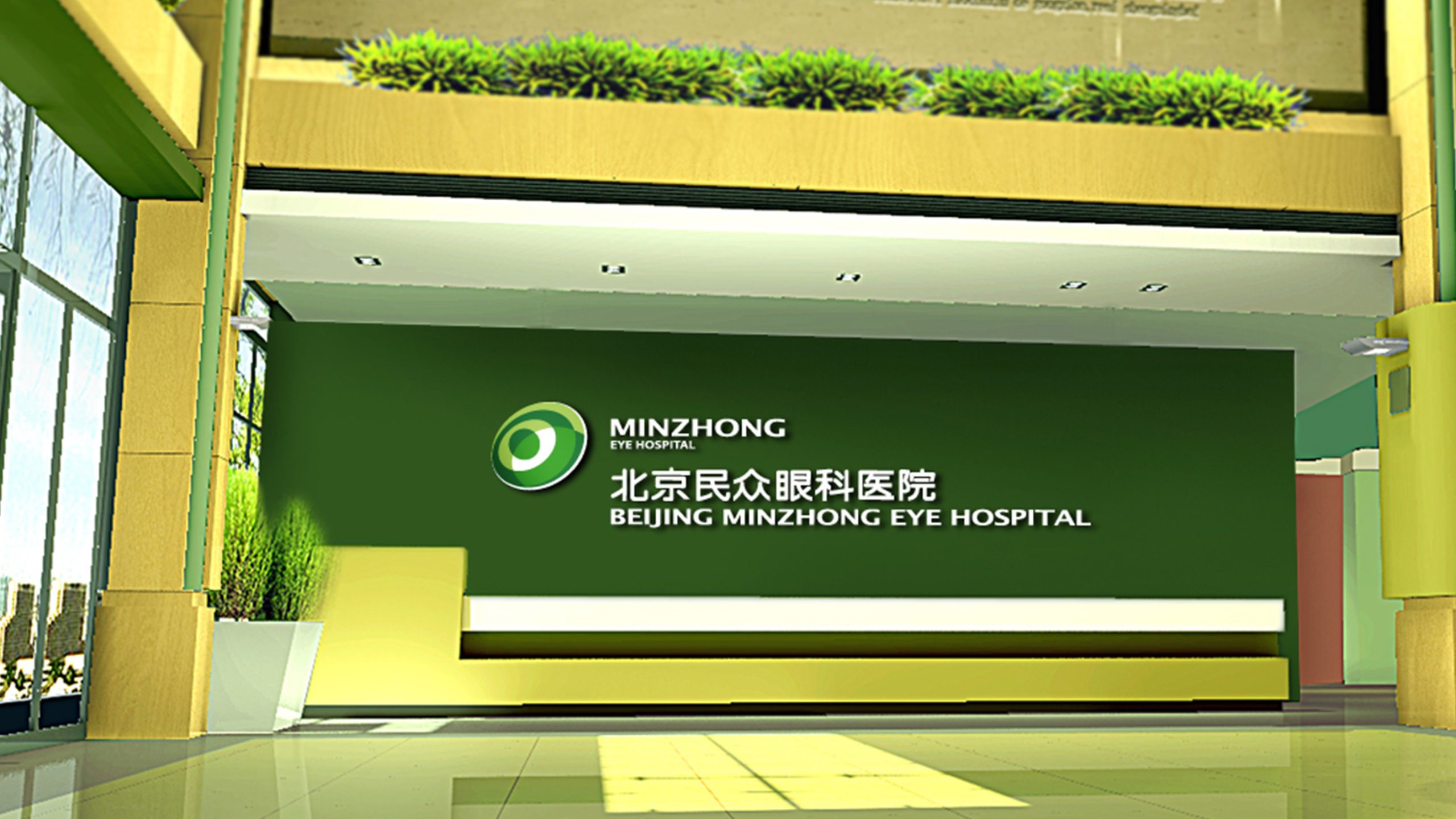
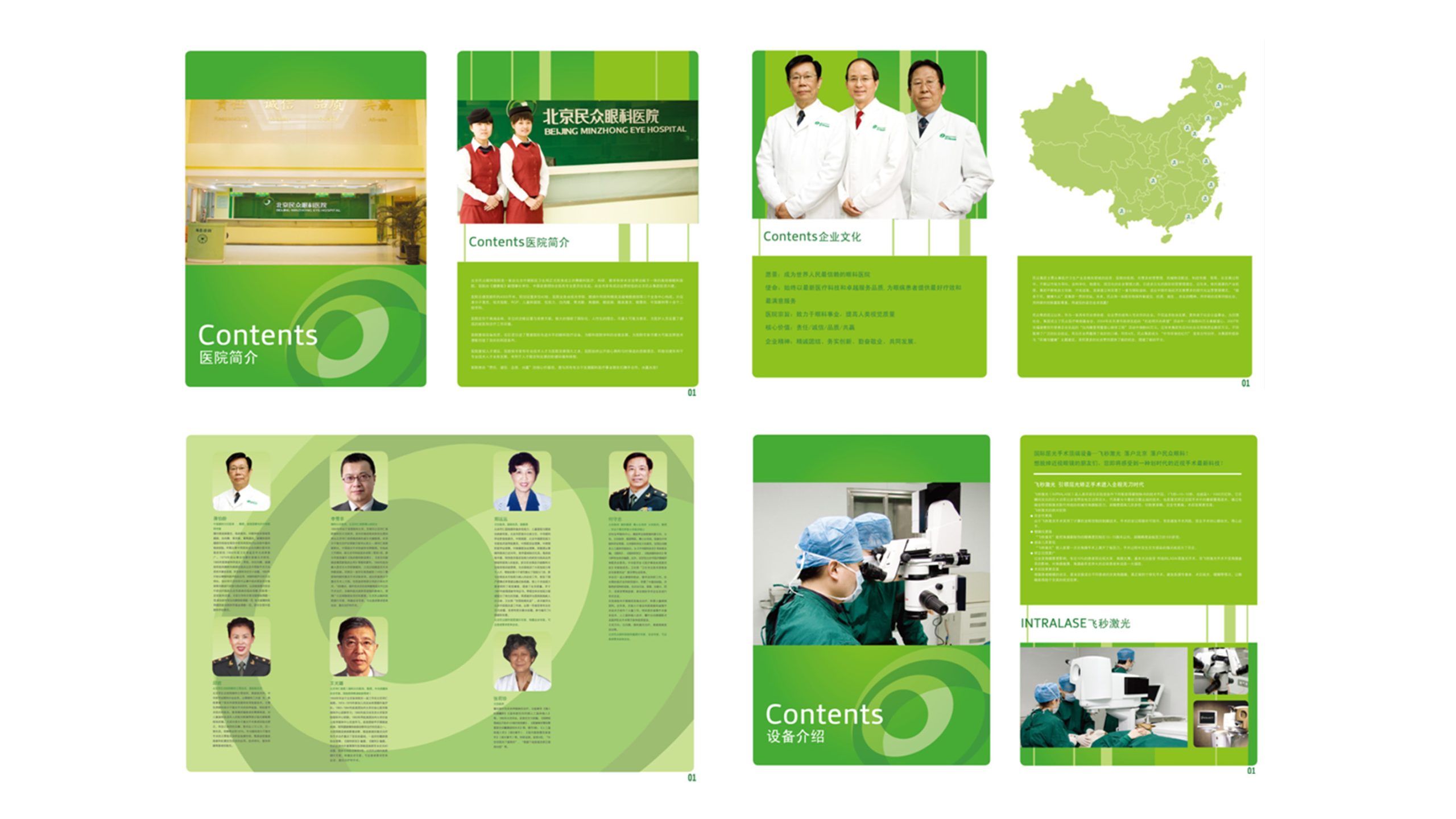
The mark adapts well across medical spaces, wayfinding, pharmaceutical packaging, collateral and digital interfaces. The circular emblem can stand alone as an icon or digital identifier for medical records systems, registration kiosks, websites and mobile interfaces. An animated version uses a gentle rotation to express “light restored,” for brand videos and presentation openers.
brand meaning
The name “Minzhong” (“the people”) signifies “born for the people, working toward light.” Through the symbolism of rings and a focal point, the mark expresses healthcare’s core values: protecting sight and caring for the spirit. It is at once a “medical eye” and a “humanistic heart,” elevating the hospital brand beyond a clinical symbol into a visual emblem of trust, care and hope.
Improper Usage (Protection Specification)
Do not alter the inner and outer circle proportions or the rotation angle. Do not change the green values or add shadows or outlines. Do not use the wordmark alone without the symbol. Recommended minimum display width: 25mm.
design results
After launch, Minzhong Eye Hospital established a unified, modern and gentle brand image in public perception. The green visual system improved recognition and trust within medical spaces and has been rolled out systematically across its national network. The design has become a model for humanizing healthcare identity, embodying the brand mission: “Bringing light closer, making care visible.”