










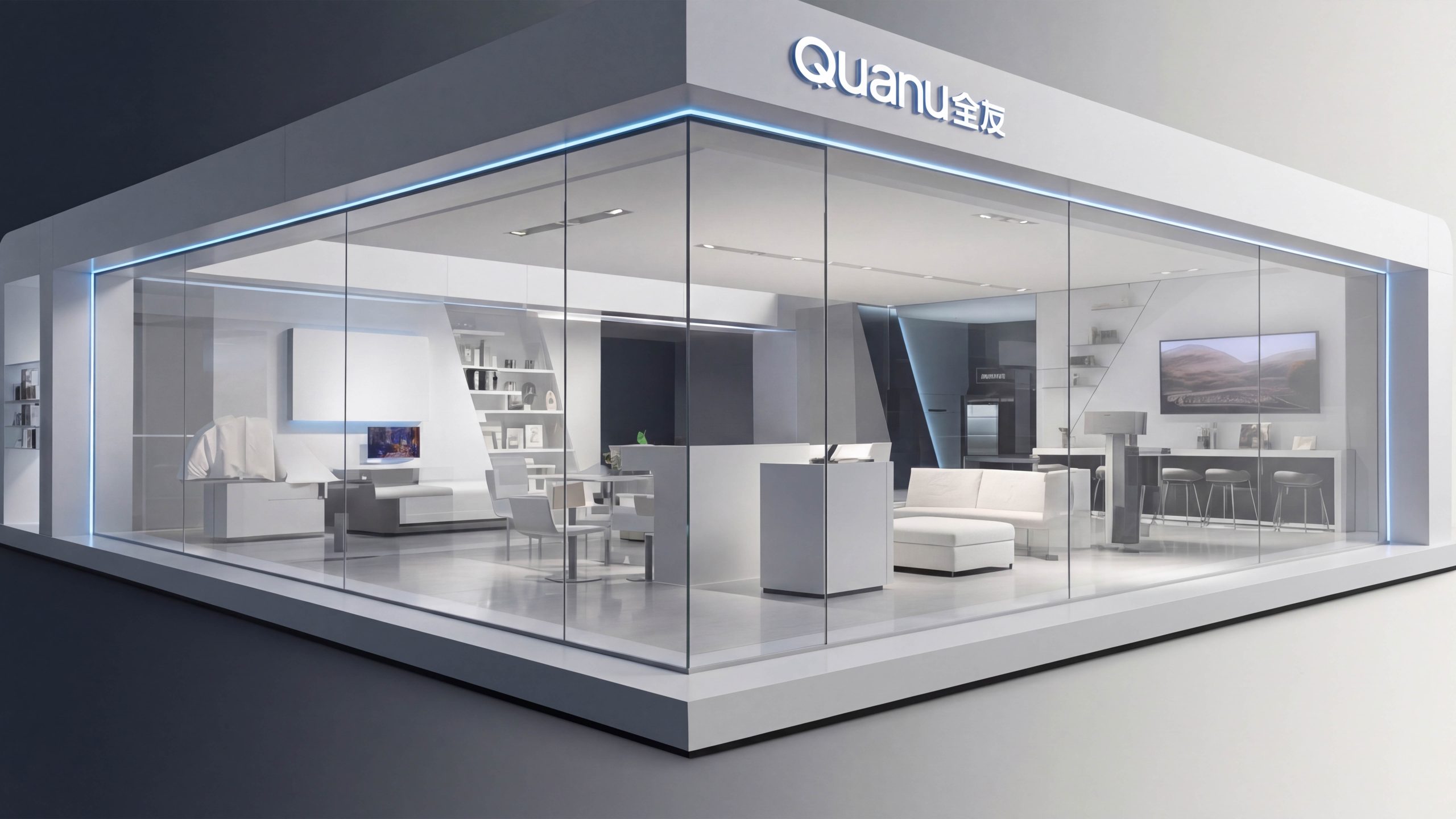
A branded showroom and retail wayfinding system for Quanu, designed for urban flagship showrooms, standard shopping mall stores and temporary exhibition spaces. The scope covers street-facing identification, entrance orientation, room-set displays and category directories, seating and mattress trial areas, checkout and collection, after-sales service and accessibility.
The project aims to create a repeatable, low-maintenance, scalable wayfinding system for high-traffic environments that bring together multiple retail formats. It helps first-time visitors orient themselves within 30 seconds, returning customers reach their chosen area in three steps, and operators standardize day-to-day management.
Assess the current state and define the goal
Site surveys and observations at different times identified three issues: limited long-distance visibility at corners, unclear connections between room-setting and category information, and promotional materials competing with the core system. These informed three priorities: continuous guidance, with advance turn signs and reassurance along long corridors; consistent legibility, with coordinated standards for viewing distance, type size, contrast and illuminance; and operational ease, with templated information that can be updated in 5–10 minutes while remaining consistent across stores.
Methodology and Coding Strategy
One grid: a consistent 8 pt/4 mm module governs sign layouts and hardware tooling for a unified appearance across stores. Two viewing ranges: 12–25 m for storefront identification and main category directories; 1–7 m for directions, specifications and service information, with corresponding type sizes and illuminance thresholds. Three sign types: permanent identification—storefronts, zones, floor directories and overviews; changeable information—prices, collection lists, featured products and promotions; and temporary guidance—peak-time crowd management, maintenance diversions and emergency evacuation. All use standardized magnetic or insert-panel interfaces. Four coding levels: store–zone–position–product, using letters and numbers. Large product combinations add a collection code and component number, linked to inventory, picking, collection and after-sales systems. Five implementation stages: survey and modeling, prototyping, pilot refinement, full rollout, and handover of the asset register and SOPs.
Visual and information rules
Brand blue forms the environmental base, white carries information, and a brighter teal highlights functional content. High-visibility yellow and blue distinguish safety and accessibility information from promotional colors. Highly legible Chinese and Latin sans serifs give both languages equal visual weight: storefront lettering ≥180 mm, zone lettering 80–120 mm, directional text 30–40 pt, and notices 18–24 pt. Prices, dimensions and IDs use tabular numerals for precise alignment. Consistent stroke weights and corner radii define a pictogram library covering living rooms, bedrooms, dining rooms, storage and custom furniture; environmentally responsible materials; and delivery and installation. Left alignment, evenly spaced columns and fixed leading support a reading sequence of room setting–category–key benefit–specifications/dimensions–price–service.
Applied in Context
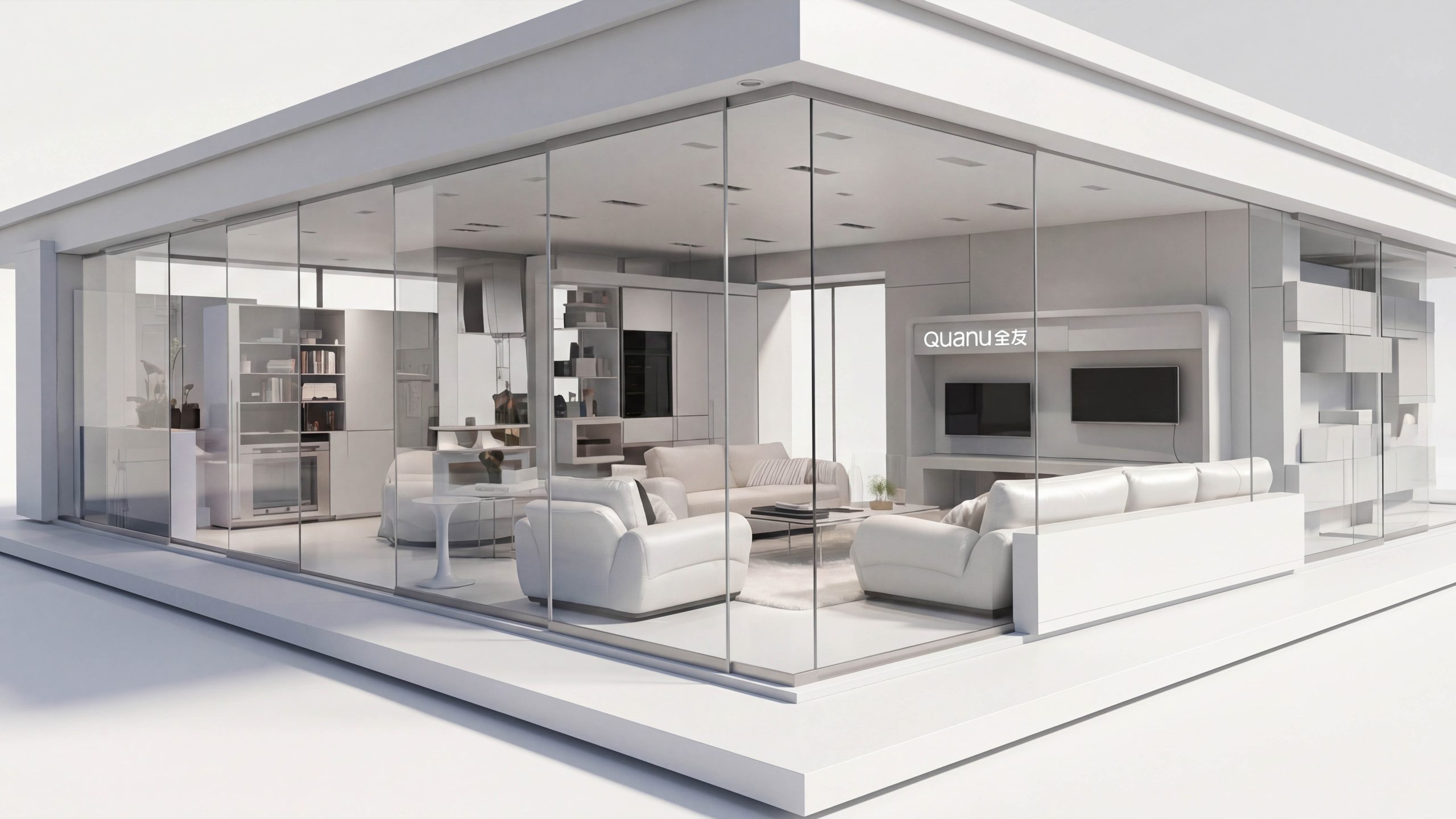
Façade and entrance: illuminated storefront identification and projecting corner banners provide visibility from two directions. Windows present room settings with coordinated collection lists, while floor guidance leads directly to the entrance hall. Entrance hall and overview: the first display combines a room-setting directory, today's featured products and a service list covering measurement, delivery, installation and recycling. At aisle entrances, popular-destination lists point to living rooms, bedrooms, dining rooms, children's furniture, custom furniture and after-sales service. Experience and conversion: sofa and mattress areas provide trial steps and hygiene guidance, with NFC and QR links to materials, load capacity, care and stock. Large furniture combinations include collection codes and component diagrams. Consultation and checkout: planning desks use a structured home layout–floor area–style–budget questionnaire. Checkout checklists cover invoices, delivery bookings, stair/elevator restrictions and installation windows. Collection and after-sales: collection areas use numbered groups and one-way circulation. Service-counter signage follows a request–required documents–estimated time structure, with separately marked routes for repairs and replacements. Accessibility and safety: high-contrast templates identify accessible routes, parent and baby rooms, AEDs, fire safety equipment and evacuation routes. Reassurance signs appear along long corridors and at corners, with minimum illuminance maintained at night.
Delivery and operation and maintenance mechanism
A closed-loop operating model connects an asset register, template library and integrated data. Every sign has a unique ID and installation and maintenance records. Price tags, collection lists, campaign materials and crowd-flow signage are generated automatically from templates and can be printed locally, allowing one person to complete updates in under 5 minutes. QR codes link to live floor plans, specification sheets, delivery and installation SOPs, and emergency plans. Inspection checklists define frequency, tolerances, cleaning and illuminance requirements. Deliverables include an overall wayfinding plan and sign location drawings; layout and icon guidelines; exploded hardware drawings and bills of materials; mounting heights and optical specifications; and operations and maintenance SOPs and training materials. The system can be rolled out quickly across cities and store formats, sustaining clear information, reliable legibility and a professional standard consistent with the Quanu brand.