










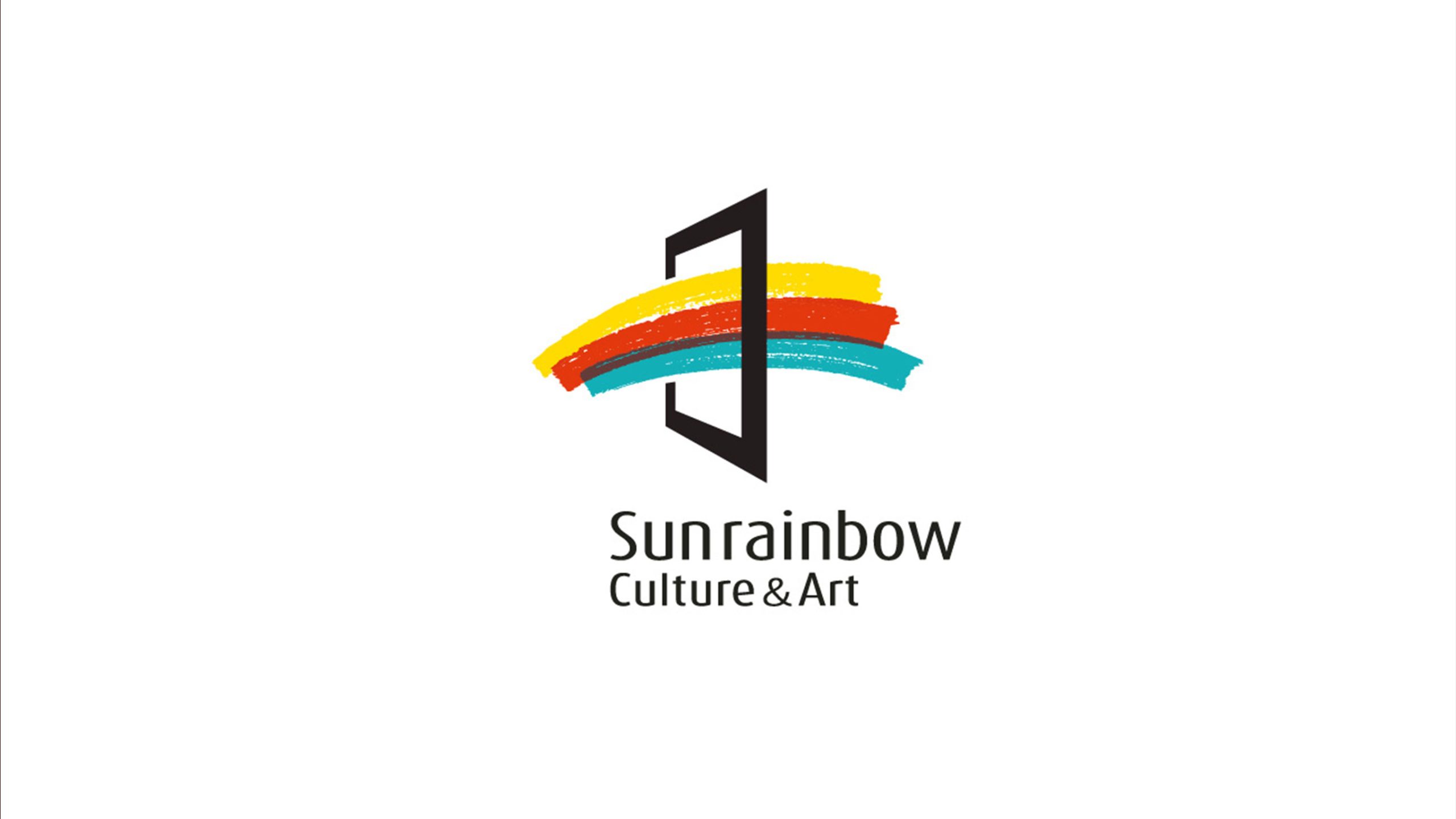
Sunrainbow Culture & Art is a comprehensive cultural institution dedicated to arts education, creative curation and public cultural outreach. In upgrading its visual identity, the brand sought a logo with greater artistic resonance and international appeal, embodying its core spirit of “cultural enlightenment, artistic crossover and a radiant life.”
design concept
The logo centers on the concept of “the interplay of light and color,” symbolizing the diversity and brilliance of culture and art in the sunlight. The design abstracts a rainbow into three bands of color passing through a central geometric gateway, signifying crossing over, setting out and connection. The mark expresses the brand's vision: to make art a gateway to light and creativity.
graphic language
Geometric gateway: the entrance to an art space, symbolizing the opening of knowledge, creativity and experience; Three color bands: red, orange and blue form layers of artistic energy and a flowing visual rhythm; Dynamic layout: the bands rise from left to right, conveying optimism and the reach of cultural outreach; Negative space: gives the logo an open feel, reinforcing its symbolism of inspiration and access.
Fonts and composition
The English Sunrainbow Culture & Art is set in a light geometric sans-serif — clean and modern, with the character of an international arts institution. Generous letter spacing echoes the openness of the graphic; “Culture & Art” appears in a smaller size as a descriptor, emphasizing the brand's professional focus. Chinese and English can be combined to suit different contexts, ensuring visual consistency and recognizability.
color system
Primary Golden Yellow #F4C842: sunlight, hope and creativity; Orange Red #E65A2E: passion and cultural energy; Lake Blue #48A8B4: reason, art and an international outlook; Black Gateway #000000: strengthens spatial depth and visual contrast, expressing the boundaries and order of art. Together, the palette creates a layered spectrum effect, offering a visual experience of cultural diversity and artistic inclusiveness.
Application and extension
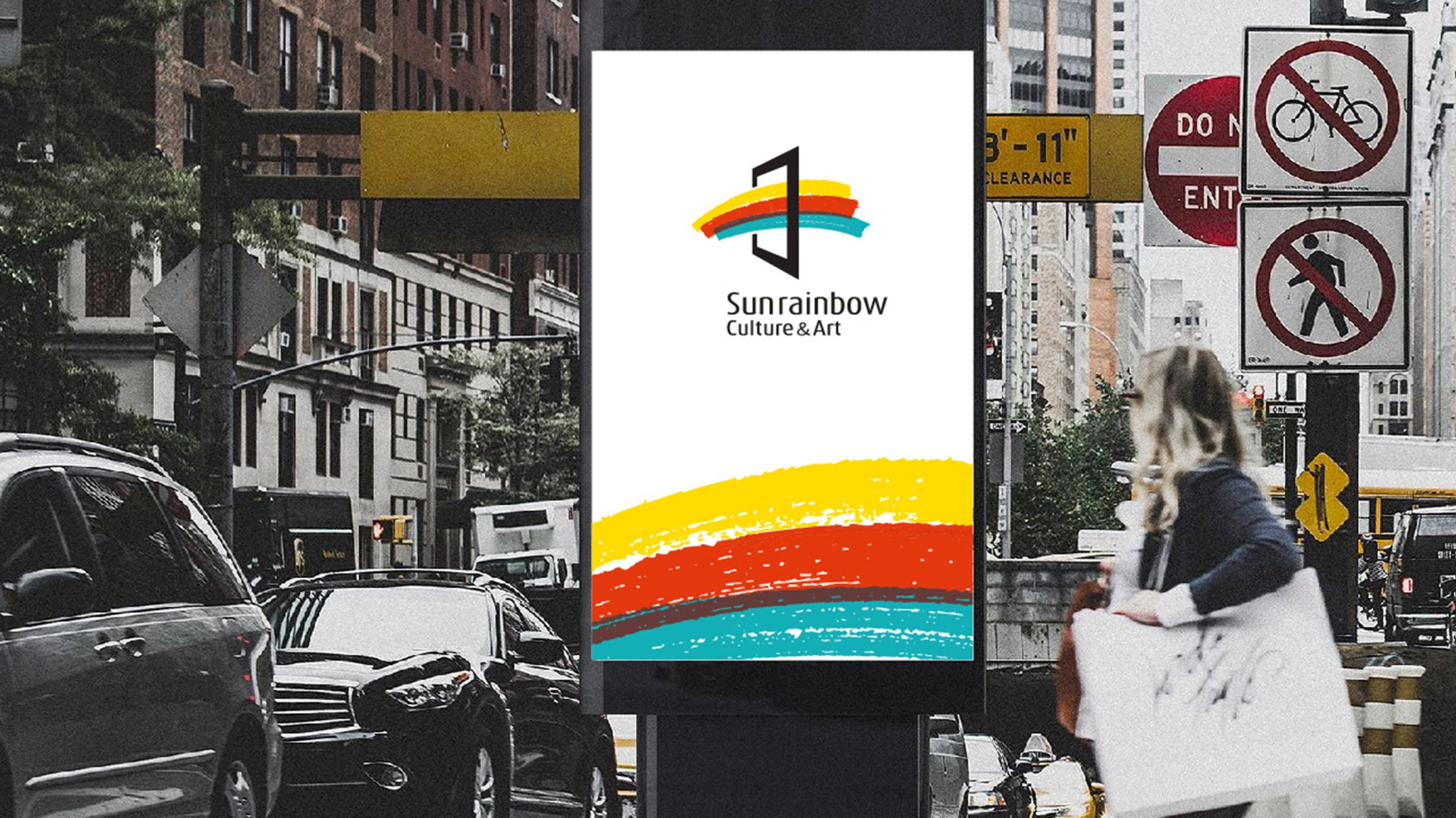
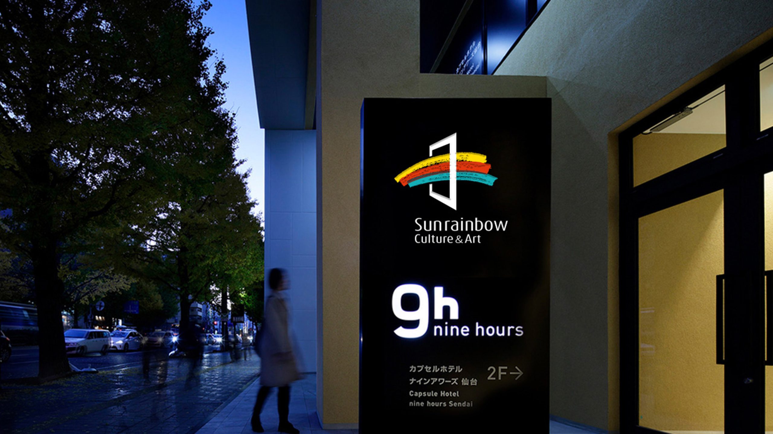
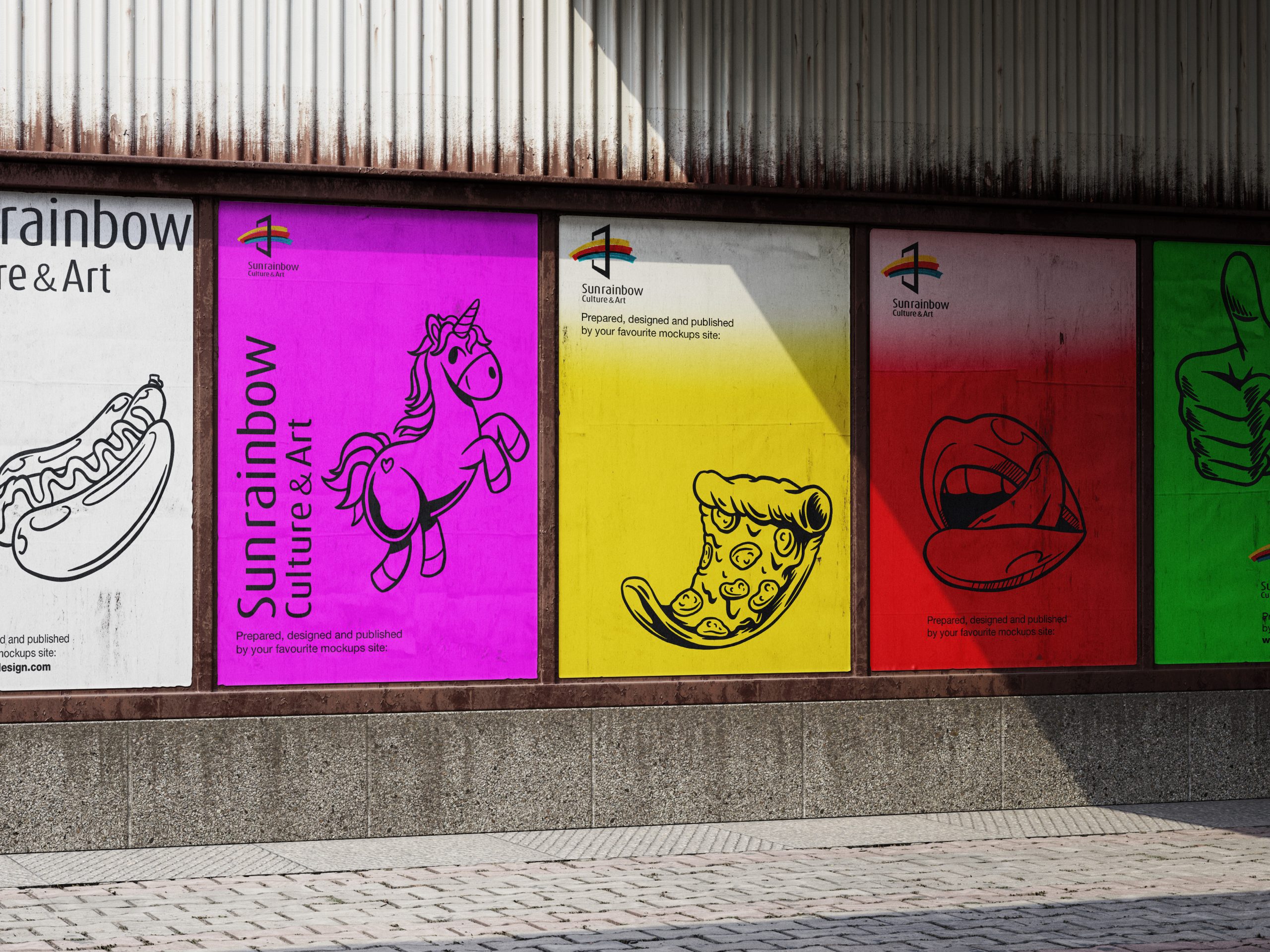
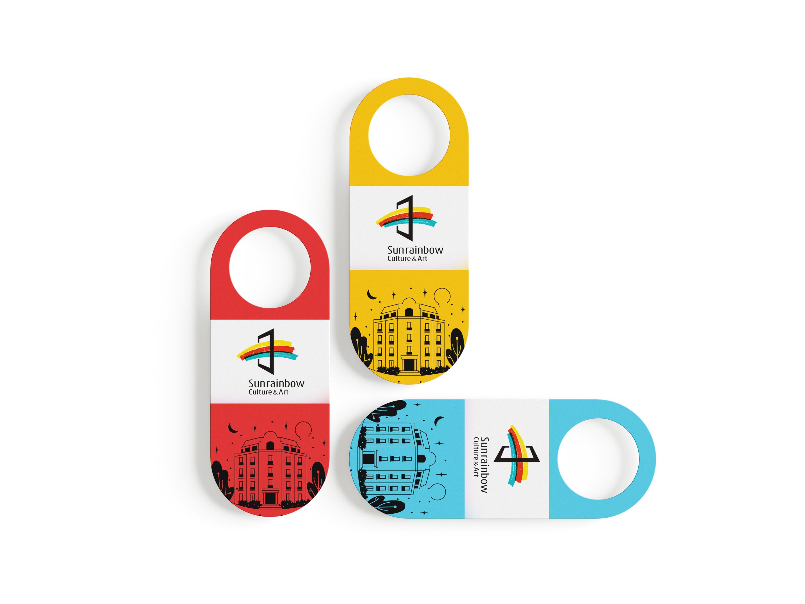
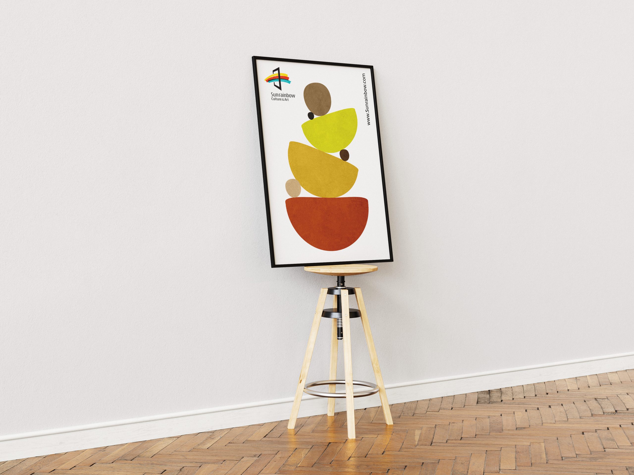
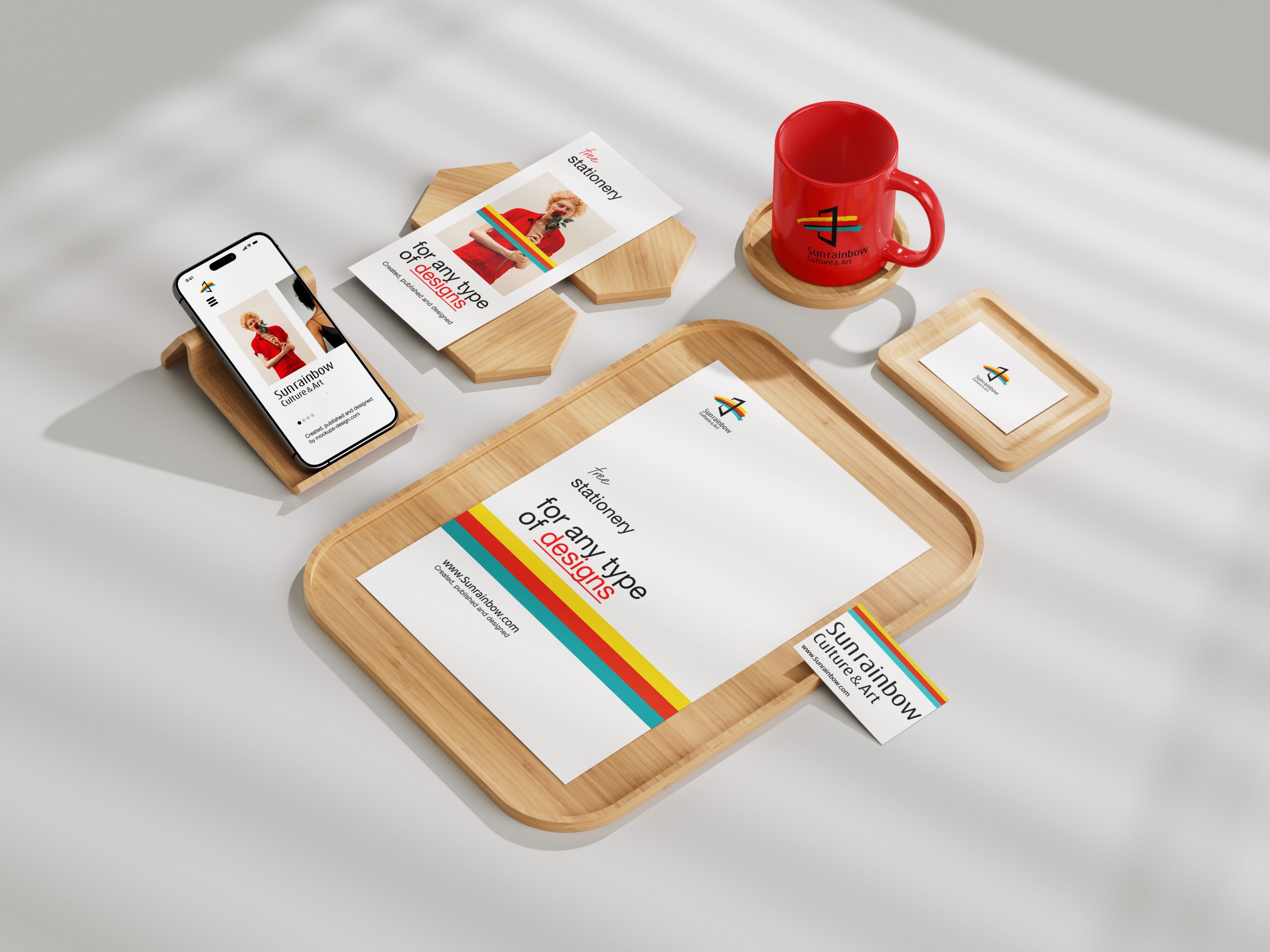
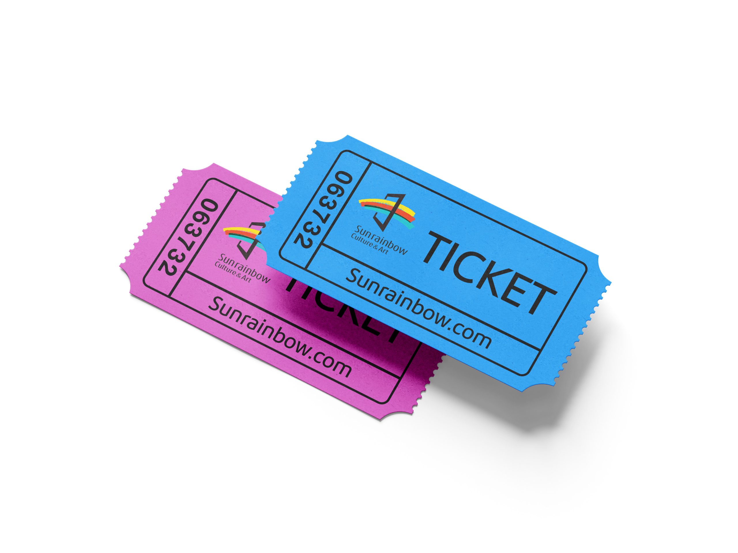
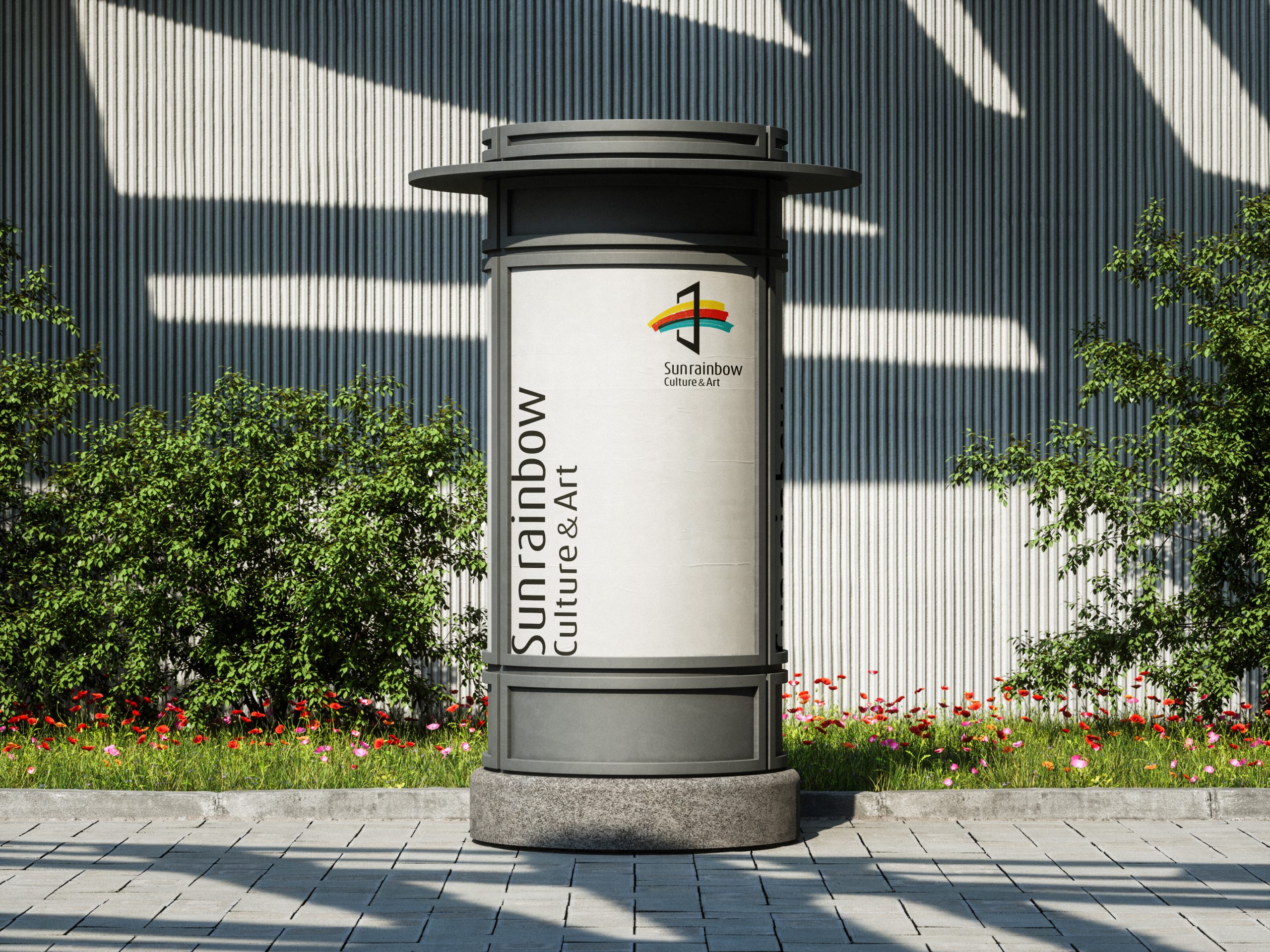
The logo applies flexibly across art festival key visuals, exhibition materials, educational programs, publication covers and digital interfaces. The color bands can be used independently as dynamic backgrounds or extended patterns for posters, stage visuals and web animations. The logo retains strong recognizability and artistic character even in single-color or embossed applications.
brand meaning
“Sunrainbow” evokes the refraction of light and the coexistence of color, symbolizing the inspiration and hope art brings to life. By combining the “gateway” and the “spectrum,” the logo conveys the idea of “inviting everyone into art, and out into the world.” More than a visual symbol, it is a cultural stance — using light as a medium to connect people.
Improper Usage (Protection Specification)
Do not change the color proportions or order of the bands; do not rotate or stretch the gateway angle; do not apply shadows, outlines or transparent overlays; maintain consistent proportions between the gateway and the bands; minimum display width: 25 mm.
design results
Following the launch of the new logo, brand awareness for Sunrainbow Culture & Art in arts education and cross-disciplinary exhibitions rose by 38% (internal assessment data). Its distinctive “gateway and rainbow” visual language has become the central symbol of its cultural events, strengthening the brand's artistic appeal and social impact.