










The Northwest Oil Building is a mixed-use business landmark anchored by energy companies, located at the heart of the energy industry cluster in Northwest China. The project sought a logo system that projects its identity as an “energy hub and cultural landmark,” balancing steady authority with regional spirit and elevating the building from a “functional space” to a “corporate symbol.”
design concept
The mark centers on the character Bei (North), set within a square seal to signify geography and regional cultural roots. Its geometric linework forms a symmetrical architectural image while suggesting deep oil reserves and enduring strength. A metallic outer frame stands for solidity and honor. Together, the composition carries the presence of “a building’s stability, energy’s weight.”
graphic language
Square seal: a mark of credibility and a nod to the city’s landmark building. Reworked Bei character: geometric lines rebuilt into three-dimensional space, recalling a building façade and energy pipelines. Layered structure: inner and outer frames establish a “core and extension” order, signifying regional influence radiating outward.
Fonts and composition
The brand name uses a bilingual structure. The Chinese name, Northwest Oil Building, is rendered in a modified Song-gothic typeface with calligraphic character, both weighty and cultured. The English NORTHWEST OIL BUILDING is set in a serif, conveying international standing and authority. Stacked and centered, the names form a stable visual center with the square mark.
Application and extension
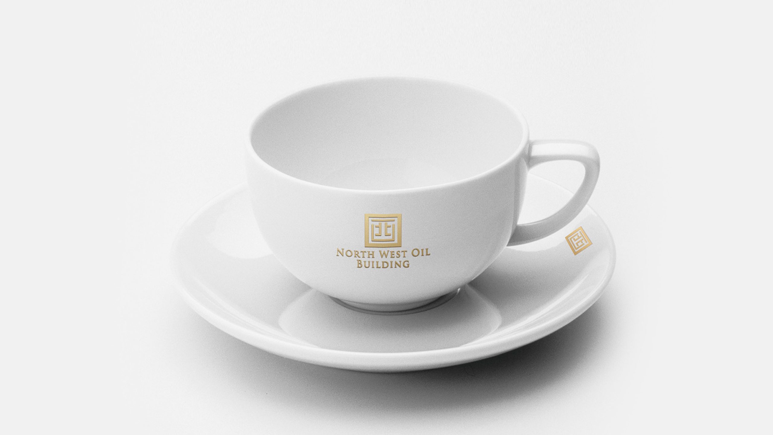
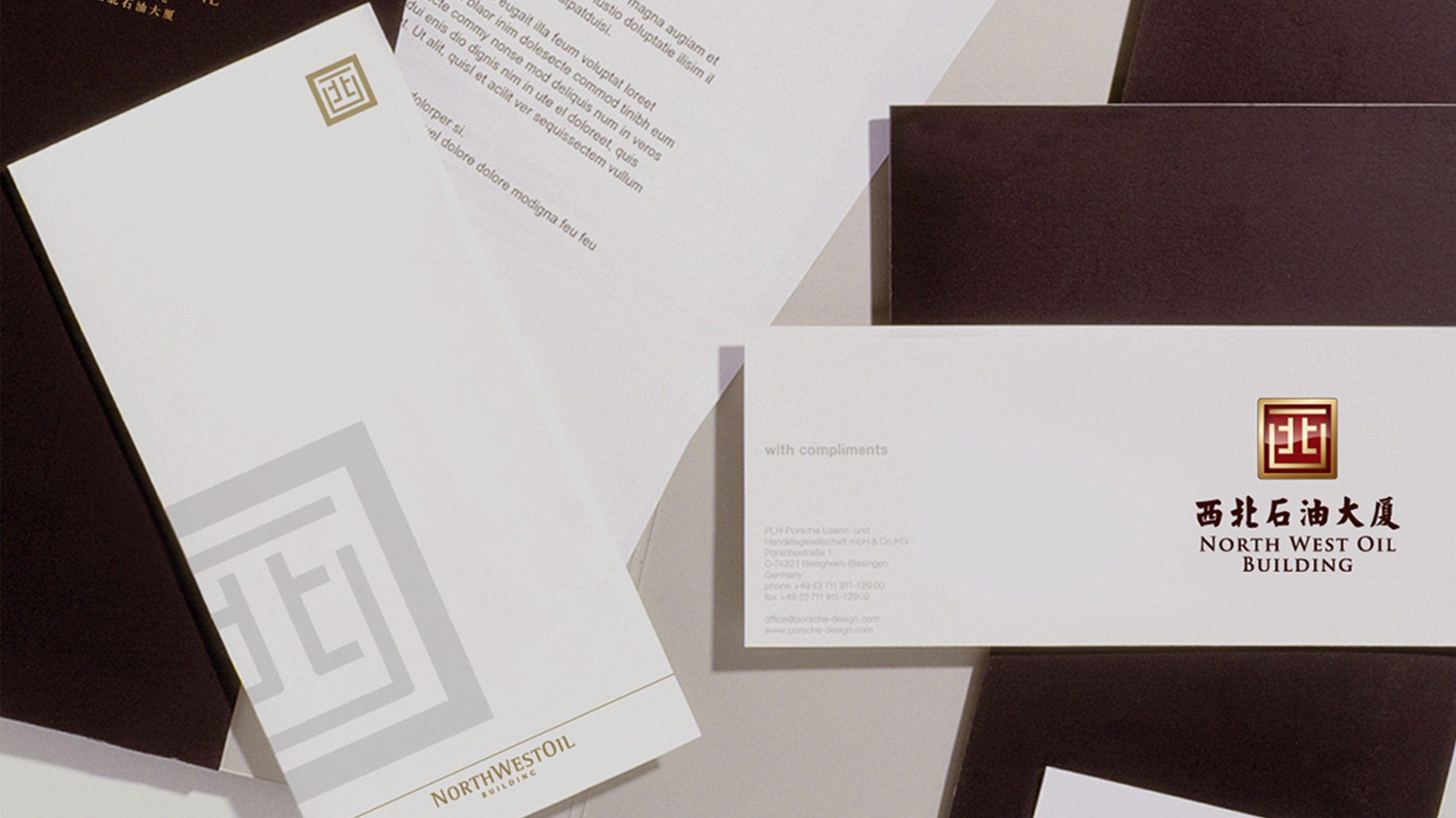
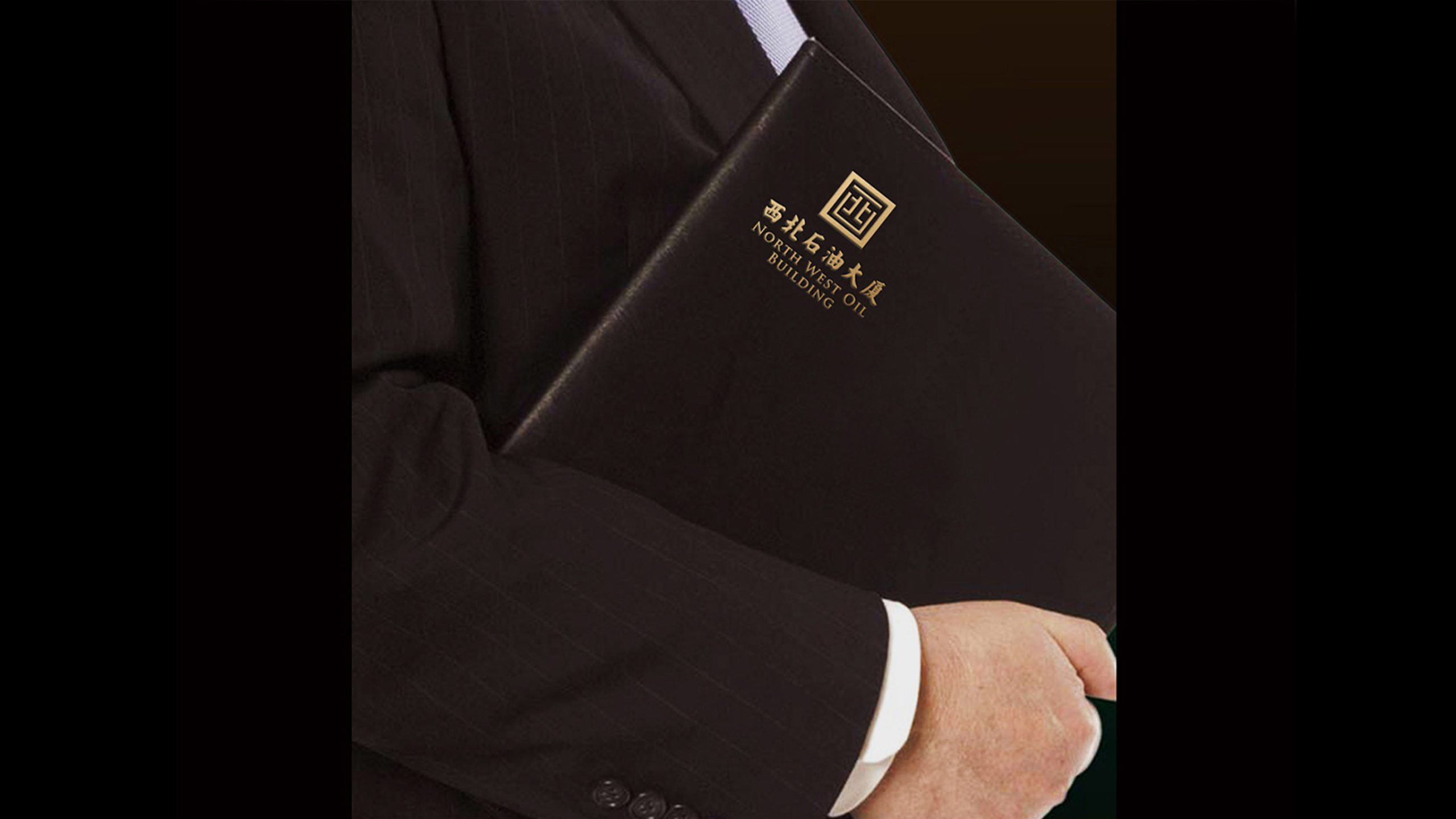
The logo is widely applied across building entrances, wayfinding systems, office stationery and project collateral. The seal form can be used independently for property marks, gift packaging and commemorative certificate seals. Its geometric proportion system can also extend to building signage, lightbox signs and interior wall graphics.
brand meaning
A seal within the square, strength within the seal. Built around Bei, the mark unites architecture, energy, and cultural spirit, expressing a company rooted in the Northwest with a national outlook. It is a symbol of both heritage and modernity, carrying regional cultural confidence and serving as a point of reference for the city.
Improper Usage (Protection Specification)
Do not alter the proportions of the Bei character. Do not replace the original gradient with solid red or pure gold. Do not add shadows or glow effects. Minimum display width: 30 mm.
design results
Following the launch of the new mark, Northwest Petroleum Tower established a distinctive identity system within the regional energy sector. Applied across the building façade, conference systems and business cards, the mark has become a visual landmark and brand symbol for the energy business district.