










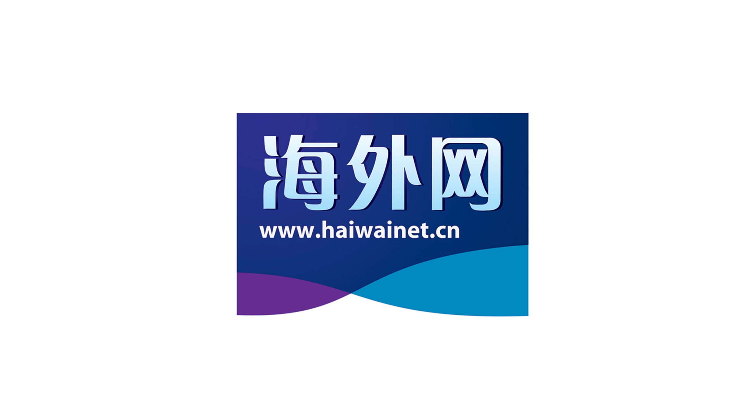
Haiwainet is a comprehensive news and cultural platform serving the global Chinese community and international readers, operated under one of China’s leading media groups. As the international media landscape evolves, the brand sought a new visual identity system to express its core values of authority, credibility, openness and global perspective, while adapting to a multilingual, multi-device digital environment.
design concept
The mark is built on the concept of a “Blue Horizon”: an information bridge connecting China and the world. A rectangular frame encloses the brand name, evoking a “window of information,” while the wave beneath represents both the ocean and flowing data, expressing a reach that begins in China and extends worldwide. The design as a whole conveys rational order, technological precision and an international outlook.
graphic language
Rectangular frame: evokes a news window and a digital screen, signaling a professional, rigorous media position. Wave motif: soft curves create a dynamic visual rhythm, representing global information flows and cross-cultural exchange. Balanced composition: steady above, fluid below, generating a visual tension of “vitality within stability.” The graphic system strikes a balance between gravitas and approachability, in keeping with the visual character of modern media.
Fonts and composition
The primary wordmark, Haiwainet, uses a steady sans-serif with square forms and clean strokes, conveying the authority of a news outlet. The English haiwainet.cn is set in geometric lowercase, contrasting in weight with the Chinese and adding a modern, technical edge. Center alignment sharpens focus and readability.
Application and extension
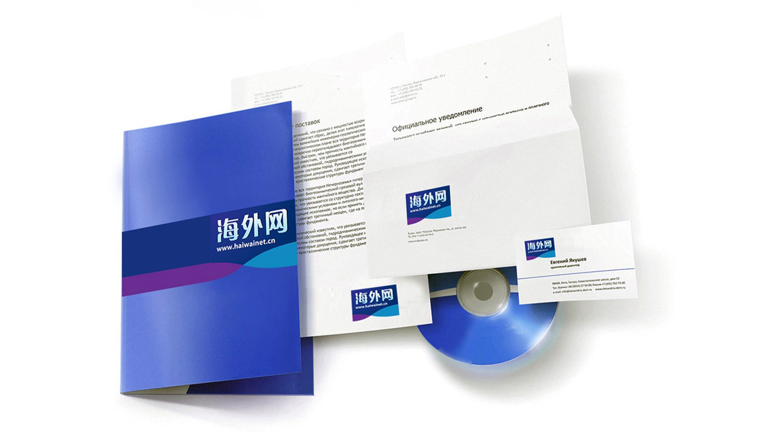
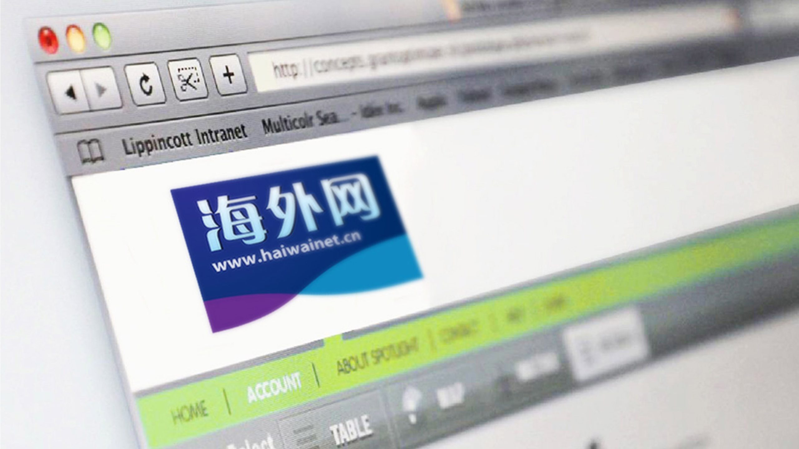
The mark is designed for news apps, video openers, media coverage, international conference backdrops, social media and more. The rectangular primary logo extends to horizontal and vertical lockups; the wave line can stand alone as a decorative graphic for web backgrounds, app motion or header transitions. It retains recognition and depth on dark backgrounds and in single-color applications.
brand meaning
Haiwainet stands for “a Chinese voice that transcends borders,” expressing the brand’s mission as an international Chinese-language medium: interpreting the world from a Chinese perspective, and telling China’s story in the language of the world. Through the visual language of “blue window + ocean wave,” the mark conveys the free flow of information, cultural resonance and open dialog, becoming a visual symbol for Chinese-language content worldwide.
Improper Usage (Protection Specification)
Do not alter the primary blue or the proportions of the purple gradient. Do not modify the shape or direction of the wave line. Do not skew, distort, or add shadows or transparency. Minimum display width: 30mm. Maintain sufficient contrast between text and background (≥ 4.5:1).
design results
Since adopting the new mark, Haiwainet has seen a 48% increase in brand consistency across its international communications (internal research data). The blue visual system has reinforced the platform’s authority and international recognition, making it a benchmark for the digital transformation of China’s international media. The design is now widely used across its news app, overseas social channels and major international coverage.