










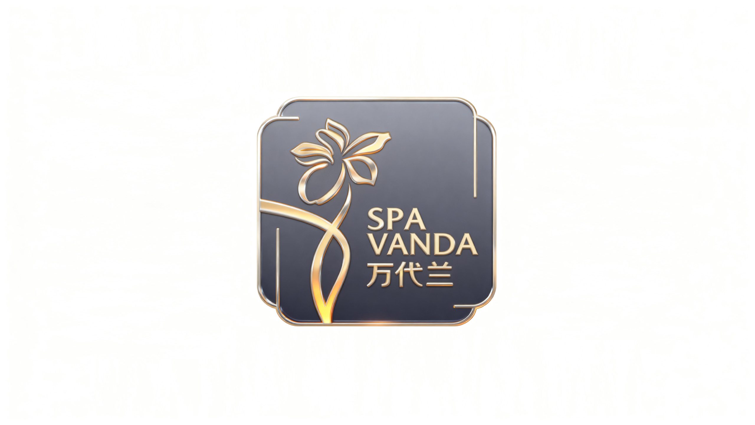
SPA VANDA is a luxury SPA brand originating from Singapore that focuses on high-end spa and physical and mental care. It is committed to protecting the balance of body and mind with oriental aesthetics and natural healing, and connecting quality life experiences with ultimate services.
The brand hopes to present a balanced state of "natural beauty x ultimate luxury" through a visual system that combines oriental elegance and luxurious texture.
design concept
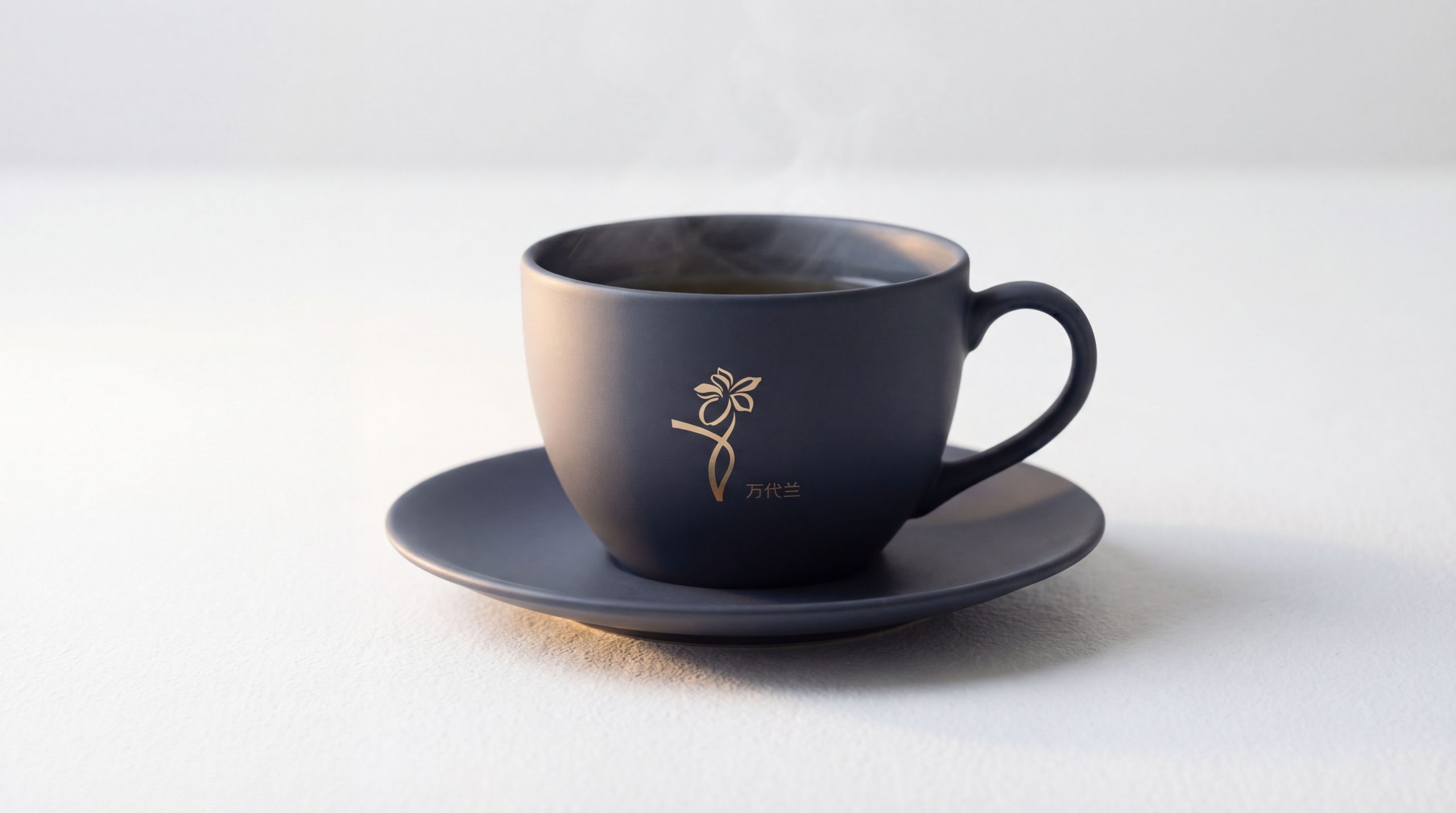
The core concept of the logo is derived from the concept of "Vanda Blossom". The design is based on the Vanda orchid flower, which symbolizes the nobility and elegance of Singapore’s national flower and the brand’s Southeast Asian origin, representing nobility and purity. The orchid pattern outlined with golden lines presents exquisite craftsmanship. The intertwined posture of the flower branches symbolizes the harmony and unity of body, mind and soul and the elegant bloom of life. The overall shape not only embodies the subtle elegance of oriental aesthetics, but also is full of the exquisite tension of a luxury brand, implying the brand mission of Vanda Orchid to continue to heal the body and mind with the beauty of nature and deliver the ultimate SPA experience. The contrast between the deep background color and golden pattern shows the noble temperament and international vision of the high-end spa brand.
Graphic composition and color system
Orchid pattern structure: represents the nobility and elegance of Singapore's national flower Vanda orchid and the foundation of brand culture; golden line outline: delicate strokes present the flexible posture and craftsmanship of the flower; intertwined flower branch shape: the entwining of flower branches symbolizes the harmony and unity of body, mind and soul and the elegant bloom of life; rounded border: the frame design with oriental charm conveys the brand's "implicit nobility".
The brand name "SPAVANDA" uses a modern serif font with elegant shape and balanced proportions, consistent with the luxurious temperament of the logo. The combination of Chinese and English is arranged and unified as a whole, strengthening the visual recognition and international communication attributes.
Noble gold #C9A227: symbolizes luxury, nobility and ultimate quality; deep gray #3D3D4D: represents calmness, tranquility and physical and mental relaxation; gloss gradient: symbolizes the brilliance of life and natural energy. Gold and gray are harmonious in contrast, forming a visual balance of "luxury and tranquility. Oriental and international", building a high-end and elegant brand impression.
Application extension and brand significance
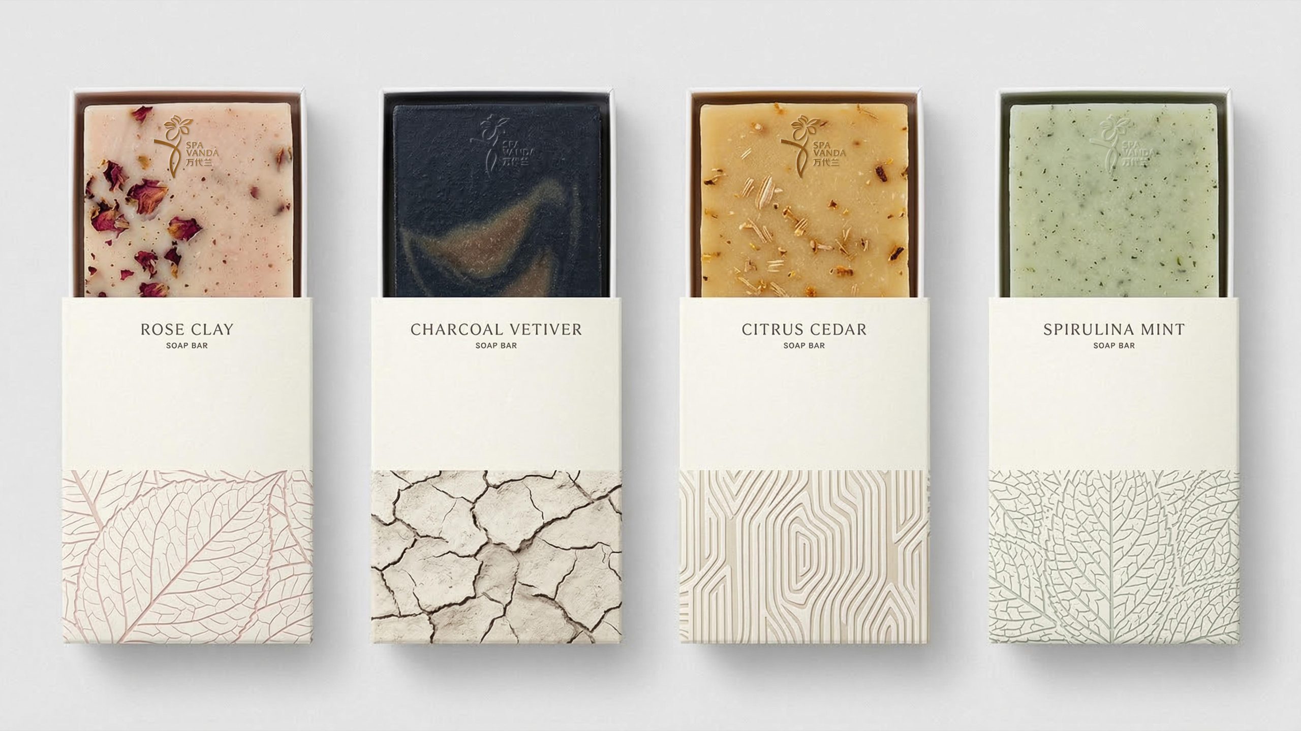
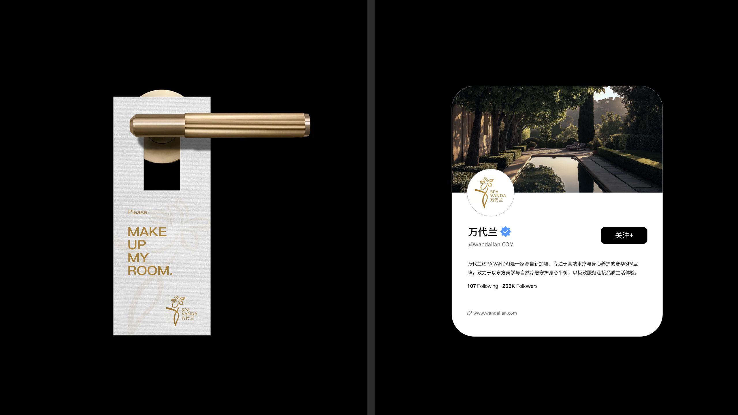
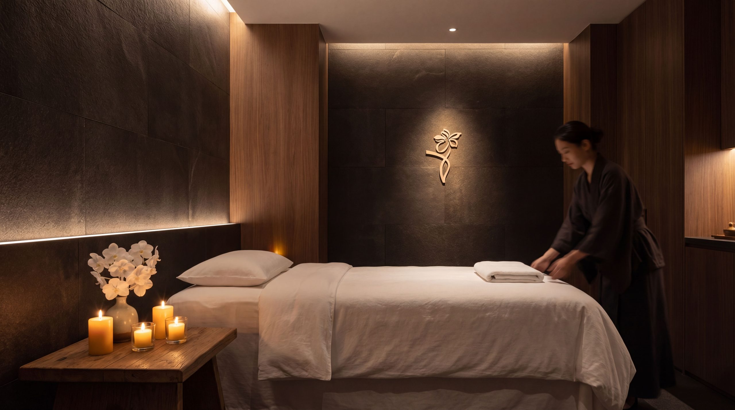
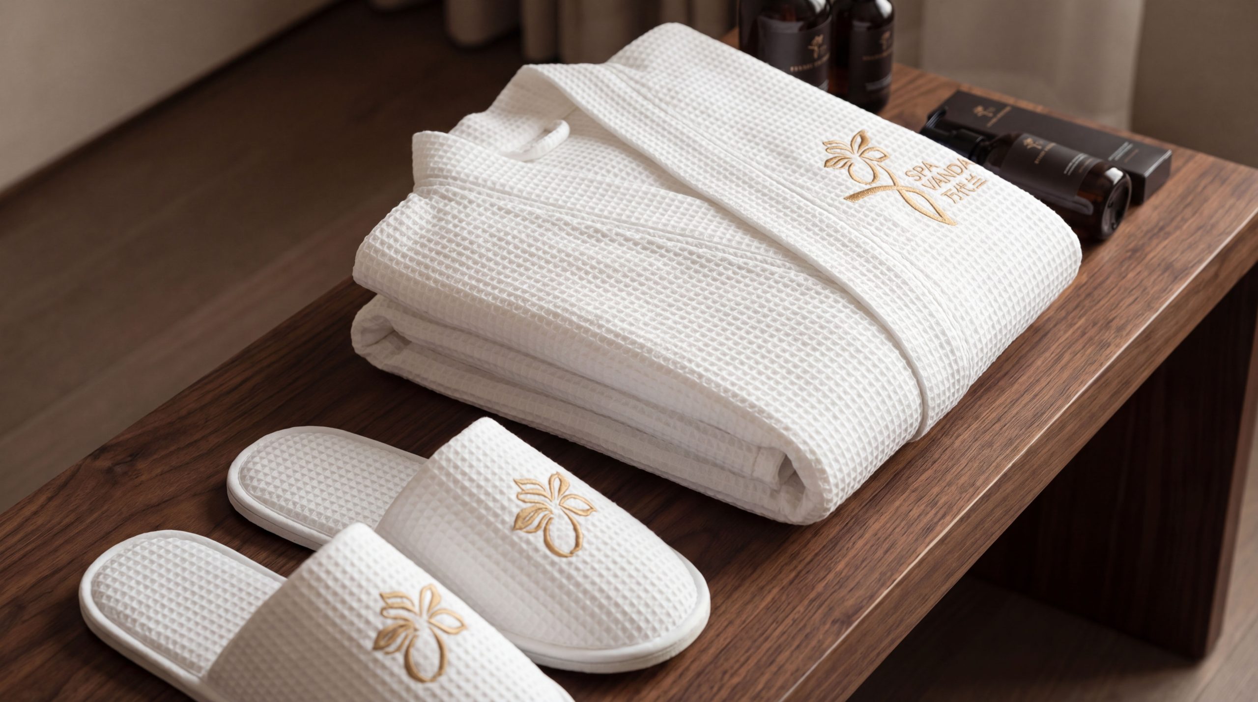
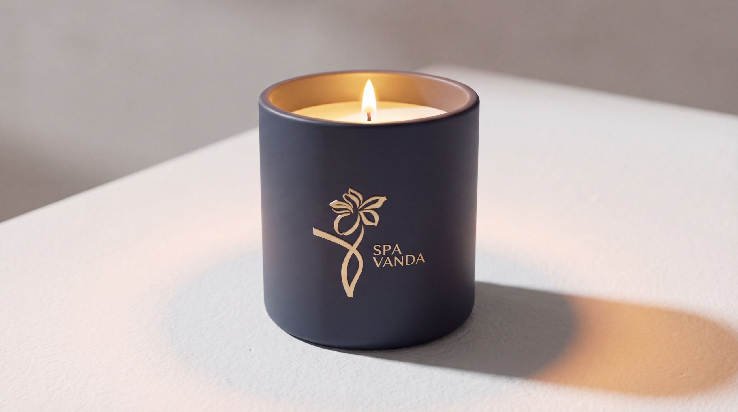
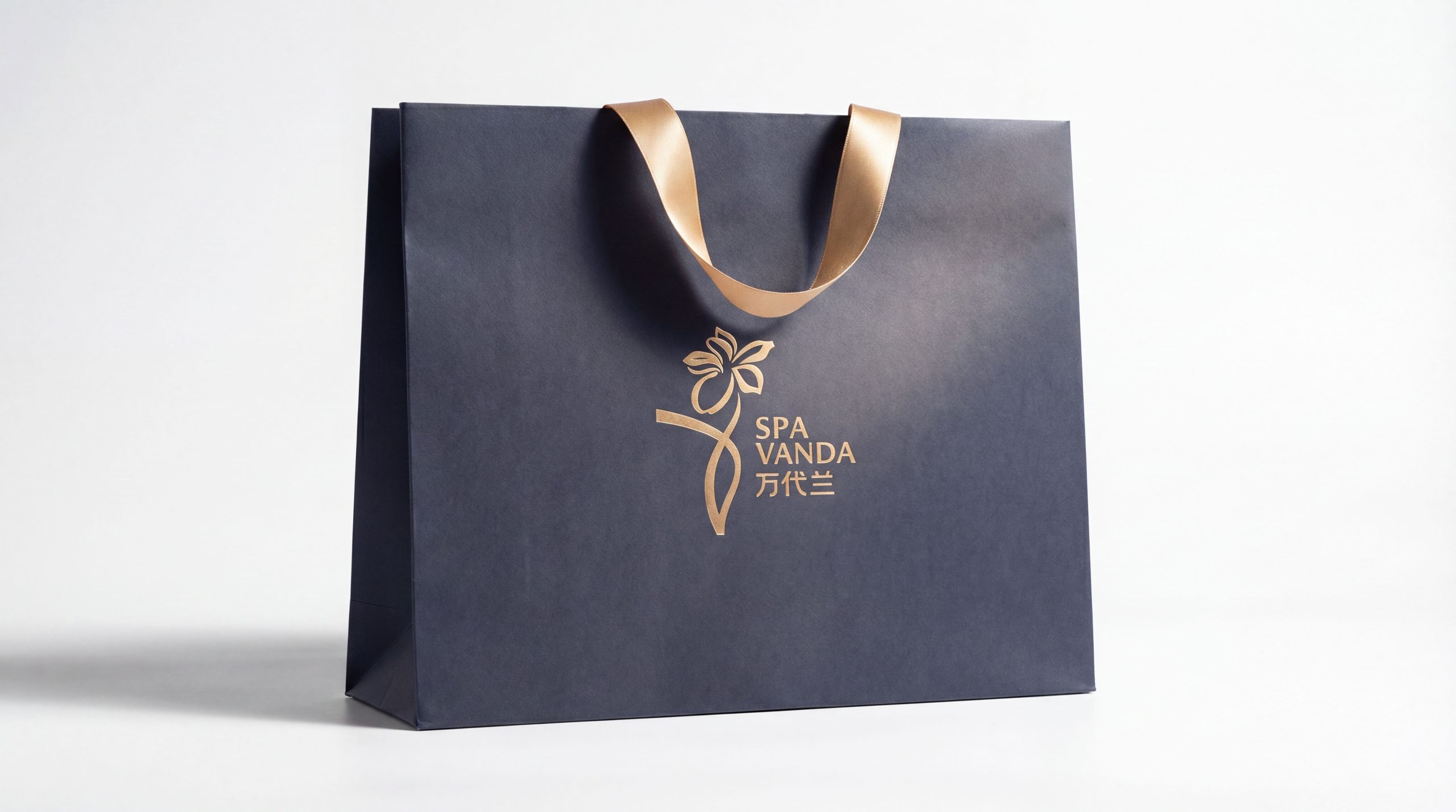
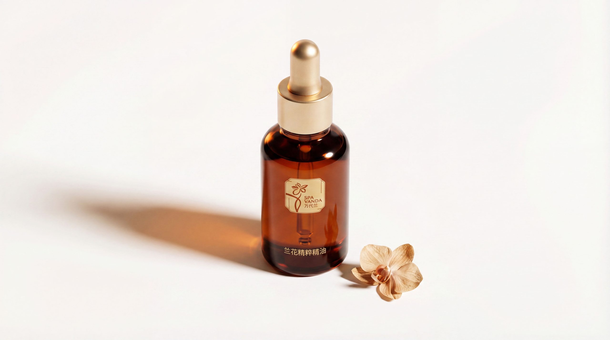
The logo has strong cross-field adaptability: corporate level: applied to store image, brand promotion, membership cards and brand launch conferences; product level: suitable for care products, essential oil packaging and gift set logos; spatial level: forming a unified visual language in SPA pavilions, guidance systems and experience spaces. In the dynamic version, the orchid can be used as a "blooming animation" or glossy flowing animation, symbolizing the continuous pursuit of physical and mental renewal.
The Vanda Orchid logo embodies the dual values of "natural beauty x ultimate luxury": orchid pattern → the core of natural elegance; gold → luxury quality commitment; deep background → the symbiosis of tranquility and nobility. This is not only a brand identification symbol, but also a visual expression of SPA philosophy - the elegance of orchids blooms the beauty of body and mind.
design results
After the release of the new visual system, Vanda Orchid has become an iconic brand image in the high-end SPA field in Singapore and Asia-Pacific. The golden orchid pattern is widely used in store image, brand communication, and international marketing promotion. With the visual expression of "oriental structure × luxury language", it has established a new aesthetic standard in the high-end spa field. This case represents the brand's mature expression in the design direction of luxury SPA, oriental aesthetics and systematic visual language, achieving the unity from "brand design" to "healing philosophy".