










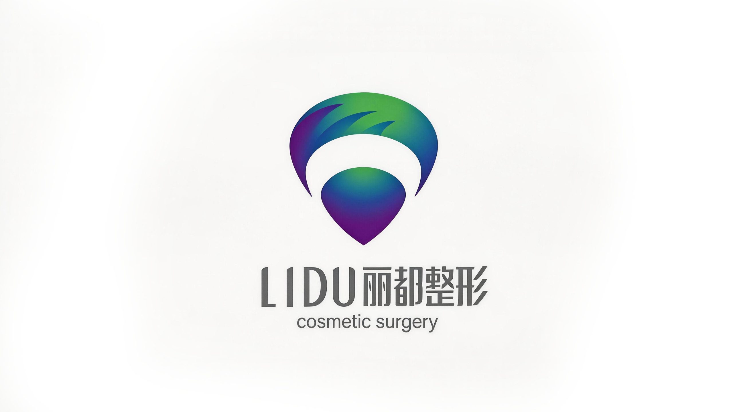
LIDU Cosmetic Surgery is a multinational plastic surgery group with international standards, committed to providing consumers with safe, professional and cutting-edge medical and cosmetic services.
The brand adheres to the core concept of "rejuvenation" and uses the world's top medical technology and humanistic care to help every consumer meet a better self. This time, Qingmei Future was commissioned to lead the brand logo design, aiming to break through the stereotype of "nobility and luxury" in China's plastic surgery industry and establish a new brand image of "international top plastic surgery".
The goal of the brand logo design is to demonstrate the industry height of Lido Plastic Surgery as a multinational plastic surgery medical group through the visual language of internationalization, professionalism and vitality, convey a fresh, modern and trustworthy brand temperament, and bring the brand imprint of "international top plastic surgery" to consumers.
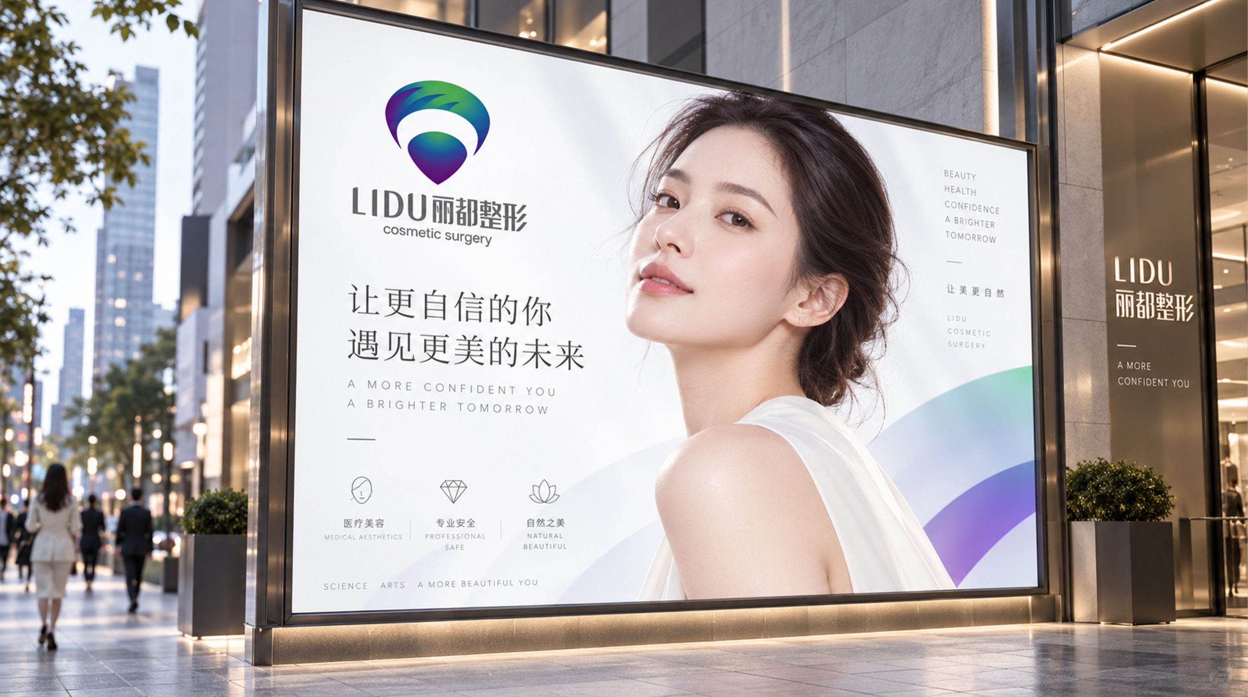
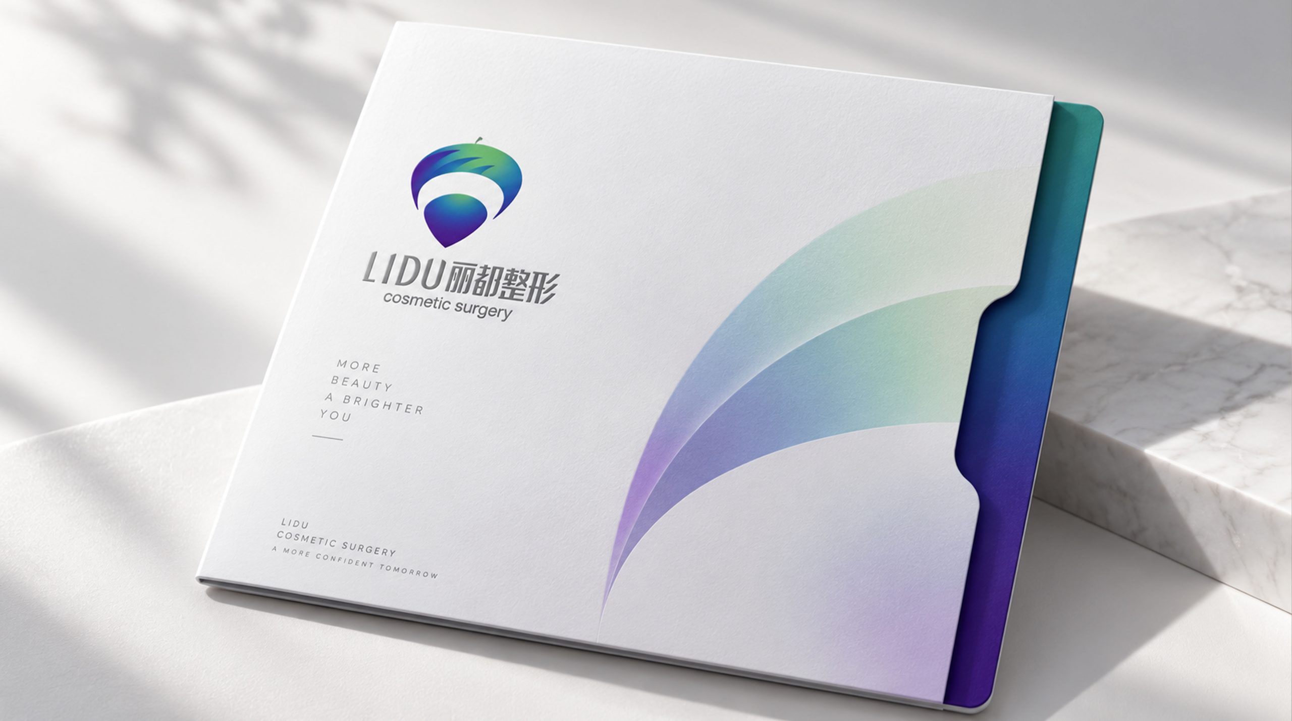
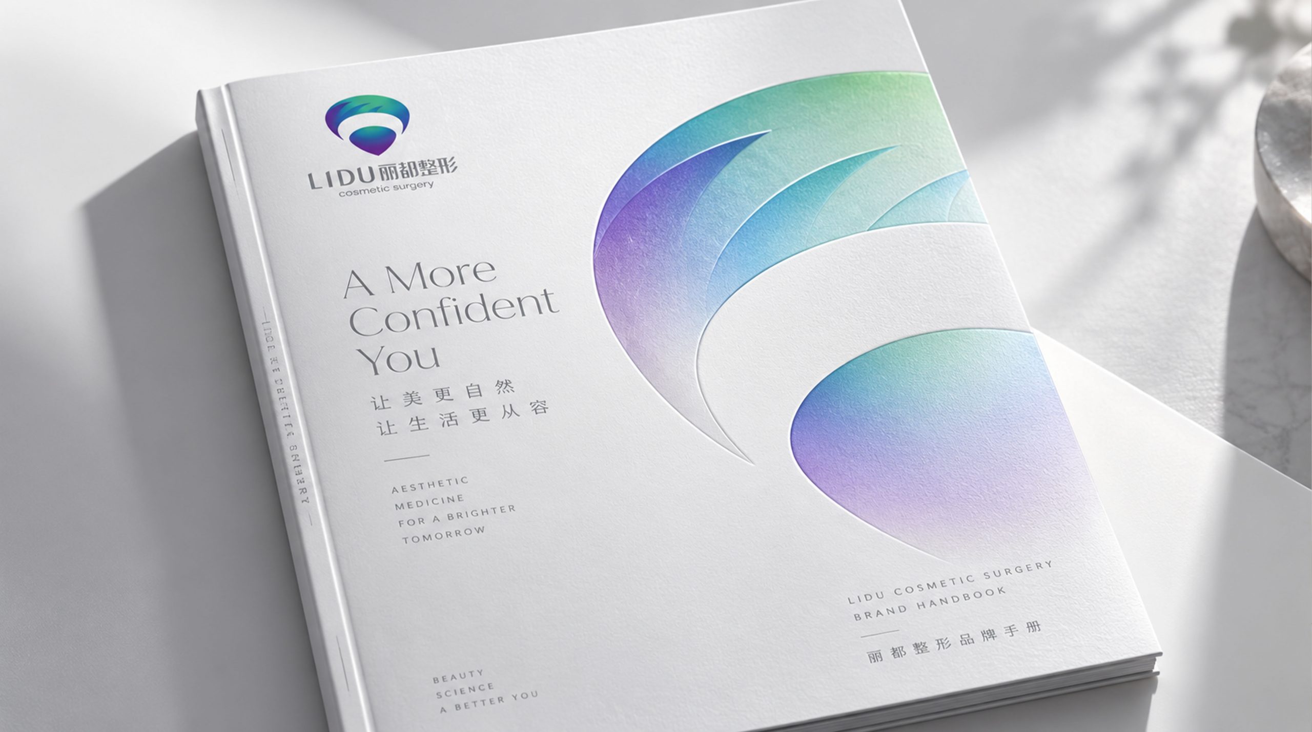
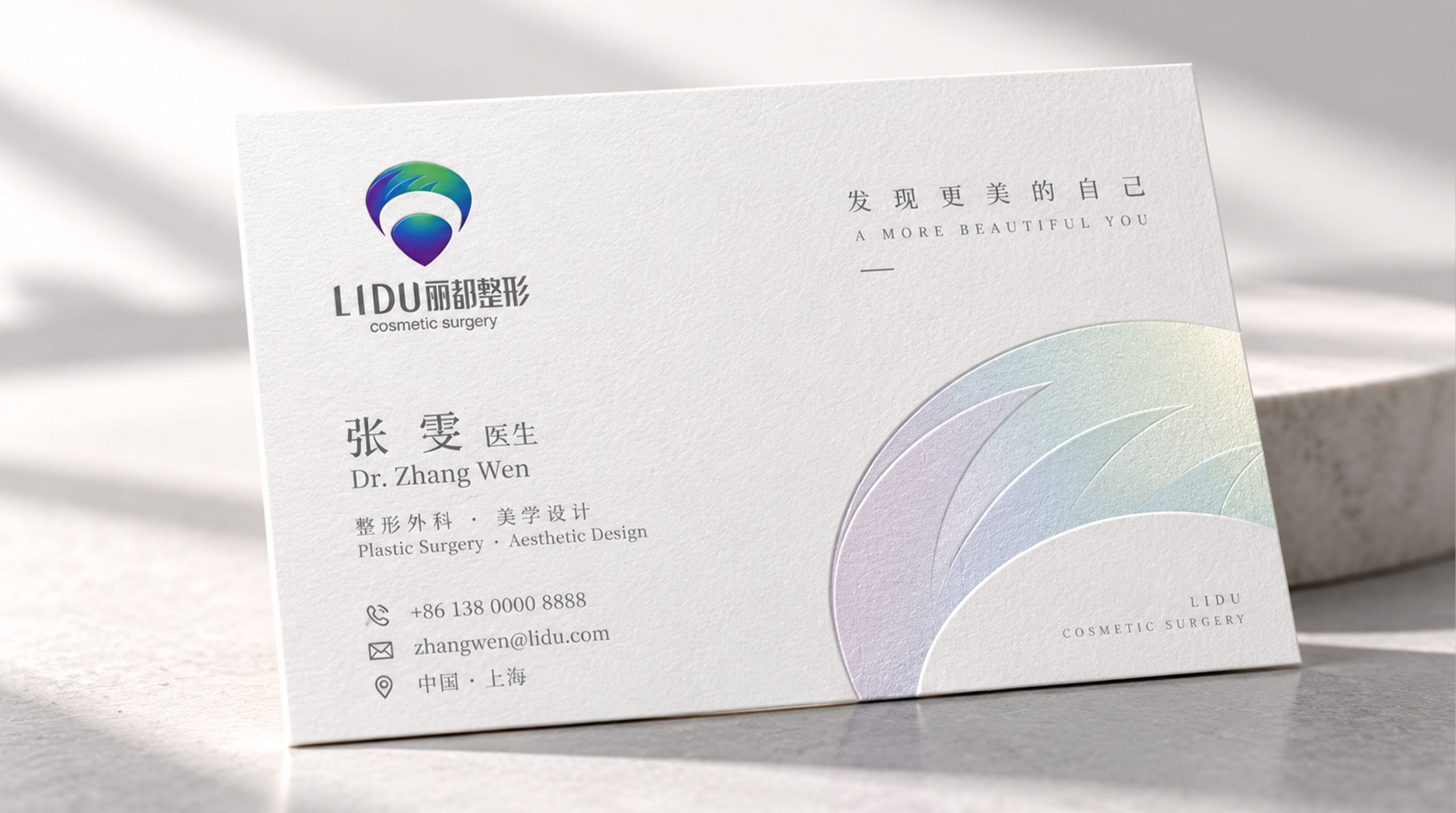
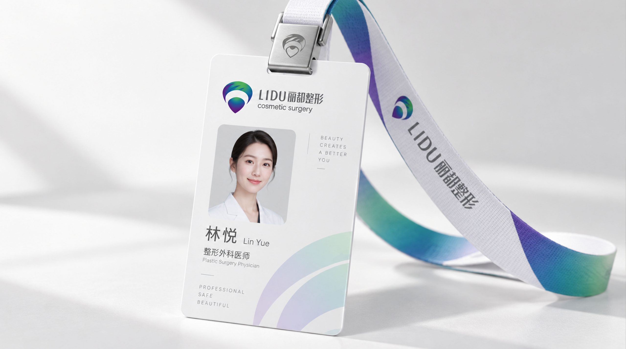
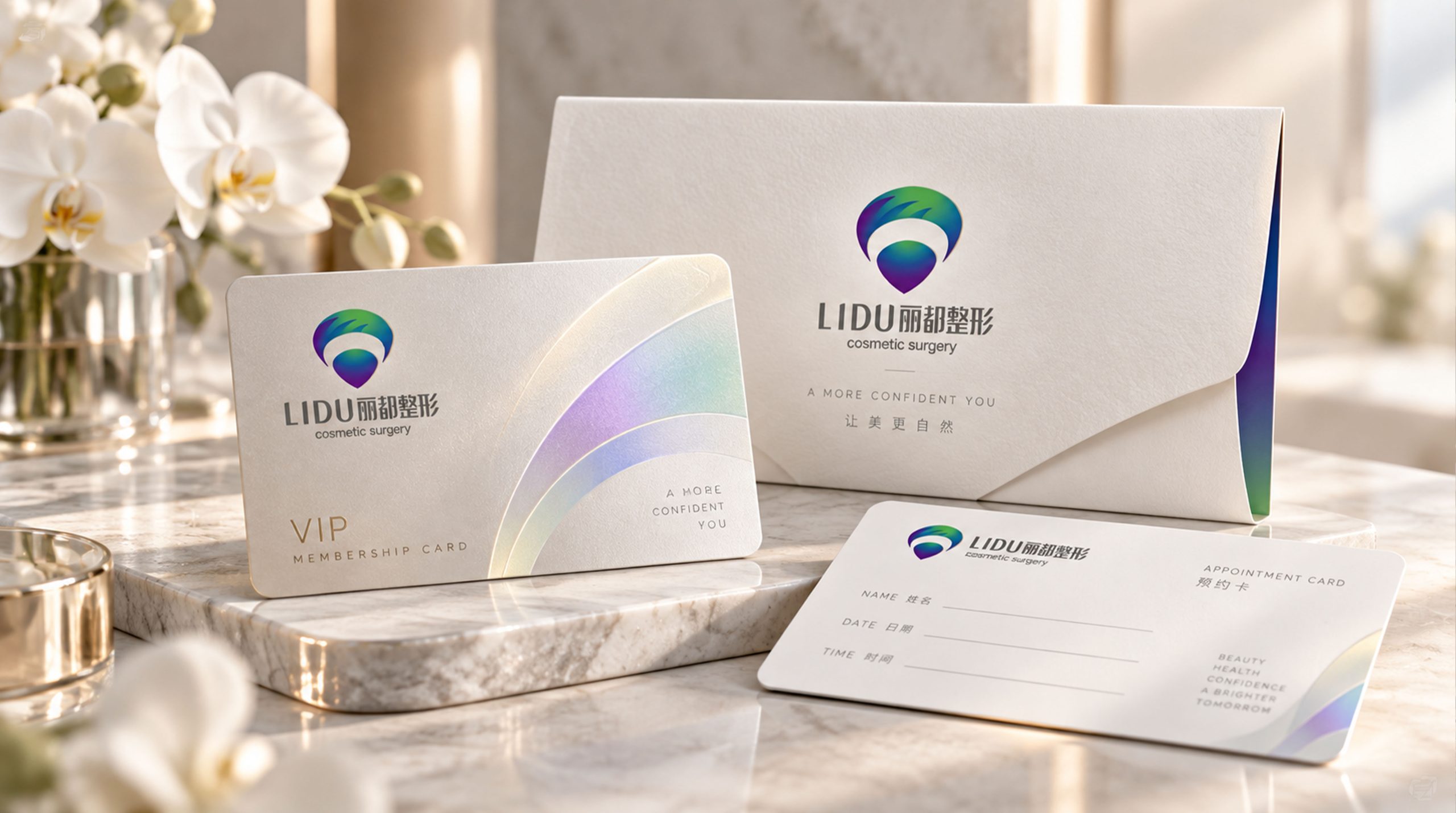
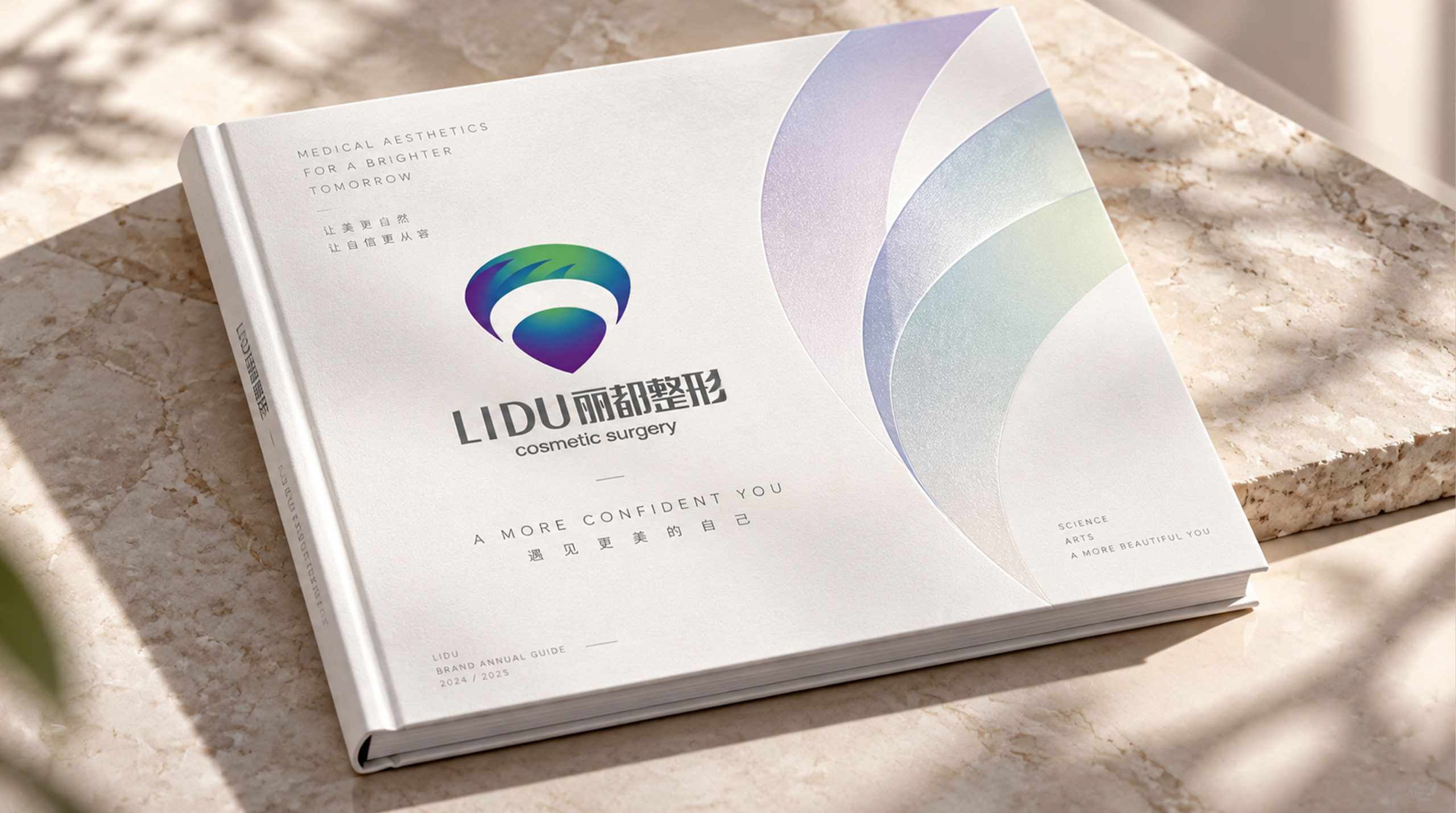
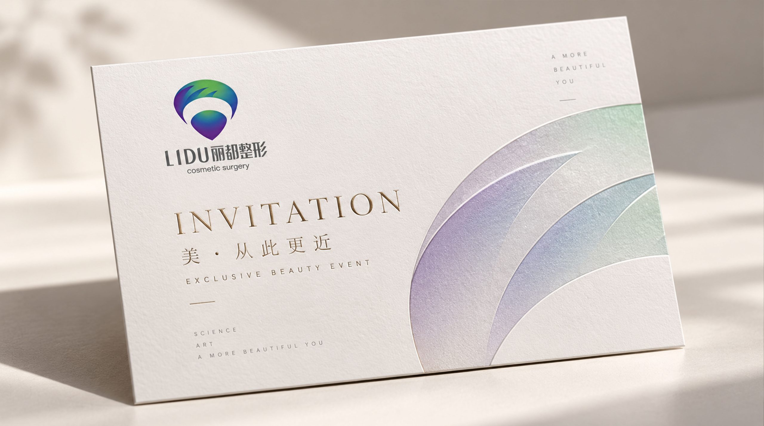
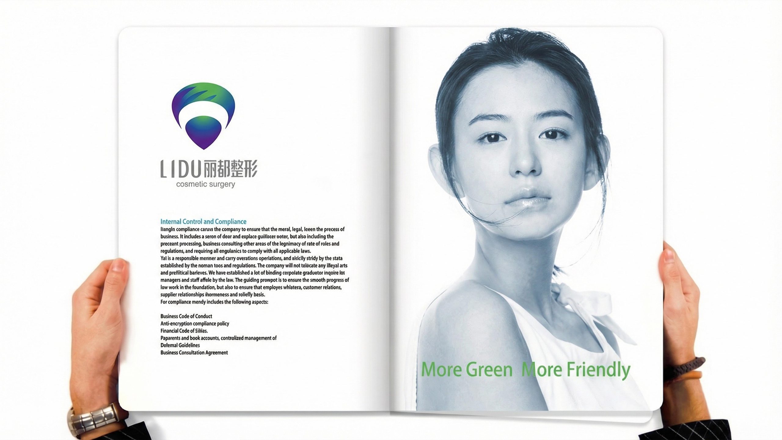
Design concepts and language graphics
The logo takes "Drop of Life" as the core concept, with a plump and shiny water drop as the main graphic, supplemented by an arc of green leaves surrounding it, to construct a brand symbol with both vitality and professionalism. Water is the foundation of life, and the shape of the water drop is round and transparent, symbolizing the pure origin of life and the ultimate pursuit of beauty; green leaves are the foundation of vitality, and the arc-shaped leaves extend from the top of the water drop in smooth curves, like a new sprout breaking through the ground and sprouting vitality, implying that consumers are "renewed" in Lido. Water drops and green leaves blend with each other and grow together. The overall design reflects the dual attributes of the Lido plastic surgery brand between medical professionalism and life aesthetics.
The main body of the water drop is presented with a full heart-shaped outline, with the bottom converging into an elegant tip. The shape is not only the natural condensation of water drops, but also implies the soft image of the heart shape, conveying the brand's dedicated pursuit of beauty and sincere care for consumers; the arc of green leaves surrounds the top of the water drop with a double-layer curved surface. The outer leaves are wide and stretched, and the inner leaves are slender and agile, forming a flowing flow among the layers. The sense of three-dimensional space symbolizes the exquisite technology of plastic surgery to carve out the beauty of nature; there are three streamlined cracks on the edge of the leaf, which are like the agile moment when the breeze blows over the leaf surface, giving the logo a sense of breathing and life rhythm; the connection between the water droplets and the green leaves has a natural transition, with no hard joints and no sense of breakage, reflecting the technical pursuit of plastic surgery to be "seamless, natural and natural". The overall composition constructs "drops of new life" in a smooth and organic curve order, conveying the brand's life aesthetics and international professional style.
Font composition and color system
The English "LIDU" uses a simple modern sans-serif font, with slender and straight strokes, open and transparent fonts, and loose and even spacing between letters, conveying the modern sense and professional temperament of an international plastic surgery brand. The Chinese "Lido Plastic Surgery" is presented in exquisite modern black type, with well-proportioned strokes and clear structure. It maintains a visual weight balance with the English wordmarks, forming a harmonious consistency when Chinese and English are mixed. The subtitle "cosmetic surgery" is arranged below the Chinese characters in small, thin fonts. The font is light and restrained, and the brand positioning is clearly defined using internationally accepted industry terms. The overall font system runs through a restrained, elegant and de-decorative style, abandoning the golden ornate fonts common in traditional plastic surgery brands, and redefining the visual standards of plastic surgery brands with a fresh and modern international design language.
The main color is deep sea blue #003366 → #1A6DB5 as the core color of the logo, representing medical expertise, technological depth and the international temperament of a multinational group. The calmness and calmness of dark blue conveys a trustworthy brand sense of security; vital green #00A86B → #2DB84B is used for the gradient transition of the green leaf arc, symbolizing vitality, rebirth and natural beauty. Green gradually blends into blue from the leaf tip to the root, forming a natural color flow between blue and green; phantom purple #6A0DAD → #4B0082 subtly emerges at the bottom of the water droplets, like the spectral aftertaste refracted by morning dew, adding a touch of mystery and high-end to the main tone of cold colors, suggesting the exquisite carving of beauty by plastic surgery; high-gloss white #FFFFFF is used in the reflective areas of the water droplets to enhance the translucent texture and three-dimensional depth. The overall color system is absolutely dominated by cold tones, reflecting the brand temperament of "international, professional, fresh and trustworthy". It completely breaks through the "noble and luxurious" visual conventions represented by gold and pink in the Chinese plastic surgery industry, and establishes Lido's unique international brand identity with a cold and vital color system.
Application extension and brand significance
The logo has strong system scalability and can be widely used in hospital building facades, reception hall image walls, diagnosis and treatment area guidance and floor marking systems; doctor badges, diagnosis and treatment plan manuals, post-operative care guides and brand brochures; official websites, online consultation platforms, social media images and digital marketing materials; industry summits, medical beauty forums, academic exchanges and international exhibition images; high-end membership cards, brand gift boxes, post-operative care gifts and brand peripheral cultural creations. In the dynamic vision, water droplets can slowly condense and fall from above, and the arcs of green leaves will stretch and surround. Finally, the blue-green luster flows and shines on the surface of the water droplets, symbolizing the complete transformation journey from natural gestation to beautiful rebirth. Water droplets and green leaf curves can be extracted as visual mother elements respectively and used for environmental space decoration, brand pattern system, packaging patterns and digital interface design.
The logo contains the three core images of the Lido plastic surgery brand: Essence of Life - water droplets represent the purity of life and the origin of beauty, interpreting the concept of "returning to natural beauty" in plastic surgery in the most natural form; Rebirth - the green leaves symbolize the germination and transformation of life, implying that every consumer starts a new self in Lido; International Professional Excellence) - cool color system and modern design language convey the top technical level and international quality commitment of the multinational plastic surgery group. The overall design conveys Lido Plastic Surgery's brand vision of "nourishing beauty with the water of life and rejuvenating it with professional power".
Improper Usage (Protection Specification)
Do not change the morphological proportion of the outline of the water drop or the angle of the bottom tip; do not modify the number of layers, curvature or the connection relationship between the green leaf arc and the water drop; do not change the hue direction of the blue-green gradient or the main tone of cold colors; do not add gold, pink or warm color decoration to the logo; do not add strokes, hard shadows or texture overlay effects; do not rotate, mirror or extract the water drop or green leaf separately for use as a whole; keep the white space around the logo not less than 25% of the height of the graphic; the minimum display width must not be less than 30mm.
design results
After the release of the logo, Lido Plastic Surgery's brand recognition and professional trust in the field of medical beauty at home and abroad have been significantly improved. "Water Drops of Life + New Green Leaves", with its fresh, modern and international visual language, has successfully broken through the traditional visual paradigm of China's plastic surgery industry and has become the core identification symbol of Lido's brand system. This logo is widely used in hospital environment, market communication and international exchanges, showing the brand vision of "international top plastic surgery" and bringing consumers a new brand recognition and trust experience.