










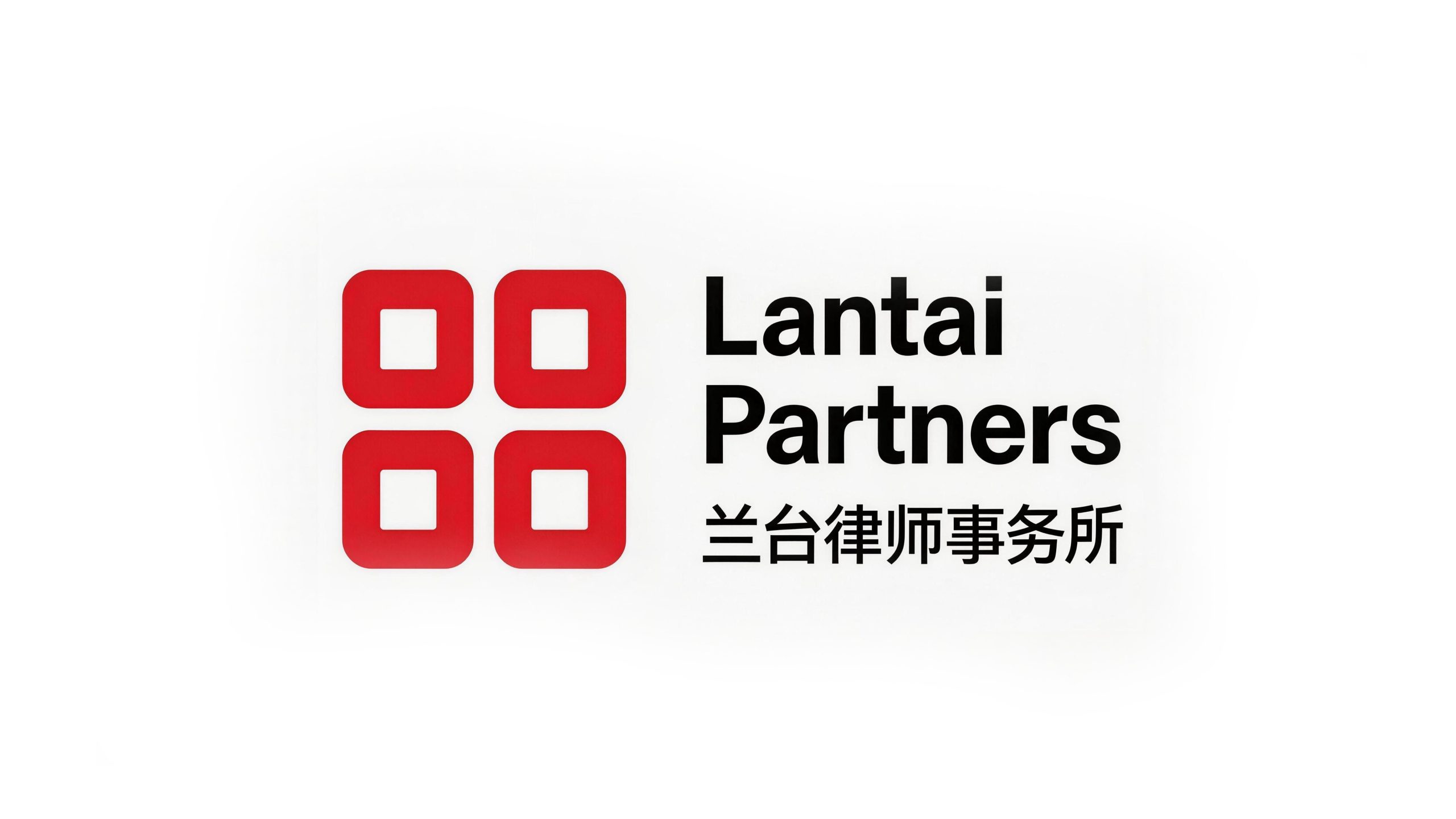
Lantai Partners is a well-known comprehensive law firm in China. It has won wide recognition in the industry for its professional, rigorous and efficient legal services.
The brand name "Lantai" comes from the Lantai institution in ancient China that is in charge of classics and laws, and carries a deep respect for the spirit of legal order and justice. The firm adheres to the service tenet of "thinking, making things happen, and not exceeding the rules" and is committed to achieving optimal solutions for clients within the legal framework. Qingmei Future was commissioned to lead the brand identity design.
The design goal of the brand logo is to demonstrate the industry status of Lantai Law Firm as a well-known legal service organization through the visual language of order, professionalism and cultural connotation, and to accurately convey its brand purpose and values of "thinking, getting things done, and not exceeding the rules".
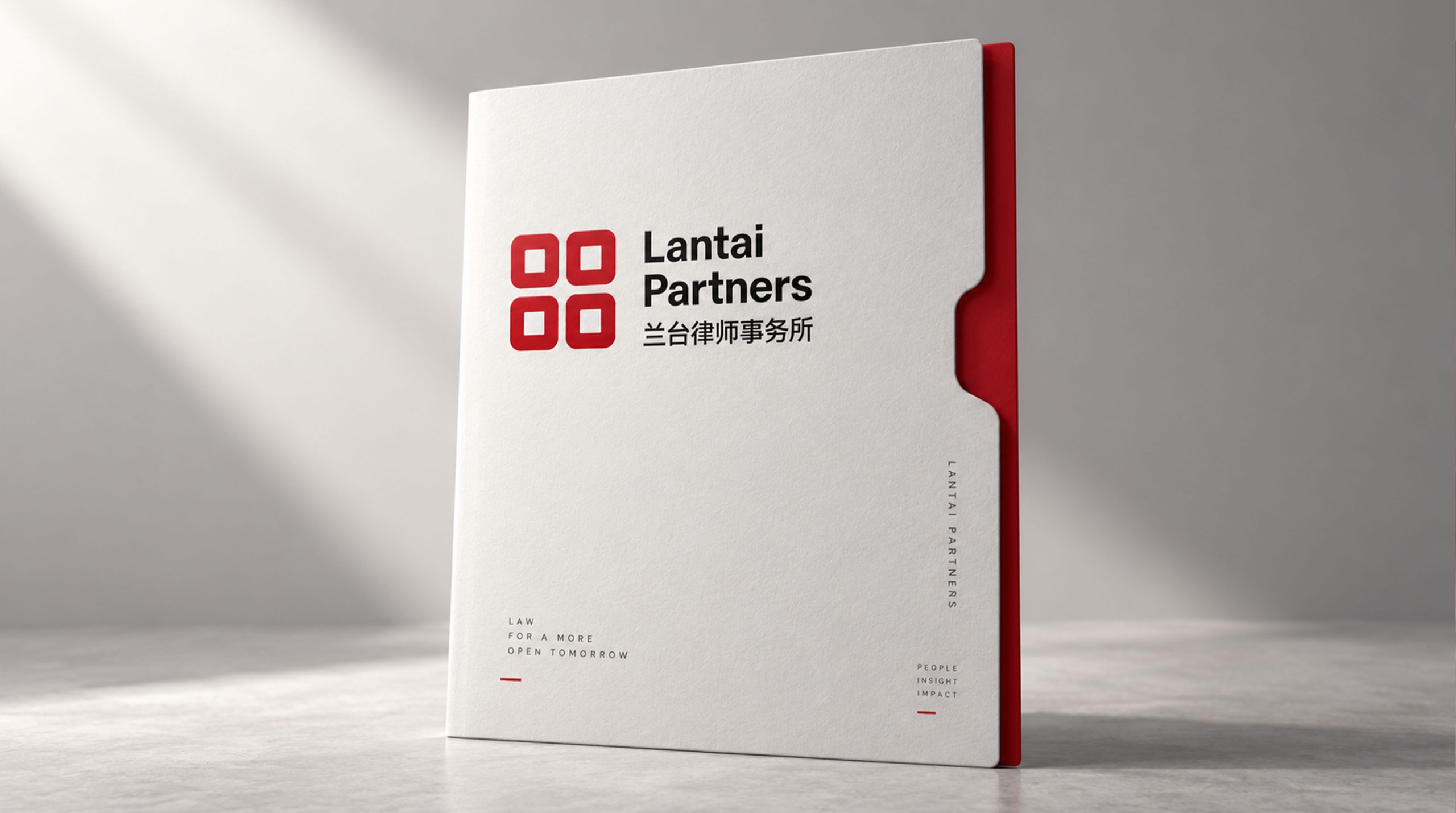
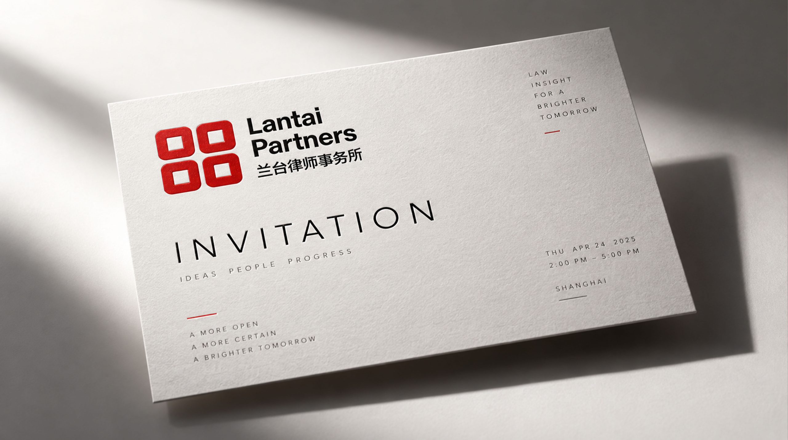
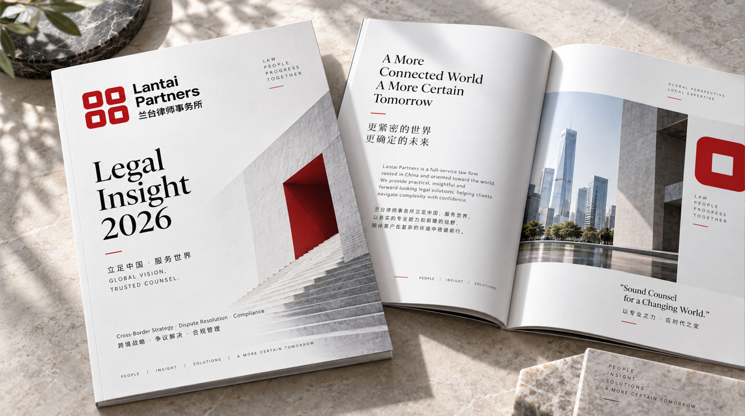

Design concepts and language graphics
The logo takes "Four Squares" as the core concept, with four rounded squares arranged at equal distances and combined into a larger square as the main visual graphic. It is neat and orderly in all directions, intuitively conveying the sense of rules and rigorous spirit of the legal industry. There is a small square hollow in the center of each square piece, which is shaped like the blank surface of a traditional Chinese seal. It not only echoes the image of classics and laws in the "Lantai" brand name, but also gives the graphics a sense of breathing and exquisite details. The four squares are closely arranged but do not cross each other and each maintains its own position, implying the core value of "not exceeding the rules" - within the framework of the law, doing things upright and adhering to boundaries. The overall design integrates the solemn ceremony of traditional seal culture with the concise expression of modern brand, reflecting the dual attributes of Lantai Law Firm between legal professionalism and cultural heritage.
The number "four" in four square blocks contains multiple brand interpretations. Firstly, "Four Squares" symbolizes all directions, comprehensiveness and stability, conveying the firm's service commitment to provide clients with comprehensive legal protection; secondly, the four squares are independent but closely collaborate, symbolizing the organic unity of teamwork and personal expertise under the partnership system. ; Thirdly, the small hollow square inside each square is like the seat of the "heart", and the outer square is where the "right" is guarded. The inside and outside are consistent, which is a direct metaphor for "what you think will come true, and do not exceed the rules" - what the heart thinks, things will come true, and all actions are within the rules and squareness. The rounded corner treatment injects a touch of softness and friendliness into the square tone, avoiding the coldness and rigidity common in the legal industry, and conveying Lantai's "upright yet warm" service attitude. The overall composition uses the simplest geometric order to construct the "seal of the law", conveying the brand's sense of rules and professional trust.
Font composition and color system
The English "Lantai Partners" uses a modern sans-serif font with straight and powerful strokes and a broad and steady font. The first letter of "Lantai" is capitalized and the rest is lowercase. "Partners" is an independent line, forming a clear visual structure of primary and secondary levels, conveying the professional authority and international image of the law firm. The Chinese "Lantai Law Firm" is presented in standard modern black font, with square and even strokes, rigorous and dignified structure, and is highly consistent with the English font in terms of visual weight and style. Chinese and English are arranged up and down, and the hierarchy is clear, ensuring the standardization and recognition of the brand in legal documents, business situations and international exchanges.
The main color of Lan Taihong #CC0000 is the only color used in the logo, representing the solemnity of the law, the power of justice and the firm stance of the brand. Red symbolizes righteousness, authority and commitment in Chinese culture. It is in the same vein as the cinnabar red of traditional Chinese seals, giving the logo a deep sense of cultural identity. The eye-catching and distinctive red color ensures that the logo has strong visual impact and brand memory in various application scenarios. The font uses pure black #000000, which supports the red graphics in the most stable tone, forming a classic red and black color system; pure white #FFFFFF is used for the square internal hollow and standard background color, symbolizing justice, transparency and the innocent nature of the law. The overall color system is composed of red, black and white, which is simple, powerful and without redundancy. It reflects the brand temperament of "the power of law lies in simplicity and fairness" and conveys the strongest brand belief with the least colors.
Application extension and brand significance
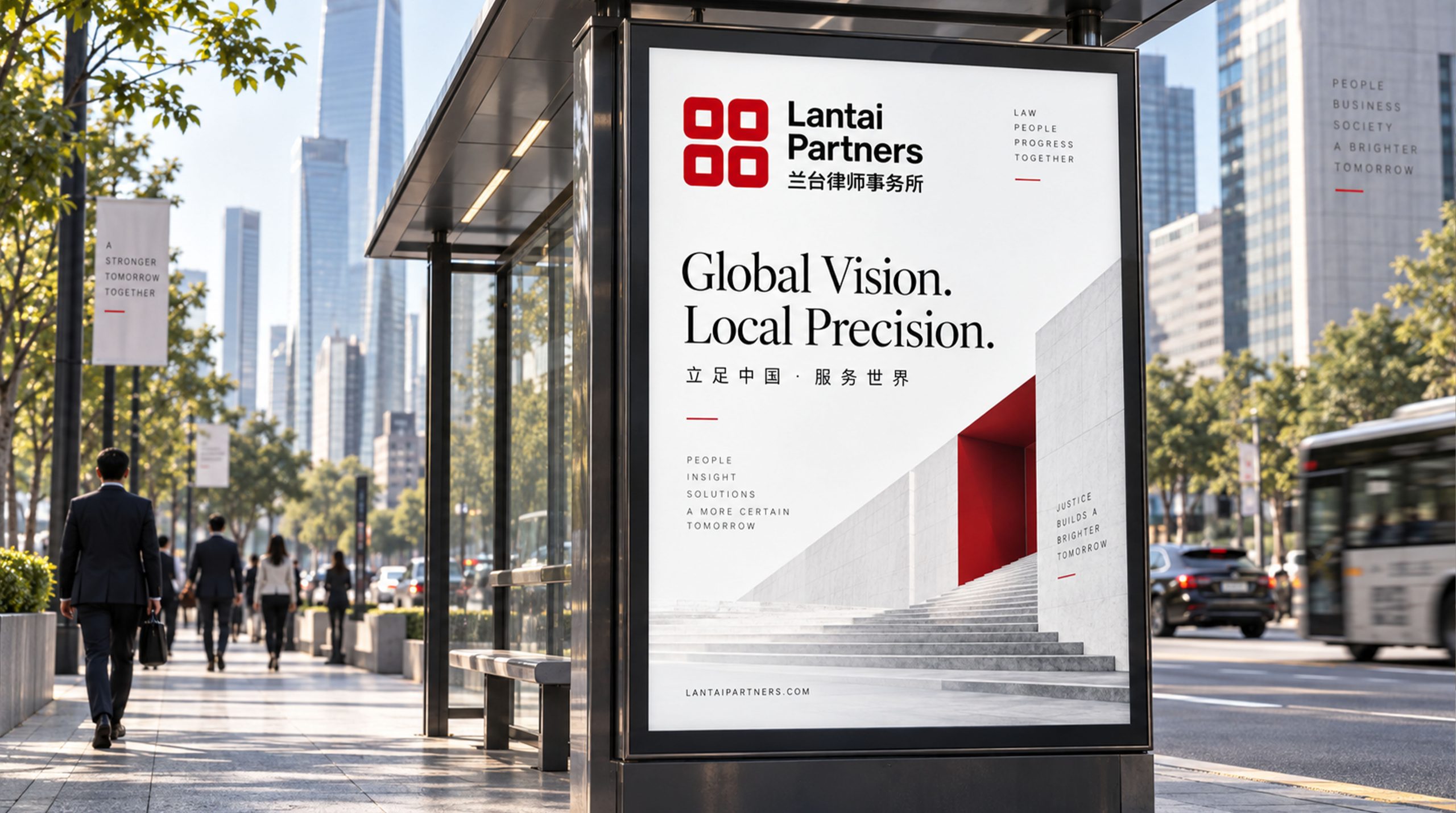
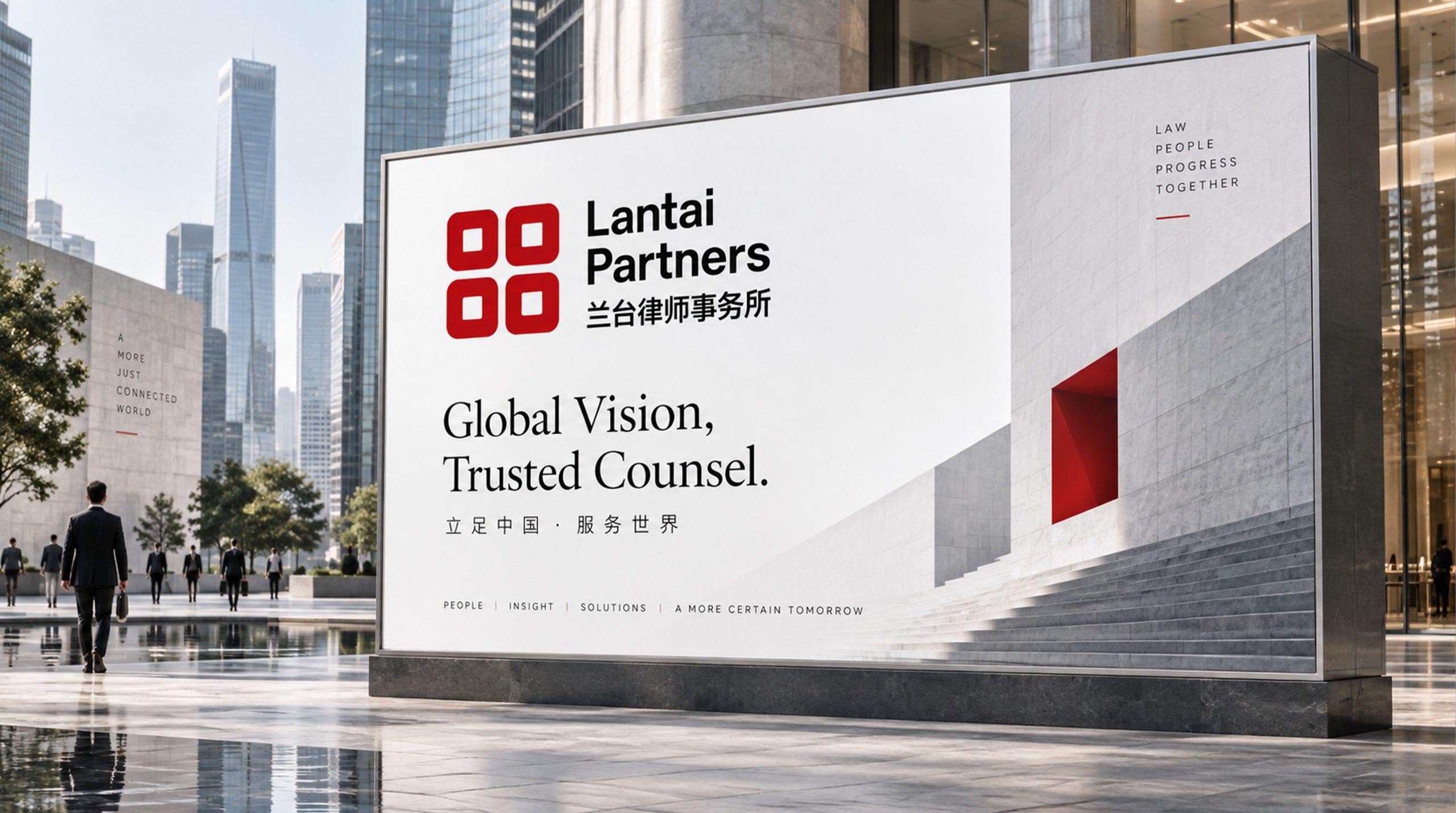
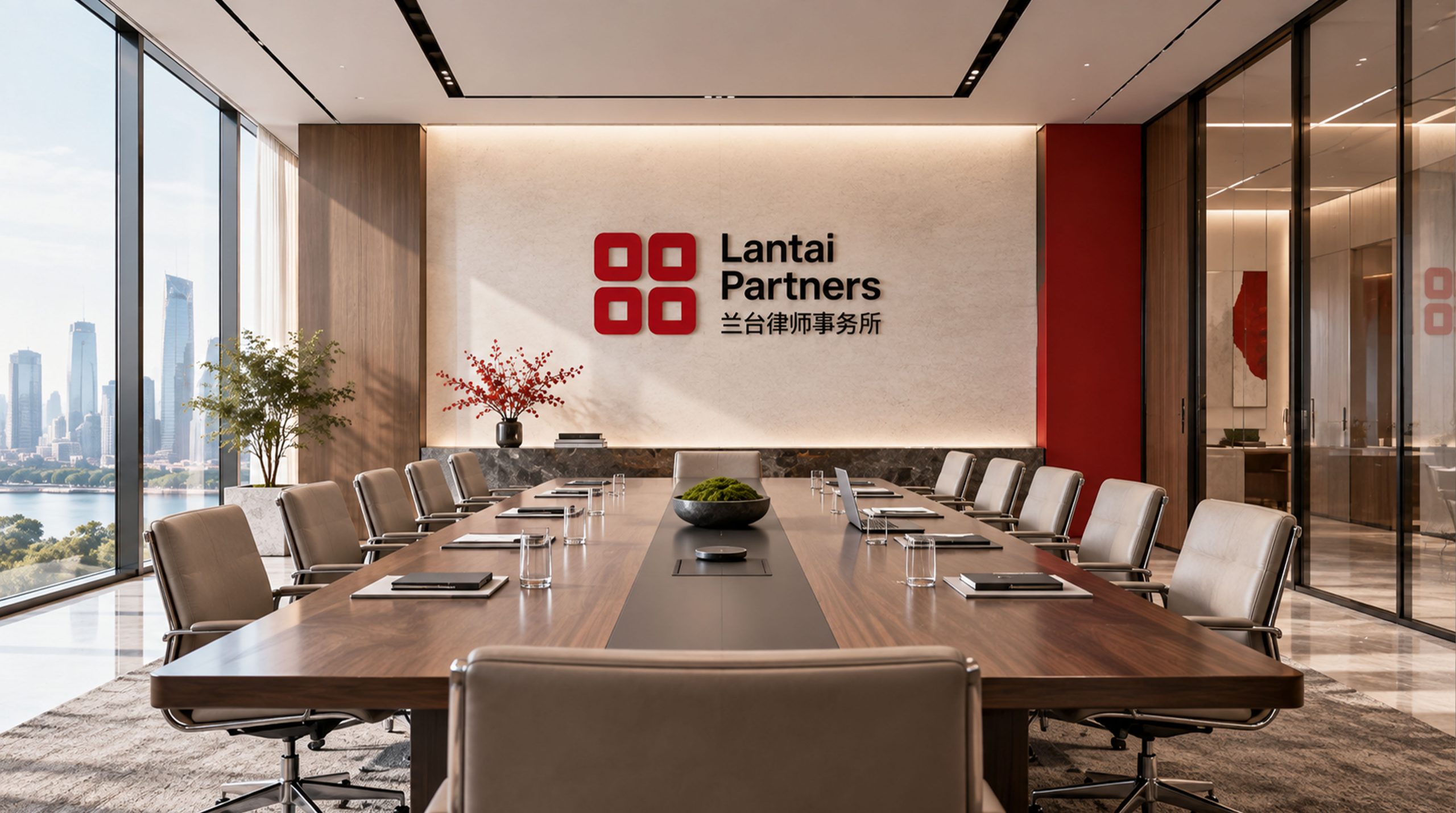
The logo has strong system scalability and can be widely used on the facade of office buildings, front image walls, conference room nameplates and floor guidance systems; lawyer business cards, legal document covers, contract templates and brand letters; official websites, customer service platforms, social media images and industry promotional materials; images of legal forums, industry summits, academic seminars and international exchange activities; brand peripheral stationery, souvenirs and high-end business gifts. In the dynamic vision, four squares can be slid in from four directions in order and accurately aligned and returned to their positions, symbolizing the establishment of legal order and the coordinated gathering of forces from all parties within the rules. The square pattern can be extended into a visual mother element and used for document shading, dividing lines, brand pattern systems and space environment decoration.
The logo contains the three core images of Lantai Law Firm's brand: Aspiration - the hollow "heart" inside the square represents the client's demands and goals. The firm undertakes every commission and expectation with professional capabilities; Achievemen t) - The four squares are closely combined and have a complete structure, symbolizing the use of systematic legal solutions to promote the achievement and realization of goals; Integrity - the correct outline and equidistant arrangement of the squares convey the professional ethics of adhering to boundaries and acting squarely within the legal framework. The overall design conveys Lantai Law Firm's brand vision of "achieving all your wishes, being upright and not overstepping the rules".
Improper Usage (Protection Specification)
Do not change the number, arrangement spacing or size ratio of the four squares; do not modify the size or position of the hollow inside the square; do not change the hue, brightness or saturation of the main color of Lantai Red; do not replace the rounded squares with right angles or other geometric shapes; do not add gradients, shadows, strokes or three-dimensional effects to the logo; do not rotate, tilt or extract part of the square separately for use as a whole; keep the white space around the logo not less than 25% of the side length of the graphic; the minimum display width must not be less than 25mm.
design results
After the release of the logo, Lantai Law Firm's brand unity and professional recognition in the legal service industry have been significantly improved. "Sifang Red Seal", with its concise, powerful and far-reaching visual language, has become the core identification symbol of Lantai's brand system. It is widely used in legal documents, business communications and industry activities, demonstrating the brand vision of "all wishes come true and no rules are exceeded".