










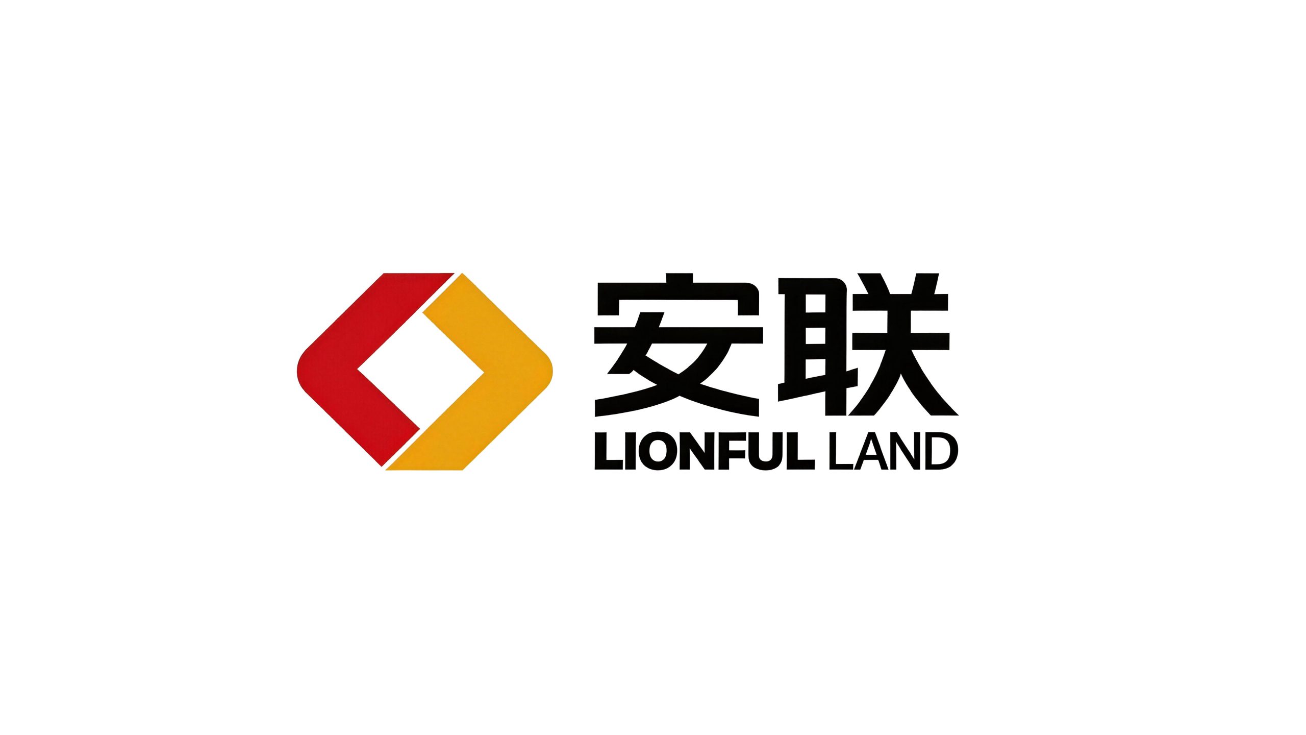
Allianz Group is a comprehensive enterprise group with diversified operations. It covers three core business sectors: Allianz Group, Anxin Alliance and Anxinhui. With "security, trust and unity" as the brand cornerstone, it is committed to providing customers with a full range of professional services.
The brand name "Allianz" means "stable alliance and trustworthy", and carries the company's strategic vision of combining resources from all parties through stable operations and creating win-win value. Qingmei Future was commissioned to lead the brand identity design. The new image design also serves the three departments of Allianz Group, Anxin Alliance and Anxinhui. As an integrated brand, it ensures its strategic height without becoming rigid, which is refreshing.
The design goal of the brand logo is to demonstrate the strategic layout of Allianz Group as a comprehensive enterprise group through circular development, enthusiastic innovation and stable and reliable visual language, while ensuring the unity and flexibility of the logo in the three major business segments, and conveying the brand's core image of "stability, unity and development".
Design concept and graphic language
The logo takes "Taiji Double L" as the core concept and the two "L" letters in the English name of Allianz Group as the basic design elements. Through a rotationally symmetrical composition, the two "L" bite each other and connect end to end, forming a Taiji ring-like cyclic graphic. In Chinese philosophy, the Tai Chi ring symbolizes the interplay of yin and yang, endless flow, and dynamic balance. It heralds the cyclic development of an enterprise—a virtuous cyclic interaction and continuous value creation between businesses, between departments, and between enterprises and customers. The two "L"s are not only the double reinforcement of "Lian", but also the visual embodiment of the "Allianz" brand spirit - the two forces unite into one, endless cycle, and endless life.
The overall structure of the graphics follows the design idea of "circle on the outside and square on the inside". The exterior uses a circular outline to wrap up the overall graphic, which is rounded and inclusive without edges and corners, symbolizing that the company's external services regard customers as God - facing the market and customers with a harmonious and accessible attitude, and winning trust and reputation with a flexible service attitude. The internal letter structure of the two "L"s maintains the geometric essence of square and straight angles, with horizontal and vertical strokes and sharp and distinct corners, symbolizing active competition and never letting up internally - a square and rigorous management system that drives the efficient operation and continuous progress of the team. It is round on the outside and square on the inside, with both hardness and softness, just like the philosophical configuration of ancient copper coins, conveying Allianz Group's business wisdom of being "soft as water externally and as hard as steel internally".
Two "L"s are arranged in a 180-degree rotational symmetry in the Tai Chi ring. One "L" occupies the upper left side of the figure in a forward posture, and the other "L" is embedded in the bottom right side of the figure in an inverted posture. The two are like the Yin fish and the Yang fish in the Tai Chi diagram - each occupying half of the wall, complementing each other and dynamically balancing. The ends of the two "L" strokes are accurately connected to form a seamless closed loop. The line of sight can be traced infinitely along the strokes of the letters without any breakpoints, conveying the sustainable power of "repeating and spiraling" corporate development. The right-angled turn of the "L" forms a strong internal support structure in the circular composition, like the load-bearing frame of the building, giving the logo a sense of solidity and strength. The negative space between the two "L"s forms a symmetrical organic form, which is not only a natural product of the "L"-shaped structure, but can also be interpreted as a flowing aura - the Tai Chi energy flows freely between the square structures, symbolizing the resource circulation and synergy between the various business sectors within the enterprise. The overall composition uses the sustainable cycle of the Tai Chi ring and the philosophical order of the outer circle and the inner square to build a "wheel of union" to convey the brand's development philosophy and management wisdom.
Font composition and color system
The Chinese "Allianz Group" uses a stable modern boldface, with thick and even strokes and a square and dignified structure. The word "An" conveys safety and stability, the word "Lian" conveys unity and connection, and the word "Group" highlights the scale and size of the enterprise. The four-character arrangement is compact and powerful, with a calm momentum. The English "ANLIAN GROUP" is presented in a standard uppercase sans-serif font. The fonts are regular and straight, and the spacing is calm and even. It maintains a visual weight balance with the Chinese logo and conveys the professional image of an international enterprise. In the sub-brand applications of the three major business sectors, "Allianz Group" can be flexibly replaced by "Anxin Lianxing" or "Anxinhui", while the Taichi double L graphic remains unchanged, guiding the brand systems of the three departments with a unified visual core to ensure the strategic consistency and recognition of the integrated brand. Chinese and English are arranged on the right side of the graphic, forming a classic brand horizontal structure of "picture on the left and text on the right" to ensure standardized application and clear communication in various business scenarios.
The main color Allianz Red #CC0000 is used in the core area of the "L" letter and Chinese logo above, representing enthusiasm, vitality and aggressive entrepreneurial spirit. Red is the color with the most energy and action, conveying Allianz Group’s courage and enthusiasm in facing market opportunities. It also symbolizes good luck, prosperity and vigorous development in the Chinese cultural context. Auxiliary golden #F5A623 is used as an accent element in the lower "L" letter and brand system, representing innovation, value and wealth creation. The brightness and warmth of golden color injects innovative vitality into the logo, conveying the company's development attitude of continuous exploration and forge ahead. Stable black #1A1A1A is the basic text used in English logos and brand systems, representing stability, professionalism and unshakable corporate foundation. The depth and restraint of black provide a steady tone support for the passion and brightness of red and yellow, ensuring that the brand image is not frivolous. The three-color combination of red, yellow and black classic colors highlights the enthusiasm, innovation and stability of Allianz Group - red ignites enthusiasm, yellow inspires innovation and black solidifies the foundation. The three colors work together to form a complete and powerful brand color system. The overall color matching is highly recognizable and memorable among Chinese corporate brands, and the most classic color combination conveys the clearest brand character.
Application extension and brand significance
As an integrated brand, the logo needs to serve the three major business sectors of Allianz Group, Essence Alliance and Anxinhui at the same time. Therefore, the flexibility of systematic extension was fully considered at the beginning of the design. As the unchanging core of the brand, the Tai Chi double L graphic can be adapted to the independent applications of the three departments with different Chinese and English names - Allianz Group uses the full name logo, ANXIN Lianhang is replaced by "ANXIN Lianhang", and Anxinhui is replaced by "Anxinhui ANXIN HUI". The three sets of logos share the same visual core, the same color system, and the same design language. While ensuring a high degree of strategic unity, the differentiation of names meets the independent identification needs of each business segment.
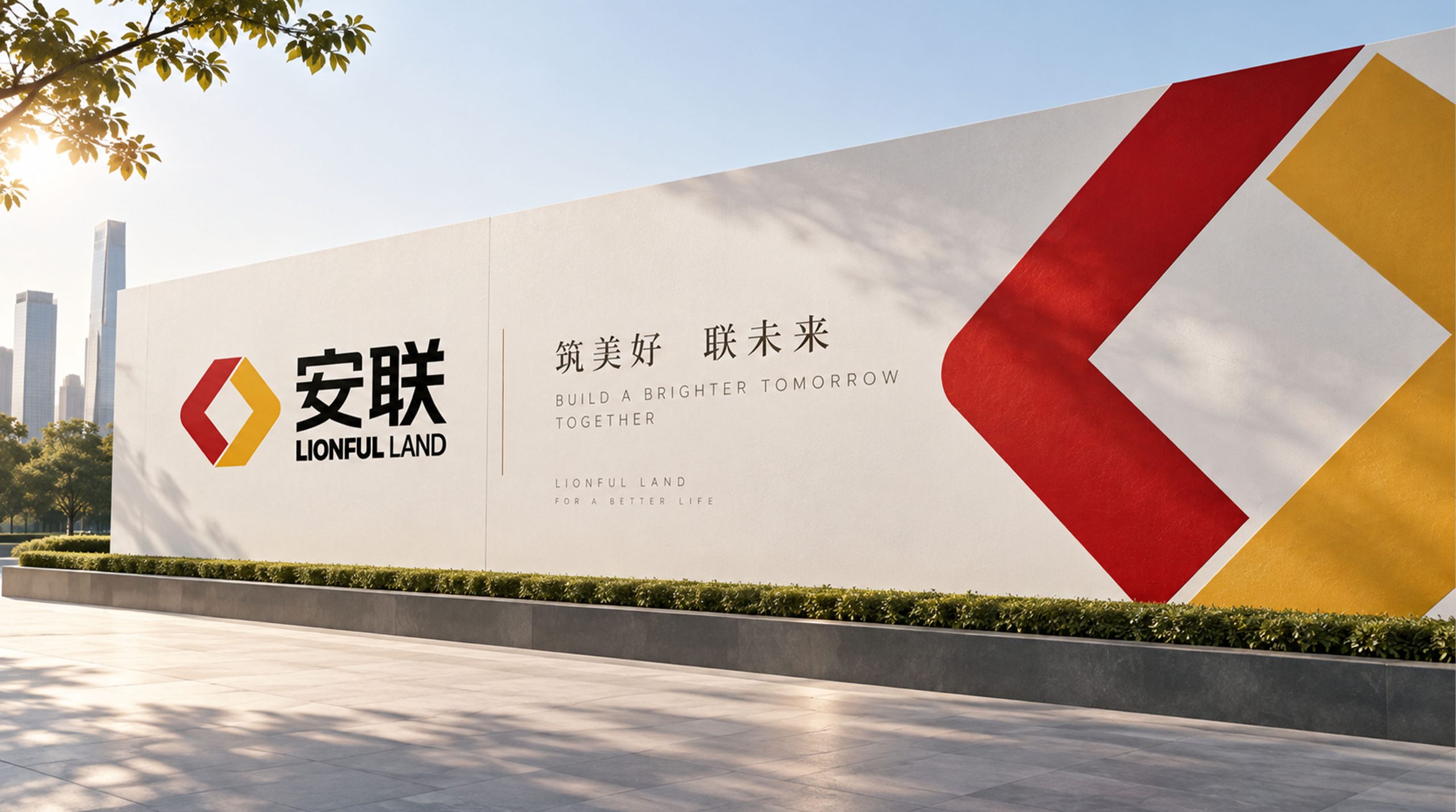
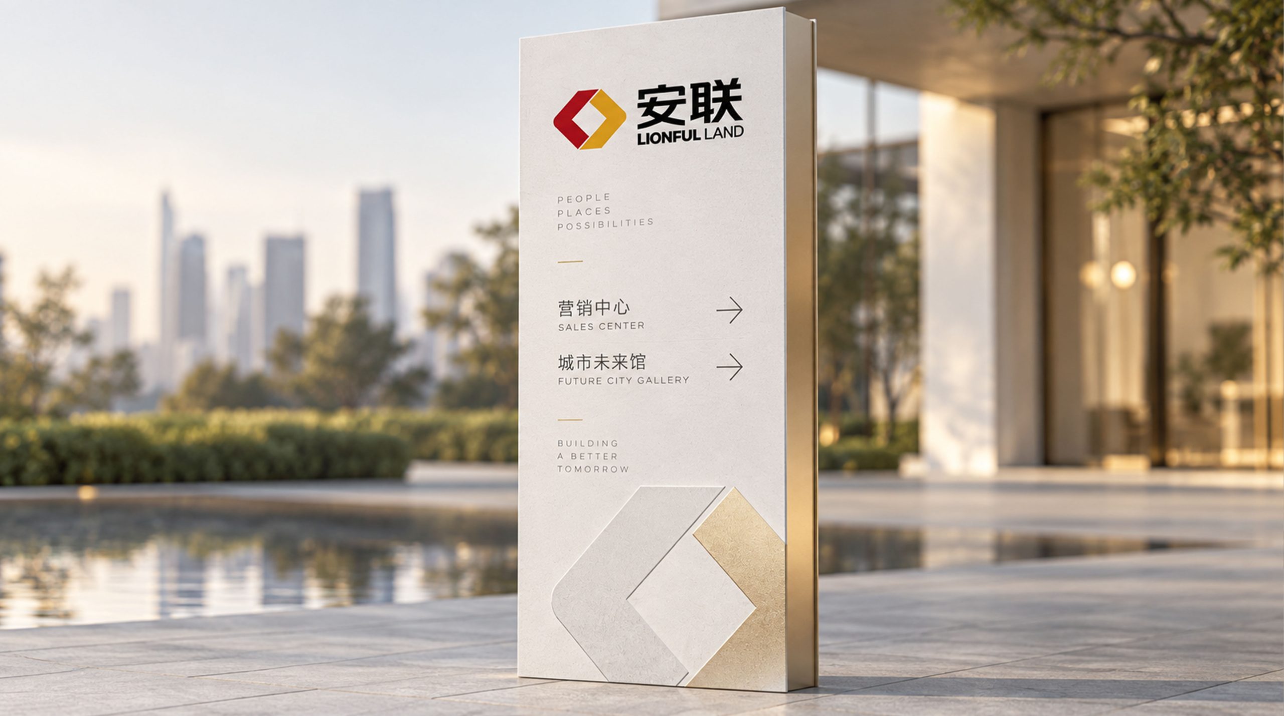
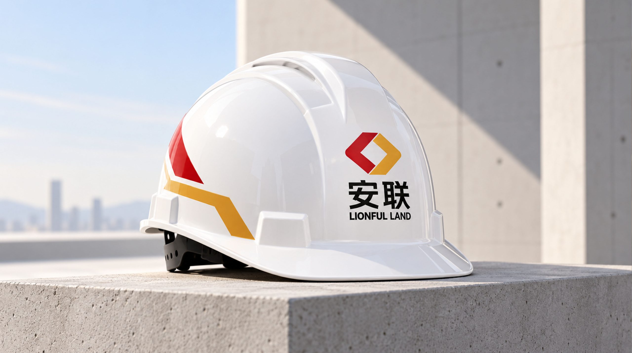
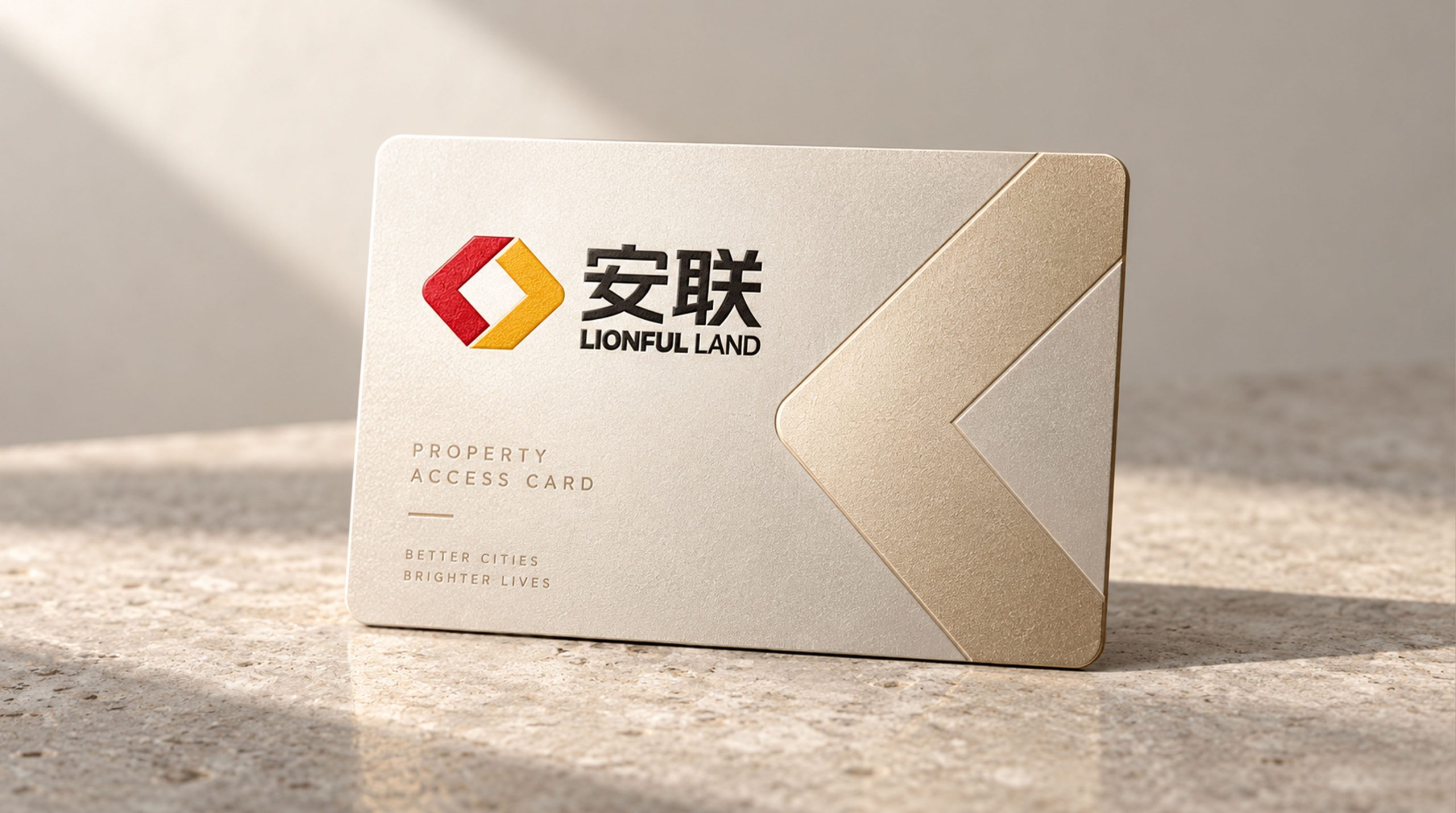
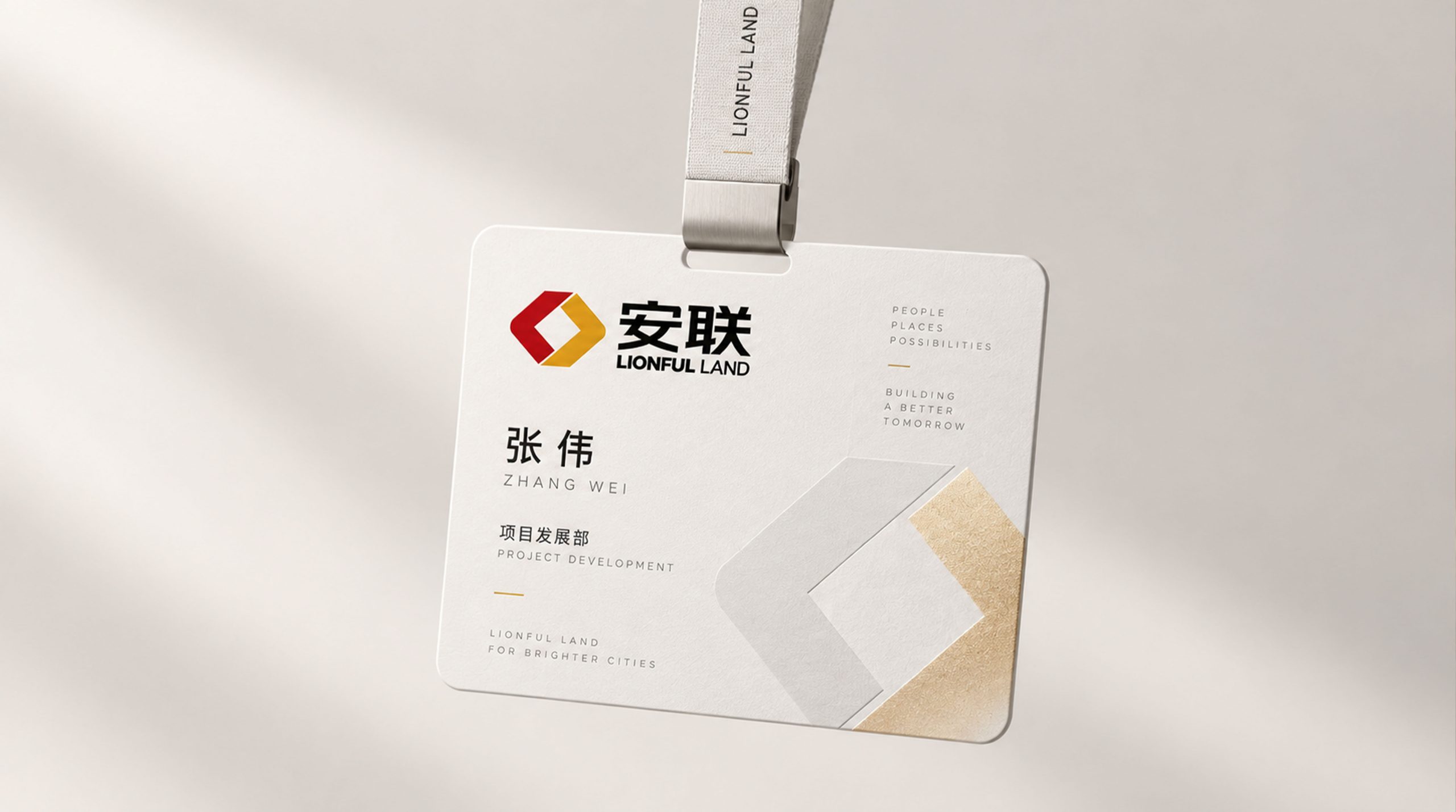
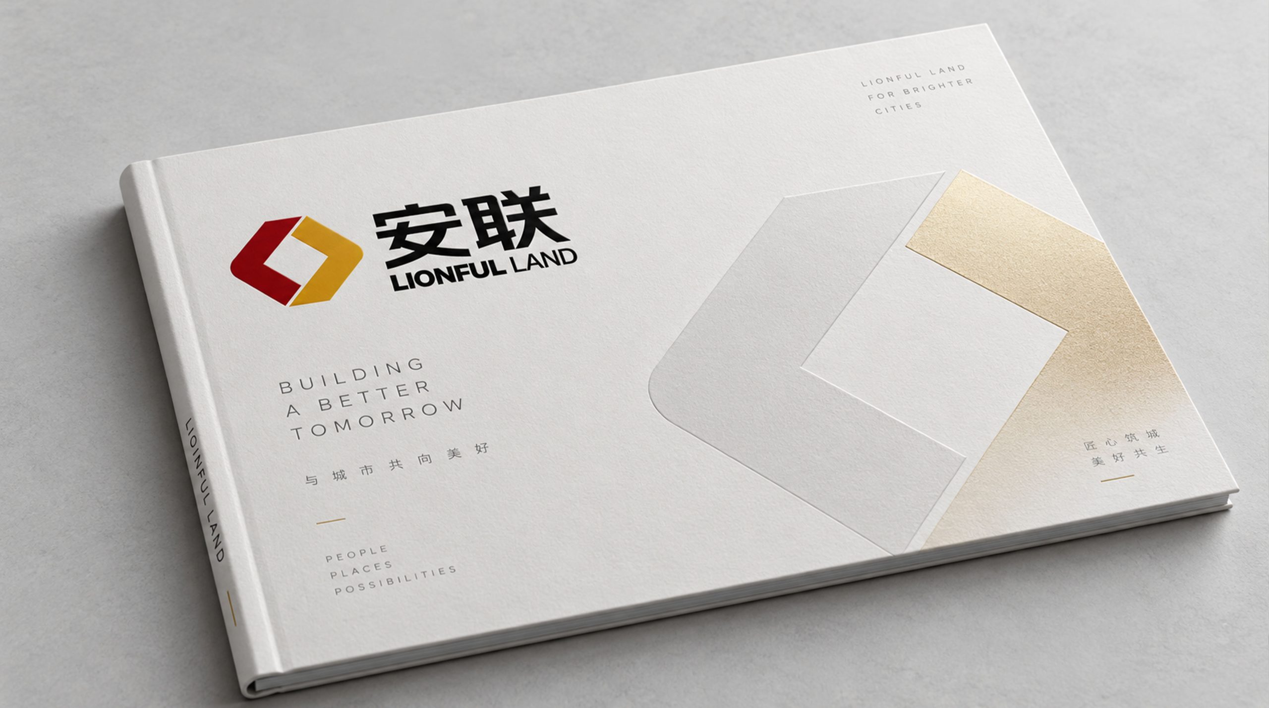
The logo can be widely used on the facade of the group headquarters building, front desk image wall, nameplates and guide systems in each department office area; business cards, corporate letters, annual report covers and investor relations materials; official website, corporate management platform, various business sector sub-websites and mobile APP icons; industry summits, business forums, government cooperation projects and cross-sector event images; business gifts, employee badges, corporate cultural products and annual souvenirs. In the dynamic vision, two "L"s can rotate and slide in from both sides of the screen, just like two forces converging from different directions, and precisely meshing in the center to form a closed loop of the Tai Chi ring, symbolizing the integration process of various business sectors within the Allianz Group from independent operation to collaborative alliance. The Tai Chi double L graphic can be extended into a visual mother element and used for departmental color logos, brand patterns, event main visual decoration and digital interface design.
The logo contains the three core images of the Allianz Group brand: Cyclical Growth - the closed cycle of the Tai Chi ring indicates the company's sustainable development momentum of repeated spiraling; Flexible & Firm - the outer circle symbolizes the flexible attitude of external service that regards customers as God, and the square "L" inside symbolizes the rigid management that never relaxes in active internal competition; Unified Brand) - The unified Tai Chi double L graphic serves Allianz Group, Anxin United Bank and Anxin Association at the same time, leading the three major business sectors with the strategic height of integrated brand. The classic color scheme of red, yellow and black highlights the passion, innovation and stability of the Allianz Group. The overall design conveys the Allianz Group's brand vision of "stable alliance, circular development, and passionate innovation".
Improper Usage (Protection Specification)
Do not change the rotational symmetry angle, bite mode or relative proportion of the two "L"s; do not modify the composition relationship between the outer circle and the inner square or to replace the circular frame with a square one; do not change the hue, brightness or respective designated application areas of the three colors of red, yellow and black; do not split the two "L"s into independent elements Do not use gradients, strokes, shadows or excessive three-dimensional effects to the logo; do not replace or modify the Tai Chi double L graphic core in the application of the three major business sectors; keep the white space around the logo not less than 25% of the diameter of the graphic; the minimum display width shall not be less than 25mm.
design results
After the release of the logo, Allianz Group's brand unity and strategic image in diversified business fields have been significantly improved. "Tai Chi Double L", with its unique visual language that combines the wisdom of Eastern philosophy and modern design sense, has become the core identification symbol of the Allianz Group's integrated brand system, and serves the three major business segments of Allianz Group, Anxin Alliance and Anxinhui. The new image design ensures a strategic height without becoming dull, which is refreshing. The classic color combination of red, yellow and black establishes a distinct brand personality in market communication, showing the brand vision of "stable union and circular development".