










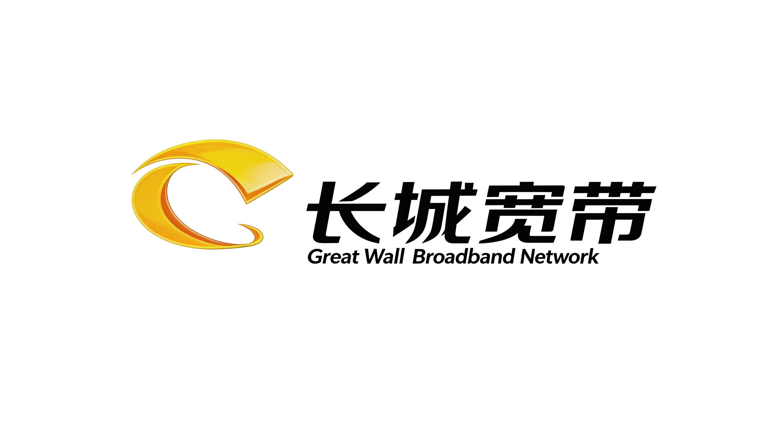
Great Wall Broadband is a well-known broadband network service provider in China. It provides high-speed, stable and convenient Internet access services to hundreds of cities across the country, providing high-quality broadband network experience to tens of millions of home and business users.
The brand name "Great Wall" comes from the Great Wall, the most symbolic and great project of the Chinese nation. It means that the brand is as strong and reliable as the Great Wall, spanning thousands of miles and connecting thousands of households. Qingmei Future was commissioned to lead the brand identity design.
The design goal of the brand logo is to demonstrate Great Wall Broadband's industry status as a national broadband network service provider through the visual language of technological speed, connection breadth and national cultural confidence, and to convey the brand image of "high-speed connection, stable and reliable, and covering thousands of miles".


Design concept and graphic language
The logo takes "Digital Great Wall" as its core concept and creatively integrates the architectural image of the Great Wall with the signal transmission form of the broadband network to build a brand symbol that is both nationally and culturally recognizable and full of technological dynamism. The graphic takes several parallel arcs as the main body, extending from the lower left to the upper right. The overall outline is like the magnificent silhouette of the Great Wall winding along the ridge - the city wall progresses layer by layer according to the mountainous terrain and stretches into the distance, conveying the breadth of the brand's coverage and the continuous extension of the service network. At the same time, this set of parallel arcs also visually presents the ripple shape of broadband signal transmission—just like data flow rushing through the network at the speed of light, advancing wave after wave, layer by layer, conveying the core technical attributes of high speed, smoothness, and uninterrupted broadband networks. The dual interpretations of the Great Wall and signal ripples are naturally superimposed in the same graphic, completing the one-time visual communication of "national brand + technological attributes".
The number of arcs has been carefully designed. The progressive arrangement of multiple parallel lines is like the crenellations of a city wall and the stacking of towers. It is also like the multi-band coverage of broadband signals. Each arc represents a coverage level - from community to city, from city to region, from region to the country, expanding layer by layer and reaching far and wide. Maintain uniform spacing and consistent arcs between arcs to convey the stability and standardized quality of network services. The left end of the arc starts thick and steady, and gradually becomes thinner and faster as it extends to the right, just like the dynamic trajectory of signals transmitted from the base station to the user terminal at high speed, giving the static graphics a strong sense of direction and movement. The overall trend of the arc group is rising upwards to the right, conveying the brand's vigorous development trend and the technological progress of continuously increasing broadband network speeds. The top of the figure ends with an abstract beacon or signal tower shape, which not only echoes the ancient function of the Great Wall beacon to "transmit information", but also hints at the technical nature of modern communication base stations to "transmit signals" - from beacons to fiber optic broadband, the way information is transmitted has changed dramatically over the millennium, but the essence of "connection" remains the same. The overall composition builds a "digital Great Wall" in a flowing arc order, conveying the brand's cultural foundation and technological strength.
Font composition and color system
The Chinese "Great Wall Broadband" uses a stable modern boldface, with thick and square strokes and a balanced and powerful structure. The word "Great Wall" carries the grand image of national culture, and the word "Broadband" directly points out the industry attributes and core business. The arrangement of the four characters is compact and steady, with a steady momentum. The English "Great Wall Broadband" is arranged below the Chinese characters in a standard capital sans-serif font, with regular fonts and moderate spacing to ensure clear identification of the brand in international communication and business cooperation. Chinese and English are arranged in the middle, with clear hierarchies. Together with the graphics on the left, they form a horizontal brand structure of "pictures on the left and text on the right" to ensure the standardized application of the logo in business halls, promotional materials and digital screens.
The main color, Great Wall Blue #0055A5, is the core color of the logo, representing technology, trust, speed and the vast space of the online world. Blue is the most common brand color in the global communications and Internet industries. From China Telecom to international communications giants, blue has become the visual synonym for "connection" and "trust." The choice of this color makes Great Wall Broadband's logo naturally integrate into the visual context of the communications industry. The calmness and rationality of dark blue convey the reliable quality and technical professionalism of network services. Auxiliary bright blue #00AAEF is used for the gradient highlight areas of arc graphics and technological elements in the brand system. It uses bright and clear tones to enhance the sense of speed and modern technology, and injects the bright vitality of the digital age into the main tone of dark blue. Auxiliary orange-red #E8611A is used as the accent color and service logo in the brand system, representing enthusiasm, vitality and user-oriented service temperature. The warmth of orange-red breaks the cold distance that pure blue may bring, conveying Great Wall Broadband's brand character of "warmth in technology and enthusiasm in service". Pure white #FFFFFF and dark gray #333333 are used as the standard background color and auxiliary text color to ensure the clarity and systematicness of the logo in various application environments. The overall color system is mainly blue, supplemented by orange, and black and white as the base, reflecting the broadband brand temperament of "reliable technology and enthusiastic service".
Application extension and brand significance
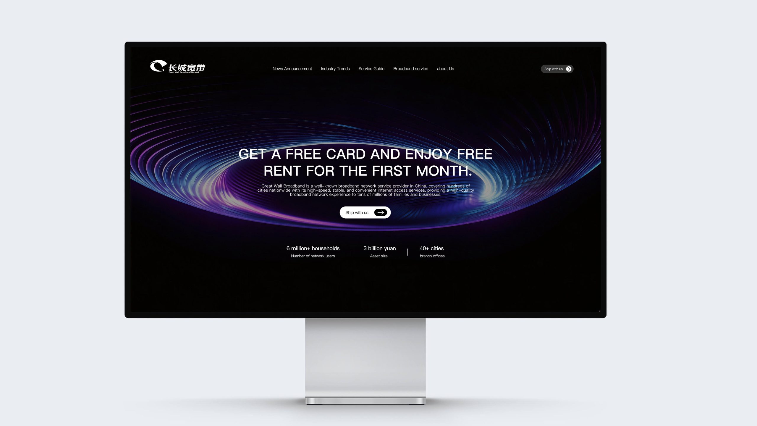
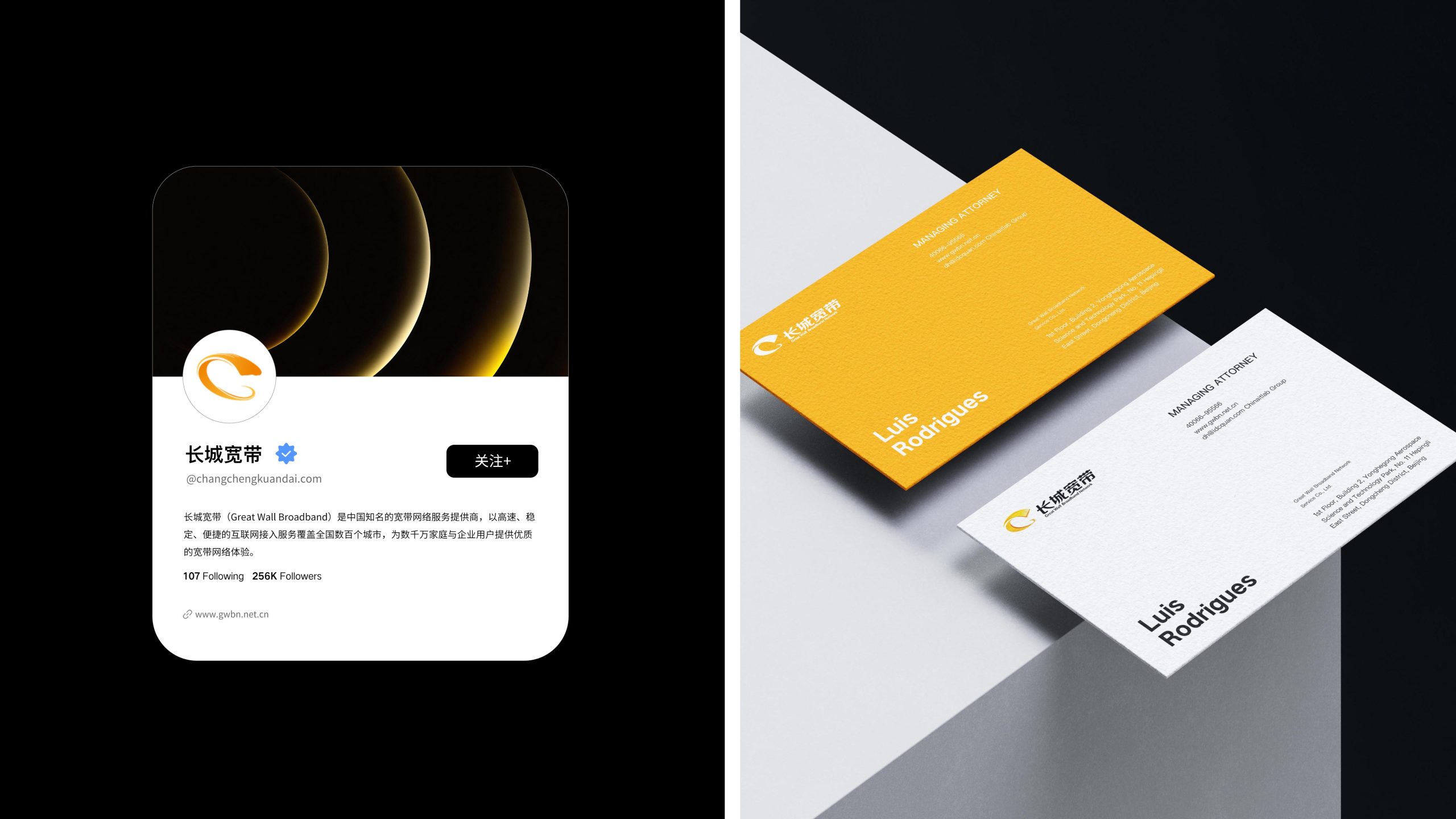
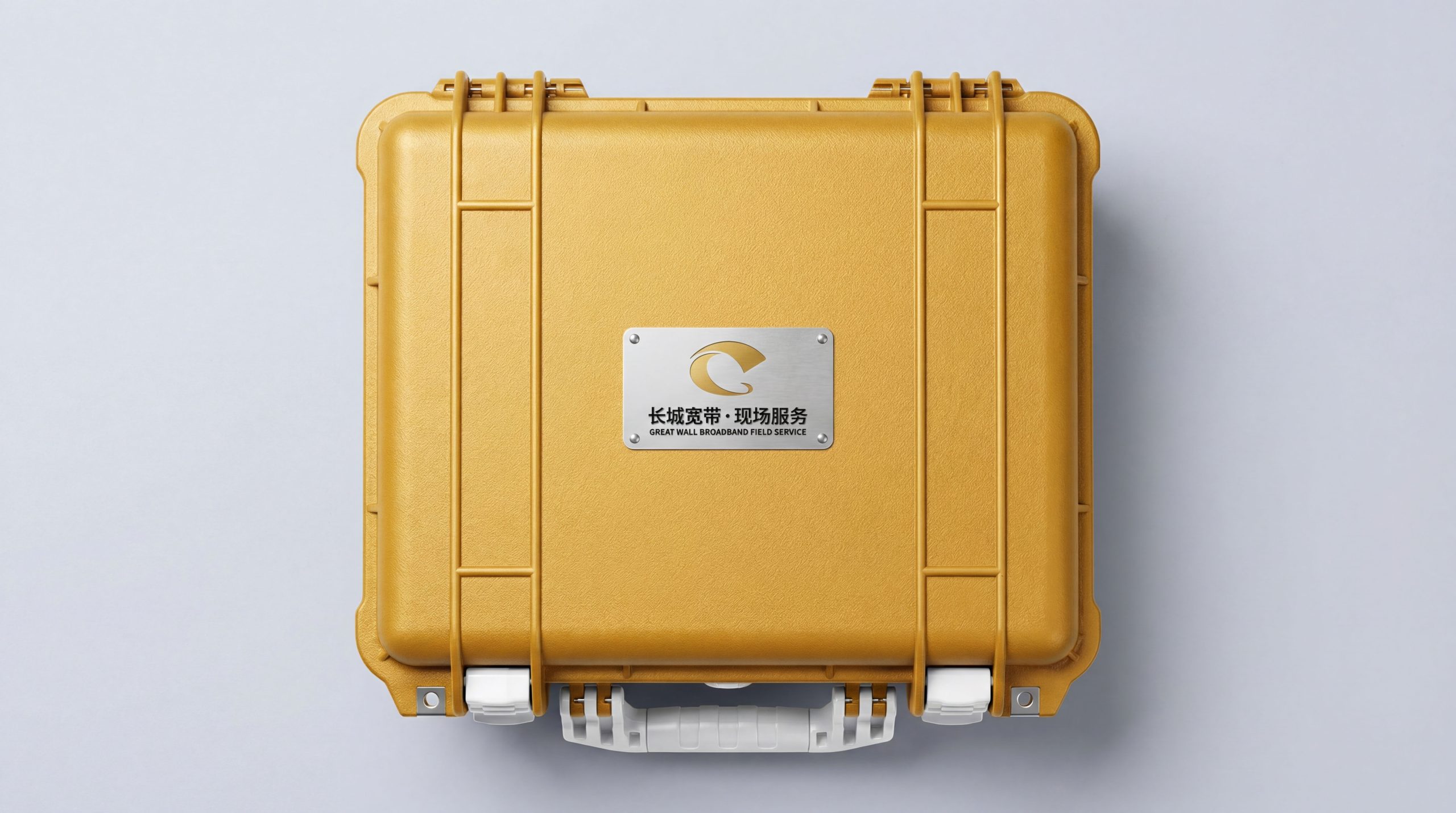
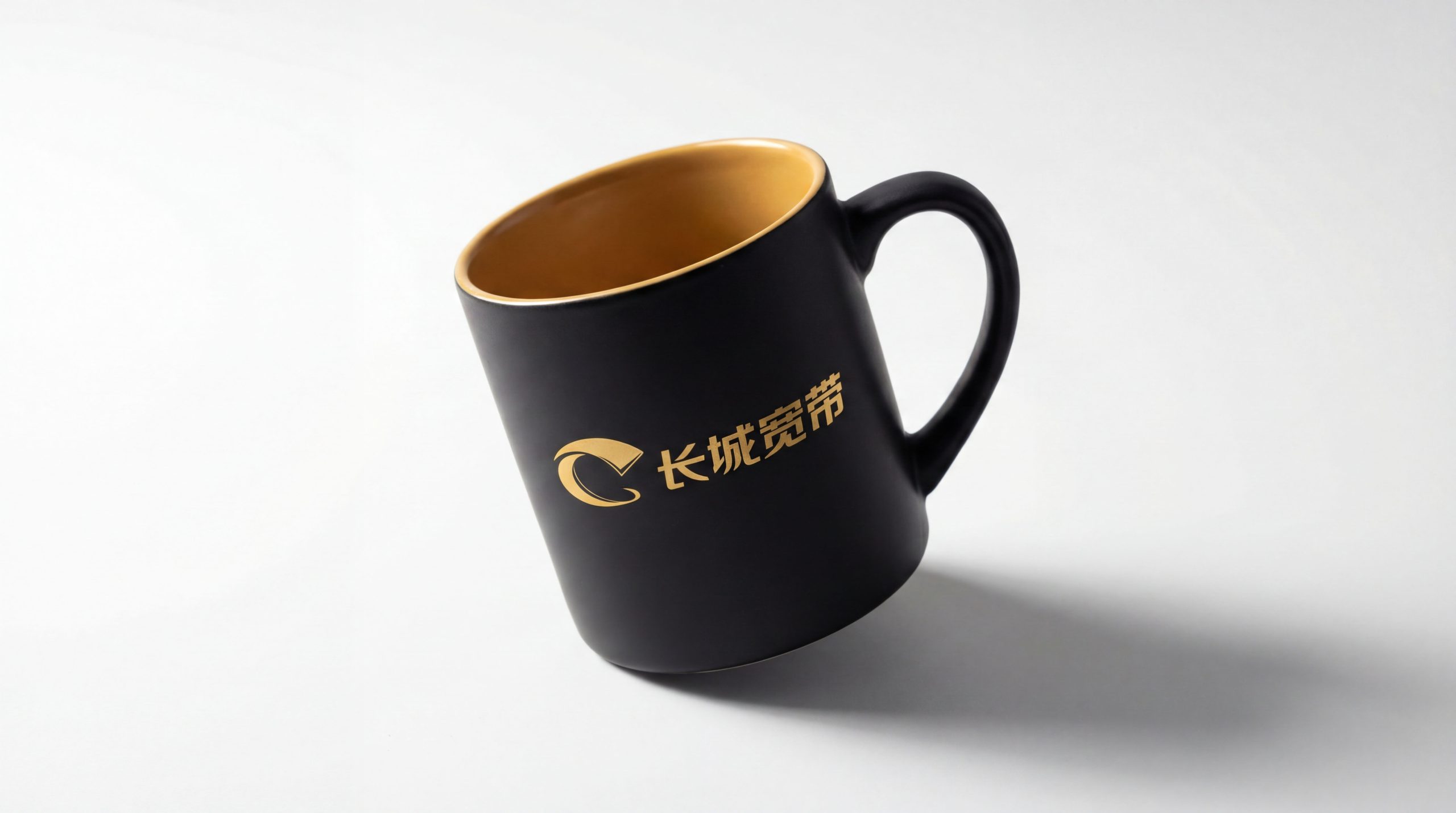
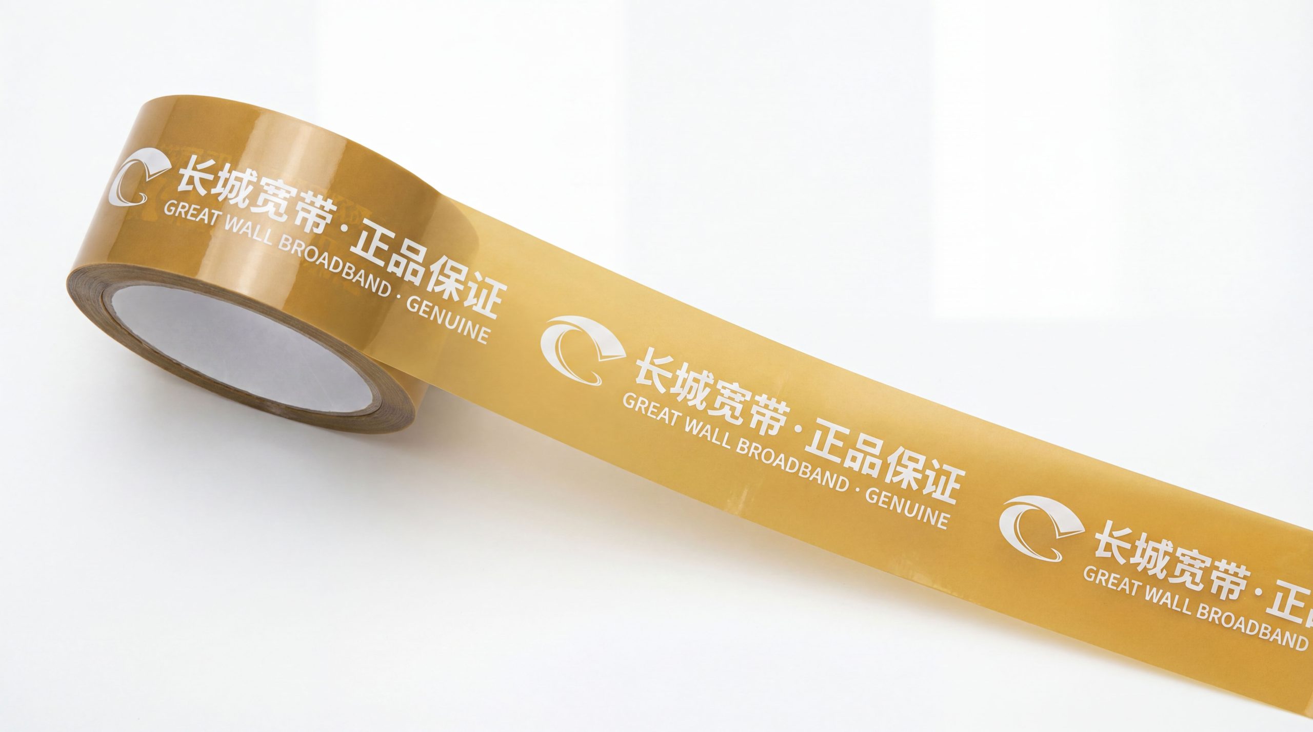
The logo has strong system scalability and can be widely used in business hall doors, service center image walls, community promotion points and outdoor billboards in cities across the country; optical modem equipment, router panels, installation tool kits and user manuals; official websites, user self-service platforms, mobile APP icons, WeChat public account avatars and social media images; city broadband promotion activities, community service days, campus discount seasons and corporate customer investment fair images; brand workwear, engineering vehicle logos, installer badges and customer service stationery. The logo is particularly prominent in the most frequent application scenario of the business hall door - the dynamic and extended direction of the arc graphics guide the line of sight to naturally flow to the brand name, ensuring long-distance visibility and rapid recognition in the street environment. In the dynamic vision, several arcs can be shot out from the left at the speed of light and extend cascading to the upper right, just like the broadband signal starting from the base station and traveling through the city to thousands of households. Finally, it converges at the top to form a beacon shape and lights up, symbolizing Great Wall Broadband's brand mission of lighting up digital life with high-speed network. The arc element can be extended into a visual parent element and used for package grading icons, network speed grade logos, brand patterns and business hall space decorations.
The logo contains the three core images of the Great Wall Broadband brand: Great Wall Connection - the meandering arc outline of the Great Wall symbolizes the breadth of broadband network coverage across the country and the mission of connecting thousands of households; High-Speed Transmission - the signal ripple shape of parallel arcs conveys the core technological advantages of high-speed, smooth and stable broadband networks; Solid & Reliable - the heaviness of the Great Wall architectural image conveys the brand's service commitment and quality assurance as solid and reliable as the Great Wall. The overall design conveys Great Wall Broadband's brand vision of "as strong as the Great Wall, as fast as the speed of light, and connecting thousands of homes thousands of miles away".
Improper Usage (Protection Specification)
Do not change the number, spacing, curvature or stacking direction of arcs; do not modify the overall trend of arcs from thick to thin strokes or to climb to the upper right; do not change the hue, brightness or saturation of the main color of Great Wall Blue; do not replace arc graphics with straight or polyline shapes; Do not add strokes, outer glow, texture overlay or excessive three-dimensional effects to the logo; do not rotate, mirror the extension direction of the arc graphics or delete the top beacon shape; keep the white space around the logo not less than 25% of the height of the graphics; the minimum display width must not be less than 30mm.
design results
After the release of the logo, Great Wall Broadband's brand recognition and user trust in the national broadband network service market have significantly improved. "Digital Great Wall", with its unique visual language that combines national cultural symbols and modern technological dynamics, has become the core identification symbol of the Great Wall Broadband brand system. It is widely used in business halls, community promotions and digital communication in hundreds of cities across the country, demonstrating the brand vision of "thousands of miles of connectivity, high speed and reliability". The high degree of unity between the "Great Wall" brand name and the visual image of "Great Wall" gives the logo a strong sense of brand memory and cultural identity, making it one of the most recognizable brand images in China's broadband industry.