










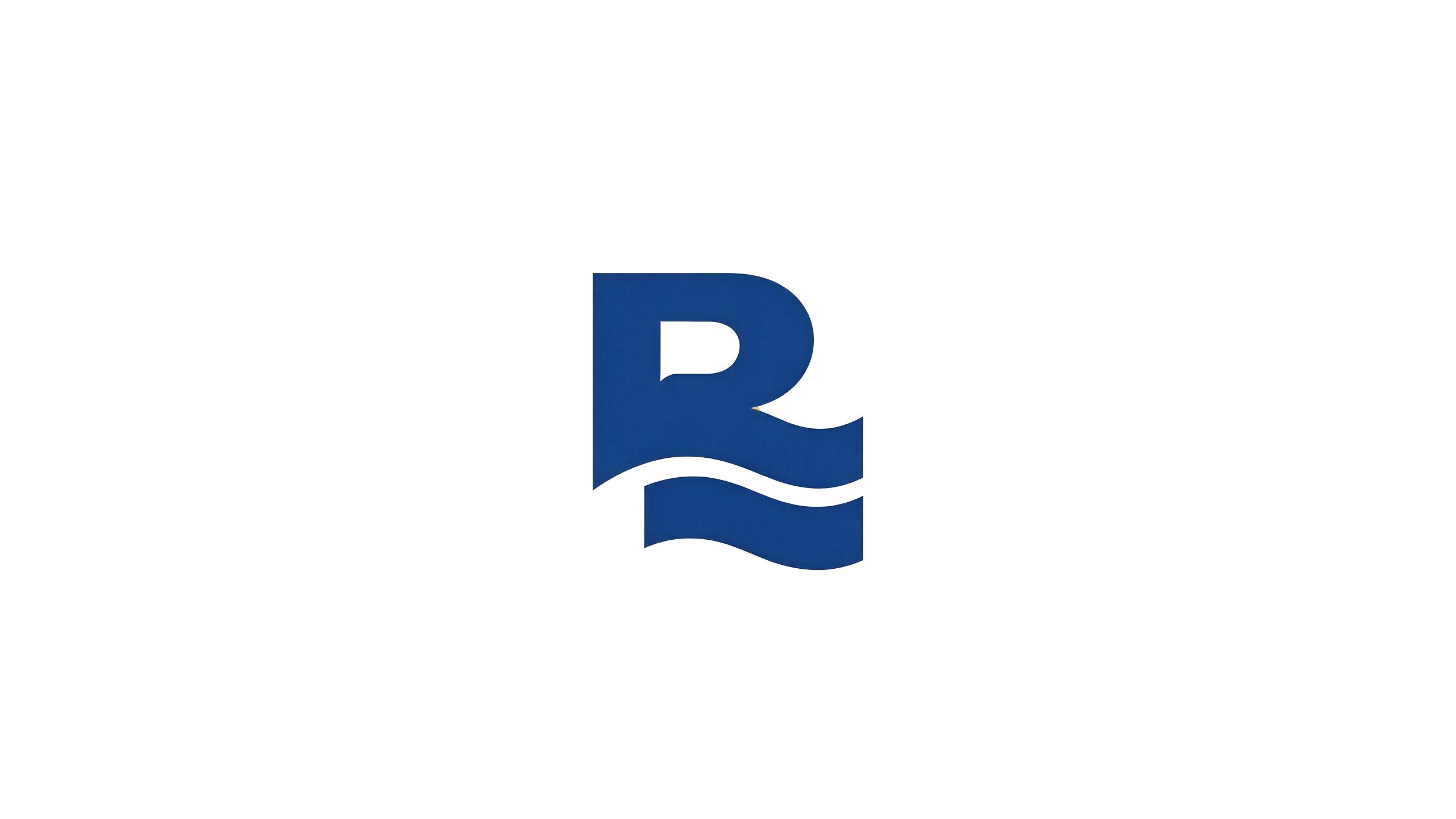
Ruige Hot Spring Hotel is a high-end resort hotel brand with natural hot springs as its core feature. With the brand concept of "Rinquan moisturizes the body and Accord peace of mind", it is committed to providing a one-stop resort experience that integrates hot spring health care and high-end accommodation for guests who pursue physical and mental healing and quality leisure.
The brand name "Rui Ge" contains beautiful oriental blessings - "Rui" means auspiciousness and auspiciousness, symbolizing the natural blessings and health and well-being of hot spring water; "ge" means elegant pavilion and pavilion, symbolizing exquisite living space and private experience. The two words combined into one outline a picture of a hot spring vacation where "the spring of auspiciousness flows in the Accord". Qingmei Future was commissioned to lead the brand identity design.
The design goal of the brand logo is to demonstrate the industry positioning of Ruige Hot Spring Hotel as a high-end hot spring resort brand through the visual language of hot spring water charm, high-end resort feeling and natural healing temperament, and to convey the brand image of "natural warmth, dignity and comfort, and unity of body and mind".
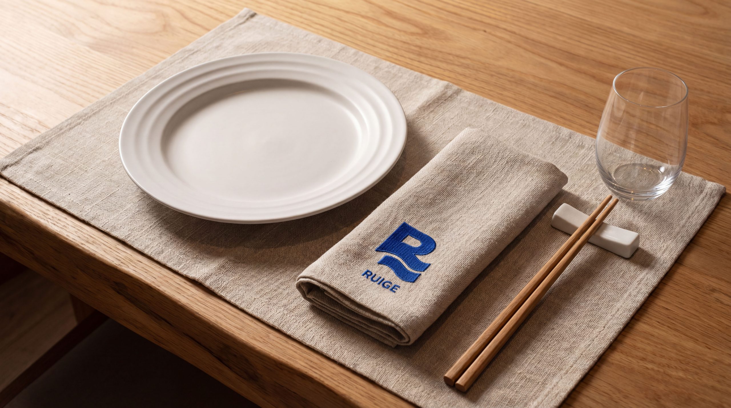
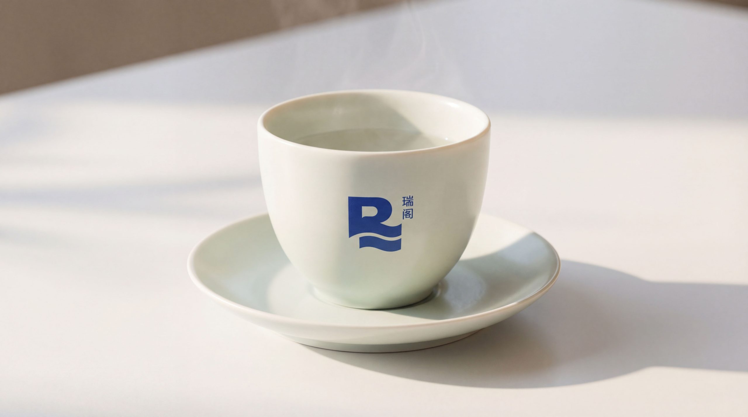
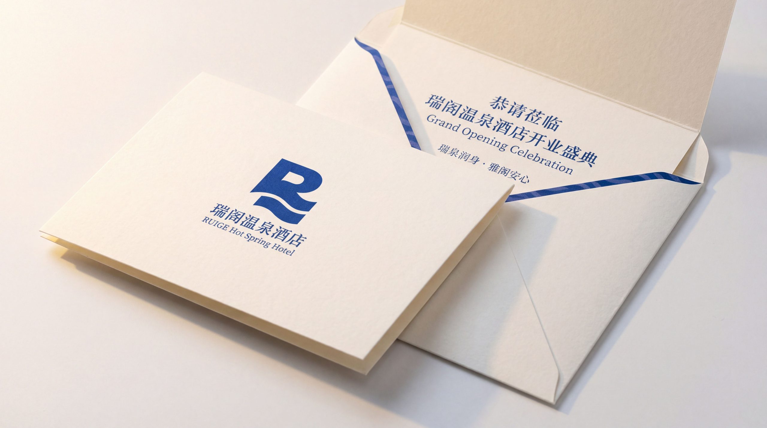
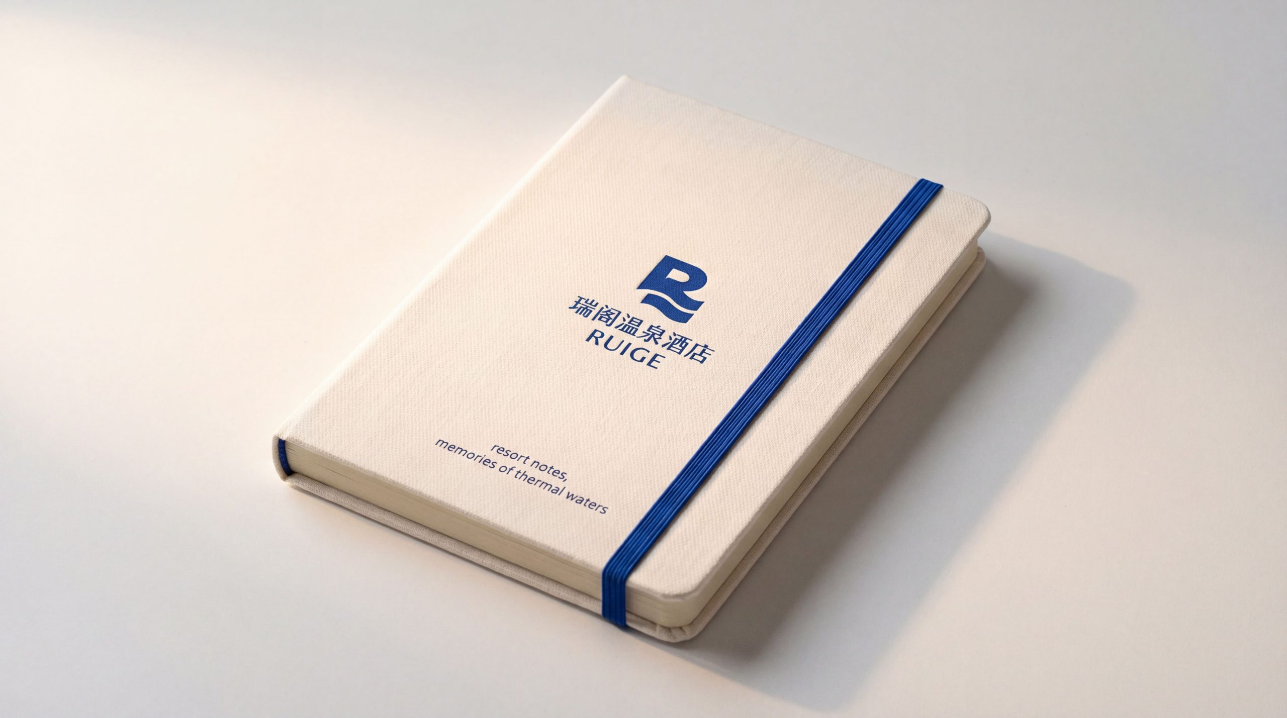
design concept
The logo takes "Aqua Pavilion" as the core concept and creatively integrates the initial letter "R" of the brand's English name with the ripple shape of the hot spring water to create a dual visual symbol that is both a brand letter and a hot spring image. The main structure of the letter "R" remains clearly identifiable, while the strokes in the lower half are transformed into several soft and flowing water wave curves, just like the graceful lines of natural hot springs gushing out from the ground and slowly rippling in the spring pool. The letters and water waves are seamlessly integrated in the same graphic - the upper part is the stability and dignity of "Pavilion", and the lower half is the agility and warmth of "Spring". One is strong and the other is soft, the other is still and the other moves, completing the one-time visual communication of the two brand keywords of "Ruige" and "Hot Spring". The overall design reflects the dual attributes of Ruige Hot Spring Hotel between high-end accommodation quality and natural hot spring experience.
graphic language
The upper part of the letter "R" is presented in a square and thick geometric structure, with vertical lines as straight as columns and rounded arcs, conveying the stability of the hotel building and the reliable quality of the brand. The arc of the head of "R" is like an elegant arch or the dome of a pavilion, using an architectural shape to suggest the spatial image of a "pavilion" - guests pass through this arch and step from the daily world into the tranquil world of Ruige Hot Spring. The lower part of the letter is the most distinctive design highlight of the logo - the diagonal strokes of the right leg of the "R" no longer converge in a straight line, but turn into two or three parallel wavy curves, gently undulating from left to right, advancing layer by layer, like the ripples on the surface of a hot spring, or the graceful path of spring water flowing through the rocks. The curvature of the wave curve is round and soothing, flowing calmly and calmly, conveying the unique warmth and softness of hot spring water - this is not the turbulent rush of a river, but the delicate soothing of a hot spring, just like the peace and healing provided by Ruige Hotel to its guests. The wavy curve extends to the right beyond the regular width of the letter "R", just like spring water overflowing the spring pool and moistening the surrounding areas, conveying the meaning of the brand "Rise" - the blessings of the hot springs are not limited to the spring pool, but also extend to all aspects of guests' lives. The overall composition uses the vertical structure of "upper spring and lower spring" to build a "water rhyme pavilion" to convey the brand's architectural quality and hot spring soul.
Font composition
The Chinese "Ruige Hot Spring Hotel" adopts modern Song font, with thin horizontal strokes and thick vertical strokes, and a dignified and elegant structure. The word "Wang" next to the word "Rui" conveys auspiciousness and preciousness, the word frame of the word "ge" conveys space and residence, the word "hot spring" directly points out the core business attributes, and the word "hotel" clearly defines the industry positioning. The overall font strikes a balance between traditional cultural charm and modern design precision, conveying the brand's cultural heritage and professional quality. The English "REGAL HOT SPRING HOTEL" is arranged below the Chinese characters in a classic uppercase serif font. The font is slender and elegant, the serifs are exquisite and clear, and the letter spacing is loose and easy, consistent with the dignified demeanor of the "R" graphic, ensuring the brand's high recognition in the international vacation market and overseas OTA platforms.
color system
The main color, hot spring blue #4472A8, is the core color of the logo and represents water, purity, tranquility and healing. This tone between dark blue and medium blue has both the calmness and trust of dark blue and the clarity and transparency of medium blue. It is like the deep and warm blue that natural hot springs present in the morning light - not the blue of cold sea water, but the blue that has been warmed by geothermal heat and has temperature. Hot spring blue conveys the brand signal of professionalism, cleanliness and tranquility in the high-end hotel industry, allowing guests to immediately enter a state of relaxation and trust at the visual level. Auxiliary mist white #EDF2F7 is used for the background color and space blank in the brand system. It is like the mist rising from the hot spring water, conveying the hazy softness and tranquility unique to the hot spring environment. Auxiliary warm gold #B8A07A is used for noble elements in the brand system - room cards, membership cards, high-end gift boxes, etc., to convey the quality commitment and noble experience of high-end hotels with warm and thick gold. Pure white #FFFFFF is used as the standard background color to set off the tranquility and transparency of hot spring blue with the purest space. The overall color system is mainly blue, supplemented by matte white, and embellished with warm gold, reflecting the brand temperament of "the tranquility of the water, the warmth of the spring, and the nobility of the pavilion".
Application extension
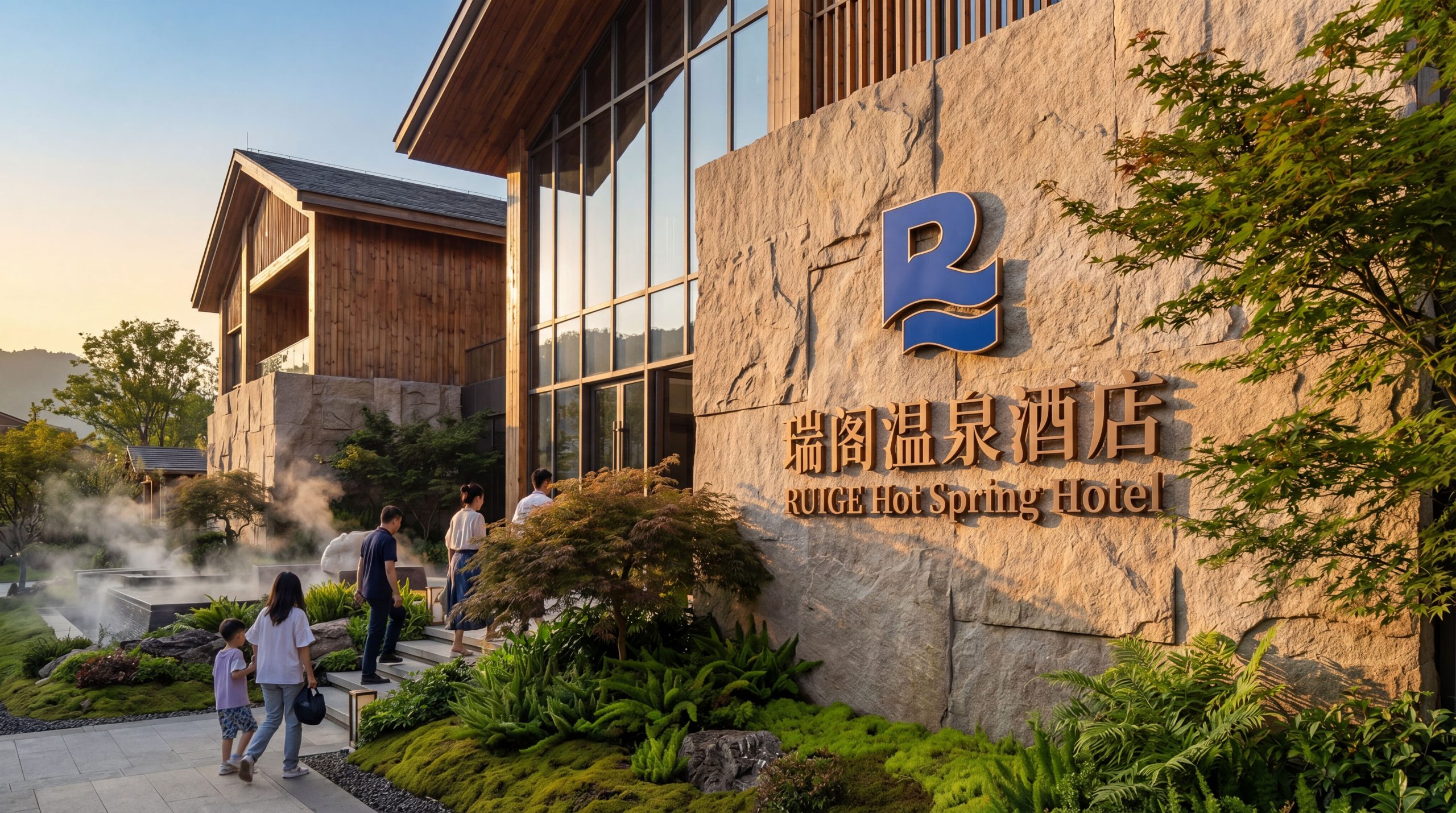
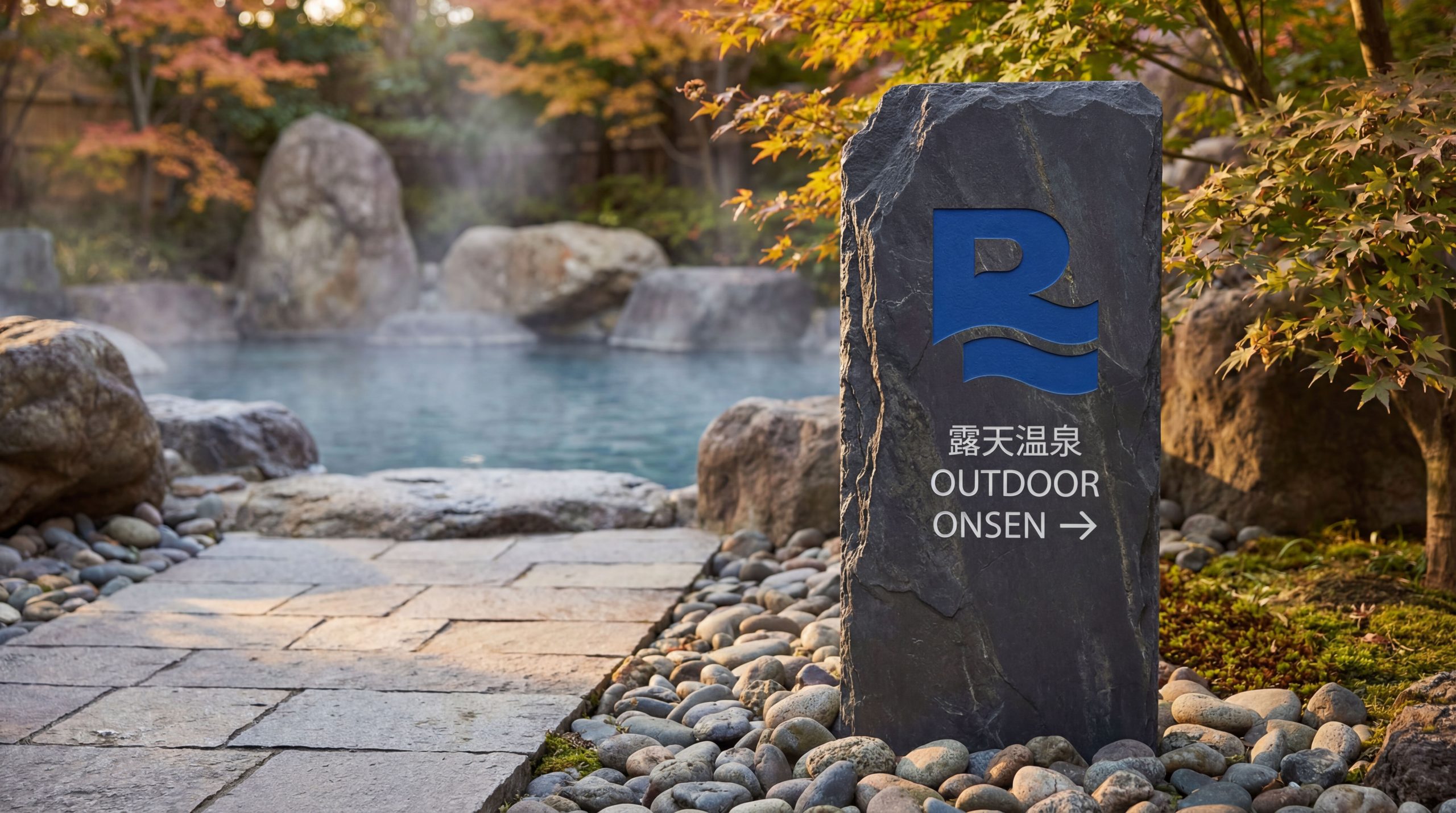
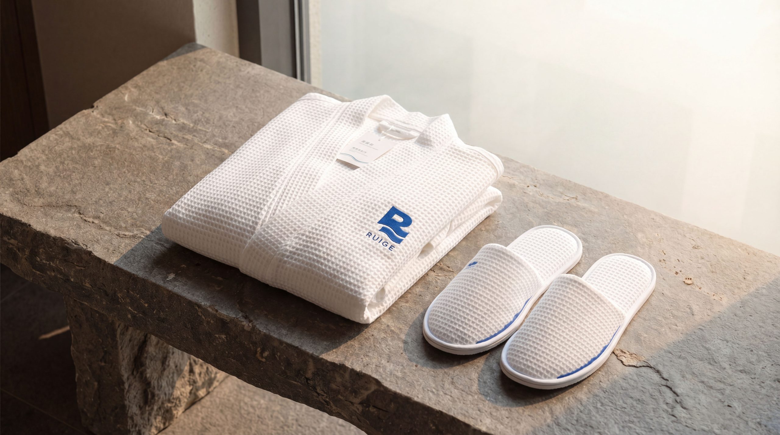
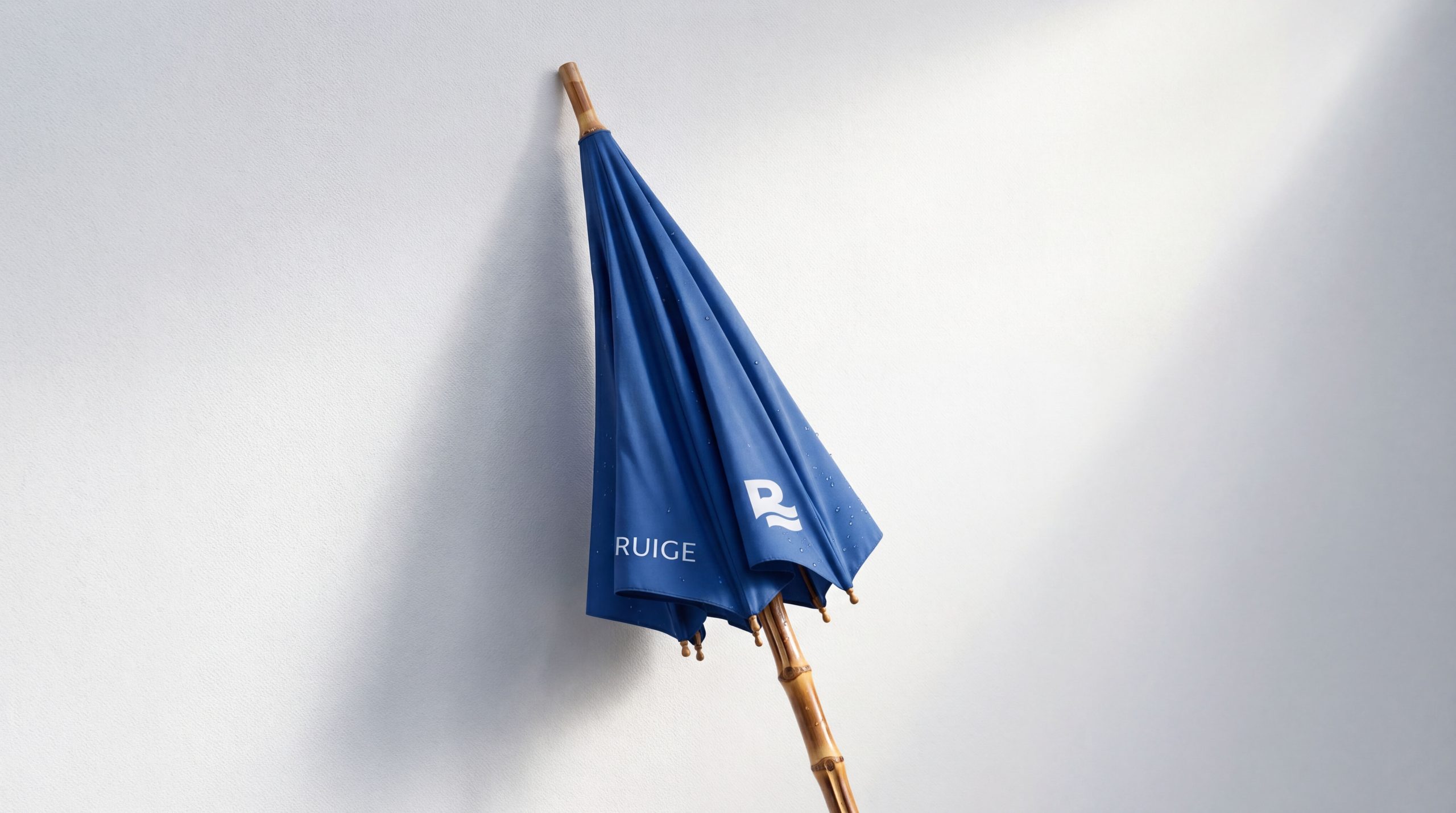
The logo has strong system scalability and can be widely used in hotel building facades, lobby image walls, hot spring area entrance signs and resort guidance systems; guest room door numbers, room card covers, bathrobe embroidery, toiletries labels and hot spring towel woven labels; brand official website, online booking platform, mobile APP interface and social media image; brand brochures, holiday package promotional leaflets, membership cards and high-end gift packaging; tourism expos, hot spring industry summits, resort destination promotion and cross-border health and wellness event images. In the core scene of the brand experience in the hot spring area, the hot spring blue logo is presented on the natural stone at the entrance of the spring pool using stone carving relief technology. The water wave curve echoes the real hot spring water surface, making the brand logo naturally integrate into the hot spring environment. In the dynamic visual, the lower half of the "R" wave curve continues to ripple in a slow-moving animation, just like the never-ending microwaves on the surface of the hot spring water. The water mist rises from the ripples and gradually disappears into the air, symbolizing the warm energy of the hot spring continuously pouring out from the depths of the spring, bringing continuous healing and tranquility to every guest. The water wave curve can be extended into a visual mother element and used for space decoration patterns, fabric patterns, floor paving and brand pattern systems.
brand meaning
The logo contains the three core images of the Ruige Hot Spring Hotel brand: Natural Warmth - the gentle flow of water curves conveys the warm texture and healing energy of natural hot springs, symbolizing the brand's core value of "nurturing the body with springs and moisturizing the heart with water"; Elegant Comfort - the solid architectural sense of the upper part of the letter "R" conveys the quality commitment of high-end hotels and the noble experience of guests; Body & Soul) - the integrated composition of upper and lower springs conveys Ruige Hot Spring Hotel's brand concept of "integration of accommodation and hot springs, architecture and nature, body and soul". The overall design conveys the brand vision of Ruige Hot Spring Hotel "Run the body with Ruiquan, and provide peace of mind in Accord".
Improper Usage (Protection Specification)
Do not change the overall proportion of the letter "R", the geometric structure of the upper part or the connection with the water wave curve; do not modify the number, radian or flow direction of the water wave curve; do not change the hue, brightness or saturation of the main color of hot spring blue; do not replace the water wave curve with straight lines, broken lines or other non-flowing forms; do not add strokes, outer glow or excessive three-dimensional effects to the logo; do not rotate, mirror graphics or separate the "R" letter and the water wave curve; keep the white space ≥ graphic height 25%; the minimum display width shall not be less than 25mm.
design results
After the release of the logo, the brand recognition and market appeal of Ruige Hot Spring Hotel in the field of high-end hot spring resorts and boutique hotels have been significantly improved. The "Shui Yun R" logo, with its unique visual language that combines the sense of architectural stability and the flowing beauty of hot springs, has become the core identification symbol of the Ruige Hot Spring Hotel brand system. This logo is widely used in hotel environments, hot spring spaces and market communications, showing the brand vision of "Rising Spring to moisturize the body, Accord to feel at ease".