










Baixin Bank is China's first approved independent legal person direct-sale bank. It was jointly initiated and established by China CITIC Bank and Baidu. With the brand positioning of "Smart Bank, People's Trust", relying on financial technology capabilities such as artificial intelligence, big data and cloud computing, it is committed to providing convenient, intelligent and inclusive digital financial services to mass users.
The brand name "Baixin" accurately conveys the core proposition of the brand - "bai" means common people, symbolizing that the service covers the broadest group of ordinary users; "xin" means trust and credit, symbolizing the fundamental demands of users for banks in the digital financial era. The English name "aiBank" directly integrates "AI (artificial intelligence)" and "Bank" to declare the brand's technological gene of "AI-driven smart bank" in the most concise way. Qingmei Future was commissioned to lead the brand identity design.
The design goal of the brand logo is to demonstrate the industry pioneer status of Baixin Bank as China's first independent legal person direct-selling bank through the visual language of financial technology, inclusive affinity and intelligent innovation, and to convey the brand image of "technological inclusiveness, intelligence and trustworthiness".
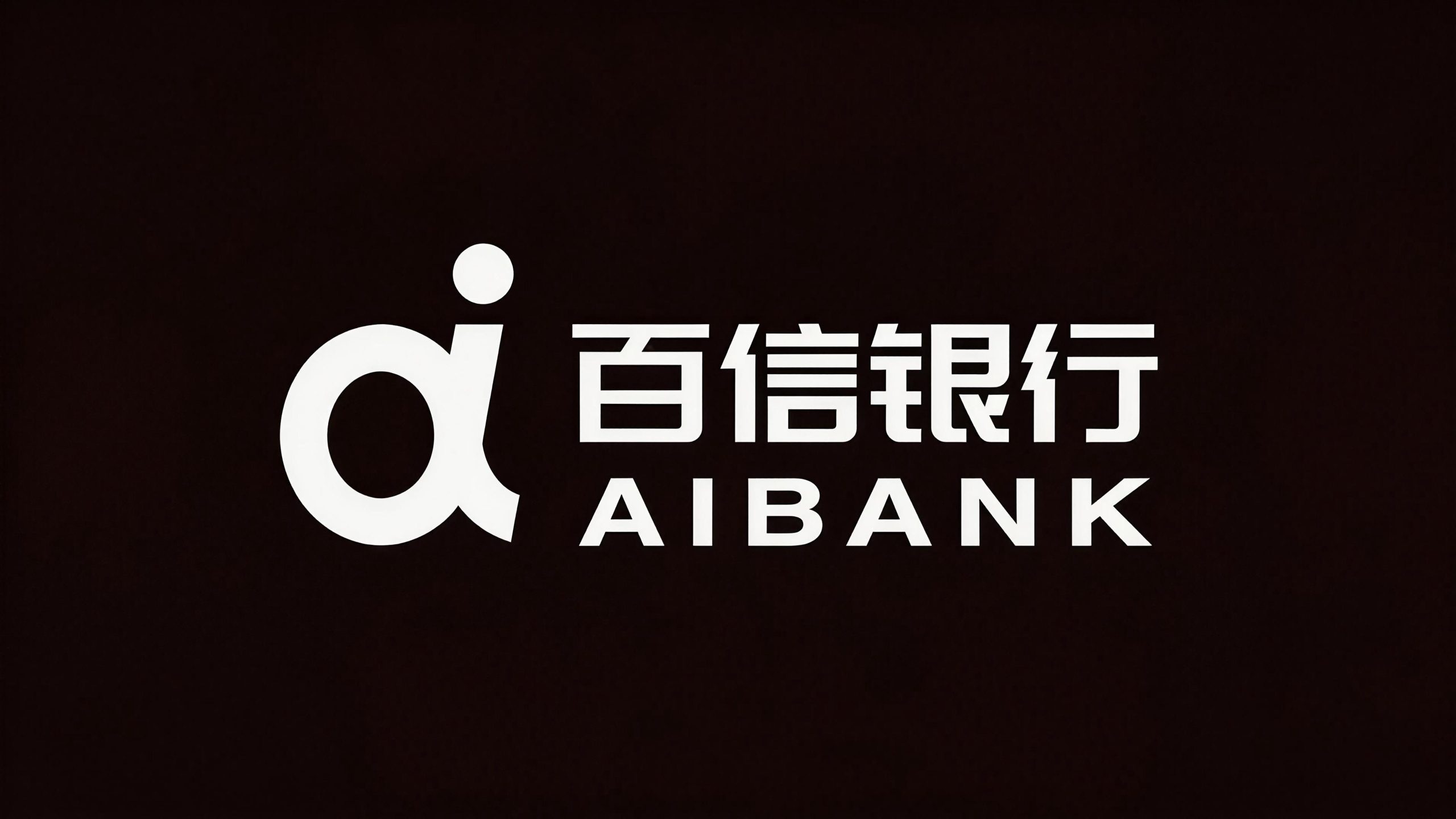

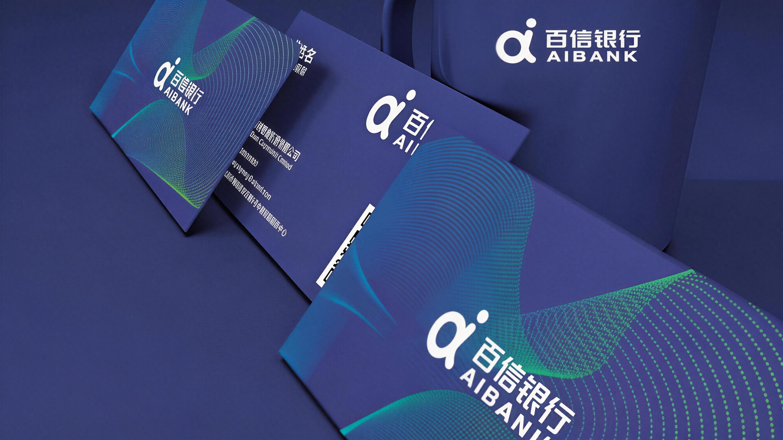
design concept
The logo takes "AI Trust Core" as its core concept and integrates the digital logic of artificial intelligence with the warm emotion of financial trust to create a brand symbol that not only conveys a sense of cutting-edge technology, but also has intimacy and trust. The design starts from the "AI + Finance" product gene of Baixin Bank and uses digital graphic language to redefine the visual paradigm of "bank" - Baixin Bank is not a traditional counter bank, but a smart bank that grows on the mobile phone screen and runs on algorithms. Its logo should naturally have a digitally native technological temperament.
graphic language
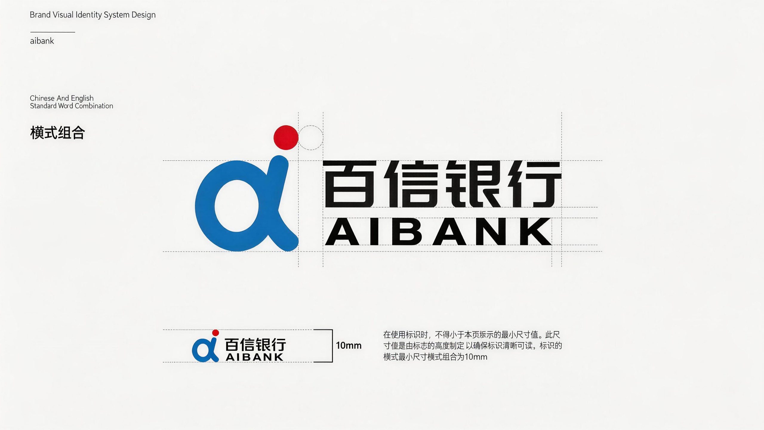
The main body of the graphic is designed based on the core letters "a" and "i" in the brand's English name "aiBank", and the two are geometrically reconstructed and organically integrated. "a" is presented in a rounded geometric shape, and the circular opening is elegantly closed with an arc. The overall shape is like a half-open door - Baixin Bank opens the door to the world of smart finance for the people; the circle of "a" also implies the technical logic of "circulation, iteration, and self-evolution" in the AI algorithm, conveying the product characteristics of smart banks that are constantly learning and optimizing. "i" is composed of simple vertical lines and dots. The dots are independent of the vertical lines, like a minimalist silhouette of a human figure. "i" is both the initial letter of "intelligence" and the symbol of "I", conveying Baixin Bank's "every user-centered" service concept.
"a" and "i" are combined in a closely connected manner in the graphic. The vertical line of "i" is naturally embedded in the opening of "a" or immediately adjacent to its right side. The two share geometric boundaries and provide structural support to each other, forming an inseparable overall symbol - "ai" is both the abbreviation of "artificial intelligence (AI)" and the homophony of the Chinese word "love". It injects a touch of humanistic warmth into technological rationality and conveys Baixin Bank's brand warmth of "using the power of AI to do things that love people." The overall graphic is based on rounded geometry, and all corners are treated with soft arcs to avoid sharp edges and corners, conveying the friendly affinity of digital banks for mass users - not a cold technological machine, but a warm intelligent partner. The overall composition uses the integrated logic of "letters are graphics, technology is temperature" to build an "intelligent message core" to convey the brand's technological genes and its original intention of inclusiveness.
Font composition
The English "aiBank" uses a customized rounded sans-serif font. The switching between lowercase "ai" and uppercase "B" forms a unique visual rhythm - the friendly and easygoing lowercase letters convey the ease of Internet products, while the steady and straight uppercase "B" conveys the professionalism and reliability of banking services. The alternate use of uppercase and lowercase letters breaks the solemnity and stereotype of traditional bank wordmarks and establishes the dual brand recognition of "technology company + licensed bank". The Chinese "Baixin Bank" uses modern boldface with rounded corners, with even and soft strokes and clear and crisp structure. The word "hundred" conveys the inclusive coverage of serving the people, the word "xin" conveys the trustworthy quality commitment, and the word "bank" clearly identifies the attributes of the financial industry. The Chinese and English font styles maintain consistent rounded corners to ensure the brand's visual unity in core digital scenarios such as mobile screens and APP interfaces.
color system
The main color, Baixin Blue #0080FF, represents technology, intelligence, trust and digitalization. This bright and clear technological blue is different from the dark blue commonly used in traditional banks - dark blue conveys historical precipitation and solemn authority, while Baixin Blue conveys digital nativeness and innovative vitality, just like the clear blue light when the mobile phone screen lights up, which is directly related to the user's visual memory of digital products. The brightness and thoroughness of Baixin Blue conveys the direct bank's service commitment of "transparency, efficiency, and no hiding", allowing users to instantly establish a sense of trust in the brand at the visual level. Auxiliary vibrant orange #FF6B35 is used in interactive elements, button highlights and marketing campaign materials in the brand system. It uses warm and bright warm colors to break the cold feeling of technology that pure blue may bring, and conveys the enthusiasm and affinity of Baixin Bank to mass users. The combination of blue and orange is one of the most recognizable color combinations in the Internet financial industry - blue builds trust and orange inspires action. The two work together to drive users' complete experience path from "seeing" to "using". The auxiliary light gray #F5F7FA is used for spatial layering in the APP interface background and digital scenes, using the softest grayscale to create the unique freshness and order of digital products. Pure white #FFFFFF as standard base color. The overall color is blue and orange as the core, reflecting the digital banking temperament of "smart, trustworthy, inclusive and warm".
Application extension
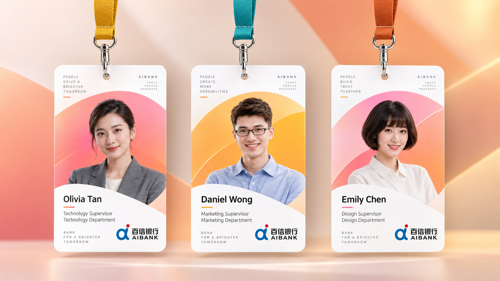
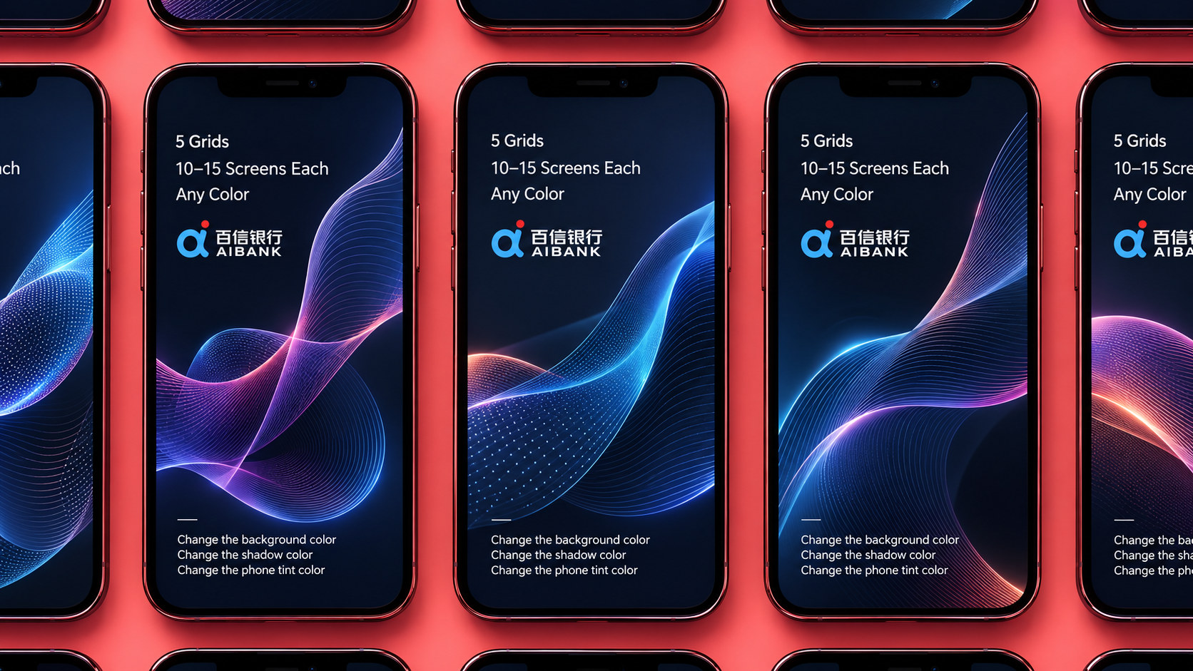
The logo can be widely used in mobile banking APP icons, startup pages and core interfaces; official websites, H5 marketing pages, mini program entrances and social media images; bank card surface design, electronic account interfaces and digital certificate logos; images of financial technology summits, Internet finance forums, product launches and brand cooperation activities; office space guides, employee badges and brand stationery systems. In the APP icon, which is the most frequent brand touch point, the "ai" graphic is presented with Baixin blue as the background color and white as the graphic color. It stands out from many application icons with a concise and bright visual image on the mobile phone desktop, ensuring users' quick recognition and a sense of brand companionship in daily use. In the dynamic visual, the circular arc of "a" is slowly drawn with the trajectory of data flow, and the dot of "i" gradually lights up like the startup indicator light of the AI algorithm. The whole process is like an intelligent system completing its initialization, symbolizing that Baixin Bank uses AI technology to open a new smart financial experience for every user.
brand meaning
The logo contains three core images: AI Powered - the fusion of "ai" letters directly conveys the brand's technological gene with artificial intelligence as the core driving force; People's Trust - the friendly shape of rounded geometry and bright blue conveys a friendly gesture and trustworthy commitment to mass users; Digital Native - the Internet-based font style and APP-first design thinking convey Baixin Bank's innovative pioneer status as China's first independent legal person direct-selling bank. The overall design conveys Baixin Bank's brand vision of "inclusive technology, intelligence and trustworthiness".
Improper Usage (Protection Specification)
Do not change the geometric relationship, fusion method or overall proportion of "a" and "i"; do not replace the rounded corners with sharp or right-angled geometry; do not change the hue or lightness of the main color of Baixin Blue; do not replace the blue and orange color combination with the dark blue and gold combination of traditional banks; do not add strokes, shadows or traditional decorative effects that are inconsistent with the digital style to the logo; do not separate the "ai" graphic and the wordmark for separate use; keep white space ≥ 25% of the graphic height; the minimum display width must not be less than 20mm.
design results
After the release of the logo, Baixin Bank's brand recognition and user trust have been significantly improved in the fields of digital finance and Internet banking. "Smart Xinxin", with its unique visual language that combines AI technological rationality and inclusive humanistic warmth, has become the core identification symbol of Baixin Bank's brand system. It is widely used in APP interfaces, digital marketing and industry communications, demonstrating the brand vision of "technological inclusiveness, intelligence and trustworthiness".