










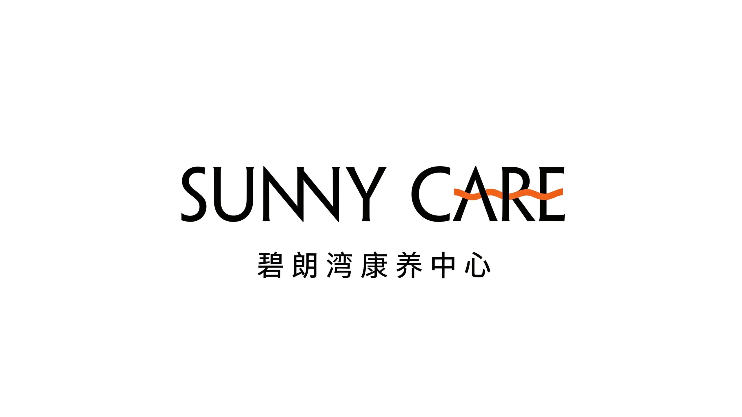
SUNNY CARE Bilangwan Wellness Center is a comprehensive health care service organization with health care and quality elderly care as its core. With the brand concept of "sunshine health care, clear water and peaceful living", it is committed to providing high-quality health care services that integrate medical care, rehabilitation and recuperation, leisure vacations and care for the elderly for middle-aged and elderly people and families pursuing a healthy life.
The brand name is composed of English "SUNNY" "CARE" and "Bilangwan" in Chinese are jointly formed - "SUNNY" means sunshine and brightness, symbolizing the positive health and bright mood of healthy life; "CARE" means care and care, symbolizing the care and concern for every resident. Professional care and sincere care; the three words "Bilang Bay" depict a natural picture - "Bi" means clear water and green mountains, "Lang" means clear sky and clear air, and "Wan" means living by the bay, conveying the natural endowment of the health care center with mountains and rivers and beautiful environment. Qingmei Future was commissioned to lead the brand identity design.
The design goal of the brand logo is to demonstrate the brand positioning of Bilangwan Health Care Center as a high-quality health care institution through the visual language of natural ecology, healthy vitality and warm care, and to convey the brand image of "sunshine health care, clear water and clear sky, and safe bay residence".
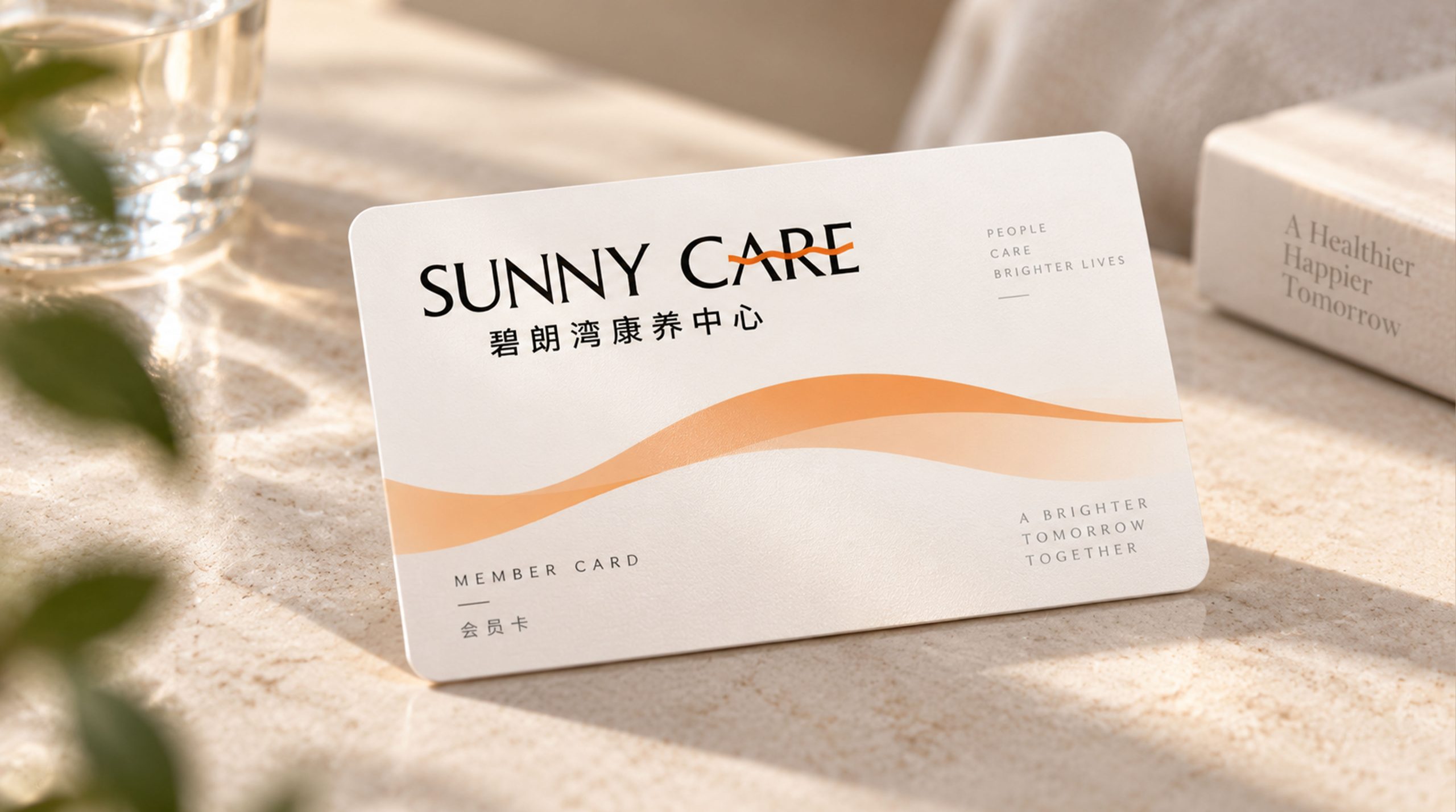
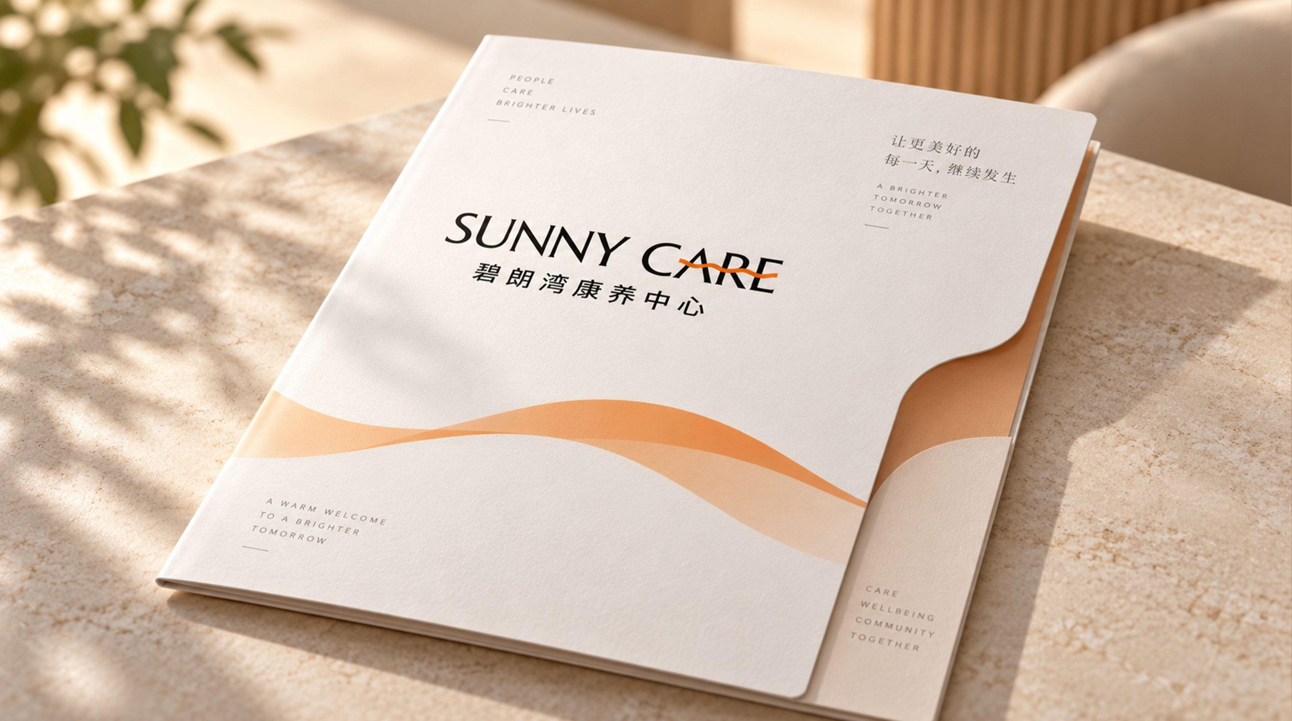
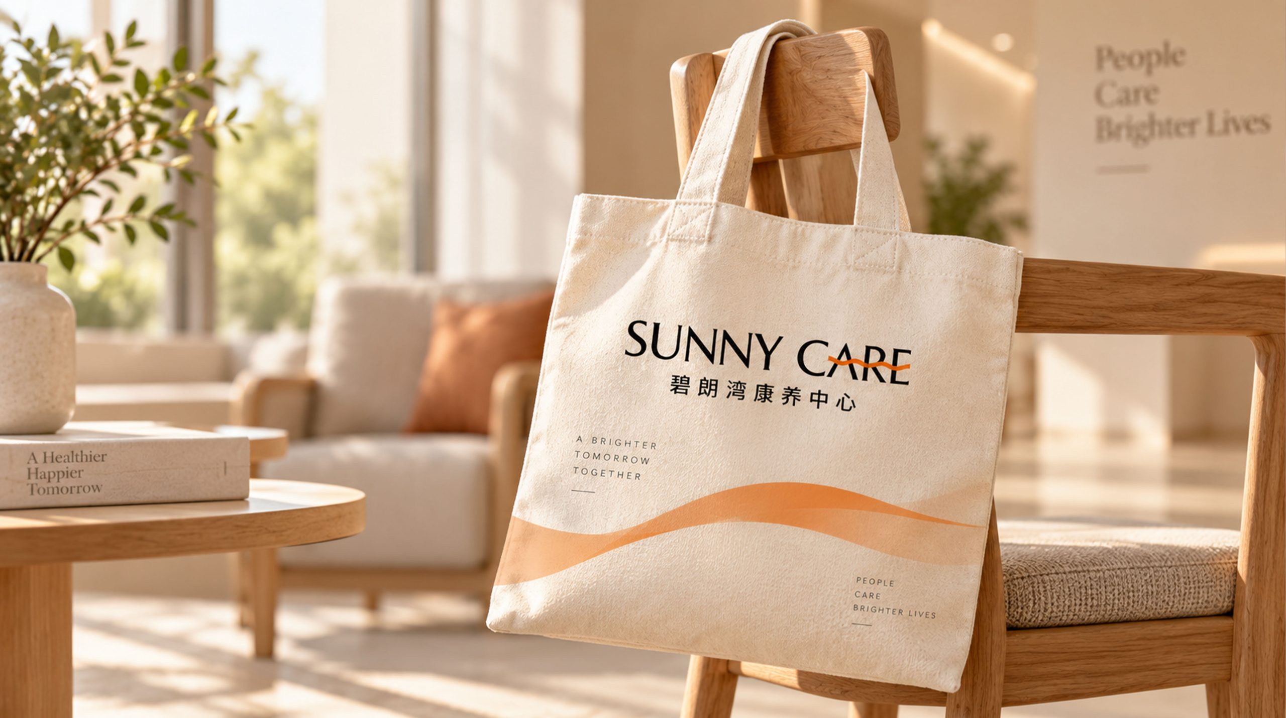
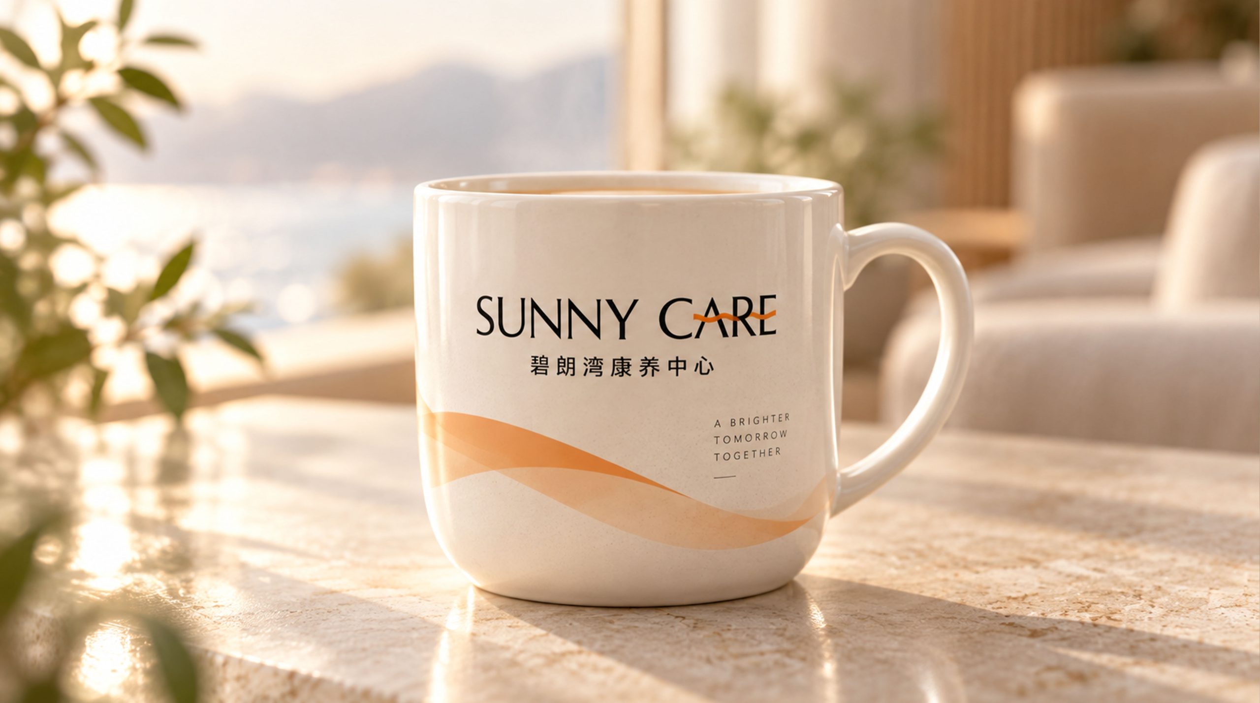
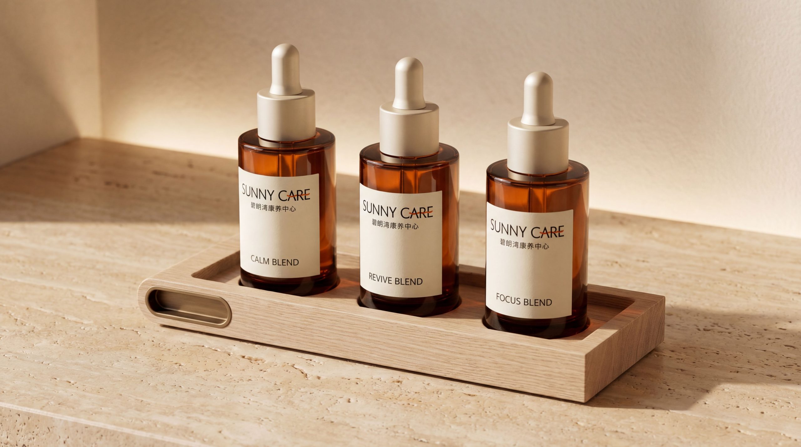
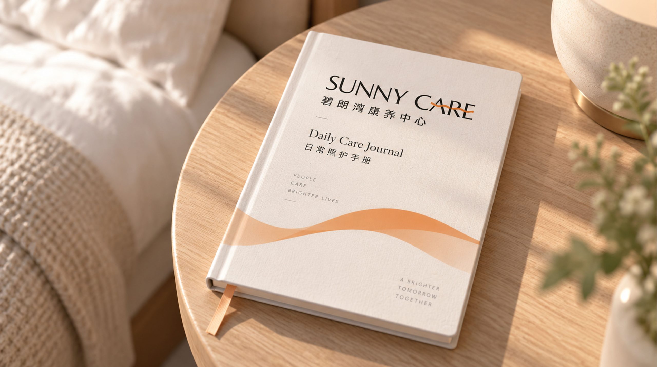
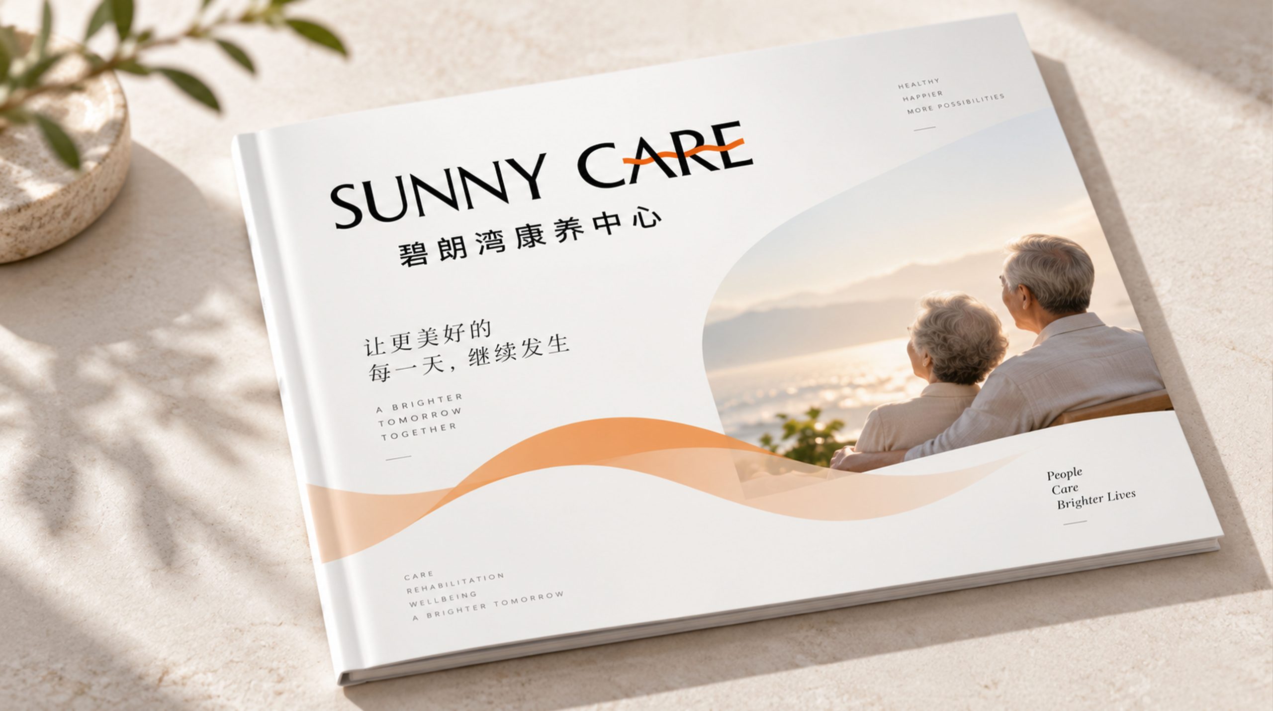
design concept
The logo takes "Sunrise over the Bay" as its core concept and condenses the natural scene of a warm sunrise slowly rising from the shore of Bishui Bay into the core visual symbol of the brand. The rising sun is the most hopeful and vital moment of the day - the morning light falls on the water, everything wakes up, and the air is fresh. This is the most ideal artistic conception of a healthy life. The design starts from the life vision of "waking up from the sun every day and living beside clear water" to build a brand totem that not only conveys the beauty of natural ecology but also carries the warmth of health care.
graphic language
The main body of the graphic uses a semicircular sun as the visual core. The sun presents the upper part in a warm and full arc, and the lower edge ends with a horizontal line. It is like the moment when the sun has just risen halfway from the horizontal plane - it has already broken but has not yet fully emerged, conveying the positive image of a healthy life of "new life and full of hope every day". Several rays of light of different lengths radiate outward softly from above the sun. The rays of light are converged at rounded corners. They are warm but not scorching, just like the gentle touch of the first ray of sunlight in the morning shining through the mist on the bayside.
Below the sun, two to three soothing wave curves form the surface of the water. The wave arcs are gentle and rounded, advancing layer by layer, just like the microwave ripples of the lake at Bilang Bay in the morning breeze - not the turbulence of the waves, but the tranquility of the inner lake, conveying the unique tranquility and calmness of the health care environment. The water wave curve extends to both sides beyond the width of the sun, just like the water on the bay extending infinitely into the distance, implying the natural geographical advantage of the health care center being built along the water. The sun and the water surface merge at the horizon. The warm color of the light and the cold color of the water surface form a subtle color temperature transition at the intersection, just like the golden rays of the rising sun falling on the clear water and sparkling, forming the most moving morning scene of "Bilang Bay".
The overall outline of the graphic can be condensed into a rounded rectangular or oval outer frame. The outer frame is like a landscape window facing Biwan - through this window, residents can see the sunshine, clear water and tranquil bayside scenery, conveying the health center's life promise of "every window is a scenery, every day is a healing". The overall composition uses the upper and lower structure of "the sun rises over the water and the light shines on the bay" to build "Biwan Chaoyang", conveying the brand's natural endowment and health care vision.
Font composition
The English "SUNNY CARE" uses a humanistic sans-serif font with rounded corners. The strokes are even and gentle, and the corners are processed with soft arcs. The font remains clear and readable while exuding a healthy, friendly and trustworthy brand temperament. The letter spacing is moderately loose, conveying the leisurely pace of health and wellness life. The Chinese "Bilangwan Health and Wellness Center" uses a rounded modern black font with soft and full strokes. The three words "Bilangwan" are presented in a slightly thicker weight, just like the brand's business cards - clear water, blue sky, and bayside. The three words are three paintings; the four words "wellness center" are supplemented by regular weights to clarify the attributes of the institution and service positioning. Chinese and English are arranged up and down. The English at the top conveys the international quality image, and the Chinese at the bottom conveys the local kindness and trust.
color system
The main color Chaoyang Orange #F5A623 represents sunshine, warmth, health and vitality. Just like the warm golden orange light on the skyline when the sun rises in the morning, it directly activates people's emotional association with "sunshine health". The warmth of orange conveys a positive and optimistic attitude toward life in the health care brand, breaks the dull visual impression common in traditional nursing homes, and conveys to residents and their families that "this is not the end of old age, but a new starting point for a sunny life." Auxiliary clear water blue #2E8B9A represents clear water, cleanliness, tranquility and natural healing. Just like the transparent blue water of the clear lake in Bilang Bay under the sun, it conveys the ecological advantages of a healthy environment surrounded by mountains and rivers and the health concept of natural healing. The combination of orange and blue is a classic complementation of warm and cold colors - the passion of the sun and the tranquility of the clear water coexist harmoniously in the same logo, just like the ideal state of healthy life of "combination of movement and stillness, balance of body and mind". Auxiliary grass green #6AAF50 is used for ecological elements and outdoor activity logos in the brand system, symbolizing the green natural environment around the wellness center and a healthy and organic lifestyle. Auxiliary warm rice #F5EDE0 is used for the background color and indoor space vision in the brand system. It is like the warm and soft light of sunlight shining on the original wooden floor, conveying the sense of home and comfort of the wellness space. Pure white #FFFFFF as standard base color. The overall color uses orange and blue as the dual core and green rice as the supplement, reflecting the brand temperament of "sunshine, clear water, natural health".
Application extension
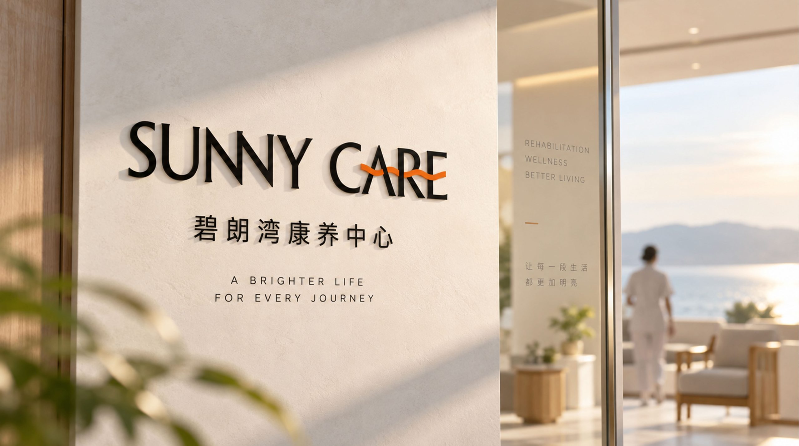
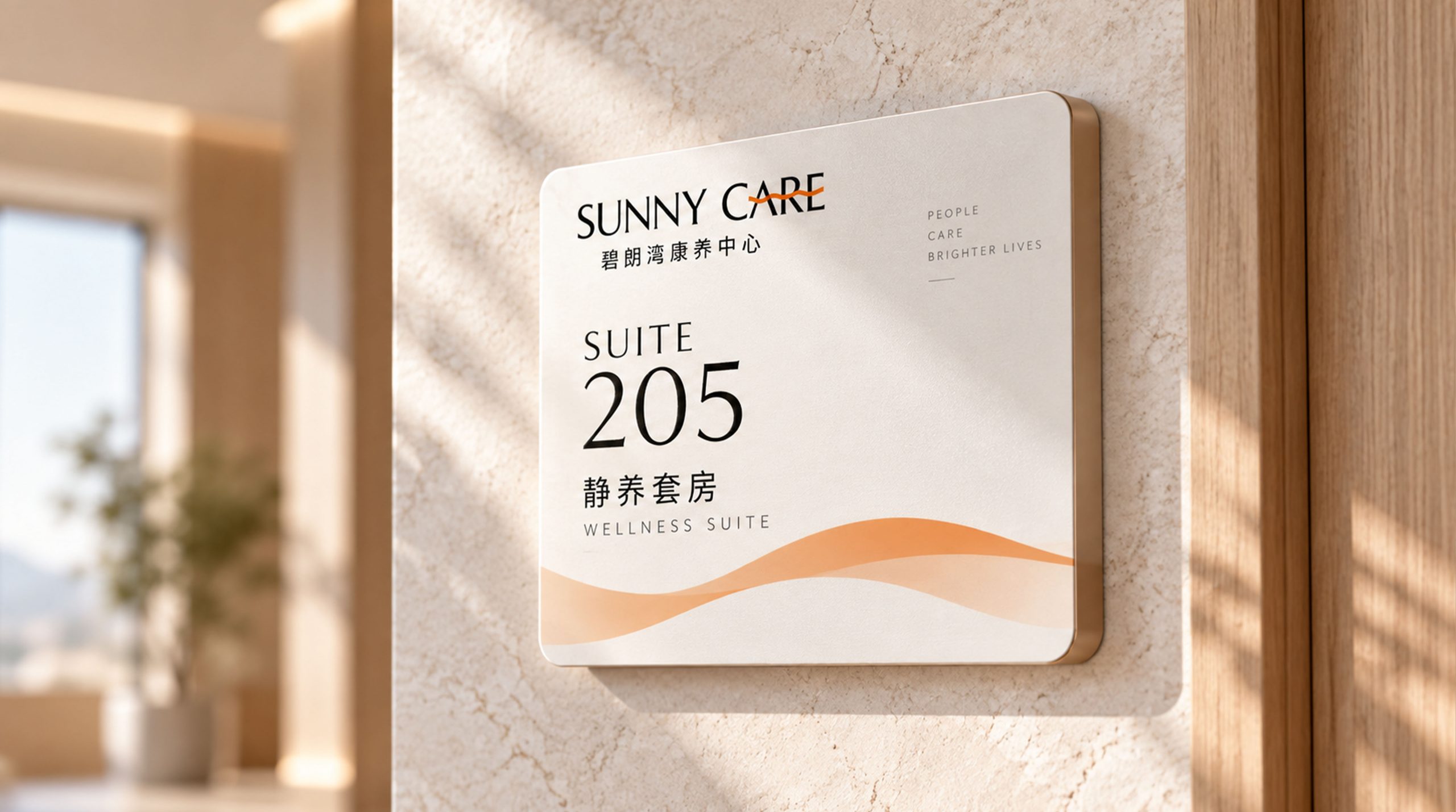
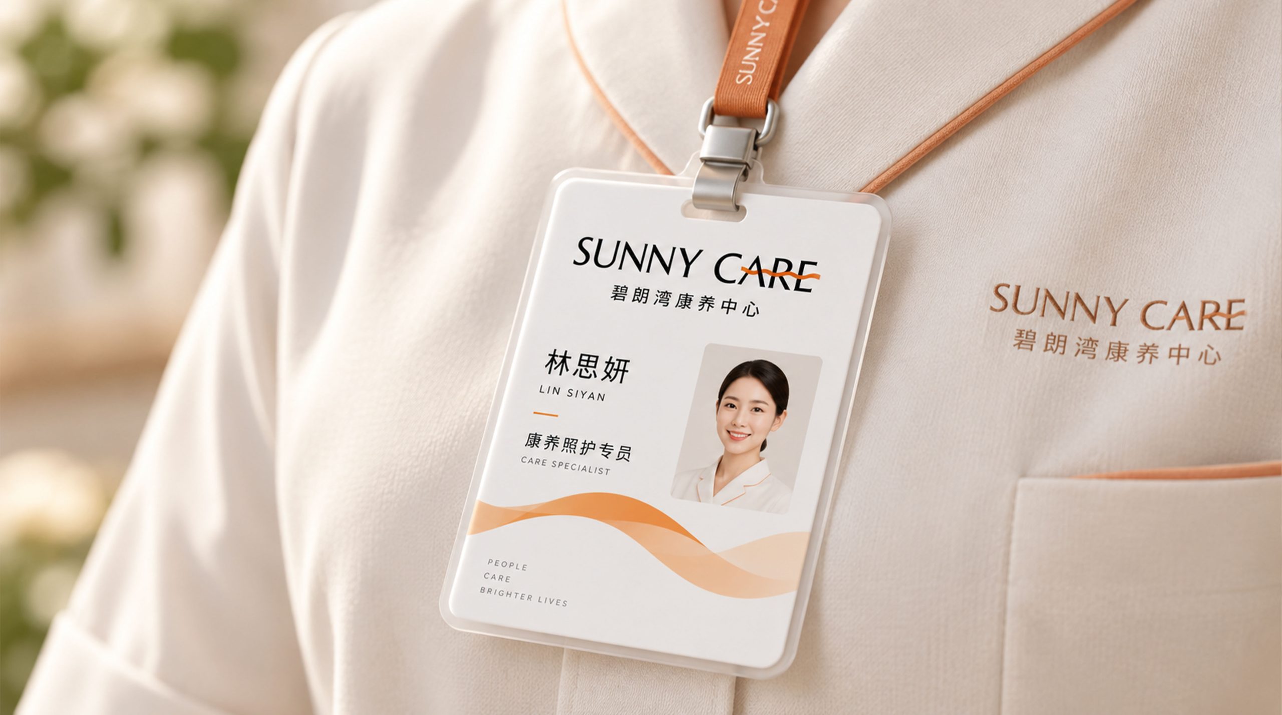
The logo can be widely used in health care center building entrances, lobby image walls, park guidance systems and building nameplates; room door numbers, care product signs, restaurant environment decoration and public activity space visuals; brand official website, online consultation platform, family communication APP and social media image; brand album, check-in guide, health management manual and family invitation letters; health care industry forums, health industry expos, community promotion activities and government cooperation project images. In the lobby of the wellness center, which is a key scene for the first impression of the brand, the Chaoyang orange and aqua blue logos are displayed on the front desk background wall with warm lighting. The residents and their families feel the brightness and peace of mind of "Biwan Chaoyang" from the first moment they step into the lobby. In the dynamic visual, the curves of the water waves slowly ripple from the bottom of the picture. The morning sun rises slowly from the water and spreads its light softly to the surroundings. The clear water sparkles under the sunlight, symbolizing that the Bilang Bay Wellness Center awakens every resident to a beautiful new day with sunshine and clear water.
brand meaning
The logo contains three core images: Sunny Wellness - the rising sun and warm orange tones convey the positive health of wellness life and the energy of hope reborn every day; Bay Living - the water curves and blue water convey the natural ecological endowment of the wellness center surrounded by mountains and rivers and the quiet and peaceful living experience; Warm Care (Caring) Warmth) - Soft graphic shapes and a color system dominated by warm colors convey the professional care and sincere care that the health care institution provides to each resident like a family member. The overall design conveys the brand vision of SUNNY CARE Bilangwan Wellness Center of "sunshine wellness, clear water and clear sky, and safe bay residence".
Improper Usage (Protection Specification)
Do not change the proportion of the semicircle of the rising sun, the number of ray lines or the angle of radiation; do not modify the arc, the number of layers of the water wave curve or the intersection relationship with the sun; do not change the hue of rising sun orange and azure blue or replace it with a cold gray tone; do not add strokes, hard shadows or sharp geometric elements that are inconsistent with the wellness style to the logo; do not separate the rising sun and water waves for separate use; keep the white space ≥ 25% of the graphic height; the minimum display width must not be less than 25mm.
design results
After the logo was released, the brand recognition and emotional identity of SUNNY CARE Bilangwan Wellness Center in the field of health care services and healthy elderly care have been significantly improved. "Biwan Chaoyang", with its unique visual language that integrates the beauty of natural ecology and the warmth of health care, has become the core identification symbol of the Biwan Bay brand system. It is widely used in health care spaces, service contacts and market communications, showing the brand vision of "sunshine health care, clear water and clear sky, and safe bay residence".